 SiteGround - Reliable hosting with speed, security, and support you can count on.
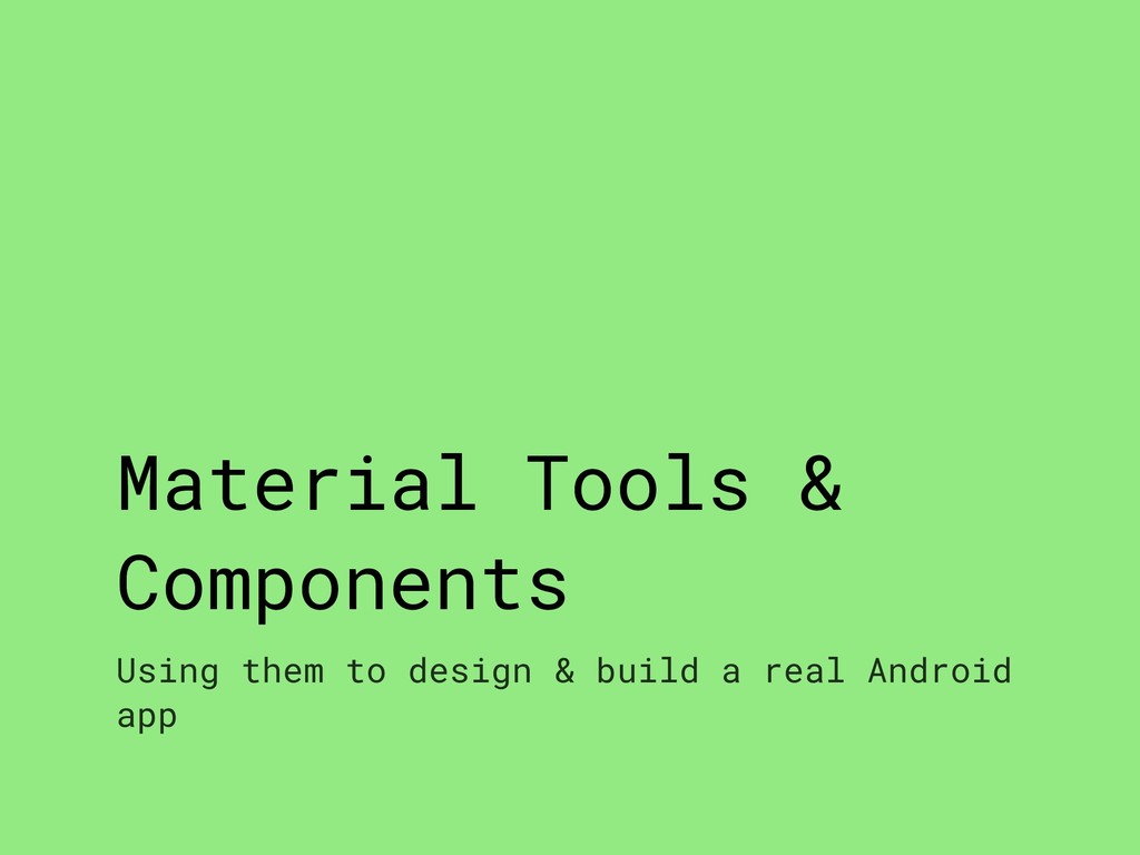
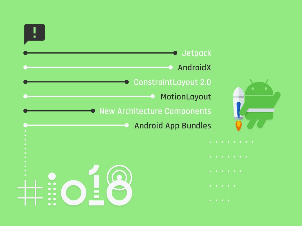
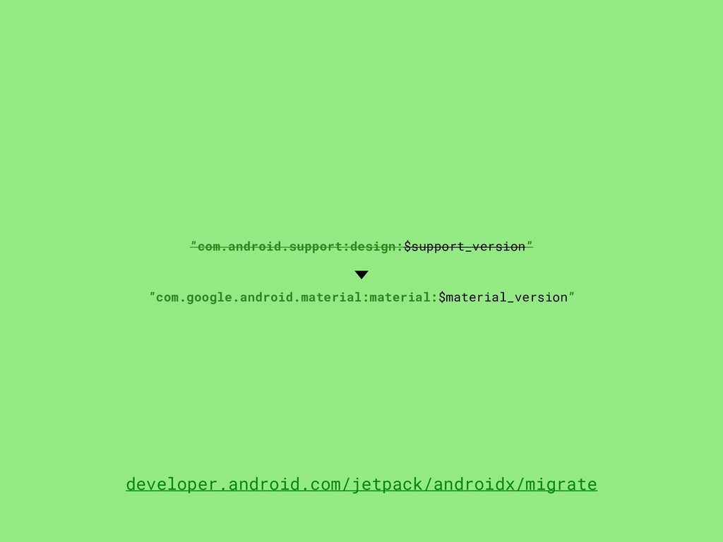
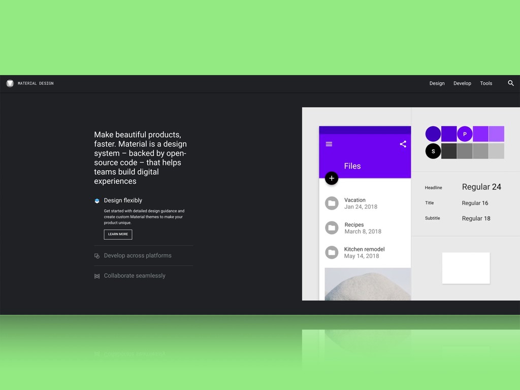
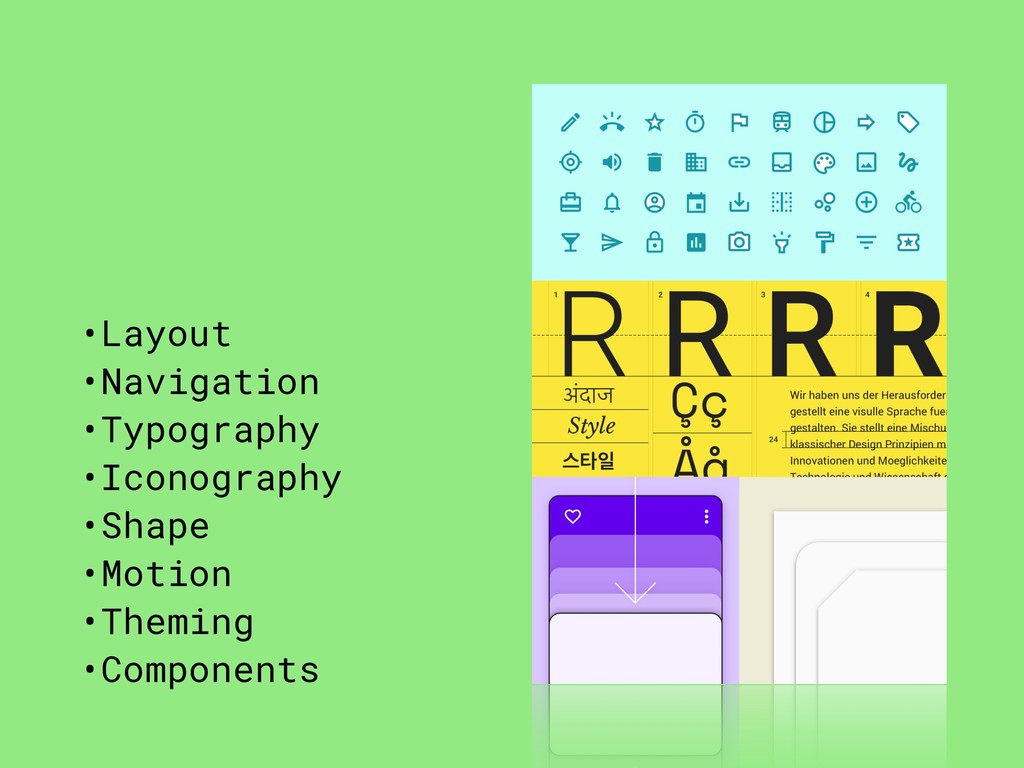
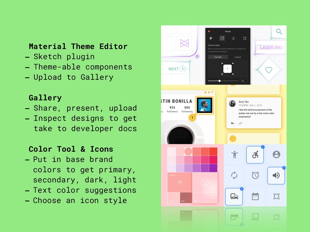
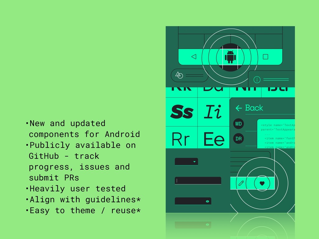
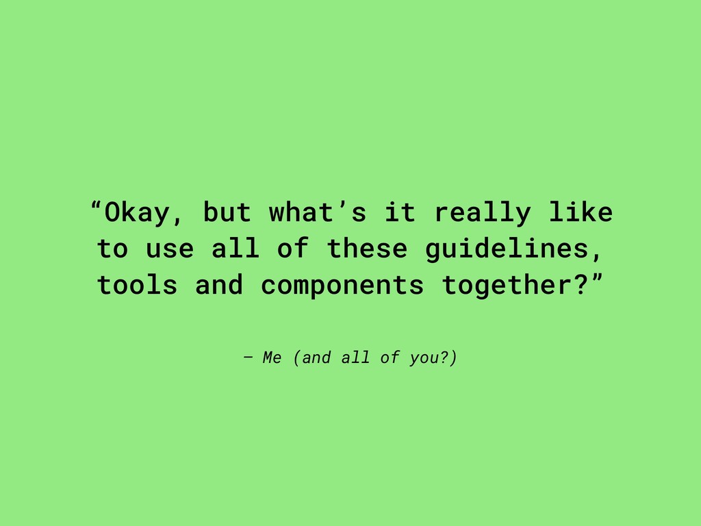
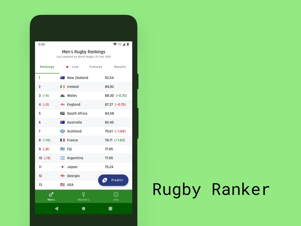
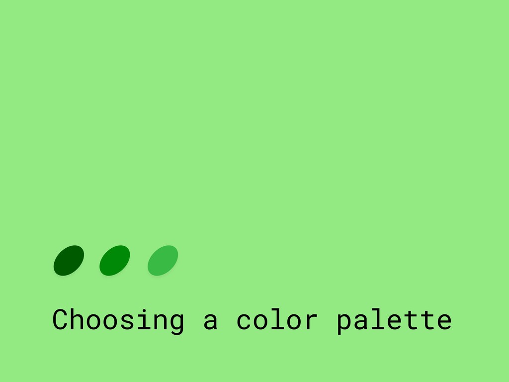
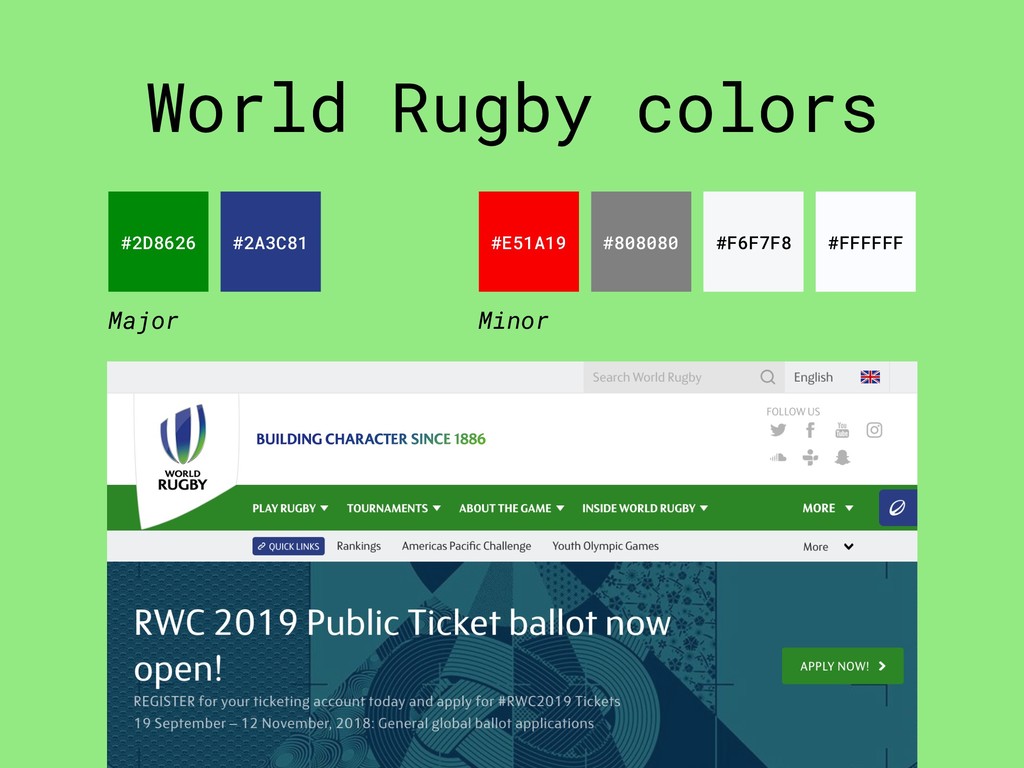
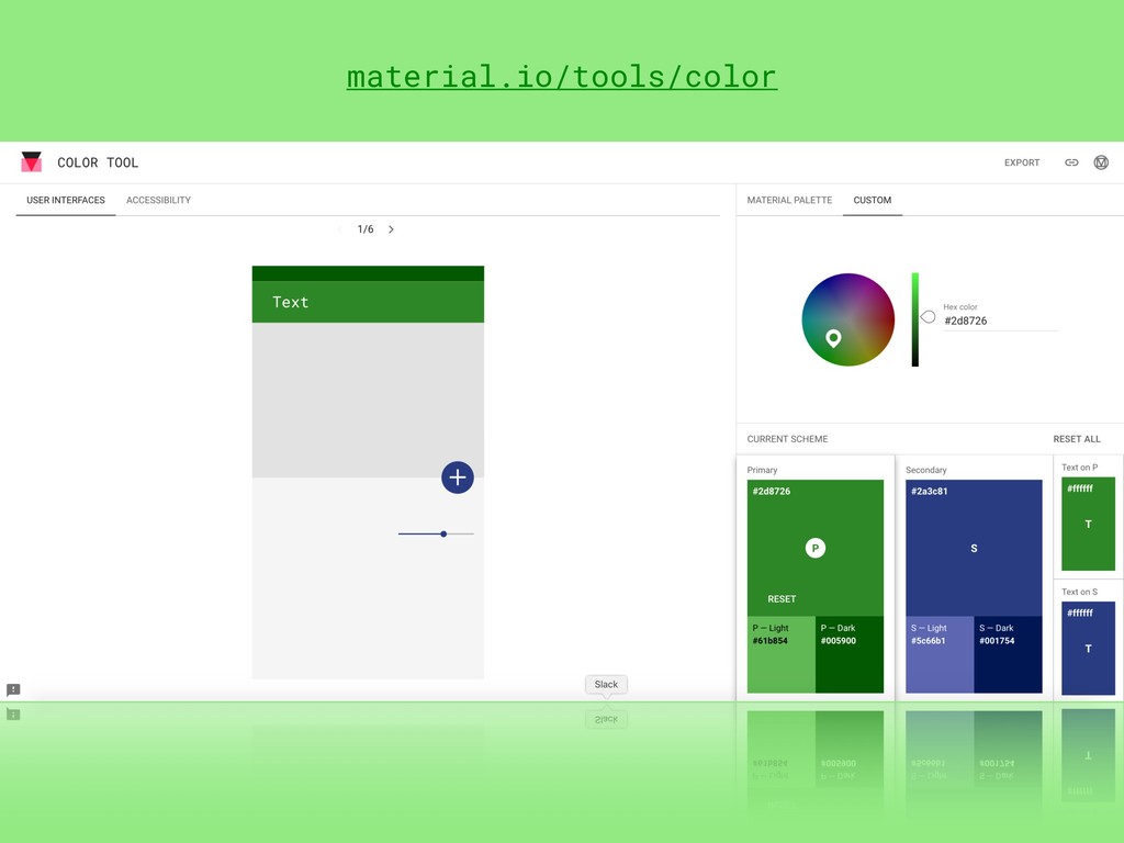
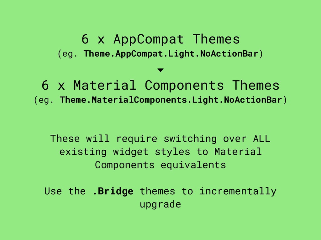
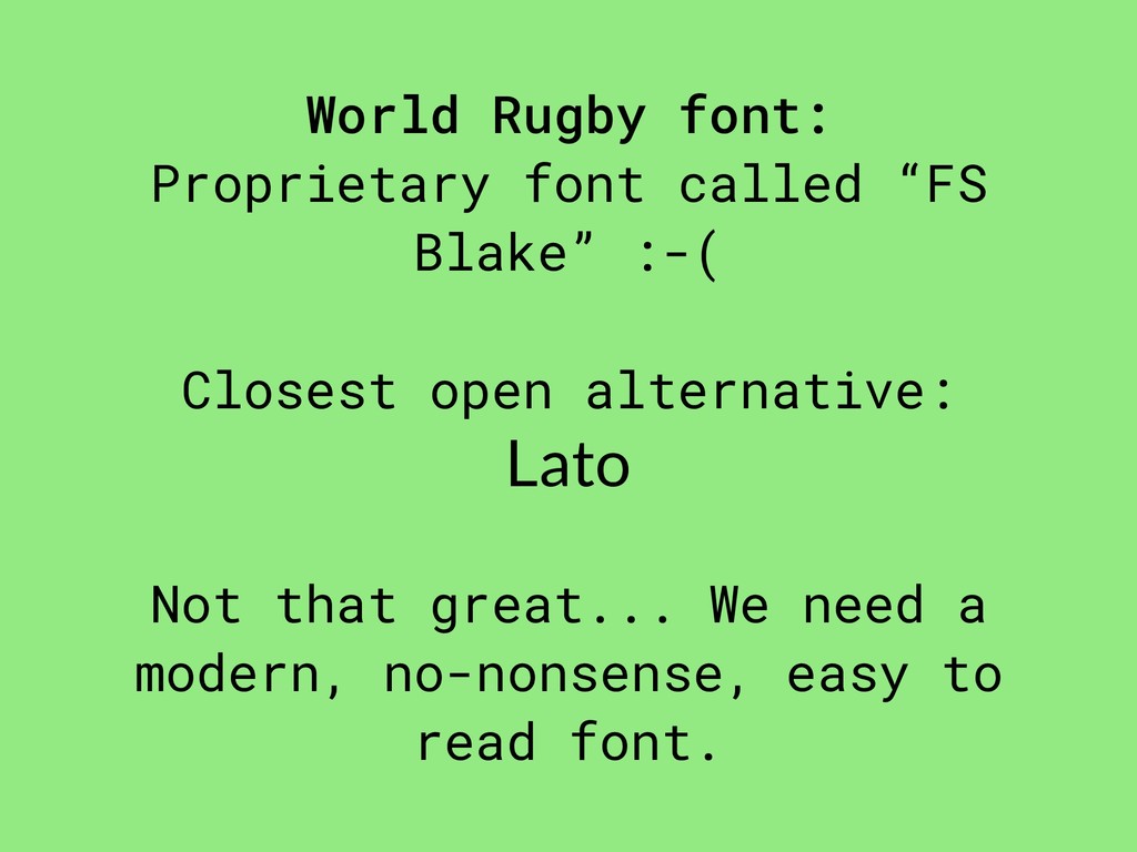
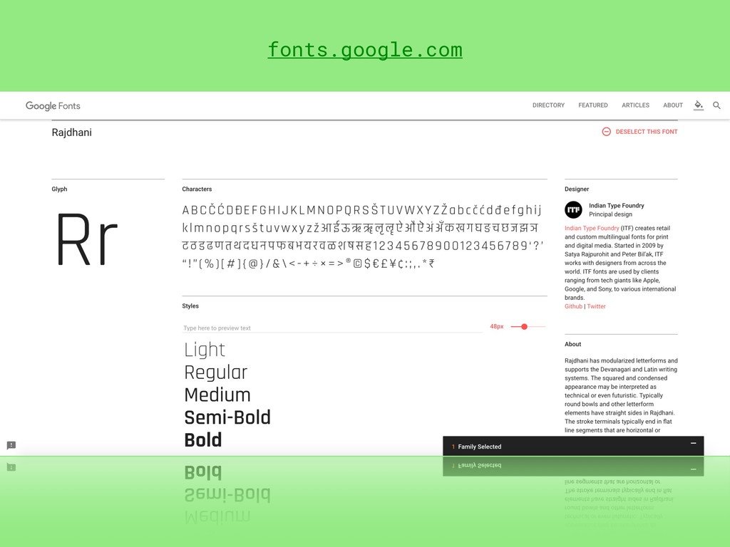
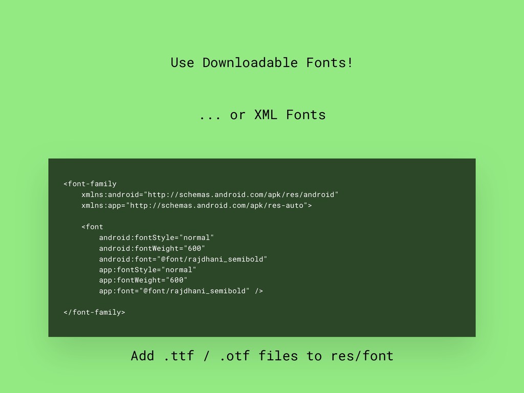
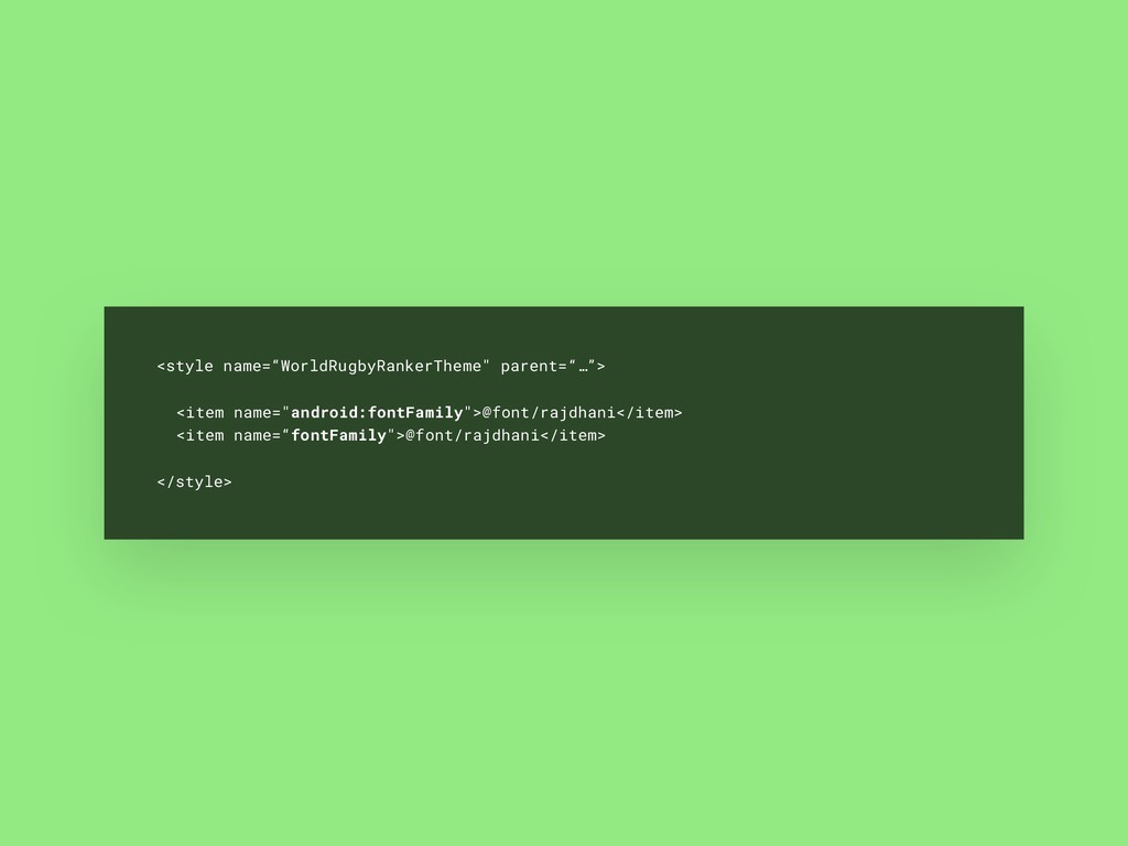
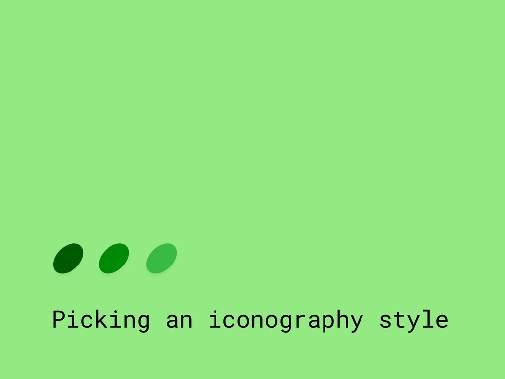
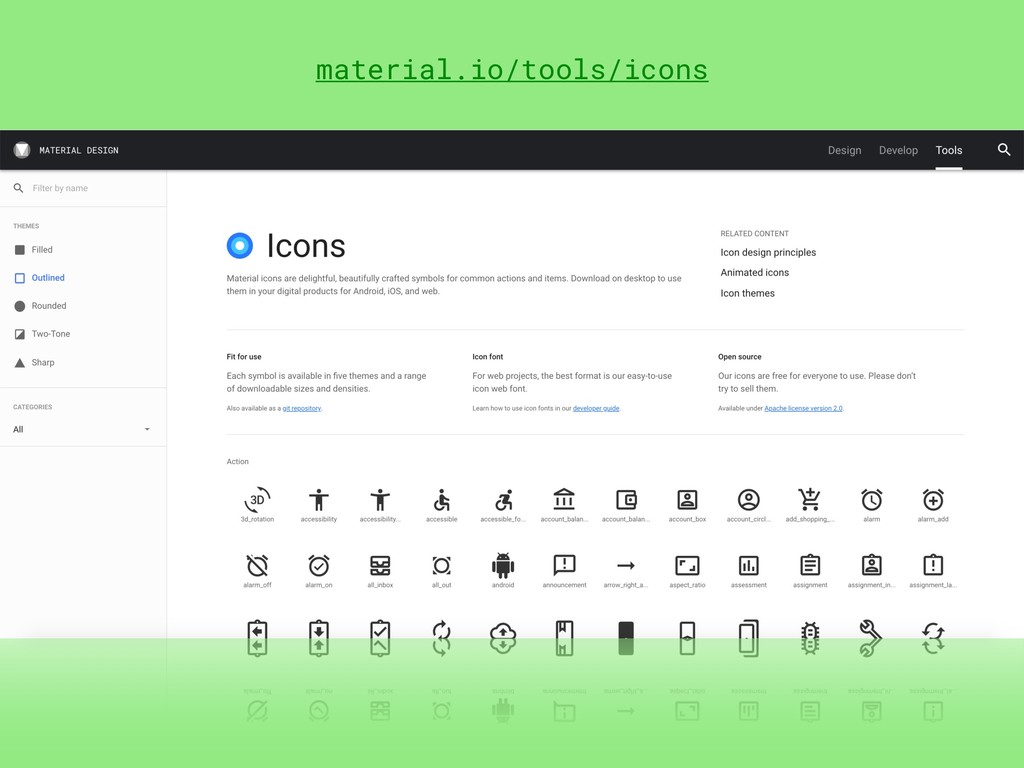
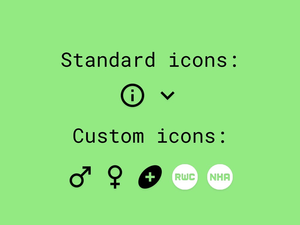
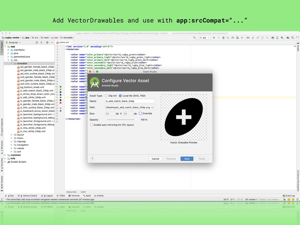
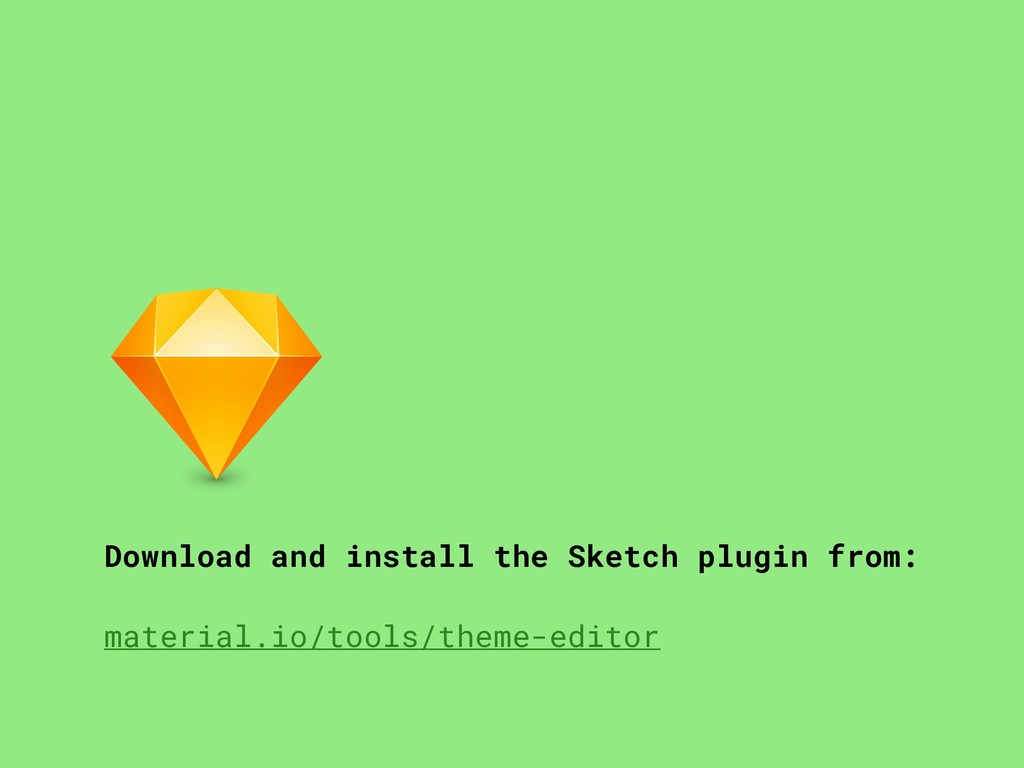
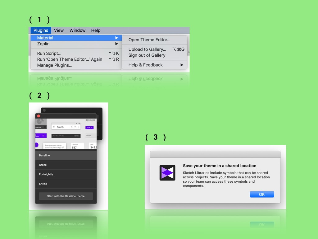
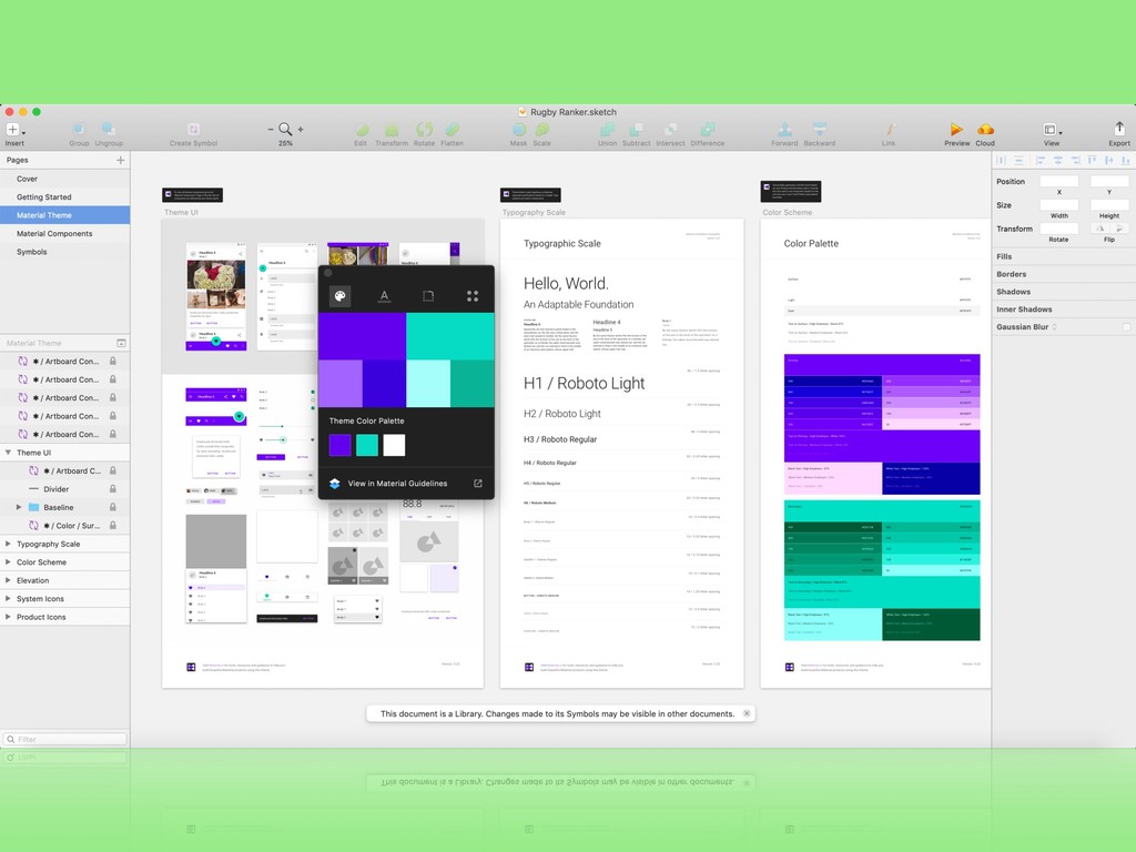
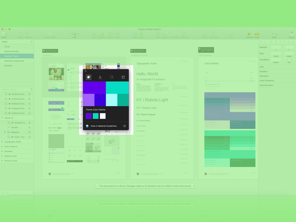
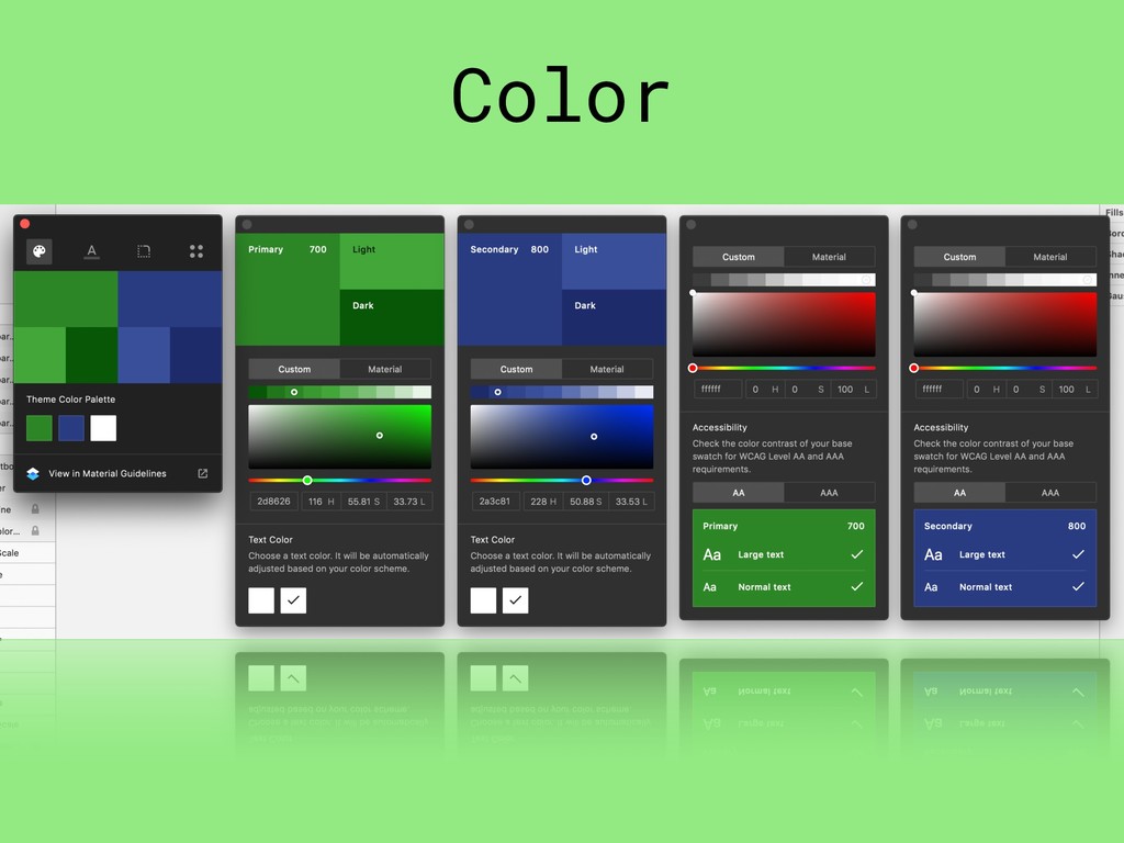
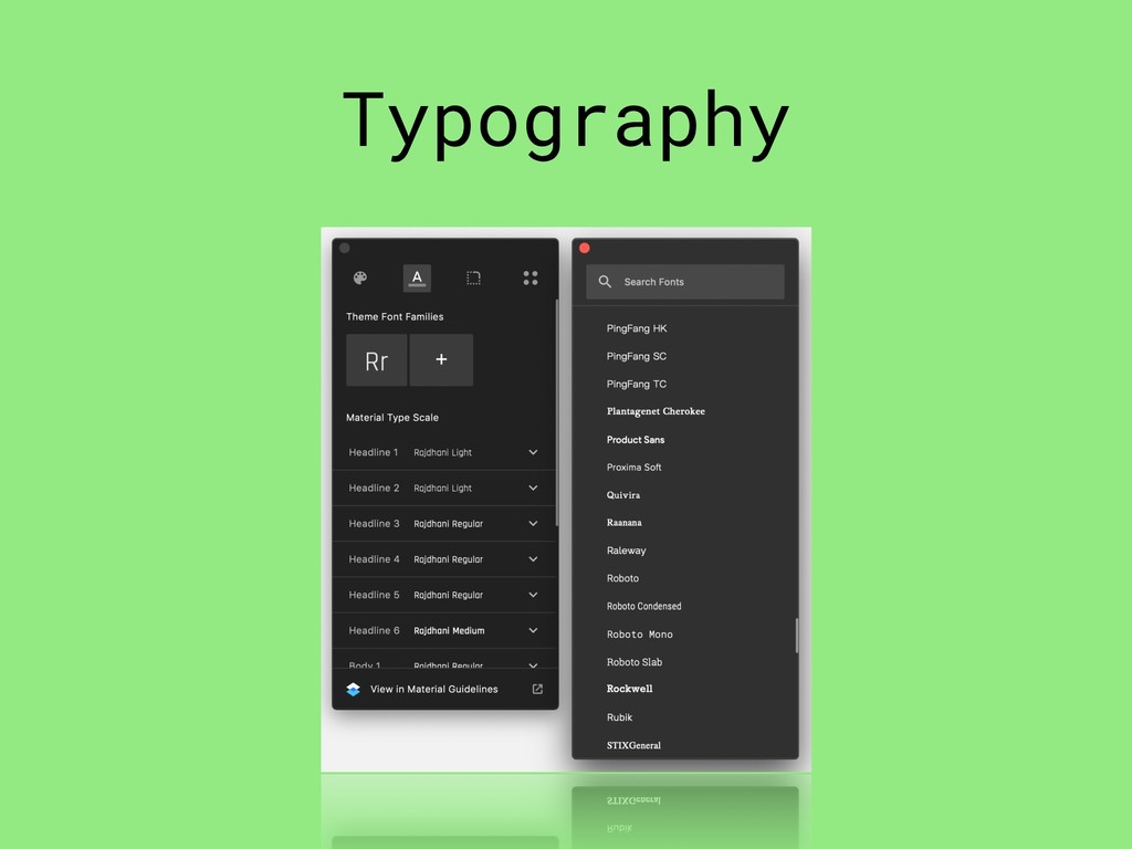
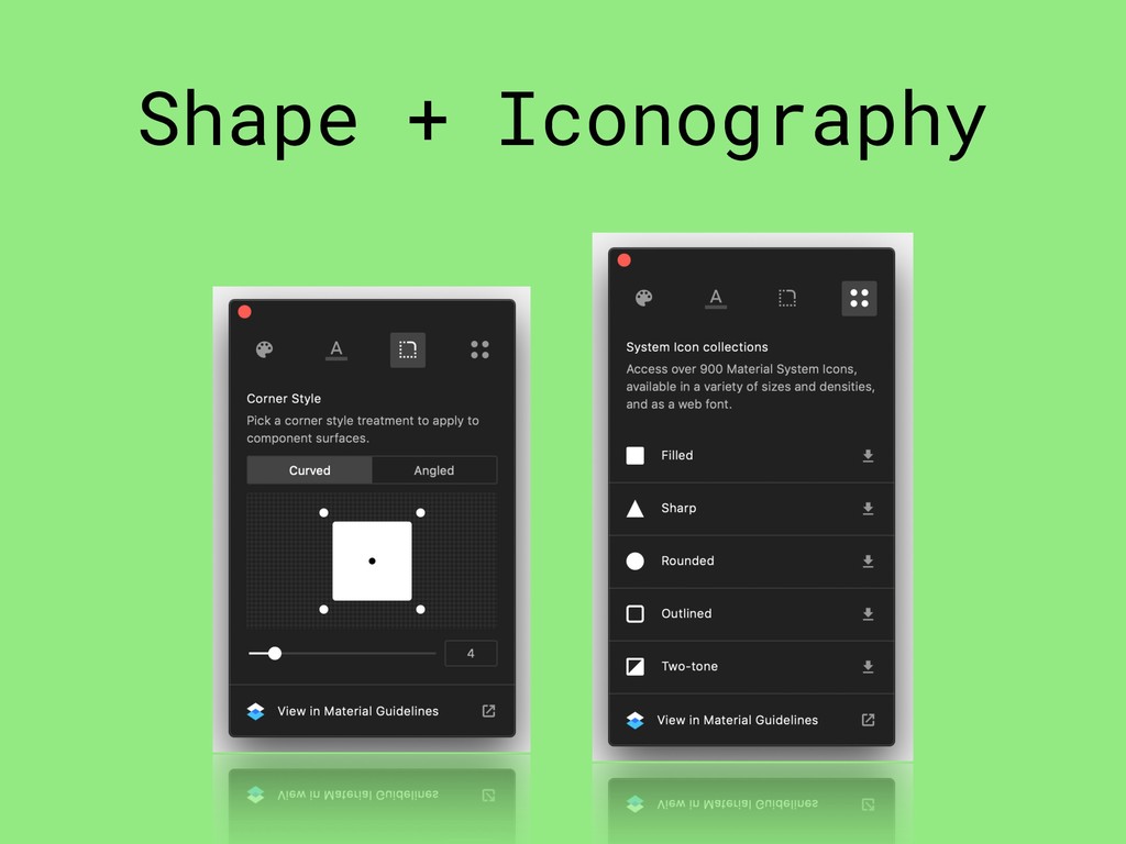
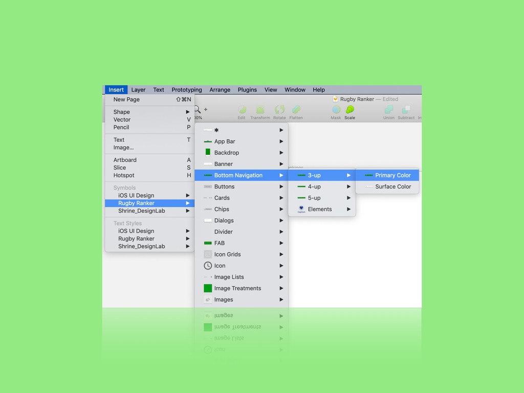
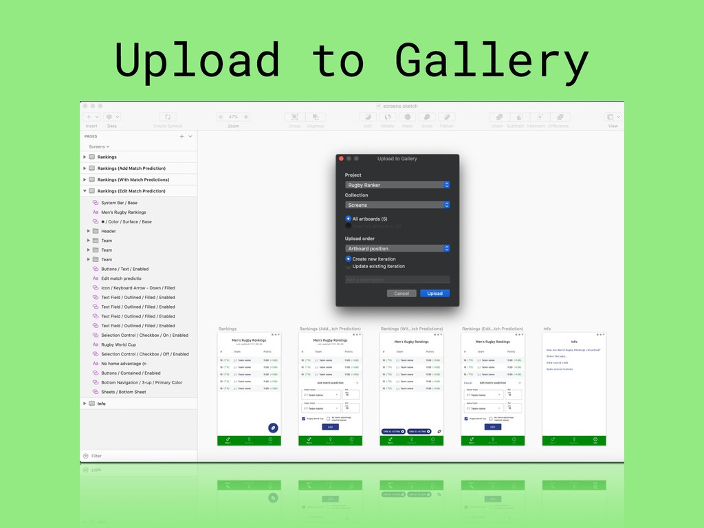
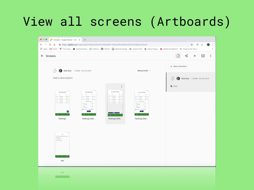
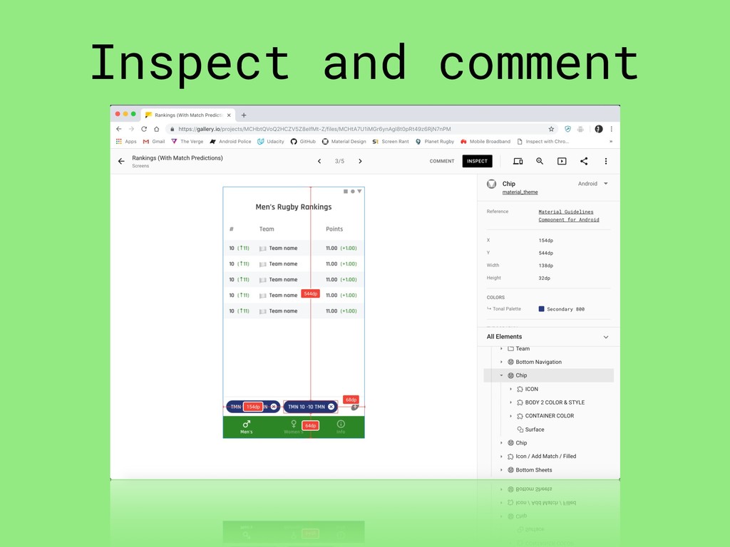
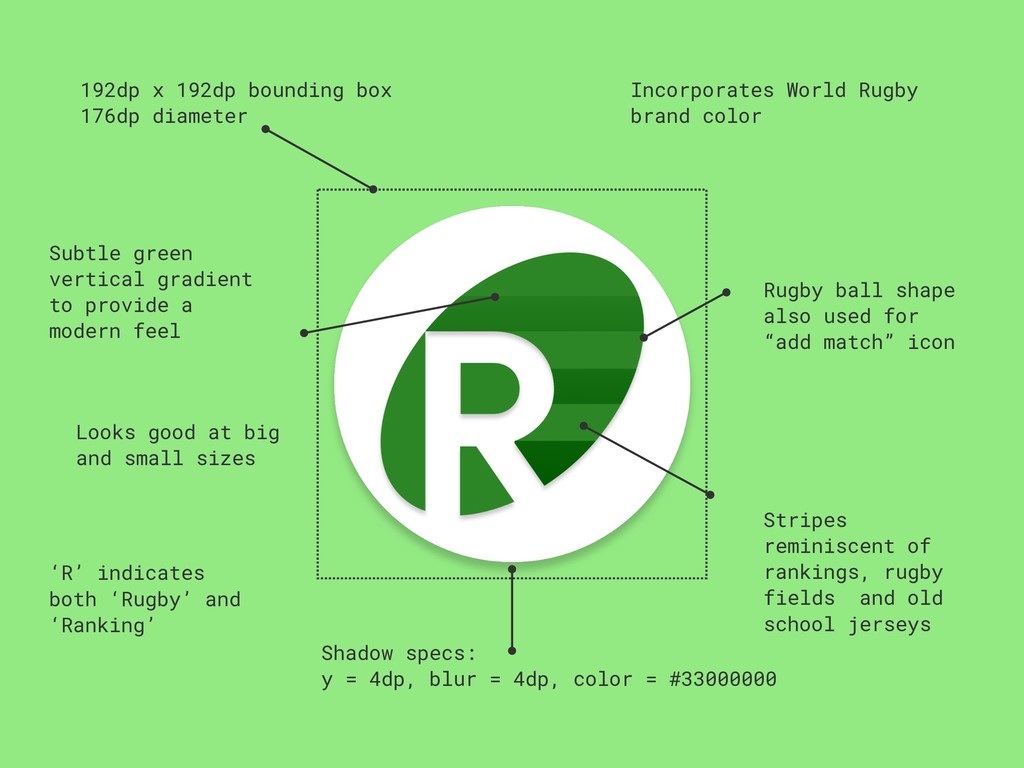
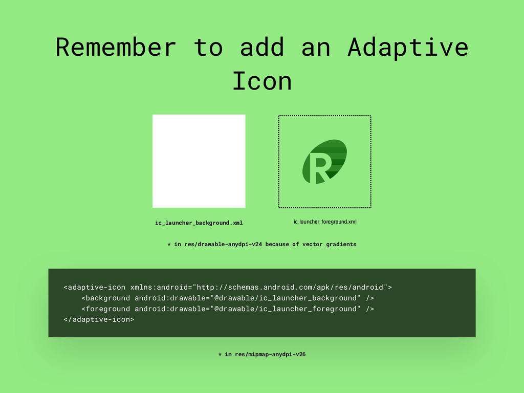
Google I/O 2018 introduced a huge shake-up of the Android guidelines, support libraries and tools for both developers and designers. In addition to Jetpack and AndroidX, developers are required to migrate their usage of the Design Support Library in favour of Material Components for Android. The Material Design team also introduced a host of new exciting guidelines and tools. This presentation covers what it is like to use these relatively new tools and components to build a real Android app, from design to development. This includes choosing colours using the Color Tool, iconography using Material Icons, designing the app in Sketch using the Material Theme Editor plugin, previewing the design using Gallery and, finally, building the app using Material Components for Android.
This was presented at Droidcon Kenya 2018:
https://twitter.com/droidconke/status/1047320655539200000
It was also presented at DevFest South Africa 2018:
https://devfest-southafrica.firebaseapp.com/schedule/2018-12-01?sessionId=157
The video recording of the presentation is available on YouTube:
https://www.youtube.com/watch?v=hjATvyrA0CQ
 ricknout
(1).png) soarteclab
soarteclab
 chicaco
 olmdrd
 ks91
ks91
 treastrain
 ryoheig0405
 yosukeshinoda
 sajikix
 1mash0
 pfn
pfn
 carta_engineering
 husengs7
 reverentgeek
 tammyeverts
 joshbly
 yeseniaperezcruz
 akademiya2063
 csswizardry
 lara
lara
 marcduiker
 mfonobong
 codingconduct
 axbom
axbom