$30 off During Our Annual Pro Sale. View Details »

Incorporating Material Theming into Custom Views

Incorporating Material Theming into Custom Views

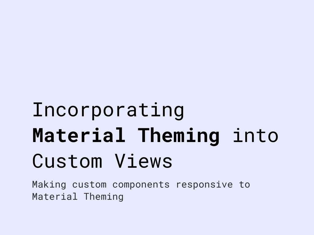
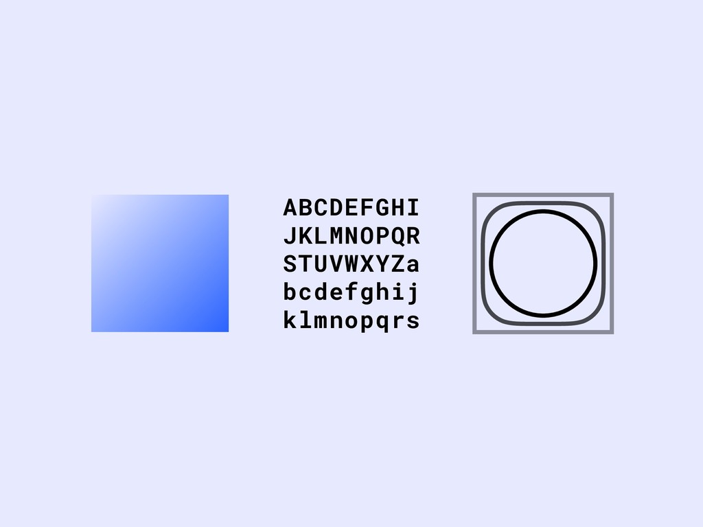
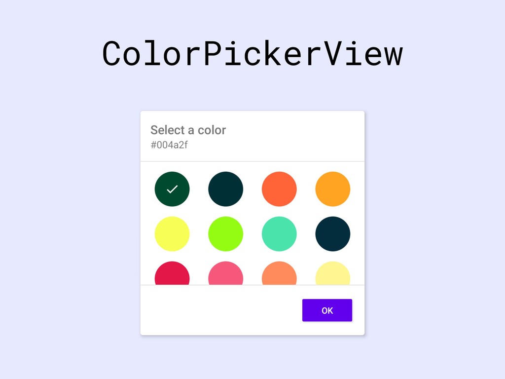
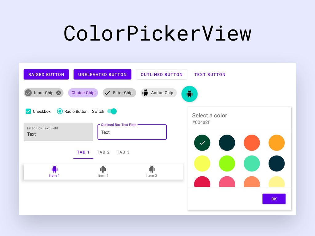
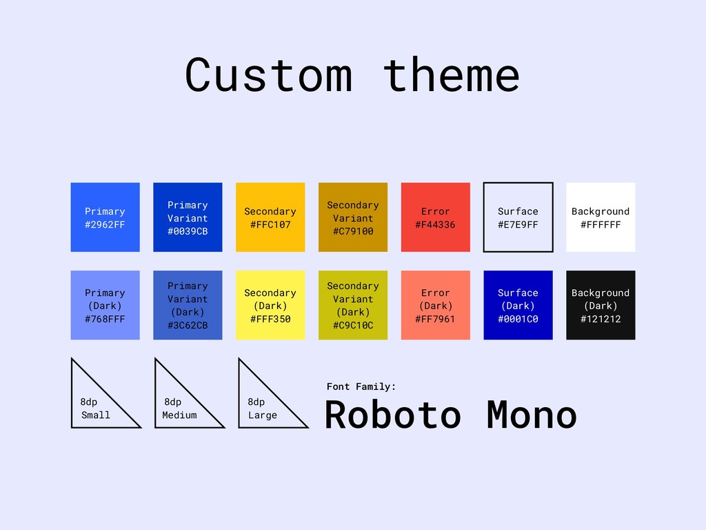
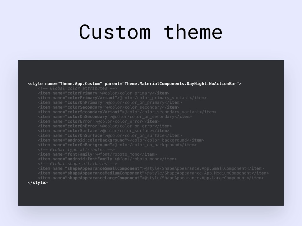
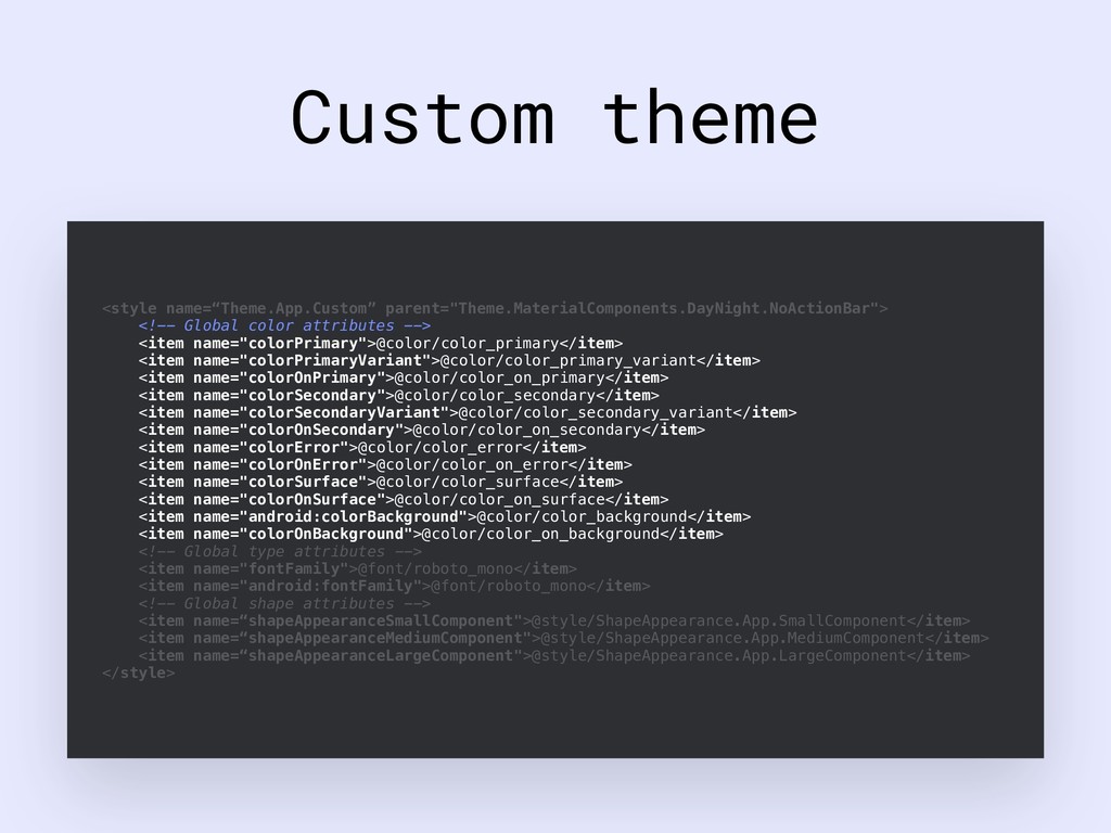
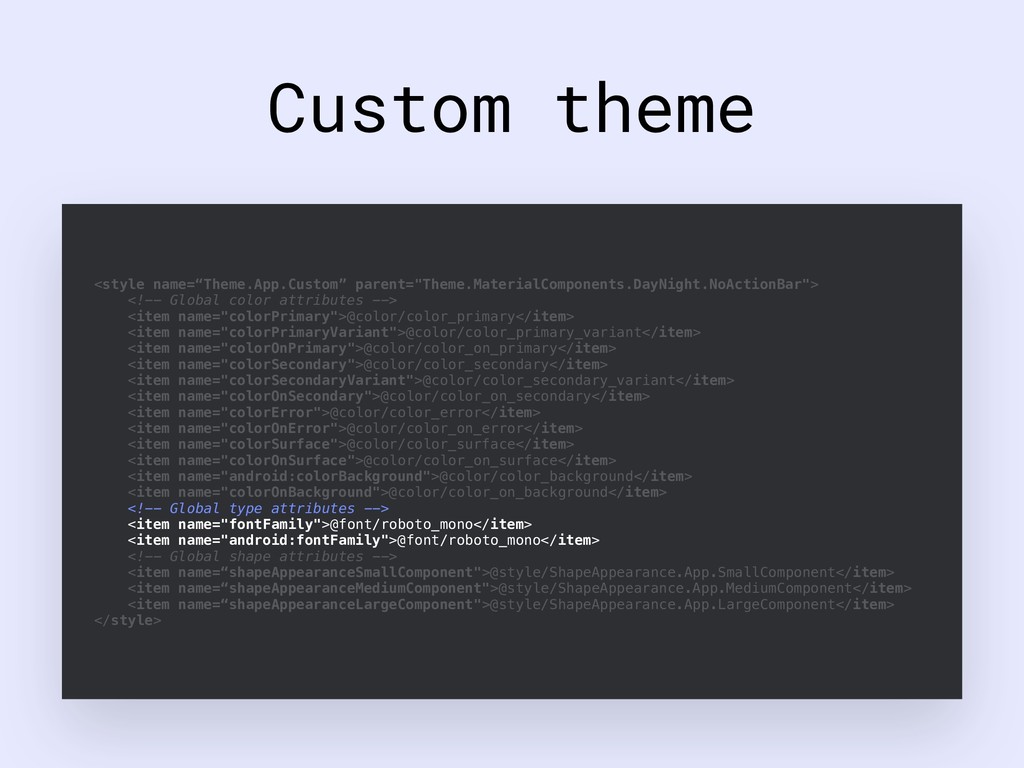
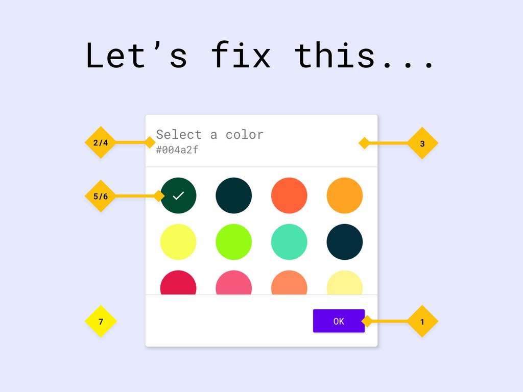
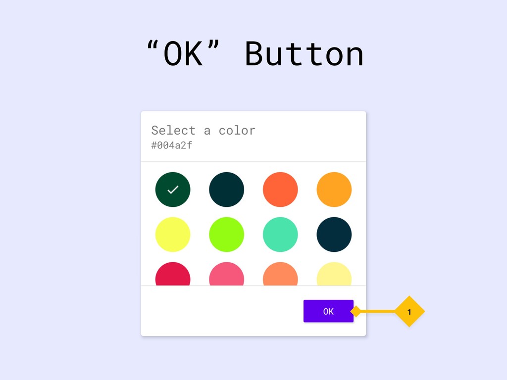
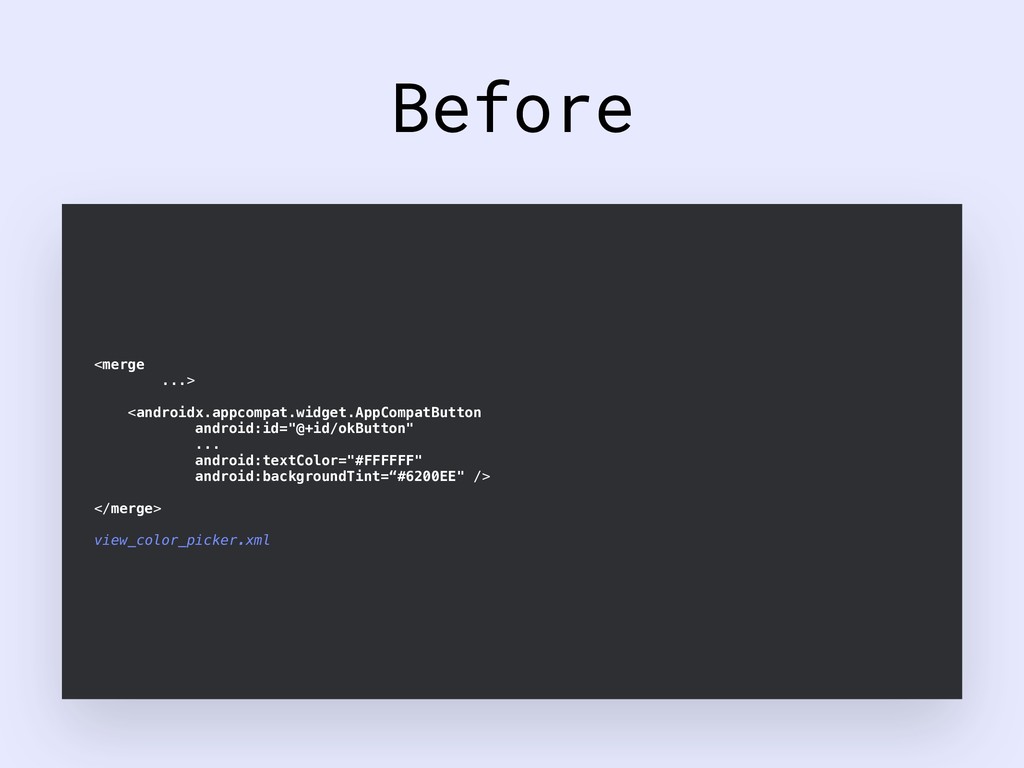
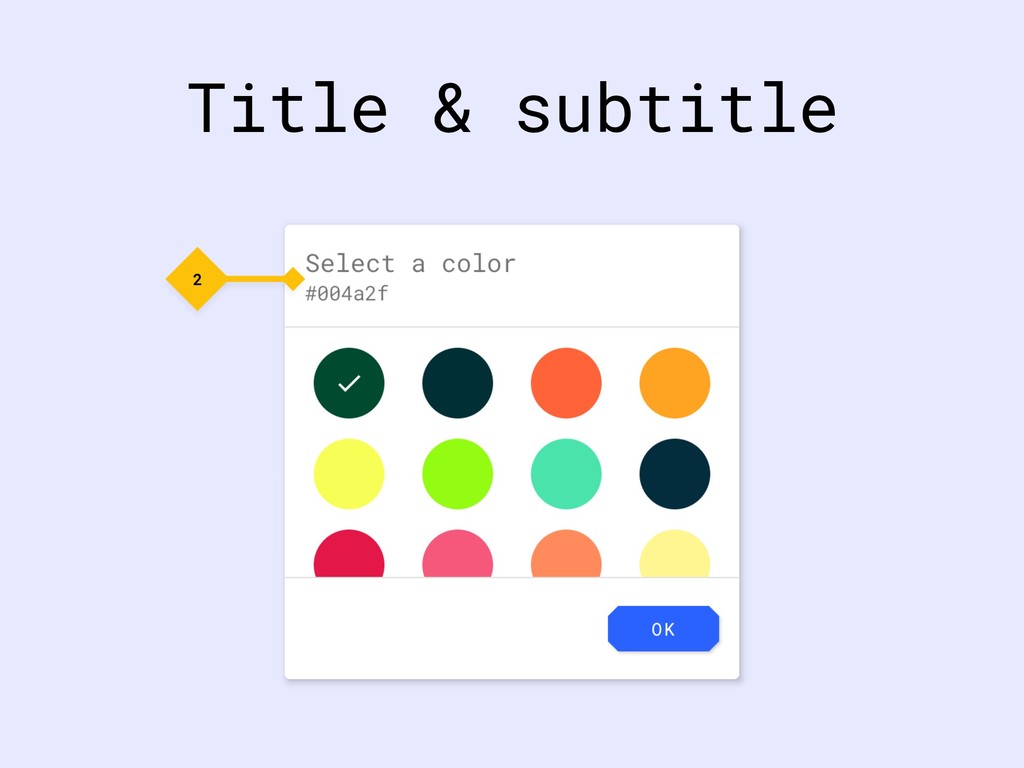
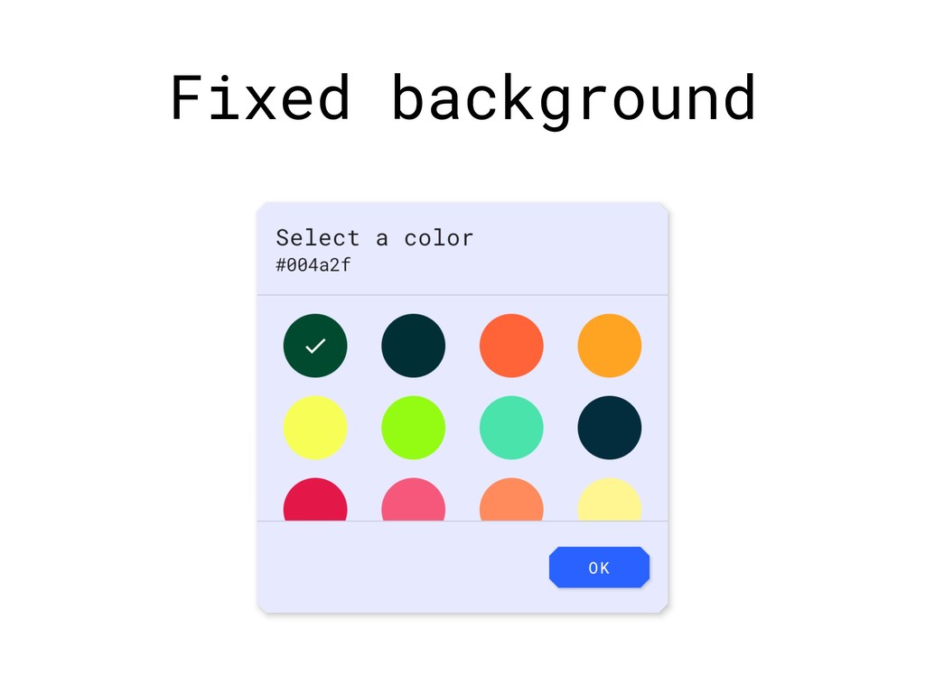
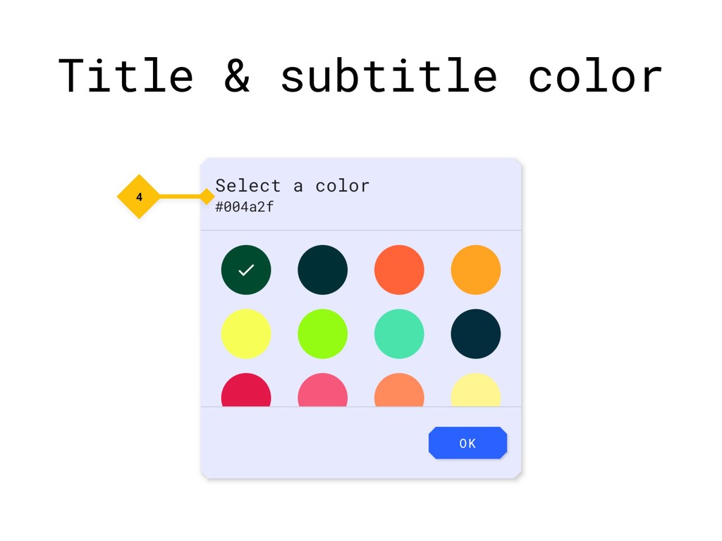
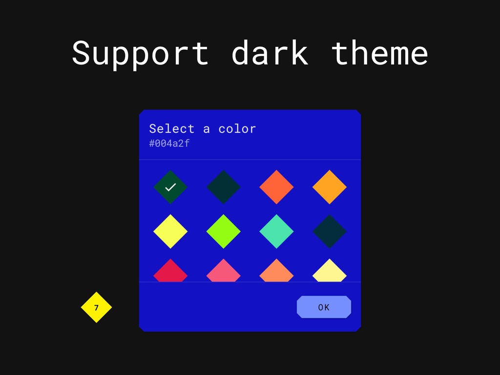
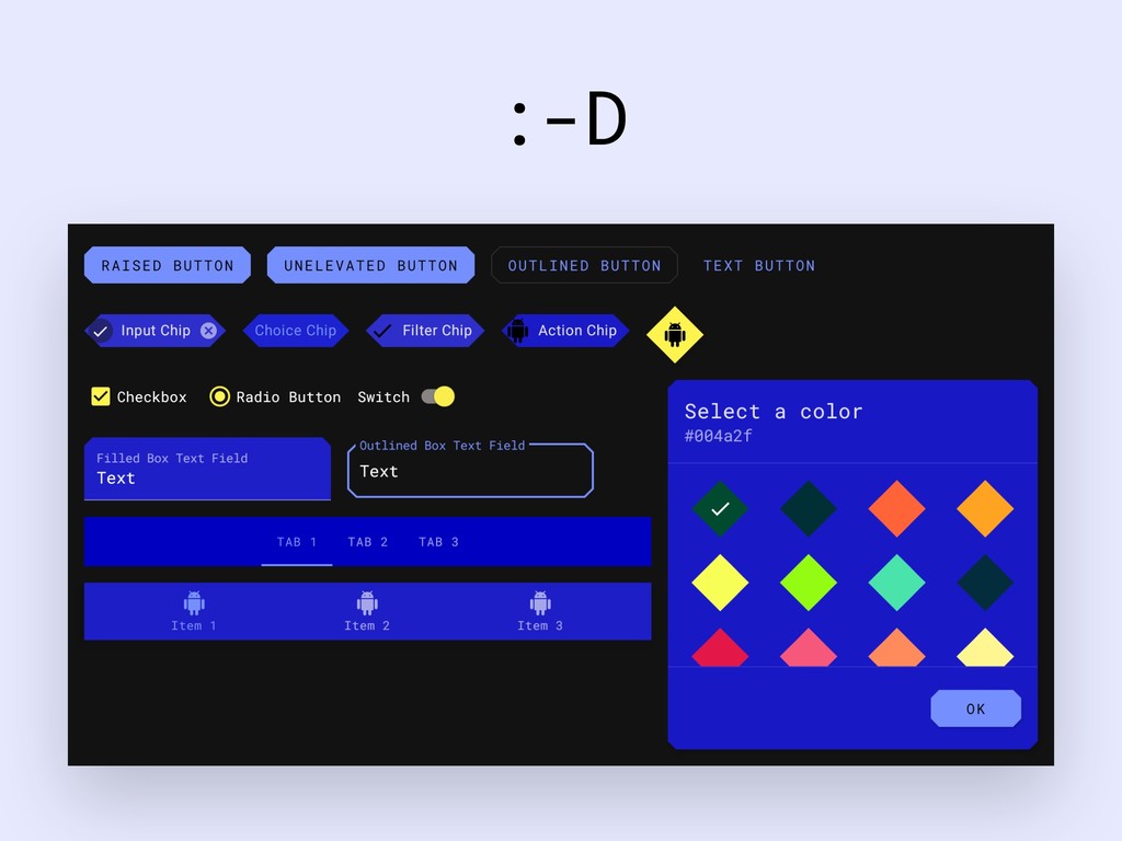
Material Theming is a means of systematically customizing Material Design to better reflect your product’s brand. It allows for easy customization of core widgets in terms of three main subsystems - color, typography and shape - when using the Material Theme Editor and Material Design Components for Android. However, how would these subsystems be incorporated into custom components?

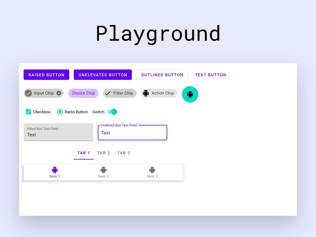
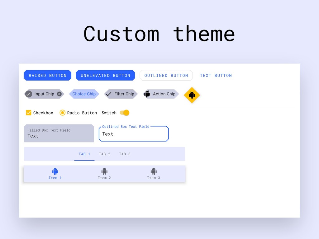
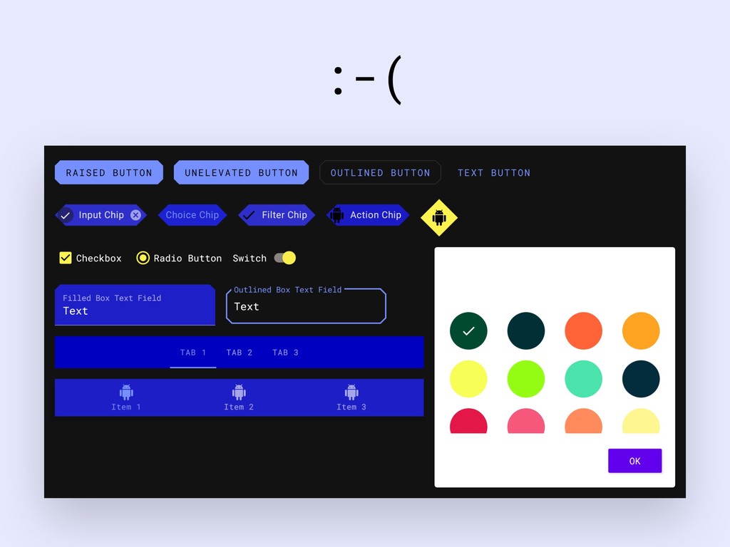
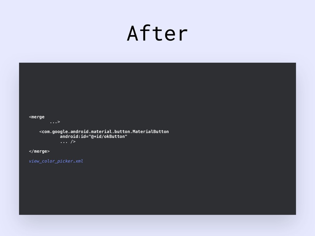
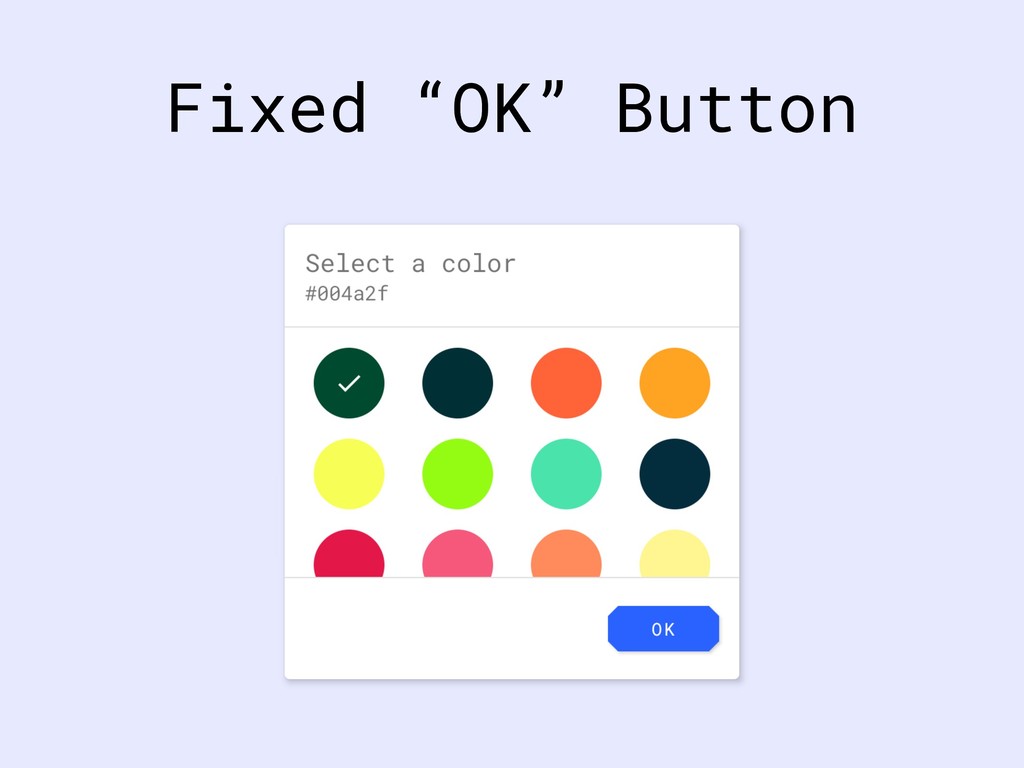
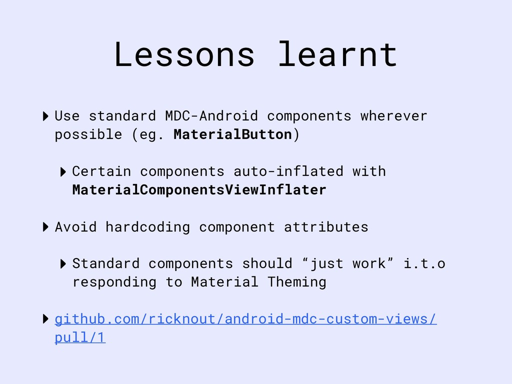
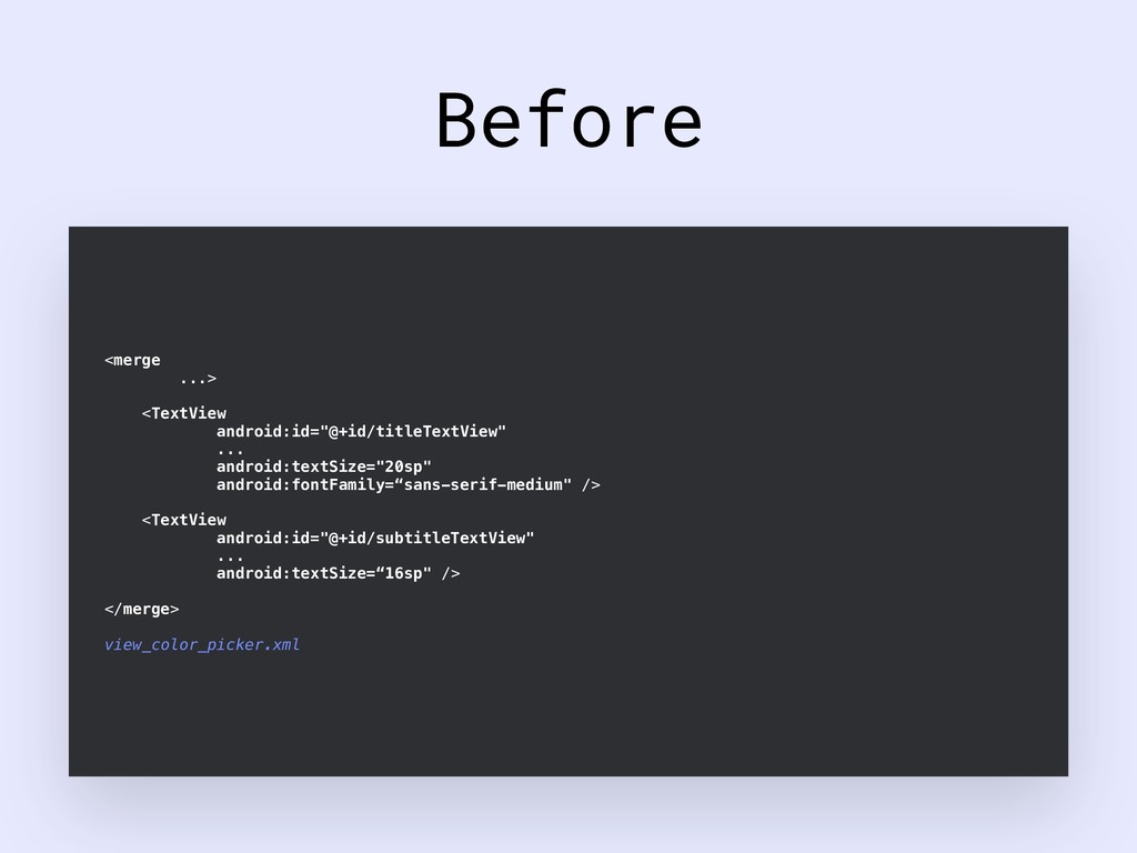
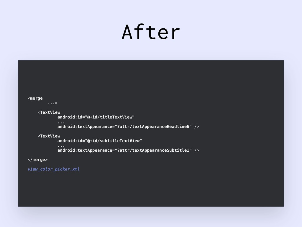
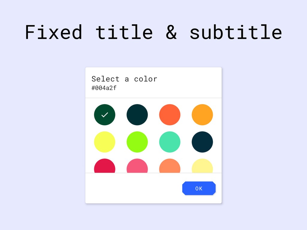
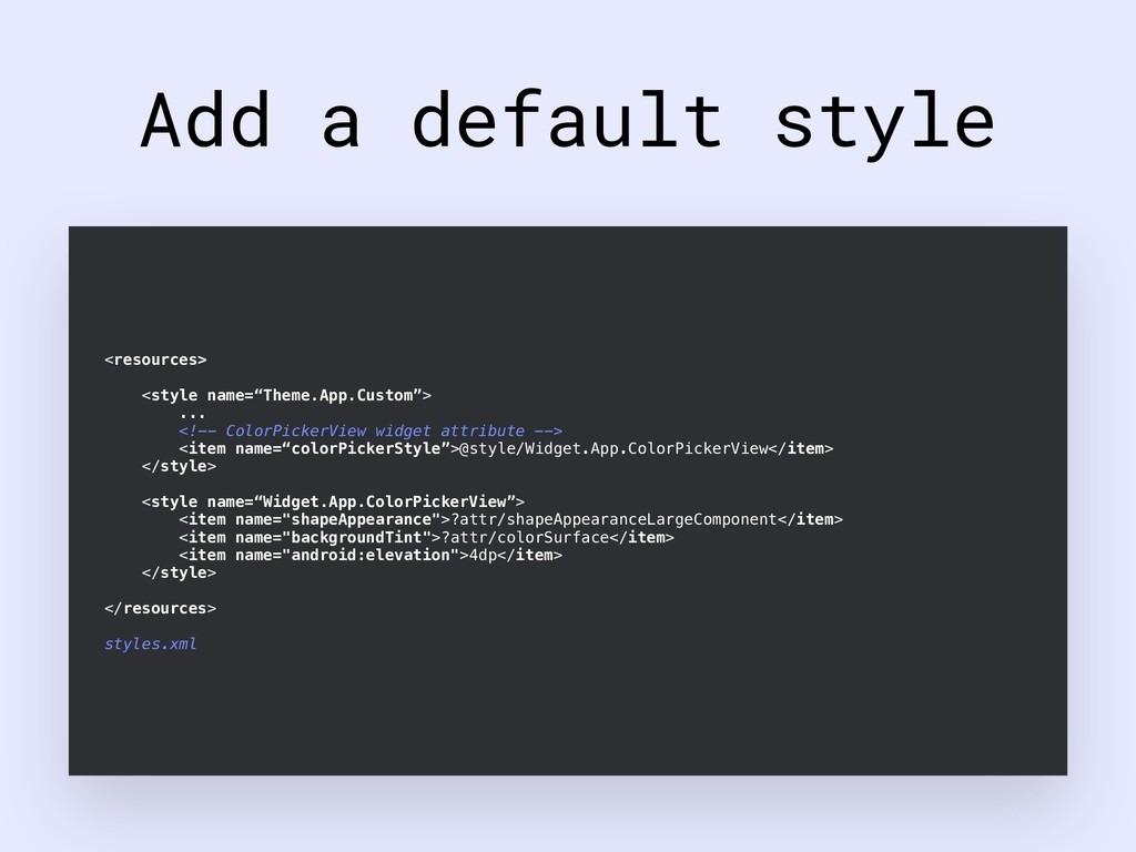
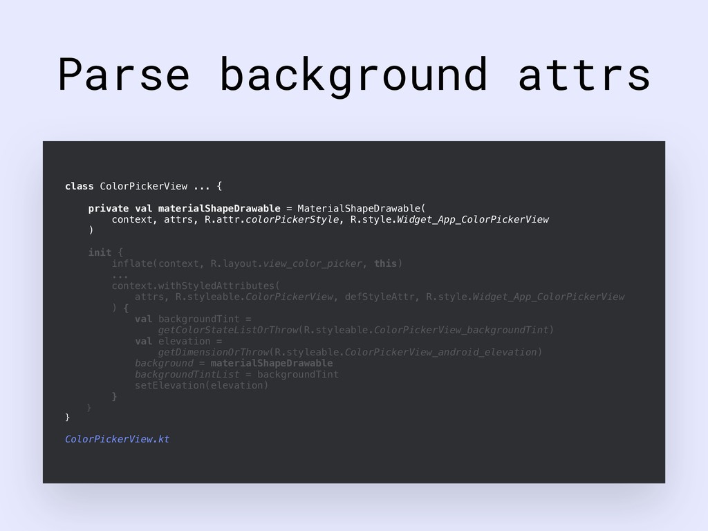
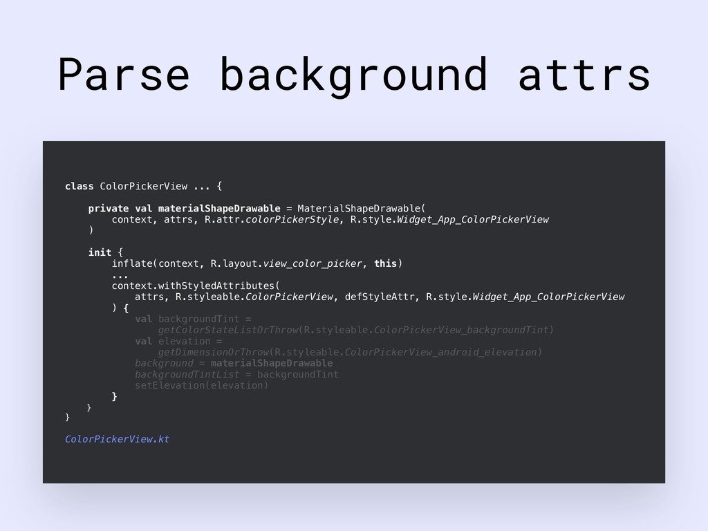
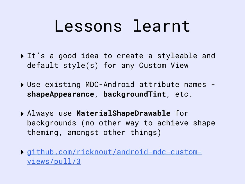
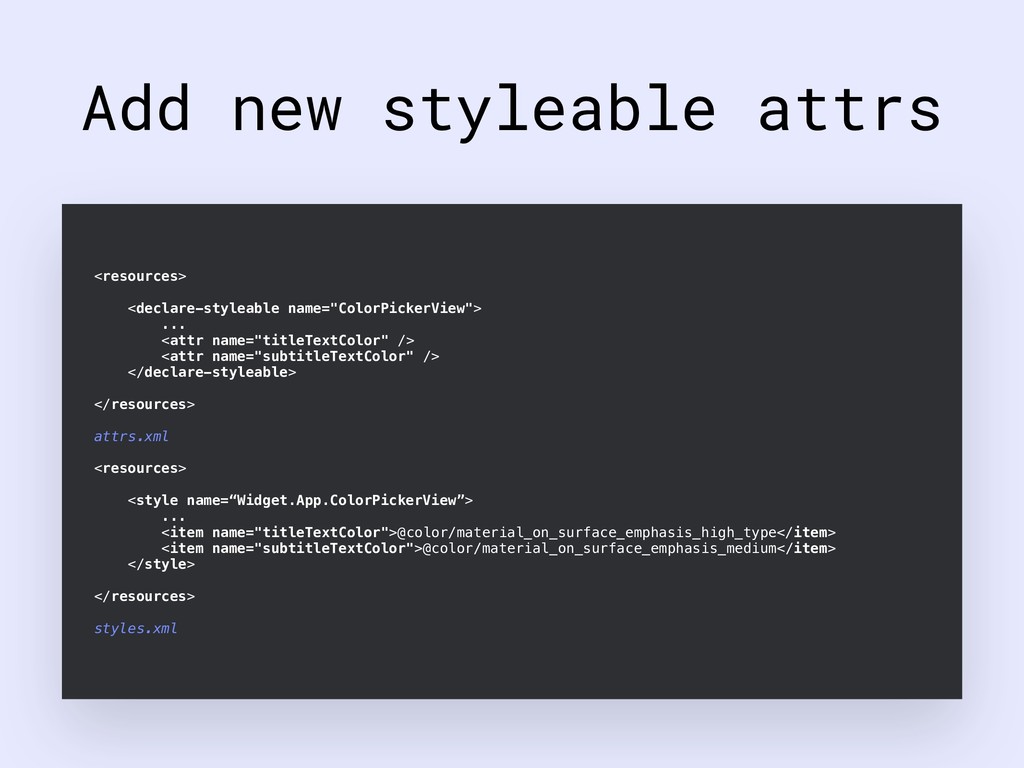
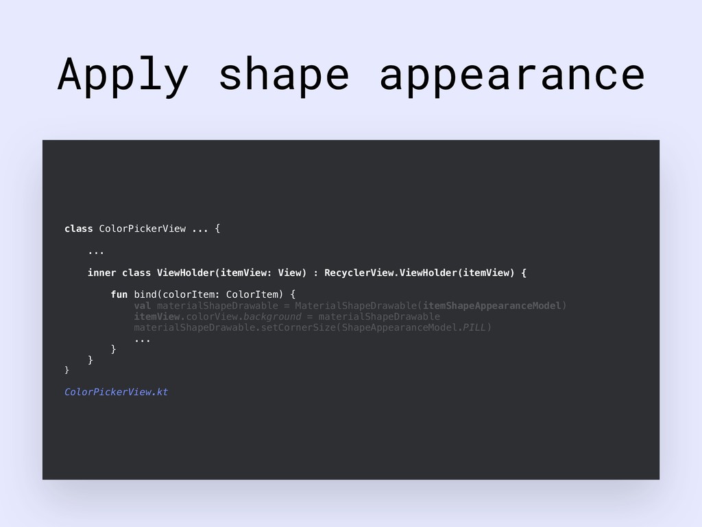
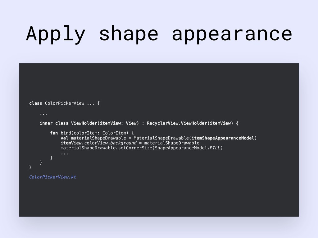
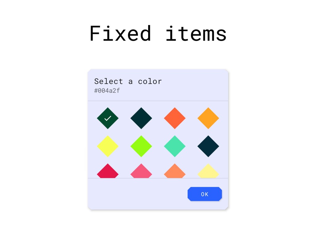
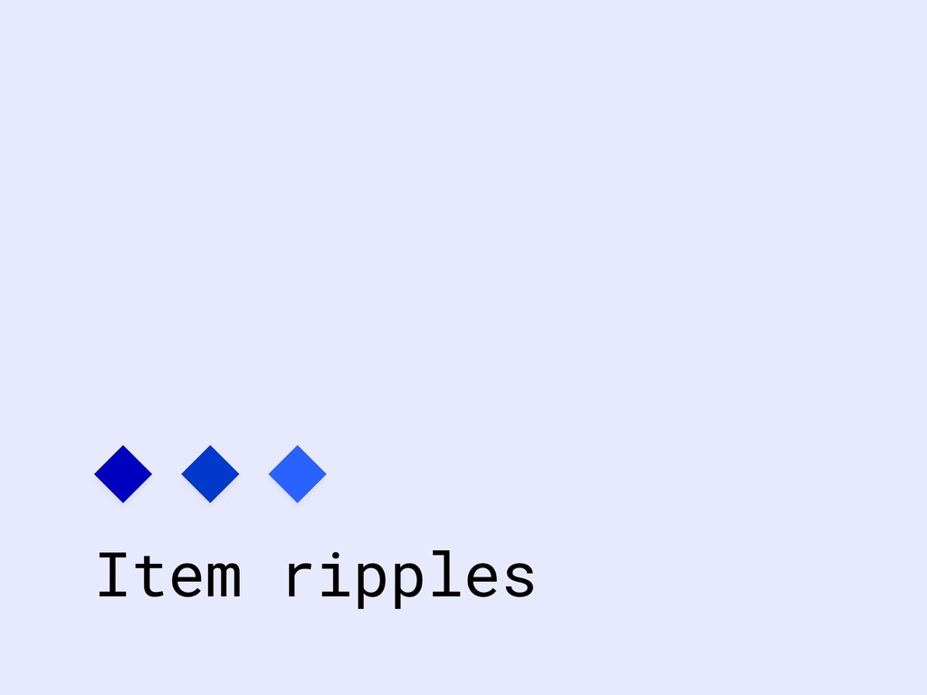
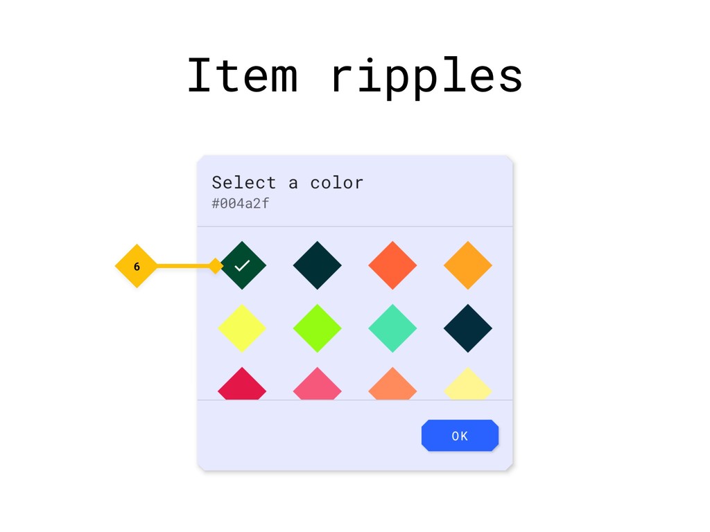
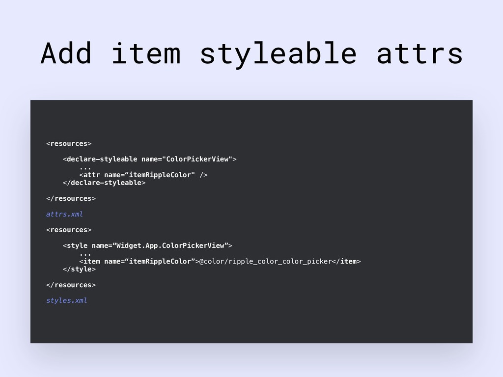
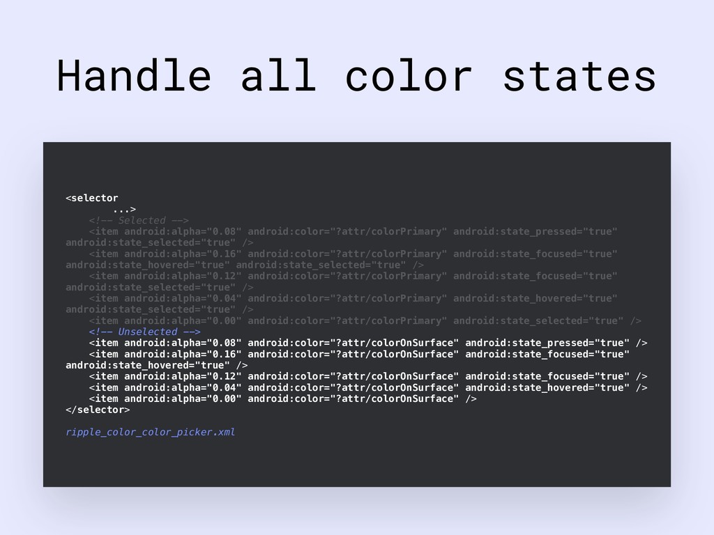
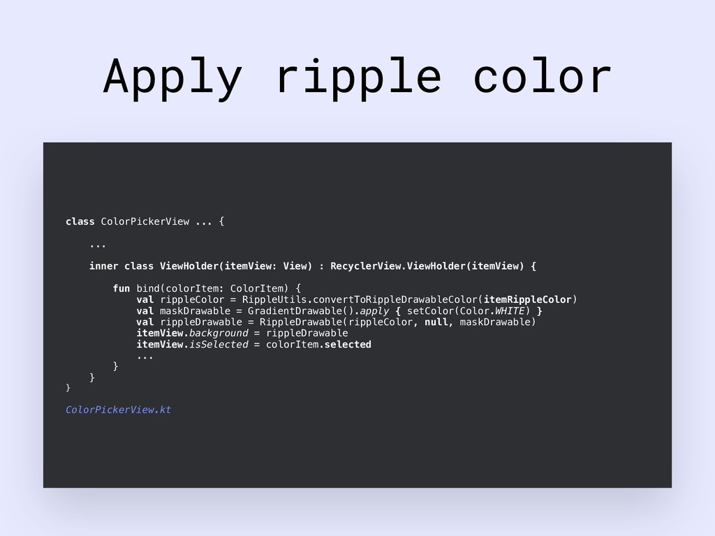
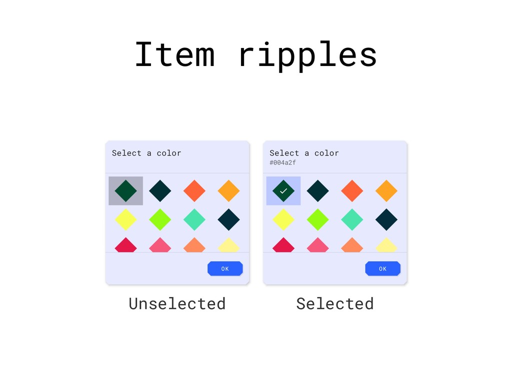
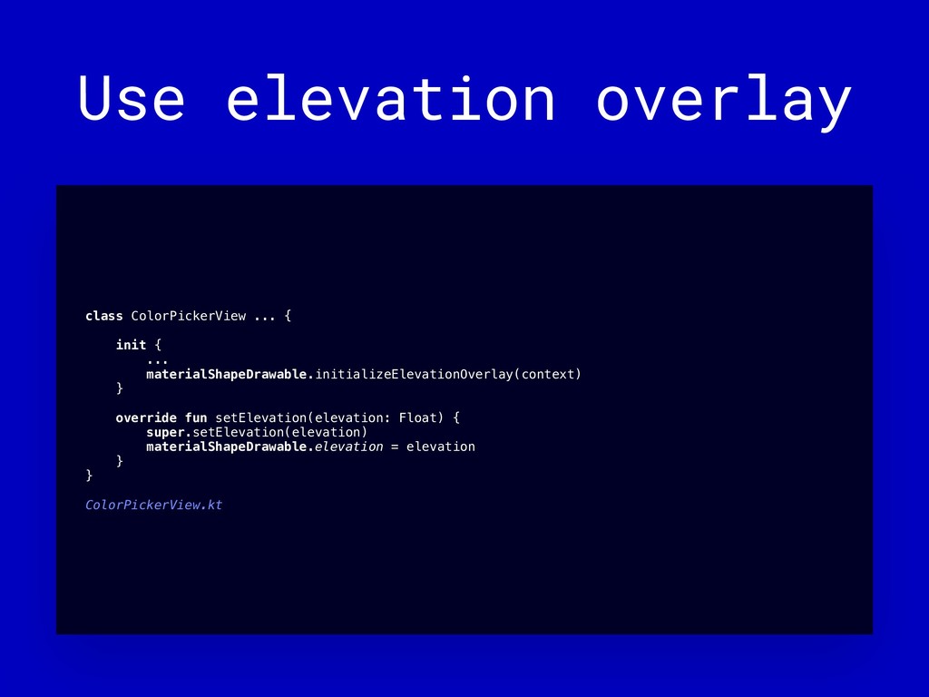
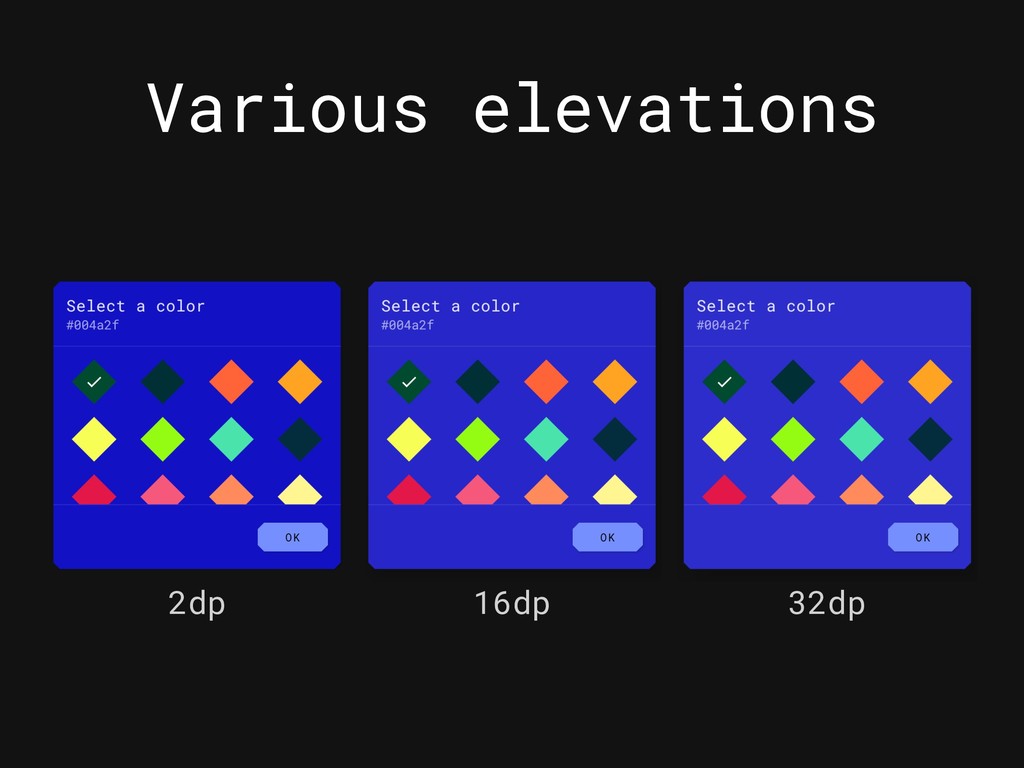
Custom Views can (and should) feel at home amongst the core components of Material Design. This presentation covers approaches to making Views responsive to Material Theming. With the aid of a practical example, this includes an intro to the capabilities of the Material Theming and MDC-Android, basic theme/style attribute support in Custom Views and a deep dive into key MDC-Android classes such as MaterialShapeDrawable, RippleUtils, ElevationOverlayProvider and more.

This was presented at mDevCamp 2019:
https://mdevcamp.eu/schedule.html#nick-rout-modal

It was also presented at Droidcon Berlin 2019:
https://www.de.droidcon.com/speaker/Nick-Rout

Nick Rout

May 31, 2019
Tweet

More Decks by Nick Rout

Other Decks in Technology

Transcript

  1. Incorporating
    Material Theming into
    Custom Views
    Making custom components responsive to
    Material Theming

    View Slide

  2. Nick Rout
    @ricknout

    View Slide

  3. What is
    Material Theming?

    View Slide

  4. ABCDEFGHI
    JKLMNOPQR
    STUVWXYZa
    bcdefghij
    klmnopqrs

    View Slide

  5. implementation ”com.android.support:design:$support_version”
    implementation ”com.google.android.material:material:$material_version”
    Material Components
    for Android

    View Slide

  6. ‣Material Design, Develop & Tools
    ‣material.io
    ‣“Material Theming: Build Expressively with
    Material Components” (Google I/O 2019)
    ‣“Setting up a Material Components theme for
    Android” & “Hands on with Material Components for
    Android” series
    ‣medium.com/@ricknout
    ‣MDC-Android repository (including “Build a
    Material Theme”)

    View Slide

  7. Playground

    View Slide

  8. ColorPickerView

    View Slide

  9. ColorPickerView

    View Slide

  10. Custom theme
    Primary
    #2962FF
    Primary
    Variant
    #0039CB
    Secondary
    #FFC107
    Secondary
    Variant
    #C79100
    Error
    #F44336
    Surface
    #E7E9FF
    Background
    #FFFFFF
    Primary
    (Dark)
    #768FFF
    Primary
    Variant
    (Dark)
    #3C62CB
    Secondary
    (Dark)
    #FFF350
    Secondary
    Variant
    (Dark)
    #C9C10C
    Error
    (Dark)
    #FF7961
    Surface
    (Dark)
    #0001C0
    Background
    (Dark)
    #121212
    8dp
    Small
    8dp
    Medium
    8dp
    Large
    Font Family:
    Roboto Mono

    View Slide

  11. Custom theme
    <br/><!-- Global color attributes --><br/><item name="colorPrimary">@color/color_primary</item><br/><item name="colorPrimaryVariant">@color/color_primary_variant</item><br/><item name="colorOnPrimary">@color/color_on_primary</item><br/><item name="colorSecondary">@color/color_secondary</item><br/><item name="colorSecondaryVariant">@color/color_secondary_variant</item><br/><item name="colorOnSecondary">@color/color_on_secondary</item><br/><item name="colorError">@color/color_error</item><br/><item name="colorOnError">@color/color_on_error</item><br/><item name="colorSurface">@color/color_surface</item><br/><item name="colorOnSurface">@color/color_on_surface</item><br/><item name="android:colorBackground">@color/color_background</item><br/><item name="colorOnBackground">@color/color_on_background</item><br/><!-- Global type attributes --><br/><item name="fontFamily">@font/roboto_mono</item><br/><item name="android:fontFamily">@font/roboto_mono</item><br/><!-- Global shape attributes --><br/><item name=“shapeAppearanceSmallComponent">@style/ShapeAppearance.App.SmallComponent</item><br/><item name=“shapeAppearanceMediumComponent">@style/ShapeAppearance.App.MediumComponent</item><br/><item name=“shapeAppearanceLargeComponent">@style/ShapeAppearance.App.LargeComponent</item><br/>

    View Slide

  12. Custom theme
    <br/><!-- Global color attributes --><br/><item name="colorPrimary">@color/color_primary</item><br/><item name="colorPrimaryVariant">@color/color_primary_variant</item><br/><item name="colorOnPrimary">@color/color_on_primary</item><br/><item name="colorSecondary">@color/color_secondary</item><br/><item name="colorSecondaryVariant">@color/color_secondary_variant</item><br/><item name="colorOnSecondary">@color/color_on_secondary</item><br/><item name="colorError">@color/color_error</item><br/><item name="colorOnError">@color/color_on_error</item><br/><item name="colorSurface">@color/color_surface</item><br/><item name="colorOnSurface">@color/color_on_surface</item><br/><item name="android:colorBackground">@color/color_background</item><br/><item name="colorOnBackground">@color/color_on_background</item><br/><!-- Global type attributes --><br/><item name="fontFamily">@font/roboto_mono</item><br/><item name="android:fontFamily">@font/roboto_mono</item><br/><!-- Global shape attributes --><br/><item name=“shapeAppearanceSmallComponent">@style/ShapeAppearance.App.SmallComponent</item><br/><item name=“shapeAppearanceMediumComponent">@style/ShapeAppearance.App.MediumComponent</item><br/><item name=“shapeAppearanceLargeComponent">@style/ShapeAppearance.App.LargeComponent</item><br/>

    View Slide

  13. Custom theme
    <br/><!-- Global color attributes --><br/><item name="colorPrimary">@color/color_primary</item><br/><item name="colorPrimaryVariant">@color/color_primary_variant</item><br/><item name="colorOnPrimary">@color/color_on_primary</item><br/><item name="colorSecondary">@color/color_secondary</item><br/><item name="colorSecondaryVariant">@color/color_secondary_variant</item><br/><item name="colorOnSecondary">@color/color_on_secondary</item><br/><item name="colorError">@color/color_error</item><br/><item name="colorOnError">@color/color_on_error</item><br/><item name="colorSurface">@color/color_surface</item><br/><item name="colorOnSurface">@color/color_on_surface</item><br/><item name="android:colorBackground">@color/color_background</item><br/><item name="colorOnBackground">@color/color_on_background</item><br/><!-- Global type attributes --><br/><item name="fontFamily">@font/roboto_mono</item><br/><item name="android:fontFamily">@font/roboto_mono</item><br/><!-- Global shape attributes --><br/><item name=“shapeAppearanceSmallComponent">@style/ShapeAppearance.App.SmallComponent</item><br/><item name=“shapeAppearanceMediumComponent">@style/ShapeAppearance.App.MediumComponent</item><br/><item name=“shapeAppearanceLargeComponent">@style/ShapeAppearance.App.LargeComponent</item><br/>

    View Slide

  14. Custom theme
    <br/><!-- Global color attributes --><br/><item name="colorPrimary">@color/color_primary</item><br/><item name="colorPrimaryVariant">@color/color_primary_variant</item><br/><item name="colorOnPrimary">@color/color_on_primary</item><br/><item name="colorSecondary">@color/color_secondary</item><br/><item name="colorSecondaryVariant">@color/color_secondary_variant</item><br/><item name="colorOnSecondary">@color/color_on_secondary</item><br/><item name="colorError">@color/color_error</item><br/><item name="colorOnError">@color/color_on_error</item><br/><item name="colorSurface">@color/color_surface</item><br/><item name="colorOnSurface">@color/color_on_surface</item><br/><item name="android:colorBackground">@color/color_background</item><br/><item name="colorOnBackground">@color/color_on_background</item><br/><!-- Global type attributes --><br/><item name="fontFamily">@font/roboto_mono</item><br/><item name="android:fontFamily">@font/roboto_mono</item><br/><!-- Global shape attributes --><br/><item name=“shapeAppearanceSmallComponent">@style/ShapeAppearance.App.SmallComponent</item><br/><item name=“shapeAppearanceMediumComponent">@style/ShapeAppearance.App.MediumComponent</item><br/><item name=“shapeAppearanceLargeComponent">@style/ShapeAppearance.App.LargeComponent</item><br/>

    View Slide

  15. Custom theme

    View Slide

  16. :-/

    View Slide

  17. :-(

    View Slide

  18. Let’s fix this...
    5/6
    2/4 3
    1
    7

    View Slide

  19. “OK” Button

    View Slide

  20. “OK” Button
    1

    View Slide

  21. Before
    ...>
    android:id="@+id/okButton"
    ...
    android:textColor="#FFFFFF"
    android:backgroundTint=“#6200EE" />

    view_color_picker.xml

    View Slide

  22. After
    ...>
    android:id="@+id/okButton"
    ... />

    view_color_picker.xml

    View Slide

  23. Fixed “OK” Button

    View Slide

  24. Lessons learnt
    ‣Use standard MDC-Android components wherever
    possible (eg. MaterialButton)
    ‣Certain components auto-inflated with
    MaterialComponentsViewInflater
    ‣Avoid hardcoding component attributes
    ‣Standard components should “just work” i.t.o
    responding to Material Theming
    ‣github.com/ricknout/android-mdc-custom-views/
    pull/1

    View Slide

  25. Title & subtitle

    View Slide

  26. Title & subtitle
    2

    View Slide

  27. Before
    ...>
    android:id="@+id/titleTextView"
    ...
    android:textSize="20sp"
    android:fontFamily=“sans-serif-medium" />
    android:id="@+id/subtitleTextView"
    ...
    android:textSize=“16sp" />

    view_color_picker.xml

    View Slide

  28. After
    ...>
    android:id="@+id/titleTextView"
    ...
    android:textAppearance="?attr/textAppearanceHeadline6" />
    android:id="@+id/subtitleTextView"
    ...
    android:textAppearance="?attr/textAppearanceSubtitle1" />

    view_color_picker.xml

    View Slide

  29. Fixed title & subtitle

    View Slide

  30. Lessons learnt
    ‣ Use the android:textAppearance attribute to
    style TextViews
    ‣ Use MDC-Android attributes that map to the
    Material type system scale (eg.
    textAppearaceHeadline6)
    ‣ material.io/design/typography/the-type-
    system.html
    ‣ github.com/ricknout/android-mdc-custom-
    views/pull/2

    View Slide

  31. Background

    View Slide

  32. Background
    3

    View Slide

  33. Before
    ...
    android:shape="rectangle">


    bg_color_picker.xml
    class ColorPickerView ... {
    init {
    inflate(context, R.layout.view_color_picker, this)
    ...
    setBackgroundResource(R.drawable.bg_color_picker)
    }
    }
    ColorPickerView.kt

    View Slide

  34. Add a styleable


    attrs.xml

    View Slide

  35. Add a default style

    <br/>...<br/><!-- ColorPickerView widget attribute --><br/><item name=“colorPickerStyle”>@style/Widget.App.ColorPickerView</item><br/>
    <br/><item name="shapeAppearance">?attr/shapeAppearanceLargeComponent</item><br/><item name="backgroundTint">?attr/colorSurface</item><br/><item name="android:elevation">4dp</item><br/>

    styles.xml

    View Slide

  36. Parse background attrs
    class ColorPickerView ... {
    private val materialShapeDrawable = MaterialShapeDrawable(
    context, attrs, R.attr.colorPickerStyle, R.style.Widget_App_ColorPickerView
    )
    init {
    inflate(context, R.layout.view_color_picker, this)
    ...
    context.withStyledAttributes(
    attrs, R.styleable.ColorPickerView, defStyleAttr, R.style.Widget_App_ColorPickerView
    ) {
    val backgroundTint =
    getColorStateListOrThrow(R.styleable.ColorPickerView_backgroundTint)
    val elevation =
    getDimensionOrThrow(R.styleable.ColorPickerView_android_elevation)
    background = materialShapeDrawable
    backgroundTintList = backgroundTint
    setElevation(elevation)
    }
    }
    }
    ColorPickerView.kt

    View Slide

  37. Parse background attrs
    class ColorPickerView ... {
    private val materialShapeDrawable = MaterialShapeDrawable(
    context, attrs, R.attr.colorPickerStyle, R.style.Widget_App_ColorPickerView
    )
    init {
    inflate(context, R.layout.view_color_picker, this)
    ...
    context.withStyledAttributes(
    attrs, R.styleable.ColorPickerView, defStyleAttr, R.style.Widget_App_ColorPickerView
    ) {
    val backgroundTint =
    getColorStateListOrThrow(R.styleable.ColorPickerView_backgroundTint)
    val elevation =
    getDimensionOrThrow(R.styleable.ColorPickerView_android_elevation)
    background = materialShapeDrawable
    backgroundTintList = backgroundTint
    setElevation(elevation)
    }
    }
    }
    ColorPickerView.kt

    View Slide

  38. Apply background attrs
    class ColorPickerView ... {
    private val materialShapeDrawable = MaterialShapeDrawable(
    context, attrs, R.attr.colorPickerStyle, R.style.Widget_App_ColorPickerView
    )
    init {
    inflate(context, R.layout.view_color_picker, this)
    ...
    context.withStyledAttributes(
    attrs, R.styleable.ColorPickerView, defStyleAttr, R.style.Widget_App_ColorPickerView
    ) {
    val backgroundTint =
    getColorStateListOrThrow(R.styleable.ColorPickerView_backgroundTint)
    val elevation =
    getDimensionOrThrow(R.styleable.ColorPickerView_android_elevation)
    background = materialShapeDrawable
    backgroundTintList = backgroundTint
    setElevation(elevation)
    }
    }
    }
    ColorPickerView.kt

    View Slide

  39. Fixed background

    View Slide

  40. Lessons learnt
    ‣ It’s a good idea to create a styleable and
    default style(s) for any Custom View
    ‣ Use existing MDC-Android attribute names -
    shapeAppearance, backgroundTint, etc.
    ‣ Always use MaterialShapeDrawable for
    backgrounds (no other way to achieve shape
    theming, amongst other things)
    ‣ github.com/ricknout/android-mdc-custom-
    views/pull/3

    View Slide

  41. Title & subtitle color

    View Slide

  42. Title & subtitle color
    4

    View Slide

  43. Add new styleable attrs


    ...


    attrs.xml

    <br/>...<br/><item name="titleTextColor">@color/material_on_surface_emphasis_high_type</item><br/><item name="subtitleTextColor">@color/material_on_surface_emphasis_medium</item><br/>

    styles.xml

    View Slide

  44. Parse attrs
    class ColorPickerView ... {
    init {
    ...
    context.withStyledAttributes(
    attrs, R.styleable.ColorPickerView, defStyleAttr, R.style.Widget_App_ColorPickerView
    ) {

    val titleTextColor =
    getColorStateListOrThrow(R.styleable.ColorPickerView_titleTextColor)
    val subtitleTextColor =
    getColorStateListOrThrow(R.styleable.ColorPickerView_subtitleTextColor)
    ...
    titleTextView.setTextColor(titleTextColor)
    subtitleTextView.setTextColor(subtitleTextColor)
    }
    }
    }
    ColorPickerView.kt

    View Slide

  45. Fixed text colors

    View Slide

  46. Lessons learnt
    ‣We got to reuse the styleable we made
    ‣Consider the color behind the text and use an
    appropriate “on” color
    ‣Existing MDC-Android text color resources exist
    for emphasis (eg. @color/
    material_on_surface_emphasis_medium)
    ‣github.com/ricknout/android-mdc-custom-views/
    pull/4
    ‣Updated for MDC 1.1.0-alpha07

    View Slide

  47. Items

    View Slide

  48. Items
    5

    View Slide

  49. Before
    ...
    android:shape="oval">


    bg_color.xml
    class ColorPickerView ... {
    inner class ViewHolder(itemView: View) : RecyclerView.ViewHolder(itemView) {
    fun bind(colorItem: ColorItem) {
    itemView.colorView.setBackgroundResource(R.drawable.bg_color)
    ...
    }
    }
    }
    ColorPickerView.kt

    View Slide

  50. Add item styleable attrs


    ...


    attrs.xml

    <br/>...<br/><item name=“itemShapeAppearance”>?attr/shapeAppearanceSmallComponent</item><br/>

    styles.xml

    View Slide

  51. Parse shape appearance
    class ColorPickerView ... {
    private lateinit var itemShapeAppearanceModel: ShapeAppearanceModel
    init {
    ...
    context.withStyledAttributes(
    attrs, R.styleable.ColorPickerView, defStyleAttr, R.style.Widget_App_ColorPickerView
    ) {
    ...
    val itemShapeAppearanceResId =
    getResourceIdOrThrow(R.styleable.ColorPickerView_itemShapeAppearance)
    itemShapeAppearanceModel = ShapeAppearanceModel
    .builder(context, itemShapeAppearanceResId, 0).build()
    }
    }
    ...
    }
    ColorPickerView.kt

    View Slide

  52. Apply shape appearance
    class ColorPickerView ... {
    ...
    inner class ViewHolder(itemView: View) : RecyclerView.ViewHolder(itemView) {
    fun bind(colorItem: ColorItem) {
    val materialShapeDrawable = MaterialShapeDrawable(itemShapeAppearanceModel)
    itemView.colorView.background = materialShapeDrawable
    materialShapeDrawable.setCornerSize(ShapeAppearanceModel.PILL)
    ...
    }
    }
    }
    ColorPickerView.kt

    View Slide

  53. Apply shape appearance
    class ColorPickerView ... {
    ...
    inner class ViewHolder(itemView: View) : RecyclerView.ViewHolder(itemView) {
    fun bind(colorItem: ColorItem) {
    val materialShapeDrawable = MaterialShapeDrawable(itemShapeAppearanceModel)
    itemView.colorView.background = materialShapeDrawable
    materialShapeDrawable.setCornerSize(ShapeAppearanceModel.PILL)
    ...
    }
    }
    }
    ColorPickerView.kt

    View Slide

  54. Apply shape appearance
    class ColorPickerView ... {
    ...
    inner class ViewHolder(itemView: View) : RecyclerView.ViewHolder(itemView) {
    fun bind(colorItem: ColorItem) {
    val materialShapeDrawable = MaterialShapeDrawable(itemShapeAppearanceModel)
    itemView.colorView.background = materialShapeDrawable
    materialShapeDrawable.setCornerSize(ShapeAppearanceModel.PILL)
    ...
    }
    }
    }
    ColorPickerView.kt

    View Slide

  55. Fixed items

    View Slide

  56. Lessons learnt
    ‣ Use a common ShapeAppearanceModel for each
    MaterialShapeDrawable item background
    ‣ For certain components, adjusting the
    shape corner size makes sense
    ‣ github.com/ricknout/android-mdc-custom-
    views/pull/5
    ‣ Updated for MDC 1.1.0-alpha07

    View Slide

  57. Item ripples

    View Slide

  58. Item ripples
    6

    View Slide

  59. Add item styleable attrs


    ...


    attrs.xml

    <br/>...<br/><item name=“itemRippleColor”>@color/ripple_color_color_picker</item><br/>

    styles.xml

    View Slide

  60. Handle all color states
    ...>

    android:state_selected="true" />
    android:state_hovered="true" android:state_selected="true" />
    android:state_selected="true" />
    android:state_selected="true" />


    android:state_hovered="true" />


    ripple_color_color_picker.xml

    View Slide

  61. Handle all color states
    ...>

    android:state_selected="true" />
    android:state_hovered="true" android:state_selected="true" />
    android:state_selected="true" />
    android:state_selected="true" />


    android:state_hovered="true" />


    ripple_color_color_picker.xml

    View Slide

  62. Parse ripple color
    class ColorPickerView ... {
    private lateinit var itemRippleColor: ColorStateList
    init {
    ...
    context.withStyledAttributes(
    attrs, R.styleable.ColorPickerView, defStyleAttr, R.style.Widget_App_ColorPickerView
    ) {
    ...
    itemRippleColor = getColorStateListOrThrow(R.styleable.ColorPickerView_itemRippleColor)
    ...
    }
    }
    ...
    }
    ColorPickerView.kt

    View Slide

  63. Apply ripple color
    class ColorPickerView ... {
    ...
    inner class ViewHolder(itemView: View) : RecyclerView.ViewHolder(itemView) {
    fun bind(colorItem: ColorItem) {
    val rippleColor = RippleUtils.convertToRippleDrawableColor(itemRippleColor)
    val maskDrawable = GradientDrawable().apply { setColor(Color.WHITE) }
    val rippleDrawable = RippleDrawable(rippleColor, null, maskDrawable)
    itemView.background = rippleDrawable
    itemView.isSelected = colorItem.selected
    ...
    }
    }
    }
    ColorPickerView.kt

    View Slide

  64. Apply ripple color
    class ColorPickerView ... {
    ...
    inner class ViewHolder(itemView: View) : RecyclerView.ViewHolder(itemView) {
    fun bind(colorItem: ColorItem) {
    val rippleColor = RippleUtils.convertToRippleDrawableColor(itemRippleColor)
    val maskDrawable = GradientDrawable().apply { setColor(Color.WHITE) }
    val rippleDrawable = RippleDrawable(rippleColor, null, maskDrawable)
    itemView.background = rippleDrawable
    itemView.isSelected = colorItem.selected
    ...
    }
    }
    }
    ColorPickerView.kt

    View Slide

  65. Apply ripple color
    class ColorPickerView ... {
    ...
    inner class ViewHolder(itemView: View) : RecyclerView.ViewHolder(itemView) {
    fun bind(colorItem: ColorItem) {
    val rippleColor = RippleUtils.convertToRippleDrawableColor(itemRippleColor)
    val maskDrawable = GradientDrawable().apply { setColor(Color.WHITE) }
    val rippleDrawable = RippleDrawable(rippleColor, null, maskDrawable)
    itemView.background = rippleDrawable
    itemView.isSelected = colorItem.selected
    ...
    }
    }
    }
    ColorPickerView.kt

    View Slide

  66. Item ripples
    Unselected Selected

    View Slide

  67. Lessons learnt
    ‣ Consider the color behind the ripple and
    use an appropriate “on” color
    ‣ Specify a default ColorStateList, convert
    using RippleUtils and use RippleDrawable
    ‣ github.com/ricknout/android-mdc-custom-
    views/pull/7
    ‣ Updated for MDC 1.1.0-alpha07

    View Slide

  68. Support dark theme

    View Slide

  69. Support dark theme
    7

    View Slide

  70. Use elevation overlay
    class ColorPickerView ... {
    init {
    ...
    materialShapeDrawable.initializeElevationOverlay(context)
    }
    override fun setElevation(elevation: Float) {
    super.setElevation(elevation)
    materialShapeDrawable.elevation = elevation
    }
    }
    ColorPickerView.kt

    View Slide

  71. Various elevations
    2dp 16dp 32dp

    View Slide

  72. Lessons learnt
    ‣ MaterialShapeDrawable supports
    ElevationOverlayProvider out-of-the-box
    ‣ github.com/ricknout/android-mdc-custom-
    views/pull/6

    View Slide

  73. :-)

    View Slide

  74. :-D

    View Slide

  75. Final considerations
    ‣ Add programmatic equivalents of styleable
    attributes
    ‣ See this commit
    ‣ Retain custom View state on configuration
    change
    ‣ eg. Selected color

    View Slide

  76. View Slide