Upgrade to Pro — share decks privately, control downloads, hide ads and more …

Email Design Best Practice - Nerv

Ringo Moss
November 19, 2013

Email Design Best Practice - Nerv

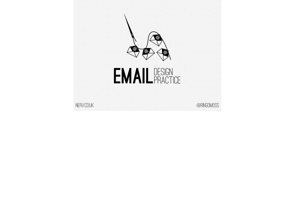
Some best practice tips for email design including
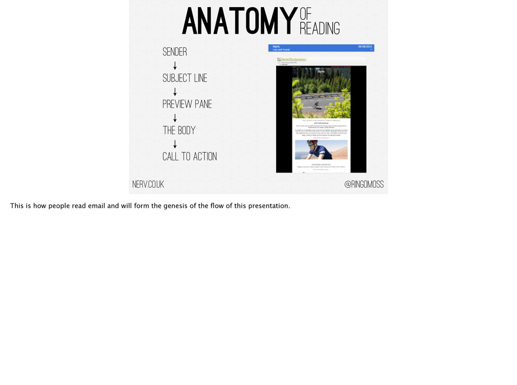
- Anatomy of email
- Subject and Sender
- Optimising for preview panes
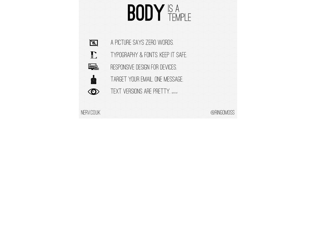
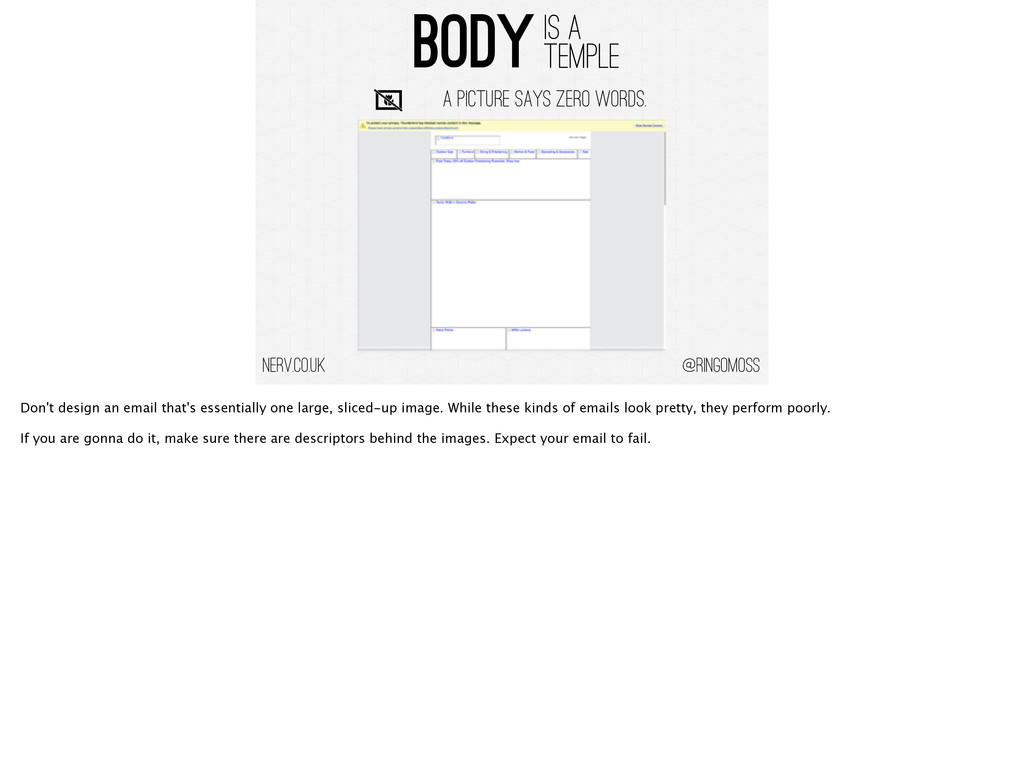
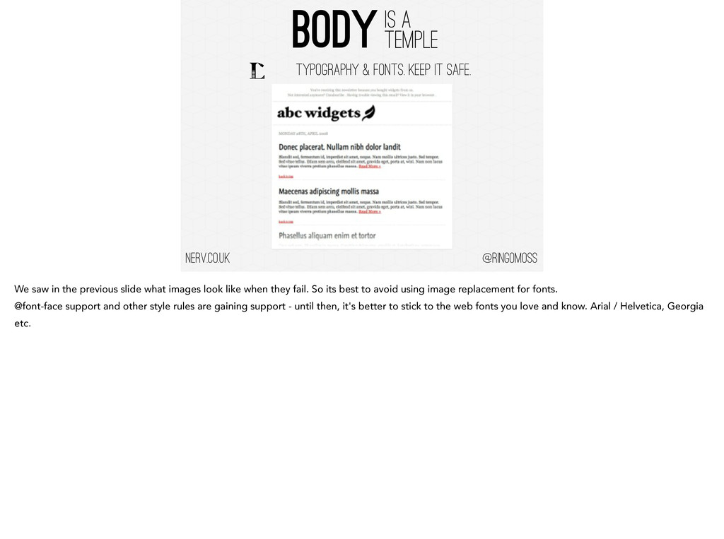
- Body design and image usage
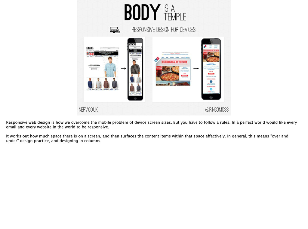
- Responsive design and Mobile
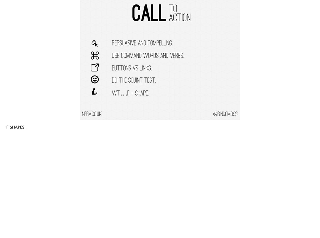
- Crafting calls to action
- Reference section

(First Delivered 15/11/13 - Endsleigh Insurance)

Ringo Moss

November 19, 2013
Tweet

Other Decks in Design

Transcript

  1. @ringomoss nerv.co.uk Sender Subject Line The BodY CALL TO ACTION

    Preview PANE ANATOMY OF Reading This is how people read email and will form the genesis of the flow of this presentation.
  2. @ringomoss SUBJECT AND SENDER nerv.co.uk 50 Chars OR Less, Unless

    Highly Targeted, OR NOT. LENGTH: The general rule of thumb in email marketing is to keep your subject line to 50 characters or less. Our analysis found this to generally be the rule. ! The exception was for highly targeted audiences, where the reader apparently appreciated the additional information in the subject line. ! Recent studies show over very large groups, variance is minor.
  3. @ringomoss SUBJECT AND SENDER nerv.co.uk 50 Chars OR Less, Unless

    Highly Targeted, OR NOT. LINK SENDER FIELD. PERSONAL SENDER. FEMALE. FROM FIELD: The From information can be as important as the subject line. As a best practice, the From and Subject line should work in tandem. ! The From line should communicate who you are as the sender. As much as possible, this entry should not change and should concisely convey who you are. ! Save any humorous phrases or concepts for the subject line.
  4. @ringomoss SUBJECT AND SENDER nerv.co.uk 50 Chars OR Less, Unless

    Highly Targeted, OR NOT. LINK SENDER FIELD. PERSONAL SENDER. FEMALE. LOCALISE DON’T Personalise. LOCALISATION: Another finding: personalization, such as including a recipient's first name or last name, doesn't significantly improve open rates. ! Providing localization, such as including a city name, does help. !
  5. @ringomoss SUBJECT AND SENDER nerv.co.uk 50 Chars OR Less, Unless

    Highly Targeted, OR NOT. LINK SENDER FIELD. PERSONAL SENDER. FEMALE. LOCALISE DON’T Personalise. NEVER USE “HELP”, “PERCENT OFF” OR “REMINDER”. NAUGHTY WORDS: Huge negative impact of three innocent words. ! Email marketers are familiar with words such as "free" which are generally to be avoided in emails since they tend to trigger spam filters. ! Research recently identified innocuous words that won't trigger a spam filter, but will negatively affect your open rates. They are: Help, Percent off, and Reminder.
  6. @ringomoss SUBJECT AND SENDER nerv.co.uk 50 Chars OR Less, Unless

    Highly Targeted, OR NOT. LINK SENDER FIELD. PERSONAL SENDER. FEMALE. LOCALISE DON’T Personalise. NEVER USE “HELP”, “PERCENT OFF” OR “REMINDER”. DON’T SELL WHAT’s INSIDE, TELL WHAT’s INSIDE. DESCRIBE: Put yourself in your recipients' shoes. ! People are flooded with spam and increasingly pressed for time. Vague teasers, constant reminders, and pleas for money are NOT going to cut through the inbox clutter. ! When it comes to subject lines, don't sell what's inside. Tell what's inside. !
  7. @ringomoss PREVIEW PANE PAIN nerv.co.uk 0.5 Seconds TO IMPRESS -

    2 Second Rule. *ExactTARGET - 2013 Out of the 2 seconds spent before your email is engaged or binned the most important 0.5s - 1s of it happens in the preview pane.
  8. @ringomoss PREVIEW PANE PAIN nerv.co.uk 0.5 Seconds TO IMPRESS -

    2 Second Rule. EMAIL PANES ARE TINY - Design to 250PX x 250PX. *ExactTARGET - 2013 For this reason, you’ve got to design your emails so that compelling content appears in that preview pane. ! That’s your first chance to make a good impression. Concentrate on the first 250x250 of your email from the top right.
  9. @ringomoss PREVIEW PANE PAIN nerv.co.uk 0.5 Seconds TO IMPRESS -

    2 Second Rule. EMAIL PANES ARE TINY - Design to 250PX x 250PX. REMEMBER MOBILE - 48% Read on mobile*. *ExactTARGET - 2013 Nobody really can know the average email pane size but recently we like to use a 250 x 250 square because mobile is now 48% of your readership, and you wont always have the luxury of responsive design.
  10. @ringomoss PREVIEW PANE PAIN nerv.co.uk 0.5 Seconds TO IMPRESS -

    2 Second Rule. EMAIL PANES ARE TINY - Design to 250PX x 250PX. REMEMBER MOBILE - 48% Read on mobile*. CHEAT! TEST! TEST! - PREVIEW YOUR PANES. *ExactTARGET - 2013 You don’t have to laboriously go through each individual browser at a million different resolutions. ! Most email platforms including Silverpop have a preview system that will let you see what your emails are going to look like.
  11. @ringomoss PREVIEW PANE PAIN nerv.co.uk 0.5 Seconds TO IMPRESS -

    2 Second Rule. EMAIL PANES ARE TINY - Design to 250PX x 250PX. REMEMBER MOBILE - 48% Read on mobile*. CHEAT! TEST! TEST! - PREVIEW YOUR PANES. *ExactTARGET - 2013 BE USEFUL. The trick in email design, is to grab attention with usefulness (not salesy-ness). ! It’s a test to see how many people you can get to open, click, and buy, based on your design. Once you start looking at numbers and influence, it’s quite fun.
  12. @ringomoss PREVIEW PANE PAIN nerv.co.uk ENTICING PRE-HEADER SNIPPET Here is

    what the designer of a very good pane email squeezed into 250 pixels: ! An enticing pre-header snippet text that tells readers what kind of content is below. The first line of an email is often what mobile users see, and it’s what appears in Gmail’s inbox view as well. ! If you’re selling stuff to subscribers, it’s usually a good idea for your first line of content in an email to NOT be too functional (unsubscribe here, view archive, forward to friend, etc). Waste of space. Use it to tell readers why they should open.
  13. @ringomoss PREVIEW PANE PAIN nerv.co.uk ENTICING PRE-HEADER SNIPPET ARCHIVE LINK

    Under the pre-header text, they squeezed in an email archive link. That’s where recipients can click if they experience a “catastrophic failure” in the email’s design. ! Click it to see an archive in the browser. By the way, all your email designs should have an archive link.
  14. @ringomoss PREVIEW PANE PAIN nerv.co.uk ENTICING PRE-HEADER SNIPPET ARCHIVE LINK

    LOGO LINKS 3 links (just below the logo) pointing to sections on the website that are Sephora’s most important categories
  15. @ringomoss PREVIEW PANE PAIN nerv.co.uk ENTICING PRE-HEADER SNIPPET ARCHIVE LINK

    LOGO LINKS BANNER SNIPPET A snippet of the hot pink banner, which talks about the the cool new thing they’re introducing: “Ratings & Reviews” ! This is their target message - which we will get to later.
  16. @ringomoss BODY IS A TEMPLE nerv.co.uk A PICTURE SAYS ZERO

    WORDS. TYPOGRAPHY & FONTS. KEEP IT SAFE. RESPONSIVE DESIGN FOR DEVICES. TARGET YOUR EMAIL. ONE MESSAGE. Text Versions are Pretty. important
  17. @ringomoss BODY IS A TEMPLE nerv.co.uk A PICTURE SAYS ZERO

    WORDS. Don't design an email that's essentially one large, sliced-up image. While these kinds of emails look pretty, they perform poorly. ! If you are gonna do it, make sure there are descriptors behind the images. Expect your email to fail.
  18. @ringomoss BODY IS A TEMPLE nerv.co.uk TYPOGRAPHY & FONTS. KEEP

    IT SAFE. We saw in the previous slide what images look like when they fail. So its best to avoid using image replacement for fonts. @font-face support and other style rules are gaining support - until then, it's better to stick to the web fonts you love and know. Arial / Helvetica, Georgia etc.
  19. @ringomoss BODY IS A TEMPLE nerv.co.uk RESPONSIVE DESIGN FOR DEVICES.

    Responsive web design is how we overcome the mobile problem of device screen sizes. But you have to follow a rules. In a perfect world would like every email and every website in the world to be responsive. ! It works out how much space there is on a screen, and then surfaces the content items within that space effectively. In general, this means “over and under” design practice, and designing in columns. !
  20. @ringomoss BODY IS A TEMPLE nerv.co.uk RESPONSIVE DESIGN FOR DEVICES.

    When designing mobile email, try to follow the mantra “one eyeball, one thumb, and arm's-length.” ! This means that, on a small screen, an email should be easily readable with one eye, any links and calls-to-action usable with one thumb, and any text or visual cues large enough so that all of the above can be done comfortably at arm's length.
  21. @ringomoss BODY IS A TEMPLE nerv.co.uk TARGET YOUR EMAIL. ONE

    MESSAGE. Your HTML email's layout should be anywhere from 600-800 pixels in width since many email clients provide a preview window that isn't very wide. ! Designing for different messages is a presentation in itself. But in general the golden rule is target one message. ! Simplicity is important. Don’t design an email as you would a website. Generally, the shorter your email is, the better it will perform. ! And that means a single crafted message.
  22. @ringomoss BODY IS A TEMPLE nerv.co.uk Text Versions are Pretty.

    important DONT FORGET YOUR TEXT VERSIONS! They really work, and are important for spam filters and old email browsers. ! Most email sending platforms (Silverpop) have a handy, built-in tool that automatically creates a text version of an HTML email. ! It's a huge time saver. We use the mailchimp one (as its better than most) and you can use it even if you don't have a MailChimp account. ! ! ! !
  23. @ringomoss CALL TO ACTION nerv.co.uk PERSUASIVE AND COMPELLING. Calls to

    action are the main driver for email - it is probably the email's only purpose, to get readers to perform a task. A good call to action should be persuasive and compelling.
  24. @ringomoss CALL TO ACTION nerv.co.uk PERSUASIVE AND COMPELLING. USE COMMAND

    WORDS AND VERBS. It should also be more descriptive than “click here”; use command verbs to make it clear just what clicking a link or button will lead to: ! Read More on The Blog Download the App Buy Now Order Yours Compare Prices
  25. @ringomoss CALL TO ACTION nerv.co.uk BUTTONS VS LINKS. Buttons should

    be used for primary actions in an email. They're the best way to define an item that requires reader action. They're attention-grabbing and prominent ! It's easier to include links within the copy of your email so that, unlike buttons, they don't cause the reader to come to an abrupt halt. On the other hand, that makes links easy to miss or forget unless they're properly set apart from the rest of the email's copy. An easy way to do that is to lengthen the number of words that a link covers.
  26. @ringomoss CALL TO ACTION nerv.co.uk PERSUASIVE AND COMPELLING. USE COMMAND

    WORDS AND VERBS. BUTTONS VS LINKS. DO THE SQUINT TEST.
  27. @ringomoss CALL TO ACTION nerv.co.uk DO THE SQUINT TEST. A

    quick way to determine whether or not your email's main call to action is obvious is to perform the good ol' 'squint test'. ! If you or anyone else can pick out the call to action while squinting at the email, then it's unlikely your readers will miss it either.
  28. @ringomoss CALL TO ACTION nerv.co.uk PERSUASIVE AND COMPELLING. USE COMMAND

    WORDS AND VERBS. BUTTONS VS LINKS. DO THE SQUINT TEST. WT…F - Shape. F SHAPES!
  29. @ringomoss CALL TO ACTION nerv.co.uk WT…F - Shape. When it

    comes to design you need to keep in mind the "F in Email" so that the eye is naturally drawn to your CTAs and key content. ! Use your "Hero" slot effectively to drive traffic, sideline the corporate logo and place your CTAs front and centre.
  30. @ringomoss THANKS VERY MUCH nerv.co.uk REFERENCES: ! Anatomical approaches to

    email: http://www.pure360.com/whitepapers/Anatomy-of-an-email ! Subject Line Length: http://blog.mailchimp.com/this-just-in-subject-line-length-means-absolutelynothing/ ! Optimising for email preview panes: http://www.aweber.com/blog/email-template-design/preview-panes.htm ! Font Usage: http://www.campaignmonitor.com/blog/post/3897/using-web-fonts-in-email ! Effective Call to Action: http://www.fulcrumtech.net/resources/how-to-create-an-effective-call-to-action/ ! Responsive Email Design: http://econsultancy.com/uk/blog/63599-responsive-email-design-five-case-studies-and-an-infographic-on-how-it- improves-engagement !