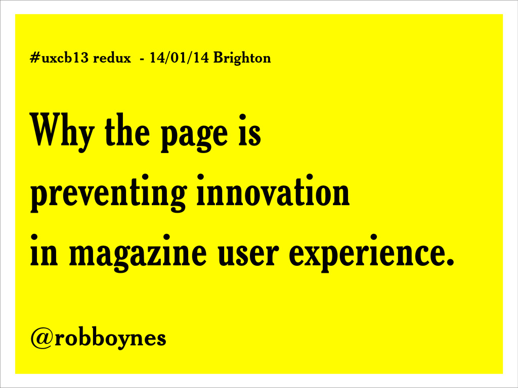
This talk was presented at UX CAMP BRIGHTON in 2013 and rewritten for a 15 minute redux talk for UX Brighton in January 2014.
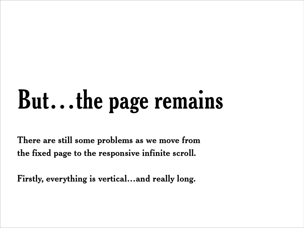
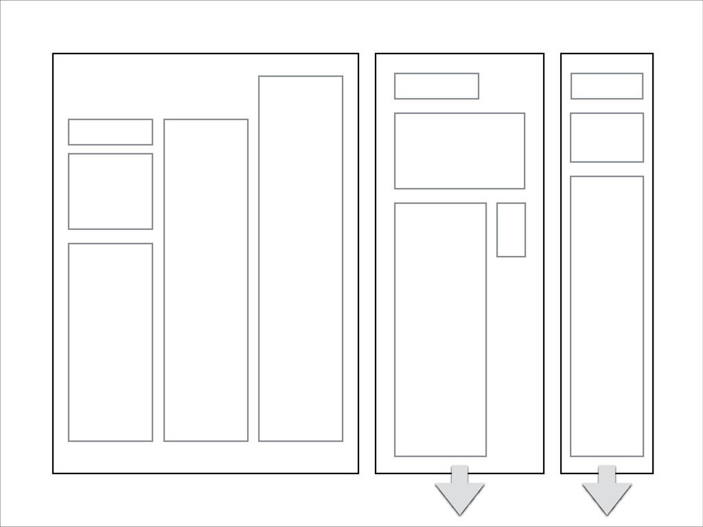
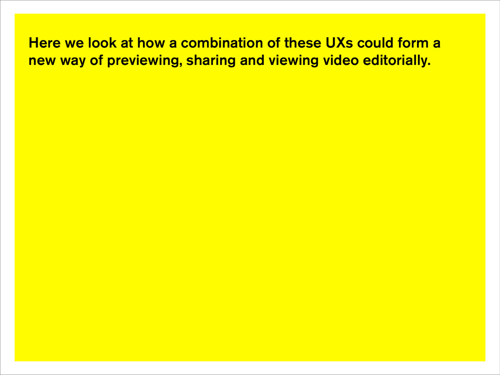
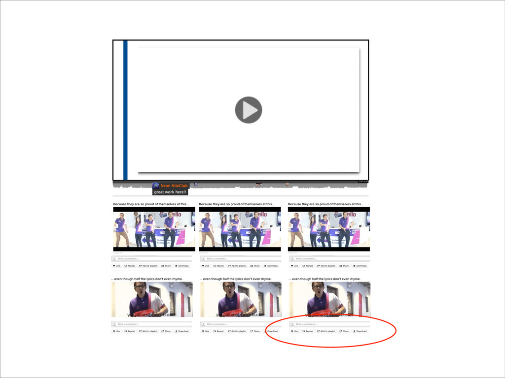
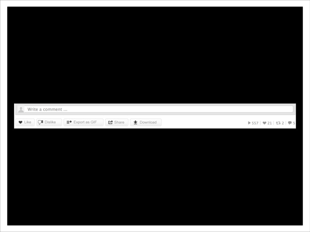
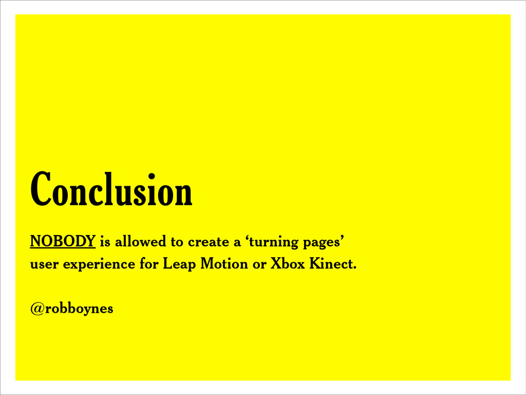
It discusses how the magazine and digital magazines in their current guise are preventing innovation. Less prescriptive, and more of a call to action, the lecture discusses the shortfall in current digital magazine UX, asks what a digital magazine should be and where it needs to innovate to.
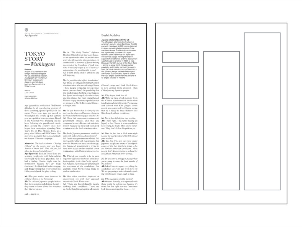
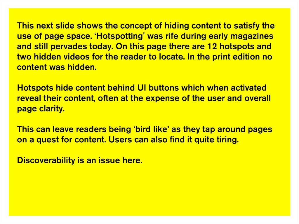
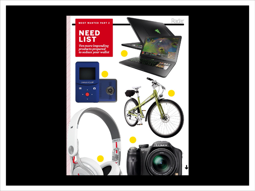
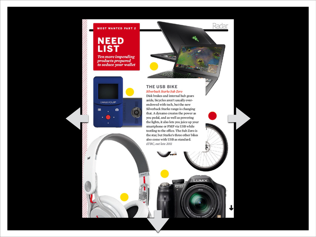
NB Notes are on yellow slides, White slides are from the original presentation.
 robboynes
 ralphpenel
 lynteo
 bitkey
 shikichee
 saka2jp
 loglass2019
 spacemarket
 tame
tame
 hiromitsuuuuu
%201.png) yoriss67
yoriss67
 hilokifigma
 designer_no_pon
 ipullrank
 bethany
 axbom
axbom
 brettharned
 gr2m
gr2m
 sugarenia
 samlambert
 akosma
 geshan
 reverentgeek
 tenderlove
 auna
auna
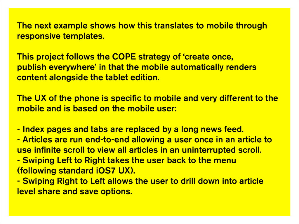