any styling • Browsers read content from top to bottom • Block level elements are displayed....? • Inline elements are displayed....? Sunday, April 21, 13
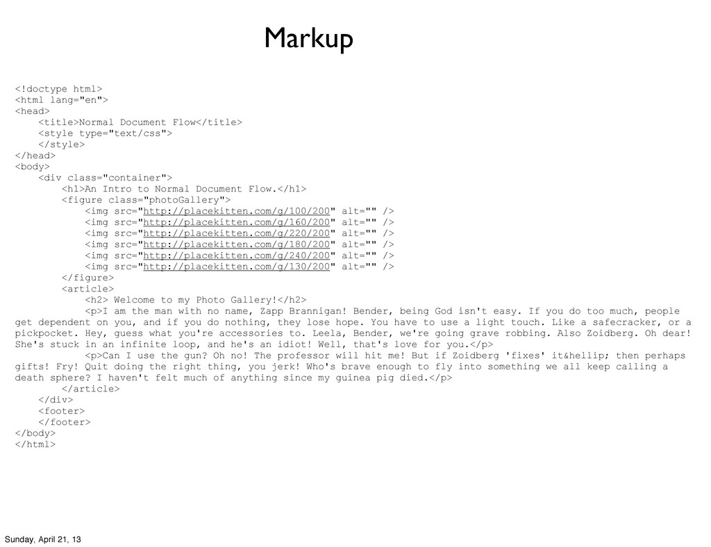
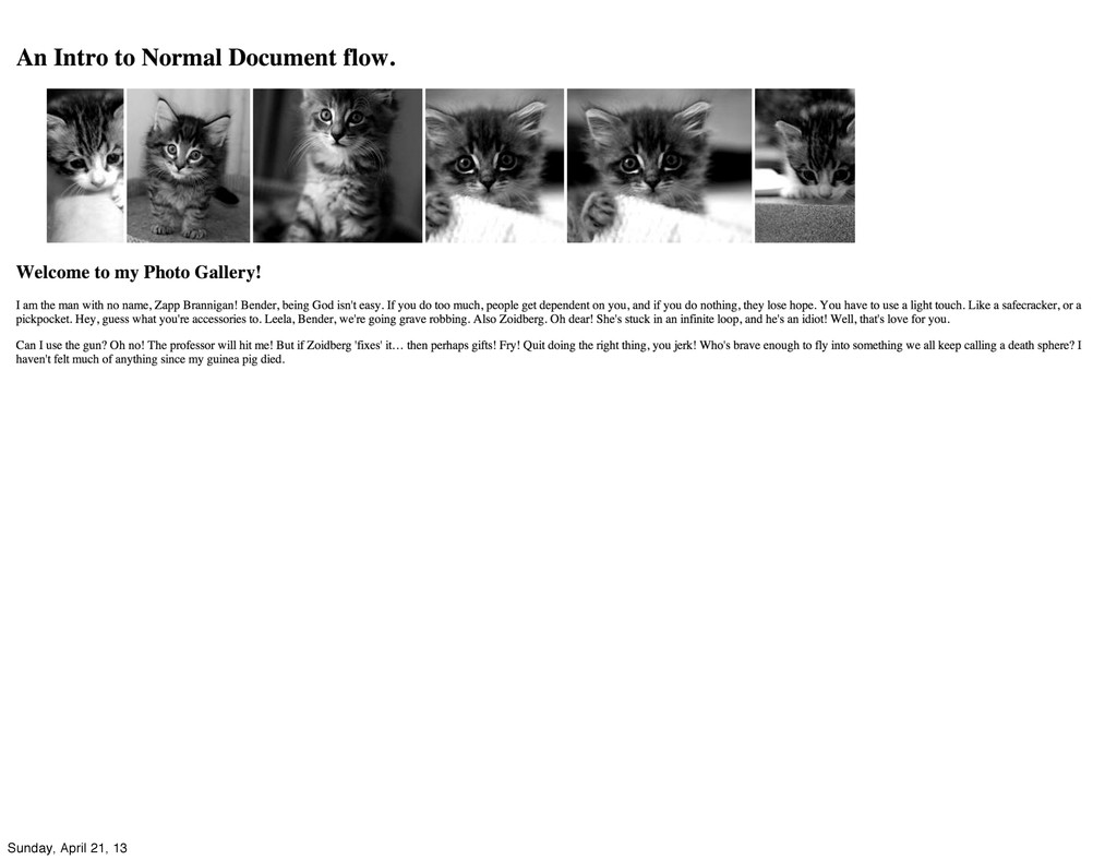
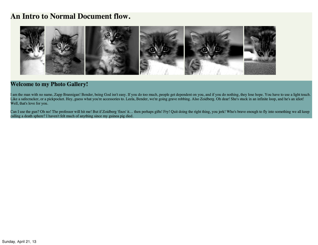
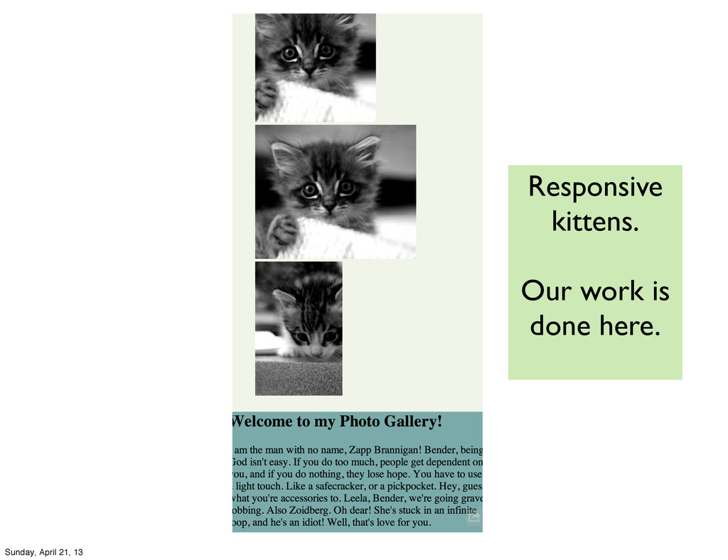
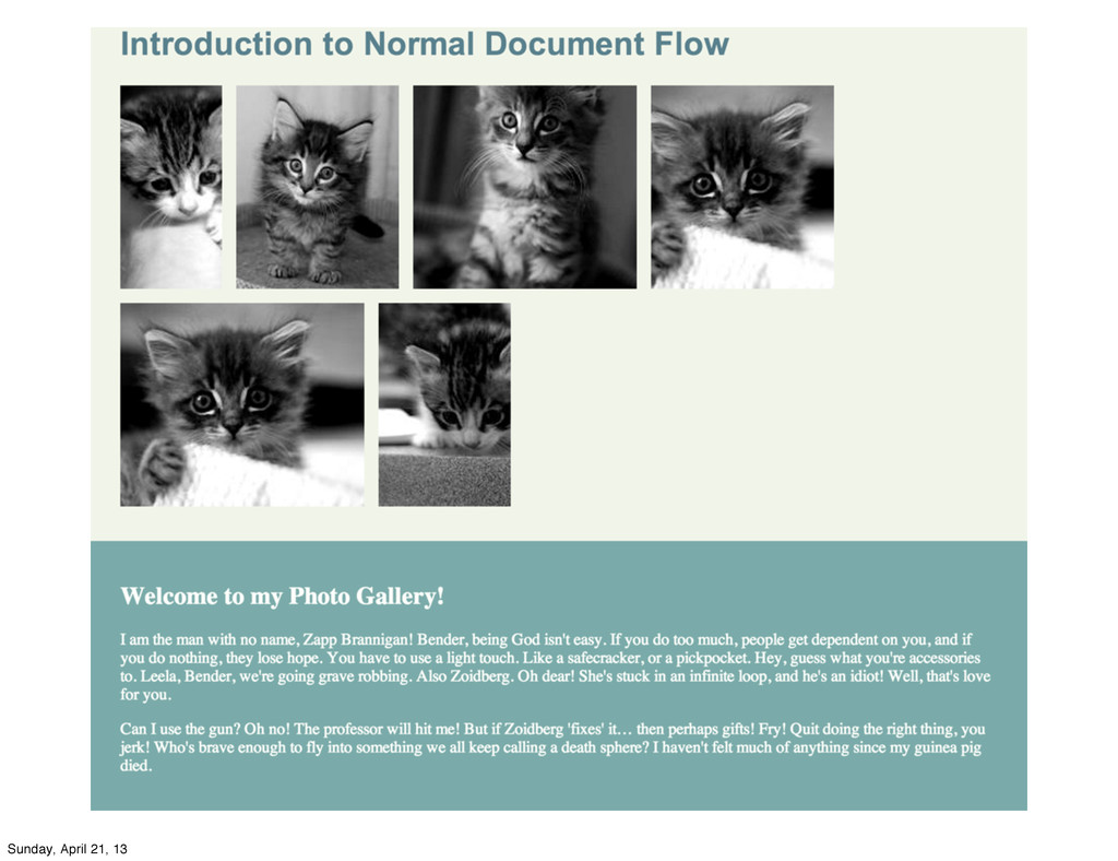
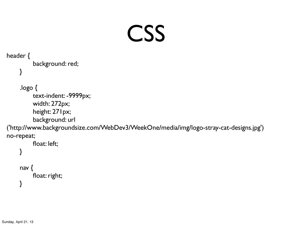
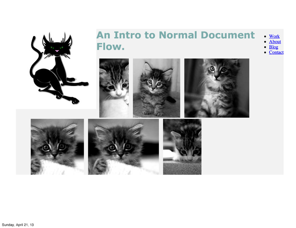
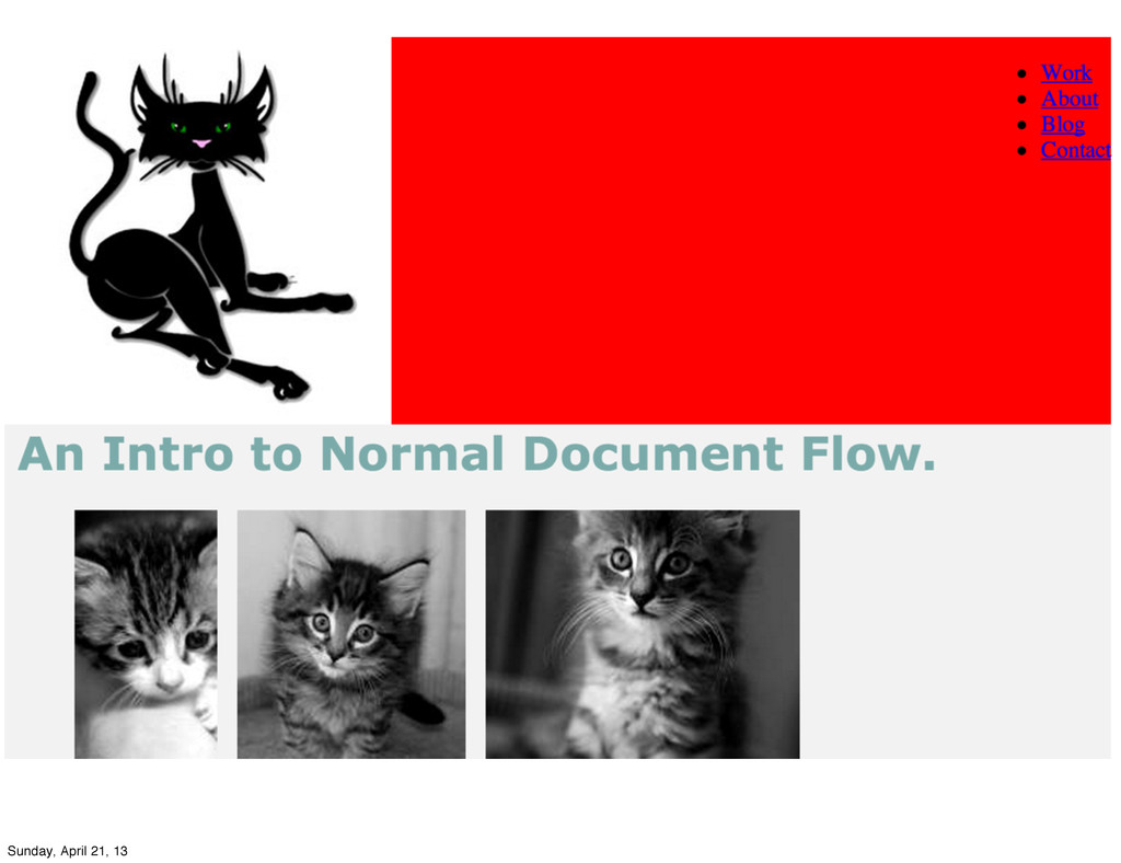
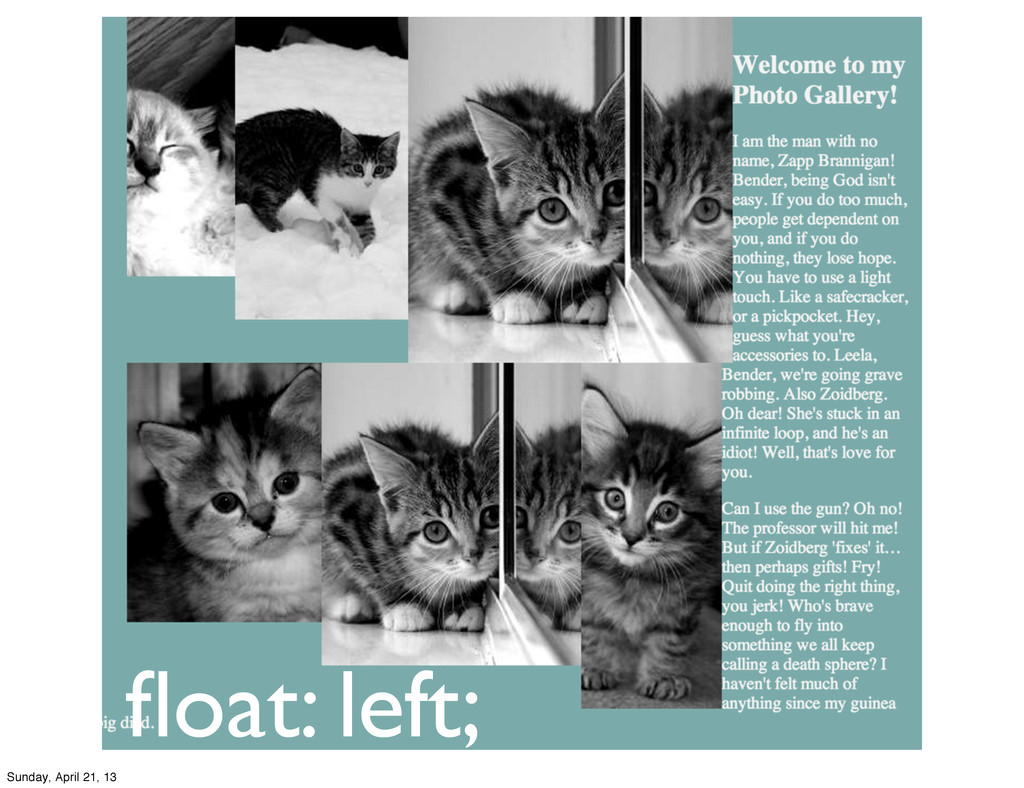
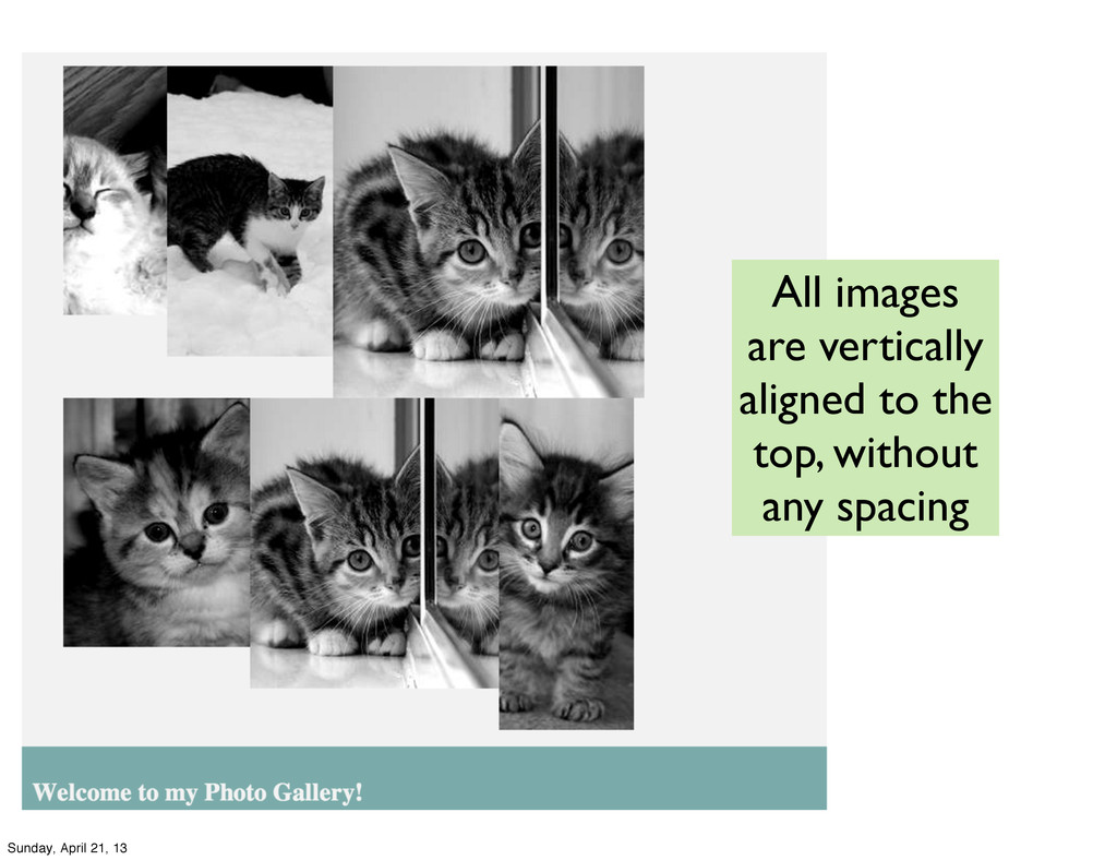
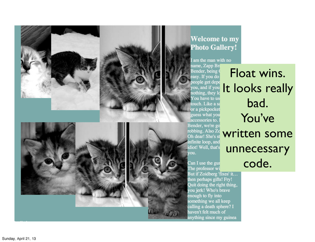
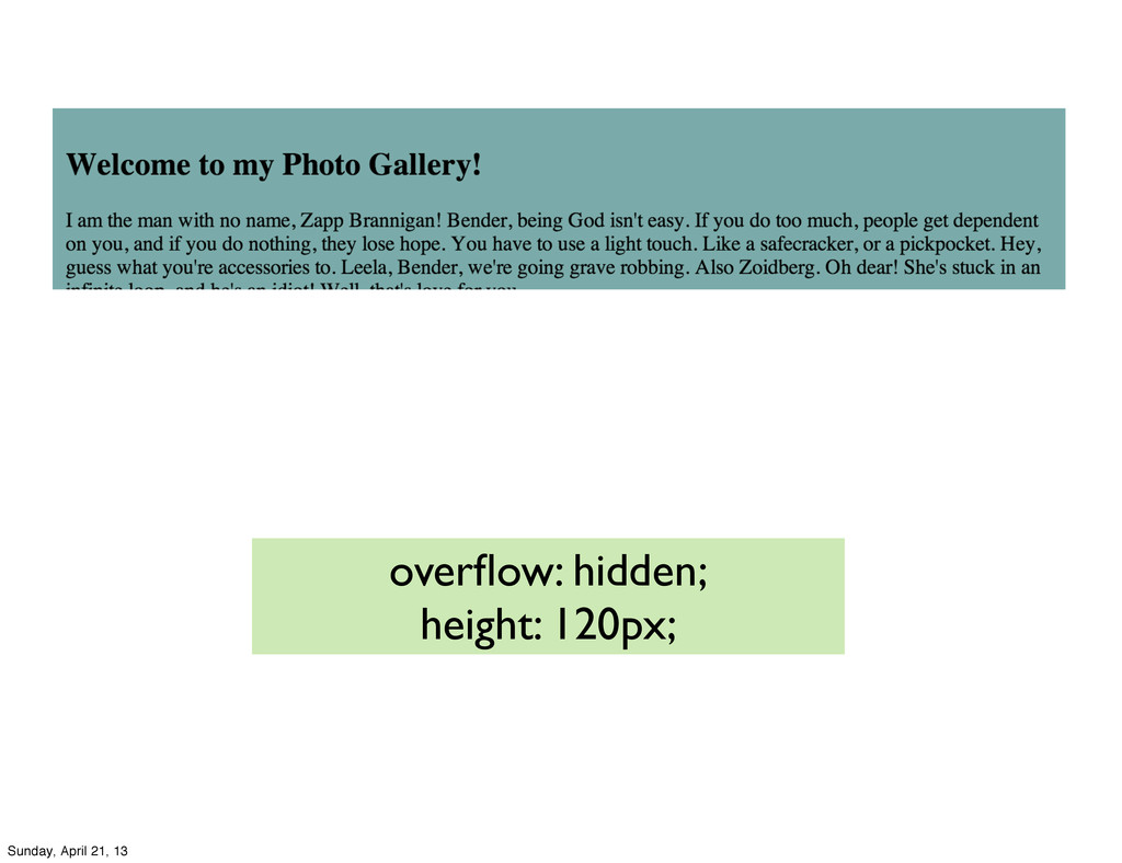
</style> </head> <body> <div class="container"> <h1>An Intro to Normal Document Flow.</h1> <figure class="photoGallery"> <img src="http://placekitten.com/g/100/200" alt="" /> <img src="http://placekitten.com/g/160/200" alt="" /> <img src="http://placekitten.com/g/220/200" alt="" /> <img src="http://placekitten.com/g/180/200" alt="" /> <img src="http://placekitten.com/g/240/200" alt="" /> <img src="http://placekitten.com/g/130/200" alt="" /> </figure> <article> <h2> Welcome to my Photo Gallery!</h2> <p>I am the man with no name, Zapp Brannigan! Bender, being God isn't easy. If you do too much, people get dependent on you, and if you do nothing, they lose hope. You have to use a light touch. Like a safecracker, or a pickpocket. Hey, guess what you're accessories to. Leela, Bender, we're going grave robbing. Also Zoidberg. Oh dear! She's stuck in an infinite loop, and he's an idiot! Well, that's love for you.</p> <p>Can I use the gun? Oh no! The professor will hit me! But if Zoidberg 'fixes' it… then perhaps gifts! Fry! Quit doing the right thing, you jerk! Who's brave enough to fly into something we all keep calling a death sphere? I haven't felt much of anything since my guinea pig died.</p> </article> </div> <footer> </footer> </body> </html> Markup Sunday, April 21, 13
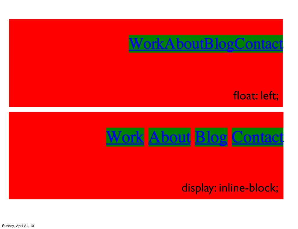
(no center... yet) • Floats will go as far as they can in the set direction • Floats disrupt the normal document flow • Following elements will flow around it... can be problematic Sunday, April 21, 13
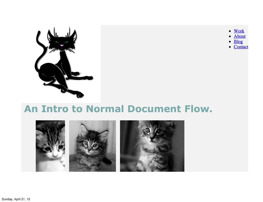
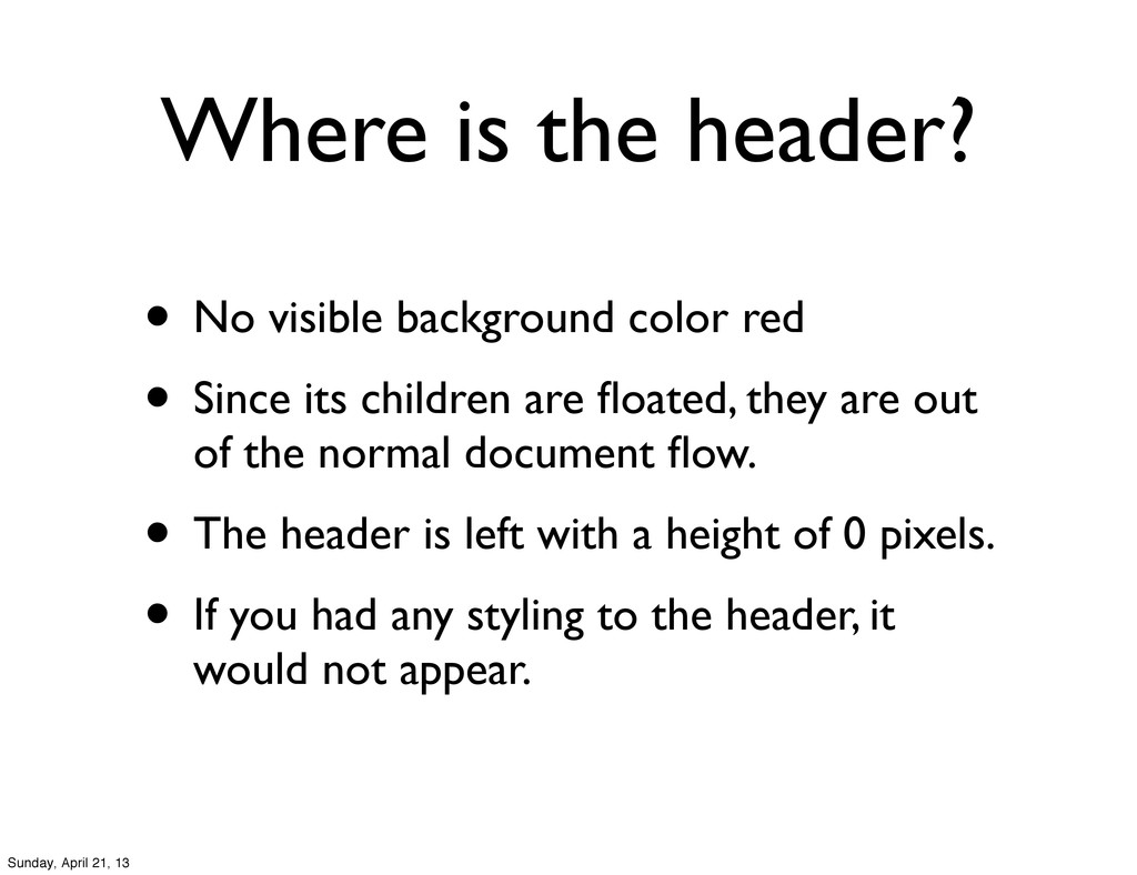
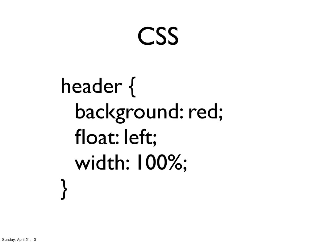
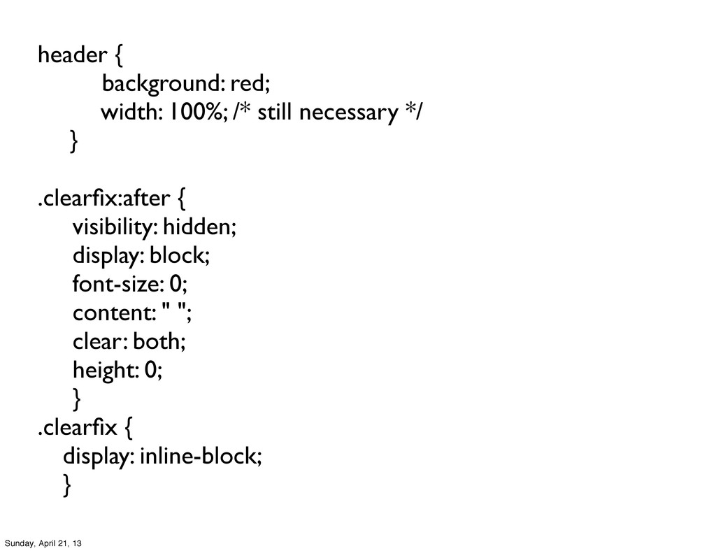
• Since its children are floated, they are out of the normal document flow. • The header is left with a height of 0 pixels. • If you had any styling to the header, it would not appear. Sunday, April 21, 13
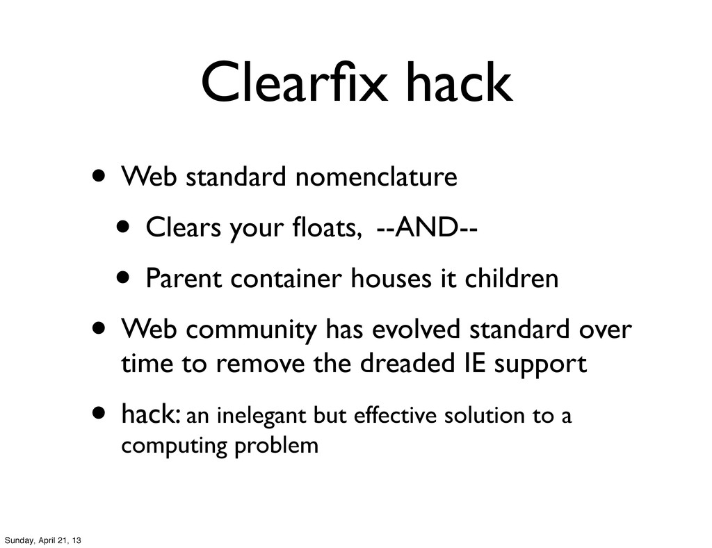
--AND-- • Parent container houses it children • Web community has evolved standard over time to remove the dreaded IE support • hack: an inelegant but effective solution to a computing problem Sunday, April 21, 13
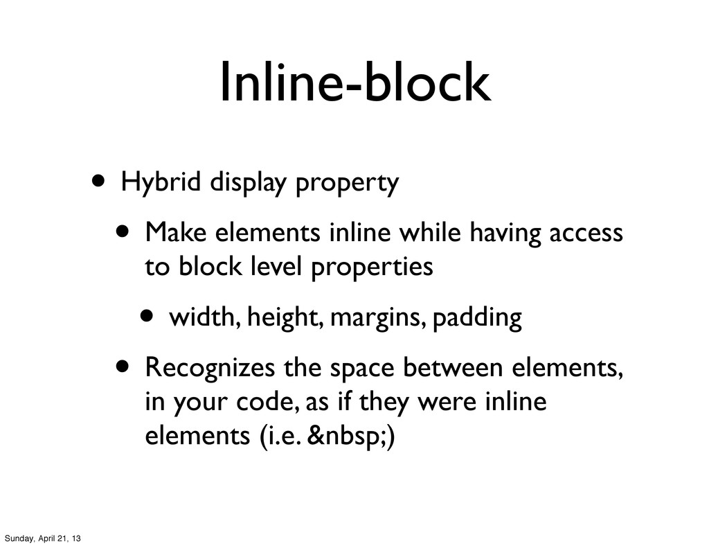
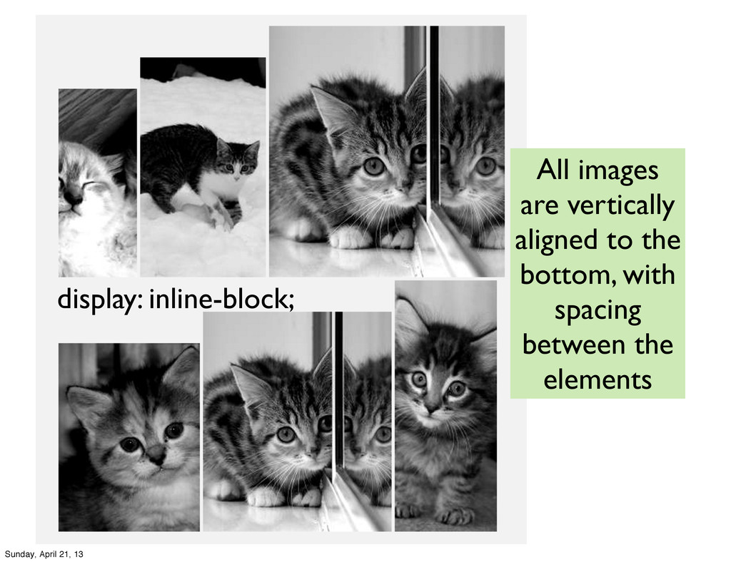
having access to block level properties • width, height, margins, padding • Recognizes the space between elements, in your code, as if they were inline elements (i.e. ) Sunday, April 21, 13
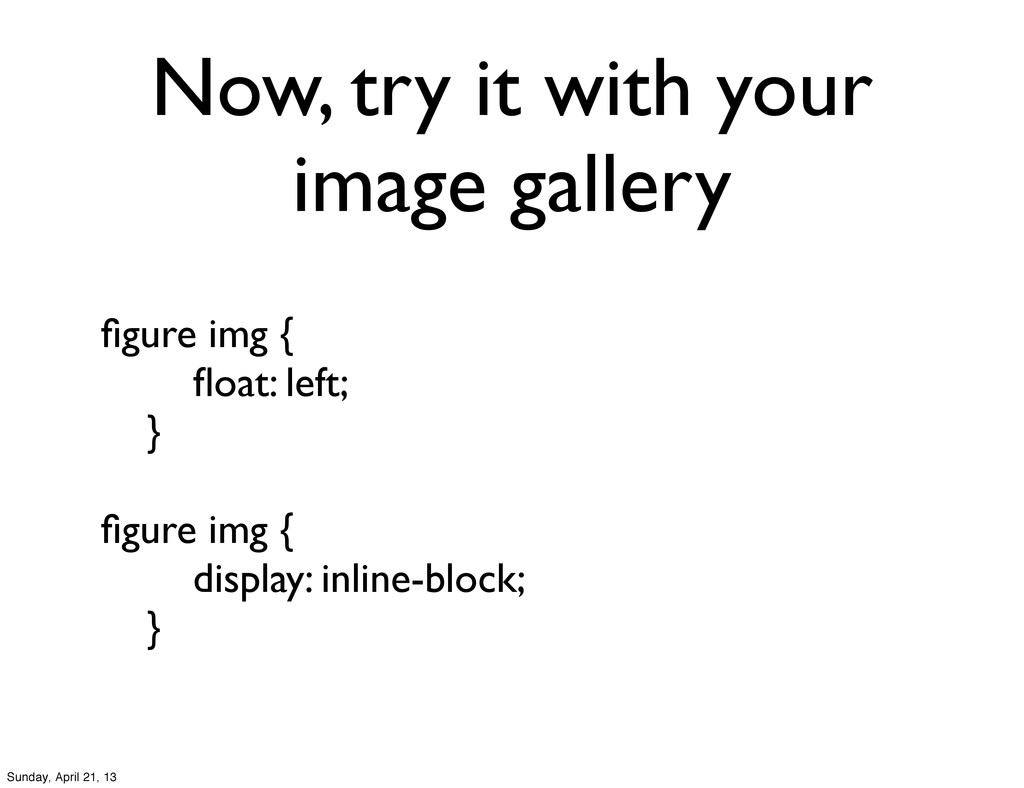
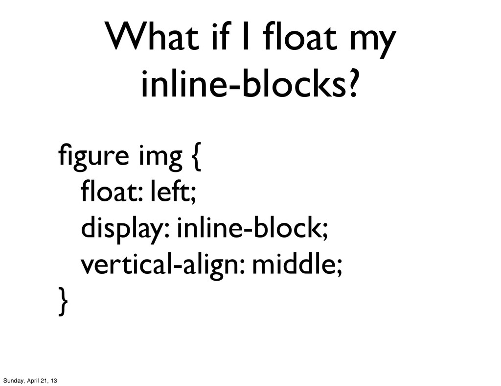
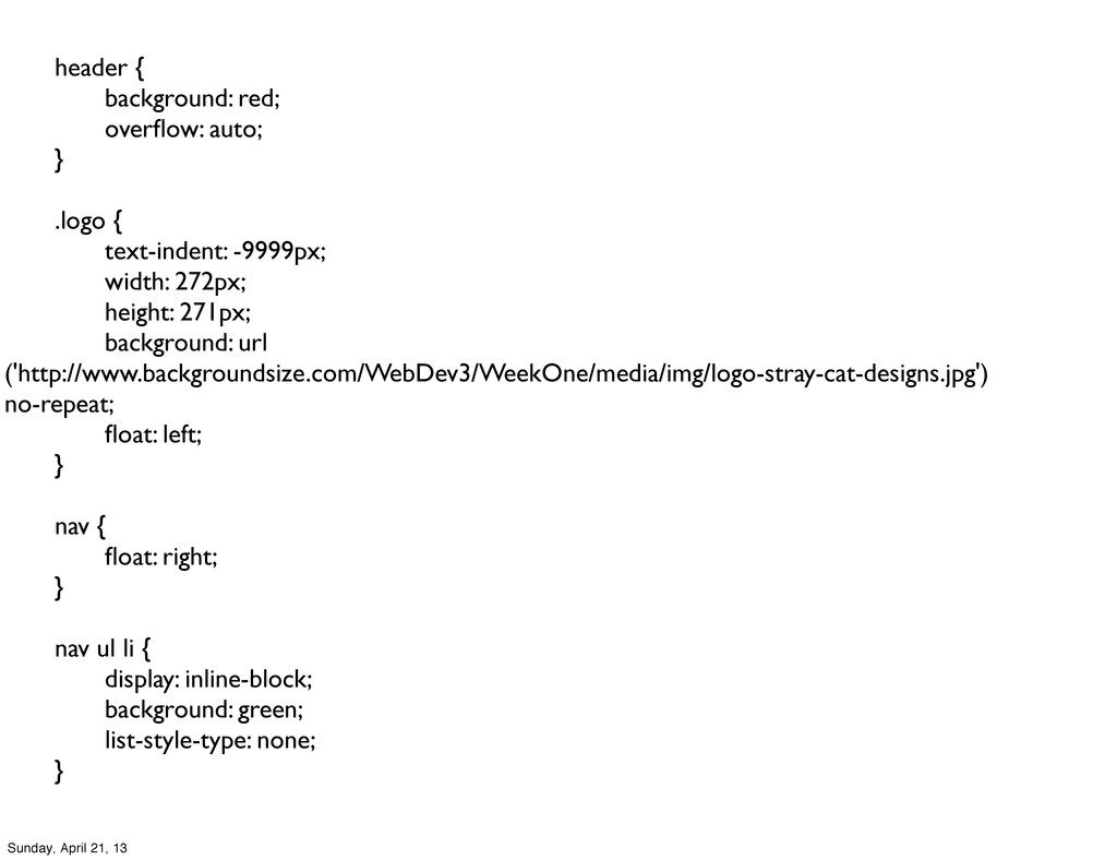
whatever you call it • add display: inline-block to figure css • --OR-- • add overflow:auto; to figure css (more to follow on overflow...) Sunday, April 21, 13
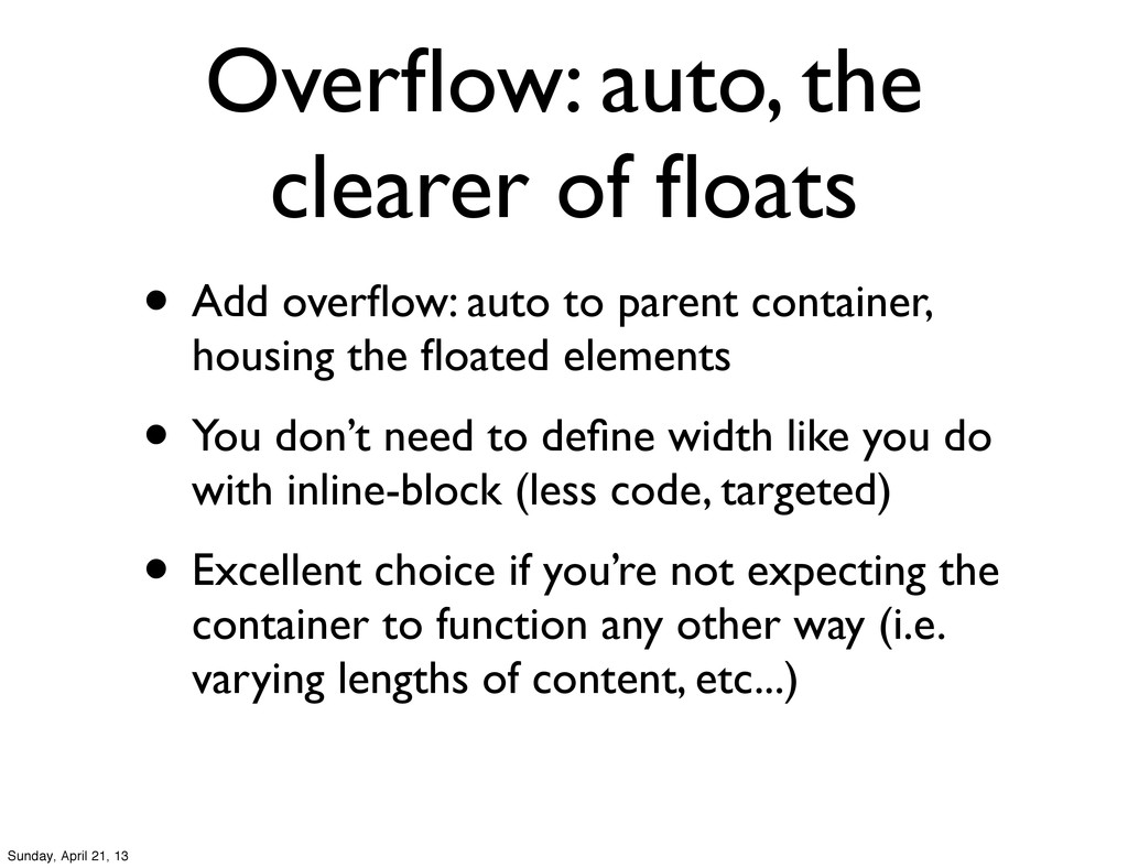
to parent container, housing the floated elements • You don’t need to define width like you do with inline-block (less code, targeted) • Excellent choice if you’re not expecting the container to function any other way (i.e. varying lengths of content, etc...) Sunday, April 21, 13
It won’t move even if the browser window is scrolled • Very popular with ‘sticky’ navigation • Can be set by: • top, right, bottom, left • layered by z-index Sunday, April 21, 13
also be positioned to a parent element if the parent is set to relative positioning • Can be set by: • top, right, bottom, left • layered by z-index Sunday, April 21, 13
the document flow • Primarily used as an anchor reference, for child elements to be absolutely positioned in reference to it, rather than the document window. • Can be set by: • top, right, bottom, left • layered by z-index Sunday, April 21, 13
their HTML and CSS • Look for floats, inline-blocks, and overflows • Compare and contrast • Tell me your preferences • Email report to me Sunday, April 21, 13
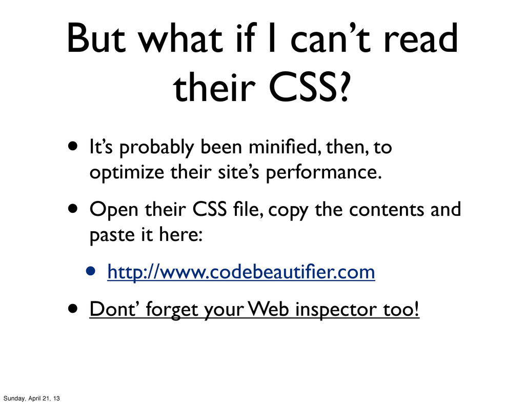
probably been minified, then, to optimize their site’s performance. • Open their CSS file, copy the contents and paste it here: • http://www.codebeautifier.com • Dont’ forget your Web inspector too! Sunday, April 21, 13
 robriggs
 line_developers_tw
 r4ynode
 moepy_stats
 oracle4engineer
 ham0215
 shiba_8ro
 shinyasaita
 nassy20
 cyberagentdevelopers
 ynt0485
 iwamot
 aleyda
 427marketing
 trishagee
 mfonobong
 jacobtomlinson
 rmw
rmw
 eileencodes
 chriscoyier
 inesmontani
 andyhume
 csswizardry
 addyosmani