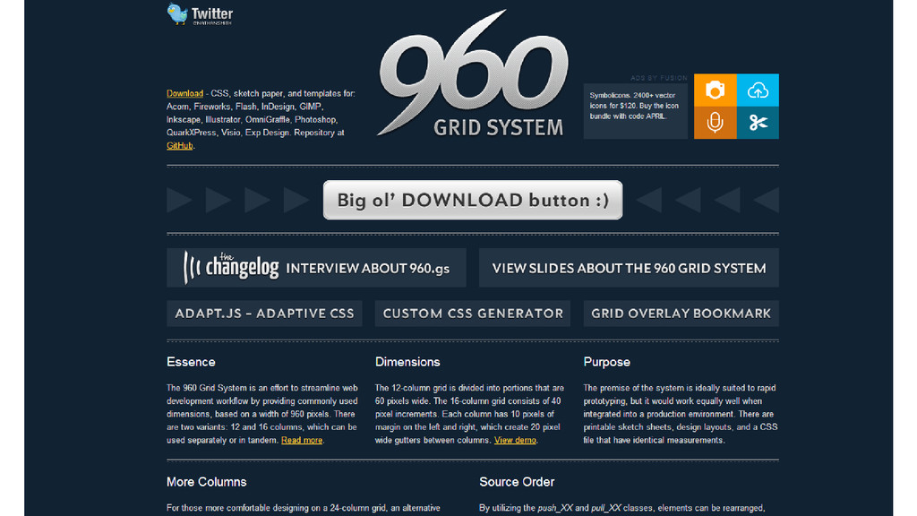
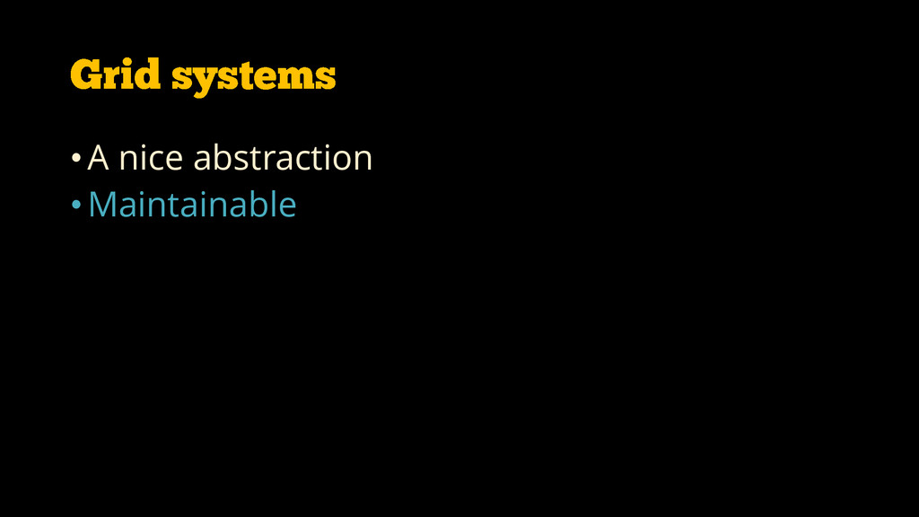
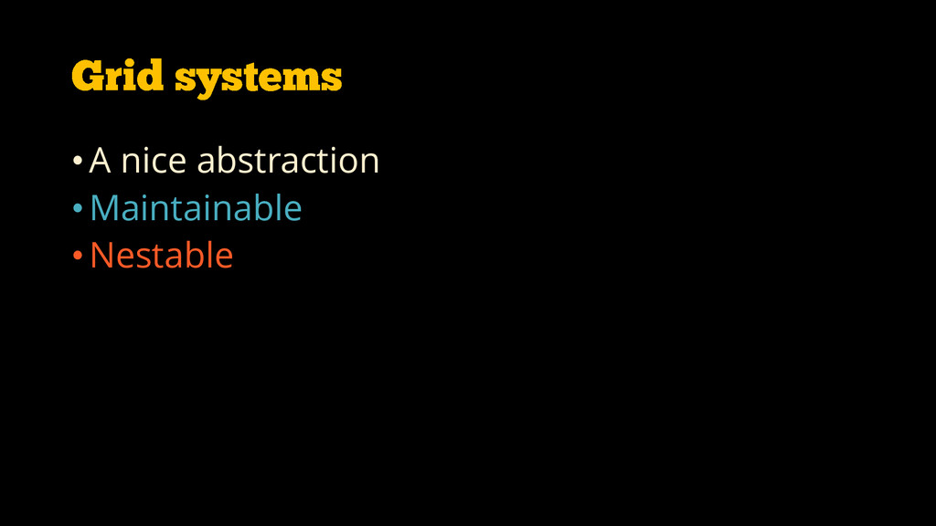
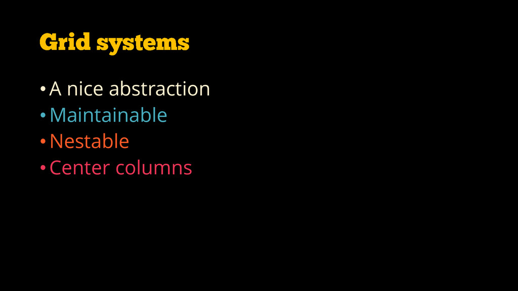
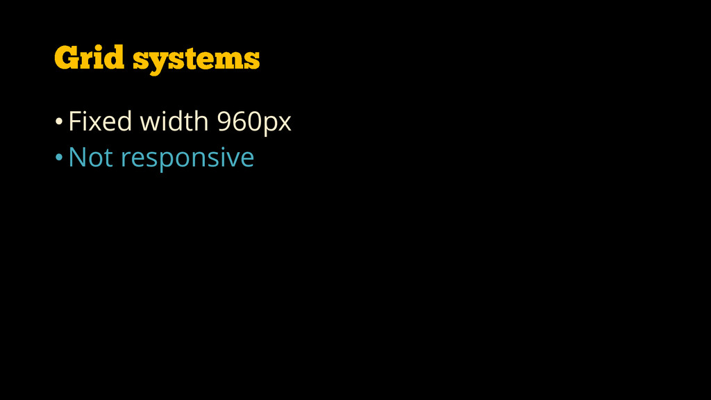
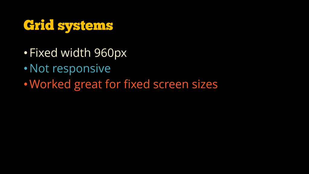
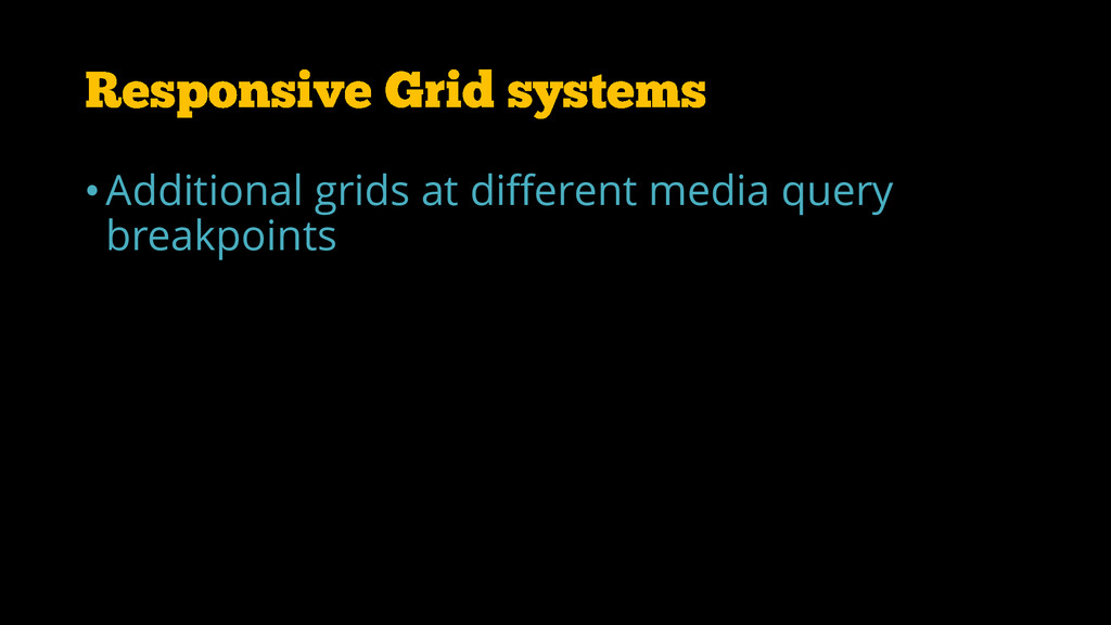
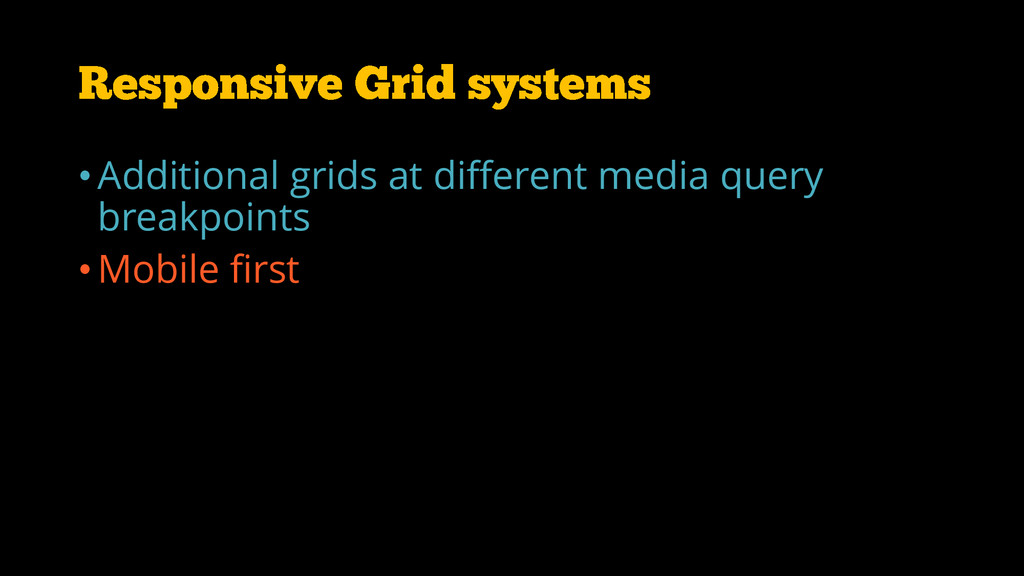
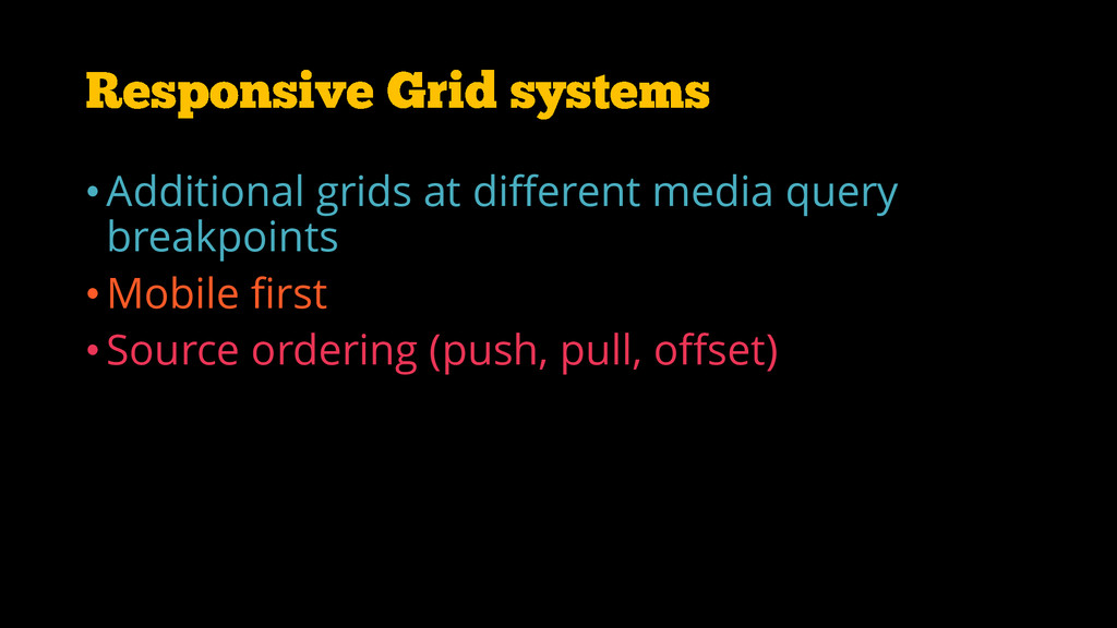
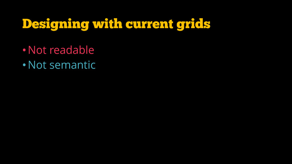
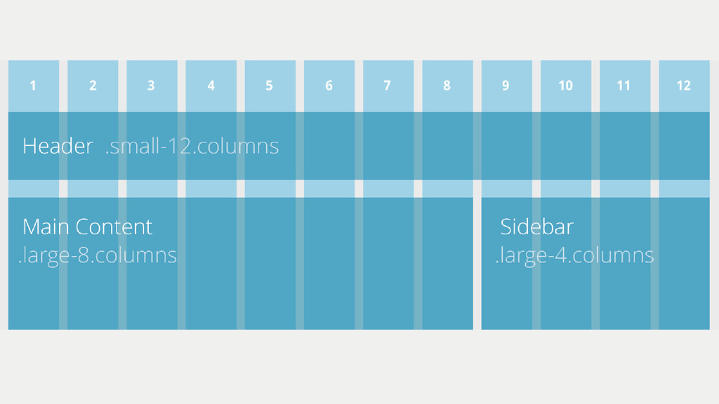
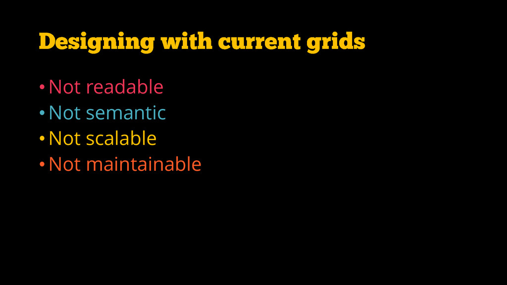
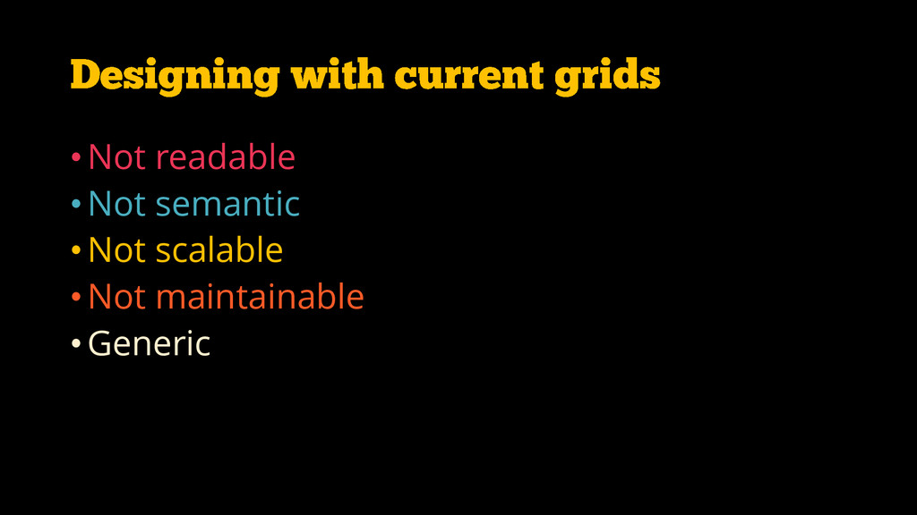
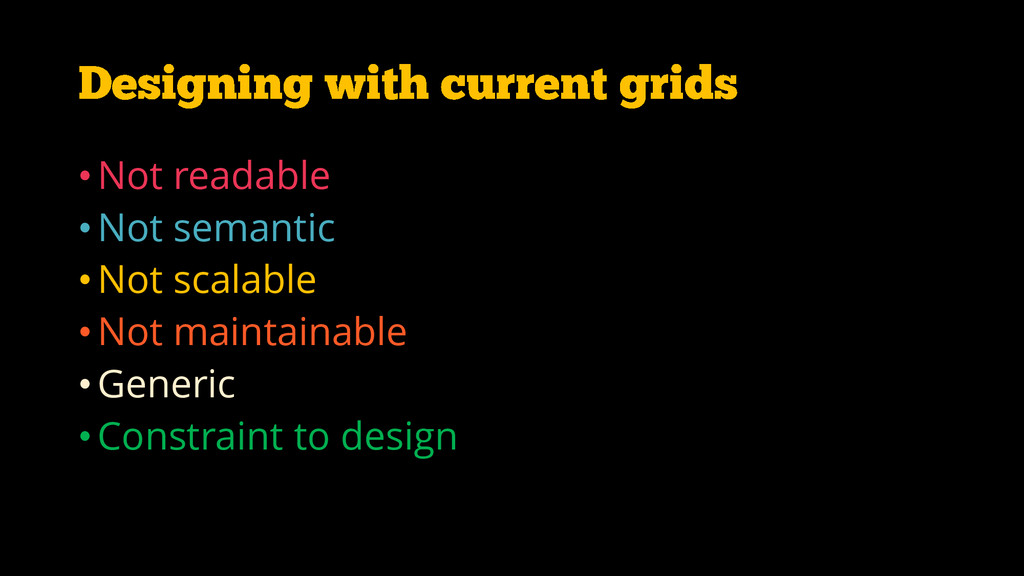
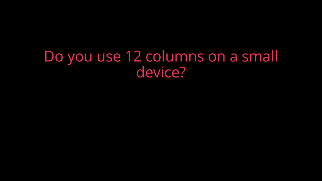
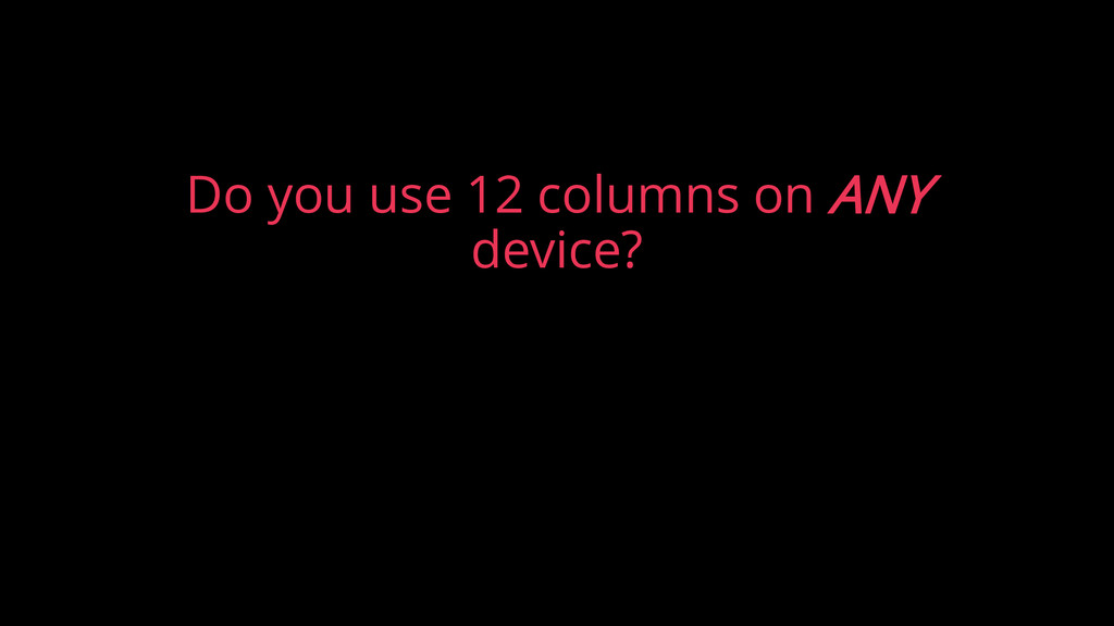
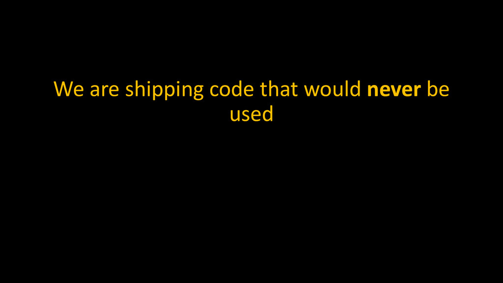
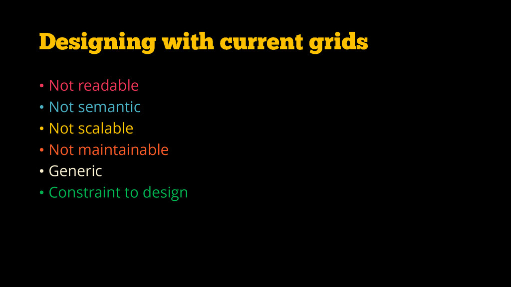
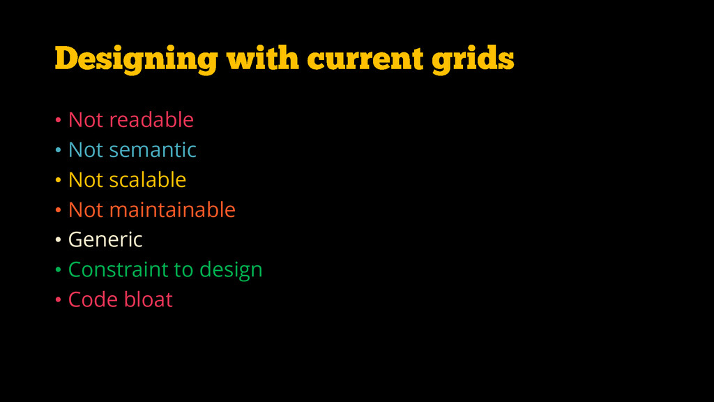
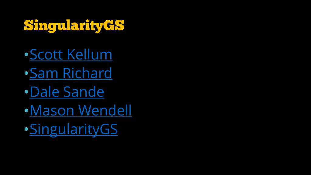
How grids evolved over time and why a 12 column grid might not work for your design. How to overcome these limitations using Singularity GS. You can view the full video along with code demos at the below link
https://www.youtube.com/watch?v=NoYcJ0YCc5o
 rvinay88
 ks91
ks91
 ueponx
 hageyahhoo
 wxyzzz
 eitarosuda
 ekispert_api
 shinyasaita
 kanny
kanny
 hatyibei
 bto
bto
 y150saya
 okana2ki
 schroneko
 nmsamuel
 jonrohan
 leimatthew05
 reverentgeek
 skipperchong
 tonyrice
 destraynor
 afnizarnur
 oripsolob
 matthewcrist
 akashhashmi