Upgrade to Pro
— share decks privately, control downloads, hide ads and more …
Speaker Deck
Features
Speaker Deck
PRO
Sign in
Sign up for free
Search
Search
Flexible grids using Sass
Search
Vinay Raghu
March 27, 2014
Technology
240
2
Share
Embed
Copy iframe code
Copy JS code
Copy link
Start on current slide
Flexible grids using Sass
A talk on grid design philosophy and using singularity grid system
Vinay Raghu
March 27, 2014
More Decks by Vinay Raghu
See All by Vinay Raghu
Content is a beast - a content-first approach to building wordpress websites
rvinay88
0
88
Lean UX: Designing successful apps
rvinay88
0
59
How to build a fully functioning app with Polymer and Firebase
rvinay88
0
120
The art of UI animation
rvinay88
2
350
Flexible grids using Sass
rvinay88
1
220
Other Decks in Technology
See All in Technology
美しいコードを書くためにF#を学んでみた話
yud0uhu
1
390
次世代ランサムウェア対策の考察 / 20260704 Mitsutoshi Matsuo
shift_evolve
PRO
5
1.7k
プロダクトだけじゃない、社内プロセスにおける自動化・省力化ノススメ
kakehashi
PRO
1
3.2k
AWS Summit の片隅で、体育座りしながらコミュニティがにぎわう理由を考えた
k_adachi_01
2
360
なぜ人は自分のプロジェクトを 「なんちゃってアジャイル」と 自嘲するのか
kozotaira
0
270
【Claude Code】鹿野さんに聞く 私の推しの並行開発環境 大公開 / claude-code-parallel-2026-07-15
tonkotsuboy_com
6
1.6k
Control Planeで育てるBtoB SaaSの認証基盤 - SRE NEXT 2026
pokohide
1
2k
Claude Codeとハーネスについて考えてみる
oikon48
18
9k
Keeping applications secure by evolving OAuth 2.0 and OpenID Connect
ahus1
PRO
1
150
プライバシー保護の理論と実践
lycorptech_jp
PRO
1
250
なぜ私たちのSREプラクティスはなかなか機能しないのか 〜システムより先に組織を見る〜 / Why our SRE practices aren't really working
vtryo
3
3.2k
“全部コピーしない”ファイルデータの活用 : — FSx for ONTAP × S3 Tables × Icebergで作るメタデータカタログ
yoshiki0705
0
630
Featured
See All Featured
Design in an AI World
tapps
1
260
State of Search Keynote: SEO is Dead Long Live SEO
ryanjones
0
220
A designer walks into a library…
pauljervisheath
211
24k
Making the Leap to Tech Lead
cromwellryan
135
10k
Visual Storytelling: How to be a Superhuman Communicator
reverentgeek
2
590
How To Stay Up To Date on Web Technology
chriscoyier
790
250k
Side Projects
sachag
455
43k
The Anti-SEO Checklist Checklist. Pubcon Cyber Week
ryanjones
0
180
Building the Perfect Custom Keyboard
takai
2
810
Reality Check: Gamification 10 Years Later
codingconduct
0
2.2k
The Director’s Chair: Orchestrating AI for Truly Effective Learning
tmiket
1
210
How to Align SEO within the Product Triangle To Get Buy-In & Support - #RIMC
aleyda
2
1.6k
Transcript
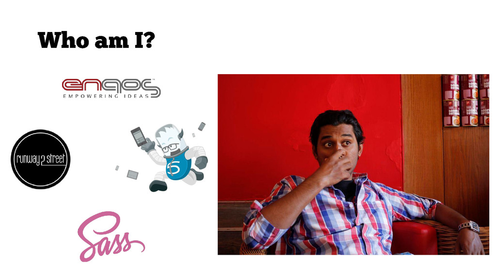
Vinay Raghu / @rvinay88 / viii.in
None
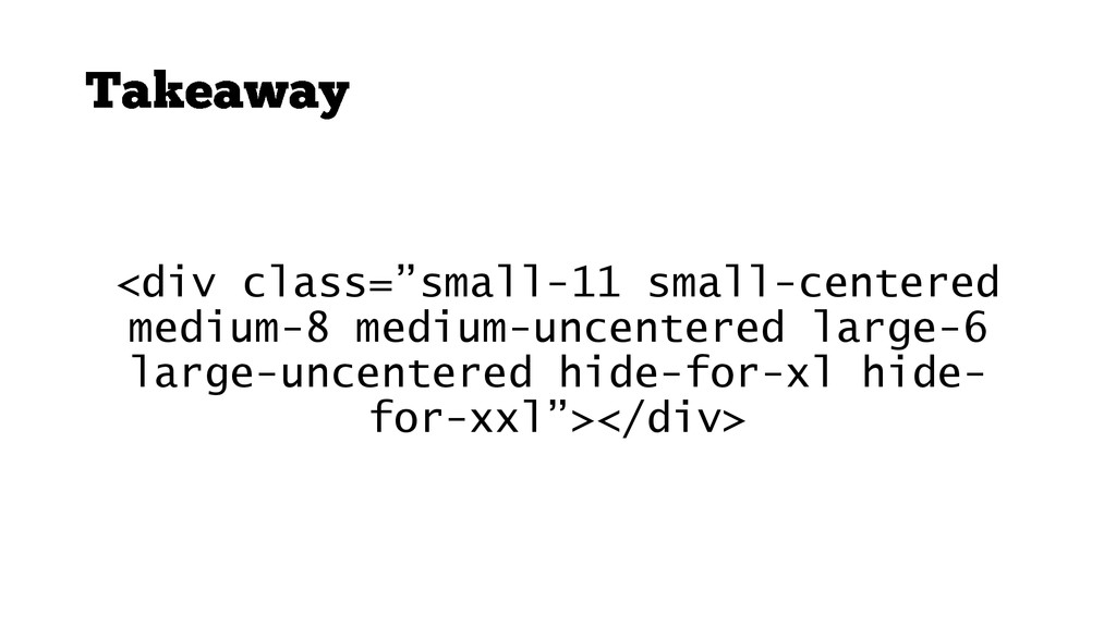
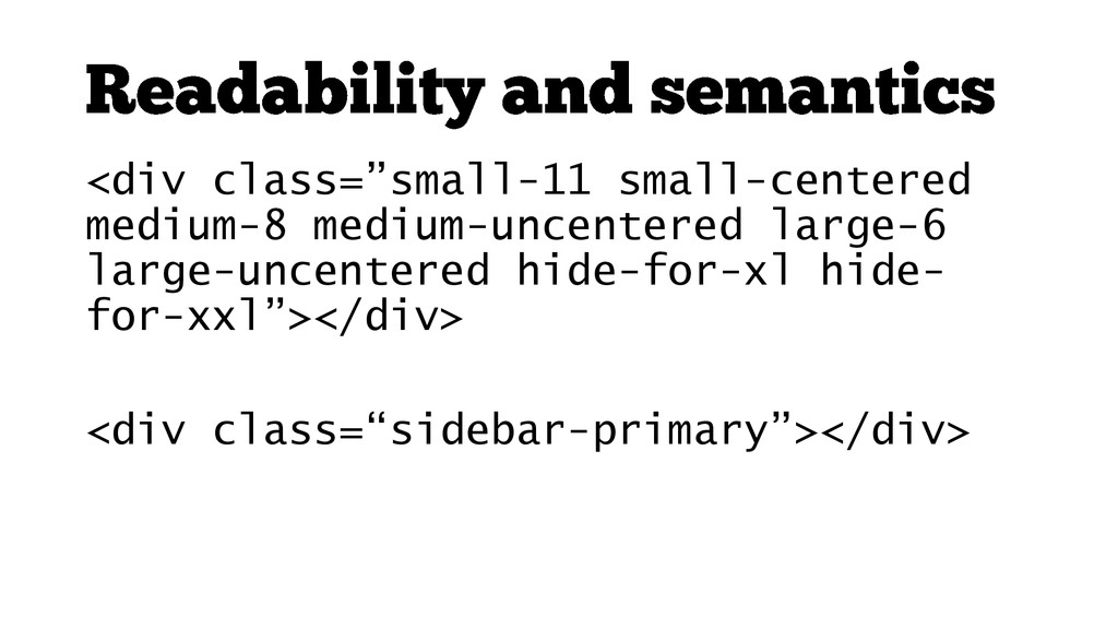
<div class=”small-11 small-centered medium-8 medium-uncentered large-6 large-uncentered hide-for-xl hide- for-xxl”></div>
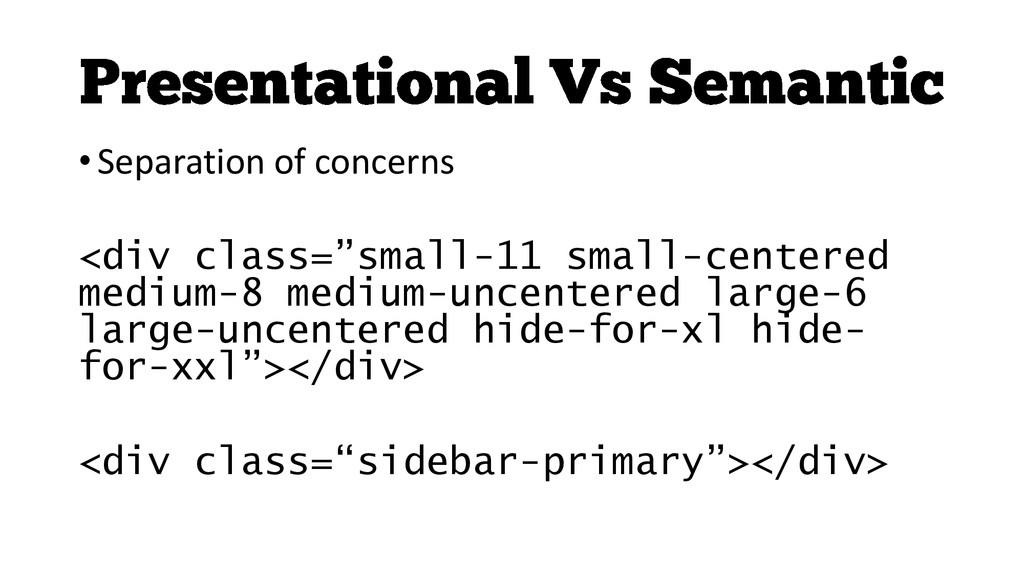
• Separation of concerns <div class=”small-11 small-centered medium-8 medium-uncentered large-6
large-uncentered hide-for-xl hide- for-xxl”></div> <div class=“sidebar-primary”></div>
http://www.flickr.com/photos/shankbone/2821569368/
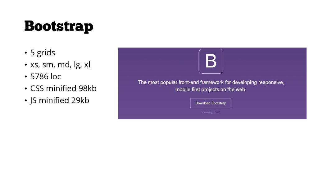
• 5 grids • xs, sm, md, lg, xl •
5786 loc • CSS minified 98kb • JS minified 29kb
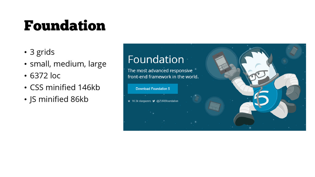
• 3 grids • small, medium, large • 6372 loc
• CSS minified 146kb • JS minified 86kb
• Abstraction • Responsive • Nestable • Source ordering –
push and pull
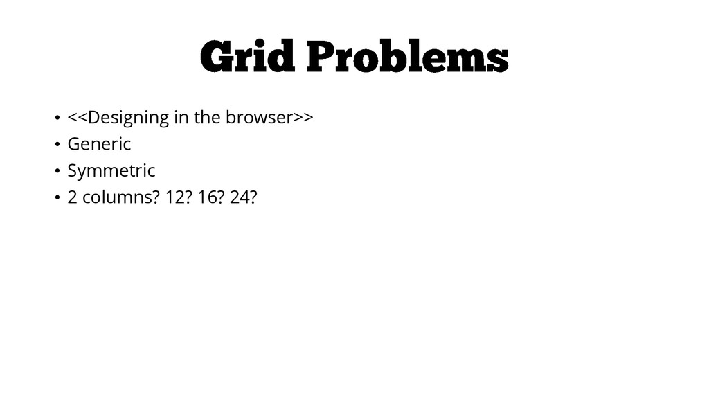
• <<Designing in the browser>> • Generic • Symmetric •
2 columns? 12? 16? 24?
None
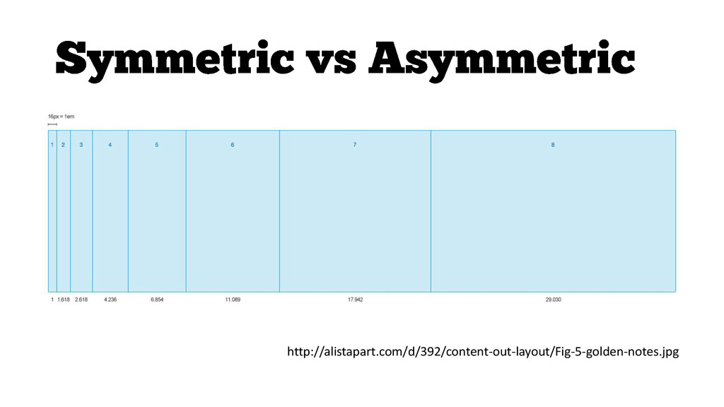
http://alistapart.com/d/392/content-out-layout/Fig-5-golden-notes.jpg
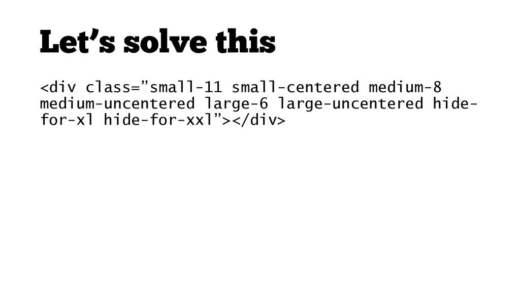
<div class=”small-11 small-centered medium-8 medium-uncentered large-6 large-uncentered hide-for-xl hide- for-xxl”></div>
<div class=“sidebar-primary”></div>
• Scalable • Maintainable – 12 columns on small •
Non Performant • Code bloat - Unnecessary styles in your code (grunt-uncss, ucss)
<div class=”small-11 small-centered medium-8 medium-uncentered large-6 large-uncentered hide- for-xl hide-for-xxl”></div>
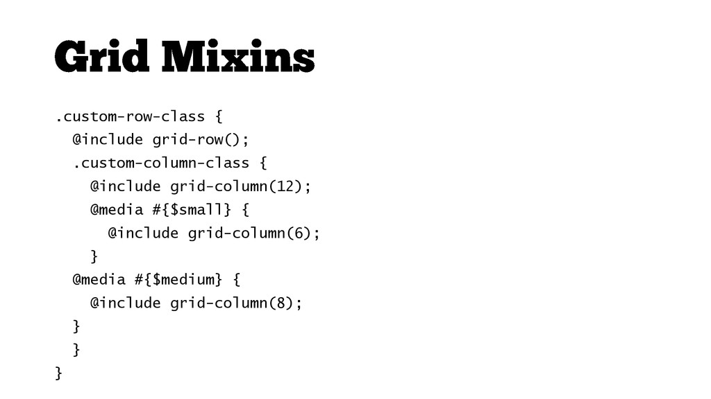
.custom-row-class { @include grid-row(); .custom-column-class { @include grid-column(12); @media #{$small}
{ @include grid-column(6); } @media #{$medium} { @include grid-column(8); } } }
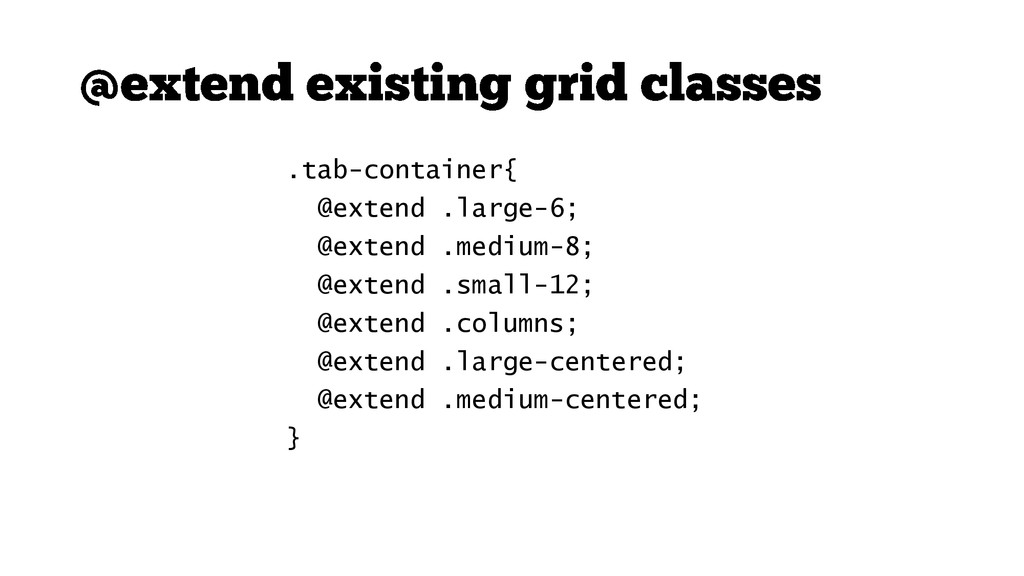
.tab-container{ @extend .large-6; @extend .medium-8; @extend .small-12; @extend .columns; @extend
.large-centered; @extend .medium-centered; }
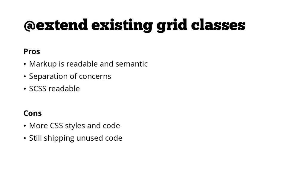
Pros • Markup is readable and semantic • Separation of
concerns • SCSS readable Cons • More CSS styles and code • Still shipping unused code
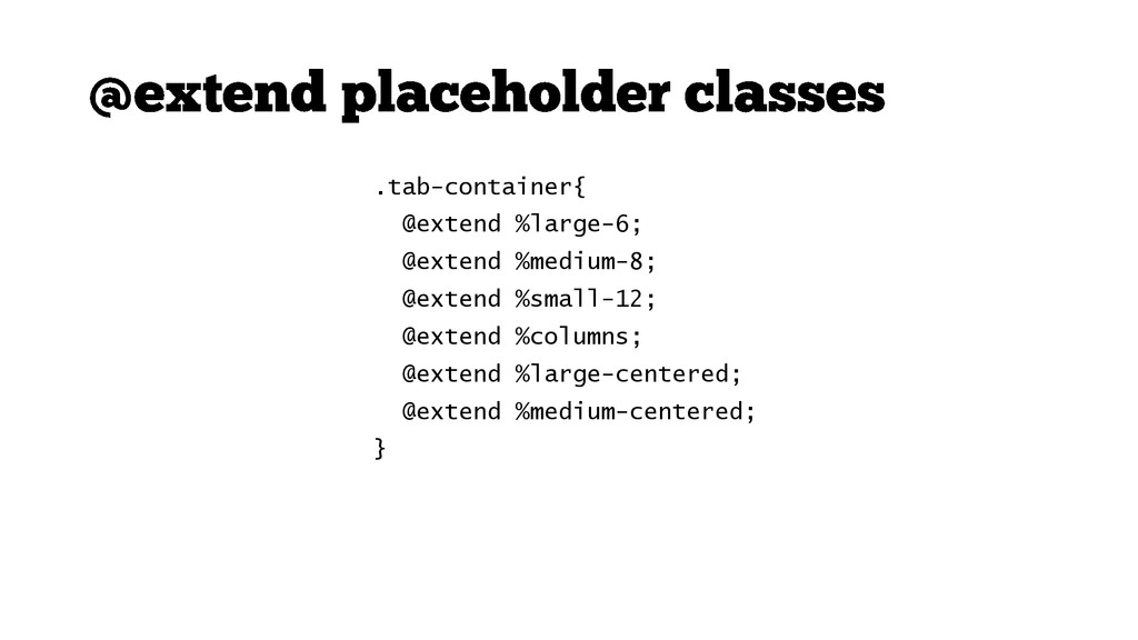
.tab-container{ @extend %large-6; @extend %medium-8; @extend %small-12; @extend %columns; @extend
%large-centered; @extend %medium-centered; }
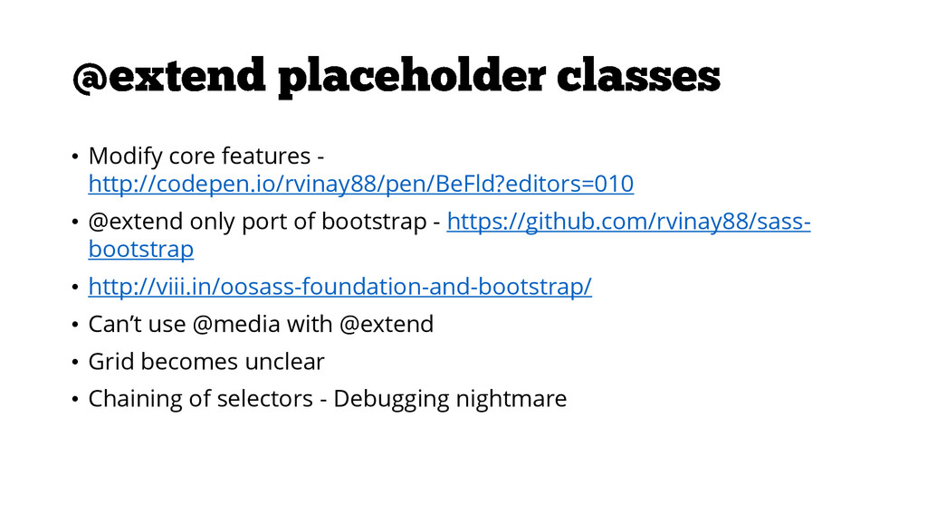
• Modify core features - http://codepen.io/rvinay88/pen/BeFld?editors=010 • @extend only port
of bootstrap - https://github.com/rvinay88/sass- bootstrap • http://viii.in/oosass-foundation-and-bootstrap/ • Can’t use @media with @extend • Grid becomes unclear • Chaining of selectors - Debugging nightmare
button.disabled, button[disabled], .button.disabled, .disabled.follow-button, .disabled.stats-button, .disabled.btn-wizard, .button[disabled], [disabled].follow-button, [disabled].stats-button, [disabled].btn-wizard
{ //styles here}
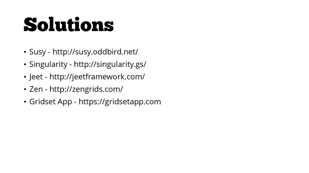
• Susy - http://susy.oddbird.net/ • Singularity - http://singularity.gs/ • Jeet
- http://jeetframework.com/ • Zen - http://zengrids.com/ • Gridset App - https://gridsetapp.com
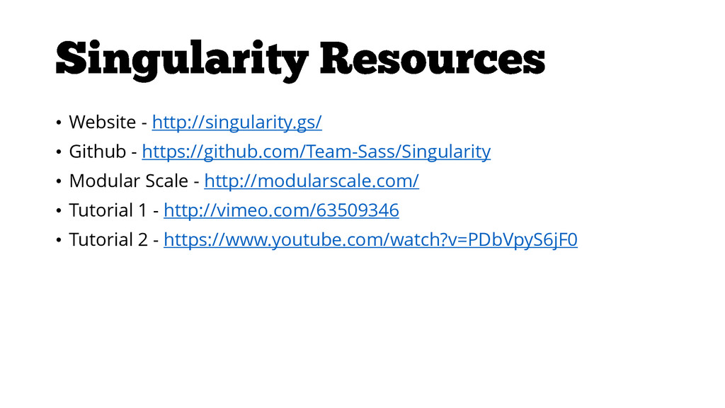
• Website - http://singularity.gs/ • Github - https://github.com/Team-Sass/Singularity • Modular
Scale - http://modularscale.com/ • Tutorial 1 - http://vimeo.com/63509346 • Tutorial 2 - https://www.youtube.com/watch?v=PDbVpyS6jF0
None
• https://github.com/Team-Sass/Singularity/wiki/Spanning-The- Grid#group-context-overrides • https://github.com/Team-Sass/modular-scale • https://gist.github.com/rvinay88/9807303 • http://www.mathsisfun.com/numbers/golden-ratio.html •
http://sassmeister.com/gist/9807303
None
 rvinay88
 yud0uhu
 shift_evolve
 kakehashi
 k_adachi_01
 kozotaira
 tonkotsuboy_com
 pokohide
 oikon48
 ahus1
ahus1
 lycorptech_jp
 vtryo
vtryo
 yoshiki0705
 tapps
tapps
 ryanjones
 pauljervisheath
 cromwellryan
 reverentgeek
 chriscoyier
 sachag
 takai
takai
 codingconduct
 tmiket
 aleyda
![button.disabled, button[disabled], .button.disabled, .disabled.follow-button, .disabled.stats-button, .disabled.btn-wizard, .button[disabled], [disabled].follow-button, [disabled].stats-button, [disabled].btn-wizard](https://files.speakerdeck.com/presentations/8494776098040131933676dfb098045d/slide_19.jpg)