Upgrade to Pro — share decks privately, control downloads, hide ads and more …

Responsive Web Design - A Primer

Responsive Web Design - A Primer

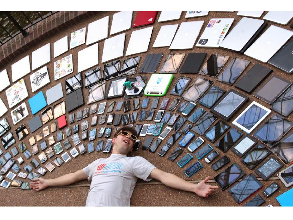
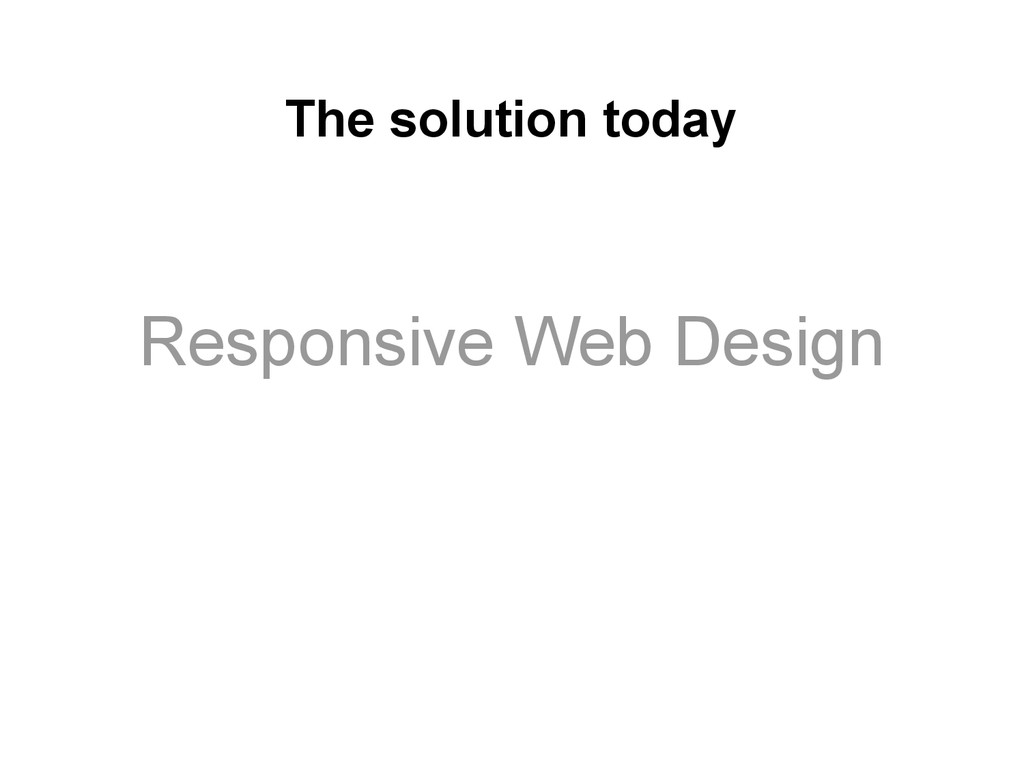
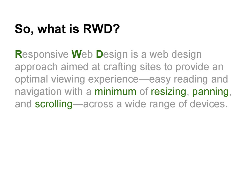
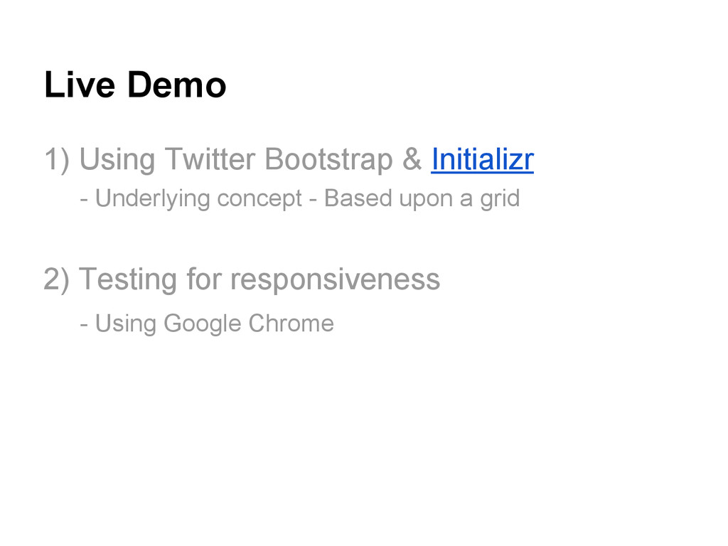
Browsers are more than likely to be the future of ubiquitous computing interfaces for a long time to come. Without responsive web design, we would be fighting a lost battle. In this presentation, I give a brief overview of responsive web design, enough to learn about the reason for its existence and tools that can help you get started.

Avatar for Ryan Sukale

Ryan Sukale

March 07, 2014
Tweet

More Decks by Ryan Sukale

Other Decks in Technology

Transcript

  1. As beautiful as it might seem at first, It soon

    turns into a developer’s nightmare. And a critical business problem.
  2. Mark Weiser had proposed screens to be available in three

    different size ranges. The market reality is that the screen sizes are more fragmented than is desirable.
  3. A quick historical note When - Aug 6, 1991 Who

    - Sir Tim Berners Lee What - The world’s first web page
  4. The web (contd..) Earlier, websites were only designed for the

    desktop experience - with fixed screen sized. As more and more mobile devices emerged, users who accessed a site had to horizontally scroll, and sometimes even zoom in to access content Result - A Bad User Experience
  5. The first solution Create a different website for each medium

    A desktop version e.g. mysite.com A mobile version e.g. m.mysite.com
  6. But wait! The new samsung galaxy has a larger screen

    size! The new iPhone fakes it screen size! All devices are used in different orientations! Did someone just mention a Phablet!!
  7. The problems don’t end there.. • How many developers to

    we need to maintain sites on different devices? • How do we know if new device will play well with our existing mobile site? • How can we launch once but run on all platforms? • What about analytics? Aren’t all the sites essentially showing the same content?
  8. So, what is RWD? Responsive Web Design is a web

    design approach aimed at crafting sites to provide an optimal viewing experience—easy reading and navigation with a minimum of resizing, panning, and scrolling—across a wide range of devices.
  9. The concepts involved Browser viewport (aka. the visible area) Media

    queries (aka visible area dimension detection) Fluid Layouts (aka. content blocks can shift positions)
  10. What can a device tell you? CSS 3 lets you

    query the following attributes of a device • max-width • min-width • orientation • color • device-width • resolution
  11. What else do you need to know? Size range of

    common devices. Common thresholds.
  12. What to do with this knowledge? Use a different CSS

    stylesheet for different device size ranges <link rel="stylesheet" type="text/css" media="screen and (max-device-width: 480px)" href="small.css" /> <link rel="stylesheet" type="text/css" media="screen and (max-device-width: 1200px)" href="medium.css" /> OR
  13. What to do (contd..) Change CSS classes depending upon device

    size /* Small screens (default) */ html { font-size: 100%; } /* Medium screens (640px) */ @media (min-width: 40rem) { html { font-size: 112%; } } /* Large screens (1024px) */ @media (min-width: 64rem) { html { font-size: 120%; } }
  14. Choosing a mobile strategy Graceful Degradation (Bad) - Design for

    the best - throw some scrap at the rest. Progressive Enhancement (Good) - Design for a base, provide enhanced functionality for devices that support the latest features
  15. You have friends! Use Responsive design frameworks - Bootstrap -

    by Twitter. - Foundation - by Zurb. - Pure - by Yahoo.
  16. A historical note When : 2011 Who : The boston

    globe What : One of the first responsive websites (As reported here) **Thats exactly 20 years after the first website was created**
  17. Live Demo 1) Using Twitter Bootstrap & Initializr - Underlying

    concept - Based upon a grid 2) Testing for responsiveness - Using Google Chrome