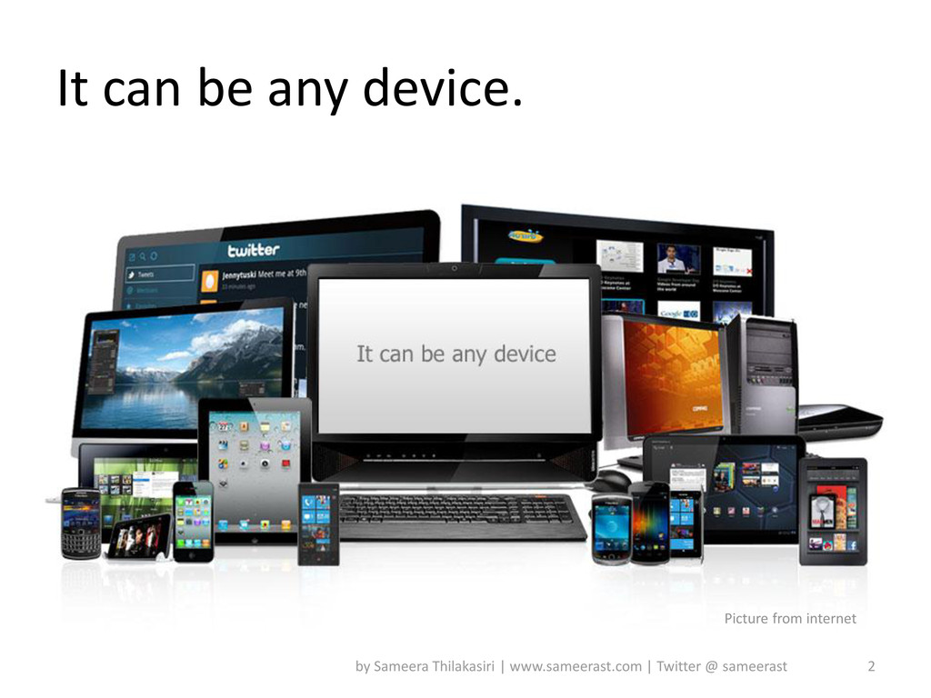
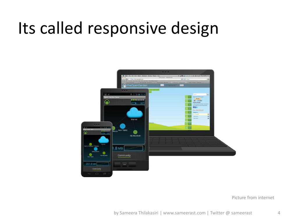
(1024x768)? Stop that! It makes you look foolish in the changing world of the Web. • Responsive Web Design is like a shiny new toy for designers and developers. It is difficult to overestimate the importance of sensible design, as it ensures that any website will look good on different screen resolutions. I think everyone will agree with me that the first thing every designer worth his salt should do is get familiar with web design response. 3 by Sameera Thilakasiri | www.sameerast.com | Twitter @ sameerast
forget style fixed width and centered on the content. This means that all elements of our design is resized in correlation. The basic idea of a fluid grid to use this formula for the calculation of the percentage proportions of design. target / context = result .sidebar { width:31.5%; } 5 by Sameera Thilakasiri | www.sameerast.com | Twitter @ sameerast
We stop using pixel sizes based on the time we use em or percentages. 14 pixels - the body font size; 21 pixels - the H1 font size; 21 ⁄ 14 = 1.5 Your CSS will look like: h1 { font-size:1.5em; } 6 by Sameera Thilakasiri | www.sameerast.com | Twitter @ sameerast
size setting father. The main idea is to use unobvious properties {max-width: 100%}. An image with img {max-width: 100%} will never get out of your head unit. If the die block is less than the size of img then the image is reduced proportionally. This principle applies to images, objects and video. • The usage of fluid images causes the adjustment of the size to the parent block. The main idea is in the unobvious usage of the properties of {max-width: 100%}. An image with img {max-width: 100%} will never come out from its parent unit. If the parent block is smaller than the size of img then the image is reduced proportionally. This principle applies to images,objects and video. Inaddition to that {display: block;} is used to avoid parent float issues. Keep in mind media query can be excuted only at latest browsers as it is part of CSS3. 7 by Sameera Thilakasiri | www.sameerast.com | Twitter @ sameerast
image sizing. This technique basically consists of having different sizes of an image, and displaying only the size adapted to the device. Quick example: <img src="image.jpg" data-src-600px="image- 600px.jpg" data-src-800px="image-800px.jpg" alt=""> And the related CSS: @media (min-device-width:600px) { img[data-src- 600px] { content: attr(data-src-600px, url); } } 8 by Sameera Thilakasiri | www.sameerast.com | Twitter @ sameerast
in order to show the optimized layout for the very resolution, which at the time was surfed the site. It is a part of the CSS standard, which allows to apply styles based on information about the device resolution. @media screen and (mas-width:980px){ /*styles*/ } 9 by Sameera Thilakasiri | www.sameerast.com | Twitter @ sameerast
320px(iPhone portrait, default), 480px (iPhone landscape), 600px, 768px(iPad portrait), 900px, 1024px (iPad landscape). • I strongly recommend to consider all these screen resolutions if you want to make your design a responsive one. 10 by Sameera Thilakasiri | www.sameerast.com | Twitter @ sameerast
we should do is to include a meta tag "viewport" into <head> to tell the browser that this webpage is optimized for mobile. <meta name="viewport" content="width=device- width, initial-scale=1.0"> 11 by Sameera Thilakasiri | www.sameerast.com | Twitter @ sameerast
useful tool when it comes to web development. Lots of jQuery plugins can help you to create better responsive websites. A quick round up of my personal favorites: • FitText: A plugin that makes font-sizes flexible. • Elastislide: A responsive jQuery carousel plugin. • Supersized: A full screen background slideshow plugin. • FitVids: A lightweight, easy-to-use jQuery plugin for fluid width video embeds. 12 by Sameera Thilakasiri | www.sameerast.com | Twitter @ sameerast
Specialist in UI, UX, SEO, IA, IxD, RWD. He is blogging technical areas while is leisure. He can be reached by http://www.sameerast.com 14 by Sameera Thilakasiri | www.sameerast.com | Twitter @ sameerast
 sameerast
 hacobu
 abnoumaru
 scrummasudar
 srenext
 ykagano
 shift_evolve
 hr01
hr01
 watany
 kazzpapa3
 amanda_hinchman
 yuukiyo
 hinac0
 honzajavorek
 lara
lara
 productmarketing
 62gerente
 eitanlees
 sergeychernyshev
 deanohume
 minecr
 skoyamalab
 bcantrill
 aleyda