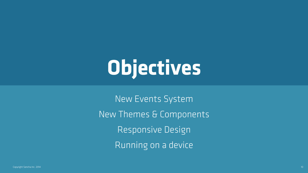
Optimizing your current Ext JS applications for touch and tablets
While there are so many reasons to upgrade your existing Ext JS 4 apps to Ext JS 5, by far, the most exciting is the ability to add support for gestures and events that make your existing app touch-friendly without needing to do a complete rewrite.
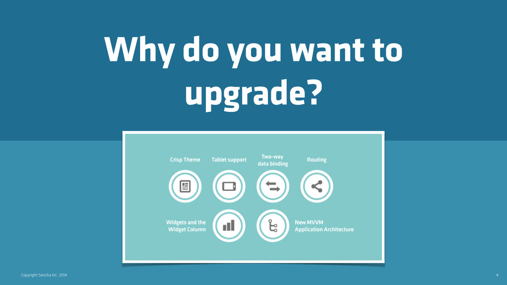
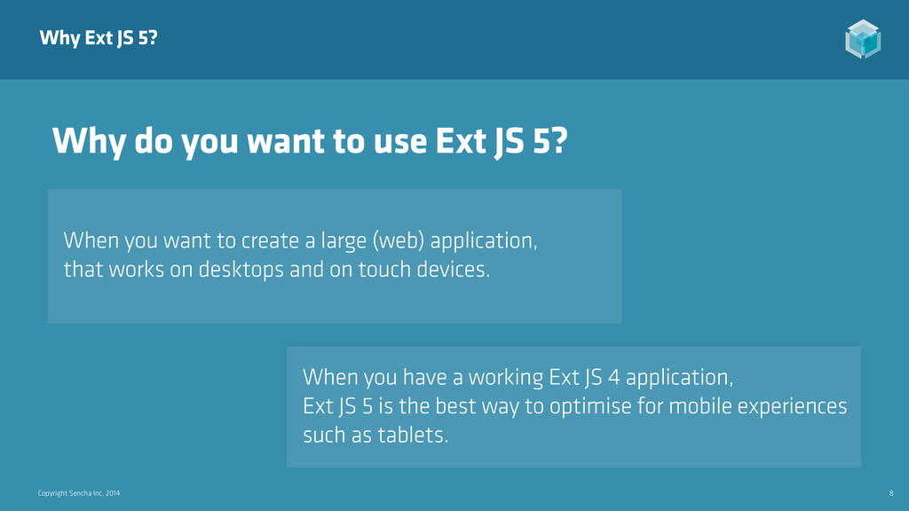
you want to create a large (web) application, that works on desktops and on touch devices. When you have a working Ext JS 4 application, Ext JS 5 is the best way to optimise for mobile experiences such as tablets. Why do you want to use Ext JS 5?
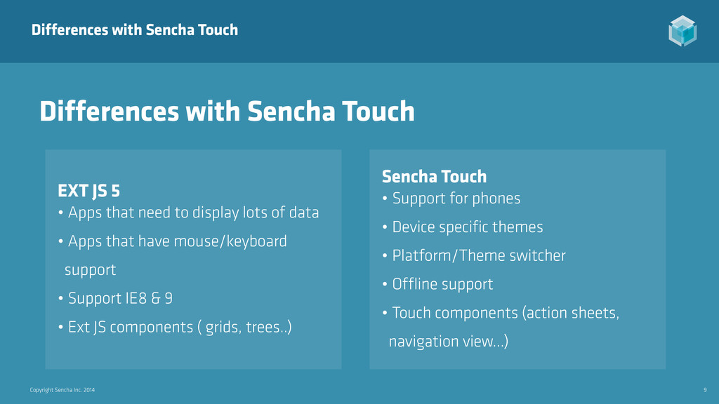
JS 5 • Apps that need to display lots of data • Apps that have mouse/keyboard support • Support IE8 & 9 • Ext JS components ( grids, trees..) Differences with Sencha Touch Sencha Touch • Support for phones • Device specific themes • Platform/Theme switcher • Offline support • Touch components (action sheets, navigation view…)
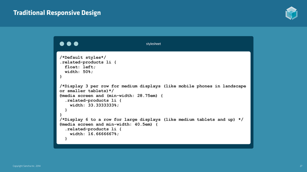
.related-products li { float: left; width: 50%; } /*Display 3 per row for medium displays (like mobile phones in landscape or smaller tablets)*/ @media screen and (min-width: 28.75em) { .related-products li { width: 33.3333333%; } } /*Display 6 to a row for large displays (like medium tablets and up) */ @media screen and min-width: 40.5em) { .related-products li { width: 16.6666667%; } stylesheet
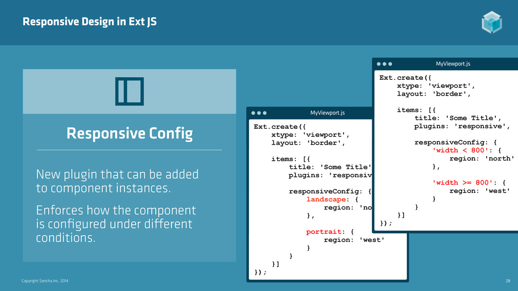
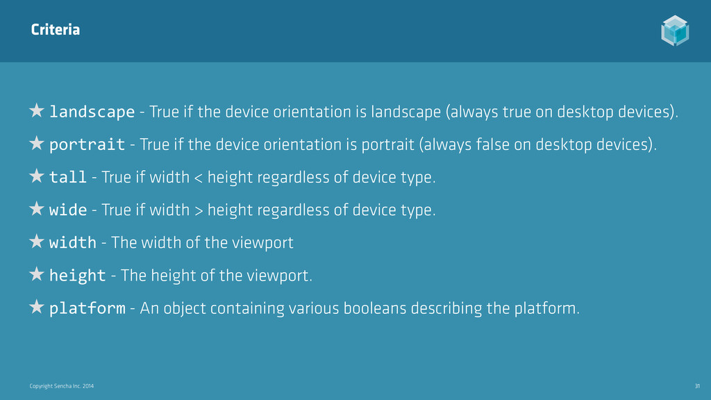
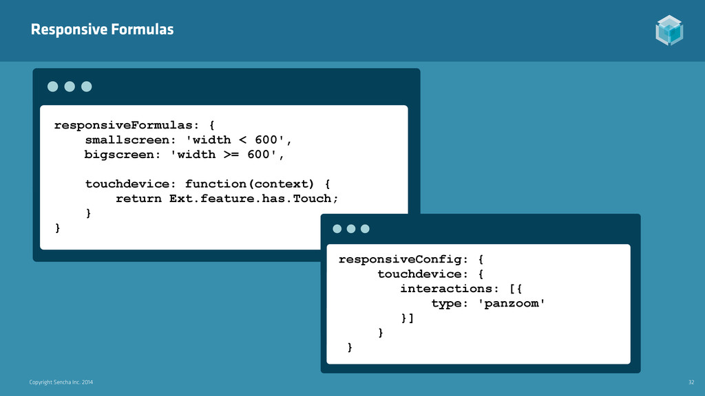
True if the device orientation is landscape (always true on desktop devices). ★ portrait - True if the device orientation is portrait (always false on desktop devices). ★ tall - True if width < height regardless of device type. ★ wide - True if width > height regardless of device type. ★ width - The width of the viewport ★ height - The height of the viewport. ★ platform - An object containing various booleans describing the platform.
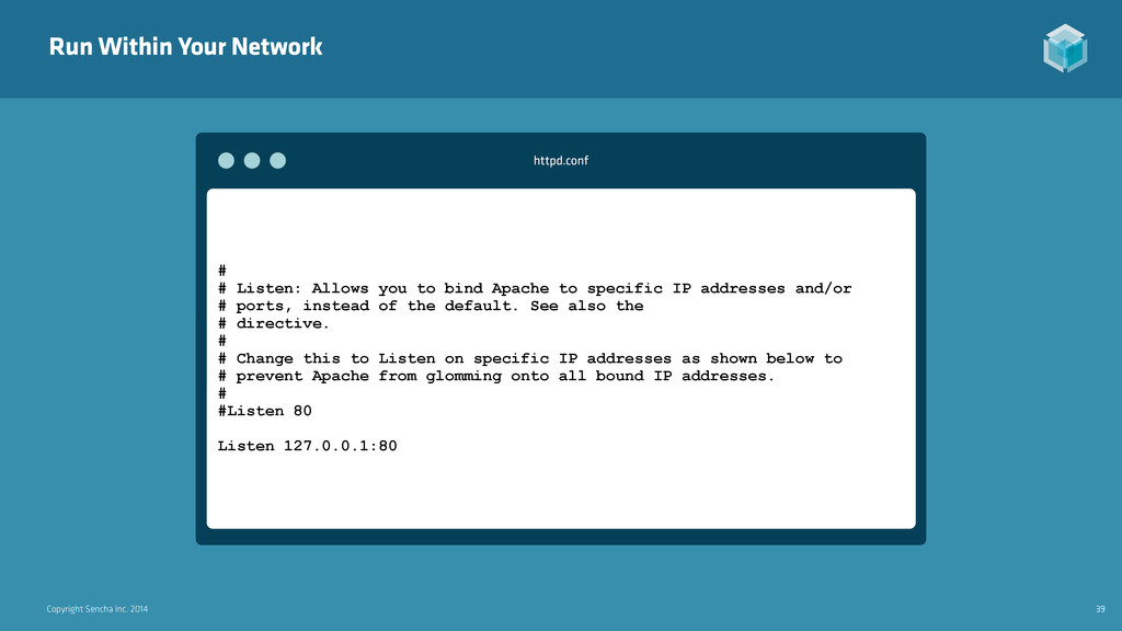
# # Listen: Allows you to bind Apache to specific IP addresses and/or # ports, instead of the default. See also the # directive. # # Change this to Listen on specific IP addresses as shown below to # prevent Apache from glomming onto all bound IP addresses. # #Listen 80 Listen 127.0.0.1:80 httpd.conf
 savelee
 nwiizo
 ken6377
 jnchito
 kanny
kanny
 shuadachi
 iotcomjpadmin
 naitosatoshi
 maruloop
 eller86
 a_ono
a_ono
 fossamagna
 yakumo
 marktimemedia
 schroneko
 garrettdimon
 kimpetersen
 davidcarrasco
 caitiem20
 lindahogenes
 paigeccino
 irinanazarova
 palkan
 chrislema
 keavy
keavy
![Copyright Sencha Inc. 2014 2 [email protected] ladysign http://www.ladysign-apps.com http://speakerdeck.com/savelee Lee](https://files.speakerdeck.com/presentations/6d42b1605b910132958b5acb03821d2a/slide_1.jpg)