Design (RWD) Problems… – Subtractive solution means too many resources – All JS code is running On Platform that is least suited to handle it – Images are loaded but hidden
Philosophy created by Luke Wroblewski* – Focuses on Progressive Enhancement Where RWD is typically Graceful Degradation – Scales Up…not down * http://www.lukew.com
Don't include anything that isn't needed – Add StyleSheets, Images and Script as scaling up – Measure, measure, measure… – Mobile is important…or perhaps critical to success
Practical… Mobile-First Important in Most Cases – But not all… Scale the effort to the size of the project E.g. Joe's Pizza doesn't matter as much as Large Enterprise
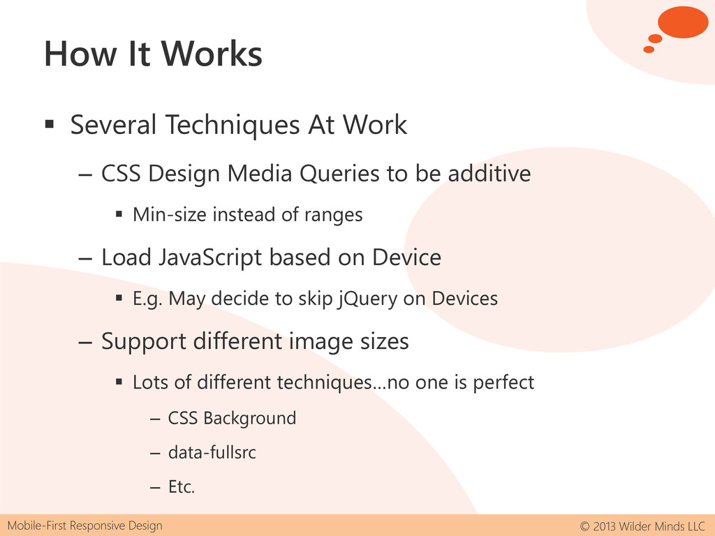
Works Several Techniques At Work – CSS Design Media Queries to be additive Min-size instead of ranges – Load JavaScript based on Device E.g. May decide to skip jQuery on Devices – Support different image sizes Lots of different techniques…no one is perfect – CSS Background – data-fullsrc – Etc.
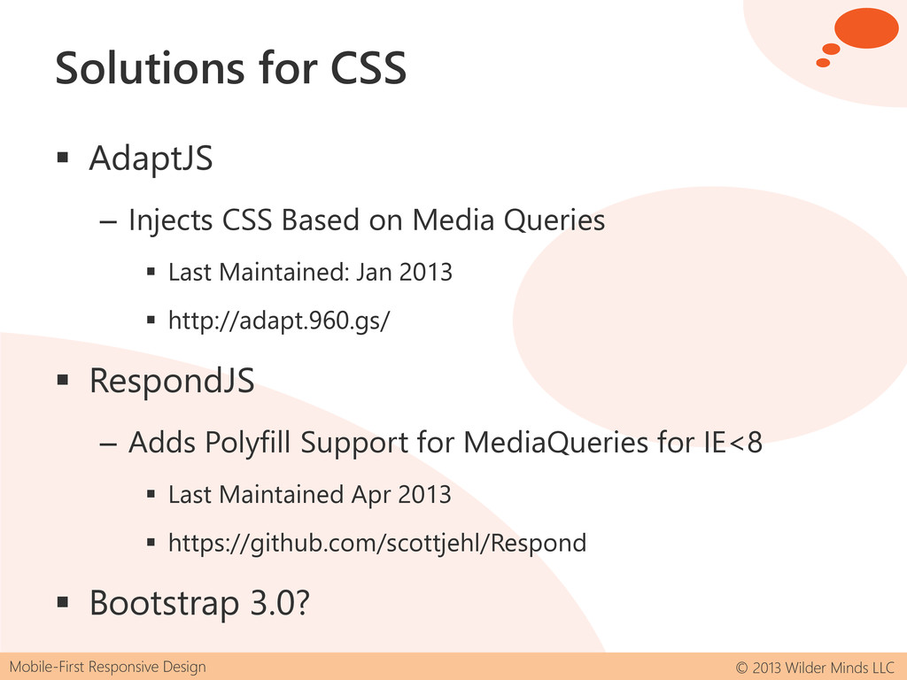
CSS AdaptJS – Injects CSS Based on Media Queries Last Maintained: Jan 2013 http://adapt.960.gs/ RespondJS – Adds Polyfill Support for MediaQueries for IE<8 Last Maintained Apr 2013 https://github.com/scottjehl/Respond Bootstrap 3.0?
JavaScript/CSS EnhanceJS – Injects CSS/JS Based on Media Queries Last maintained: Aug 2010 https://code.google.com/p/enhancejs Backend still a solution – But limited dynamic support
This demo and slides will be available: – http://wildermuth.com Important Links – Luke Wroblewski's Site http://www.lukew.com – Brad Frost's Mobile First: http://shawnw.me/13nHtOu – Jason Brigsby Article: http://shawnw.me/11vMlhG My Company – http://wilderminds.com
 shawnwildermuth
 shotatsuge
 eller86
 isaoshimizu
 nealle
 moznion
 y150saya
 hayama17
 kentarofujii
 sugupoko
 kazu_kichi_67
 ks91
ks91
 lycorptech_jp
 emna__ayadi
 cassininazir
 afnizarnur
 akademiya2063
 eileencodes
 jnunemaker
 techseoconnect
 mlcsv
mlcsv
 kastner
 ryanjones
 codingconduct
 aleyda