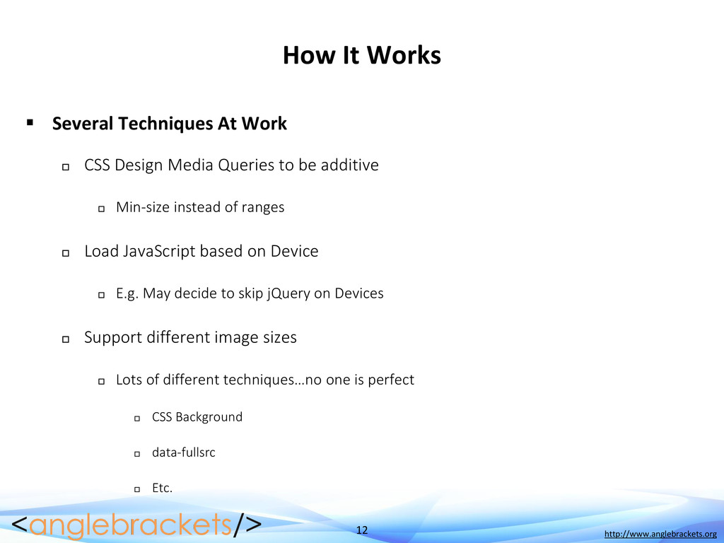
CSS Design Media Queries to be additive Min-size instead of ranges Load JavaScript based on Device E.g. May decide to skip jQuery on Devices Support different image sizes Lots of different techniques…no one is perfect CSS Background data-fullsrc Etc.
Can Slow You Down Should You Load all JavaScript or CSS? Maybe not… You can do it on demand… Can over-complicate the code Please use sparingly…
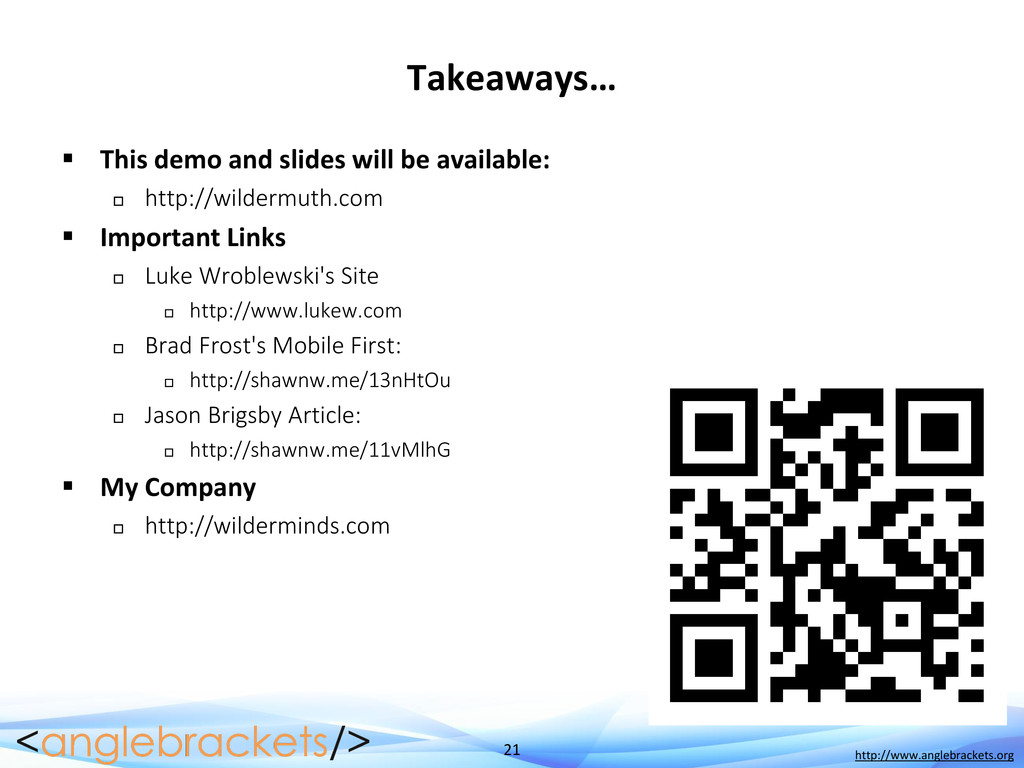
available: http://wildermuth.com Important Links Luke Wroblewski's Site http://www.lukew.com Brad Frost's Mobile First: http://shawnw.me/13nHtOu Jason Brigsby Article: http://shawnw.me/11vMlhG My Company http://wilderminds.com
 shawnwildermuth
 k1mu21
 hjmkth
 wagyu
wagyu
 nakahara
 16bitidol
 kishida
 kajitack
 ochtum
 wakana0222
 rollbear
 rkaga
rkaga
 hollycummins
 samtorres
 cassininazir
 uxyall
 rasmusluckow
 marktimemedia
 katarinadahlin
 pwiseman
 marcelosomers
 lemiorhan
 lauravandoore
 apolaine
 addyosmani