Upgrade to Pro
— share decks privately, control downloads, hide ads and more …
Speaker Deck
Features
Speaker Deck
PRO
Sign in
Sign up for free
Search
Search
(responsive) webdesign
Search
simoncoudeville
February 24, 2012
Design
1.1k
13
Share
Embed
Copy iframe code
Copy JS code
Copy link
Start on current slide
(responsive) webdesign
simoncoudeville
February 24, 2012
Other Decks in Design
See All in Design
第18回サイゼミ
lw
1
4k
「見せる」登壇資料デザインの極意
takanorip
4
1.1k
Decksh keywords
ajstarks
0
100
はじめての演奏会フライヤーデザイン
chorkaichan
1
320
JBUG大阪#9_登壇資料_引き継ぎで困らないためのBacklogWikiの整え方_ミスと属人化を防ぐために、 “次の人が動ける状態”をどう残すか
webnaut
1
170
ISO 9241-171:2025っていうのがあってな
shosira
1
200
広い関与の可能性に どう向き合うのか? 私たちは。|Timee MarketingDesign 2026-06-18
bebe
0
230
Design dependencies
teba_eleven
0
130
2026_01_07_3DプリントはじめましたLT.pdf
hideakitakechi
0
220
社長の宿題への回答 「新卒×AI」が生み出す価値
saki822
2
170
改正JISを見据えた、企業のアクセシビリティ対応ロードマップ
securecat
1
410
AI時代に必要な アイデアの形
uxman
0
220
Featured
See All Featured
The #1 spot is gone: here's how to win anyway
tamaranovitovic
3
1.1k
Balancing Empowerment & Direction
lara
6
1.2k
Darren the Foodie - Storyboard
khoart
PRO
3
3.4k
10 Git Anti Patterns You Should be Aware of
lemiorhan
PRO
659
62k
JavaScript: Past, Present, and Future - NDC Porto 2020
reverentgeek
52
6k
The Spectacular Lies of Maps
axbom
PRO
1
840
実際に使うSQLの書き方 徹底解説 / pgcon21j-tutorial
soudai
PRO
201
75k
The agentic SEO stack - context over prompts
schlessera
0
830
Optimising Largest Contentful Paint
csswizardry
37
3.7k
Public Speaking Without Barfing On Your Shoes - THAT 2023
reverentgeek
1
440
Have SEOs Ruined the Internet? - User Awareness of SEO in 2025
akashhashmi
0
380
Leo the Paperboy
mayatellez
7
1.9k
Transcript
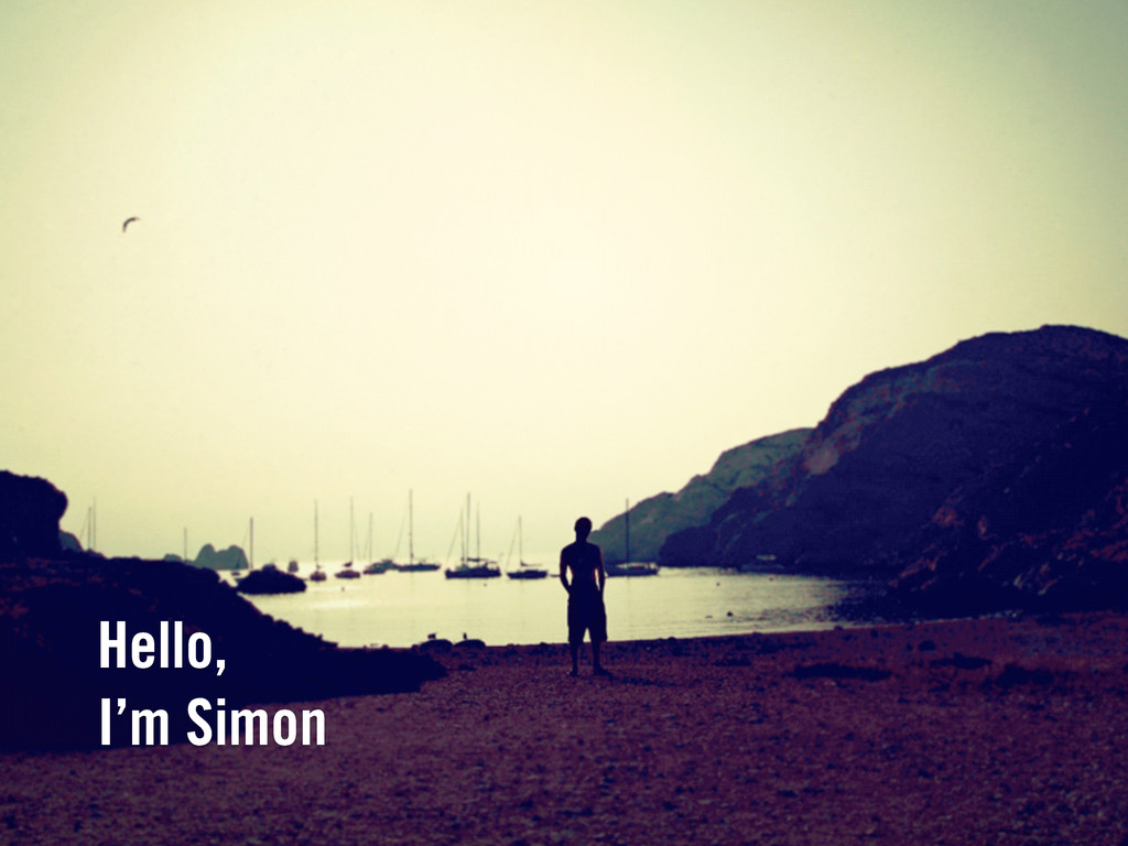
Hello, I’m Simon
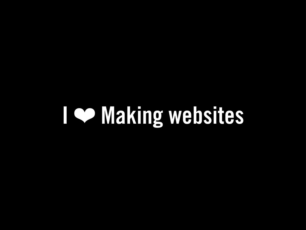
I ❤ Making websites
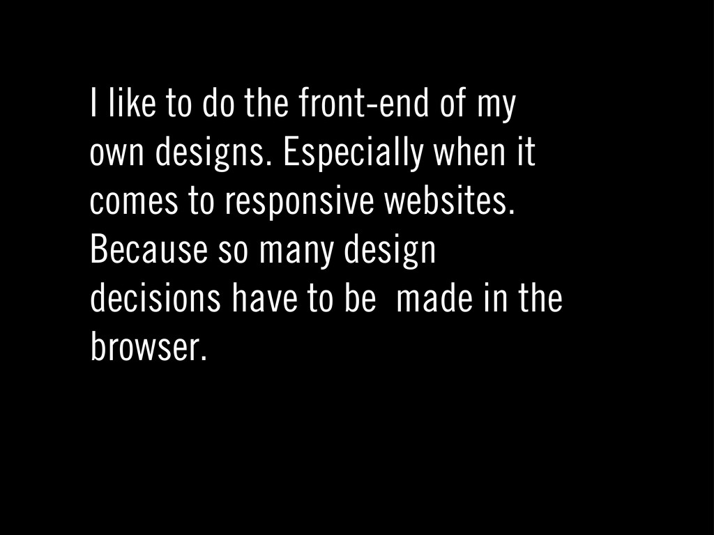
I like to do the front-end of my own designs.
Especially when it comes to responsive websites. Because so many design decisions have to be made in the browser.
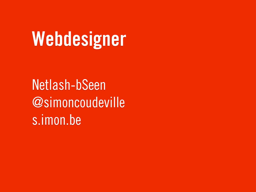
Webdesigner Netlash-bSeen @simoncoudeville s.imon.be
None
None
None
None
(responsive) webdesign
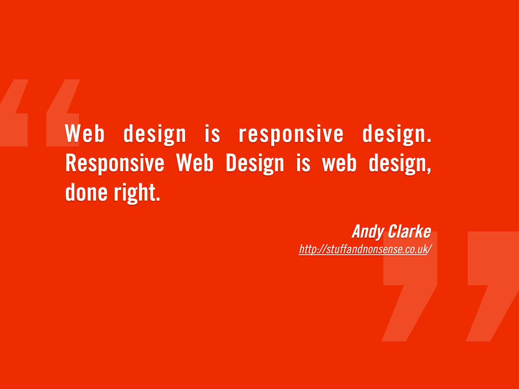
Andy Clarke http://stuffandnonsense.co.uk/ Web design is responsive design. Responsive Web
Design is web design, done right.
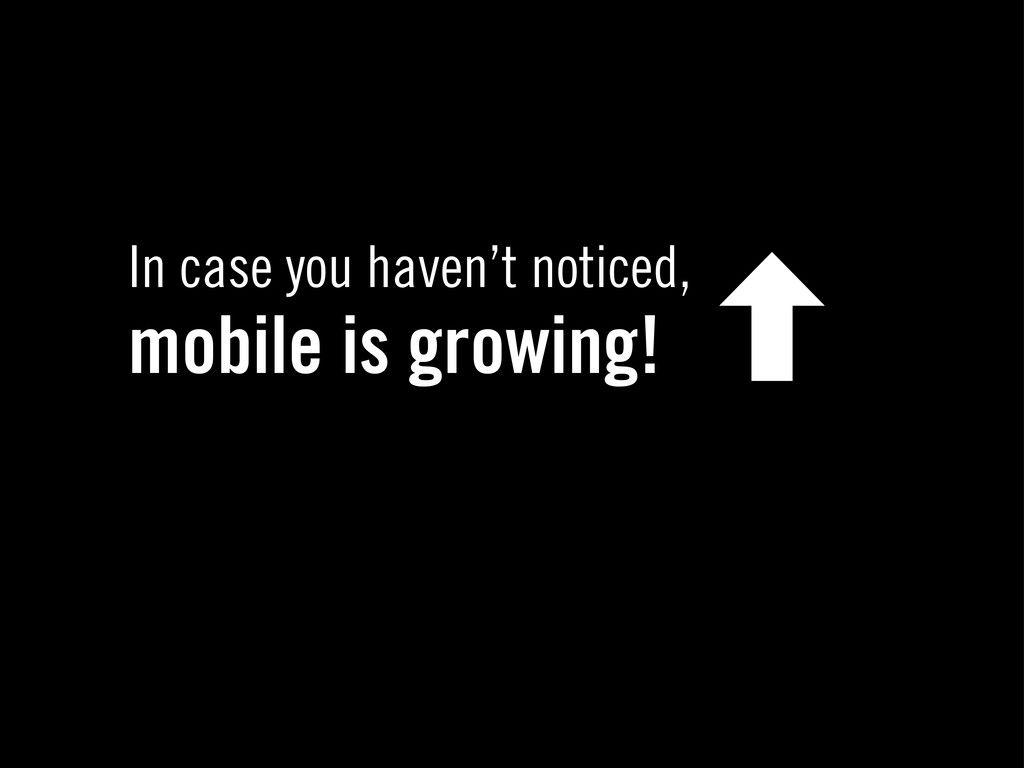
In case you haven’t noticed, mobile is growing! ‐
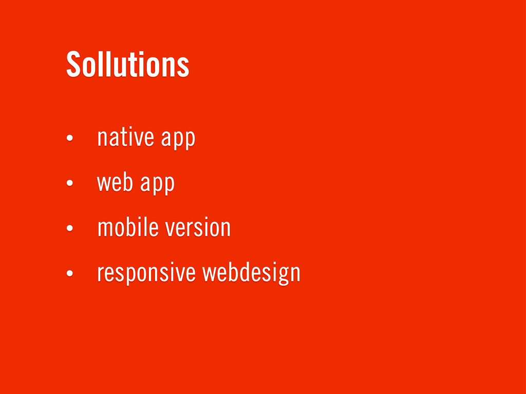
Sollutions • native app • web app • mobile version
• responsive webdesign
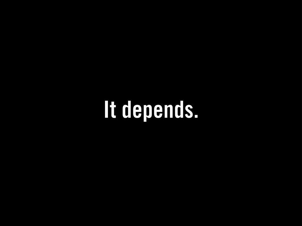
It depends.
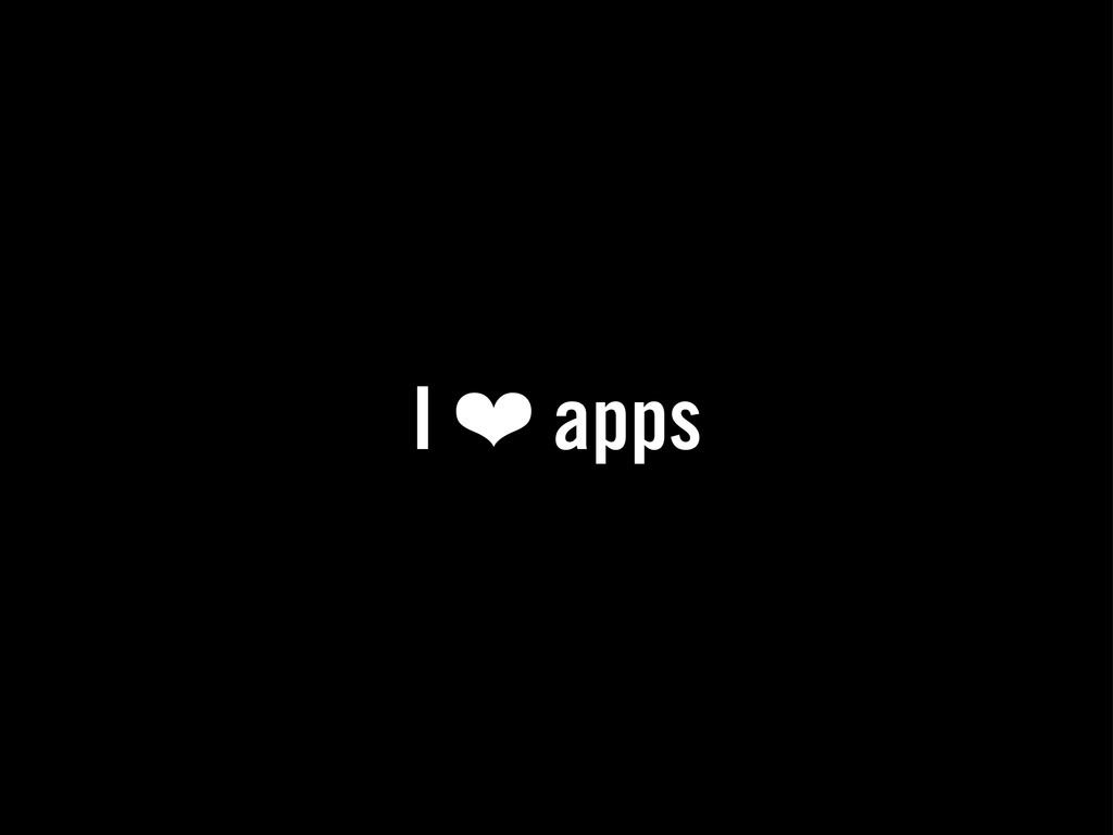
I ❤ apps
I ☠ mobile sites
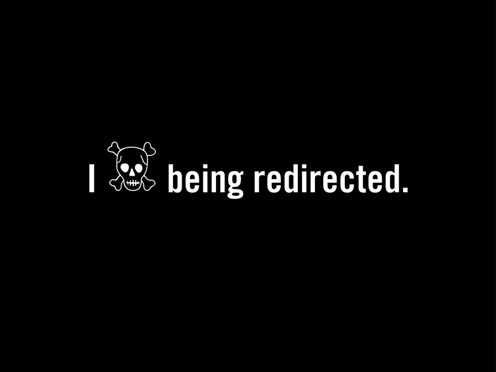
I ☠ being redirected.
Via, tweets, Facebook, bookmark, RSS readers, ...
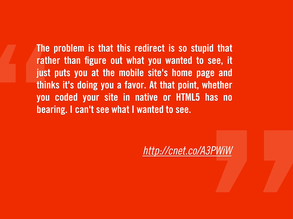
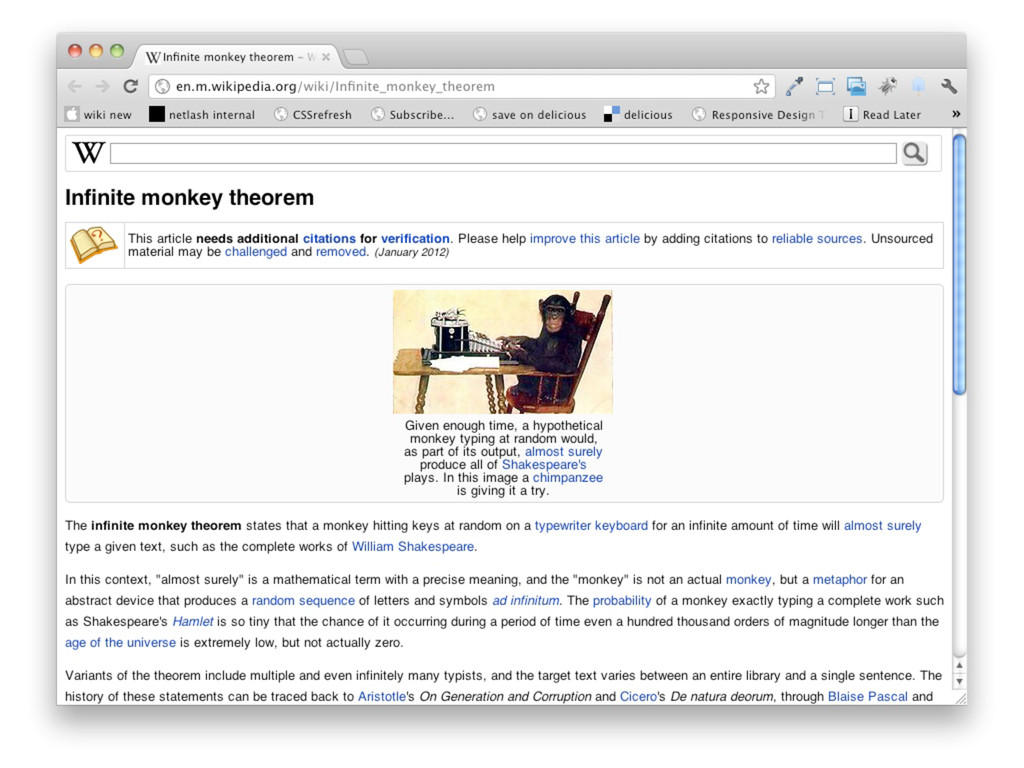
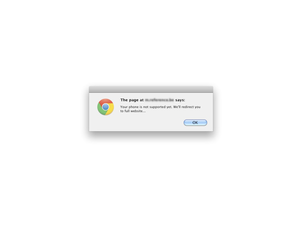
http://cnet.co/A3PWiW The problem is that this redirect is so stupid
that rather than figure out what you wanted to see, it just puts you at the mobile site's home page and thinks it's doing you a favor. At that point, whether you coded your site in native or HTML5 has no bearing. I can't see what I wanted to see.
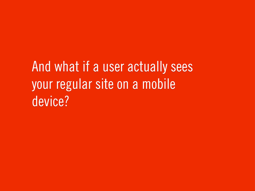
And what if a user actually sees your regular site
on a mobile device?
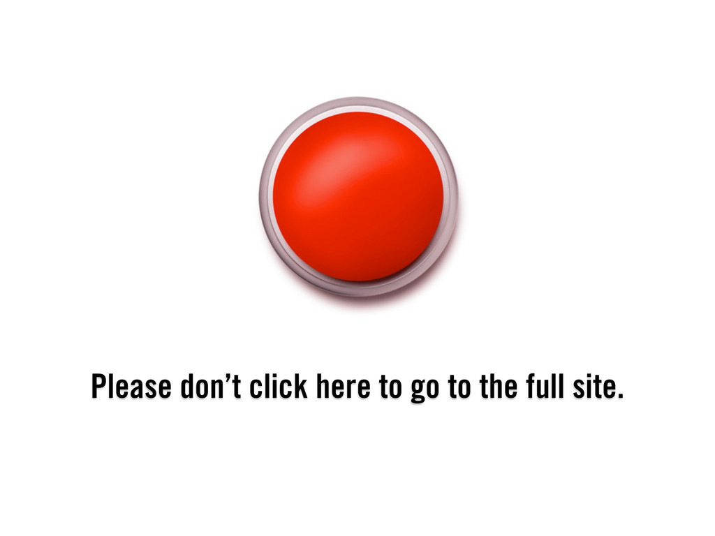
Please don’t click here to go to the full site.
↺ The other way around.
None
None
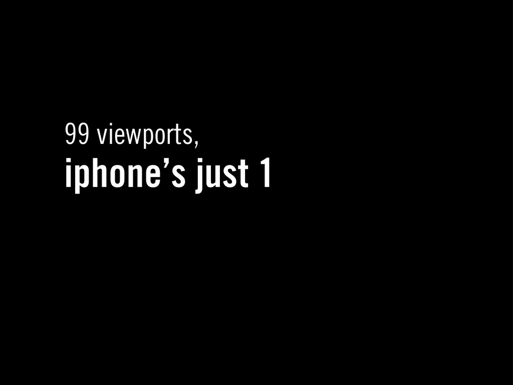
99 viewports, iphone’s just 1
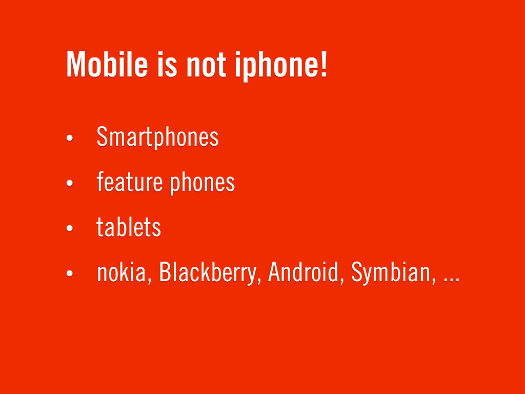
Mobile is not iphone! • Smartphones • feature phones •
tablets • nokia, Blackberry, Android, Symbian, ...
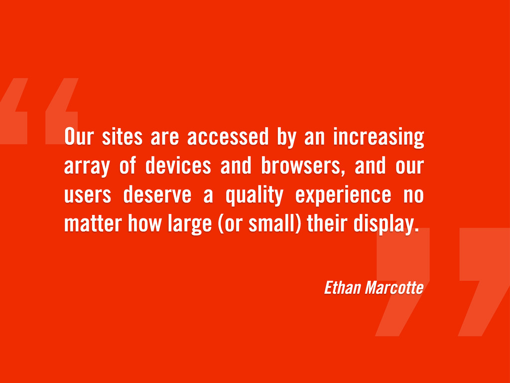
Ethan Marcotte Our sites are accessed by an increasing array
of devices and browsers, and our users deserve a quality experience no matter how large (or small) their display.
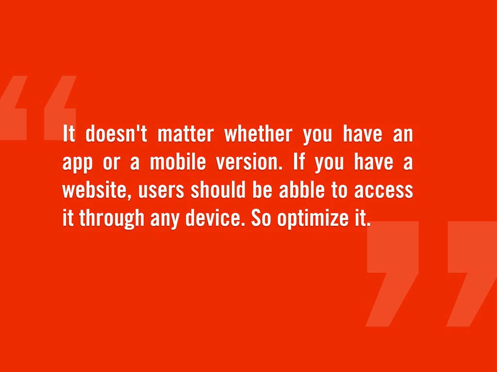
It doesn't matter whether you have an app or a
mobile version. If you have a website, users should be abble to access it through any device. So optimize it.
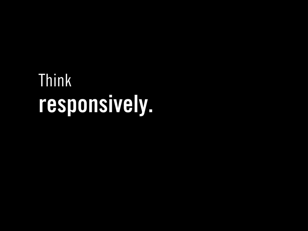
Think responsively.
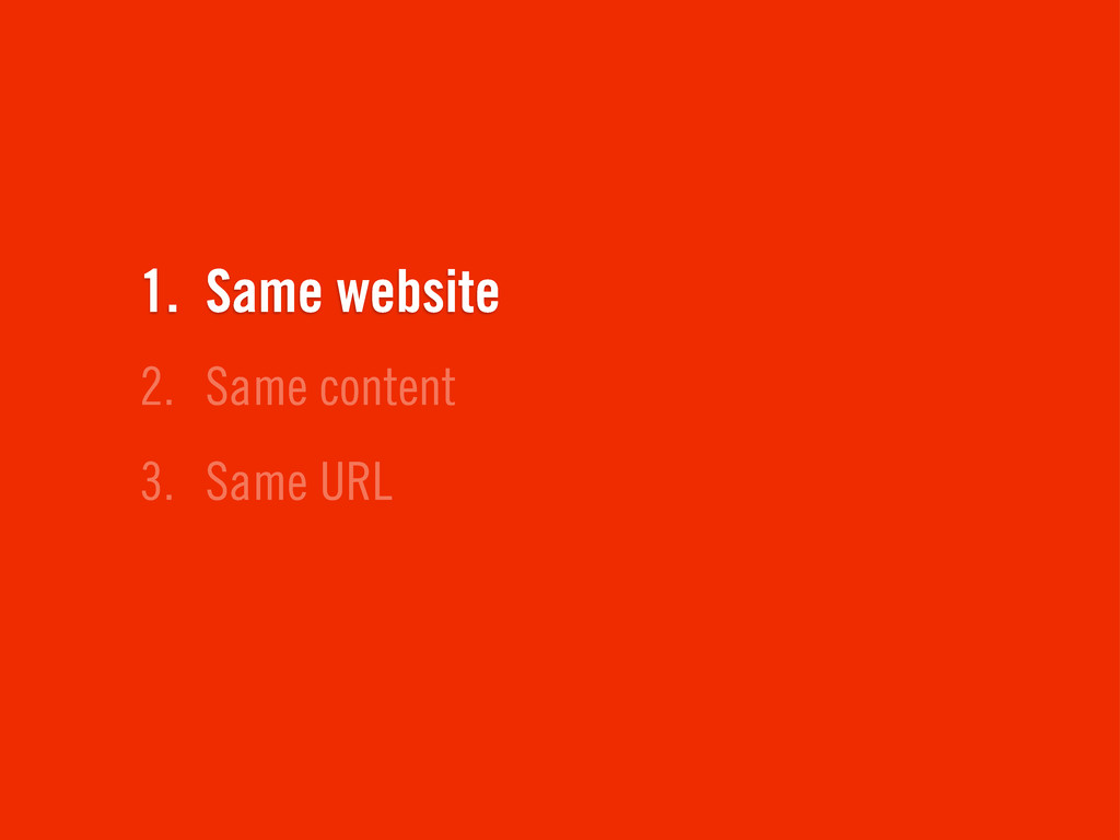
3. Same URL 2. Same content 1. Same website
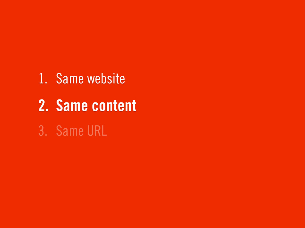
3. Same URL 2. Same content 1. Same website
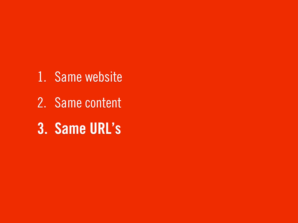
3. Same URL’s 2. Same content 1. Same website
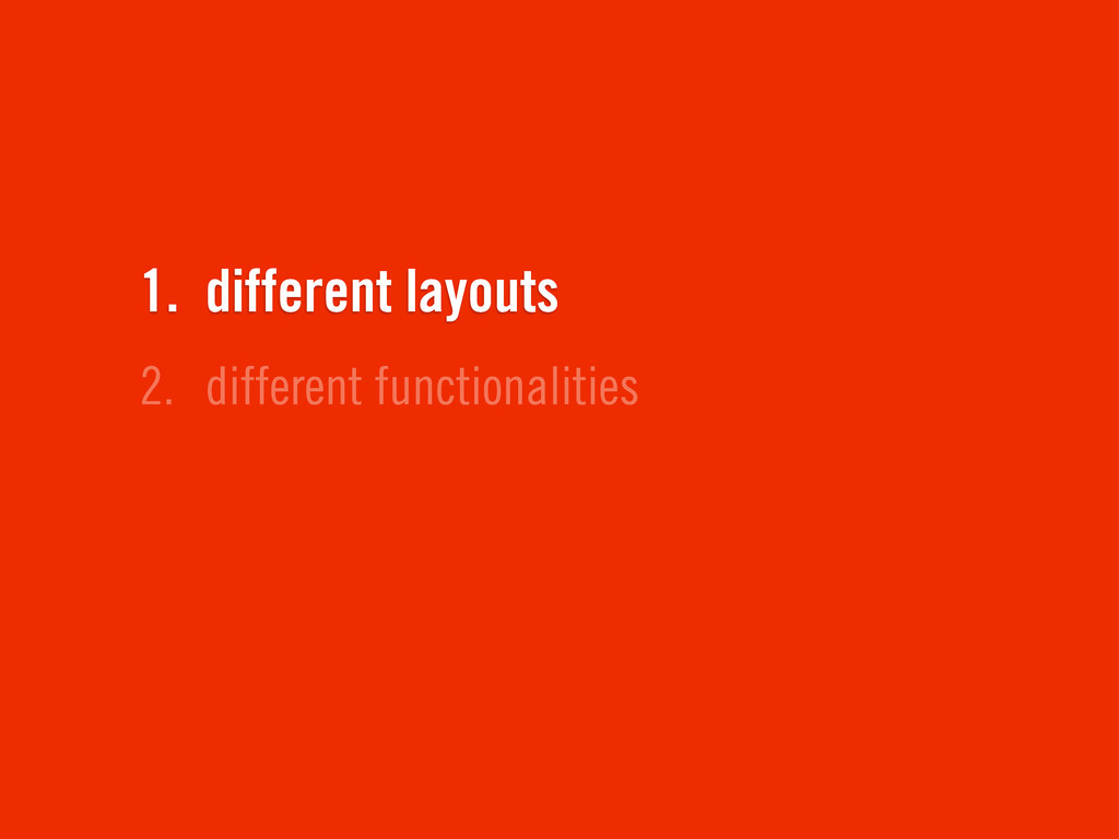
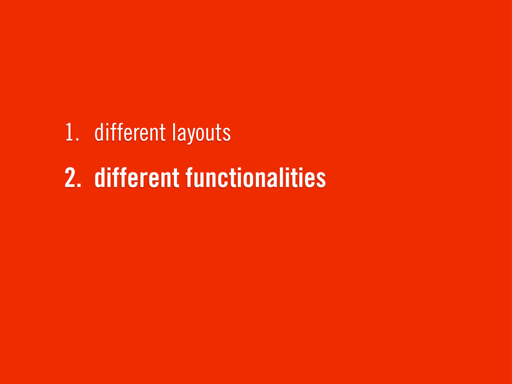
2. different functionalities 1. different layouts
2. different functionalities 1. different layouts
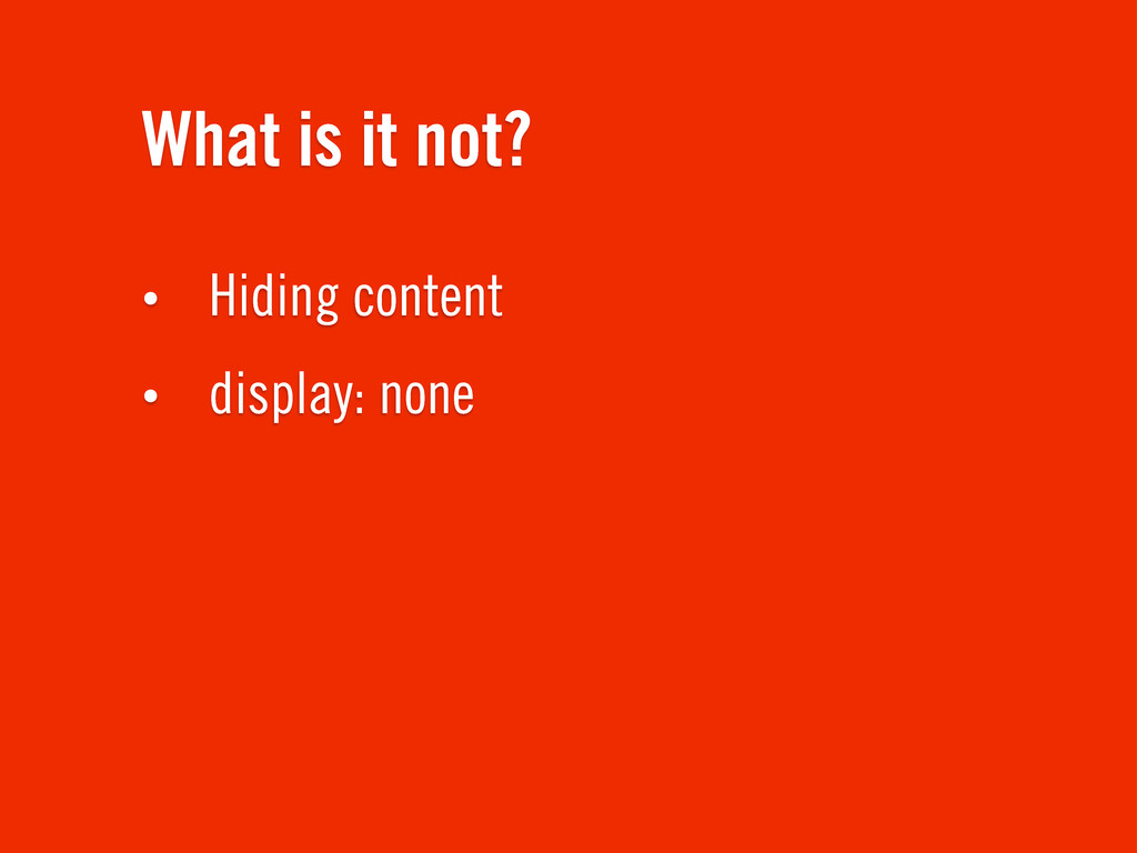
What is it not? • Hiding content • display: none
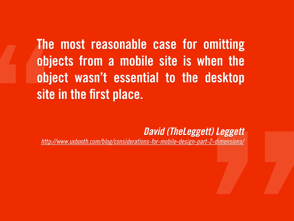
David (TheLeggett) Leggett http://www.uxbooth.com/blog/considerations-for-mobile-design-part-2-dimensions/ The most reasonable case for omitting
objects from a mobile site is when the object wasn’t essential to the desktop site in the first place.
The new road To enlightment.
how to start? (working draft)
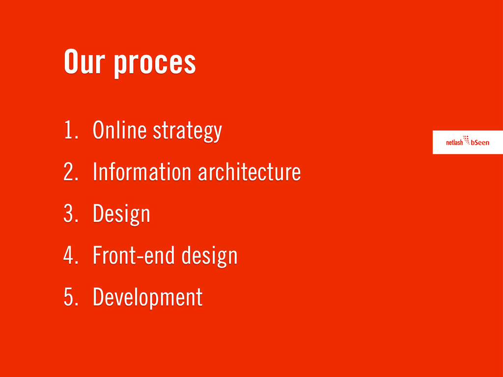
1. Online strategy 2. Information architecture 3. Design 4. Front-end
design 5. Development Our proces
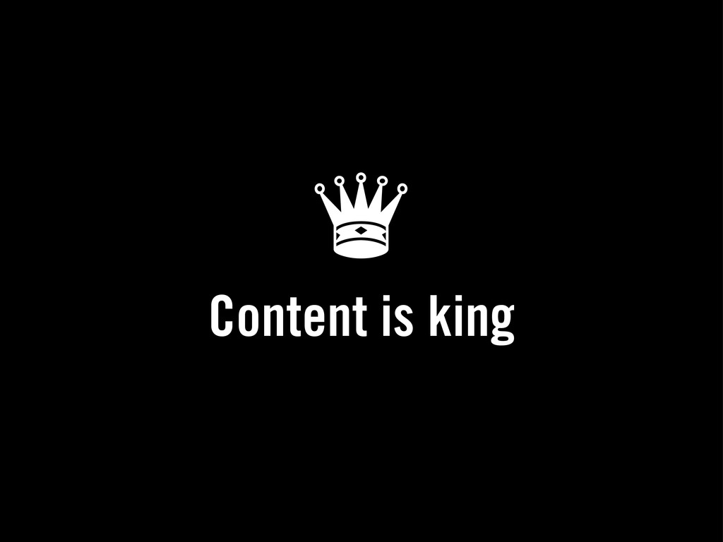
♛ Content is king
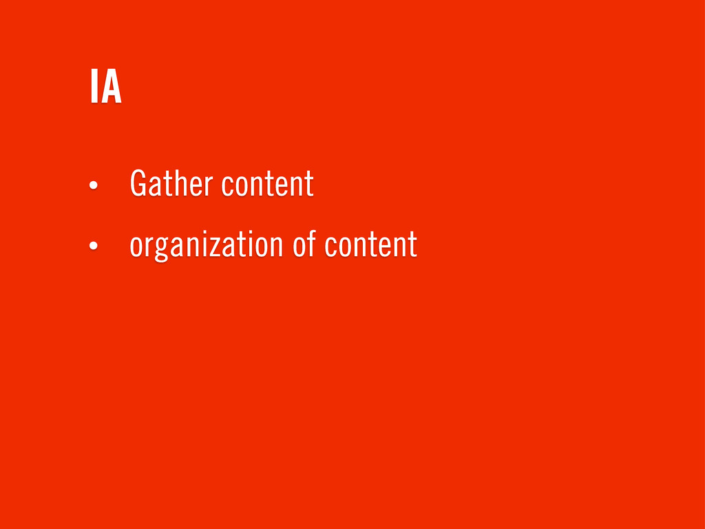
IA • Gather content • organization of content
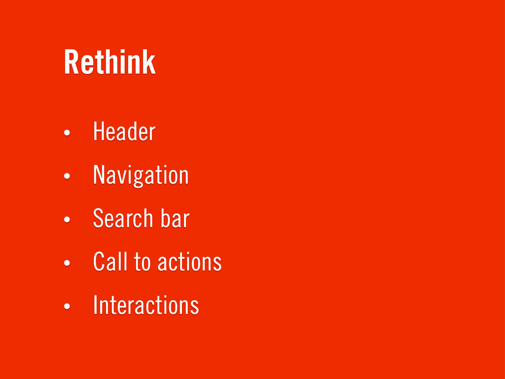
Rethink • Header • Navigation • Search bar • Call
to actions • Interactions
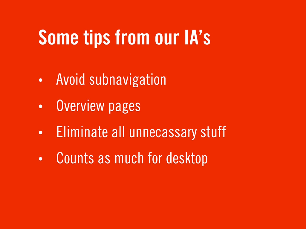
Some tips from our IA’s • Avoid subnavigation • Overview
pages • Eliminate all unnecassary stuff • Counts as much for desktop
✒ Design
Designing in the browser
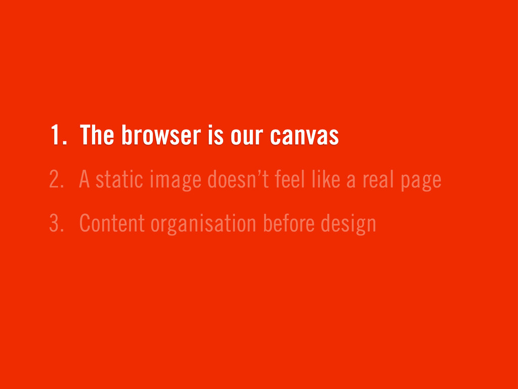
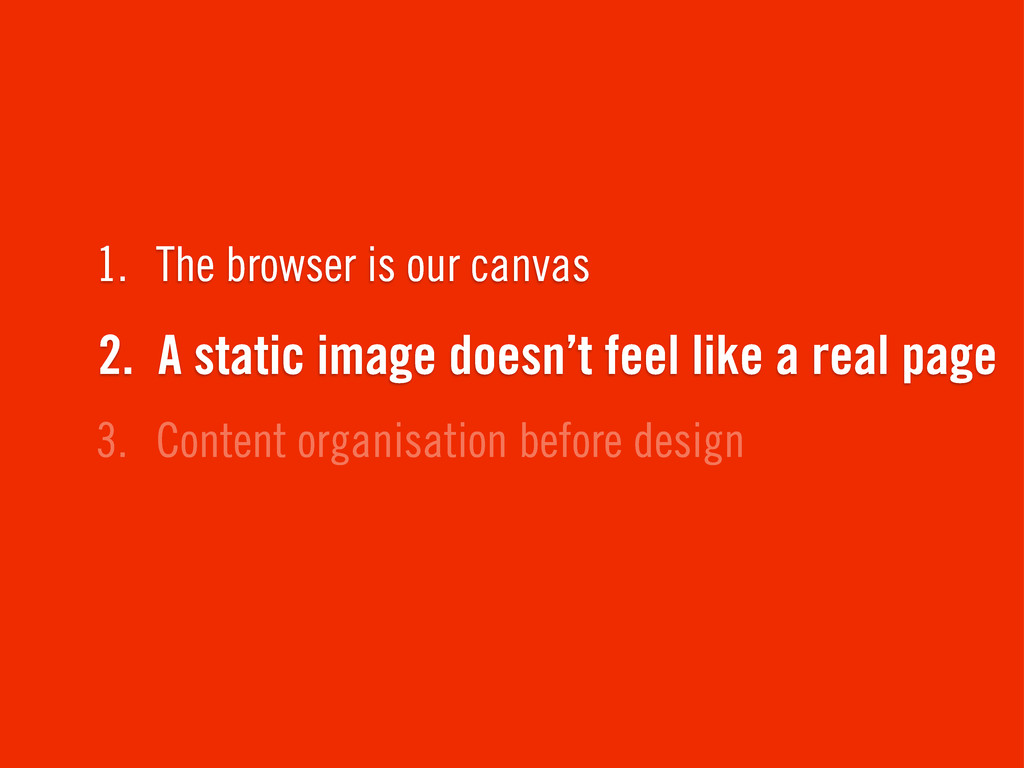
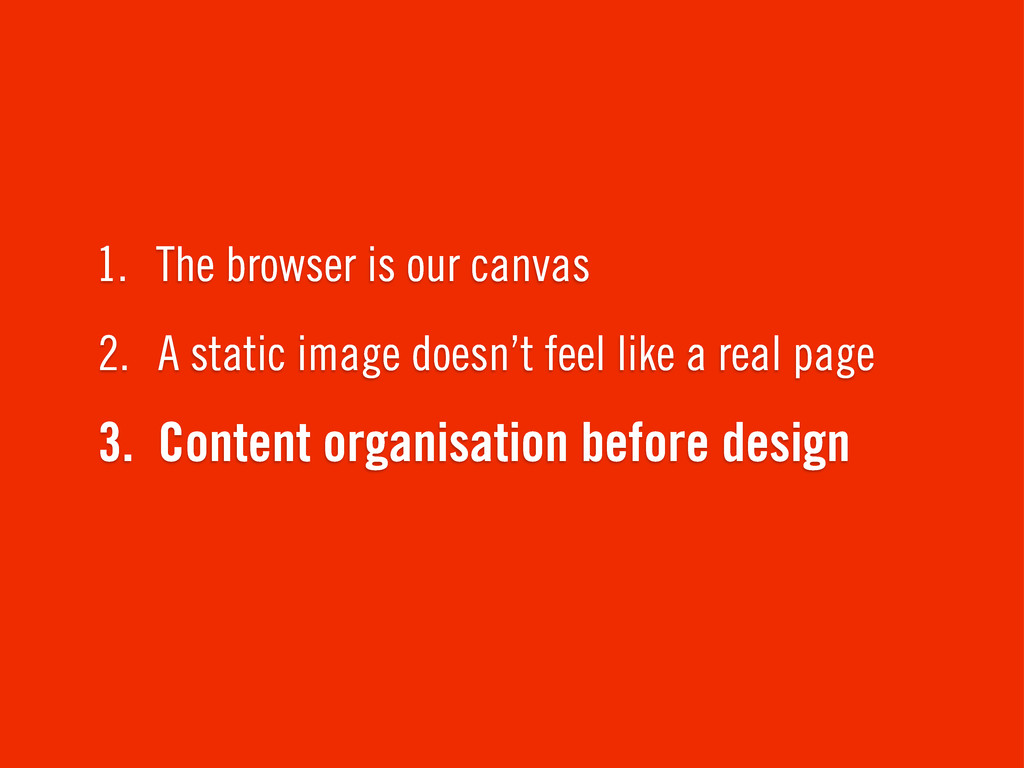
3. Content organisation before design 2. A static image doesn’t
feel like a real page 1. The browser is our canvas
3. Content organisation before design 2. A static image doesn’t
feel like a real page 1. The browser is our canvas
3. Content organisation before design 2. A static image doesn’t
feel like a real page 1. The browser is our canvas
Designing in photoshop
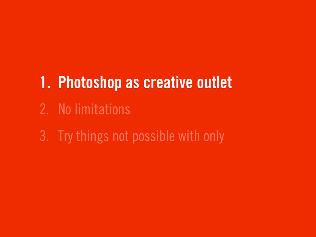
3. Try things not possible with only 2. No limitations
1. Photoshop as creative outlet
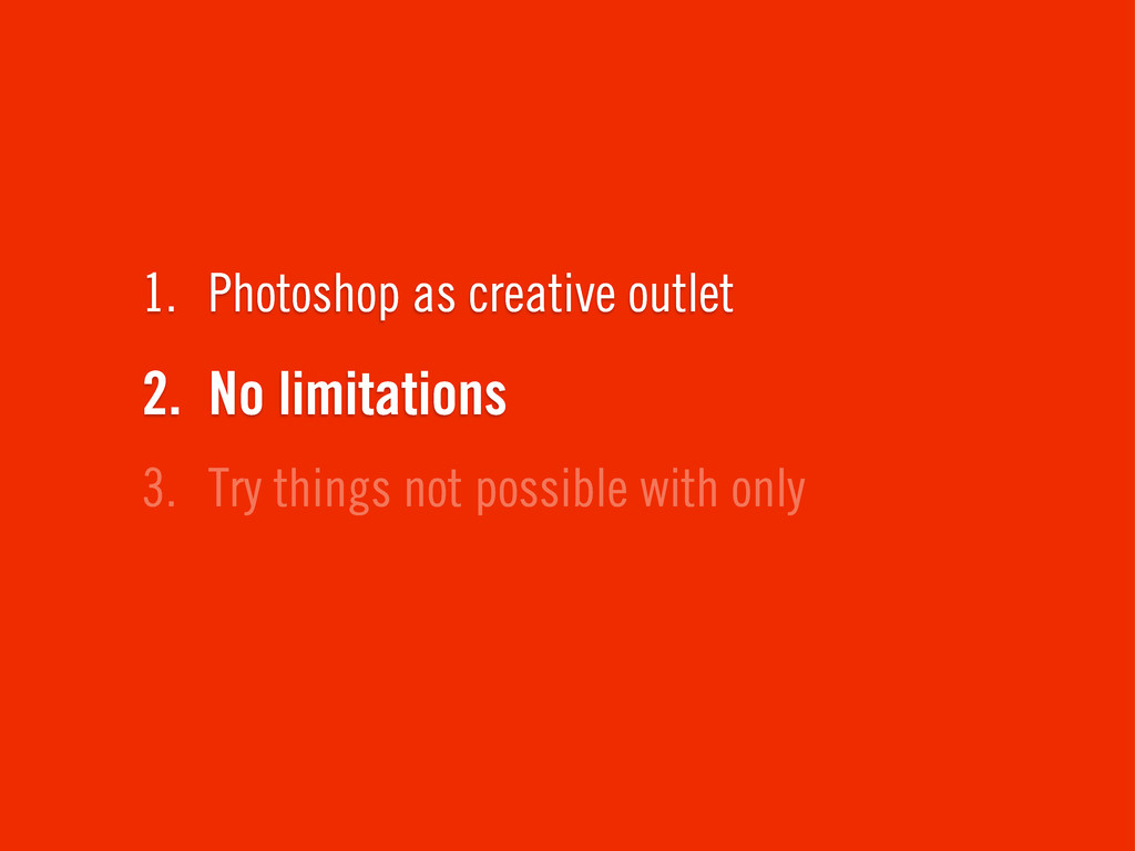
3. Try things not possible with only 2. No limitations
1. Photoshop as creative outlet
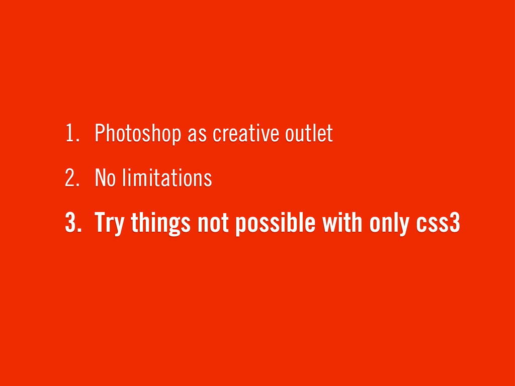
3. Try things not possible with only css3 2. No
limitations 1. Photoshop as creative outlet
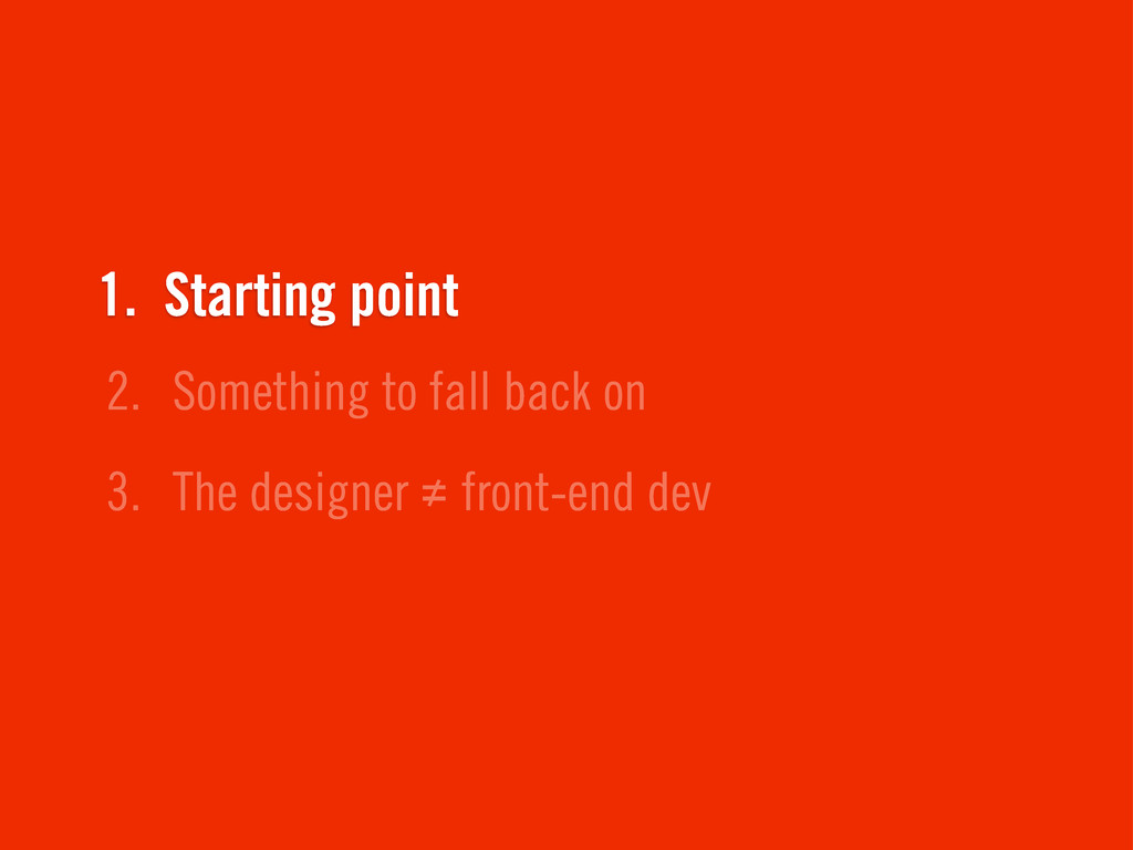
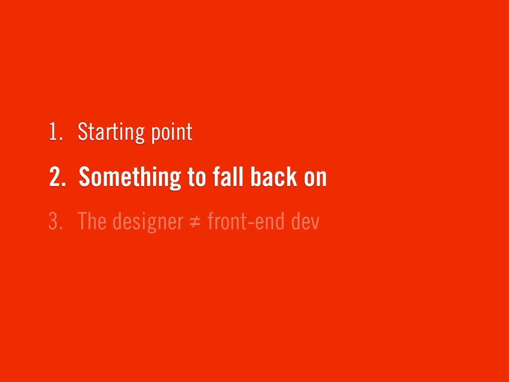
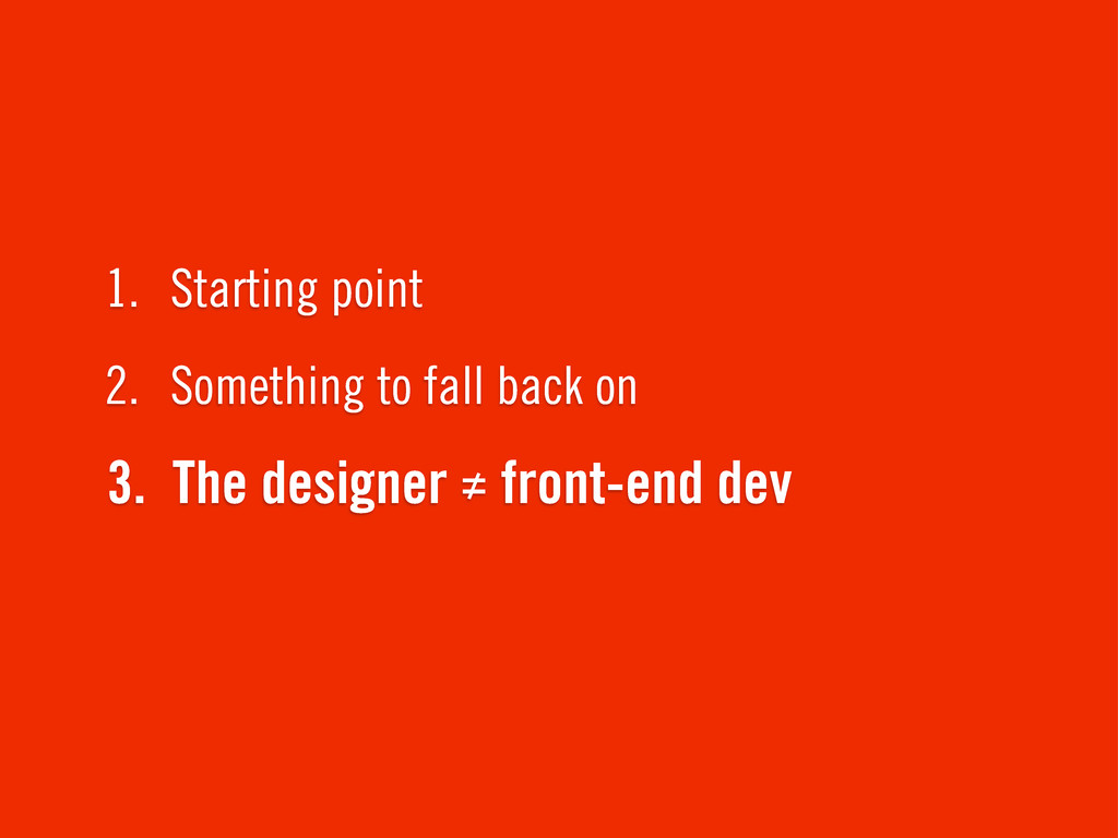
Establish the global visual design direction
3. The designer ≠ front-end dev 2. Something to fall
back on 1. Starting point
3. The designer ≠ front-end dev 2. Something to fall
back on 1. Starting point
3. The designer ≠ front-end dev 2. Something to fall
back on 1. Starting point
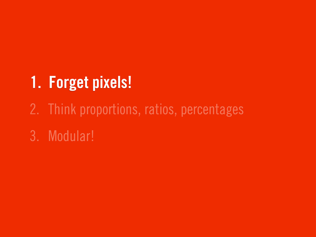
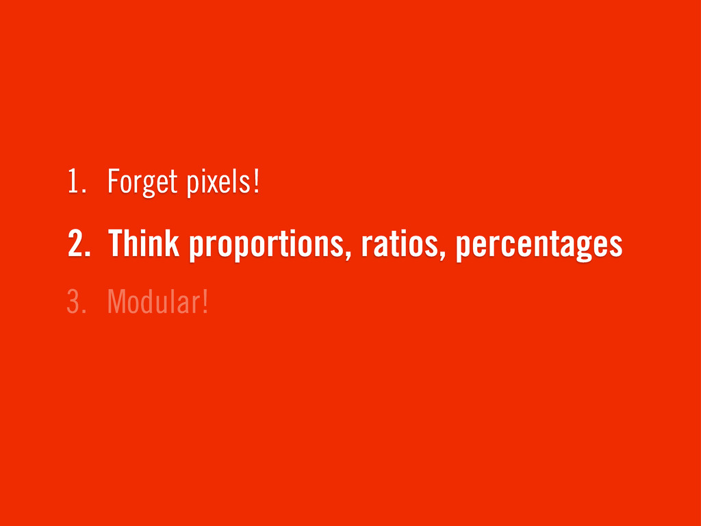
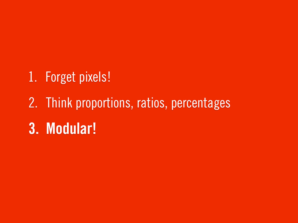
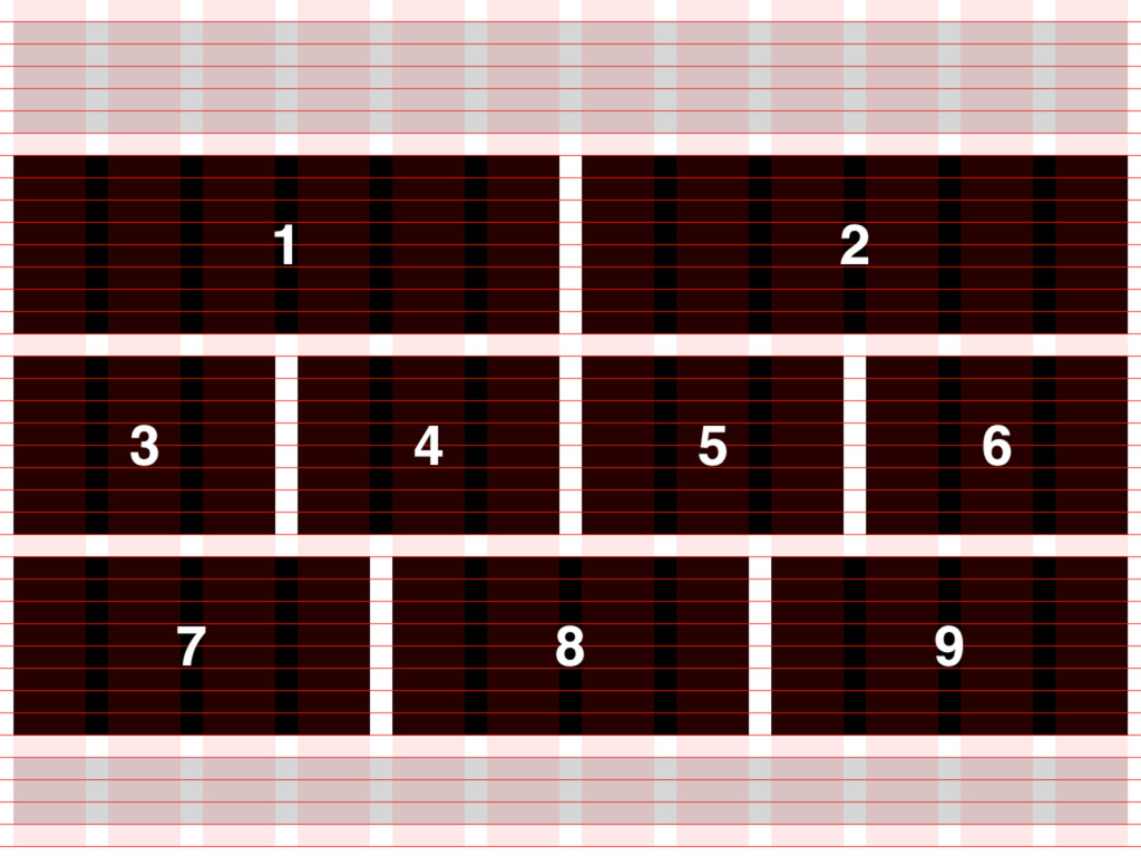
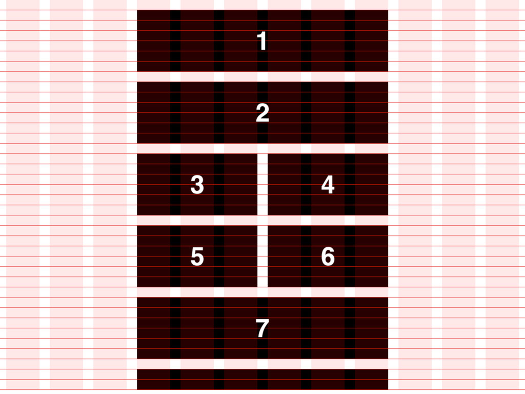
Designing proportions.
3. Modular! 2. Think proportions, ratios, percentages 1. Forget pixels!
3. Modular! 2. Think proportions, ratios, percentages 1. Forget pixels!
3. Modular! 2. Think proportions, ratios, percentages 1. Forget pixels!
Width?
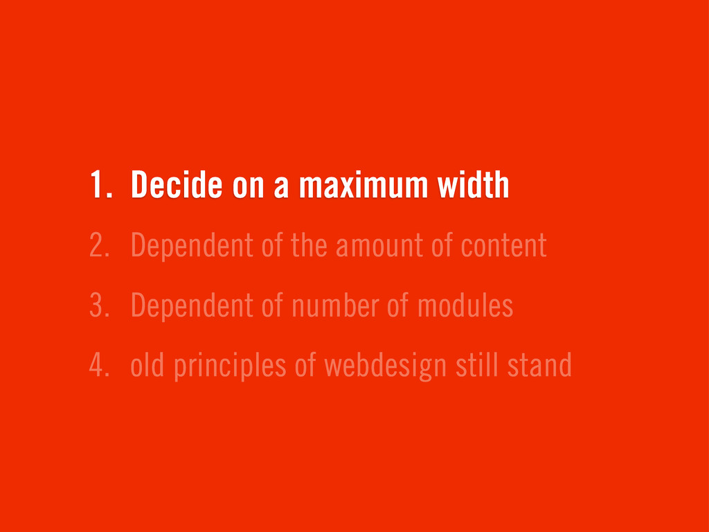
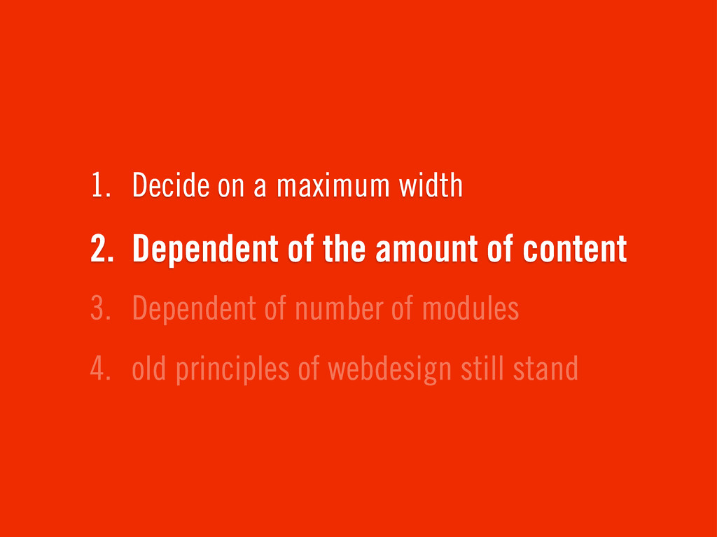
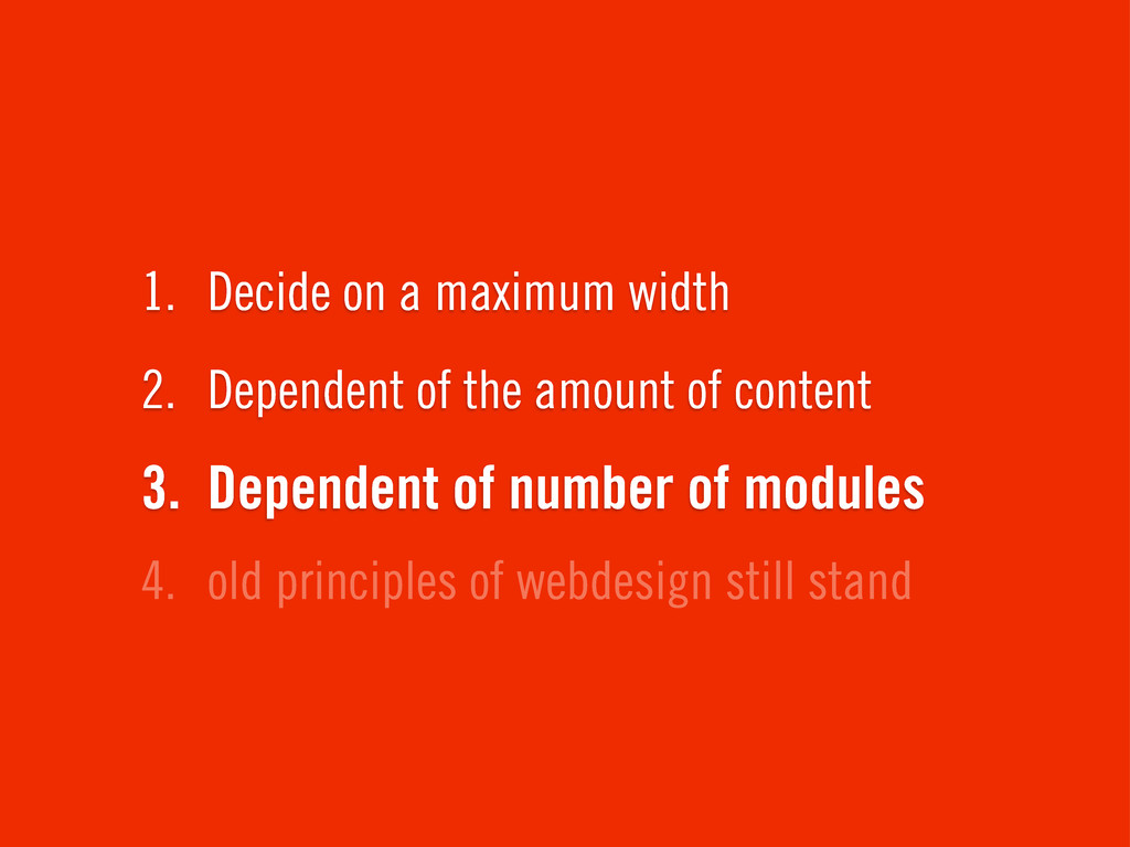
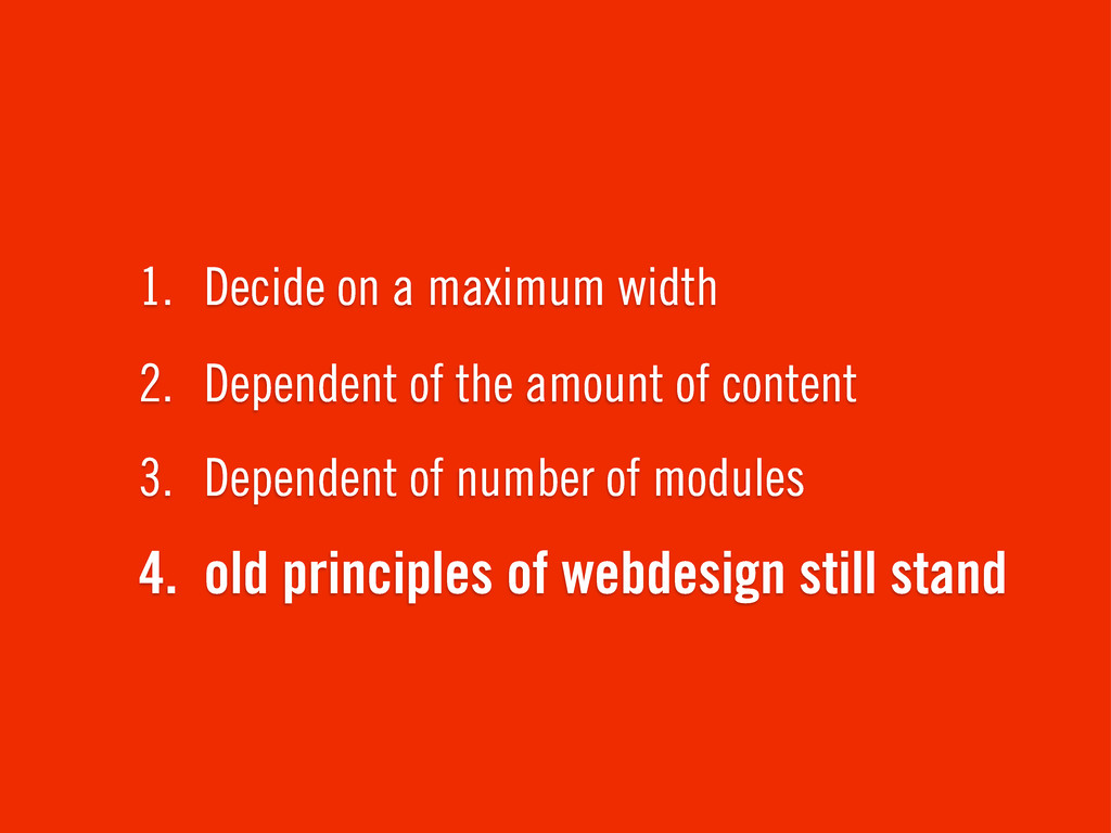
4. old principles of webdesign still stand 3. Dependent of
number of modules 2. Dependent of the amount of content 1. Decide on a maximum width
4. old principles of webdesign still stand 3. Dependent of
number of modules 2. Dependent of the amount of content 1. Decide on a maximum width
4. old principles of webdesign still stand 3. Dependent of
number of modules 2. Dependent of the amount of content 1. Decide on a maximum width
4. old principles of webdesign still stand 3. Dependent of
number of modules 2. Dependent of the amount of content 1. Decide on a maximum width
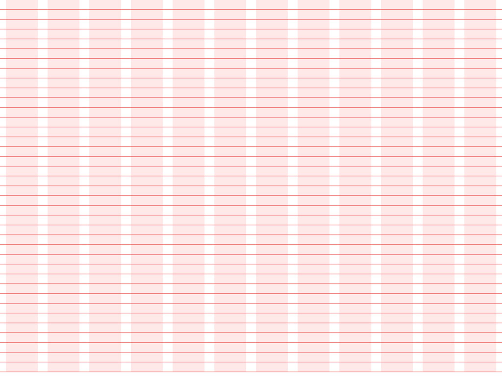
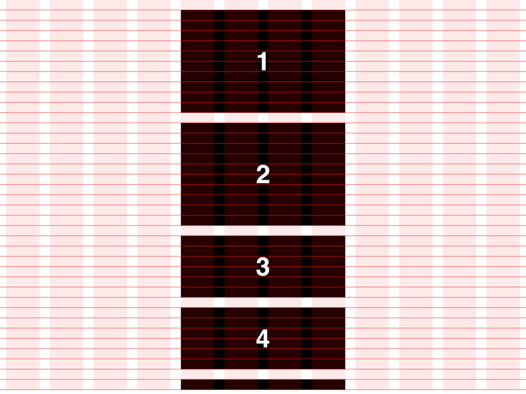
Grid!
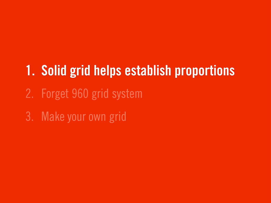
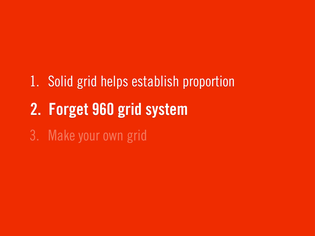
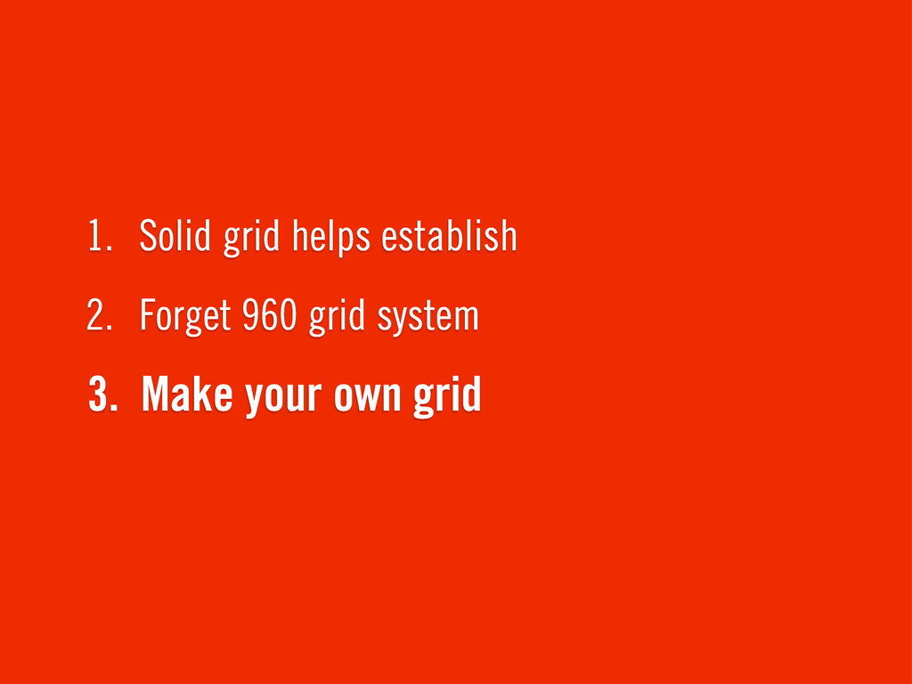
3. Make your own grid 2. Forget 960 grid system
1. Solid grid helps establish proportions
3. Make your own grid 2. Forget 960 grid system
1. Solid grid helps establish proportion
3. Make your own grid 2. Forget 960 grid system
1. Solid grid helps establish
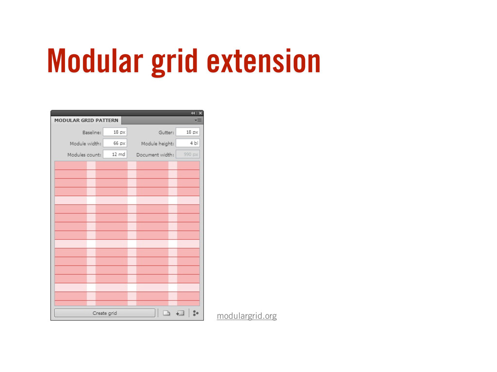
Modular grid extension modulargrid.org
None
None
None
None
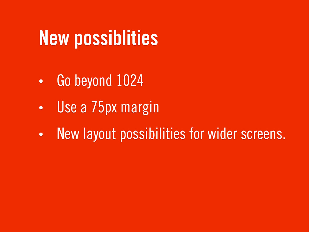
New possiblities • Go beyond 1024 • Use a 75px
margin • New layout possibilities for wider screens.
None
None
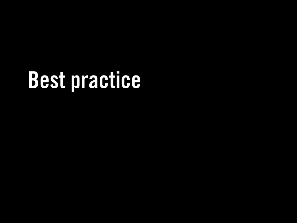
Best practice
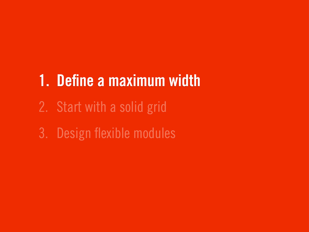
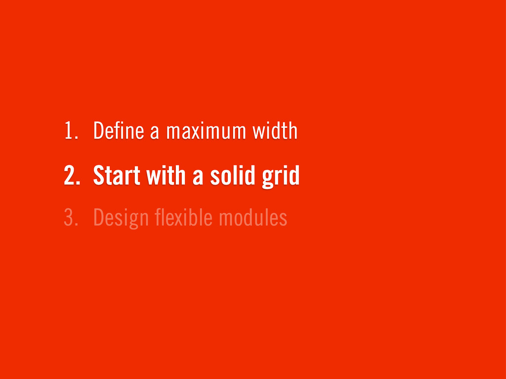
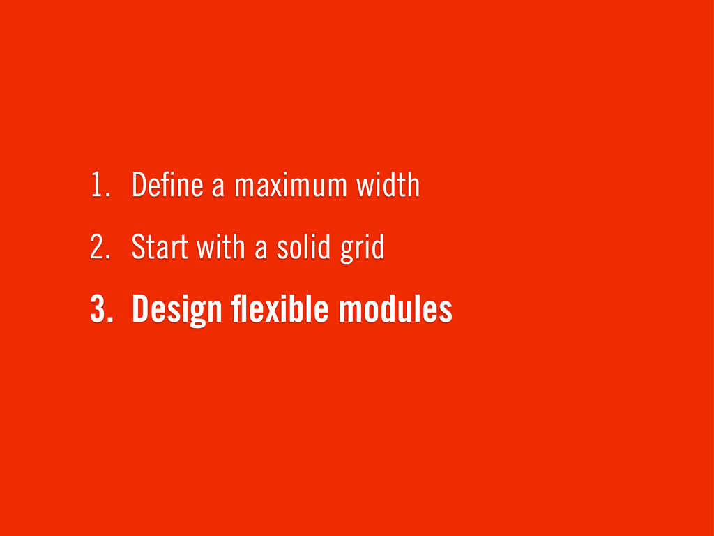
3. Design flexible modules 2. Start with a solid grid
1. Define a maximum width
3. Design flexible modules 2. Start with a solid grid
1. Define a maximum width
3. Design flexible modules 2. Start with a solid grid
1. Define a maximum width
To the browser!
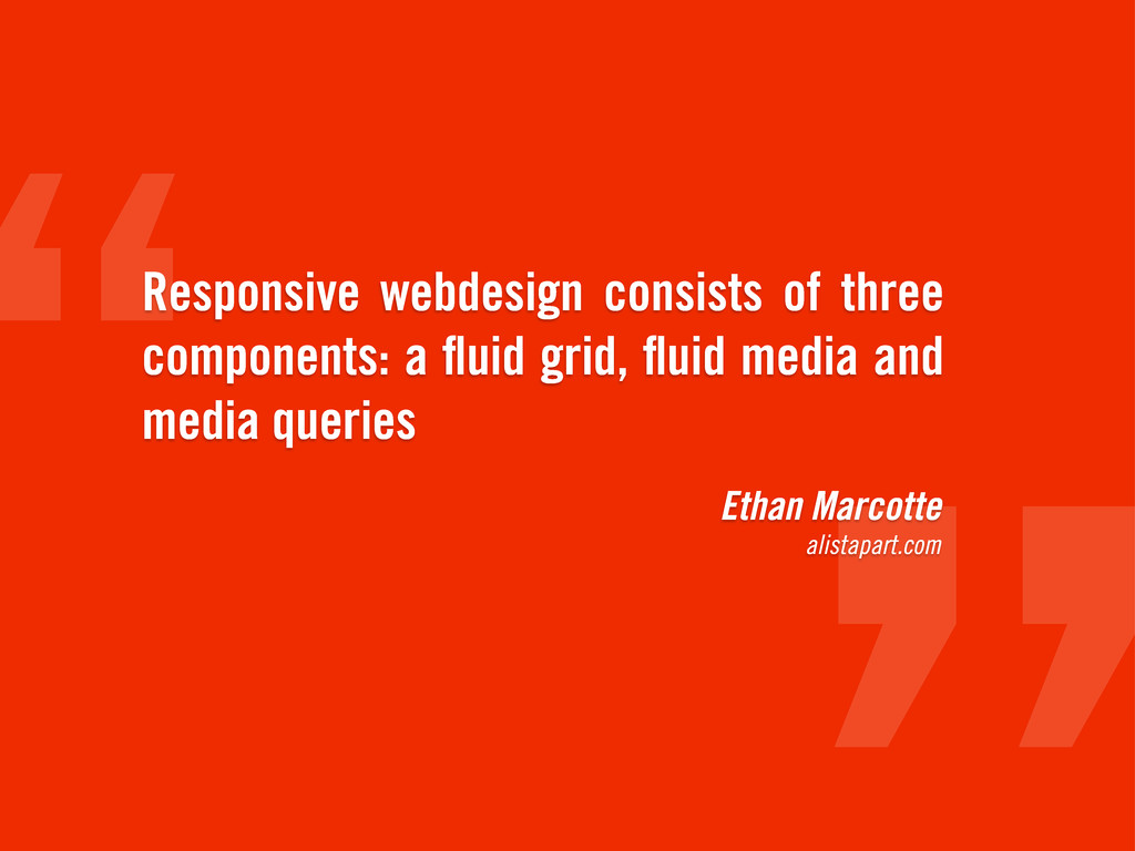
Ethan Marcotte alistapart.com Responsive webdesign consists of three components: a
fluid grid, fluid media and media queries
Fluid vs fixed Responsive vs adaptive
fluid, responsive http://dropmark.com/
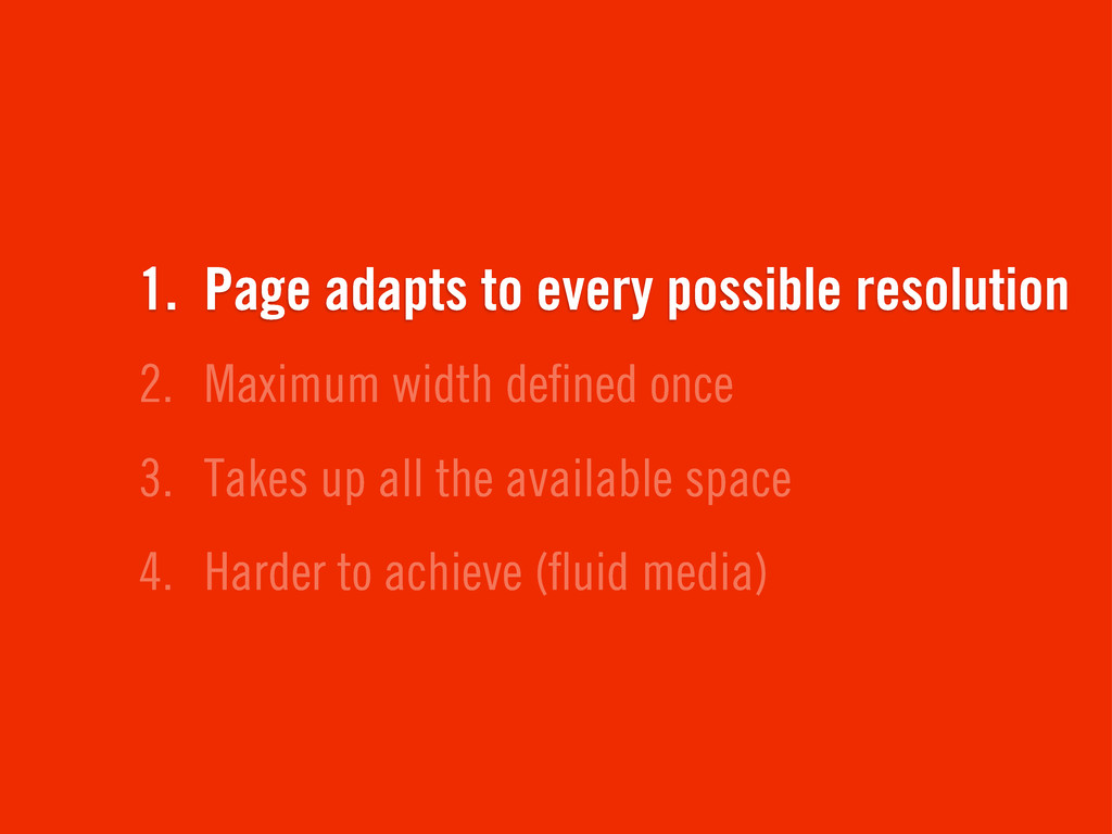
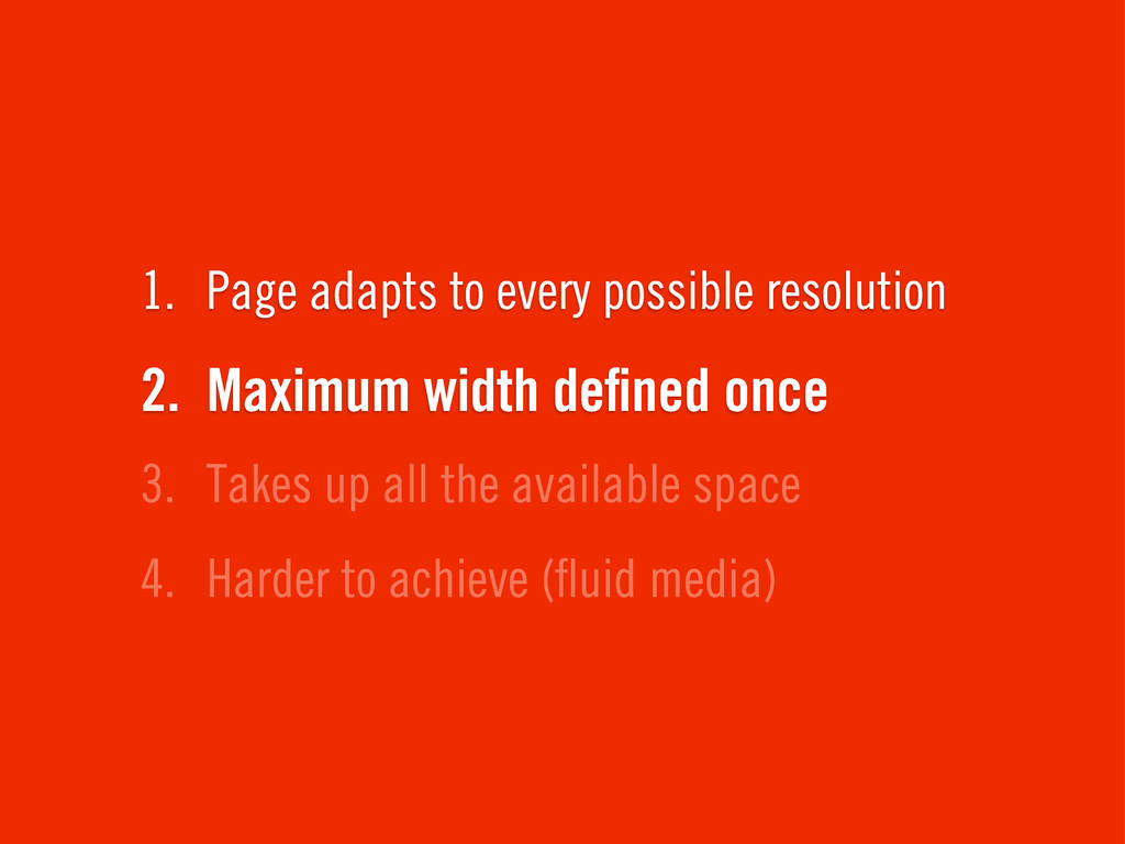
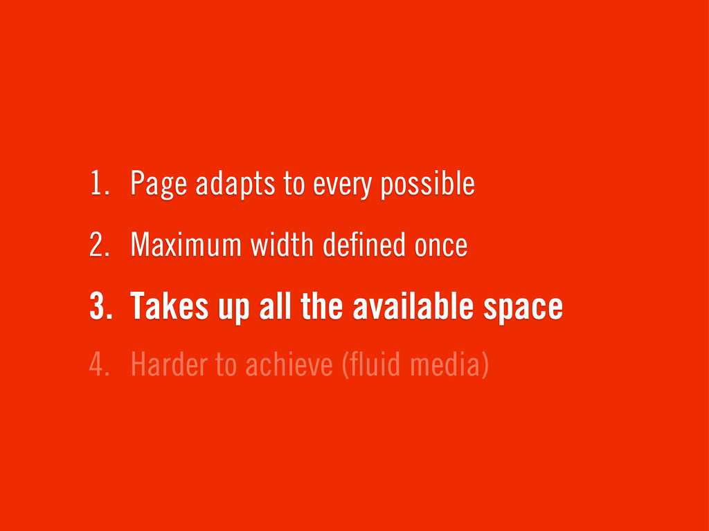
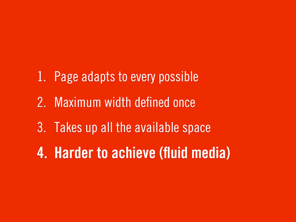
4. Harder to achieve (fluid media) 3. Takes up all
the available space 2. Maximum width defined once 1. Page adapts to every possible resolution
4. Harder to achieve (fluid media) 3. Takes up all
the available space 2. Maximum width defined once 1. Page adapts to every possible resolution
4. Harder to achieve (fluid media) 3. Takes up all
the available space 2. Maximum width defined once 1. Page adapts to every possible
4. Harder to achieve (fluid media) 3. Takes up all
the available space 2. Maximum width defined once 1. Page adapts to every possible
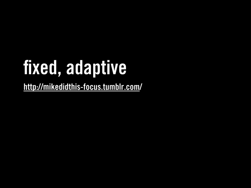
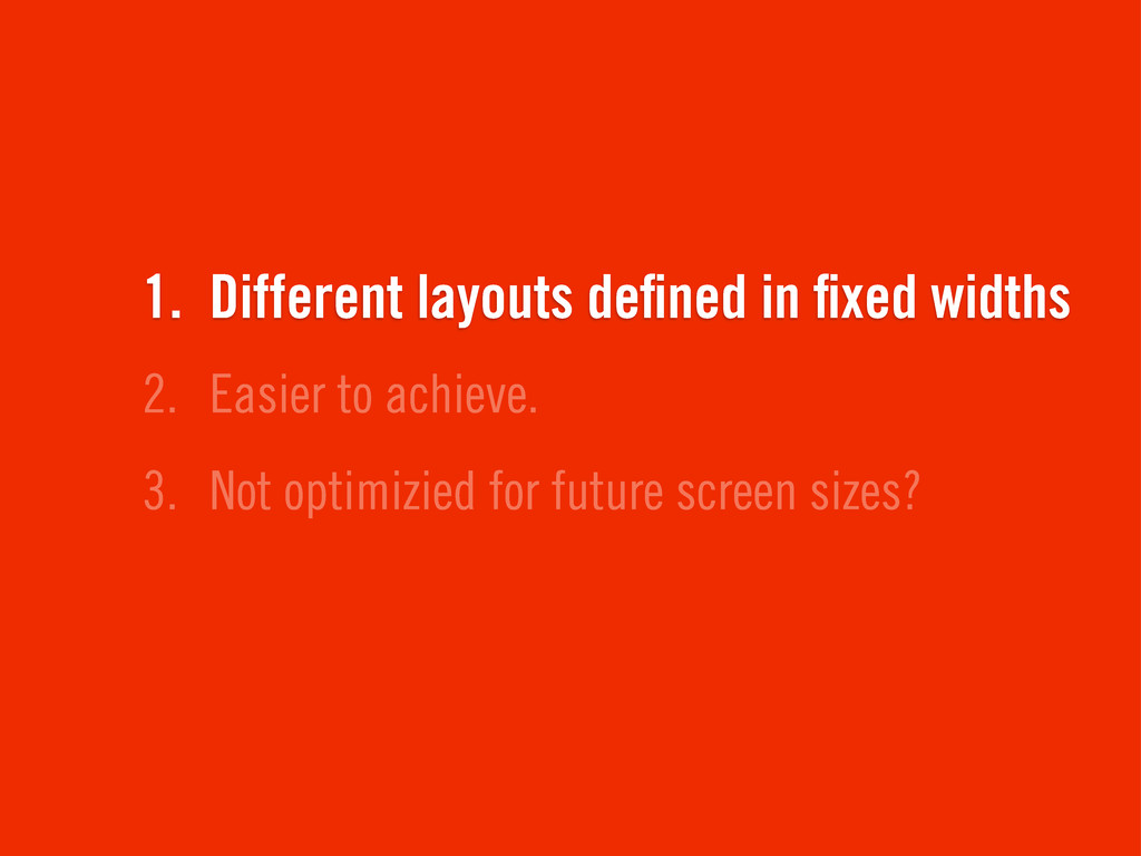
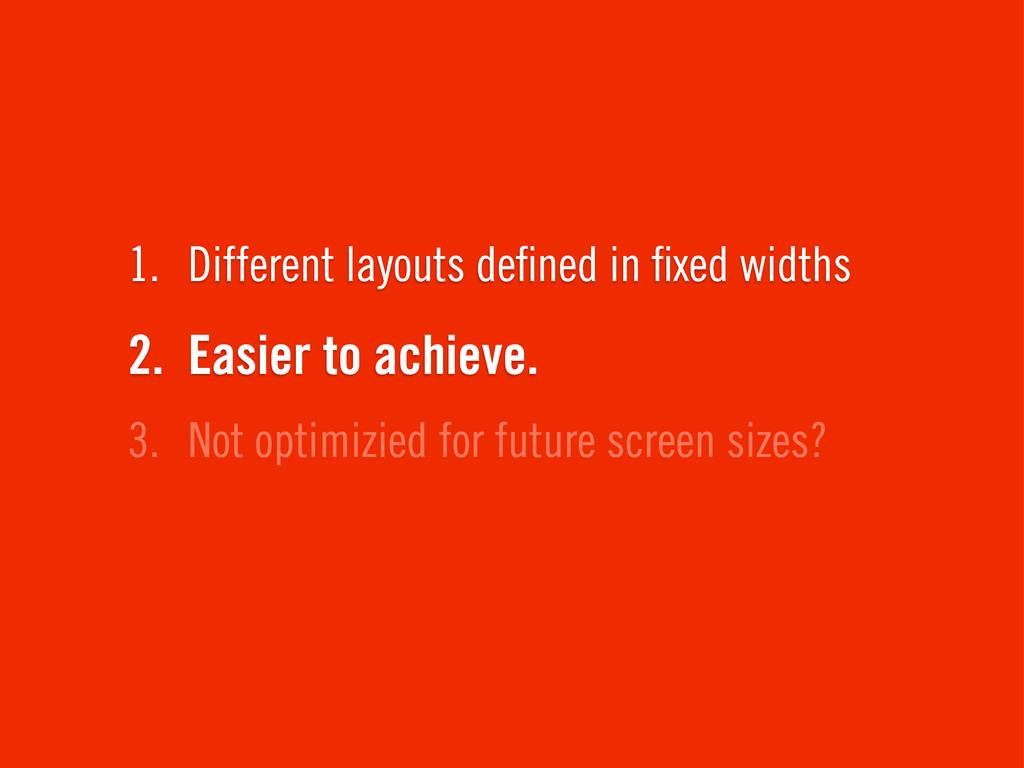
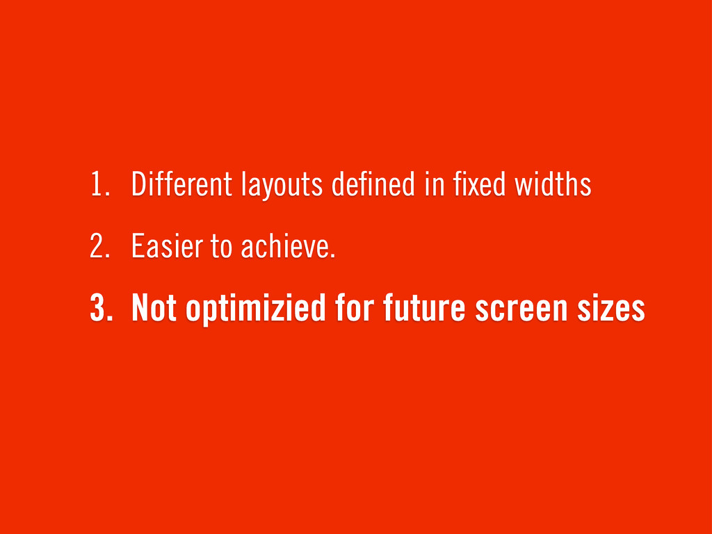
fixed, adaptive http://mikedidthis-focus.tumblr.com/
3. Not optimizied for future screen sizes? 2. Easier to
achieve. 1. Different layouts defined in fixed widths
3. Not optimizied for future screen sizes? 2. Easier to
achieve. 1. Different layouts defined in fixed widths
3. Not optimizied for future screen sizes 2. Easier to
achieve. 1. Different layouts defined in fixed widths
CSS3 media queries
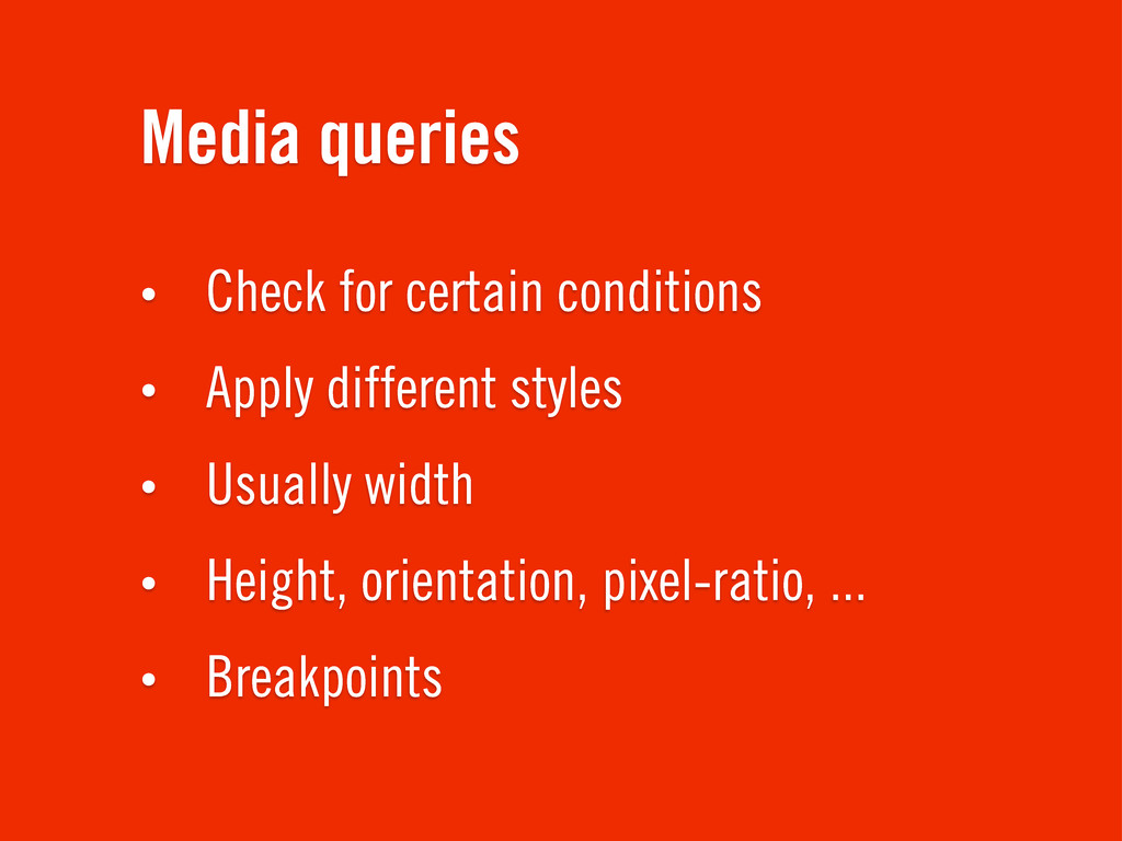
Media queries • Check for certain conditions • Apply different
styles • Usually width • Height, orientation, pixel-ratio, ... • Breakpoints
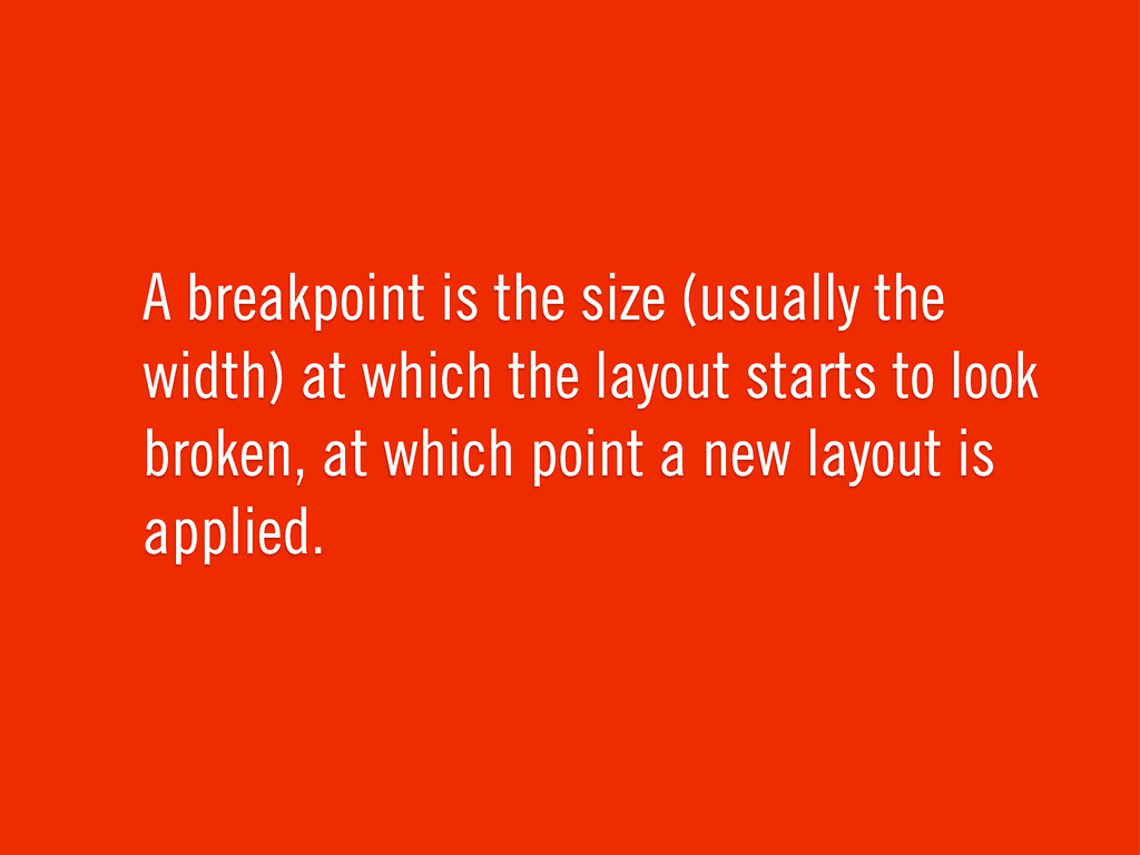
A breakpoint is the size (usually the width) at which
the layout starts to look broken, at which point a new layout is applied.
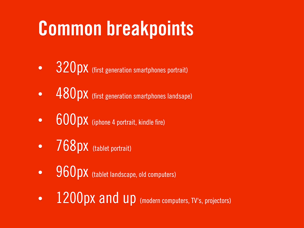
Common breakpoints • 320px (first generation smartphones portrait) • 480px
(first generation smartphones landsape) • 600px (iphone 4 portrait, kindle fire) • 768px (tablet portrait) • 960px (tablet landscape, old computers) • 1200px and up (modern computers, TV's, projectors)
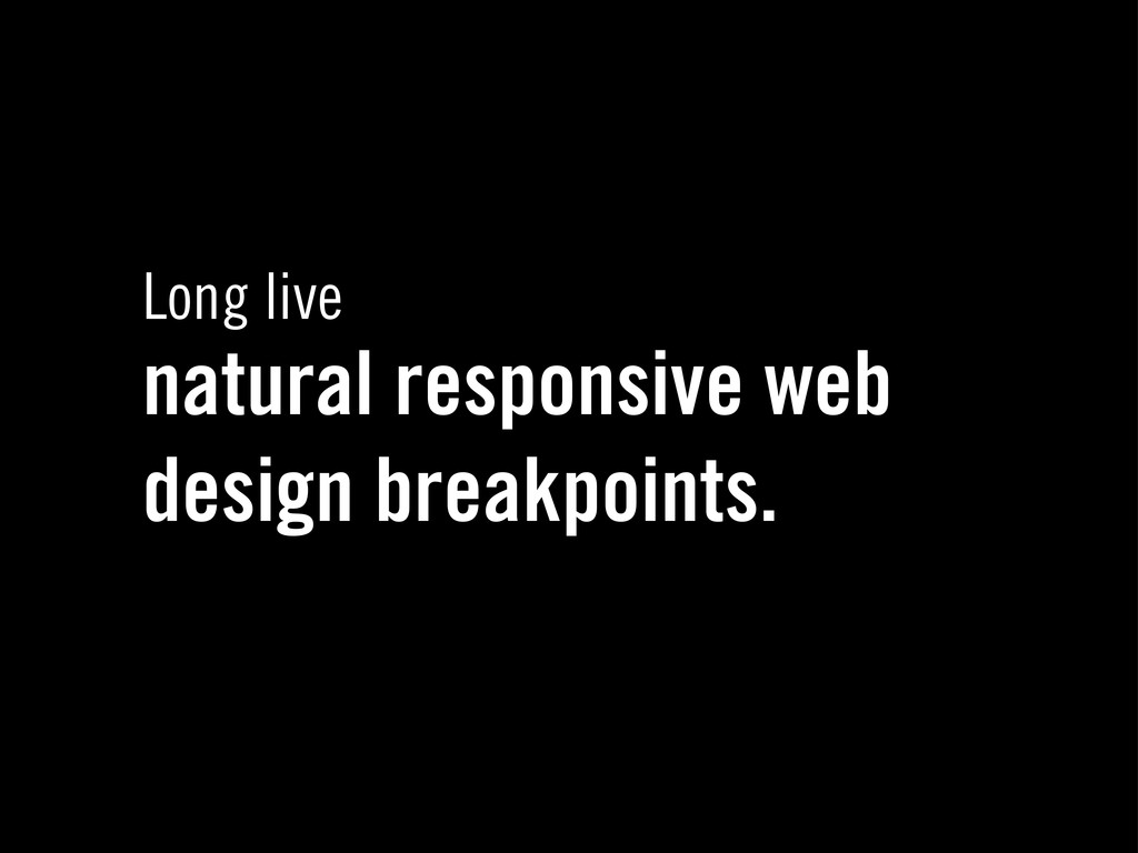
Long live natural responsive web design breakpoints.
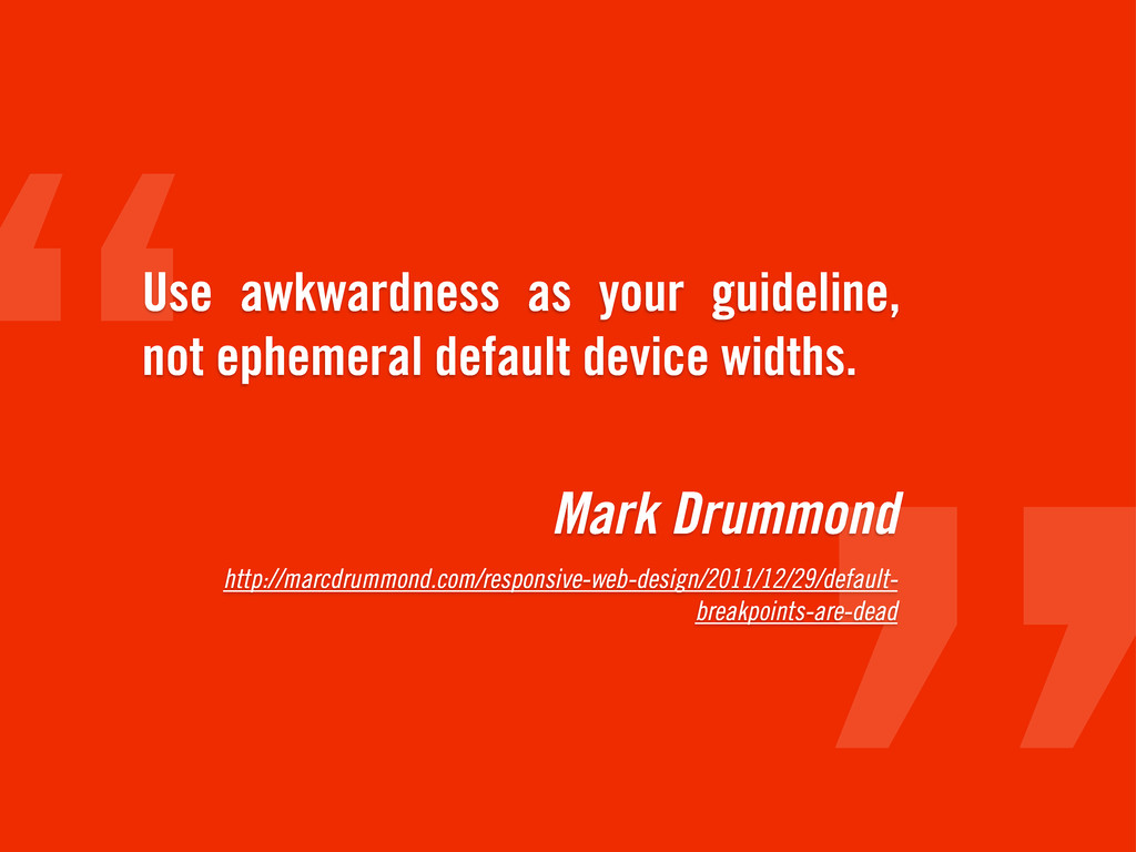
Mark Drummond http://marcdrummond.com/responsive-web-design/2011/12/29/default- breakpoints-are-dead Use awkwardness as your guideline, not
ephemeral default device widths.
http://responsivepx.com/ http://www.youtube.com/watch? v=kYpENMubJKQ
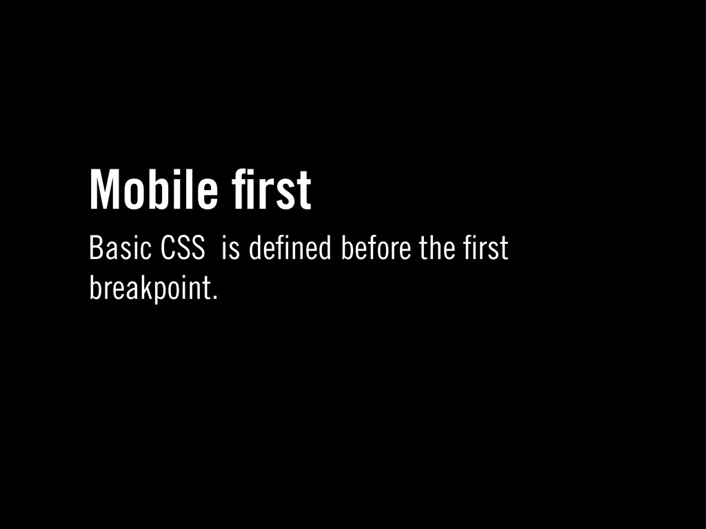
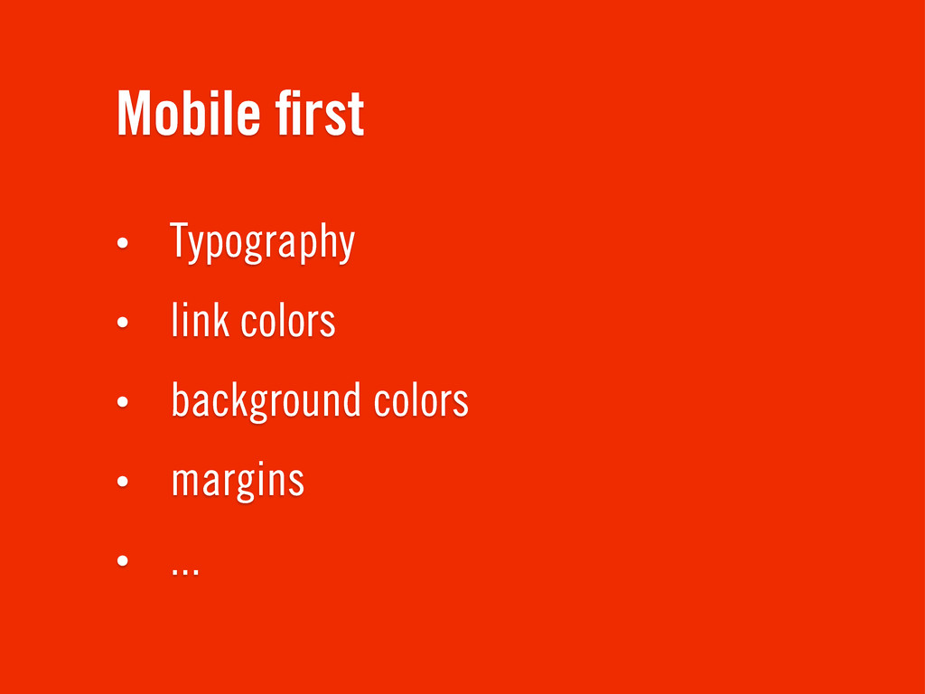
Mobile first Basic CSS is defined before the first breakpoint.
Mobile first • Typography • link colors • background colors
• margins • ...
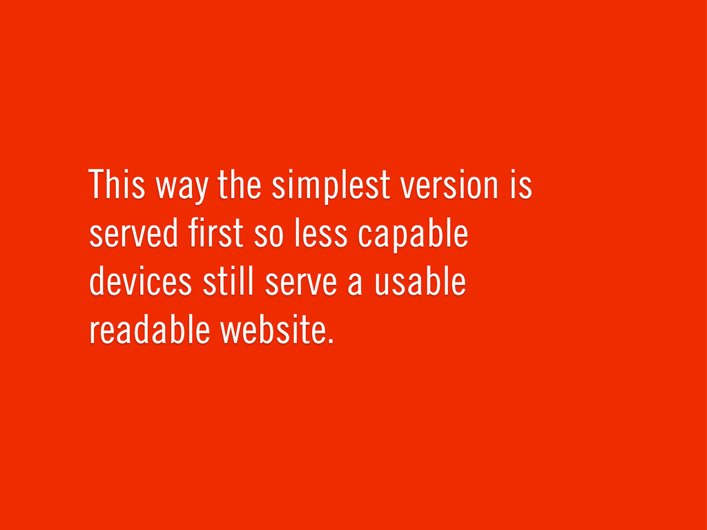
This way the simplest version is served first so less
capable devices still serve a usable readable website.
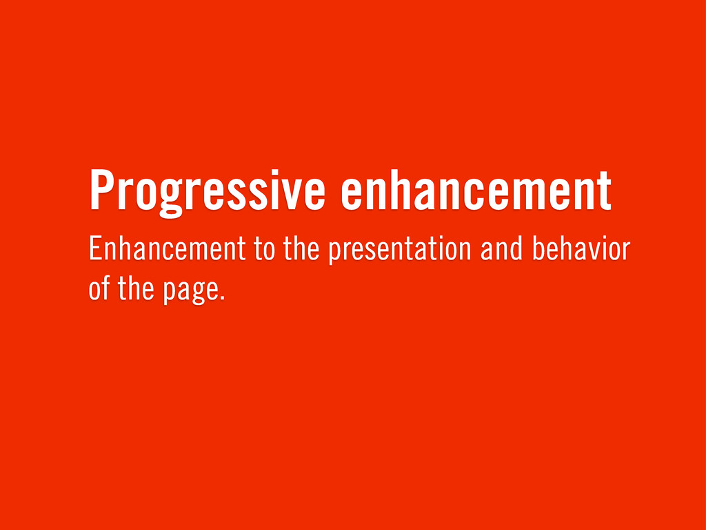
Progressive enhancement Enhancement to the presentation and behavior of the
page.
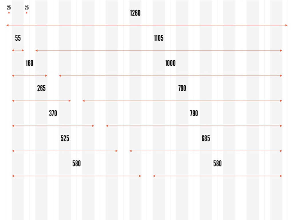
This is my grid. There are many like it, but
this one is mine. My grid is my best friend. It is my life. I must master it as I must master my life.
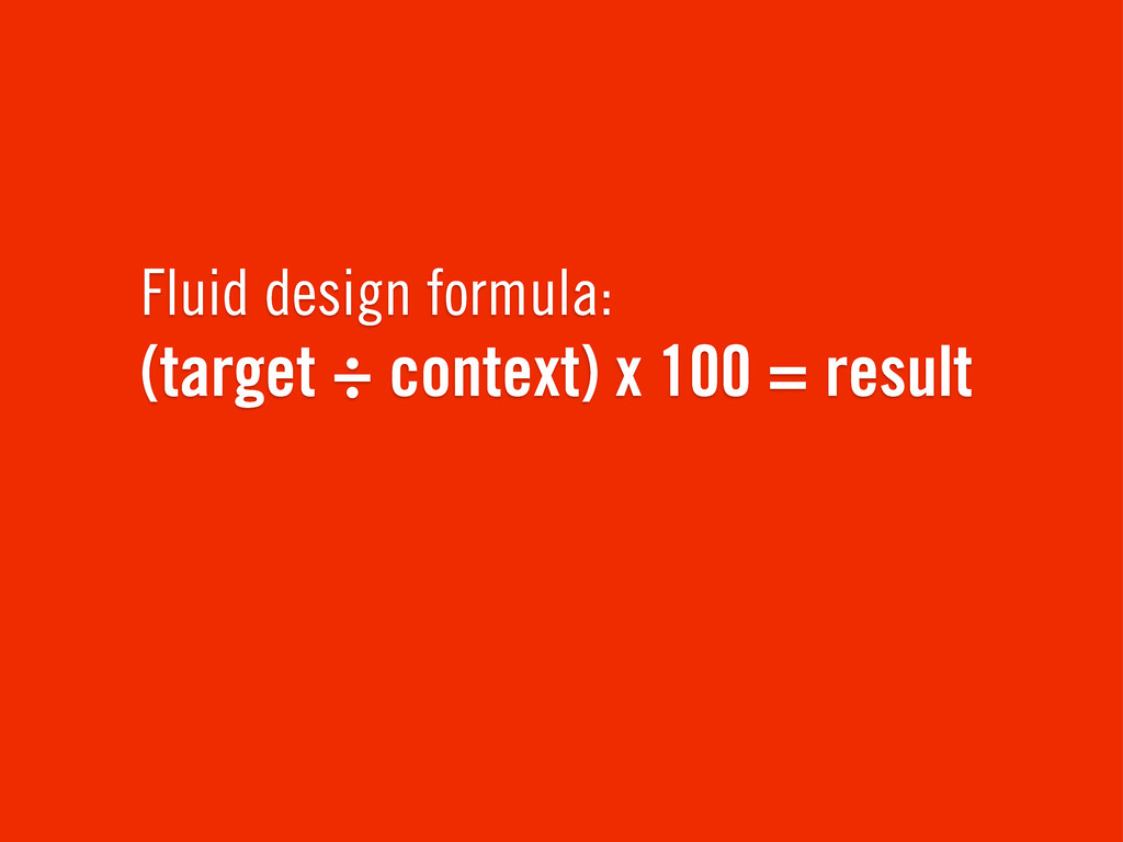
Fluid design formula: (target ÷ context) x 100 = result
None
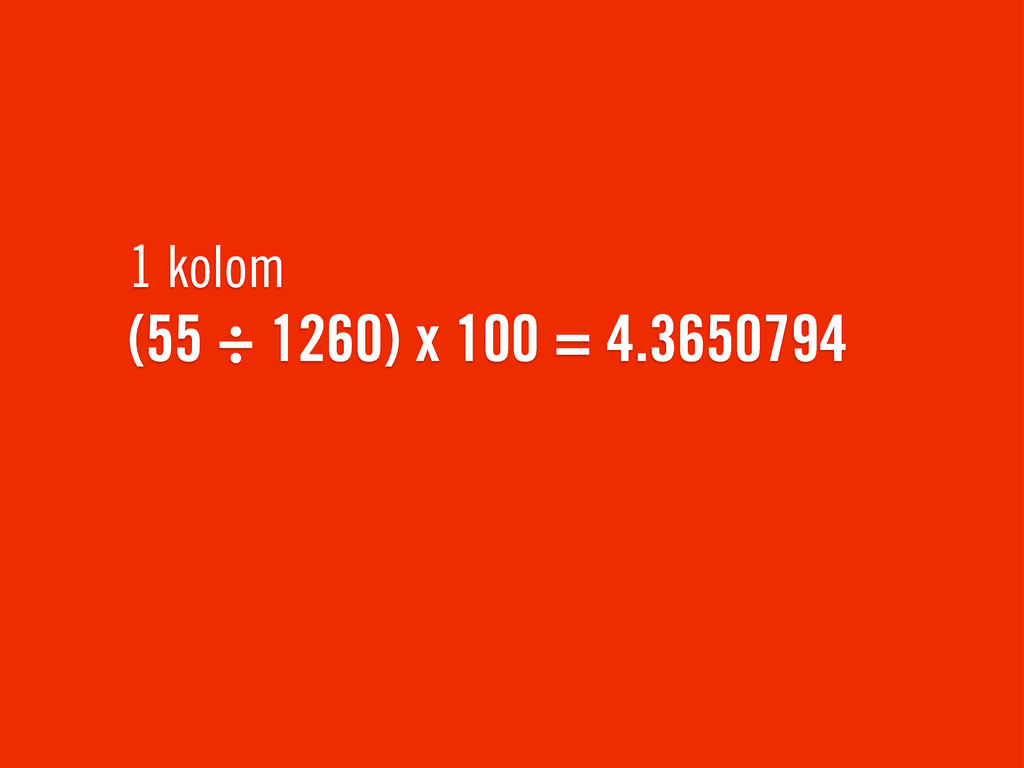
1 kolom (55 ÷ 1260) x 100 = 4.3650794
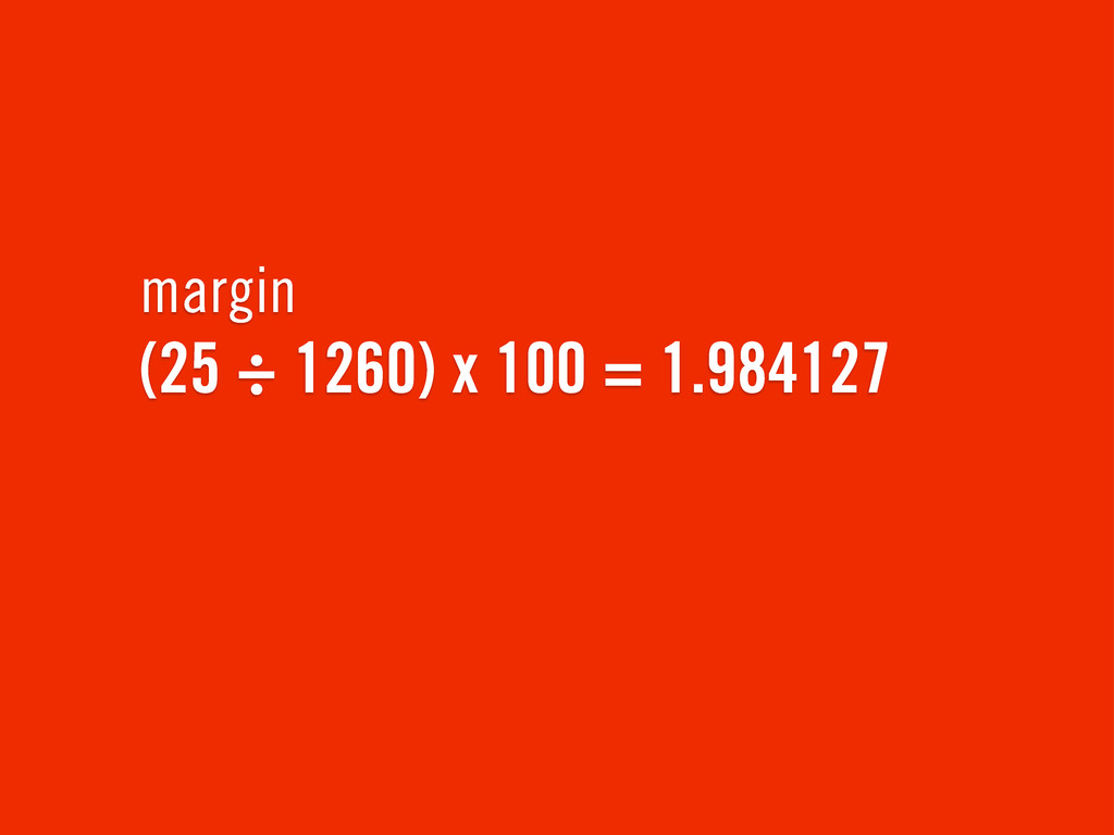
margin (25 ÷ 1260) x 100 = 1.984127
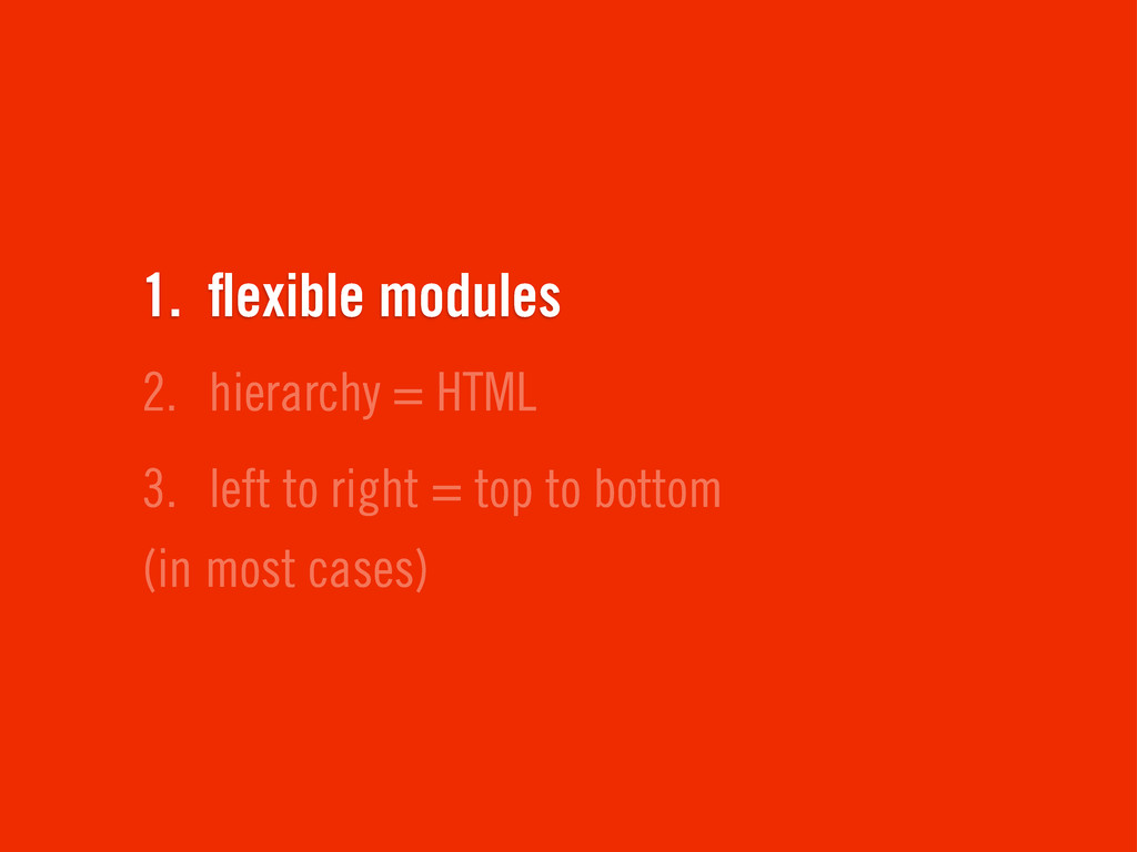
3. left to right = top to bottom (in most
cases) 2. hierarchy = HTML 1. flexible modules
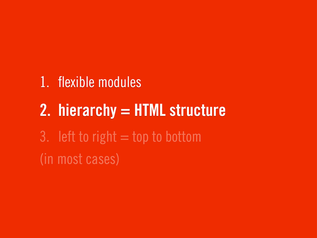
3. left to right = top to bottom (in most
cases) 2. hierarchy = HTML structure 1. flexible modules
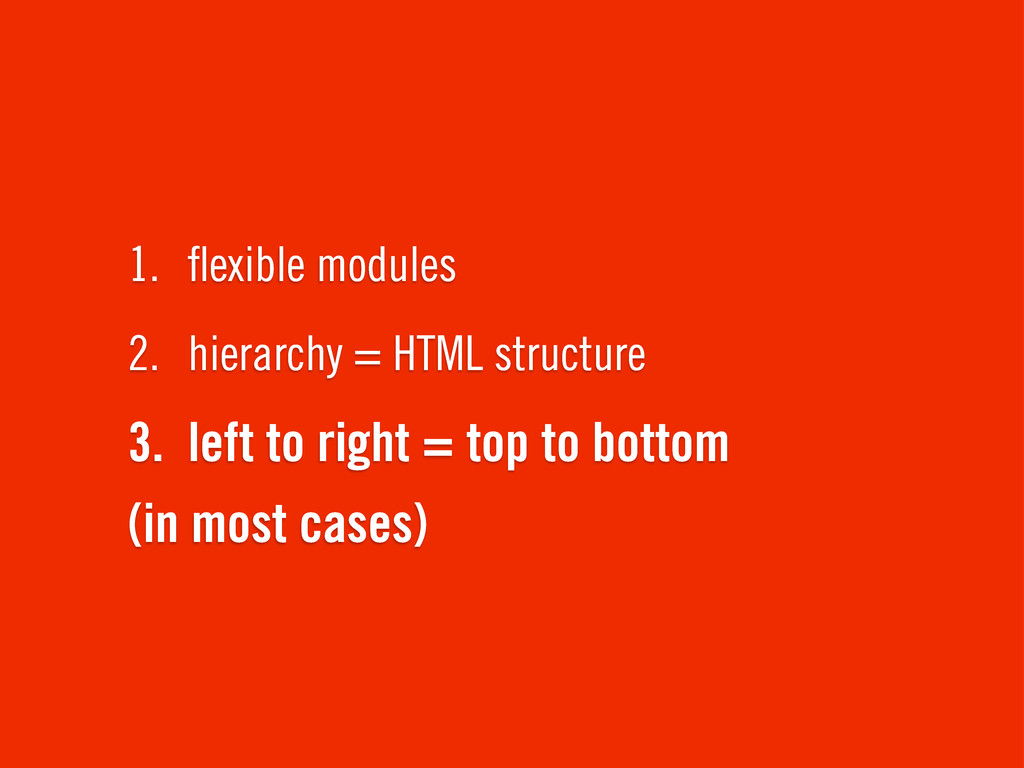
3. left to right = top to bottom (in most
cases) 2. hierarchy = HTML structure 1. flexible modules
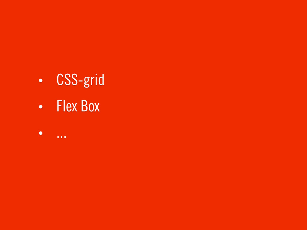
The future is awesome! ✌
• CSS-grid • Flex Box • ...
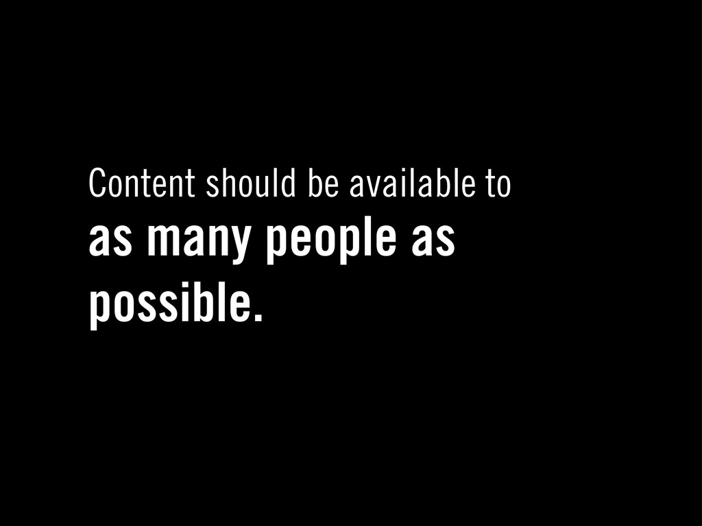
Content should be available to as many people as possible.
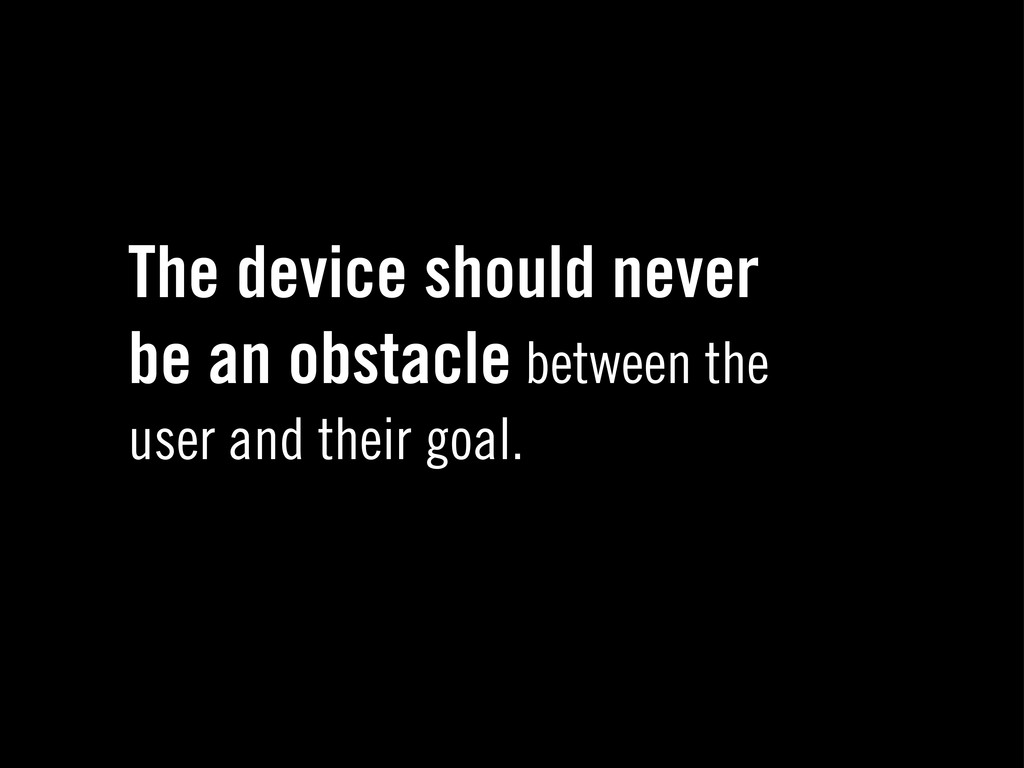
The device should never be an obstacle between the user
and their goal.
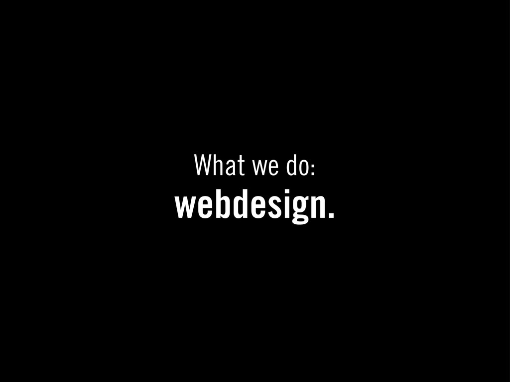
What we do: webdesign.
 lw
lw
 takanorip
 ajstarks
 chorkaichan
 webnaut
 shosira
 bebe
bebe
 teba_eleven
 hideakitakechi
 saki822
 securecat
 uxman
uxman
 tamaranovitovic
 lara
lara
 khoart
 lemiorhan
 reverentgeek
 axbom
axbom
 soudai
 schlessera
 csswizardry
 akashhashmi
 mayatellez