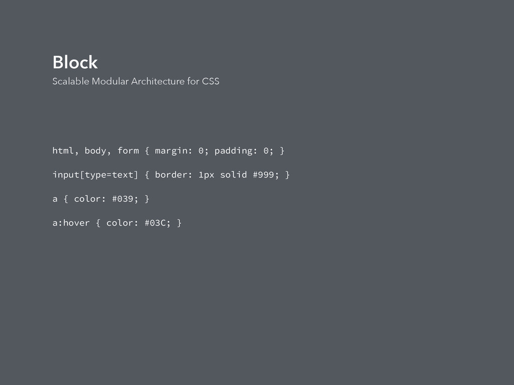
defaults. • These are single element selectors. • Can include: attribute selectors, pseudo-class selectors, child selectors or sibling selectors. • Doesn't include class or id. • Define the default styling of the content on the page. How content appears on the page. • Base styling include heading, links, body background, etc. • There should be no need to use !important.
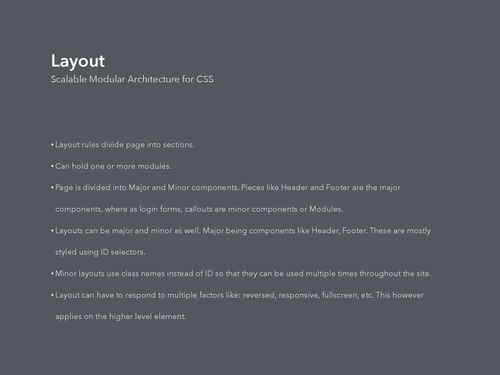
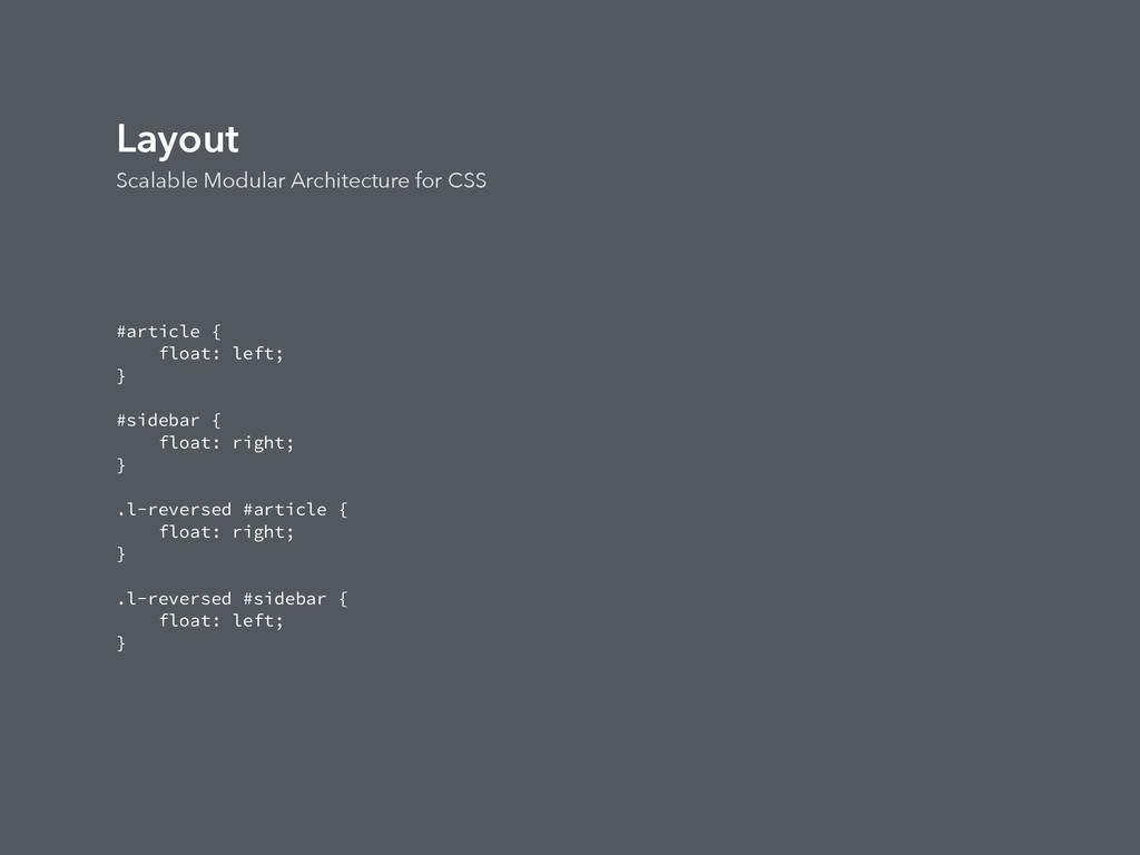
page into sections. • Can hold one or more modules. • Page is divided into Major and Minor components. Pieces like Header and Footer are the major components, where as login forms, callouts are minor components or Modules. • Layouts can be major and minor as well. Major being components like Header, Footer. These are mostly styled using ID selectors. • Minor layouts use class names instead of ID so that they can be used multiple times throughout the site. • Layout can have to respond to multiple factors like: reversed, responsive, fullscreen, etc. This however applies on the higher level element.
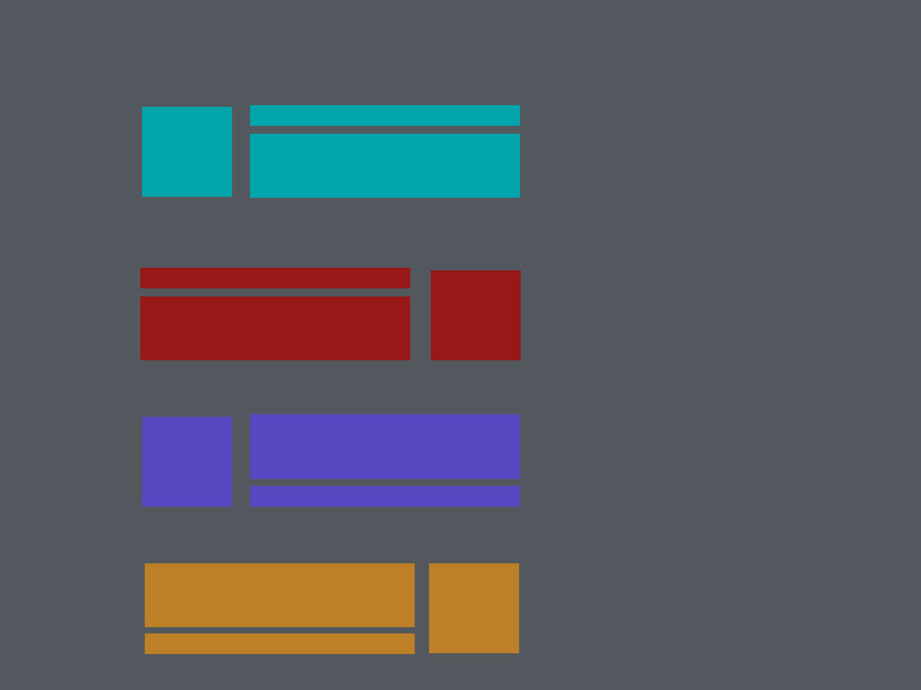
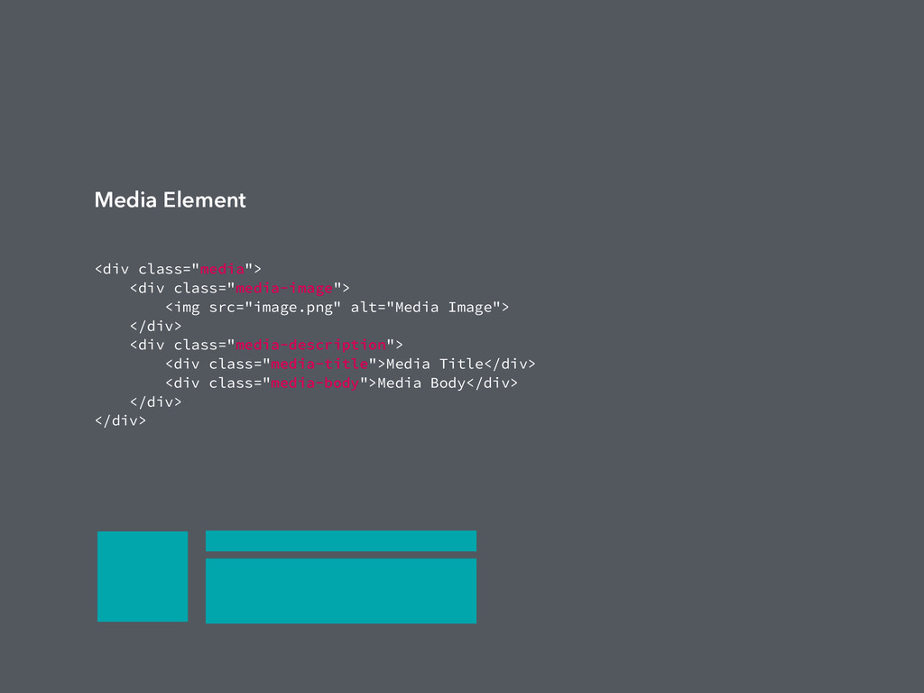
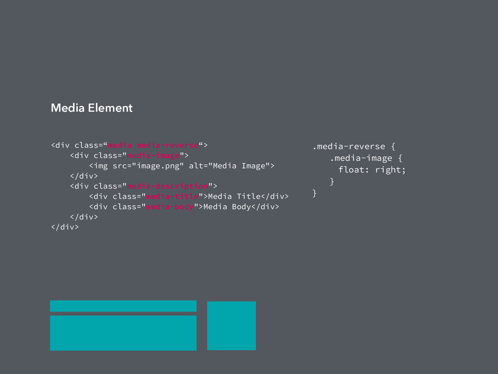
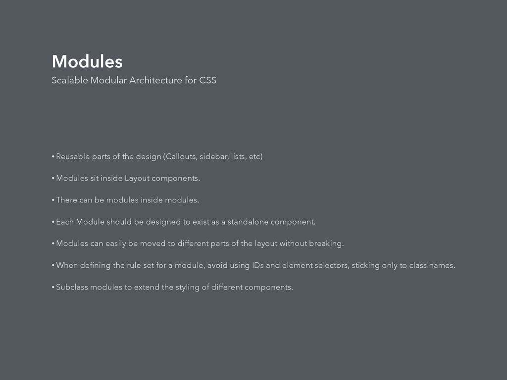
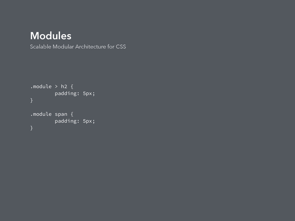
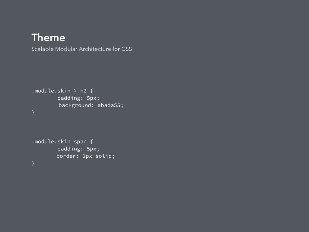
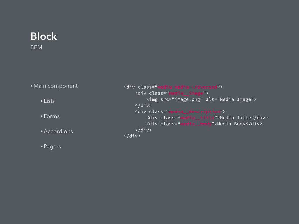
the design (Callouts, sidebar, lists, etc) • Modules sit inside Layout components. • There can be modules inside modules. • Each Module should be designed to exist as a standalone component. • Modules can easily be moved to different parts of the layout without breaking. • When defining the rule set for a module, avoid using IDs and element selectors, sticking only to class names. • Subclass modules to extend the styling of different components.
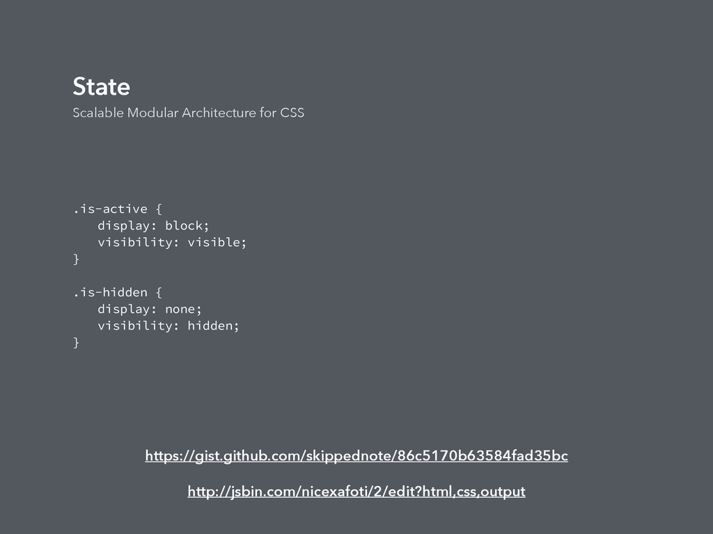
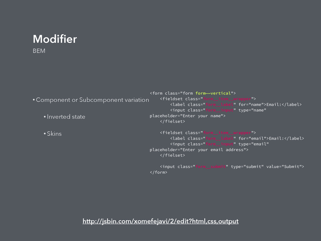
layout looks in particular state (hidden, expanded, visible, active, etc) • Use class only. • Similar to Subclassing modules. • Useful for JS hooks. • Can apply to Layout and module styles. • Can use !important in states when overriding existing styles. But use only when needed. • State rules should reside inside modules.
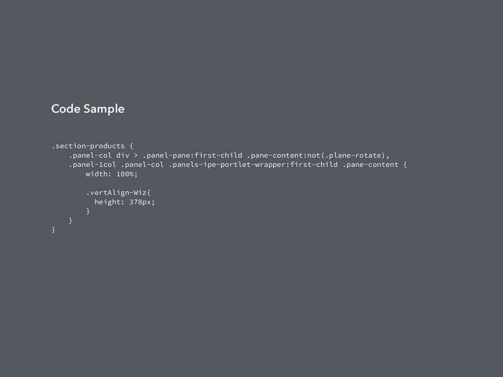
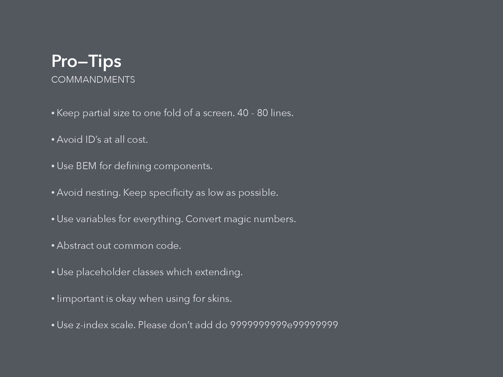
a screen. 40 - 80 lines. • Avoid ID’s at all cost. • Use BEM for defining components. • Avoid nesting. Keep specificity as low as possible. • Use variables for everything. Convert magic numbers. • Abstract out common code. • Use placeholder classes which extending. • !important is okay when using for skins. • Use z-index scale. Please don’t add do 9999999999e99999999
 skippednote
 murabayashi
 minorun365
 shuadachi
 isaoshimizu
 y150saya
 sugupoko
 hiranabe
 iotcomjpadmin
 a_ono
a_ono
 ryooob
 shift_evolve
 tanimuyk
 watany
 maggiecrowley
 caitiem20
 coloredviolet
 deanohume
 colly
colly
 popppiees
 morganepeng
 michielstock
 ipullrank
 jct
jct
 codingconduct