Upgrade to Pro — share decks privately, control downloads, hide ads and more …

The Art of Building Reusable UI

The Art of Building Reusable UI

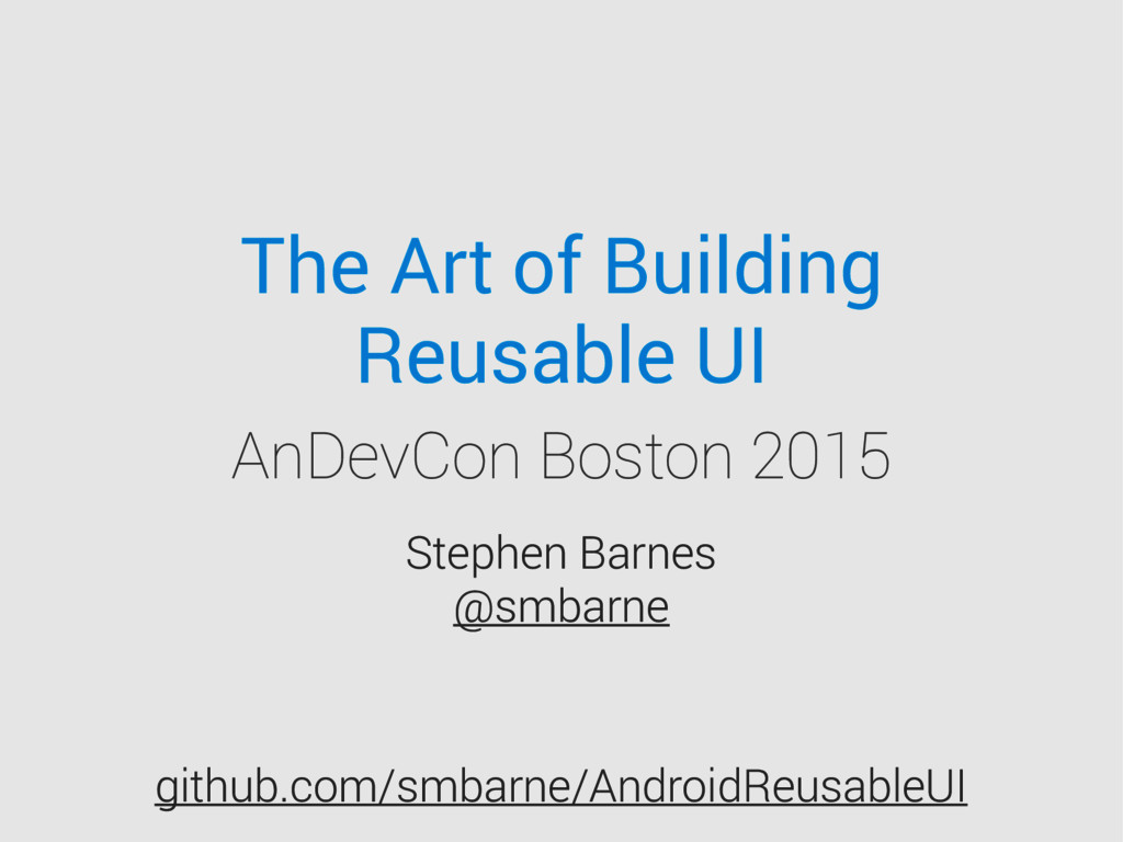
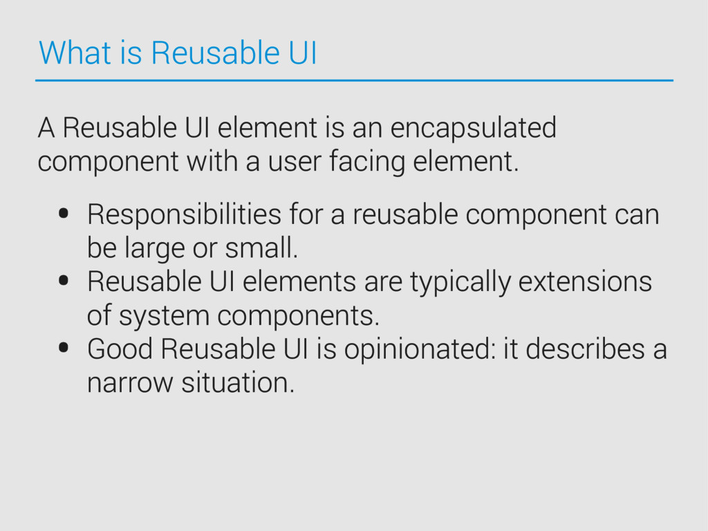
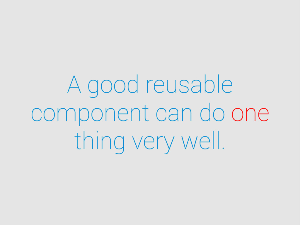
The need or desire to build a great user interface doesn’t happen once; it happens over and over again. Finding a way to build great reusable UI components and consistently deliver awesome user experiences is an art form.

In this talk, we will discuss three major areas of this art form and how to succeed in building a great UI every time:
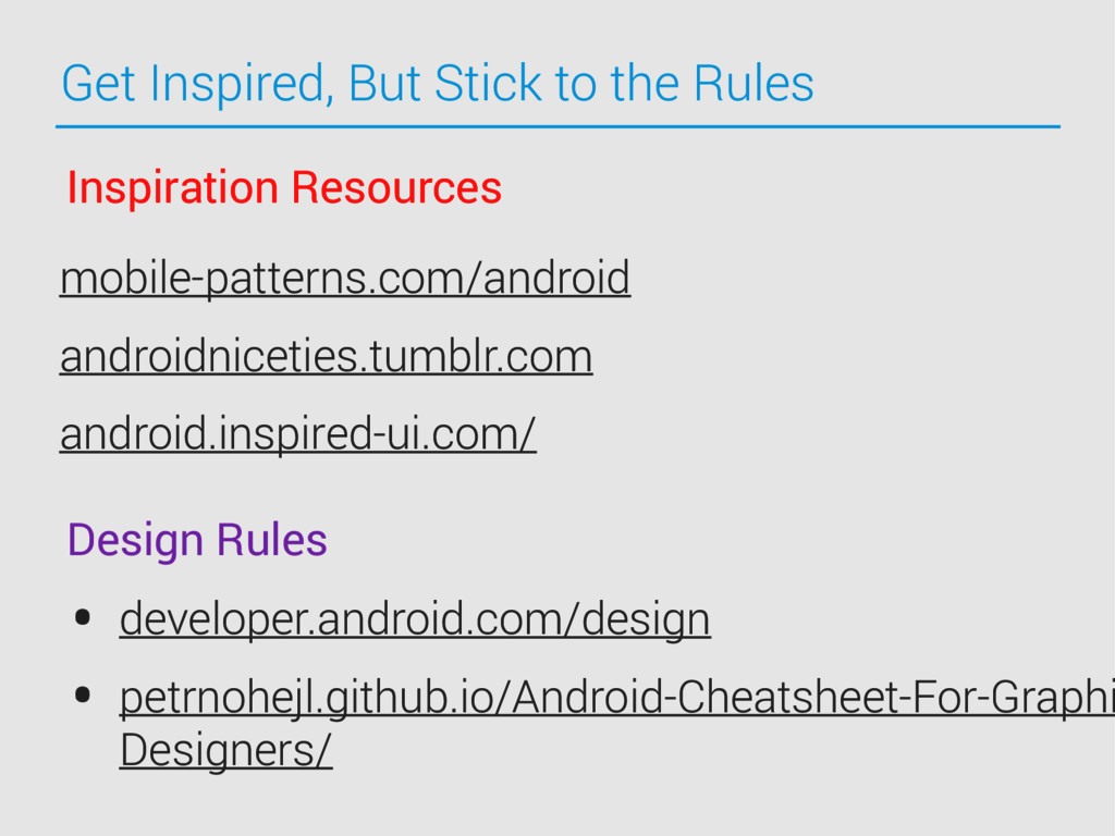
Rules for UI Design

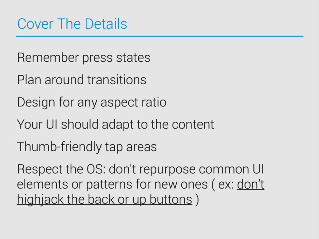
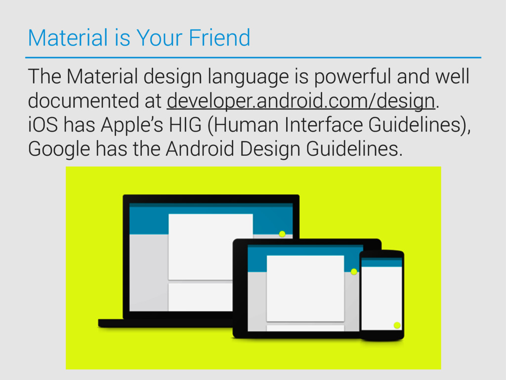
Consistency and platform rules
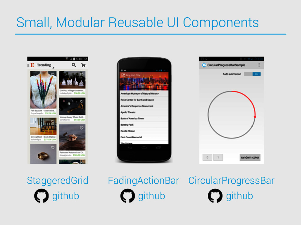
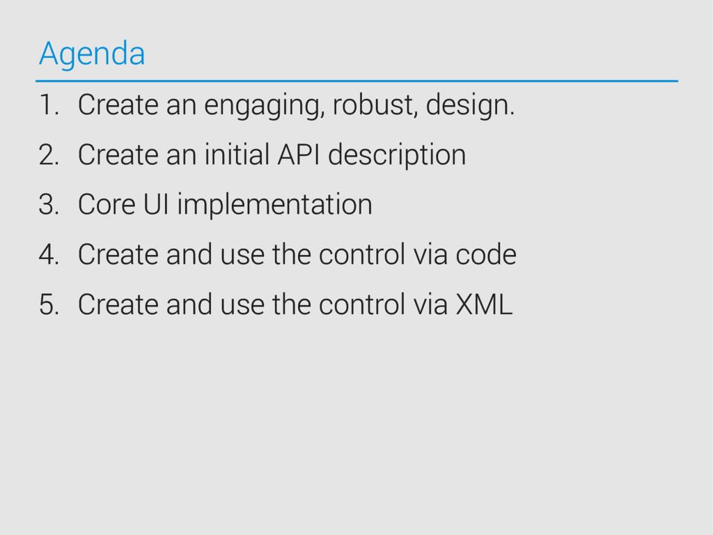
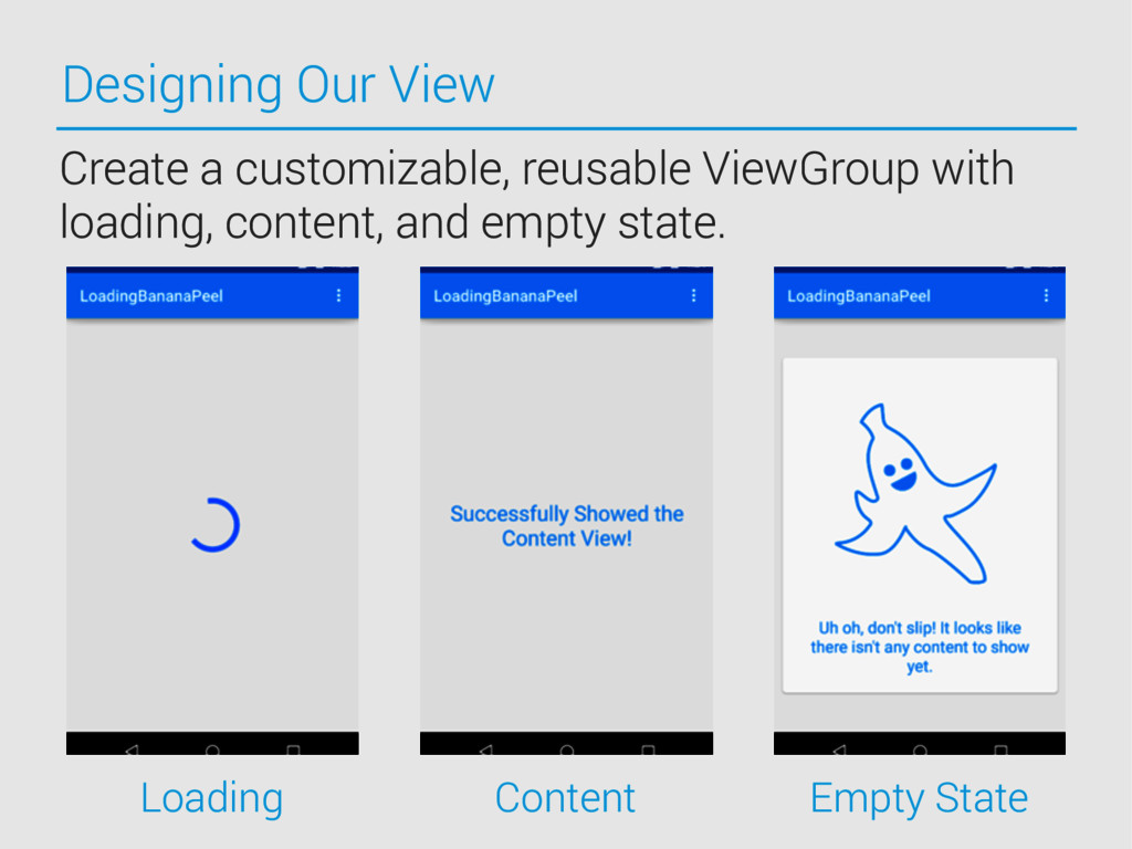
- Building a reusable UI component: when and why
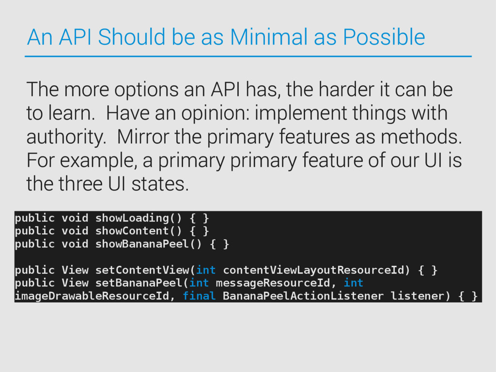
- Creating a clear, friendly API

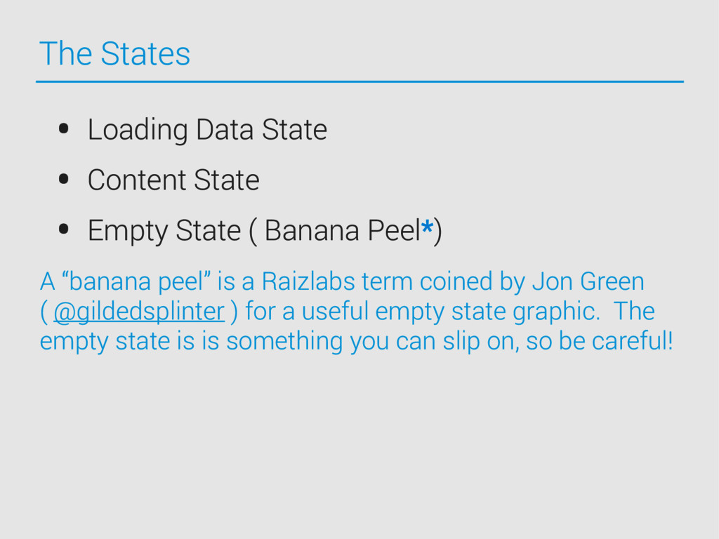
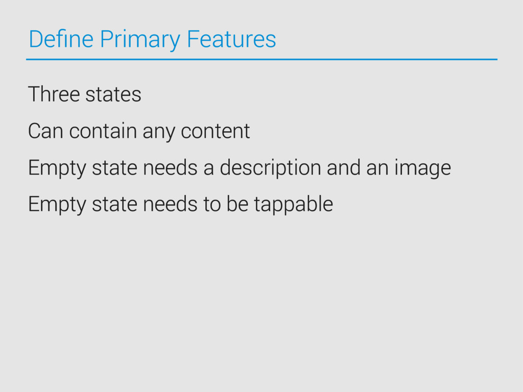
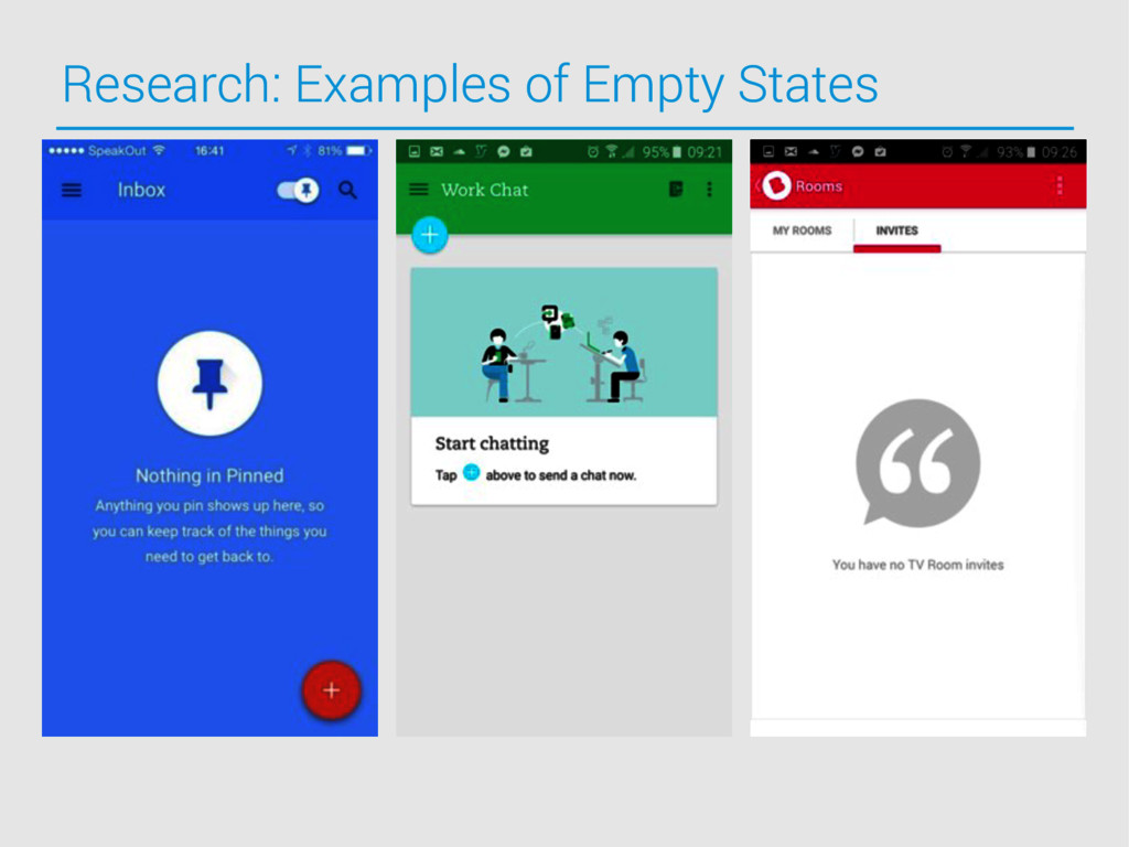
Exposing elements: what is important and what isn't
- Creating interfaces that encapsulate logic
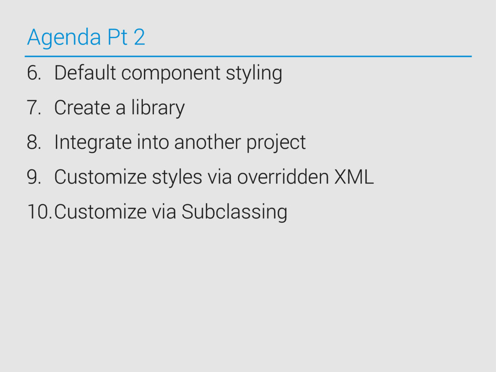
- Default styles and allowing easy style changes
- Tips for Android: structuring your API and utilizing XML

Building reusable, extensible layouts
- What to use as a parent view type
- Design patterns for reusable UI components
- Observable data structures to make your life easier

Let's get inspired to create something worth using everywhere!

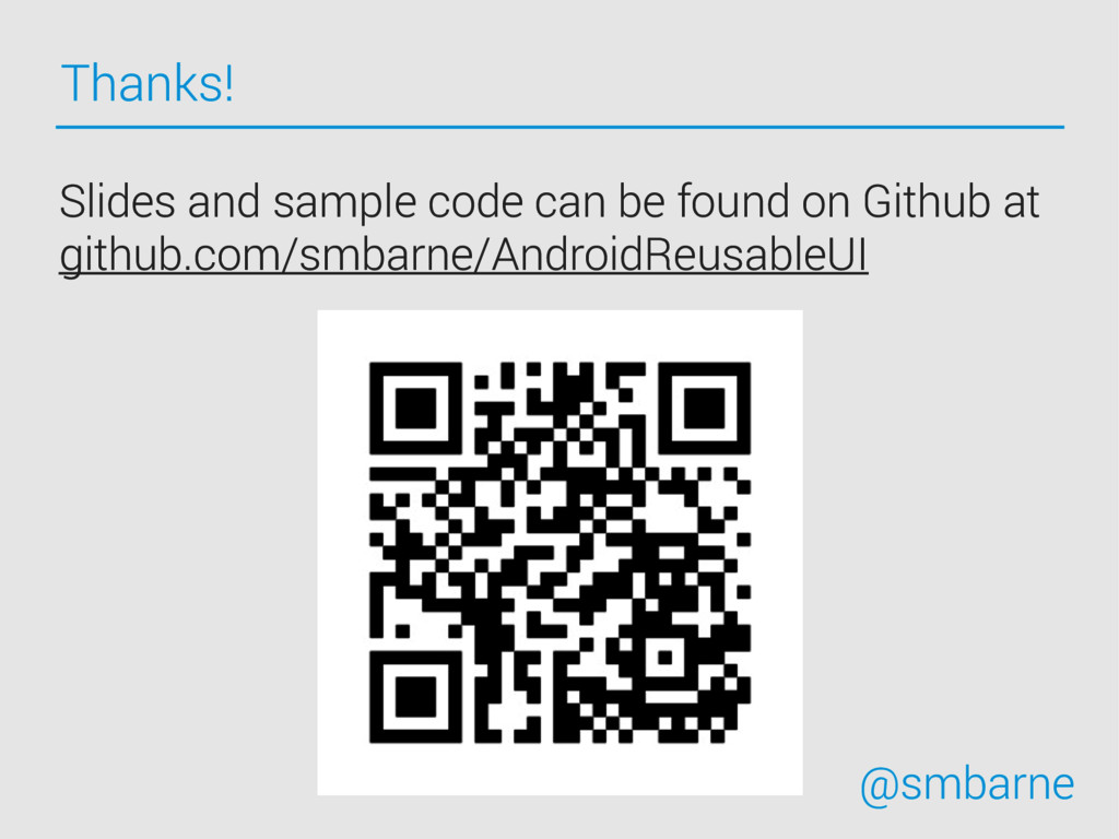
Note: You should be comfortable with using Android UI components and editing layouts. Sample project available via GitHub - https://github.com/smbarne/AndroidReusableUI.

Stephen Barnes

August 07, 2015
Tweet

More Decks by Stephen Barnes

Other Decks in Programming

Transcript

  1. The Art of Building Reusable UI AnDevCon Boston 2015 Stephen

    Barnes 
 @smbarne github.com/smbarne/AndroidReusableUI
  2. Who is this guy? Senior iOS Developer 
 @Fitbit, previously

    Senior Mobile Developer @Raizlabs @smbarne smbarne engineeringart.io
  3. Resources This class assumes you are comfortable with using Android

    UI components and editing layout xml files. Slides and sample code can be found on Github at github.com/smbarne/AndroidReusableUI
  4. What is Reusable UI A Reusable UI element is an

    encapsulated component with a user facing element. • Responsibilities for a reusable component can be large or small. • Reusable UI elements are typically extensions of system components. • Good Reusable UI is opinionated: it describes a narrow situation.
  5. Outline for Creating Great Reusable UI User Happiness: Design UI

    that provides a good user experience and lasts the tests of time. Developer Happiness: Create a clear, friendly API and make it easy to use. Operating System Happiness: Take advantage of OS capabilities such as utilizing XML properties in Android.
  6. Problem To provide a good UX, it is best to

    not block user interaction with a progress dialog when loading ( the Android Design guidelines cover this here ). One approach is to use the ‘Activity Circle’ pattern. However, often, when loading data from the web, we need a tri-state ViewGroup.
  7. The States • Loading Data State • Content State •

    Empty State ( Banana Peel*) A “banana peel” is a Raizlabs term coined by Jon Green ( @gildedsplinter ) for a useful empty state graphic. The empty state is is something you can slip on, so be careful!
  8. Agenda 1. Create an engaging, robust, design. 2. Create an

    initial API description 3. Core UI implementation 4. Create and use the control via code 5. Create and use the control via XML
  9. Agenda Pt 2 6. Default component styling 7. Create a

    library 8. Integrate into another project 9. Customize styles via overridden XML 10.Customize via Subclassing
  10. Define Primary Features Three states Can contain any content Empty

    state needs a description and an image Empty state needs to be tappable
  11. Cover The Details Remember press states Plan around transitions Design

    for any aspect ratio Your UI should adapt to the content Thumb-friendly tap areas Respect the OS: don't repurpose common UI elements or patterns for new ones ( ex: don’t highjack the back or up buttons )
  12. Get Inspired, But Stick to the Rules mobile-patterns.com/android androidniceties.tumblr.com android.inspired-ui.com/

    • developer.android.com/design • petrnohejl.github.io/Android-Cheatsheet-For-Graphi Designers/ Inspiration Resources Design Rules
  13. Material is Your Friend The Material design language is powerful

    and well documented at developer.android.com/design. iOS has Apple’s HIG (Human Interface Guidelines), Google has the Android Design Guidelines.
  14. Designing Our View Loading Content Empty State Create a customizable,

    reusable ViewGroup with loading, content, and empty state.
  15. A Word on API Design A Few API Requests: •

    Modular • Approachable • Documented • Platform Friendly
  16. An API Should be as Minimal as Possible The more

    options an API has, the harder it can be to learn. Have an opinion: implement things with authority. Mirror the primary features as methods. For example, a primary primary feature of our UI is the three UI states. public void showLoading() { } public void showContent() { } public void showBananaPeel() { } public View setContentView(int contentViewLayoutResourceId) { } public View setBananaPeel(int messageResourceId, int imageDrawableResourceId, final BananaPeelActionListener listener) { }
  17. Ready to Go, Out of the Box Do not require

    additional methods to have a component work after initialization, but do allow for it. /** * Create a banana peel with the given message and image drawable. * @param messageResourceId - The string resource id for the banana peel text. * @param imageDrawableResourceId - The id for the drawable to be displayed. * @param listener - (optional) An event listener for when the banana peel is clicked. */ public void setBananaPeel(int messageResourceId, int imageDrawableResourceId, final BananaPeelActionListener listener) { configureBananaPeel(imageDrawableResourceId, listener); setBananaPeelMessage(messageResourceId); }
  18. Ready to Go, Out of the Box /** * Update

    the banana peel message text. If 0 is passed in for the {@code messageResourceId} * then the image message textview will be set to visibility {@link View#GONE}. * @param messageResourceId - The resource id for the banana peel text. */ public void setBananaPeelMessage(int messageResourceId) { /** * Update the banana peel image drawable. If 0 is passed in for the {@code imageDrawableResourceId} * then the image drawable will be set to visibility {@link View#GONE}. * @param imageDrawableResourceId - The id for the drawable to be displayed. */ public void setBananaPeelImage(int imageDrawableResourceId) {
  19. API Documentation /** 
 * Create a banana peel with

    a card view with the given message and image drawable.
 * @param messageResourceId - The string resource id for the banana peel text.
 * @param imageDrawableResourceId - The id for the drawable to be displayed.
 * @param listener - (optional) An event listener for when the banana peel is clicked.
 */ public void setBananaPeel(int messageResourceId, 
 int imageDrawableResourceId, 
 final BananaPeelActionListener listener) {
 configureBananaPeel(imageDrawableResourceId, listener);
 setBananaPeelMessage(messageResourceId);
 } Take advantage of JavaDoc and document your API. The method documentation and API structure should make it possible to use the control without another document.
  20. LoadingBananaPeel Approach Subclass ViewFlipper. Expose the content view and the

    empty state setters. Create and expose an interface for the empty state click listener. Inflate and layout our views. Make our public API thread-safe.
  21. Overrides for Subclassing a View public class MyView extends View

    { // Constructor required for in-code creation public MyView(Context context){ super(context); init(context, null); } // Constructor required for inflation from resource file public MyView(Context context, AttributeSet attr){ super(context,attr); init(context, attrs); } // Private common init method private void init(Context context, AttributeSet attrs) { // … } }
  22. Initializing with Default Layout XML Often, if UI is non-trivial,

    it is best to create an XML file to inflate instead of creating elements manually. In this case, create a default XML layout file for your reusable UI ( we’ll cover overriding this later ). In our case, we want default layouts for each of our three states.
  23. Inflating Our Default XML @Override protected void onFinishInflate() { super.onFinishInflate();

    bananaPeelView = inflateAndAddResource(R.layout.view_default_banana_peel); } private View inflateAndAddResource(int layoutResourceId) { LayoutInflater inflater = LayoutInflater.from(getContext()); View bananaPeel = inflater.inflate(layoutResourceId, this, false); addView(bananaPeel); cacheViewIndicies(); return bananaPeel; } Inflating and Adding the default banana peel view state.
  24. State Management It is important to expose configuration setters publicly.

    But remember! Break out configuration into modular methods. Use the same methods to initialize the component. Update the component state after setting properties.
  25. BananaPeel Code Example /** * Create a banana peel with

    with the given message and image drawable. * @param messageResourceId - The string resource id for the banana peel text. * @param imageDrawableResourceId - The id for the drawable to be displayed. * @param listener - (optional) An event listener for when the banana peel is clicked. */ public void setBananaPeel(int messageResourceId, int imageDrawableResourceId, final BananaPeelActionListener listener) { configureBananaPeel(imageDrawableResourceId, listener); setBananaPeelMessage(messageResourceId); } Public API Convenience Method
  26. BananaPeel Code Example /** * Update the banana peel message

    text. If 0 is passed in for the {@code messageResourceId} * then the image message textview will be set to visibility {@link View#GONE}. * @param messageResourceId - The resource id for the banana peel text. */ public void setBananaPeelMessage(int messageResourceId) { if (bananaPeelView != null) { TextView bananaTitle = (TextView) bananaPeelView.findViewById(R.id.bananaPeel_TextView); if (messageResourceId != 0) { bananaTitle.setVisibility(VISIBLE); bananaTitle.setText(messageResourceId); } else { bananaTitle.setVisibility(GONE); } } } Public API Setter
  27. UI Configuration the Android Way Often, we want to include

    our reusable UI in a layout XML file. Wouldn’t it be great if we could configure it in the XML file as well?
  28. Styleable XML Attributes First, we need to define styleable attributes

    in a XML file specific to our component. <?xml version="1.0" encoding="utf-8"?> <resources> <declare-styleable name="LoadingBananaPeelView"> <attr name="bananaPeelDefaultMessageStringResource" format="reference" /> <attr name="bananaPeelDefaultImageResource" format="reference" /> <attr name="bananaPeelViewResource" format="reference" /> <attr name="bananaPeelContentViewLayoutResource" format="reference" /> </declare-styleable> </resources>
  29. Valid Attribute Format Types public enum AttributeFormat { Reference, String,

    Color, Dimension, Boolean, Integer, Float, Fraction, Enum, Flag }
  30. Applying Attributes When configuring your View, you can retrieve and

    apply the attributes at runtime. public LoadingBananaPeelView(Context context, AttributeSet attrs) {
 super(context, attrs);
 init(attrs);
 }
 private void init(AttributeSet attrs) {
 hadAttrs = (attrs != null);
 if (attrs != null) {
 TypedArray styledAttributes = getContext().getApplicationContext().obtainStyledAttributes(attrs, R.styleable.LoadingBananaPeelView);
 bananaPeelViewResourceId = styledAttributes.getResourceId(R.styleable.LoadingBananaPeelView_bananaPee lViewResource, 0);
 styledAttributes.recycle();
 }
 }
  31. Using Styleable Attributes in Layouts Lastly, specify values for any

    of your custom styled attributes in a layout XML file. Note the namespace! <com.smb.loadingbananapeel.LoadingBananaPeelView
 xmlns:android="http://schemas.android.com/apk/res/android"
 xmlns:app="http://schemas.android.com/apk/res-auto"
 android:id="@+id/fragment_content_loading_view"
 android:layout_width="match_parent"
 android:layout_height="match_parent"
 app:bananaPeelDefaultImageResource="@drawable/ic_bananapeel_default"
 app:bananaPeelDefaultMessageStringResource="@string/ banana_peel_default_empty_message"
 app:contentViewLayoutResource="@layout/view_example_content" />
  32. Namespacing Prepend your styleable attributes! There is no namespacing for

    styleable XML attributes. If you name them generically in your library, they can collide during the dexing process.
  33. Zero Effort Pretty Others are more likely to use the

    component you have spent your time on if it does not require any styling to make it look nice. Make sure that your UI looks presentable without any overrides.
  34. LoadingBananaPeel Default Styling Place the banana peel image and message

    within a card. Give a default banana peel image. Update the font size and color. Match the Activity Theme’s primary color.
  35. Create a Custom XML Files Style XML File Color XML

    File Dimens XML File Values XML File String XML File For each of the following, create new files for your component.
  36. Material Fun Android L and Material design have introduced some

    great concepts for customizable UI components. Two of which are: - Activity Configurable Colors - Image Tinting via XML
  37. Material Fun <style name="AppTheme" parent="AppTheme.Base"/> <!-- Base application theme. -->


    <style name="AppTheme.Base" parent="Theme.AppCompat.Light.DarkActionBar" >
 <item name=“colorPrimary"> @color/Material.Blue </item>
 <item name=“colorPrimaryDark”> @color/Material.Blue.Dark </item>
 <item name=“colorAccent”> @color/Material.Blue.Accent </item>
 <item name=“android:textColorPrimary”> @color/Material.White </item>
 </style>
  38. Material Fun <ImageView
 android:id="@+id/bananaPeel_ImageView"
 android:layout_width="match_parent"
 android:layout_height="wrap_content"
 android:contentDescription="Banana Peel: Empty State"


    android:tint="?android:colorPrimary"/>
 <TextView
 android:id="@+id/bananaPeel_TextView"
 android:layout_width="match_parent"
 android:layout_height="wrap_content"
 android:gravity="center"
 android:textColor="?android:attr/colorPrimary"
 android:textSize="20sp"/>
  39. Creating a Library Start by going to File -> New

    Module. Select Android Library.
  40. Integration into Another Project Let’s integrate the LoadingBananaPeel into another

    project. Let’s use a small sample app that loads MBTA train data. You can grab the code from: github.com/smbarne/AndroidForiOS
  41. Overriding XML Files XML files In the parent project override

    XML files in library projects. For a quick win, create an alternate implementation of view_default_banana_peel.xml with different coloring coloring, spacing, and typography.
  42. Override Specific Values You can also override specific values such

    as specific padding dimensions declared in your library. 
 <dimen name=“BananaPeel.DefaultMargin”>30dp</dimen>

  43. When and Why to Subclass Congratulations, you can now use

    your wonderful, reusable UI in all of your projects. But what about special changes? When you need to make special changes for one specific project - subclass instead of than inserting one-off code into the base component.
  44. Subclassing Example Let’s say we now want our content views

    to be inset and have a red background on them.
  45. Subclassing public class RedContentBananaPeel extends LoadingBananaPeelView { @Override public View

    setContentView(View contentView) { View inflatedView = super.setContentView(contentView); // Modify the inflated content view (hideously) inflatedView.setBackgroundColor(getResources().getColor (R.color.Material_Red)); int padding = getResources().getDimensionPixelSize(R.dimen.Padding_Large); inflatedView.setPadding(padding, padding, padding, padding); return inflatedView; } }
  46. Thanks! Slides and sample code can be found on Github

    at github.com/smbarne/AndroidReusableUI @smbarne