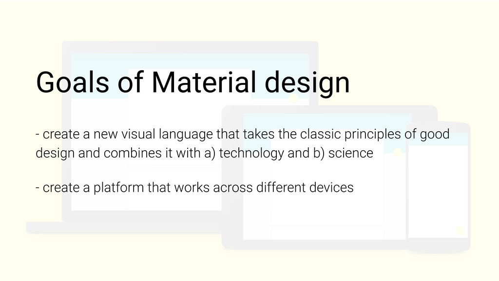
that takes the classic principles of good design and combines it with a) technology and b) science - create a platform that works across different devices
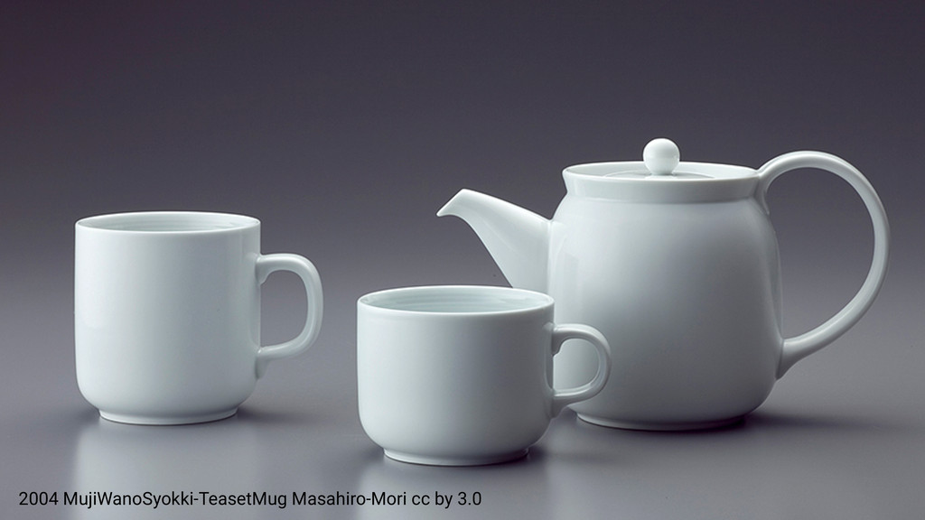
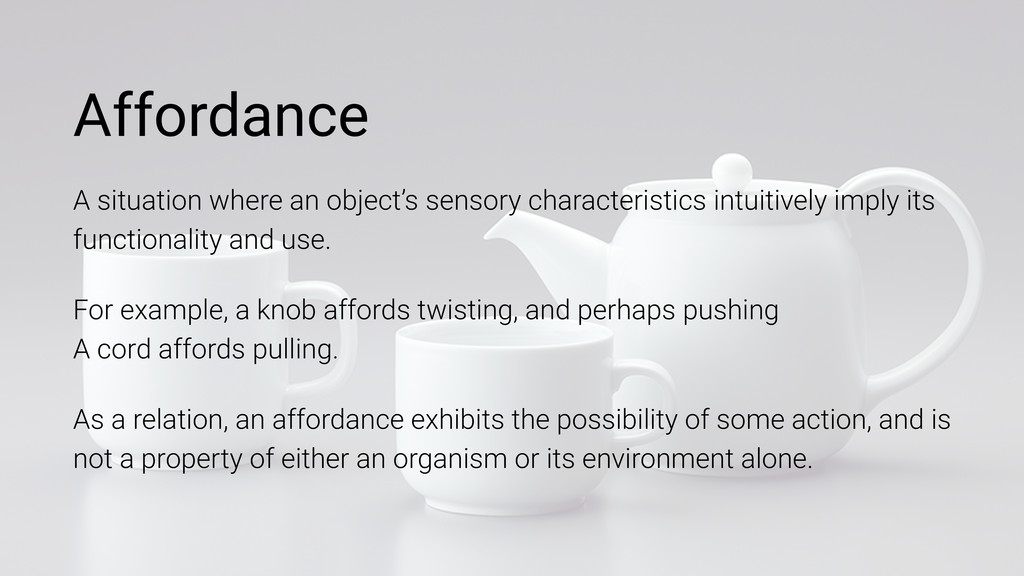
functionality and use. For example, a knob affords twisting, and perhaps pushing A cord affords pulling. As a relation, an affordance exhibits the possibility of some action, and is not a property of either an organism or its environment alone. Affordance
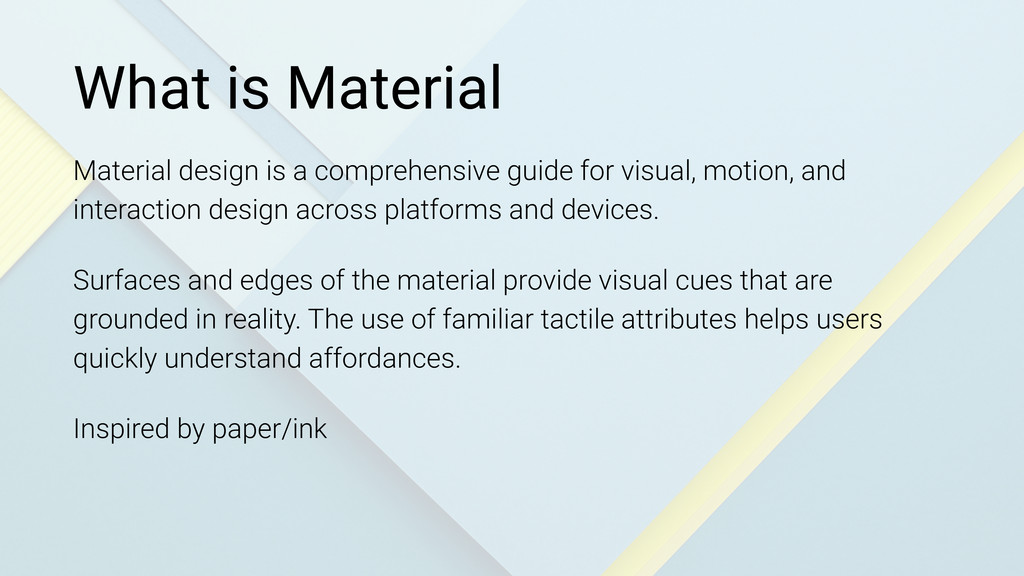
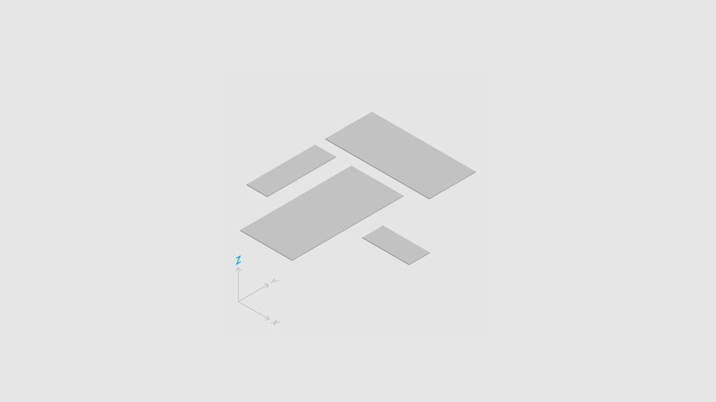
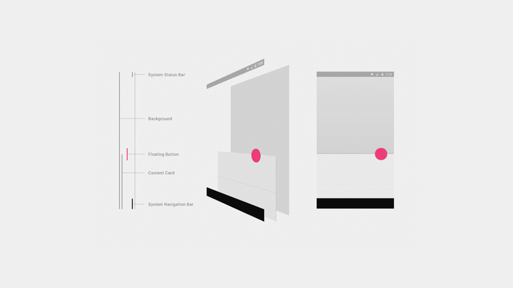
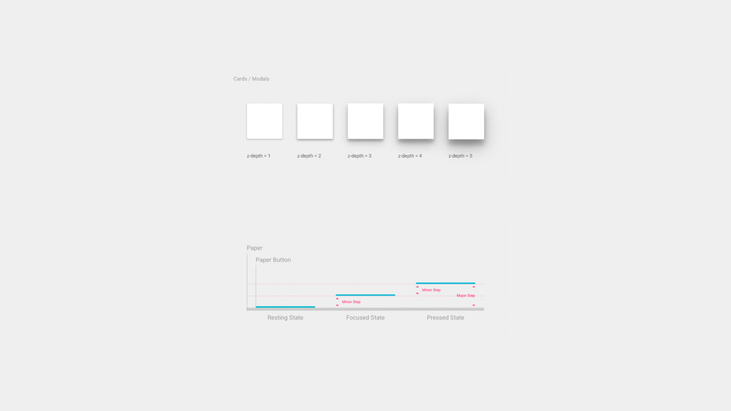
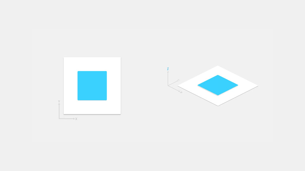
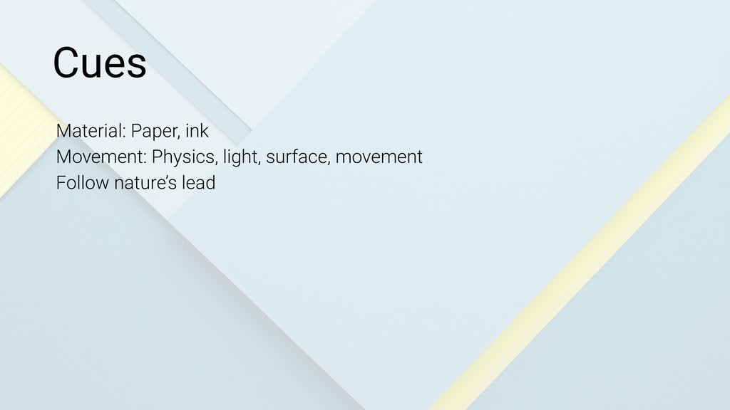
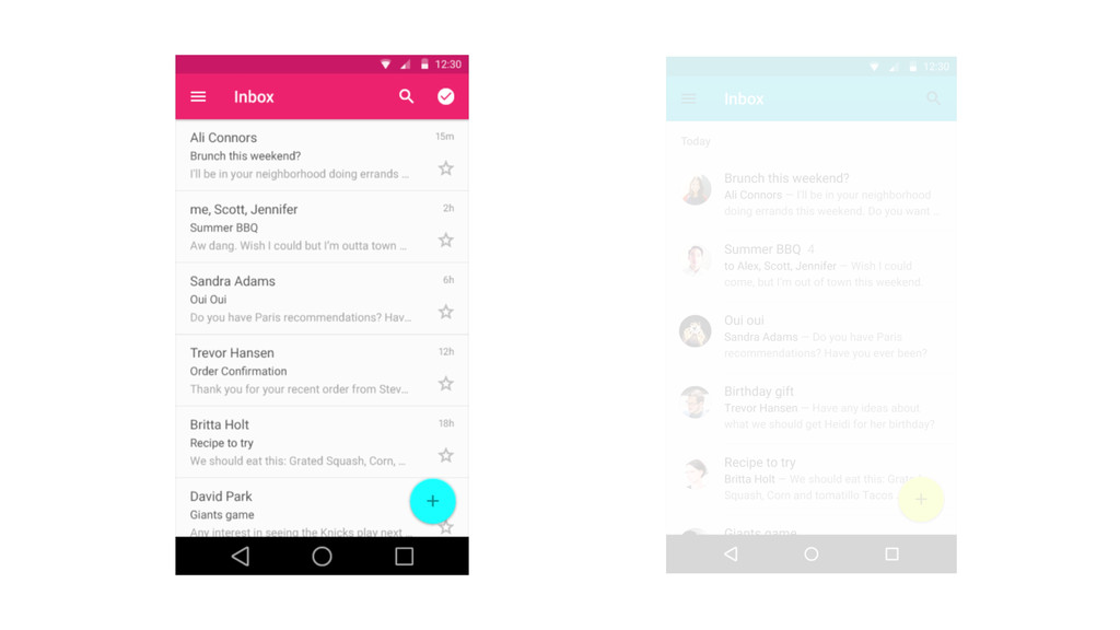
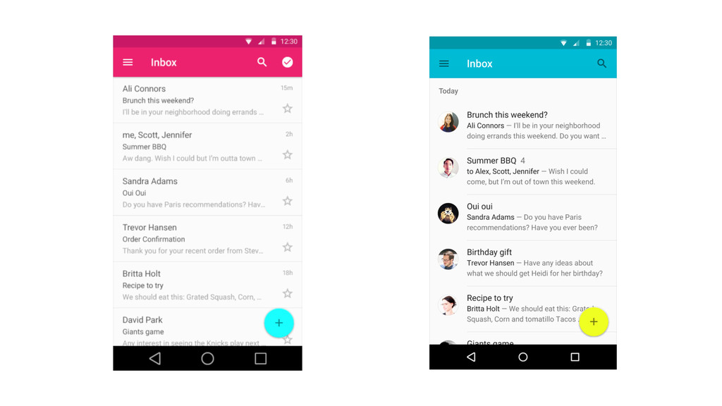
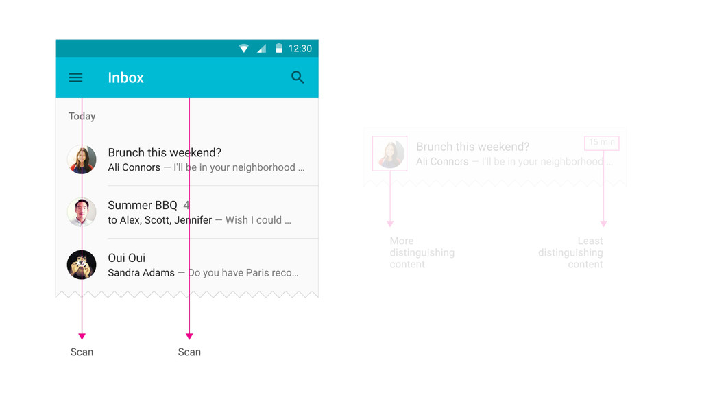
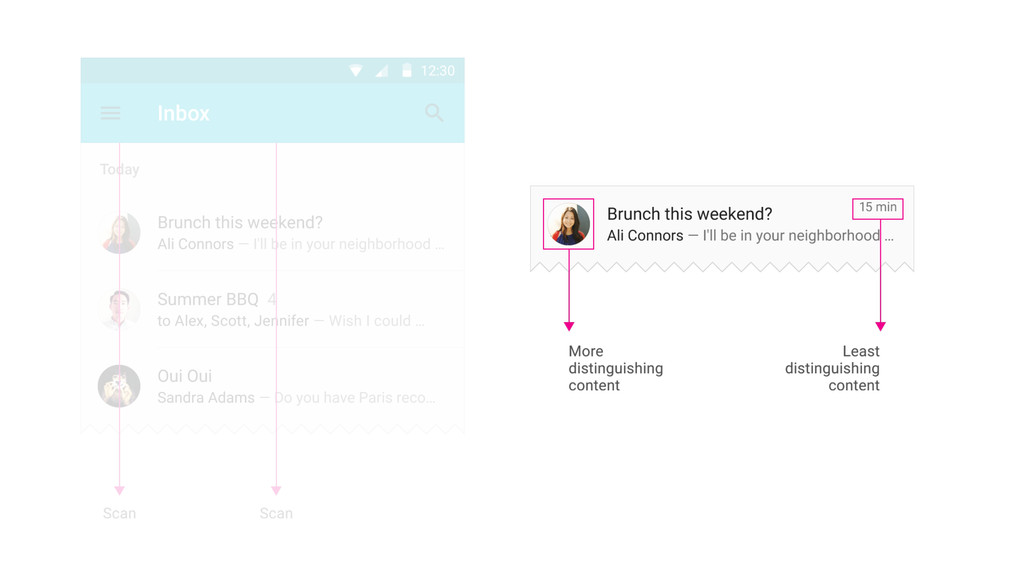
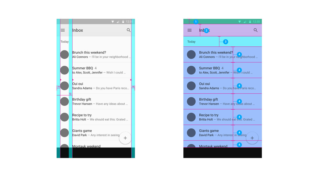
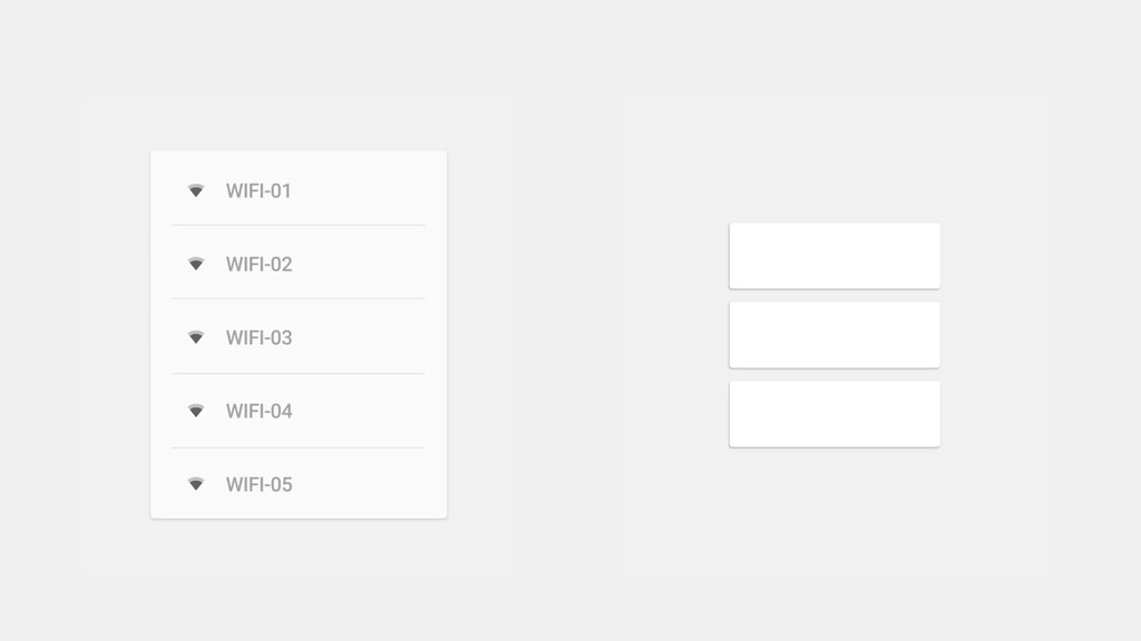
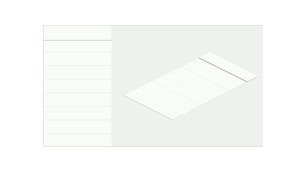
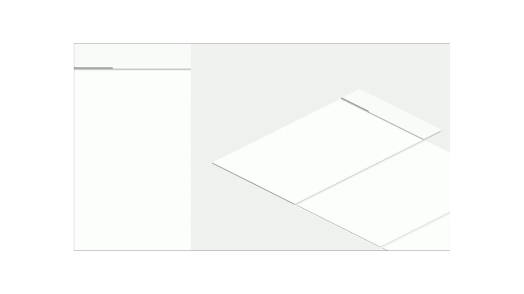
visual, motion, and interaction design across platforms and devices. Surfaces and edges of the material provide visual cues that are grounded in reality. The use of familiar tactile attributes helps users quickly understand affordances. Inspired by paper/ink
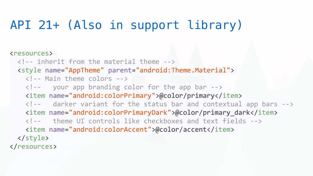
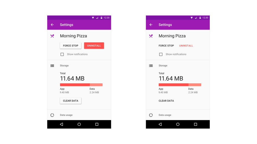
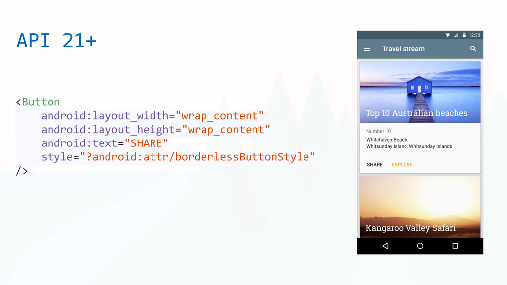
<style name="AppTheme" parent="android:Theme.Material"> <!-‐-‐ Main theme colors -‐-‐> <!-‐-‐ your app branding color for the app bar -‐-‐> <item name="android:colorPrimary">@color/primary</item> <!-‐-‐ darker variant for the status bar and contextual app bars -‐-‐> <item name="android:colorPrimaryDark">@color/primary_dark</item> <!-‐-‐ theme UI controls like checkboxes and text fields -‐-‐> <item name="android:colorAccent">@color/accent</item> </style> </resources> API 21+ (Also in support library)
 soham
soham
 a_ono
a_ono
 tanimuyk
 lycorptech_jp
 z63d
z63d
 ken6377
 kawaguti
 sansantech
 freshdaz
 appleboy
 uhyo
uhyo
 smasato
 rryz09
 tessaabrams
 destraynor
 addyosmani
 lfama
lfama
 reverentgeek
 irinanazarova
 sugarenia
 szymonslowik
 inesmontani
 signer
 quramy
 scottboms
![Q&A [email protected] | [email protected] @s0h4m www.soham.cc Source: http://www.google.com/design/](https://files.speakerdeck.com/presentations/ca9ff3705c6a01328bf36297dcb9d705/slide_77.jpg)