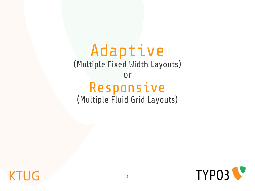
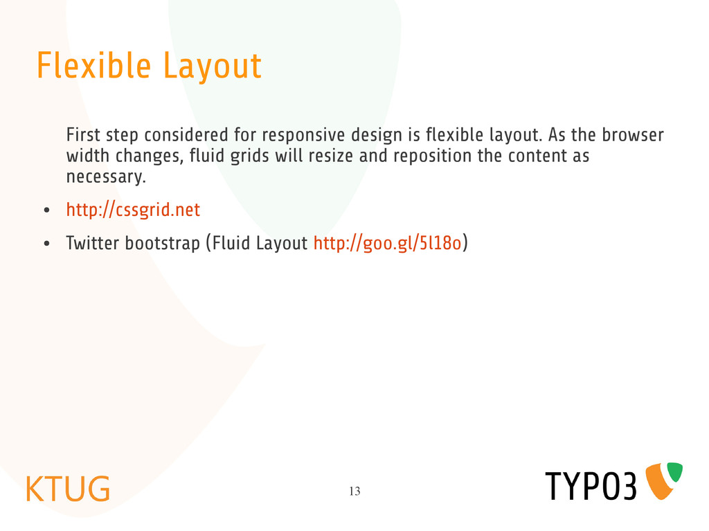
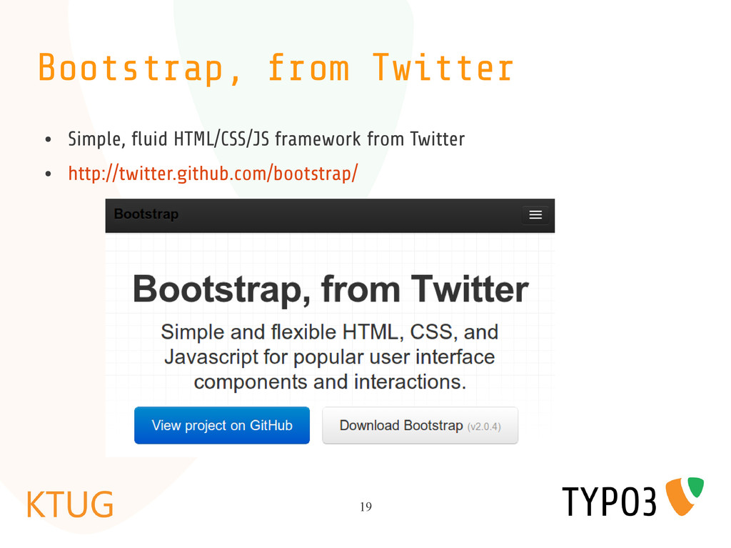
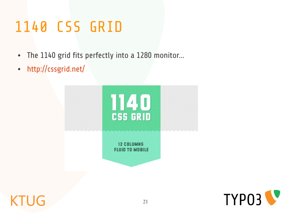
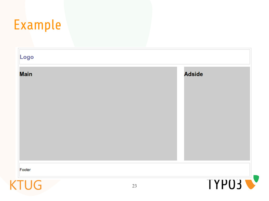
flexible layout. As the browser width changes, fluid grids will resize and reposition the content as necessary. • http://cssgrid.net • Twitter bootstrap (Fluid Layout http://goo.gl/5l18o)
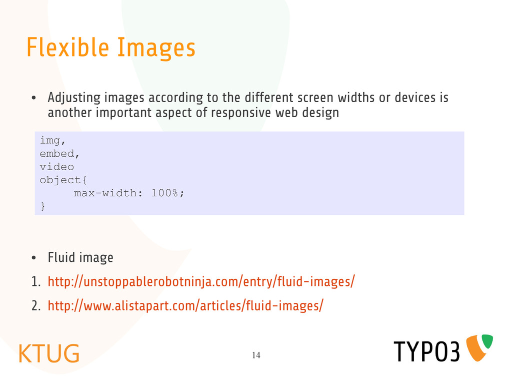
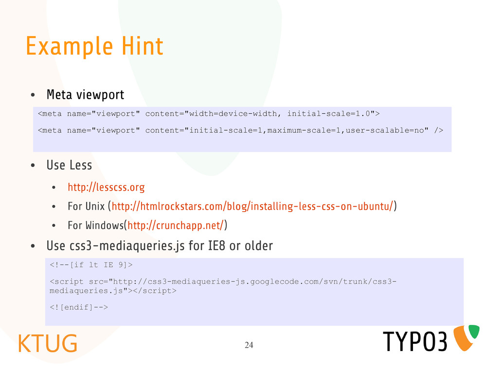
screen widths or devices is another important aspect of responsive web design • Fluid image 1. http://unstoppablerobotninja.com/entry/fluid-images/ 2. http://www.alistapart.com/articles/fluid-images/ img, embed, video object{ max-width: 100%; }
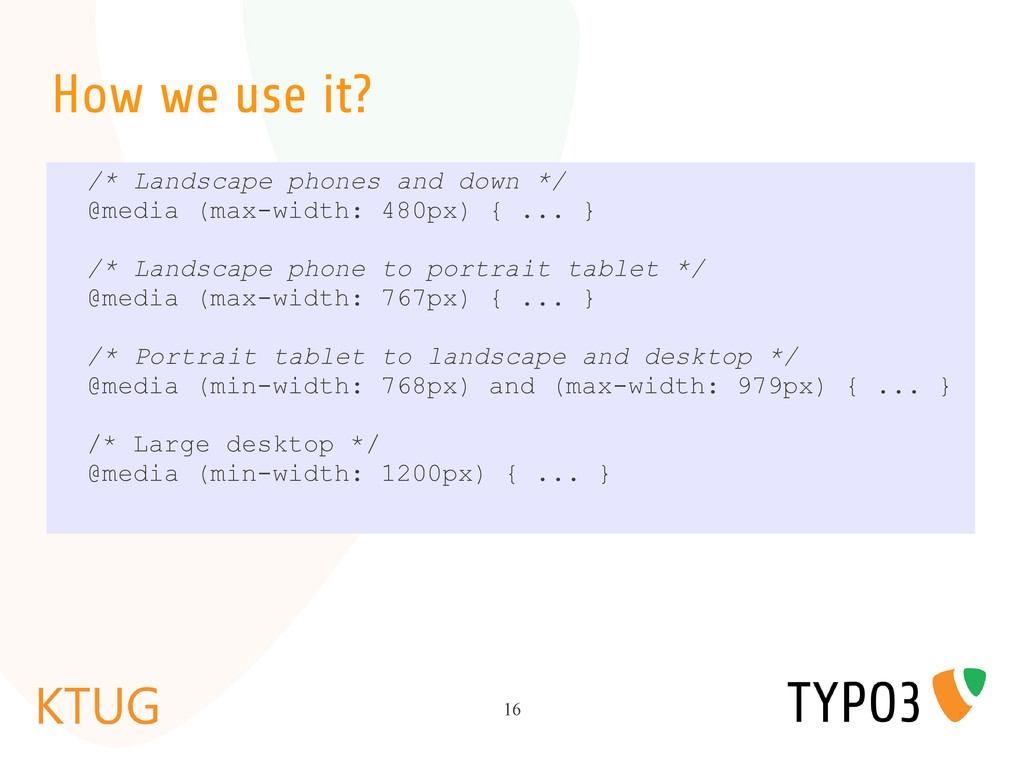
apply specific stylesheet for specify media type like screen or print. • In CSS3, W3C made it more efficient by adding media queries made it as part of the CSS3 specification
 a2k
a2k
 vivion
 videlvequio
 designer_no_pon
 lynteo
 karad
karad
 takaikanako
 kamechi7222222
 stmn
stmn
 sony
sony
 garyuten
 sarafernandez
 lara
lara
 morganepeng
 livdayseo
 honzajavorek
 reverentgeek
 chrisshort
 jonoalderson
 bkeepers
 orderedlist
 varn
varn
 tammyeverts
![Responsive Design and TYPO3 Part1 Sophy ([email protected]) @psophy http://www.typo3cambodia.org](https://files.speakerdeck.com/presentations/500cb7393774e40002026531/slide_0.jpg)