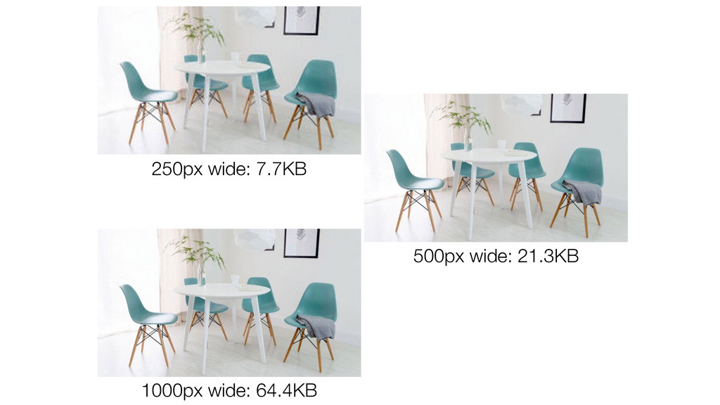
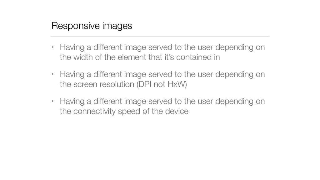
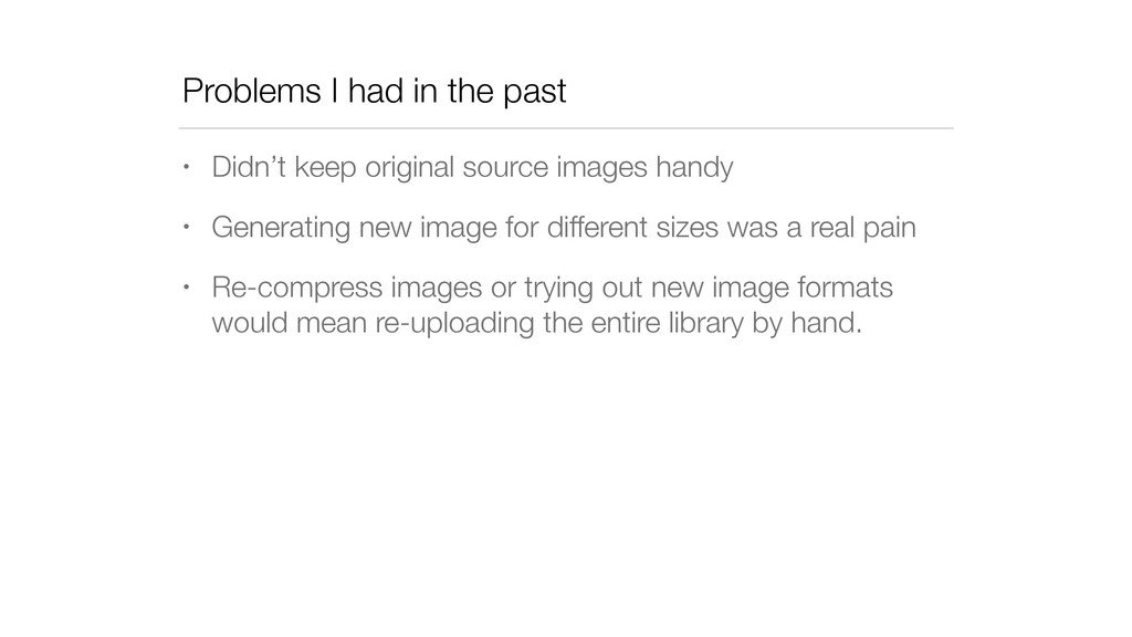
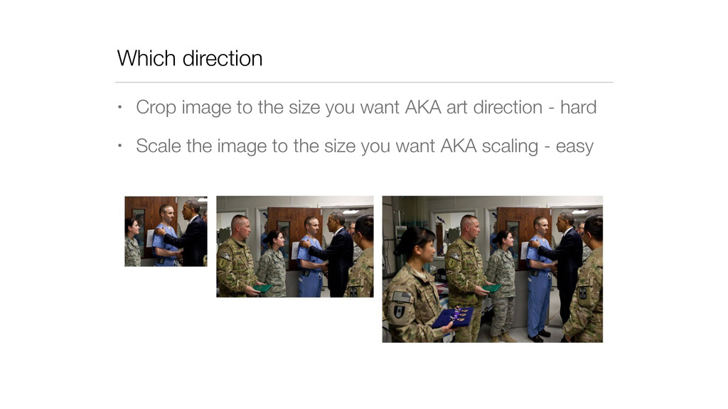
Images are becoming more and more complex on the web. We want to have great looking images but keep file sizes to a minimum especially on mobile devices. Take a look at one simple and effective way to server up images that automatically are the right size for the device you're using.
 nrslib
 _fhhmm
 rkaga
rkaga
 johnroyer
 minodriven
.png) yuriko1211
yuriko1211
 yuzneri
 slashnephy
 supurazako
 tk3fftk
 o0h
o0h
 petamoriken
 orderedlist
 kevinliebholz
 aemeredith
 sergeychernyshev
 greggifford
 marktimemedia
 uxyall
 palkan
 jnunemaker
 livdayseo
 addyosmani
 lcolladotor
![Yay it’s over! • @thickey on twitter • [email protected] on](https://files.speakerdeck.com/presentations/a905b9d1359b4fe797298fa39b0545db/slide_18.jpg)