Upgrade to Pro — share decks privately, control downloads, hide ads and more …

example

Sponsored · Your Podcast. Everywhere. Effortlessly. Share. Educate. Inspire. Entertain. You do you. We'll handle the rest.
Avatar for thiru thiru
April 30, 2012

 example

Avatar for thiru

thiru

April 30, 2012
Tweet

Other Decks in Research

Transcript

  1. Nikhita Kumar, Jeongmin Lee, Thiru Manikandan, Jeff McElhannon, Yue Ren

    X-Informatics 04/24/2012 Final Project Assignment 1.1 Choose an advanced information application. Write 3-4 sentences describing the current implementation, what you think the use case is and why you made your choice. Global Disaster Alert Coordination System (GDACS) is a cooperation framework of the United Nations, the European Commission and disaster managers around the world, aiming to exchange disaster information and coordinate relief in the first phase of a disaster’s aftermath. As for a subject for analyzing information architecture, GDACS is quite an interesting system to analyze because it has various actors, ranging from earthquake observatories to disaster managers in the field, as well as its variety of data and information. GDACS is comprised of two sub-systems; the automated disaster alert system and the disaster relief coordination system, named V-OSOCC(Virtual On-Site Operations & Coordination Center). For this term project, we only reviewed and re-implemented V-OSOCC. 1.2 Analyze the information architecture including presentation of information content, clarity, what goals of a use case were achievable, etc. Min 3-4 sentences. 1.2.A Disaster Relief Introduction Before we review the information architecture, we will discuss the basic process of disaster relief coordination and the information flow. When a disaster happens and its impact large enough to needs global-scale intervention, relief actors including international organizations(UN,UNICEF, etc.), international NGOs(World Vision, Save the Children, etc.) and other countries become involved. The United Nations’ Office for the Coordination of Humanitarian Affairs (OCHA) has the primary responsible of initial assessment of the disaster and coordination for disaster relief. Then, OCHA deploys the United Nations Disaster Assessment and Coordination (UNDAC) team to the disaster affected area within 48 hours. The UNDAC team is composed of experts of disaster assessment and coordination field, and set up the On-Site Operations and Coordination Center(OSOCC) in those area. The OSOCC plays the role of the base-camp for all disaster relief coordinations throughout the entire relief process. Then, the UNDAC team examines damages and any aftershocks of the disaster to determine the scale of relief aid. Additionally, they write reports of this assessment and share the information with humanitarian actors. Meanwhile, followed by the UNDAC team, other international humanitarian NGOs and international organizations arrive to the disaster area. UNDAC coordinates the disaster relief actions by 1) having a meeting in the OSOCC with delegates or leaders of most disaster relief organizations, 2) maintaining constant communication with all actors around the relief including OCHA’s headquarters, all different kinds of disaster relief organization’s field office and headquarters and affected countries’ government and local government. UNDAC and other international actors produce, share, and consume various information simultaneously. At this point, the role of well developed information architecture and information flow is very important.
  2. 1.2.B Information Flow and Architecture on GDACS Within V-OSOCC, information

    about disaster relief and coordination is categorized by each disaster. Each disaster is categorized by the year in which it occurred. For one specific disaster, it has its own V-OSOCC and it has several disaster relief categories. Sections can vary by the scale and type of the disaster characteristics and the situation of the affected country, however, usually it maintains a similar structure. For this analysis, we reviewed the 2010 Haiti earthquake and the 2011 Japan earthquake/tsunami. The following list describes the sections for the 2010 Haiti earthquake V-OSOCC: • Alert roster • After shock (rapid assessment of the disaster) • Coordination • Logistics • Situation • Contacts • Media reports • Maps and satellite images • Relief teams • Relief items For each section, there are a number of situation reports, maps, contact lists, documents, and satellite images available. Following diagram represents information entities available on V- OSOCC. Those sections are managed by OCHA and the Joint Research Center(JRC). Disaster managers at OCHA and UNDAC are monitoring each sections and its articles, comments, attached files. Meanwhile, in the disaster response phase, various relief actions are grouped by cluster and each cluster is managed by each international organization. Similarly, each section of the V-OSOCC’s contents and reports are generated by each cluster managing organization.
  3. 1.2.C Presentation of Information Content on V-OSOCC Most Information on

    V-OSOCC is contained within files of various formats, such as Microsoft’s Word ‘.doc’ file, Microsoft’s PowerPoint ‘.ppt’, or Adobe Reader’s ‘.pdf’ file. These files are uploaded as attached files and the file name and download link are presented to users by each section. Therefore, from a user’s perspective, the user should download the file to his or her desktop and open it through the appropriate application to read the file. The Summary text is a abstracted information about the each section. Before looking around the specific information contained in attached files, the user can understand the current situation by reading the summary text and deciding what specific information is needed. A discussion board is also provided in each section. A user can enter the discussion board for each section by clicking the “comment” button on the top. When a user enters the discussion board, it can leave a comment and also attach a file. In the discussion board lots of humanitarian actors can express their opinions, describe situations, and list any needs they may have. 1.2.D Goals of the use case were achievable
  4. The goal of the use case is “Coordinate international relief

    and disaster response from various actors at local and global scale disaster area.” and we can conclude the goal was achievable by the current implementation of the system, its information architecture, and information presentation. However, it is not enough to say that the goal was achieved completely because there are still problems within the system. One of the biggest problems is the way users generate, share, and access the information. We will explain specific problems and propose a prospective solution in the next section. 1.3 Critique(Assess) the implementation in the areas defined in lecture materials covering information uncertainty, semiotics, cognition, and architecture. including details (screenshot, other documents supporting critique.) One characteristic of V-OSOCC is its text-based very dry website design. On the V-OSOCC website, its is hard to find any images except the logos of related organizations such as UN, JRC, OCHA and icons for attached files. We assume this is because the user’s context of using the website is in a disaster area, with low connectivity and slow internet speeds. Usually, in the disaster field, internet and communication connectivity is provided by specialized technical NGO named TSF (Telecoms Sans Frontieres; Telecom Without Borders). TSF brings satellite
  5. communication devices and sets users up for the V-OSOCC and

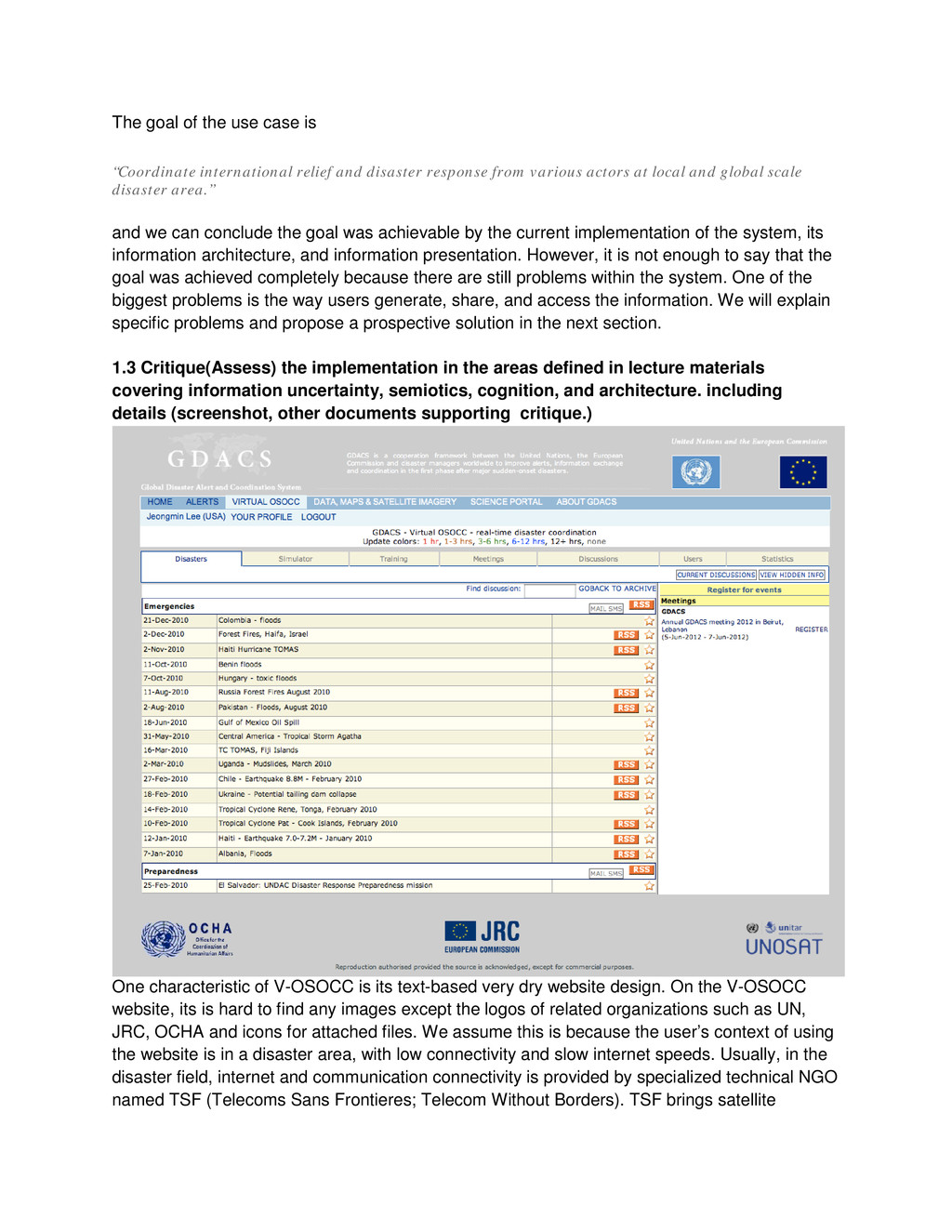
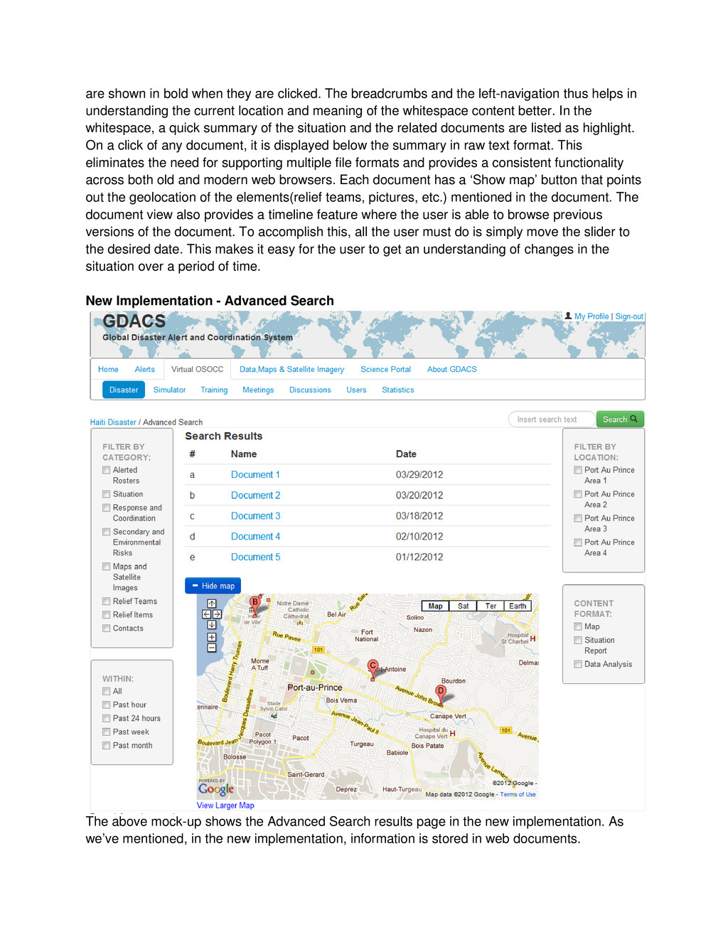
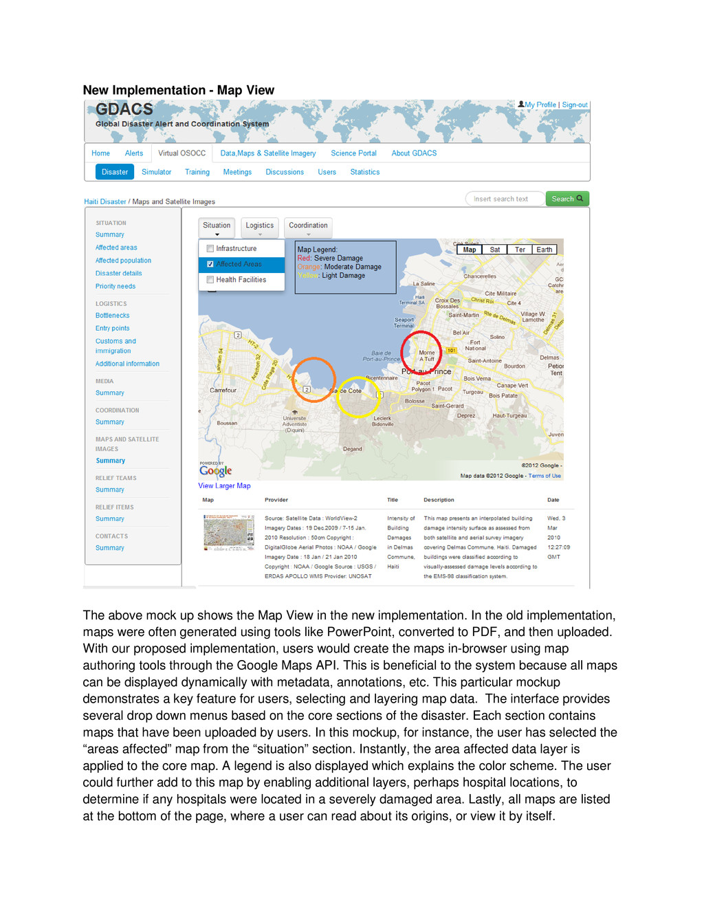
    other humanitarian NGO’s temporary field center. Therefore, considering loading speeds, the website should be light with less images and semiotics. On the usability side, we assess that the structure and navigation system is quite well developed but needs to be changed in some areas. First of all, text, such as the menu title, on the navigation bars is too small. Additionally, there is no emphasis on the navigation system, which is a crucial element of the website. Important or frequently used entities such as navigation should be emphasised and have some space between itself and other elements. However, the website’s navigation system is too narrow and there is no stress on it. Therefore, our re-implementation should guarantee more space dedicated to the navigation system. Information uncertainty and ‘findability’ By Shannon’s information theory, information uncertainty increases when noise interferes the signal between the sender and receiver. For the V-OSOCC website, we assume that one type of ‘noise’ for smooth communication is a lack of ‘findability’ and information presentation on the current system. There is no search page or search bar on each disaster page. The lack of ‘findability’ increases information uncertainty in the system. Currently, as mentioned before, most information is contained within Word, PowerPoint, or PDF files. Because of this, it is hard for the web system to index these files’ contents. Also, there is no means of metadata acquisition and curation. To increase ‘findability’, the convention of information process should be changed. We propose a method for searching which includes a search bar as well as an advanced search page. Also, we propose a way to change information acquisition, curation and the management process by providing ‘templates’ for the data types which are currently saved in the various file formats. With a template provided, users can write various articles such as situation reports, contacts lists, and relief items based on the article template. Additionally, the written articles will be saved in a database system. In the future, we can expect that semantic web principles could be applied to V-OSOCC, which would allow users to find information that they want more easily, and could automatically generate data reports. Meanwhile, there is no means of retrieving information based on time or geolocation information. In disaster response, almost all information is coupled with time and geolocation data. For time, this would include the time when the information is created and reported, as well as the specific time of an incident’s occurrence. This time data is a critical clue for disaster responders to understand past and current situations. With geolocation data, users can specify the location of incidents, themes of information and situation, and where people, needs, and resources are available. All of these things are essential information for disaster coordination. However, in the current system, there is no means of retrieving information based on geolocation and time. Therefore, we propose a map-based search page and a time-slide bar which allows users to specify a moment in time and view the related information. With this time- slide bar, it means that users can quickly and easily gather information from any period of a disaster.
  6. To build the two models, the entities were decided by

    analyzing the data flow of the co- ordination section of the GDACS site. The team started creating entities to represent the basic content such as "User" ,”Level1Report” and "SituationReport". Entities such as “Contact”,
  7. ”Situation”, “Logistics” etc, which were contained by “SituationReport” were created

    after the team analyzed the “SituationReport”. With these four entities together, the team saw a clear picture of how the system's data fits together, and subsequently added two more entities: “Document” and “Comment”. The attributes of each entity were decided by going through the GDACS guidelines, where the data flow was explained in further detail. In the beginning, the basic data flow was presented by entities like GDACS which issued the Level1Report. The SystemManager has relationships with the Level1Report and Level2Report. Level2Report was then changed to SituationReport after the team realized that level2Report is generated by the system. By analyzing the co-ordination section of the GDACS site, the team then found that there should be various users like UNDACTeamMembers, OCHAMember etc as entities, each having a “create” relationship with the “Document” and Comment”. So the model was further modified by creating an entity User having a relationship of “subClassOf” with all the different kinds of users. This way all the subclasses can inherit the attributes of the parent class User. All the sections contained by the SituationReport, like the co-ordination page, logistics page etc., were made into entities with a relationship of “has” with the SituationReport. Each of these entities contained comments and documents which the users can create. At first there was a Type entity with a relationship to Document as its actual type. The type entity has the following attributes: “Name”, “Map”, “Image”, and “Text”. One revised area was the removal of this "Type" entity with the sub entities “Map”, “Image”, and “Text”. Therefore, instead of having the "Type" entity and the “ofType” relationship from Document, the team decided to express each type as an entity with a “subClassOf” relationship, such as from Map to Document. As mentioned above in the case of user, the subclasses of Document also inherits one or more properties from Document. As far as pragmatics are concerned, the team considered it in terms of the information management behind the site or data. This website includes web content management, documentation management and records management, all of which are part of the information management and are shown in the conceptual model. In particular, we considered having attributes or entities to help represent the persistence, security, or ownership of the Disaster Situation data. As a system integrated activities of different teams, authentication should be required. User needs a valid username and password to access the discussion pages. So the team added the username, department and password as attributes of the user entity. Each kind of user in different departments can have their own properties besides what it inherits from the user entity. Also, the discussion pages for disasters dating back to 2001 still exist on the site indicating that they have not removed any of the site data. Moreover, there were no indications of any kind of information lifetime on the data, which can be searched as far back as they exist.The data will continue to be valuable regardless of the time. Finally, the ownership, although not in the model explicitly, is implicit in how the whole system is part of the GDACS, showing how the GDACS entity issues the Level1Report.
  8. The data of the co-ordination section of the GDACS site

    is mainly presented in the form of a document. Users can post different kinds of documents on sections such as Contact, Situation and Logistics etc, contained by SituationReport. As for other data, the team knew where entities are stored and queried from, by analysing the data flow and has already defined relationships among different entities. 3. Prototype Re-Implementation While the current architecture implementation does satisfy the use case goal, it is far from perfect, and our proposed architecture implementation solves many of the problems that plague the current GDACS system. To start, the current implementation requires that a user has Microsoft Word, Excel, Powerpoint and a PDF reader to view all documents. This places a strict requirement on the user and does not allow for flexibility of devices, such as mobile phones. Additionally, while GDACS does run on all web browsers, it seems to be optimized for Internet Explorer. On other browsers, such as Mozilla Firefox or Google Chrome, styling is out of place and many navigational functions are broken. Lastly, since all disaster data is uploaded in Word, Excel, Powerpoint, or PDF format, the data is hard to find, reuse, or modify. With our re-implementation, all modern web browsers and operating systems (including mobile devices) are able to access GDACS and even interact with the data. Using jQuery and the Twitter Bootstrap framework, functionality across all browsers is the exact same. Instead of
  9. uploading Word, Excel, Powerpoint, and PDF documents, users are able

    to create similar documents using the web interface. Since all information is created using the web interface, there are no dependencies on the user besides having a semi-modern web browser. Templates are provided for these documents, and once the information has been submitted by the user it is stored in an RDF format. These documents can then be queried by users using the SPARQL layer. Having this search ability is something completely new to the system, and allows users to find information much easier without having to find, download, and view multiple documents. Besides documents, the new implementation also contains a maps section, where detailed maps are available to be viewed by the users. Using a similar approach to Google Earth, the maps section contains different layers that can be filtered by the users. Some of these map layers might include road conditions, disaster impact damage, or location of relief teams. Having this information available in a dynamic, searchable format is extremely helpful for users. Before, a user would have to download large map files (which were created in PowerPoint), and view each item separately. With the new map visualization system, a user can mash up any available data and can make new connections to the data that were previously ignored.
  10. Current Implementation - Situation Summary The current implementation of the

    situation summary suffers from a lot of issues. The title(disaster name) couldn’t be differentiated from the content. The left navigation is not clear - parent/child relationship is not clearly shown and the context is not available. i.e. the user is not sure which left-nav item is clicked. Navigation aids like breadcrumbs that help users to keep track of their location are not available. The separation of content is improper - though the child items of Situation left-nav items are clearly labeled and linked, the Summary page tries to cram everything in a single page. This results in cluttered whitespace where the information is not easily viewable. A lot of screen space is wasted due to the improper placing of elements in the web-page. For example: the link to the user’s profile, the link to sign-out of the system, the repetition of GDACS inside the whitespace and the legend to represent the last time the document was updated.
  11. New Implementation - Situation Summary The above mock-up shows the

    situation summary page. It uses neutral colors like black, grey for headings, content and light blue to clearly identify links in the web-page.The current implementation in the GDACS is cluttered and the elements in the page do not display the same way in all the modern browsers. GDACS is the source for disaster alert and coordination and we believe that the design should be simple for the users of the system(relief teams, general populace, etc.) to navigate the website and quickly find information in it. In the new implementation, the hierarchy is clearly showed using tabs (Disaster under Virtual OSOCC). Breadcrumbs are displayed to aid navigation. A persistent search bar is provided in all the pages and it will aid in information discovery. The left-navigation items are clearly represented with the parent and child items clearly marked. To understand the location, the left-nav items
  12. are shown in bold when they are clicked. The breadcrumbs

    and the left-navigation thus helps in understanding the current location and meaning of the whitespace content better. In the whitespace, a quick summary of the situation and the related documents are listed as highlight. On a click of any document, it is displayed below the summary in raw text format. This eliminates the need for supporting multiple file formats and provides a consistent functionality across both old and modern web browsers. Each document has a ‘Show map’ button that points out the geolocation of the elements(relief teams, pictures, etc.) mentioned in the document. The document view also provides a timeline feature where the user is able to browse previous versions of the document. To accomplish this, all the user must do is simply move the slider to the desired date. This makes it easy for the user to get an understanding of changes in the situation over a period of time. New Implementation - Advanced Search The above mock-up shows the Advanced Search results page in the new implementation. As we’ve mentioned, in the new implementation, information is stored in web documents.
  13. Depending on the document, it may contain geolocation data that

    represents an area which the document covers, or many other possibilities. This geolocation data can prove useful in a user’s search for information. For instance, if a user knows they only want to find files that pertain to a certain geographic area of the disaster, they could simply filter by that location. This would dramatically reduce the time needed to find the correct document and greatly reduces information uncertainty. Besides geolocation, the advanced search allows the user to filter by other fields. The mock-up shows the search results sorted by date for a search term and various filters that can be applied to the results. Filters can be used to quickly filter the results by category, time, location, or format. This enables different users of the website to quickly zero in on what they are looking for. Lastly, any geolocation data within a document is harnessed to provide a map visualization which gives a visual representation of its location.
  14. New Implementation - Map View The above mock up shows

    the Map View in the new implementation. In the old implementation, maps were often generated using tools like PowerPoint, converted to PDF, and then uploaded. With our proposed implementation, users would create the maps in-browser using map authoring tools through the Google Maps API. This is beneficial to the system because all maps can be displayed dynamically with metadata, annotations, etc. This particular mockup demonstrates a key feature for users, selecting and layering map data. The interface provides several drop down menus based on the core sections of the disaster. Each section contains maps that have been uploaded by users. In this mockup, for instance, the user has selected the “areas affected” map from the “situation” section. Instantly, the area affected data layer is applied to the core map. A legend is also displayed which explains the color scheme. The user could further add to this map by enabling additional layers, perhaps hospital locations, to determine if any hospitals were located in a severely damaged area. Lastly, all maps are listed at the bottom of the page, where a user can read about its origins, or view it by itself.
  15. Functionality of this type is impossible with the current implementation,

    and we believe that having a dynamic mapping visualization system would allow users to discover new information. Semiotics Considerations in New Implementation As we previously mentioned, semiotics did not seem to be a large concern when the current system was developed. There are minimal icons or symbols and they are generally poorly used. In our re-implementation, we carefully considered the need of icons throughout the system. We identified certain areas of the pages which would benefit from icons, which are listed below: • “User” icon next to my account link - signifies a link for the user’s profile • “Magnifying glass” icon next to search button - signifies a place to search for information • “Plus” icon next to show map button - signifies that a section of content will be expanded • “Minus” icon next to hide map button - signifies that a section of content will be collapsed • “Download” icon for exporting to pdf - signifies that a document can be converted to PDF and downloaded • “Print” icon for printing document - signifies that a document can be printed • “Time” icon next to timeline - signifies that the slider will change the time dimension • “Comment” icon next to comment link - signifies a link for commenting Once we implemented these icons into our mockups, we immediately noticed how much they improved the information certainty and also improved the cognitive aspects of the site; allowing users to interact with easily recognizable icons gives them a familiar experience. New Implementation Summary: To summarize, we believe our new implementation is an effective design that greatly enhances the user interface while adding new functionality that can help the users better achieve their use case goals. By using many of the principles discussed in class, we were able to create a much more effective information system. We considered design theory, contrast, semiotics, and cognition to make the user interface easy to look at and reduce uncertainty. On the functionality side, we considered information flow, information discovery, data acquisition, and data visualizations to give the user the best tools to create, share, and discover new data through the GDACS V-OSOCC system.