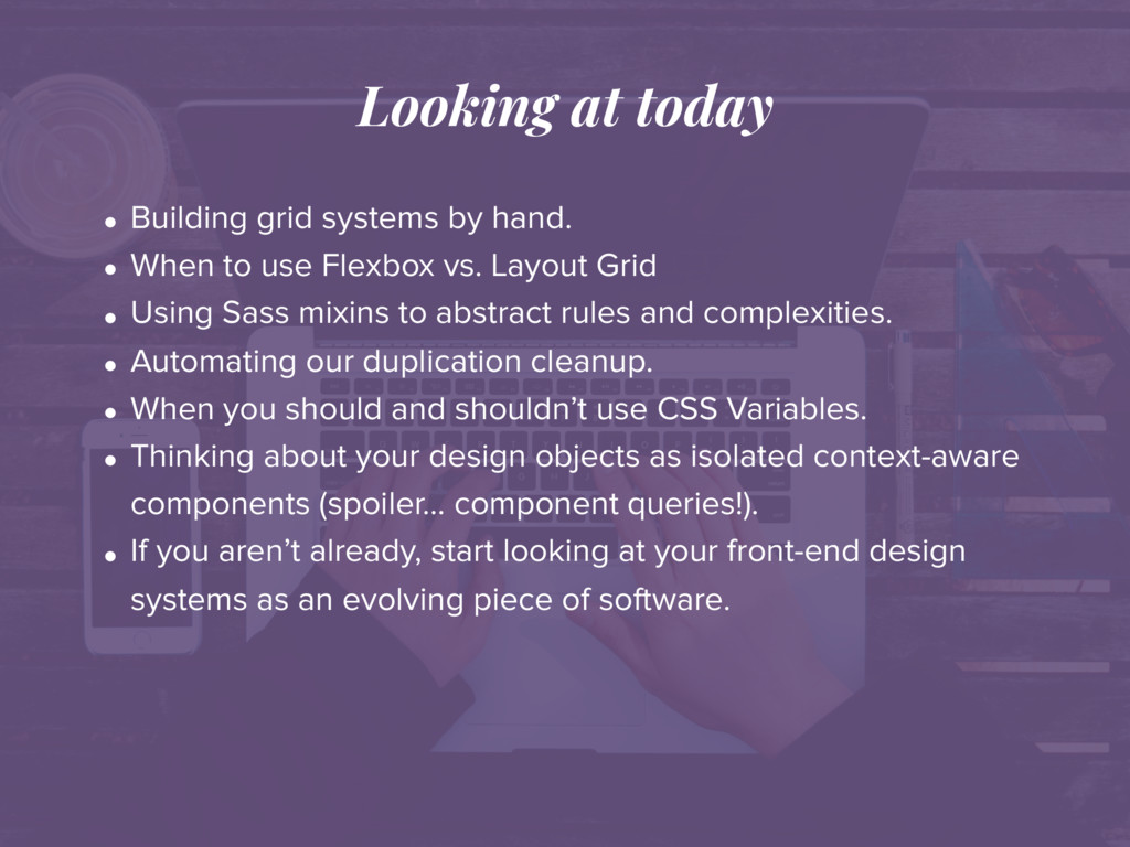
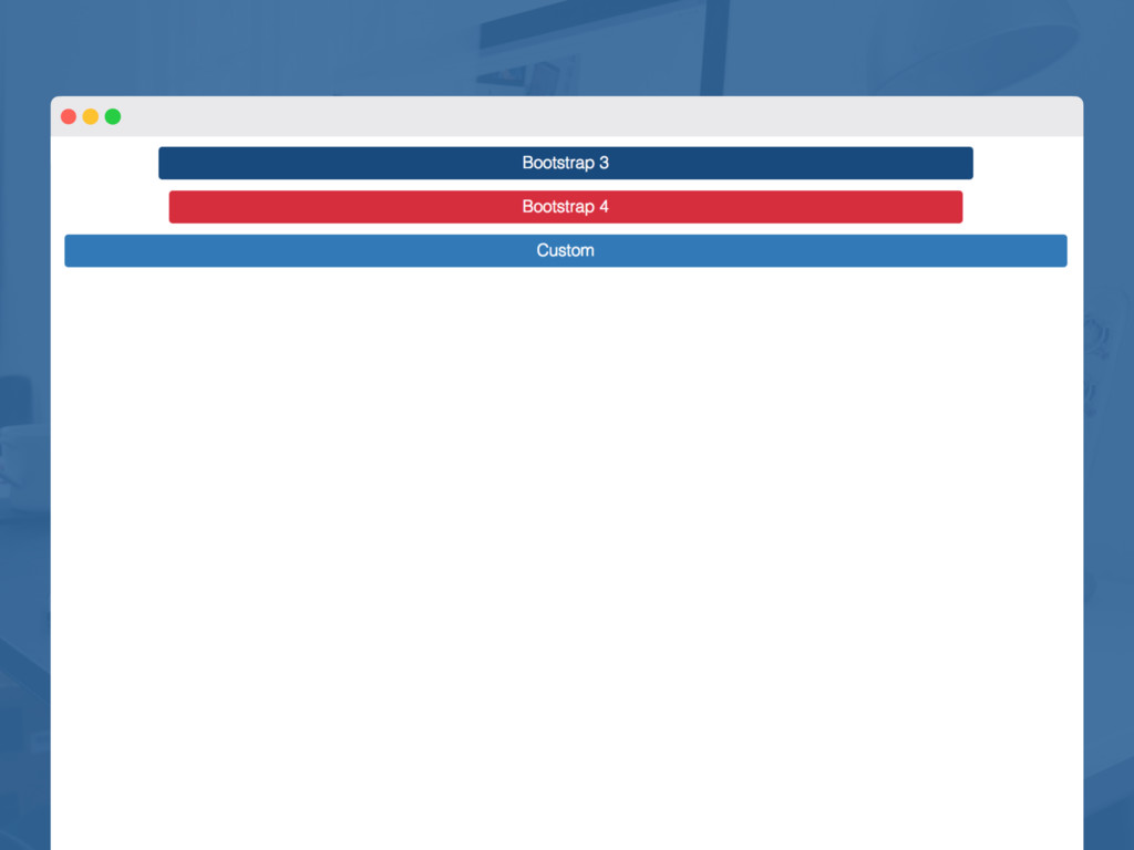
When to use Flexbox vs. Layout Grid • Using Sass mixins to abstract rules and complexities. • Automating our duplication cleanup. • When you should and shouldn’t use CSS Variables. • Thinking about your design objects as isolated context-aware components (spoiler… component queries!). • If you aren’t already, start looking at your front-end design systems as an evolving piece of software.
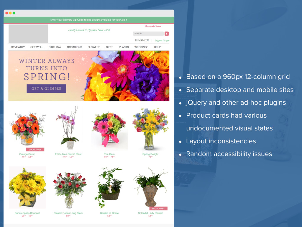
and mobile sites • jQuery and other ad-hoc plugins • Product cards had various undocumented visual states • Layout inconsistencies • Random accessibility issues
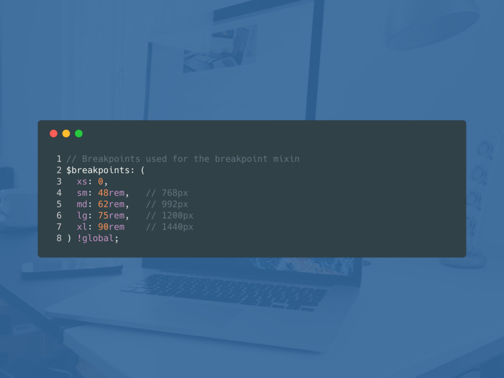
compiled into your CSS. • Values you want to use Sass’ color functions with (e.g. darken, lighten, etc.). • Values used for conditional checking (like $debug: true;)
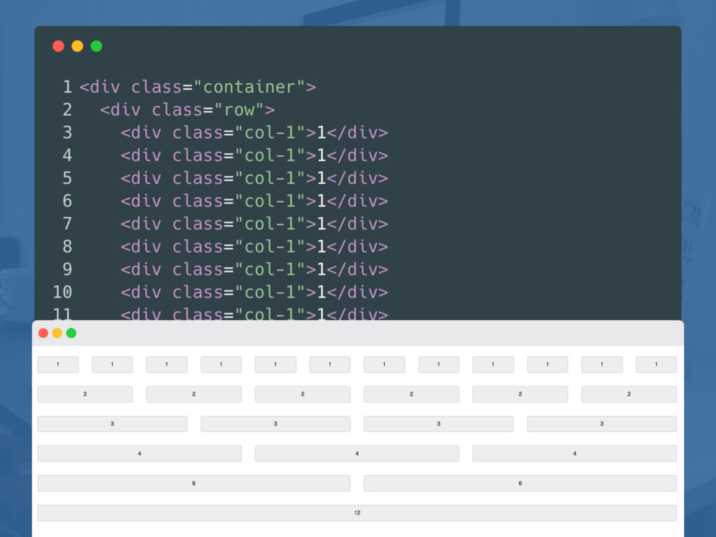
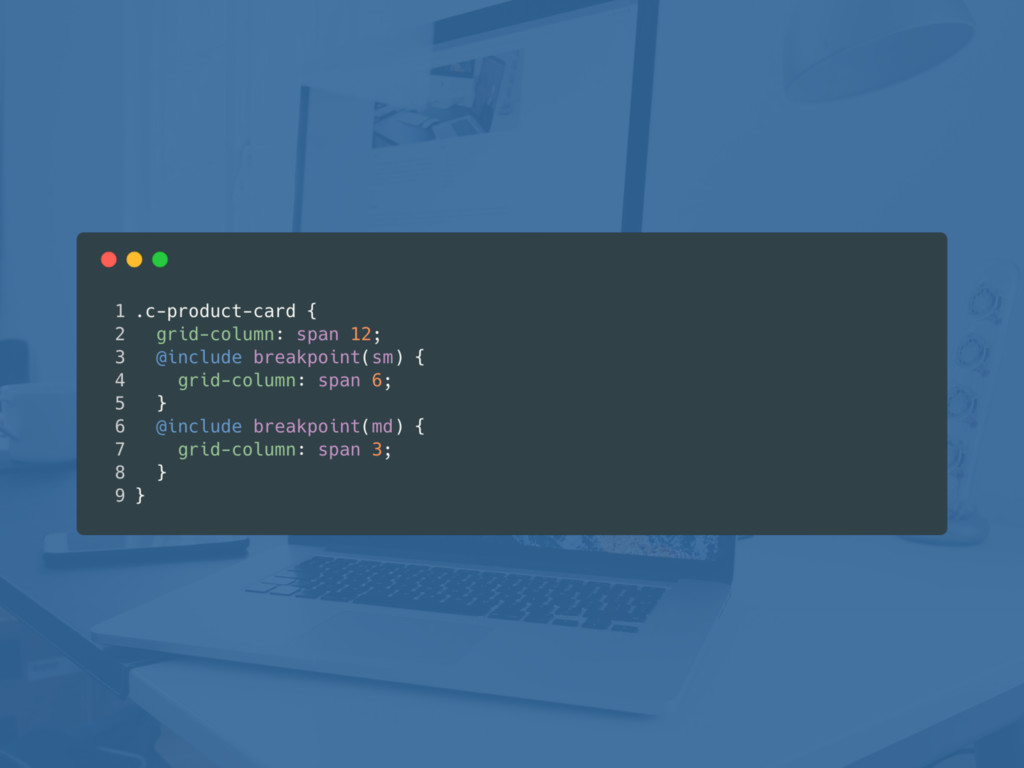
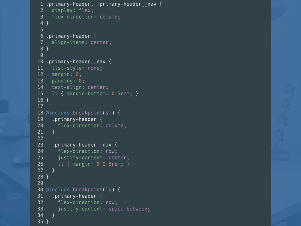
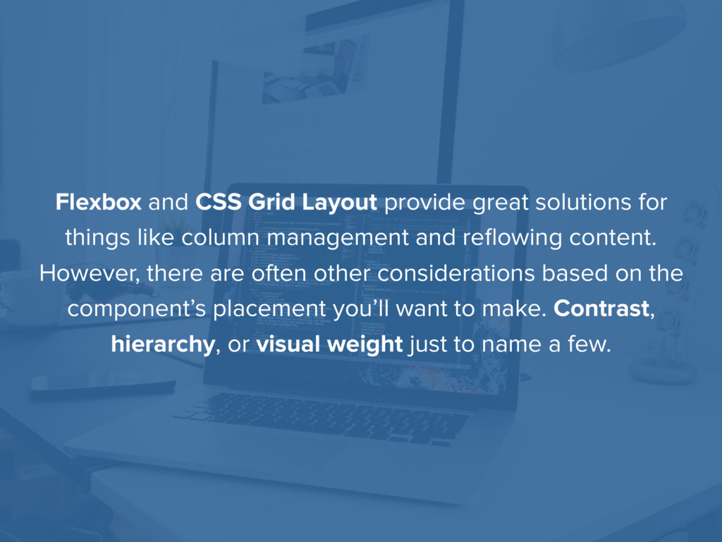
like column management and reflowing content. However, there are often other considerations based on the component’s placement you’ll want to make. Contrast, hierarchy, or visual weight just to name a few.
of my clients started using a CMS because they wanted to start blogging. Of course, many of them stopped blogging within the next 90 days, but that’s beside the point. Blogging is often a top requested feature for most CMSs and is often the reason why solutions like WordPress are given a lot of priority. Even if you’re not building a blog, you can use this same process for building news archives or other similar date- sorted content for your website. To do this, Craft CMS has a Section Type called a Channel. Unlike Structures which we covered in the previous chapter, Channels are sorted by the publishing date which makes them perfect for blogs or other news-based, date-sorted content on your site. Creating the Section First we’re going to into the Settings > Sections and create a new section. To keep things simple for now, we’ll just name this section “Blog” with a handle of “blog”. Finally, just make sure that “Channel” is selected as your Section Type. Building with Craft 74 Creating a T eam Directory ! If you want to edit the image file name or the image title. Just double check on the image asset box. ! Building with Craft 62 Designing Templates and Layouts with Twig 6 6. Designing Templates and Layouts with Twig One of the most refreshing aspects of using Craft CMS is the use of the Twig templating language. Of course there are ways to use Twig within other platforms like WordPress, Drupal, and even your custom PHP projects, but having Twig built in as a first-class citizen in Craft without having to do any special configuration will help keep you from losing your mind as you work on your projects. Okay, first—let’s talk about layouts. It’s common to find a project where there is a separate header and footer file that are included within all files. Twig works a little differently where you can “extend” a file from your page and the effectively overwrite a block of that extended file’s content. This results in giving you a single file for both your header and footer to act as your layout. Let’s start putting together a layout to see how this works in practice. W ithin our templates folder let’s create another folder called _layouts. I like to use an underscore on files that aren’t directly accessed are that act as included or partial files. W ithin that folder we’re going to create a new file called main.twig which will act as our main layout. Craft CMS supports files with either the html extension or the twig extension. I tend to prefer using the twig extension so regardless of the text editor I’m Building with Craft 30 Table of Contents Preface iii ........................................................................................................... What is Craft CMS? iv ............................................................................................... Who Should Read This Book? iv ............................................................................... Legal v ....................................................................................................................... About the Author vi ........................................................................................... 1. Power for Front-End Developers 1 .............................................................. Part I: Craft Fundamentals 2. Installing Craft CMS 3 ................................................................................... Downloading and Installing MAMP 4 ........................................................................ Downloading Craft CMS 7 ......................................................................................... Connecting Craft to MySQL 11 ................................................................................. Finalizing Y our Installation 15 .................................................................................... Deleting Admin Defaults 17 ....................................................................................... Selecting Y our License 18 ......................................................................................... Managing Site Configuration 20 ................................................................................ 3. Setting Up Multiple Environment Support 21 ............................................. 4. Organizing Site Assets 24 ............................................................................ Adding Static Assets 24 ............................................................................................ Creating an Asset Source for Uploads 24 ................................................................. 5. Section T ypes, Entry T ypes, and Fields 28 .................................................. Defining a Section T ype 28 ........................................................................................ Single 28 .............................................................................................................. Channel 28 ........................................................................................................... Structure 28 .......................................................................................................... Creating New Fields 29 ............................................................................................. 6. Designing T emplates and Layouts with T wig 30 ........................................ Extending Our Layout 33 ........................................................................................... Including Partials 35 .................................................................................................. Building with Craft i Get updates at www.iamtimknight.com I am writing a book.
 timknight
 nwiizo
 maruloop
 joooee0000
 sugupoko
 doradora09
 moznion
 oprstchn
 diggymo
 ks91
ks91
 y150saya
 ymhiroki
 k_adachi_01
 tammyeverts
 jnunemaker
 brad_frost
 eileencodes
 kevinliebholz
 mkilby
 mojombo
 panda_program
 uxyall
 cassininazir
 danielanewman