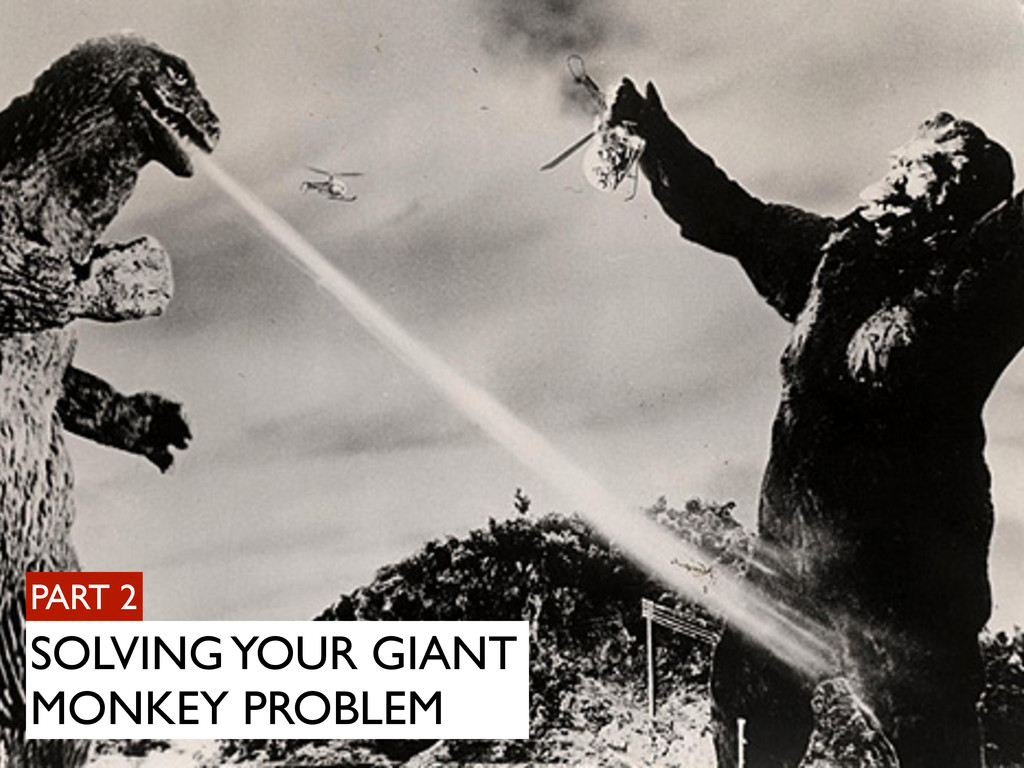
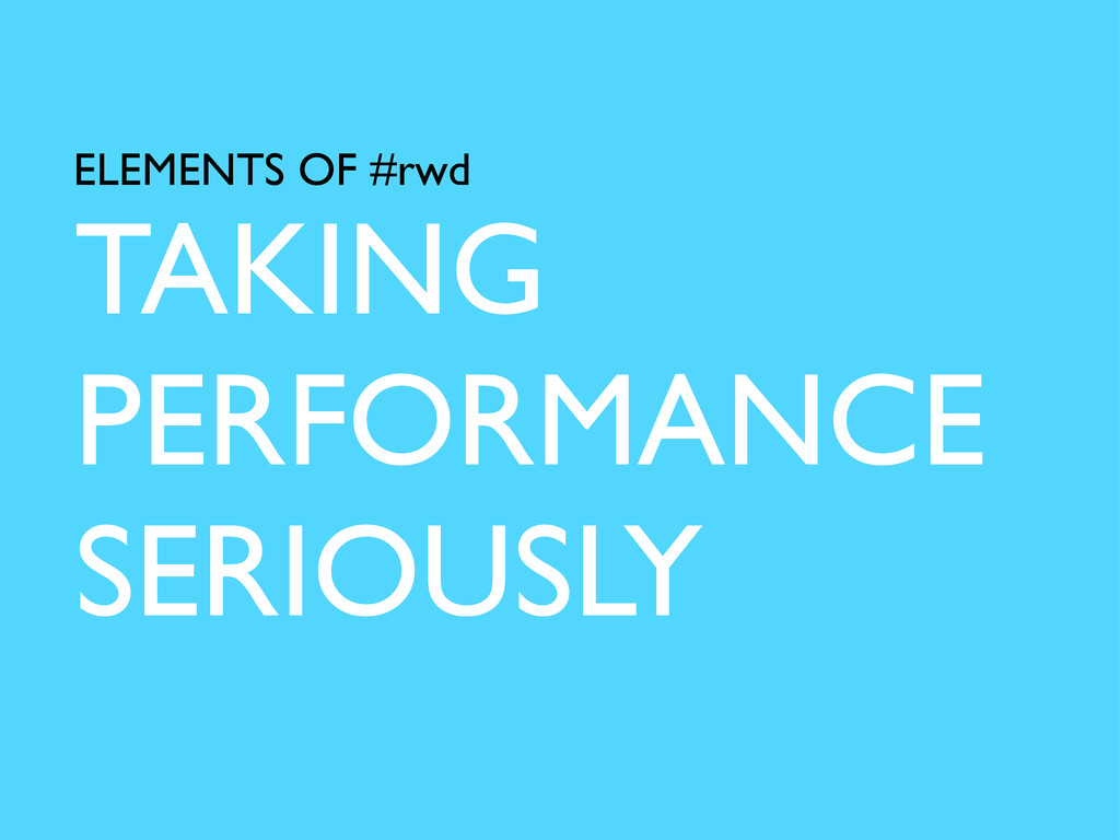
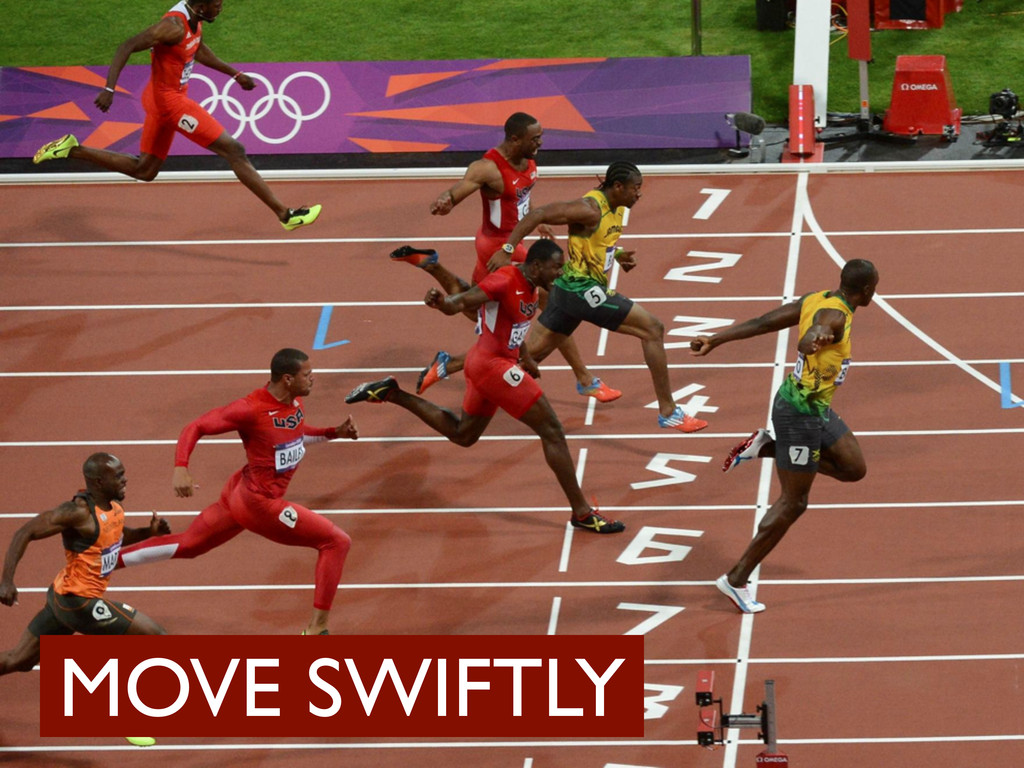
Moving Swiftly: The story of how BBC News fell in love with Responsive Web Design
An in-depth presentation about the reasons for moving a global news website to a responsive codebase with examples of the development concepts that were followed.
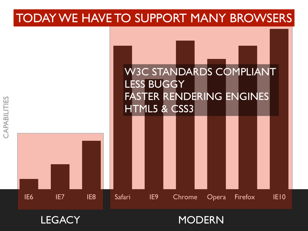
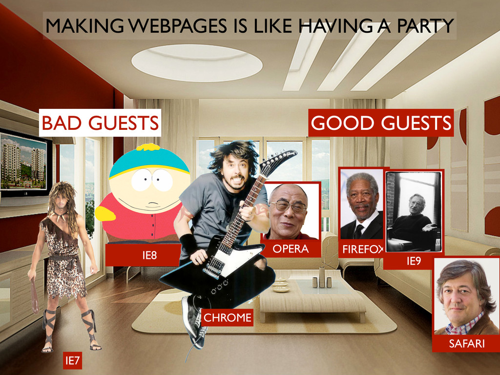
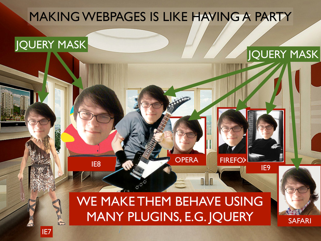
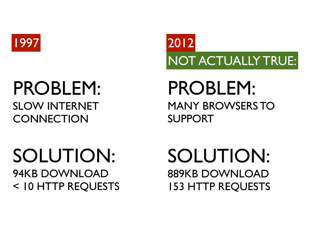
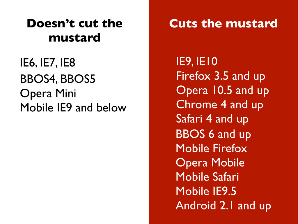
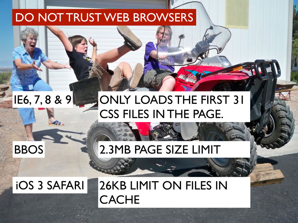
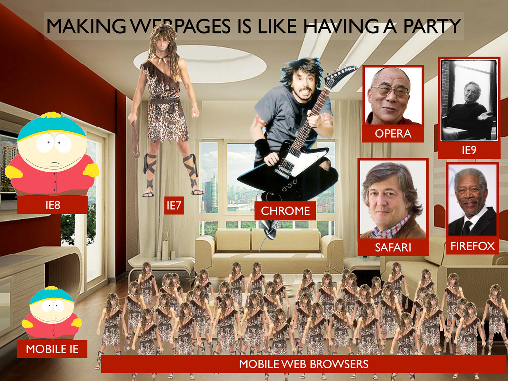
IE9, IE10 Firefox 3.5 and up Opera 10.5 and up Chrome 4 and up Safari 4 and up BBOS4, BBOS5 Opera Mini Mobile IE9 and below BBOS 6 and up Mobile Firefox Opera Mobile Mobile Safari Mobile IE9.5 Android 2.1 and up
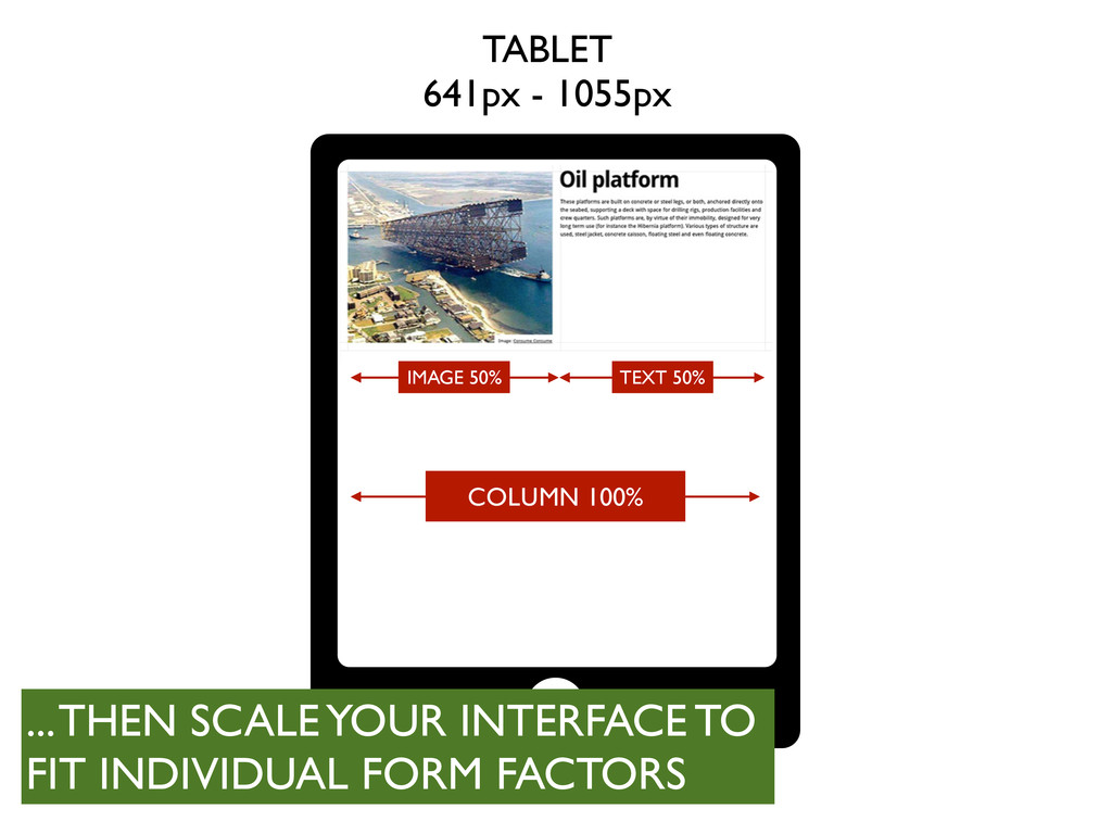
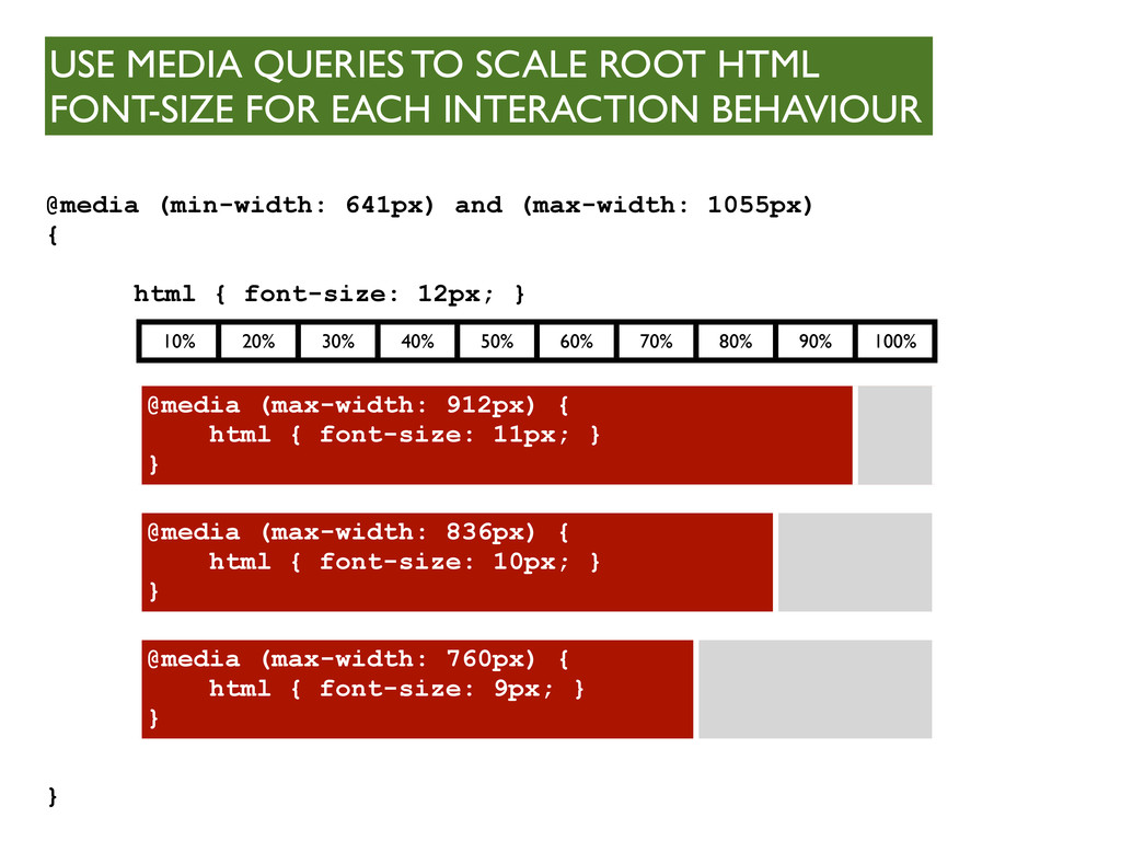
@media (max-width: 912px) { html { font-size: 11px; } } @media (max-width: 836px) { html { font-size: 10px; } } @media (max-width: 760px) { html { font-size: 9px; } } USE MEDIA QUERIES TO SCALE ROOT HTML FONT-SIZE FOR EACH INTERACTION BEHAVIOUR @media (min-width: 641px) and (max-width: 1055px) { html { font-size: 12px; } }
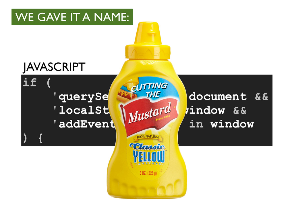
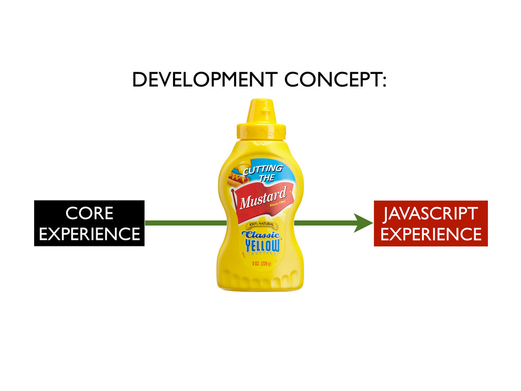
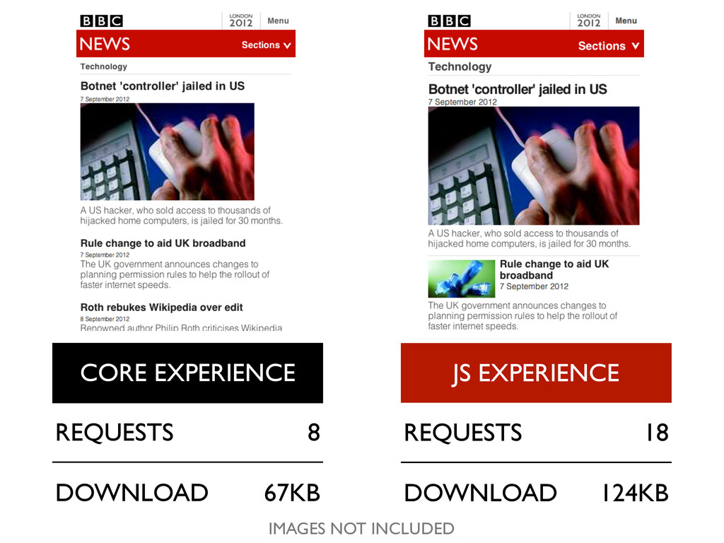
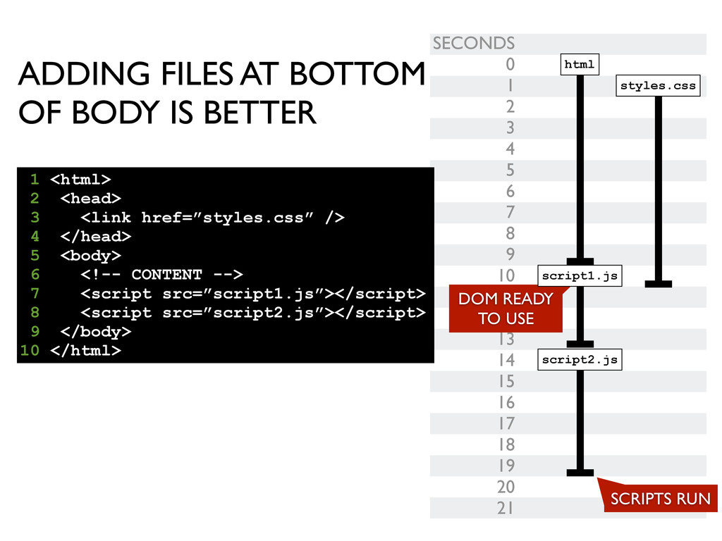
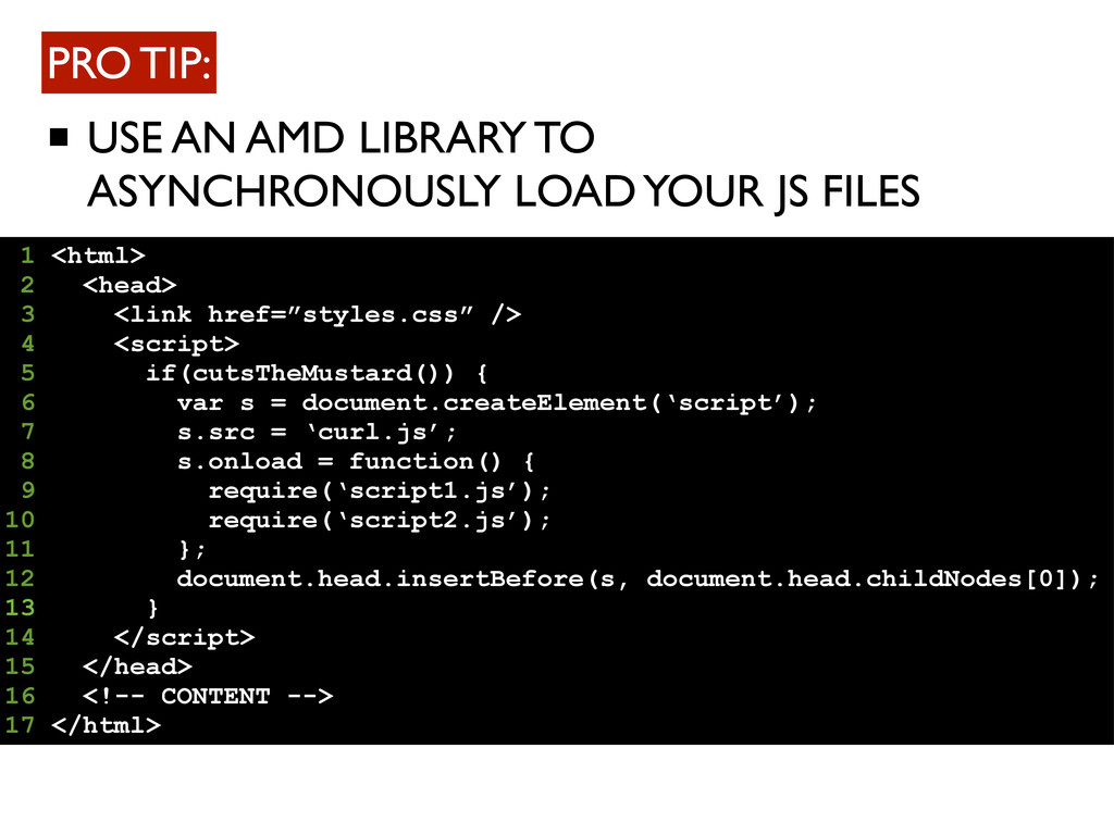
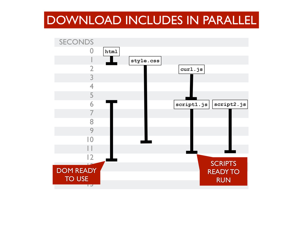
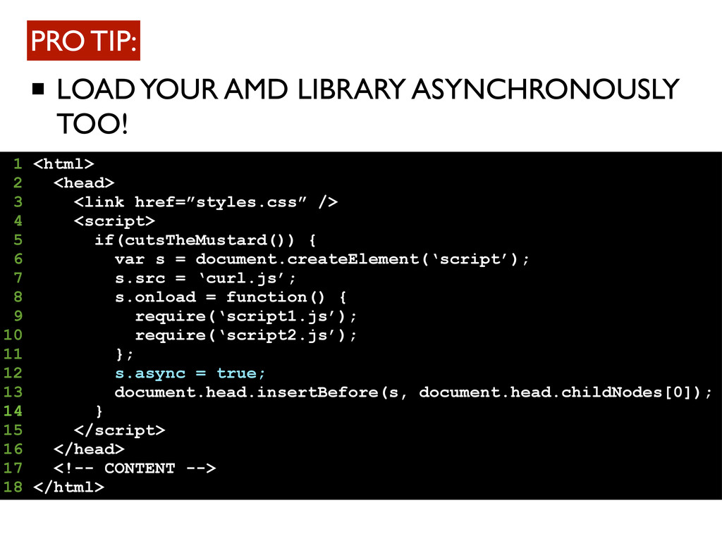
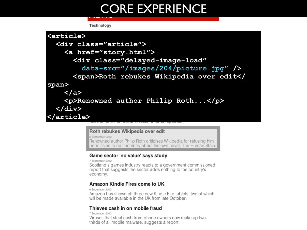
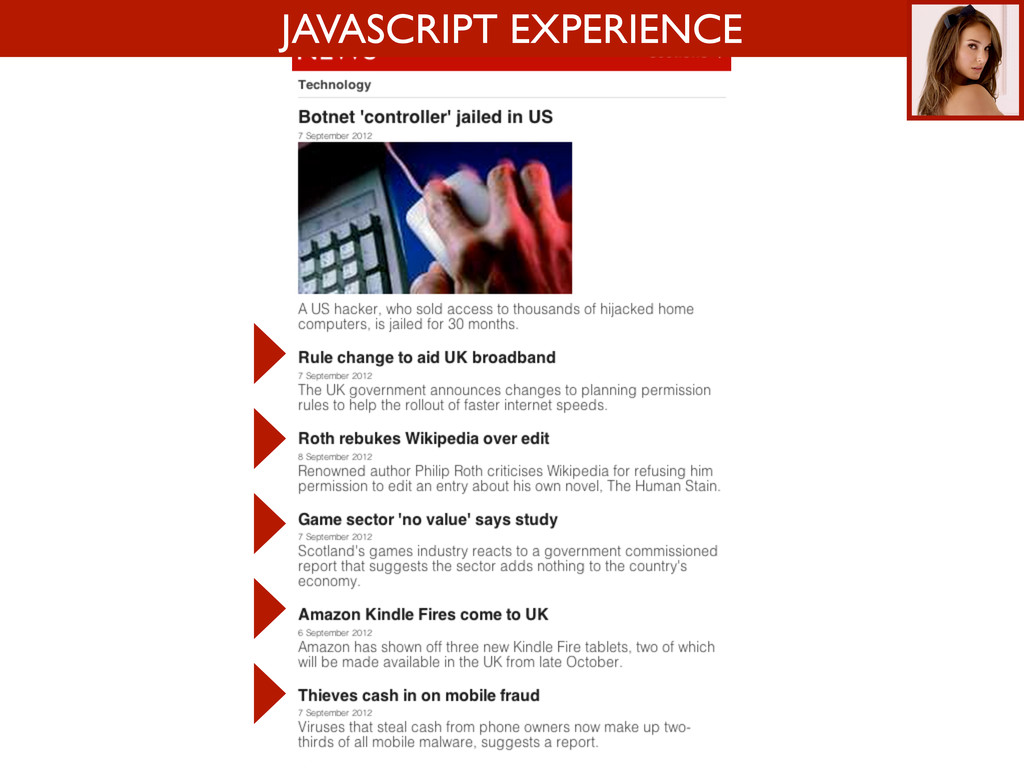
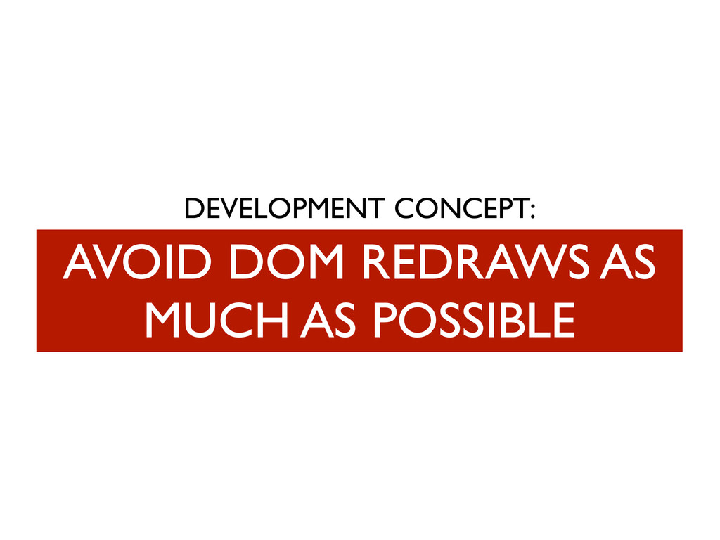
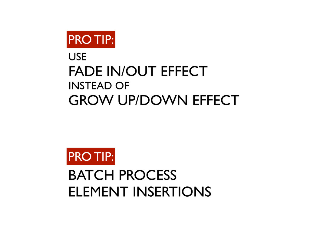
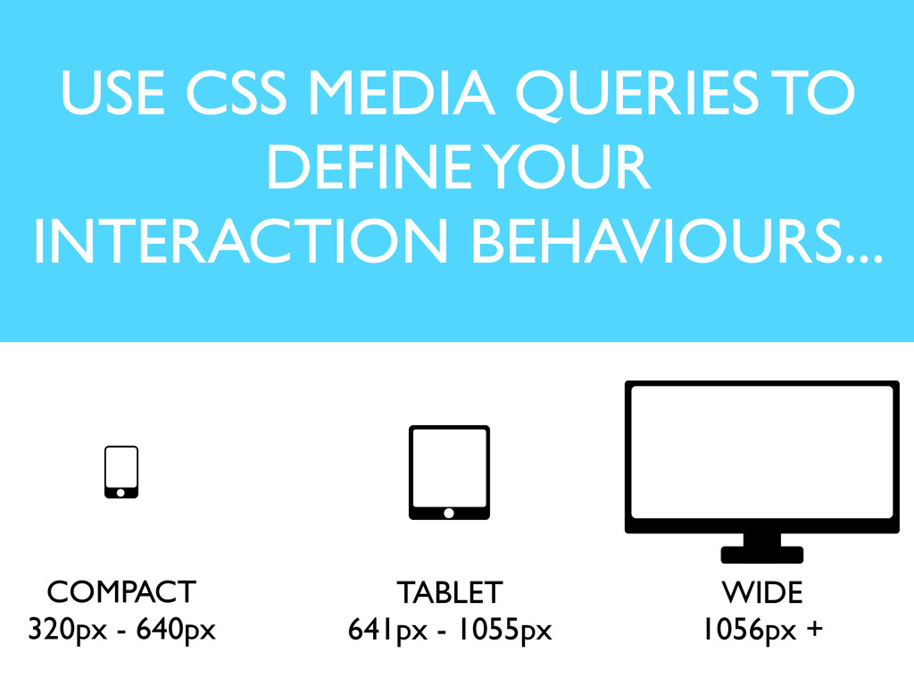
DEVELOPMENT CONCEPTS: CUTTING THE MUSTARD AJAX CONTENT IN TO ENHANCE PAGE MAKE THE PAGE USABLE WITHIN 10 SECONDS AJAX CONTENT IN TO ENHANCE PAGE ONLY DOWNLOAD WHAT YOU ARE GOING TO USE AVOID DOM REDRAWS AS MUCH AS POSSIBLE DESIGN FOR INTERACTION BEHAVIOURS, NOT DEVICES
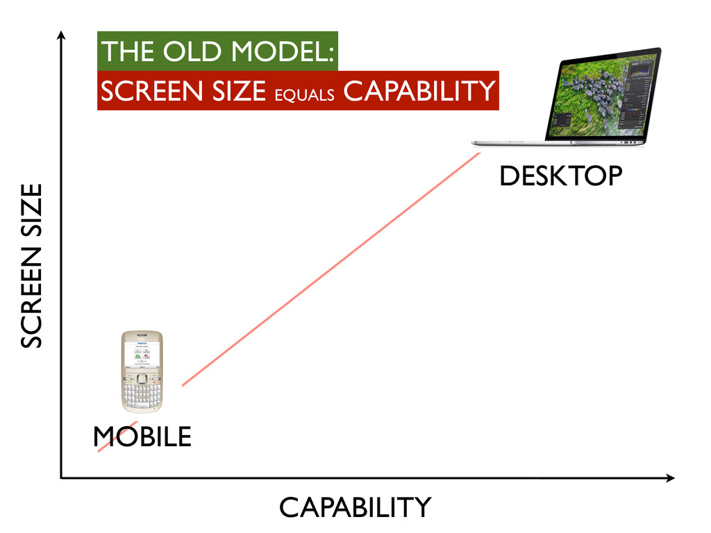
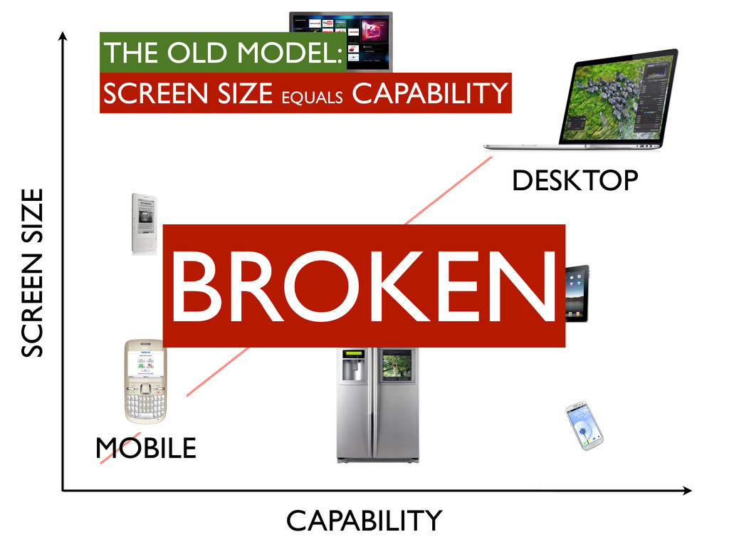
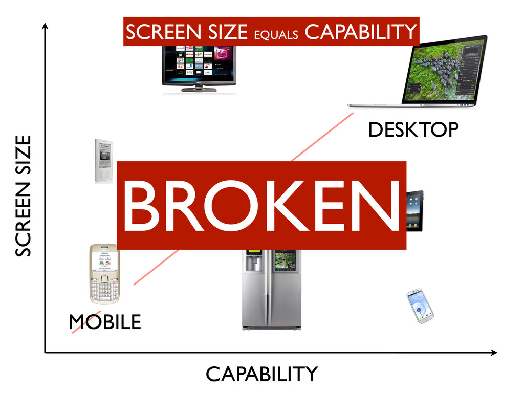
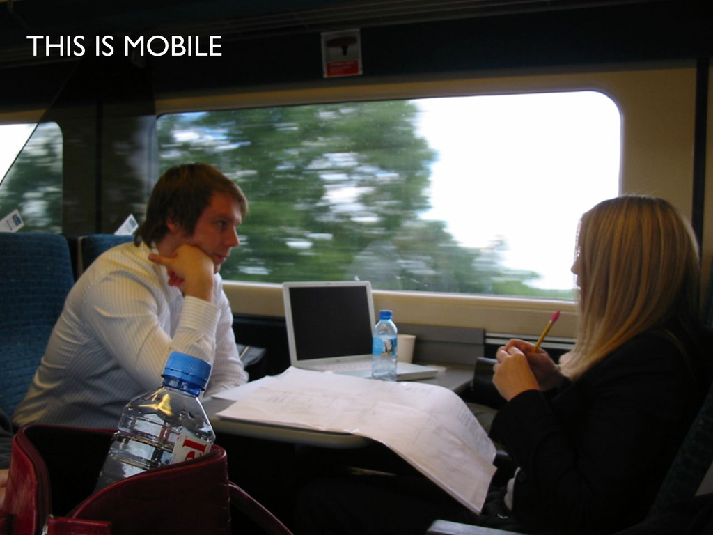
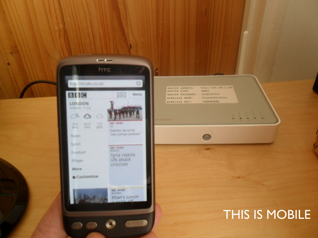
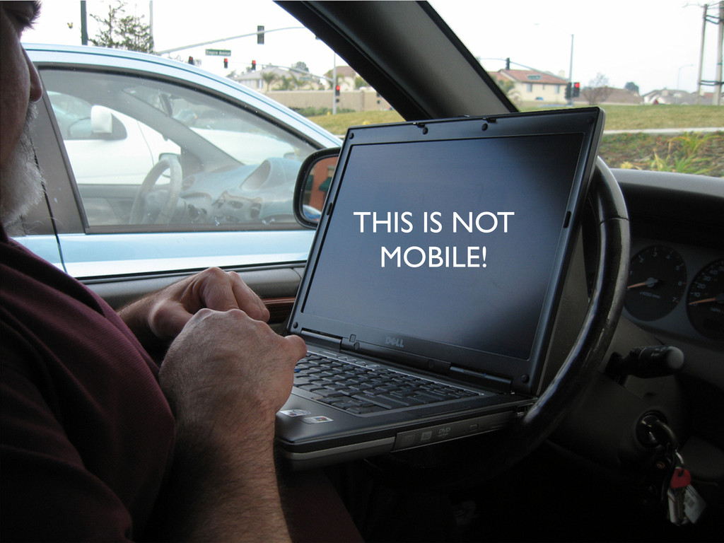
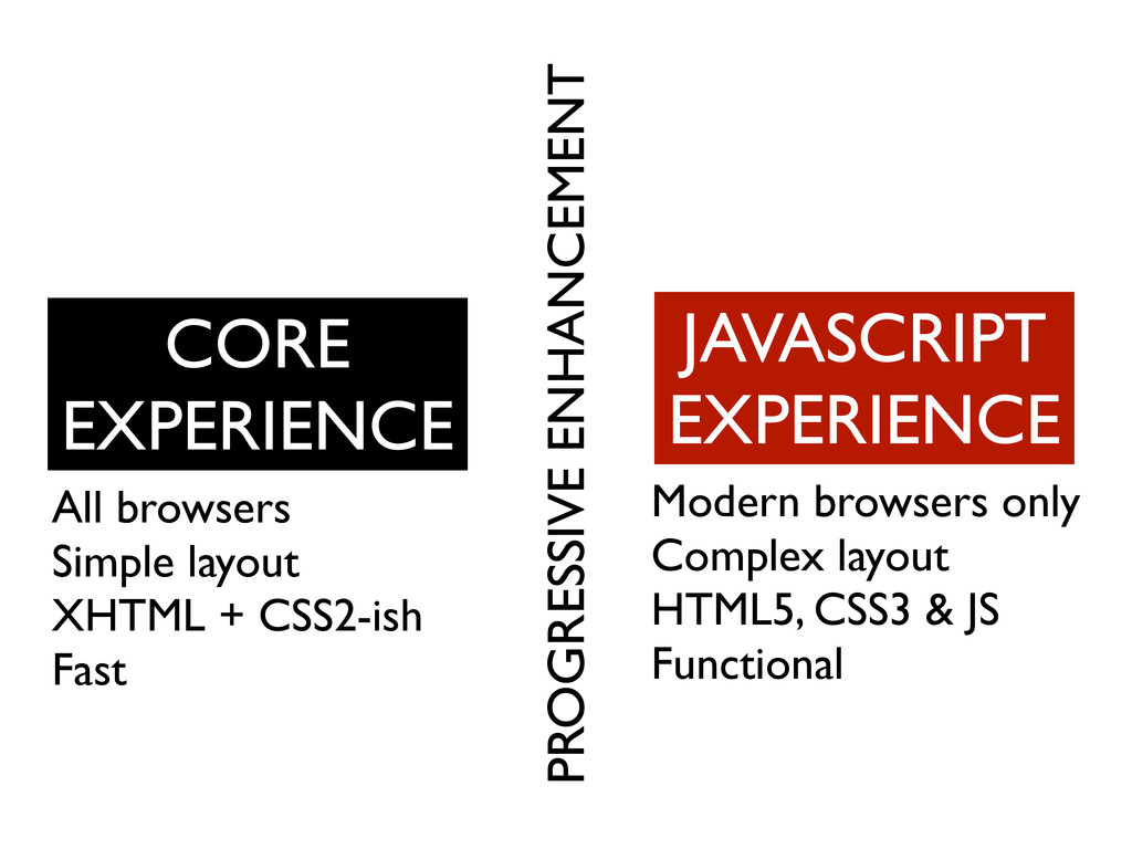
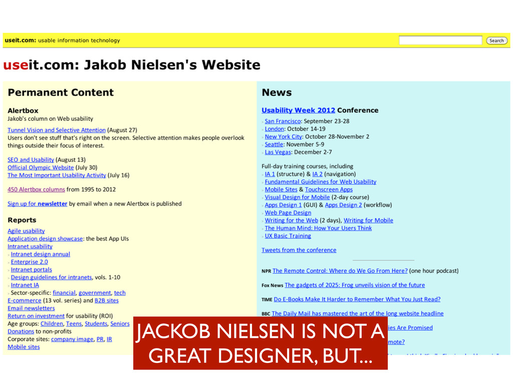
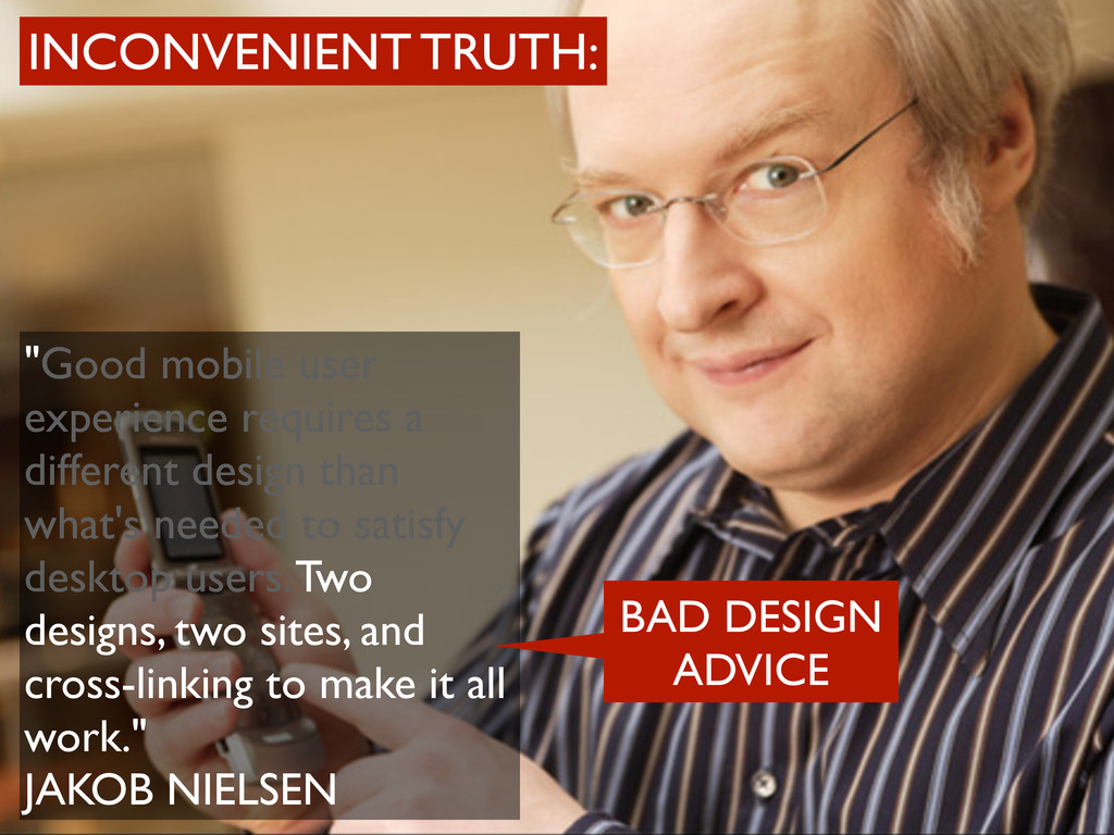
needed to satisfy desktop users. Two designs, two sites, and cross-linking to make it all work." JAKOB NIELSEN INCONVENIENT TRUTH: GREAT USABILITY ADVICE
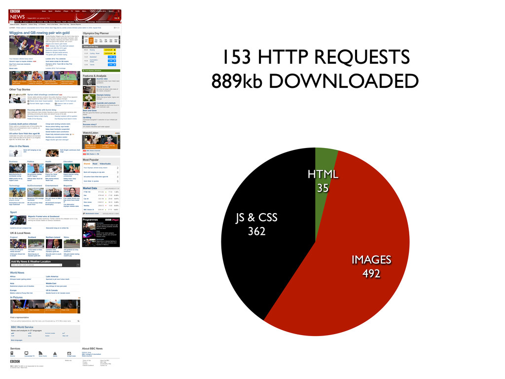
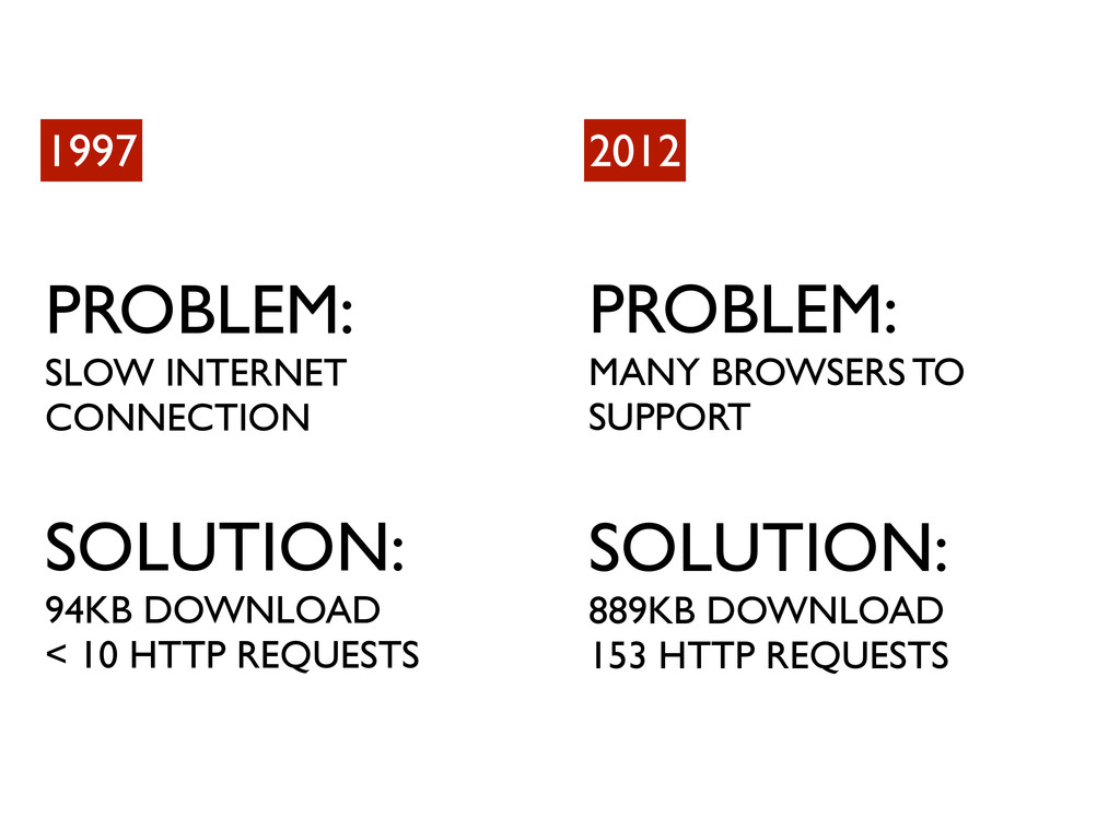
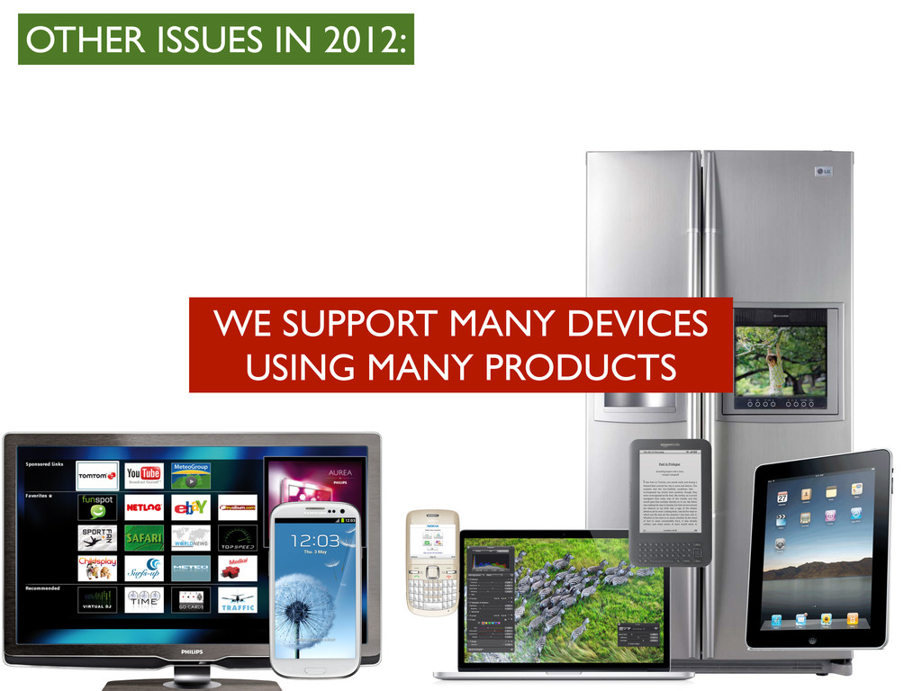
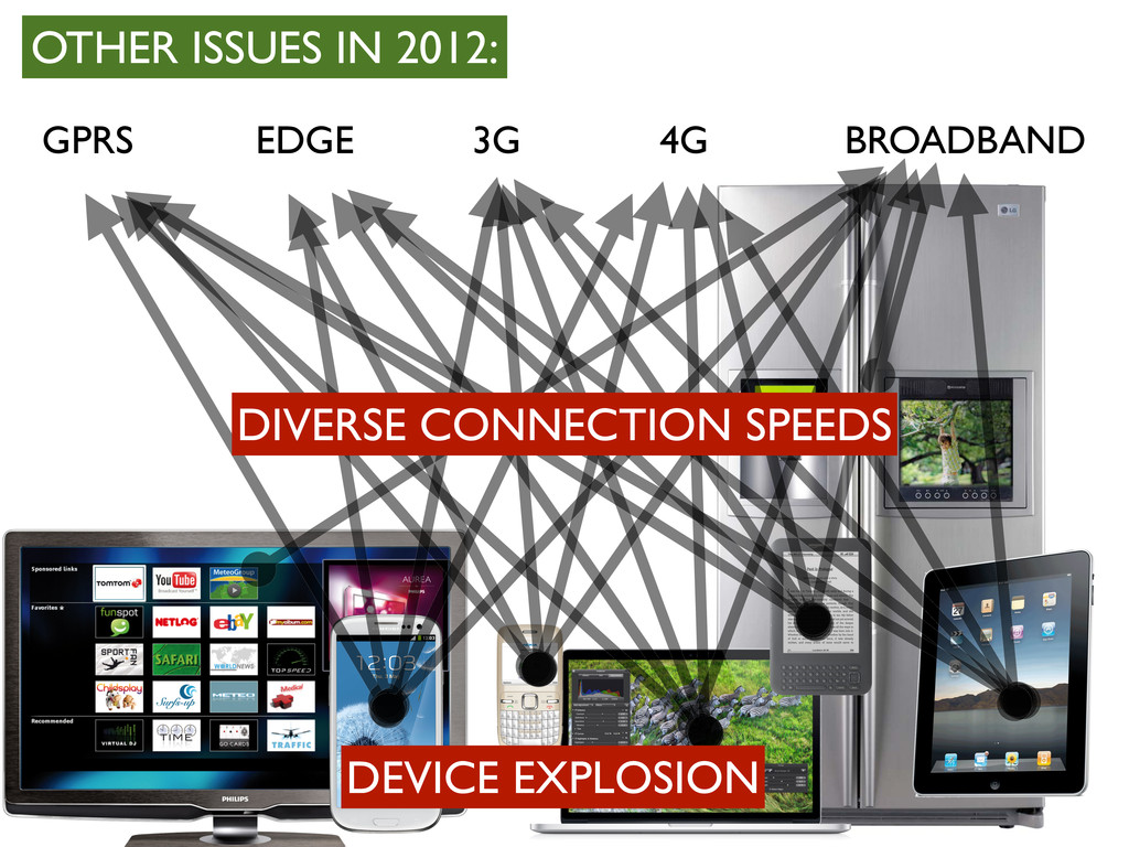
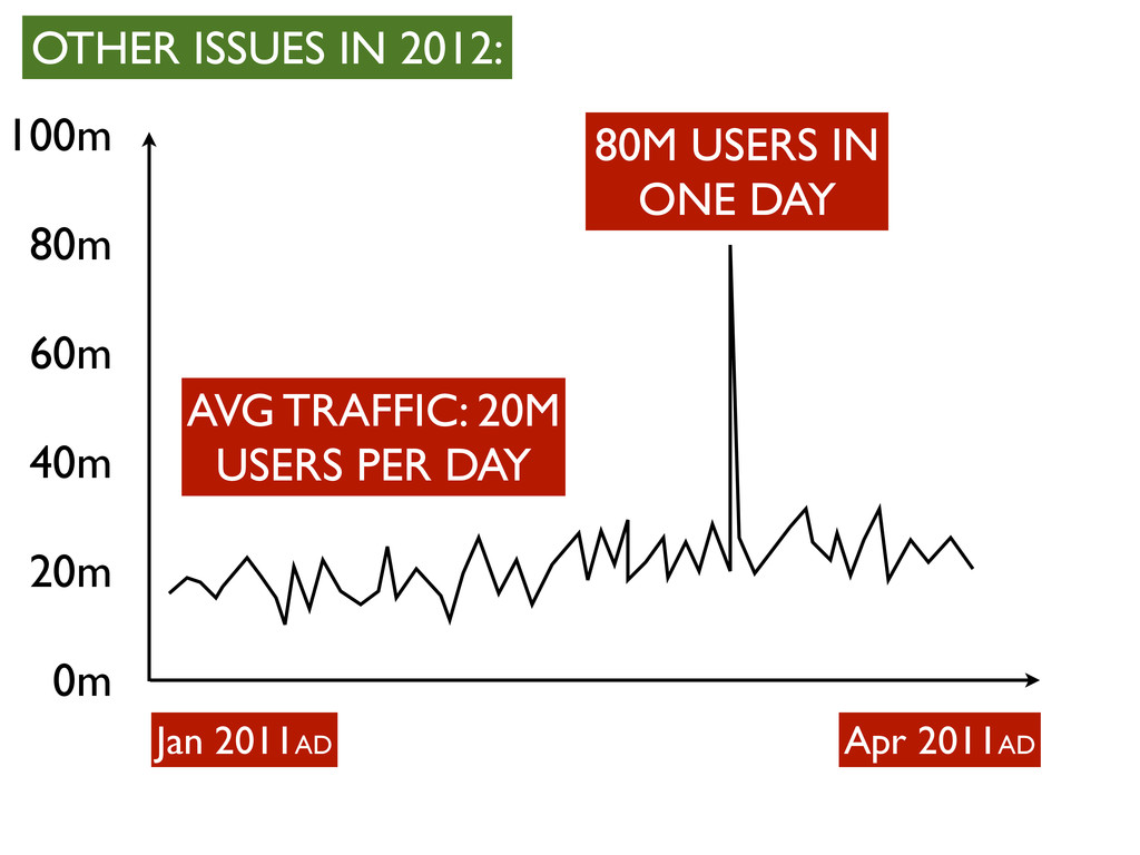
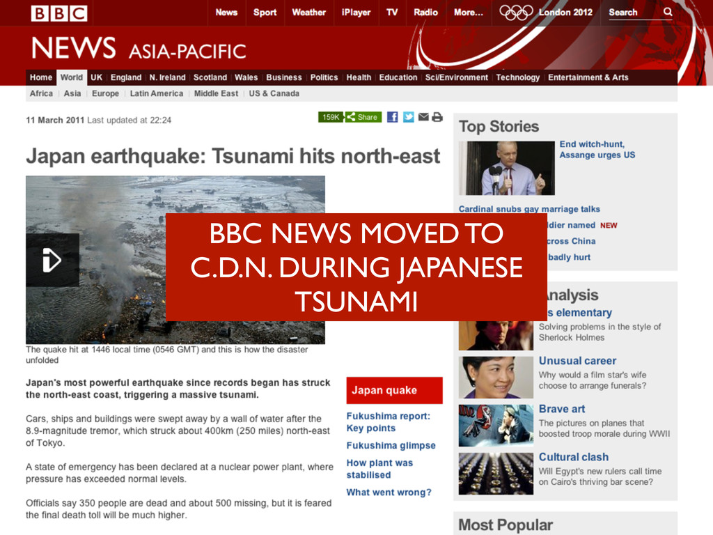
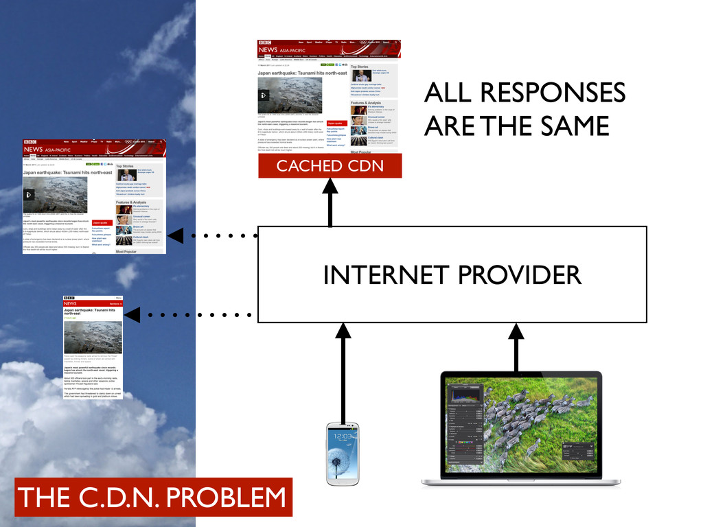
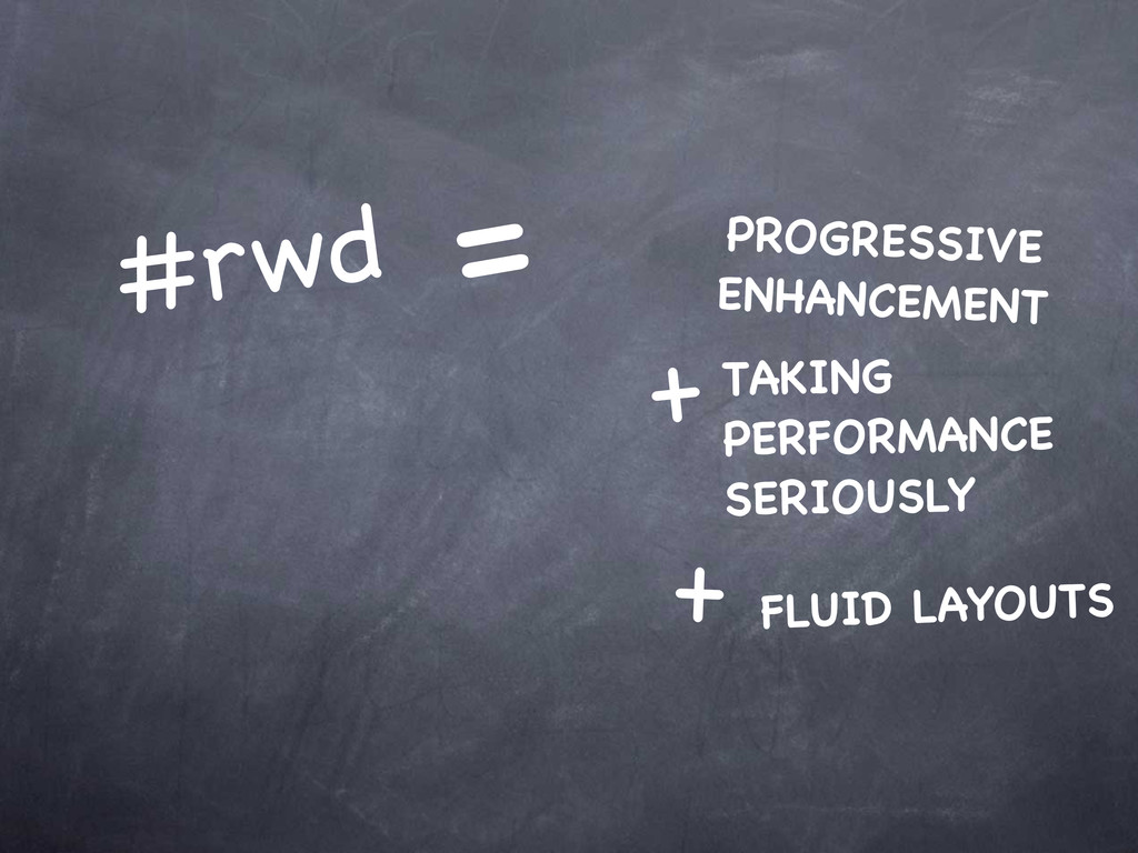
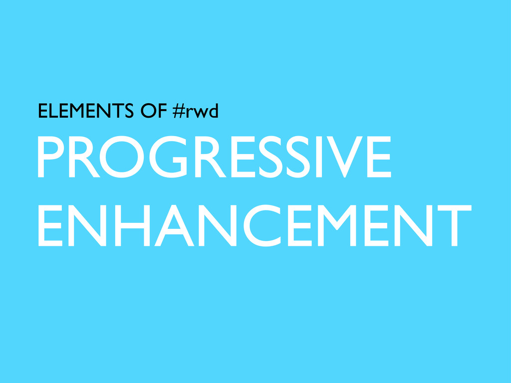
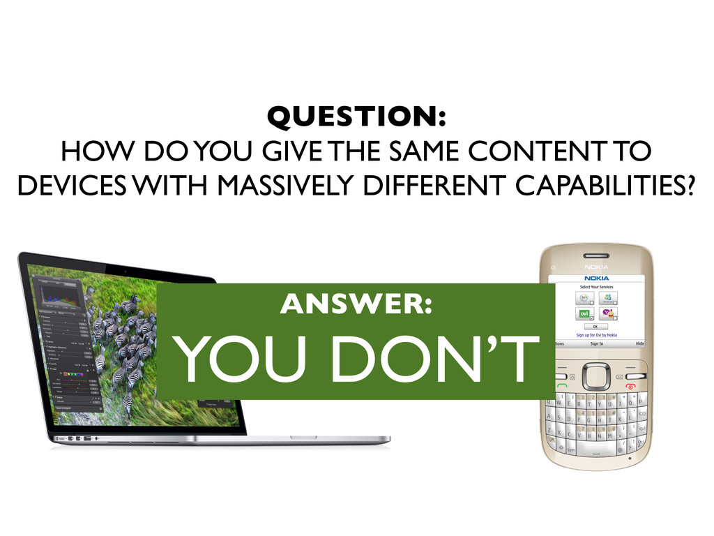
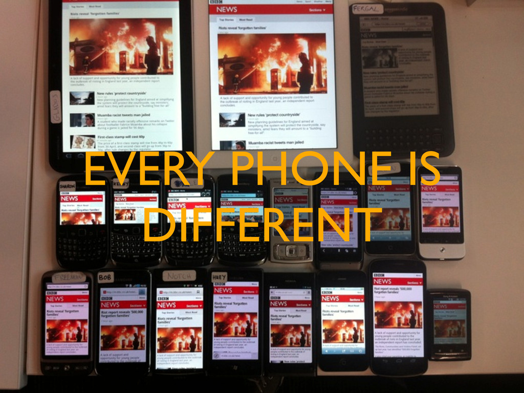
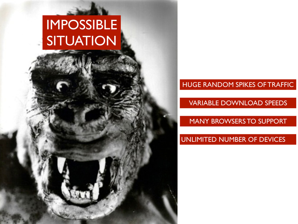
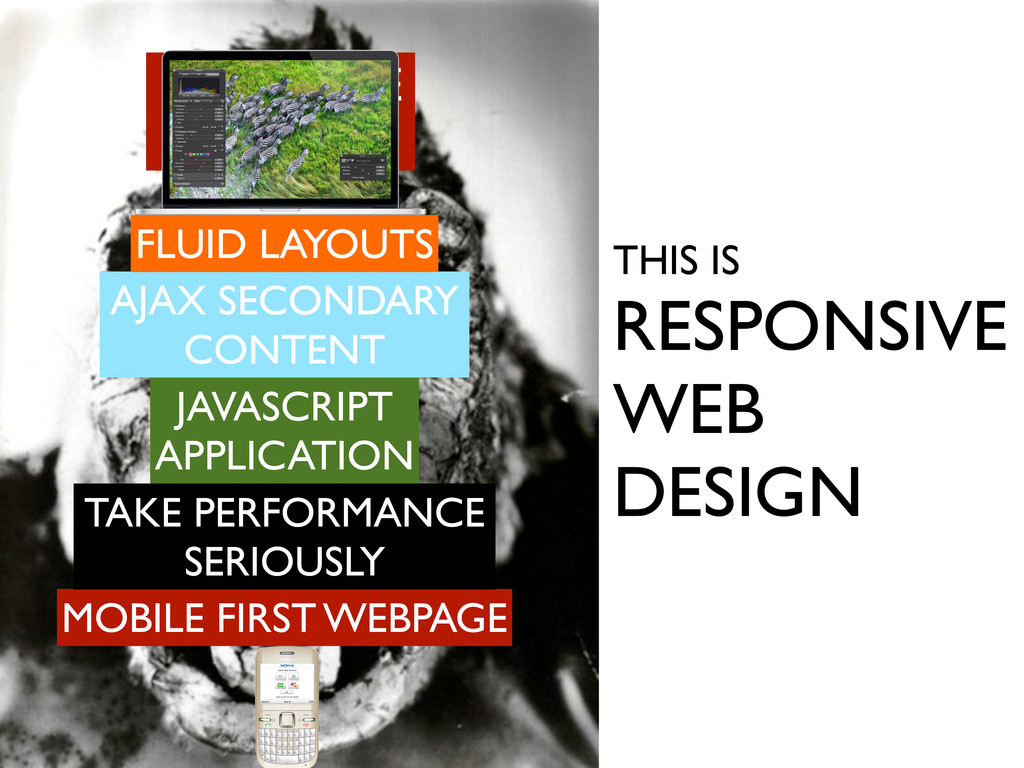
CONTENT MANY BROWSERS TO SUPPORT UNLIMITED NUMBER OF DEVICES VARIABLE DOWNLOAD SPEEDS HUGE RANDOM SPIKES OF TRAFFIC THIS IS RESPONSIVE WEB DESIGN IMPOSSIBLE SITUATION FLUID LAYOUTS
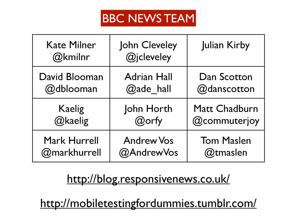
Kirby David Blooman @dblooman Adrian Hall @ade_hall Dan Scotton @danscotton Kaelig @kaelig John Horth @orfy Matt Chadburn @commuterjoy Mark Hurrell @markhurrell Andrew Vos @AndrewVos Tom Maslen @tmaslen http://mobiletestingfordummies.tumblr.com/ http://blog.responsivenews.co.uk/
 tmaslen
 ming_ayami
 prgckwb
 pokohide
 dmmsre
 maruloop
 coborinai
 chmikata
 diggymo
 tsukamotokenji
 nari_ex
 nek0128
 muziyoshiz
 katarinadahlin
 rabernat
 kastner
 davidcarrasco
 aleyda
 charlesmeaden
 addyosmani
 jeffersonlam
 zakiyama
 stephaniewalter
 chrislema
 frankvandijk