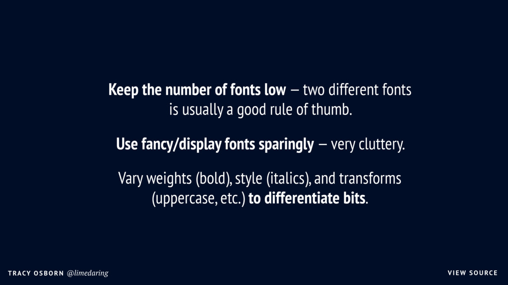
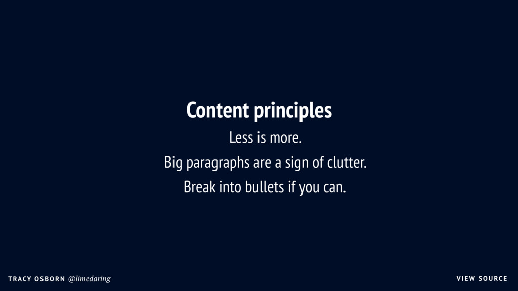
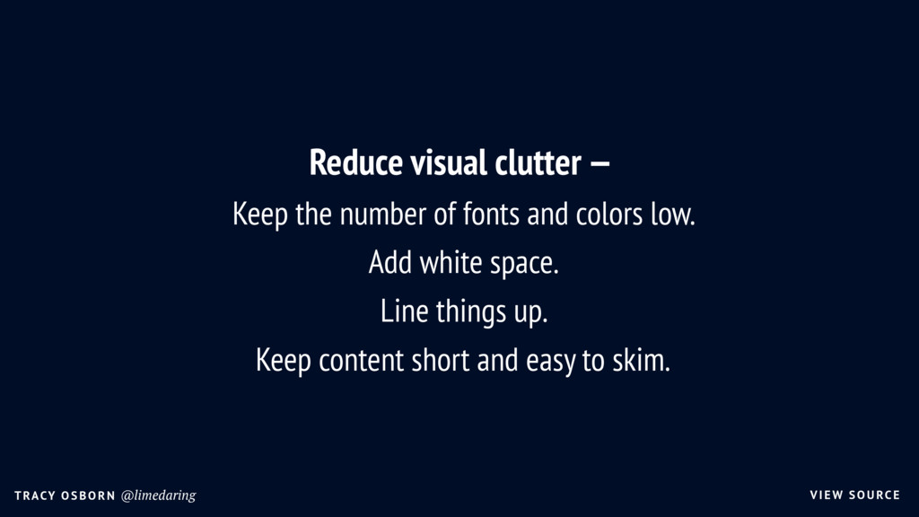
fonts low — two different fonts is usually a good rule of thumb. Use fancy/display fonts sparingly — very cluttery. Vary weights (bold), style (italics), and transforms (uppercase, etc.) to differentiate bits.
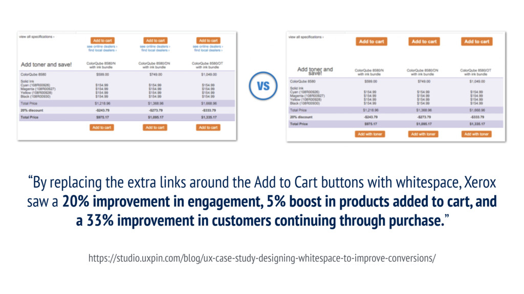
links around the Add to Cart buttons with whitespace, Xerox saw a 20% improvement in engagement, 5% boost in products added to cart, and a 33% improvement in customers continuing through purchase.” https://studio.uxpin.com/blog/ux-case-study-designing-whitespace-to-improve-conversions/
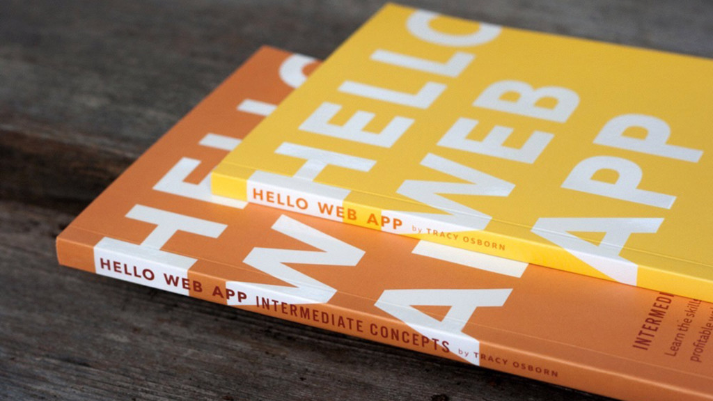
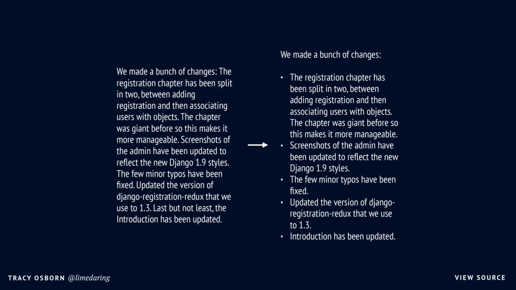
of changes: The registration chapter has been split in two, between adding registration and then associating users with objects. The chapter was giant before so this makes it more manageable. Screenshots of the admin have been updated to reflect the new Django 1.9 styles. The few minor typos have been fixed. Updated the version of django-registration-redux that we use to 1.3. Last but not least, the Introduction has been updated. We made a bunch of changes: • The registration chapter has been split in two, between adding registration and then associating users with objects. The chapter was giant before so this makes it more manageable. • Screenshots of the admin have been updated to reflect the new Django 1.9 styles. • The few minor typos have been fixed. • Updated the version of django- registration-redux that we use to 1.3. • Introduction has been updated.
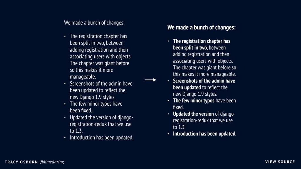
of changes: • The registration chapter has been split in two, between adding registration and then associating users with objects. The chapter was giant before so this makes it more manageable. • Screenshots of the admin have been updated to reflect the new Django 1.9 styles. • The few minor typos have been fixed. • Updated the version of django- registration-redux that we use to 1.3. • Introduction has been updated. We made a bunch of changes: • The registration chapter has been split in two, between adding registration and then associating users with objects. The chapter was giant before so this makes it more manageable. • Screenshots of the admin have been updated to reflect the new Django 1.9 styles. • The few minor typos have been fixed. • Updated the version of django- registration-redux that we use to 1.3. • Introduction has been updated.
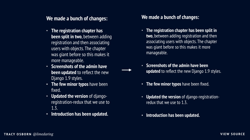
of changes: • The registration chapter has been split in two, between adding registration and then associating users with objects. The chapter was giant before so this makes it more manageable. • Screenshots of the admin have been updated to reflect the new Django 1.9 styles. • The few minor typos have been fixed. • Updated the version of django-registration- redux that we use to 1.3. • Introduction has been updated. We made a bunch of changes: • The registration chapter has been split in two, between adding registration and then associating users with objects. The chapter was giant before so this makes it more manageable. • Screenshots of the admin have been updated to reflect the new Django 1.9 styles. • The few minor typos have been fixed. • Updated the version of django- registration-redux that we use to 1.3. • Introduction has been updated.