B OR N @limedaring Keep the number of fonts low — two different fonts is usually a good rule of thumb. Use fancy/display fonts sparingly — can be very cluttery.
B OR N @limedaring Keep the number of fonts low — two different fonts is usually a good rule of thumb. Use fancy/display fonts sparingly — can be very cluttery. Vary weights (bold), style (italics), and transforms (uppercase, etc.) to differentiate bits.
B OR N @limedaring “By replacing the extra links around the Add to Cart buttons with whitespace, Xerox saw a 20% improvement in engagement, 5% boost in products added to cart, and a 33% improvement in customers continuing through purchase.” https://studio.uxpin.com/blog/ux-case-study-designing-whitespace-to-improve-conversions/
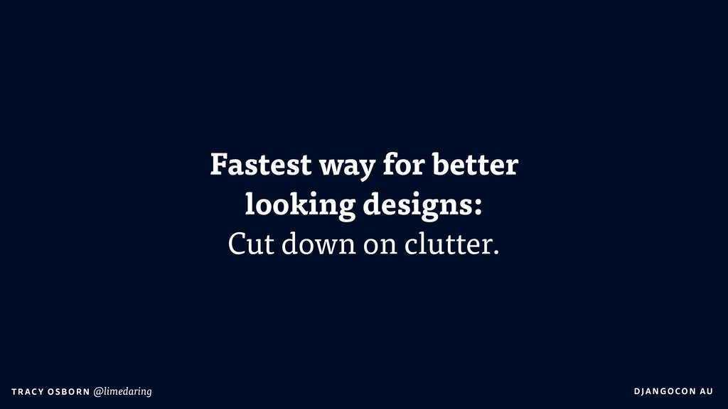
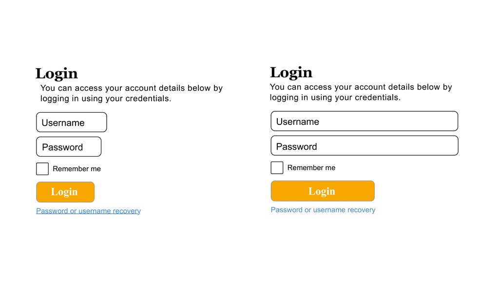
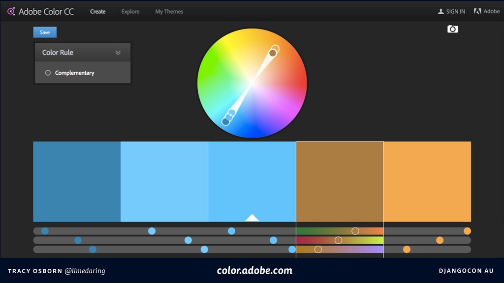
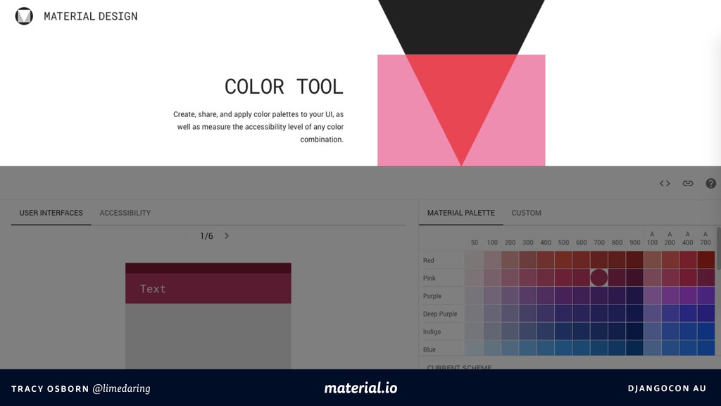
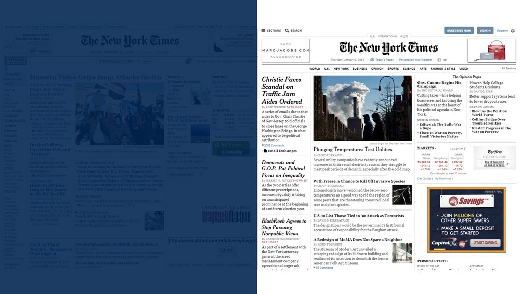
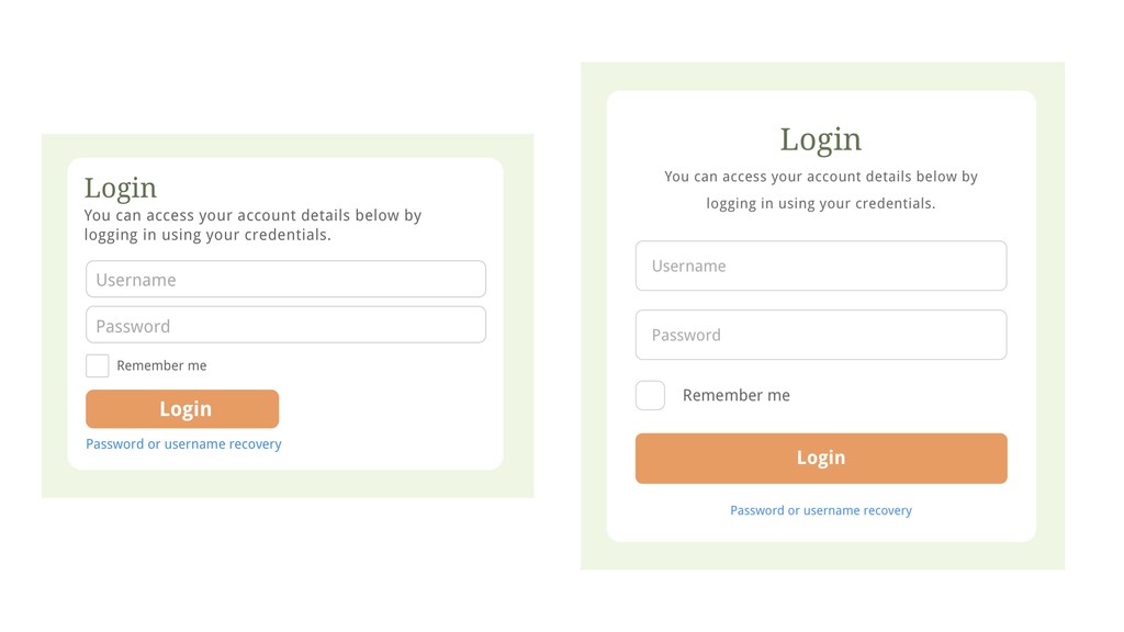
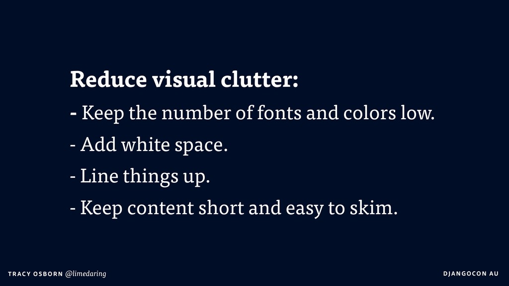
B OR N @limedaring Reduce visual clutter, by keeping the number of fonts and colors low, add white space, and line things up. Aim for a “clean” design.
OR N @limedaring vs sign up email address I believe folks who know a bit about design will be more likely to hire a professional designer when the time is right. I’m a designer, and even I hire designers for things bigger than me. And if you agree, you should join my newsletter. I believe folks who know a bit about design will be more likely to hire a professional designer when the time is right. I’m a designer, and even I hire designers for things bigger than me. If you agree, you should join my newsletter.
B OR N @limedaring Please note that although Chrome is supported for both Mac and Windows operating systems, it is recommended that all users of this site switch to the most up-to-date version of the Firefox web browser for the best possible results.
B OR N @limedaring For best results, use the latest version of Firefox. Chrome for Mac and Windows is also supported. Please note that although Chrome is supported for both Mac and Windows operating systems, it is recommended that all users of this site switch to the most up-to-date version of the Firefox web browser for the best possible results.
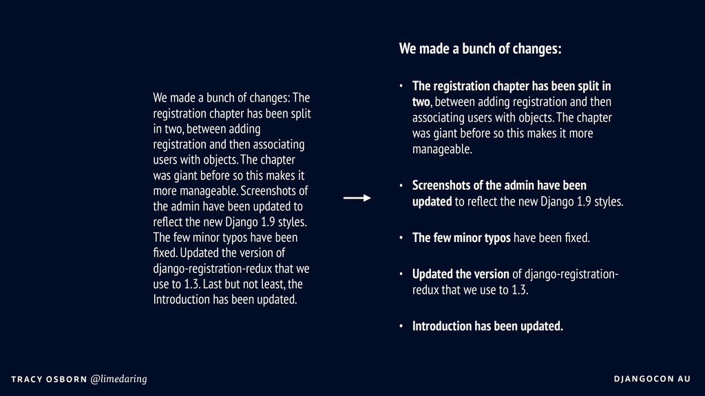
B OR N @limedaring We made a bunch of changes: • The registration chapter has been split in two, between adding registration and then associating users with objects. The chapter was giant before so this makes it more manageable. • Screenshots of the admin have been updated to reflect the new Django 1.9 styles. • The few minor typos have been fixed. • Updated the version of django-registration- redux that we use to 1.3. • Introduction has been updated. We made a bunch of changes: The registration chapter has been split in two, between adding registration and then associating users with objects. The chapter was giant before so this makes it more manageable. Screenshots of the admin have been updated to reflect the new Django 1.9 styles. The few minor typos have been fixed. Updated the version of django-registration-redux that we use to 1.3. Last but not least, the Introduction has been updated.
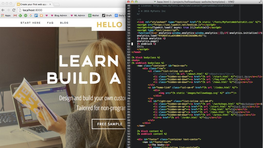
B OR N @limedaring Images: • Stock photos usually look like stock photos. Be careful what you pick. • You can accomplish a lot with just type and screenshots. • Remember to pay attention to file size. • Don’t forget retina-quality images.
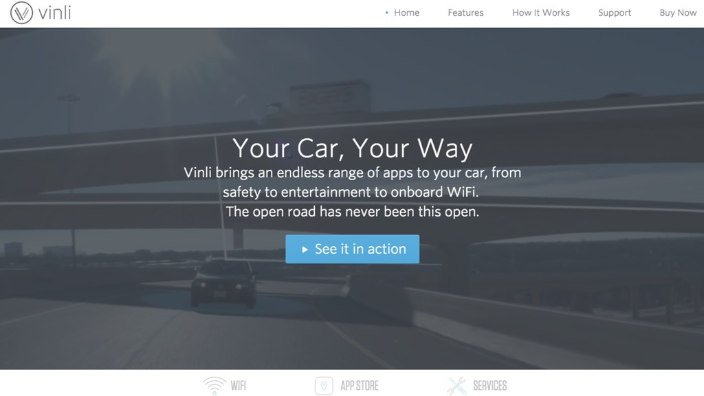
B OR N @limedaring Reduce visual clutter: - Keep the number of fonts and colors low. - Add white space. - Line things up. - Keep content short and easy to skim.