Upgrade to Pro — share decks privately, control downloads, hide ads and more …

Data Visualisation: Principles and practice

Data Visualisation: Principles and practice

4th GM Analyst Network meetup, 17-05-2018, Manchester Metropolitan University.

Avatar for Trafford Data Lab

Trafford Data Lab

May 17, 2018
Tweet

More Decks by Trafford Data Lab

Other Decks in Design

Transcript

  1. “Chart time! It's first Q shipping it garnered 19% market

    share, Palm 9.8%, RIM 39%, other 20%, Nokia 7% …" Macworld 2008 keynote Source: Macworld 2008 keynote; www.engadget.com
  2. Cleveland’s perceptual hierarchy 1 Position along a common scale Scatter

    plots 2 Positions along non-aligned, identical scales Small multiples 3 Length, direction, angle Waterfall chart 4 Area Treemap 5 Volume, curvature 3D bar charts 6 Shading, colour saturation Continuous color scale Source: Cleveland and McGill (1984) Accuracy
  3. “A table is nearly always better than a dumb pie

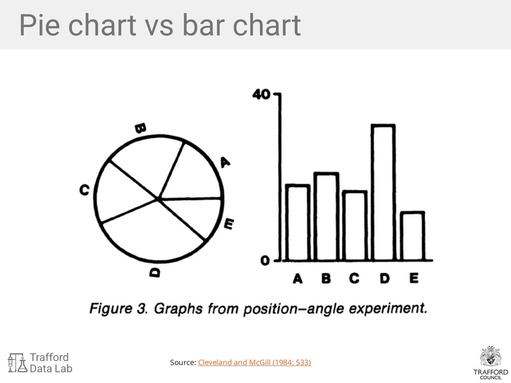
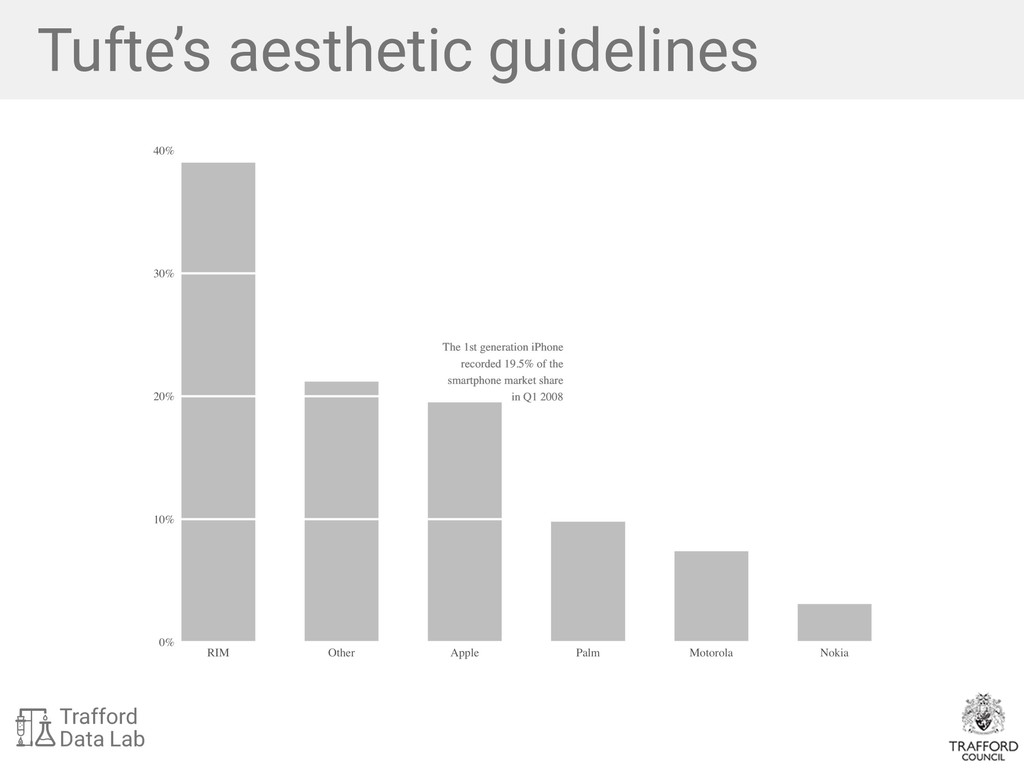
    chart; the only worse design than a pie chart is several of them, for then the viewer is asked to compare quantities located in spatial disarray both within and between charts […] Given their low density and failure to order numbers along a visual dimension, pie charts should never be used.” — Edward Tufte (1983)
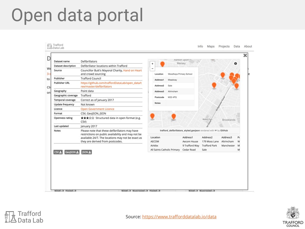
  4. Wilkinson’s Grammar of Graphics Source: Wilkinson (2005) "A statistical graphic

    is a mapping from data to aesthetic attributes (colour, shape, size) of geometric objects (points, lines, bars)." — Hadley Wickham (2016)
  5. Rosling’s bubble charts Source: gapminder.org Variable Geometry Aesthetic GDP per

    capita ($) point x-position Life Expectancy point y-position Population point size Continent point fill
  6. • Re-run code or adapt with different data • R

    is a language so it is readable as text • Post R code via Twitter, reddit, email etc Reproducibility in R