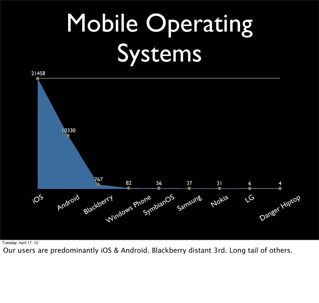
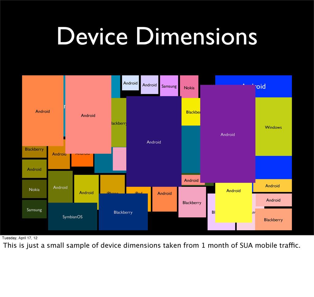
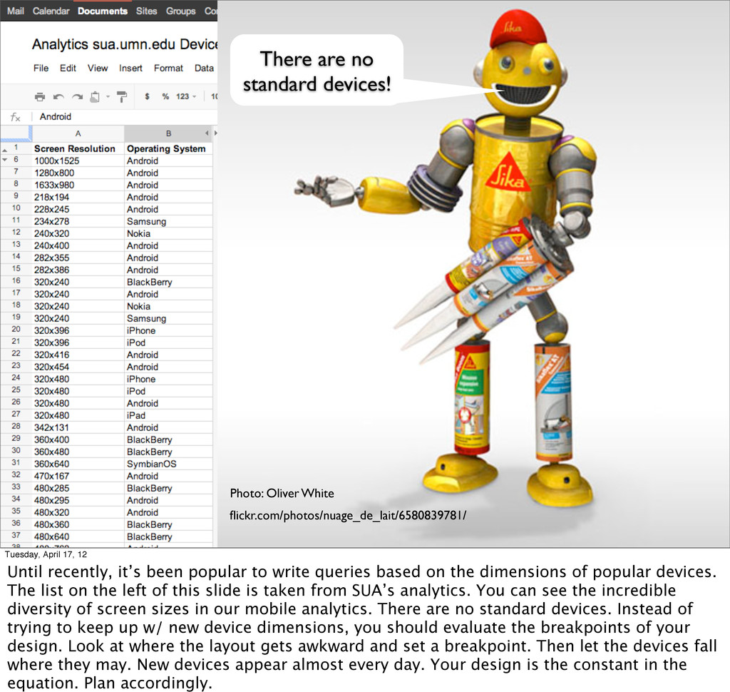
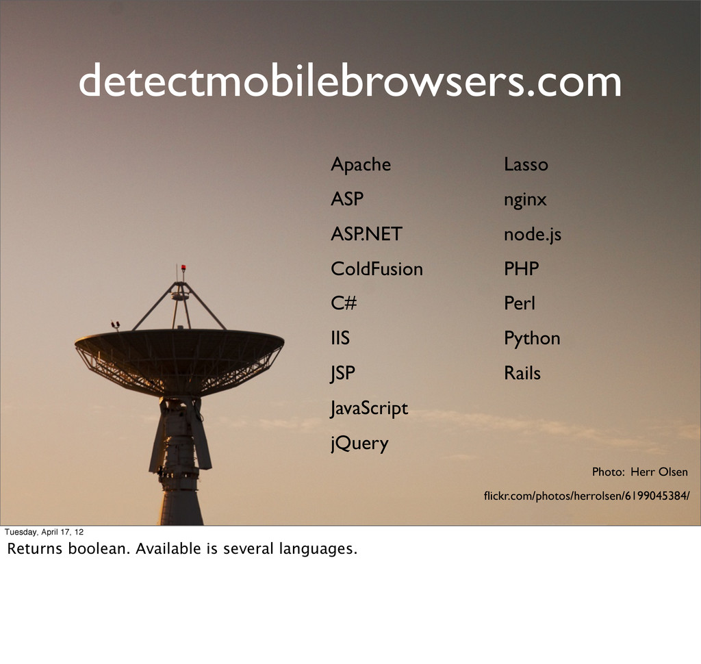
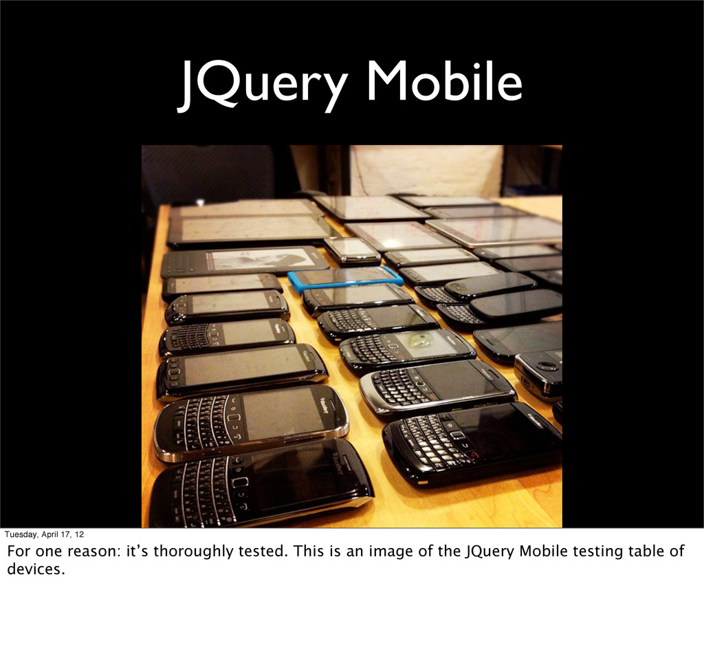
Android Android Blackberry Android Nokia Samsung Android Android iPhone iPod Android Android Blackberry Blackberry SymbianOS Android Blackberry Android Android Blackberry Blackberry Android Windows Android Android Android Android Android SymbianOS Blackberry Android Android Tuesday, April 17, 12 This is just a small sample of device dimensions taken from 1 month of SUA mobile traffic.
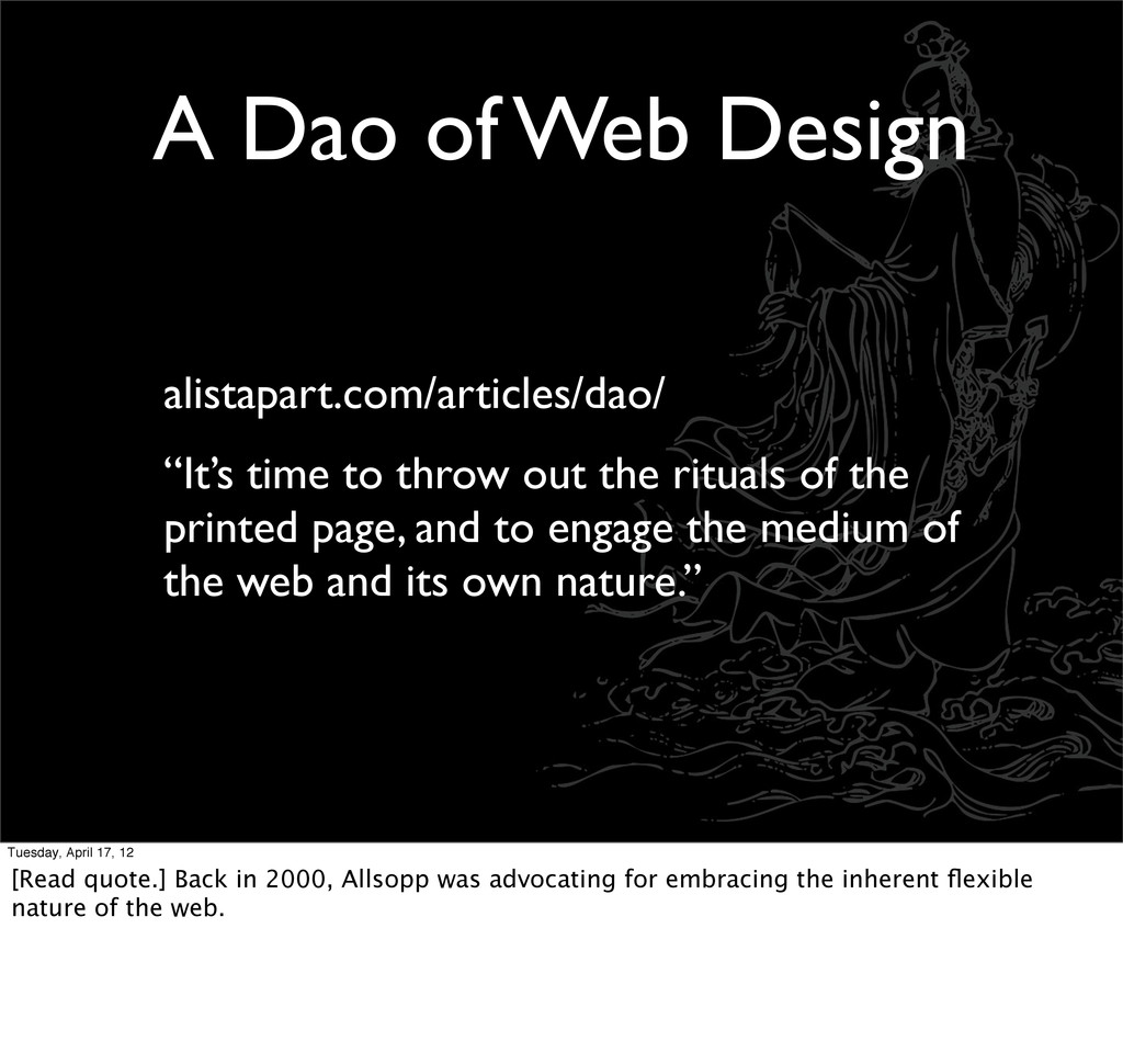
out the rituals of the printed page, and to engage the medium of the web and its own nature.” Tuesday, April 17, 12 [Read quote.] Back in 2000, Allsopp was advocating for embracing the inherent flexible nature of the web.
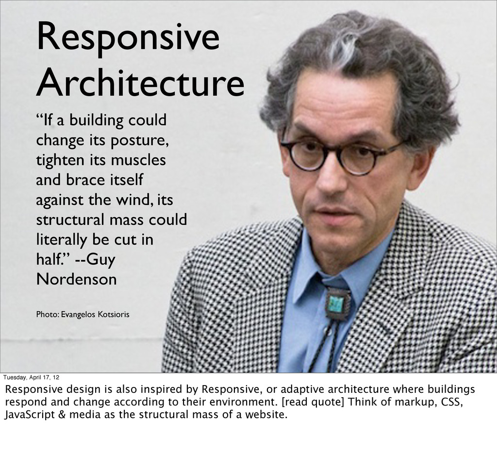
its posture, tighten its muscles and brace itself against the wind, its structural mass could literally be cut in half.” --Guy Nordenson Tuesday, April 17, 12 Responsive design is also inspired by Responsive, or adaptive architecture where buildings respond and change according to their environment. [read quote] Think of markup, CSS, JavaScript & media as the structural mass of a website.
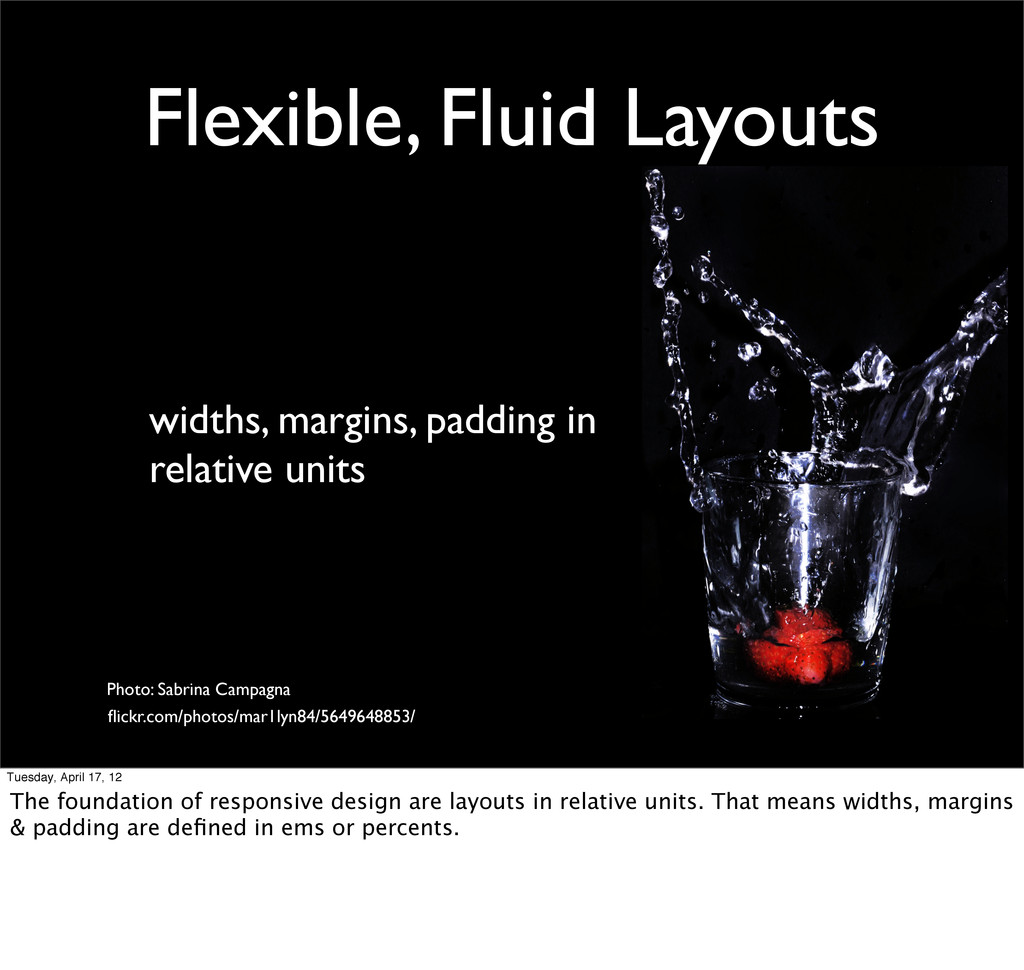
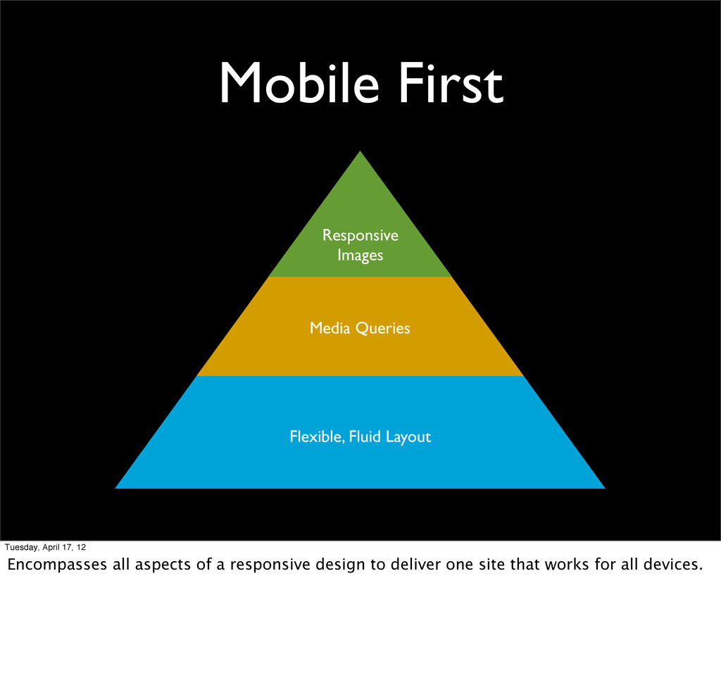
Sabrina Campagna flickr.com/photos/mar1lyn84/5649648853/ Tuesday, April 17, 12 The foundation of responsive design are layouts in relative units. That means widths, margins & padding are defined in ems or percents.
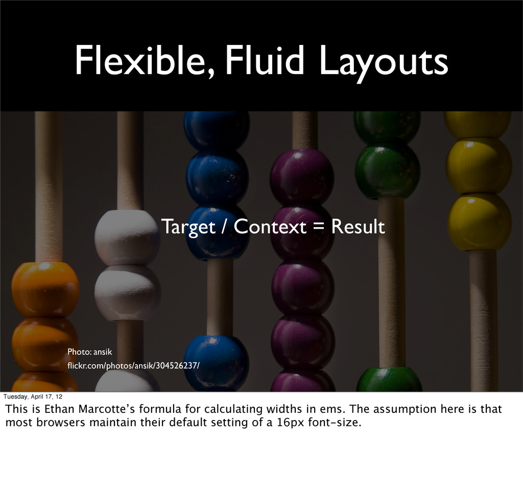
flickr.com/photos/ansik/304526237/ Tuesday, April 17, 12 This is Ethan Marcotte’s formula for calculating widths in ems. The assumption here is that most browsers maintain their default setting of a 16px font-size.
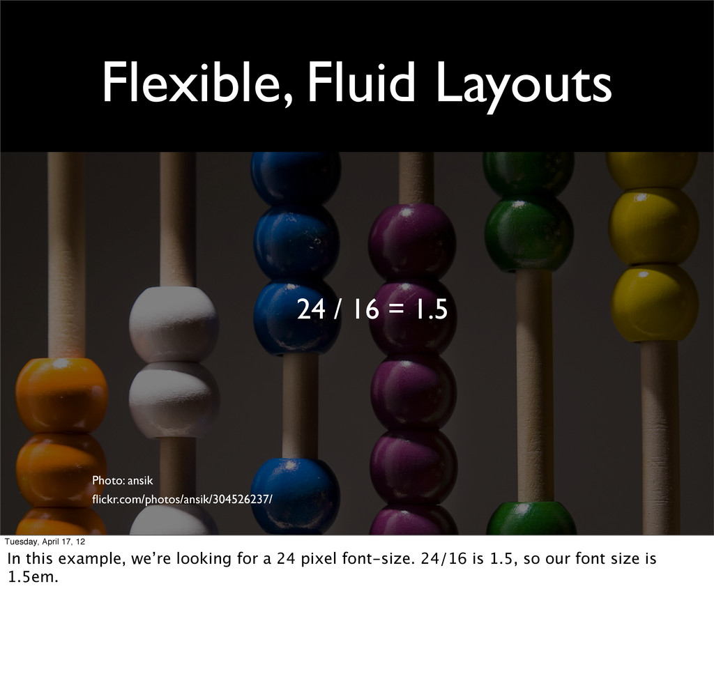
flickr.com/photos/ansik/304526237/ Tuesday, April 17, 12 In this example, we’re looking for a 24 pixel font-size. 24/16 is 1.5, so our font size is 1.5em.
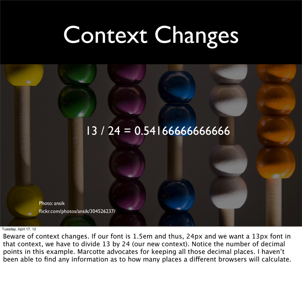
Tuesday, April 17, 12 Beware of context changes. If our font is 1.5em and thus, 24px and we want a 13px font in that context, we have to divide 13 by 24 (our new context). Notice the number of decimal points in this example. Marcotte advocates for keeping all those decimal places. I haven’t been able to find any information as to how many places a different browsers will calculate.
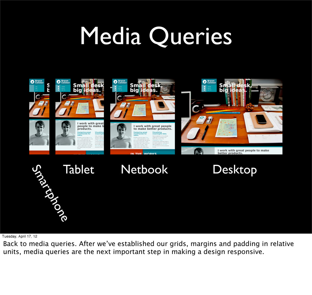
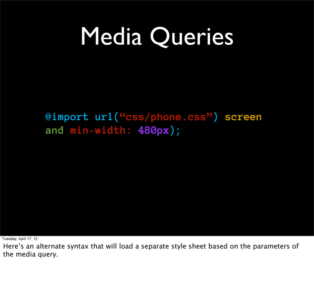
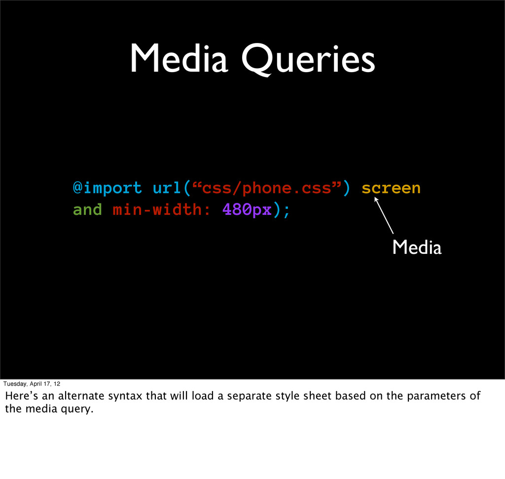
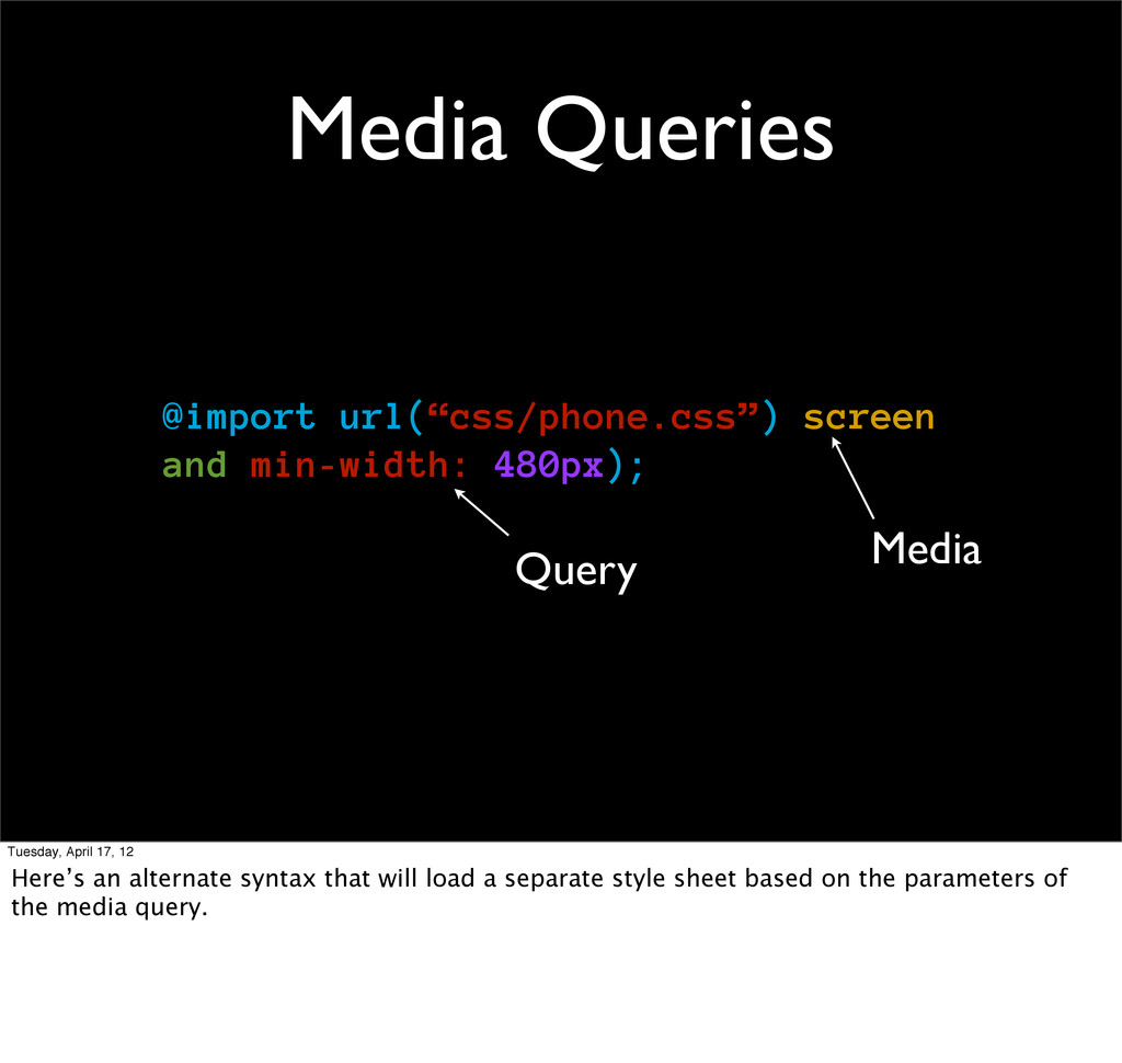
Back to media queries. After we’ve established our grids, margins and padding in relative units, media queries are the next important step in making a design responsive.
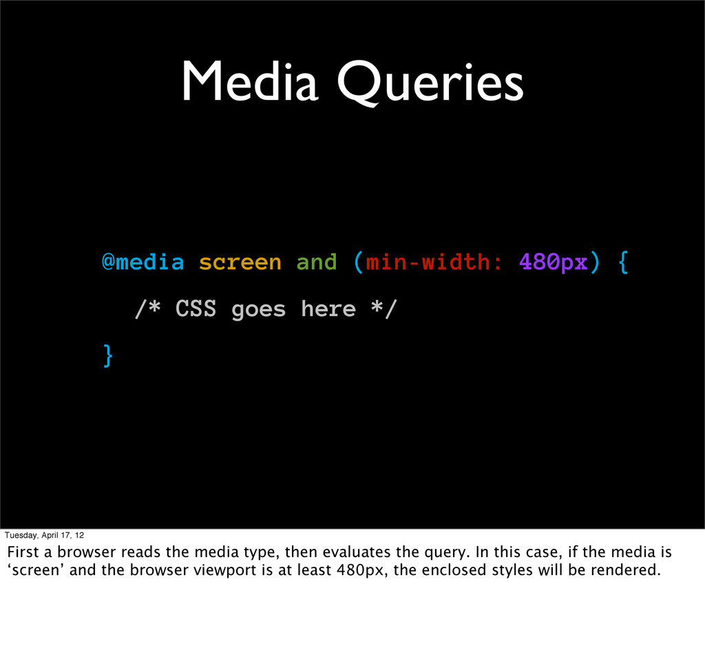
goes here */ } Tuesday, April 17, 12 First a browser reads the media type, then evaluates the query. In this case, if the media is ‘screen’ and the browser viewport is at least 480px, the enclosed styles will be rendered.
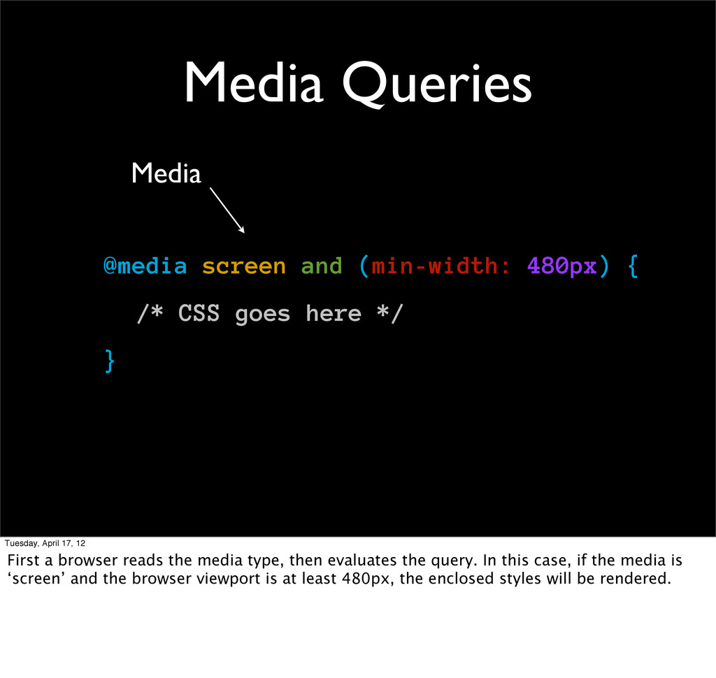
goes here */ } Media Tuesday, April 17, 12 First a browser reads the media type, then evaluates the query. In this case, if the media is ‘screen’ and the browser viewport is at least 480px, the enclosed styles will be rendered.
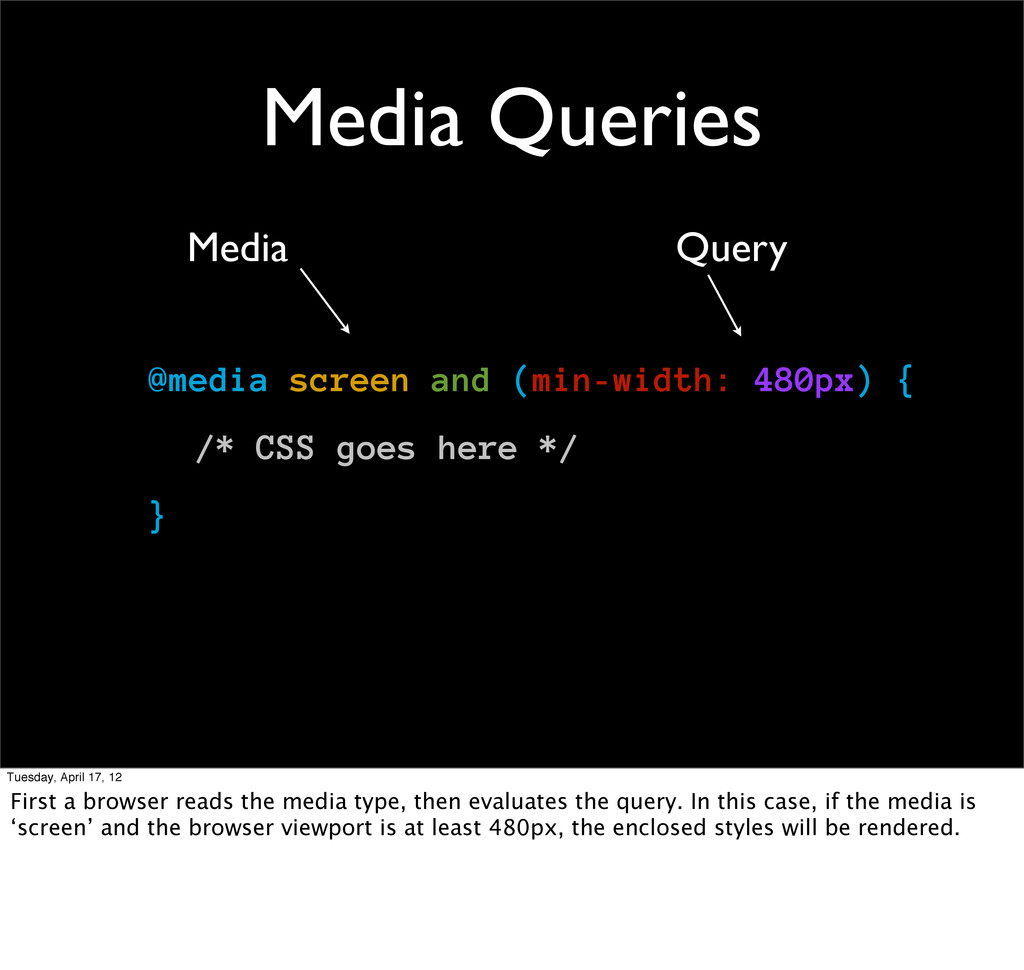
goes here */ } Media Query Tuesday, April 17, 12 First a browser reads the media type, then evaluates the query. In this case, if the media is ‘screen’ and the browser viewport is at least 480px, the enclosed styles will be rendered.
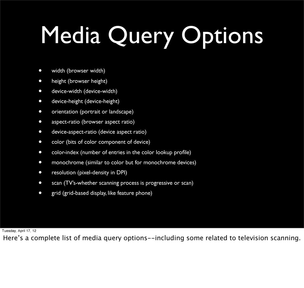
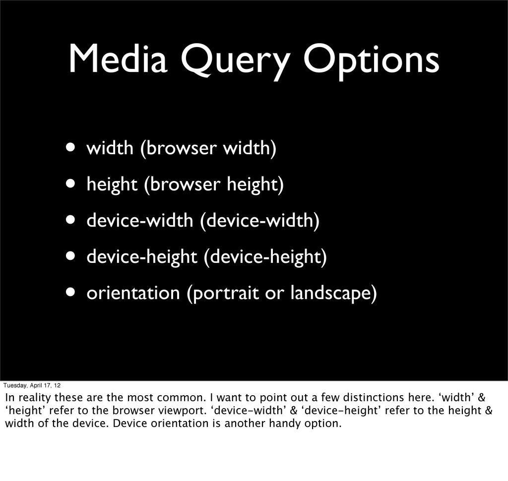
height) • device-width (device-width) • device-height (device-height) • orientation (portrait or landscape) • aspect-ratio (browser aspect ratio) • device-aspect-ratio (device aspect ratio) • color (bits of color component of device) • color-index (number of entries in the color lookup profile) • monochrome (similar to color but for monochrome devices) • resolution (pixel-density in DPI) • scan (TV’s-whether scanning process is progressive or scan) • grid (grid-based display, like feature phone) Tuesday, April 17, 12 Here’s a complete list of media query options--including some related to television scanning.
height) • device-width (device-width) • device-height (device-height) • orientation (portrait or landscape) Tuesday, April 17, 12 In reality these are the most common. I want to point out a few distinctions here. ‘width’ & ‘height’ refer to the browser viewport. ‘device-width’ & ‘device-height’ refer to the height & width of the device. Device orientation is another handy option.
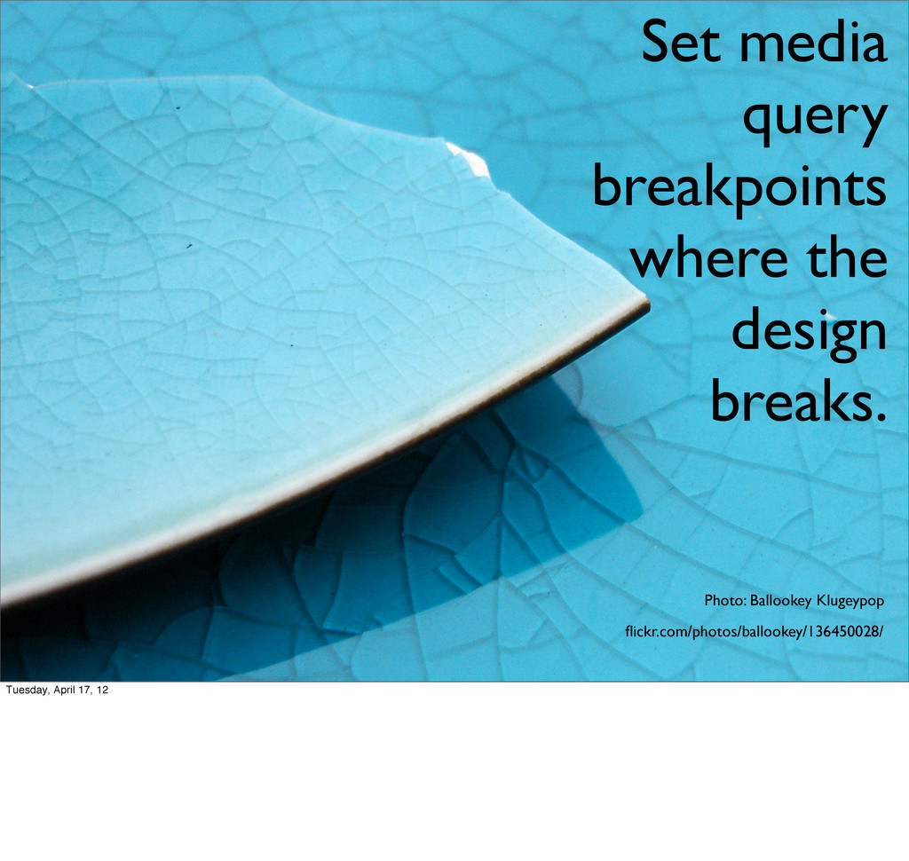
April 17, 12 Until recently, it’s been popular to write queries based on the dimensions of popular devices. The list on the left of this slide is taken from SUA’s analytics. You can see the incredible diversity of screen sizes in our mobile analytics. There are no standard devices. Instead of trying to keep up w/ new device dimensions, you should evaluate the breakpoints of your design. Look at where the layout gets awkward and set a breakpoint. Then let the devices fall where they may. New devices appear almost every day. Your design is the constant in the equation. Plan accordingly.
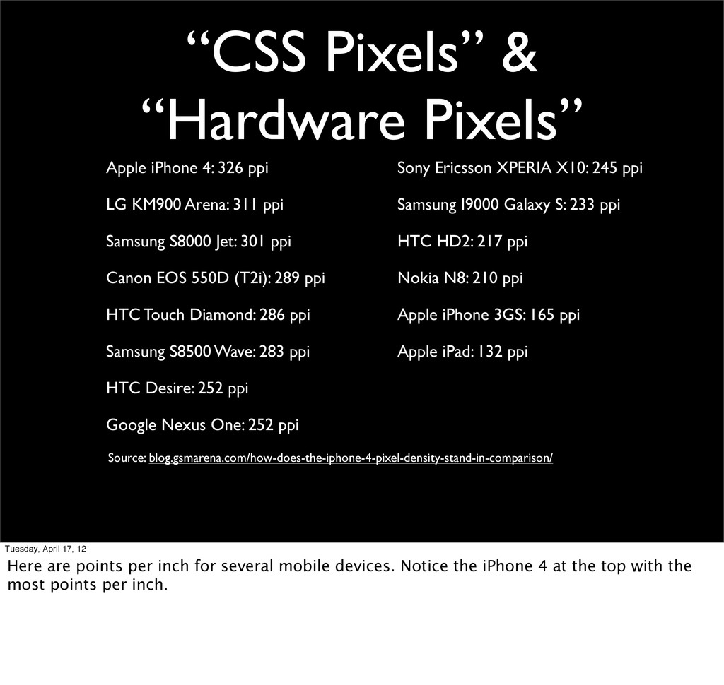
LG KM900 Arena: 311 ppi Samsung S8000 Jet: 301 ppi Canon EOS 550D (T2i): 289 ppi HTC Touch Diamond: 286 ppi Samsung S8500 Wave: 283 ppi HTC Desire: 252 ppi Google Nexus One: 252 ppi Sony Ericsson XPERIA X10: 245 ppi Samsung I9000 Galaxy S: 233 ppi HTC HD2: 217 ppi Nokia N8: 210 ppi Apple iPhone 3GS: 165 ppi Apple iPad: 132 ppi Source: blog.gsmarena.com/how-does-the-iphone-4-pixel-density-stand-in-comparison/ Tuesday, April 17, 12 Here are points per inch for several mobile devices. Notice the iPhone 4 at the top with the most points per inch.
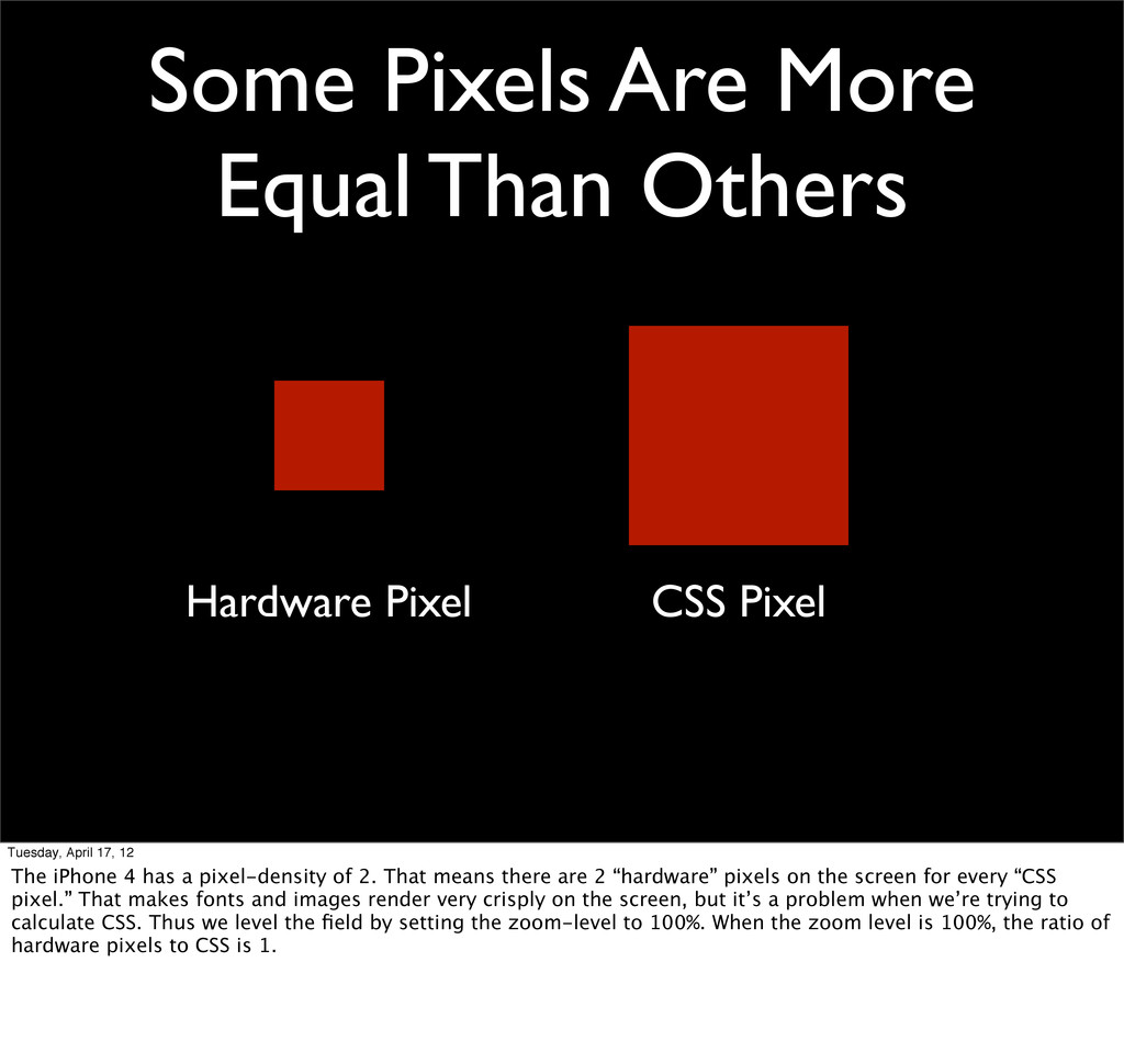
Pixel Tuesday, April 17, 12 The iPhone 4 has a pixel-density of 2. That means there are 2 “hardware” pixels on the screen for every “CSS pixel.” That makes fonts and images render very crisply on the screen, but it’s a problem when we’re trying to calculate CSS. Thus we level the field by setting the zoom-level to 100%. When the zoom level is 100%, the ratio of hardware pixels to CSS is 1.
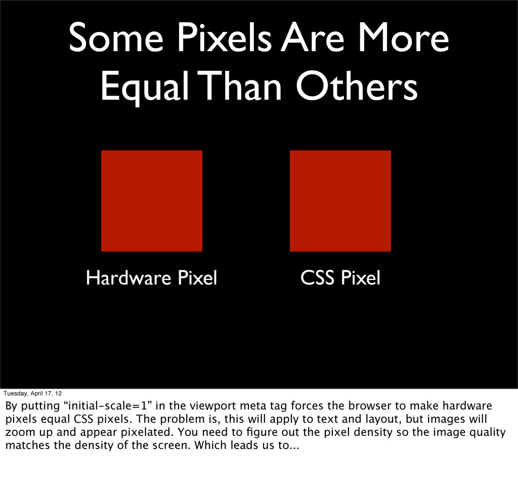
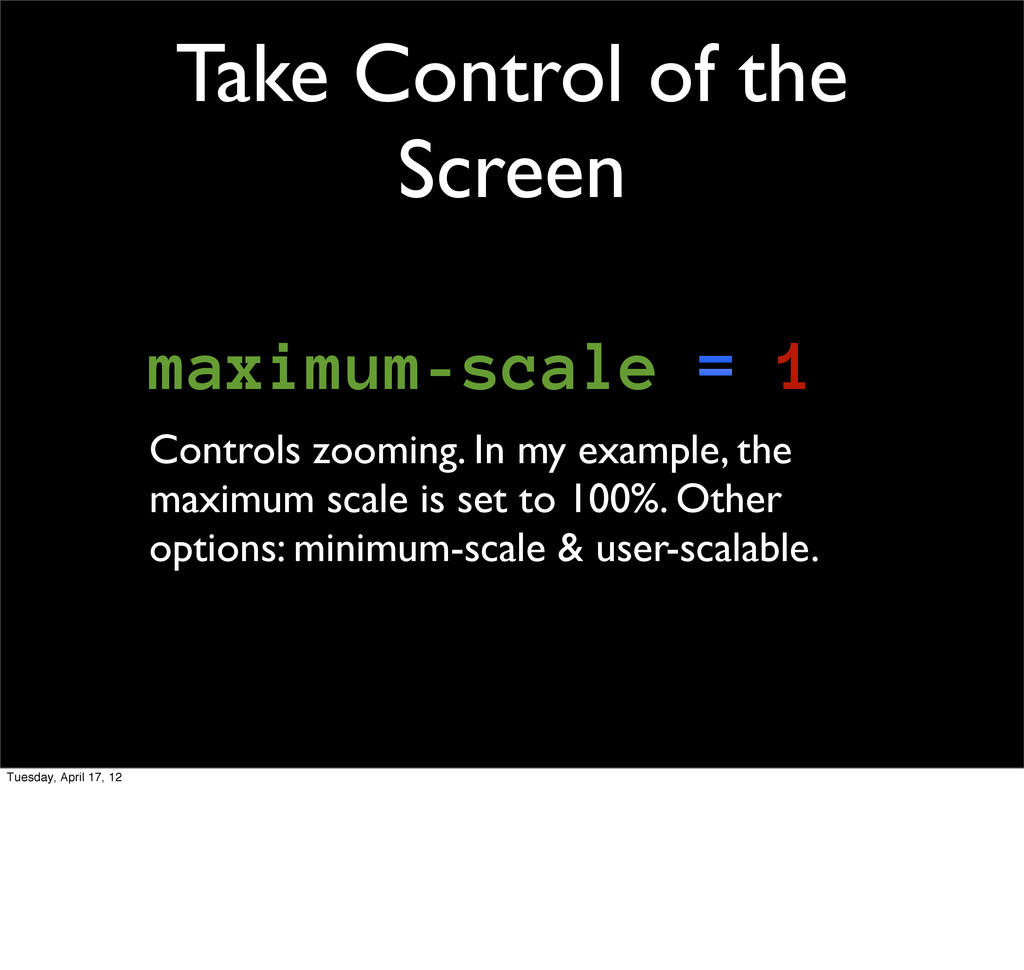
Pixel Tuesday, April 17, 12 By putting “initial-scale=1” in the viewport meta tag forces the browser to make hardware pixels equal CSS pixels. The problem is, this will apply to text and layout, but images will zoom up and appear pixelated. You need to figure out the pixel density so the image quality matches the density of the screen. Which leads us to...
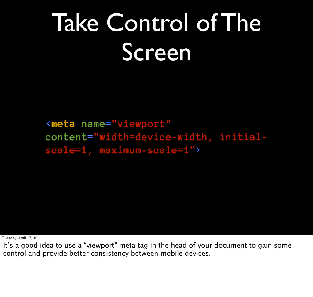
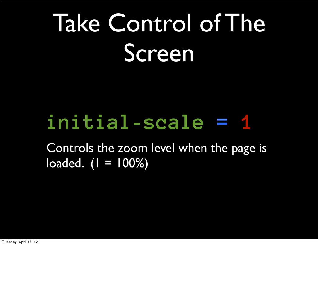
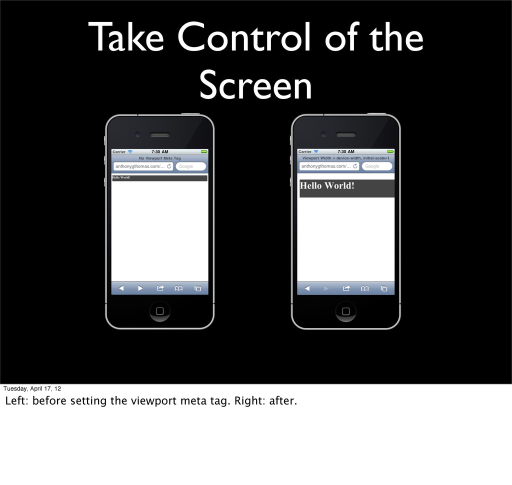
maximum-scale=1"> Tuesday, April 17, 12 It’s a good idea to use a “viewport” meta tag in the head of your document to gain some control and provide better consistency between mobile devices.
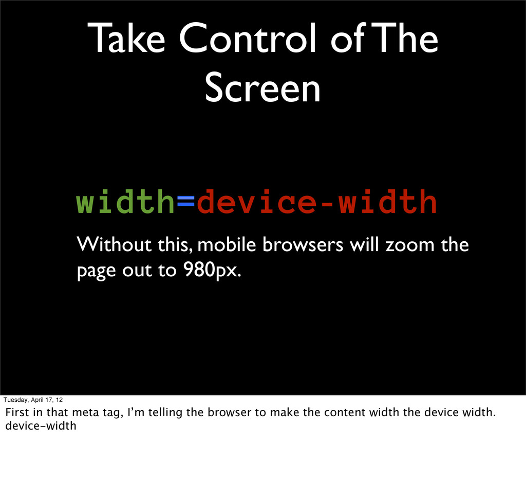
will zoom the page out to 980px. Tuesday, April 17, 12 First in that meta tag, I’m telling the browser to make the content width the device width. device-width
17, 12 After after fluid layouts and media queries come responsive images. The talking phones are outraged that we’re trying to send them a gigantic image.
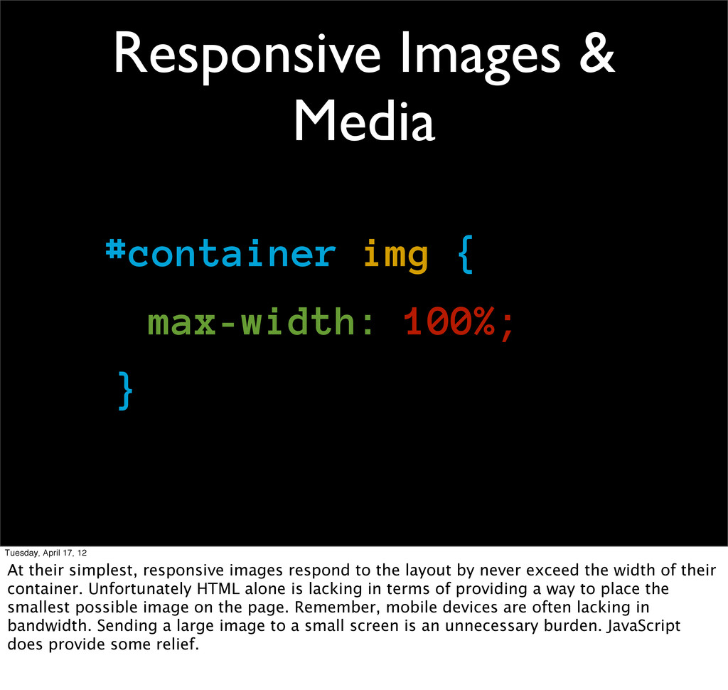
Tuesday, April 17, 12 At their simplest, responsive images respond to the layout by never exceed the width of their container. Unfortunately HTML alone is lacking in terms of providing a way to place the smallest possible image on the page. Remember, mobile devices are often lacking in bandwidth. Sending a large image to a small screen is an unnecessary burden. JavaScript does provide some relief.
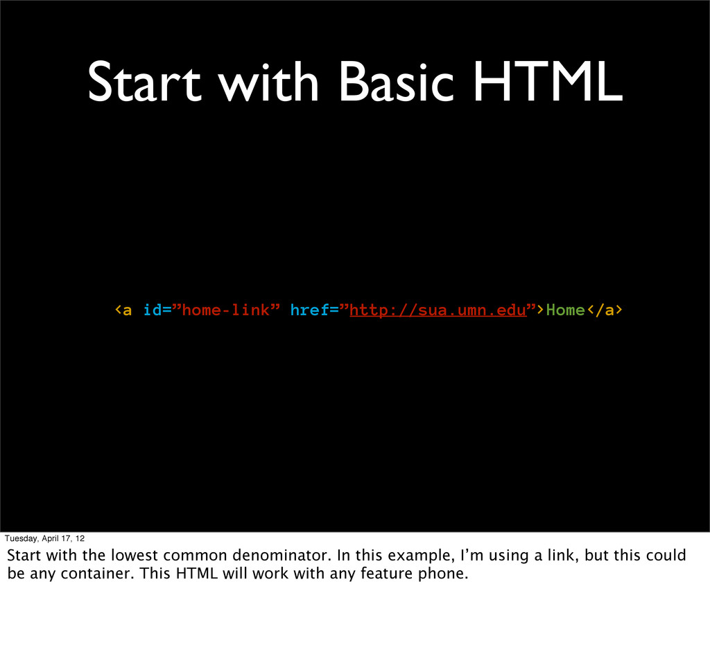
12 Start with the lowest common denominator. In this example, I’m using a link, but this could be any container. This HTML will work with any feature phone.
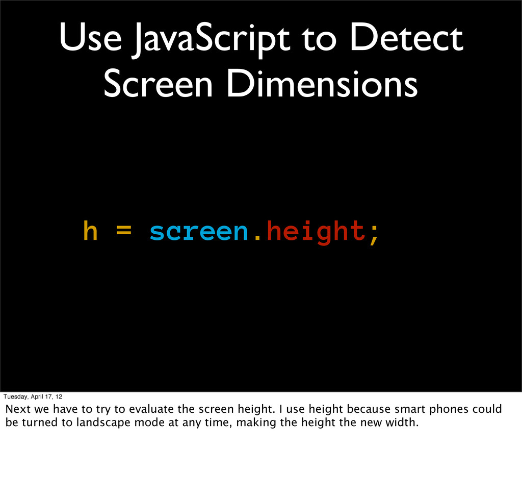
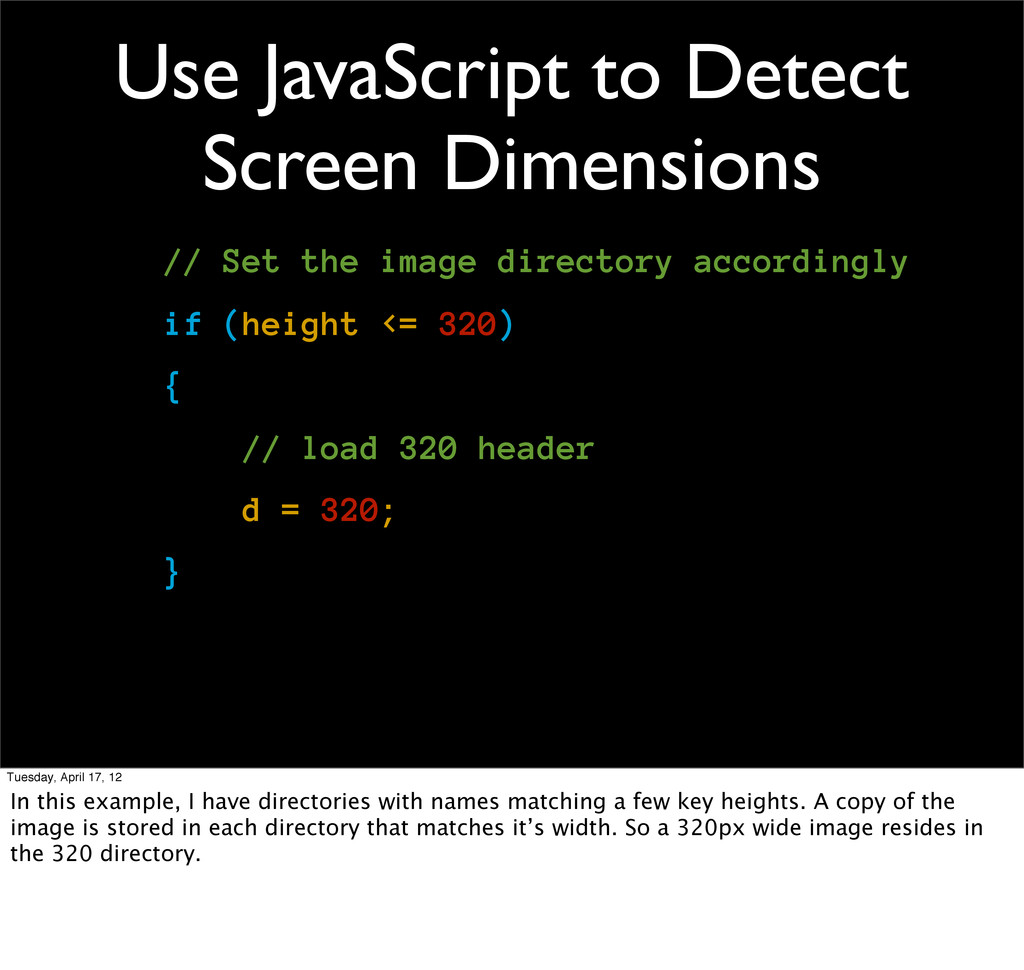
April 17, 12 Next we have to try to evaluate the screen height. I use height because smart phones could be turned to landscape mode at any time, making the height the new width.
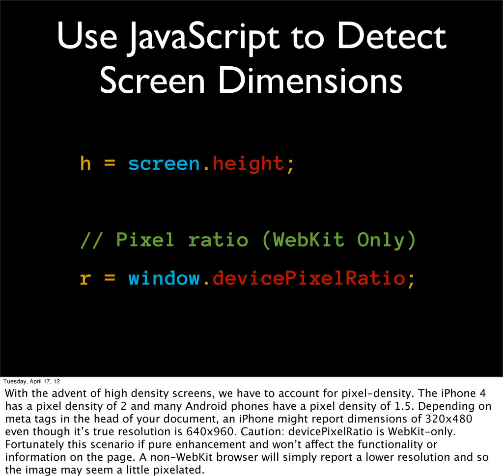
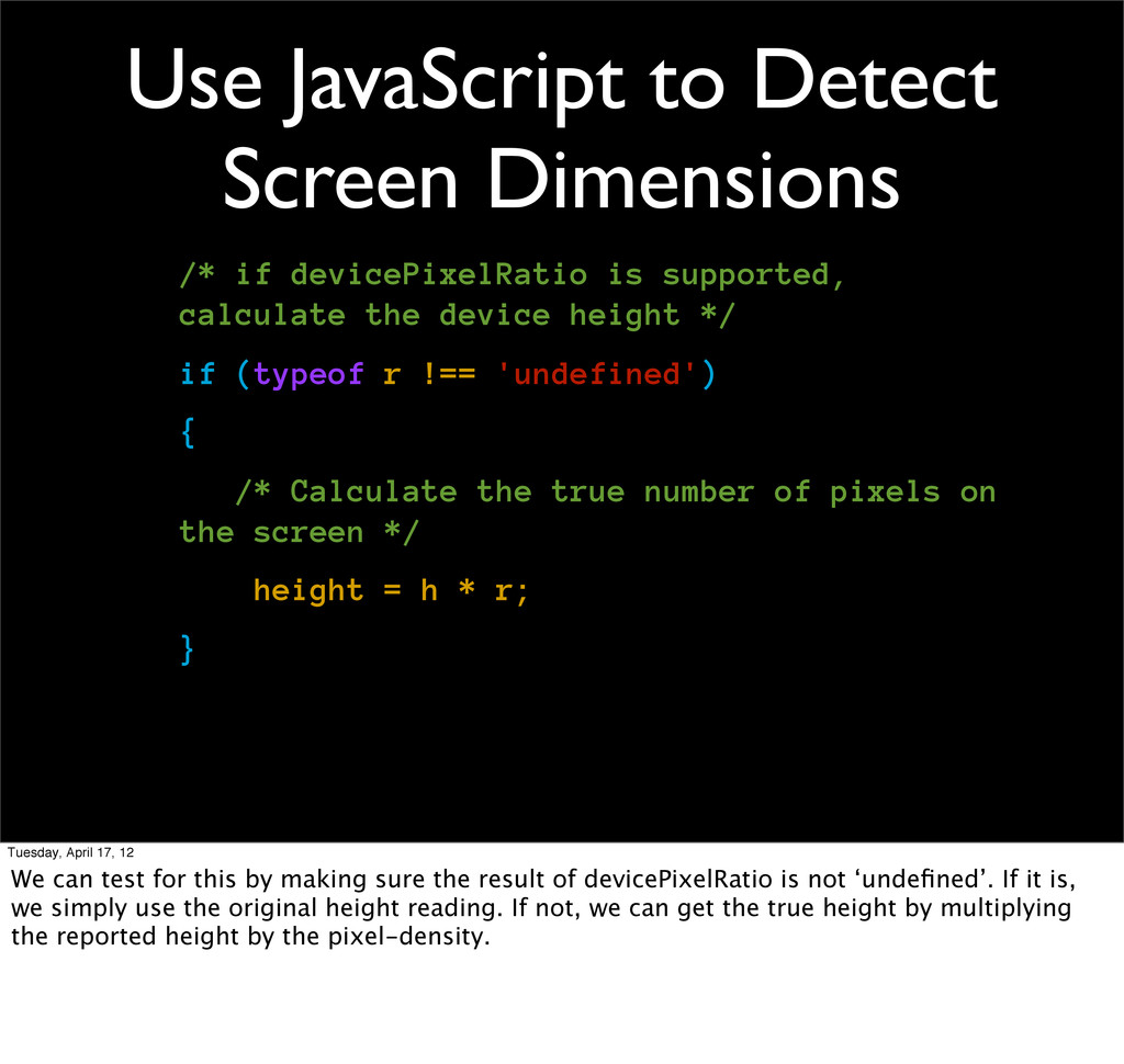
Pixel ratio (WebKit Only) r = window.devicePixelRatio; Tuesday, April 17, 12 With the advent of high density screens, we have to account for pixel-density. The iPhone 4 has a pixel density of 2 and many Android phones have a pixel density of 1.5. Depending on meta tags in the head of your document, an iPhone might report dimensions of 320x480 even though it’s true resolution is 640x960. Caution: devicePixelRatio is WebKit-only. Fortunately this scenario if pure enhancement and won’t affect the functionality or information on the page. A non-WebKit browser will simply report a lower resolution and so the image may seem a little pixelated.
supported, calculate the device height */ if (typeof r !== 'undefined') { /* Calculate the true number of pixels on the screen */ height = h * r; } Tuesday, April 17, 12 We can test for this by making sure the result of devicePixelRatio is not ‘undefined’. If it is, we simply use the original height reading. If not, we can get the true height by multiplying the reported height by the pixel-density.
directory accordingly if (height <= 320) { // load 320 header d = 320; } Tuesday, April 17, 12 In this example, I have directories with names matching a few key heights. A copy of the image is stored in each directory that matches it’s width. So a 320px wide image resides in the 320 directory.
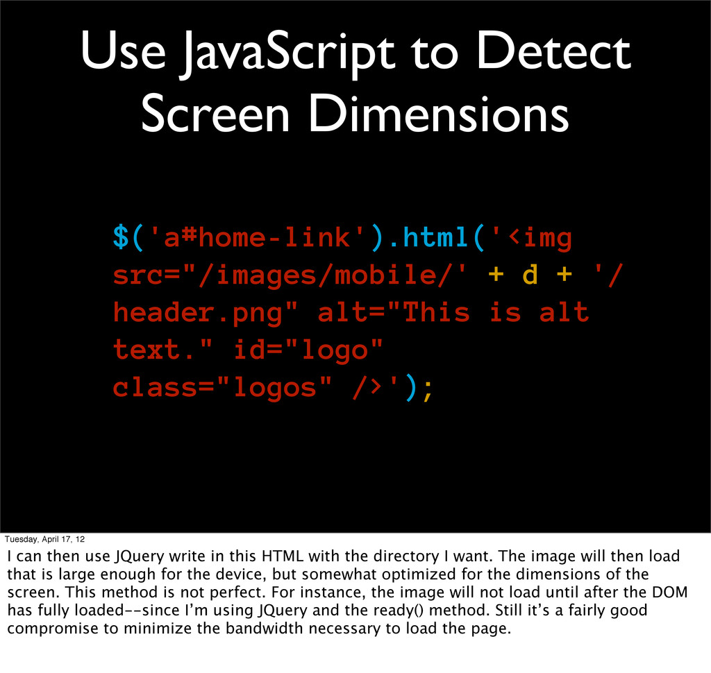
+ '/ header.png" alt="This is alt text." id="logo" class="logos" />'); Tuesday, April 17, 12 I can then use JQuery write in this HTML with the directory I want. The image will then load that is large enough for the device, but somewhat optimized for the dimensions of the screen. This method is not perfect. For instance, the image will not load until after the DOM has fully loaded--since I’m using JQuery and the ready() method. Still it’s a fairly good compromise to minimize the bandwidth necessary to load the page.
Now that I’ve touched on a few techniques, I want to go over three approaches to developing for mobile. Those are Mobile First, a separate mobile experience and RESS which stands for Responsive and Server Side.
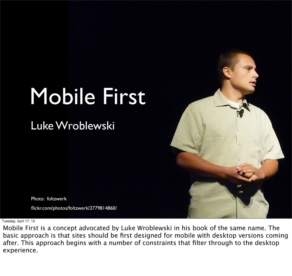
12 Mobile First is a concept advocated by Luke Wroblewski in his book of the same name. The basic approach is that sites should be first designed for mobile with desktop versions coming after. This approach begins with a number of constraints that filter through to the desktop experience.
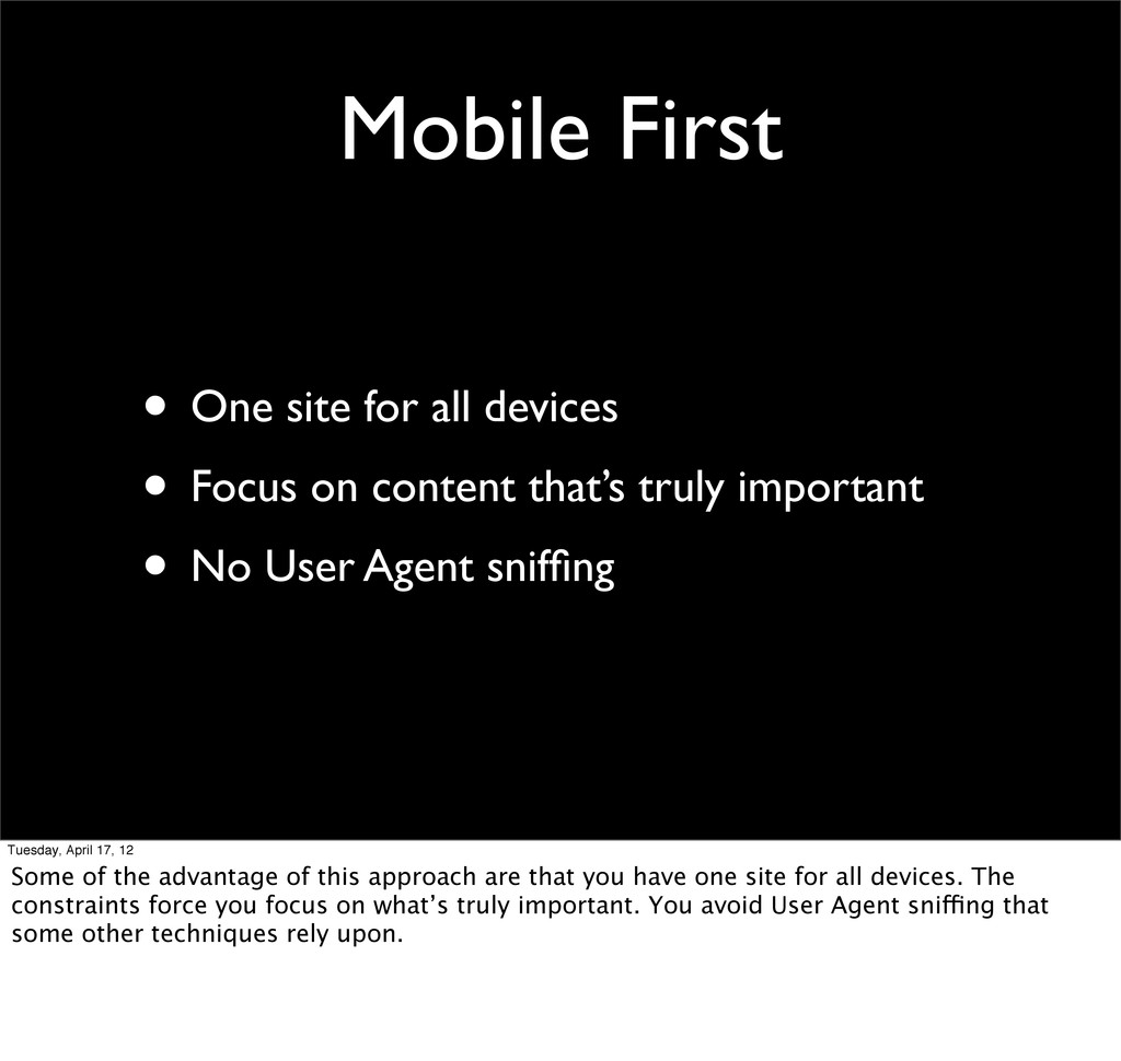
on content that’s truly important • No User Agent sniffing Tuesday, April 17, 12 Some of the advantage of this approach are that you have one site for all devices. The constraints force you focus on what’s truly important. You avoid User Agent sniffing that some other techniques rely upon.
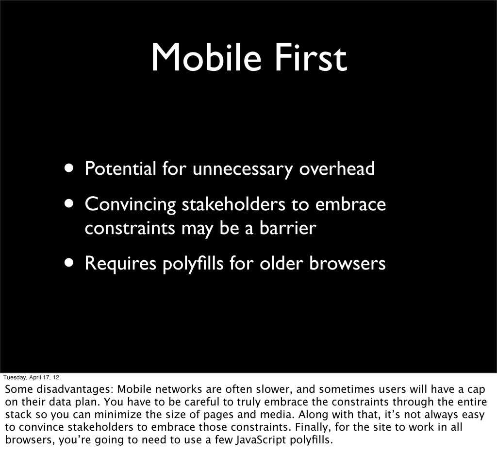
to embrace constraints may be a barrier • Requires polyfills for older browsers Tuesday, April 17, 12 Some disadvantages: Mobile networks are often slower, and sometimes users will have a cap on their data plan. You have to be careful to truly embrace the constraints through the entire stack so you can minimize the size of pages and media. Along with that, it’s not always easy to convince stakeholders to embrace those constraints. Finally, for the site to work in all browsers, you’re going to need to use a few JavaScript polyfills.
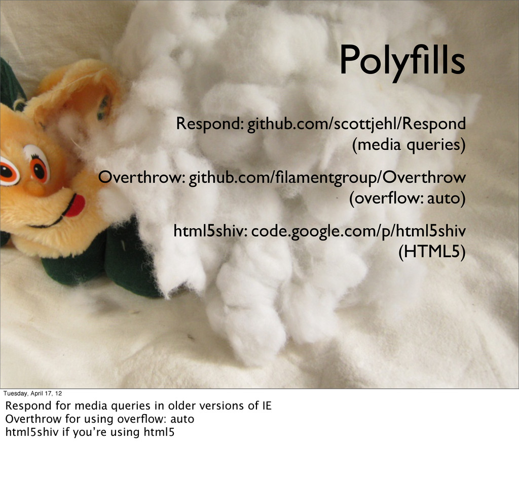
code.google.com/p/html5shiv (HTML5) Tuesday, April 17, 12 Respond for media queries in older versions of IE Overthrow for using overflow: auto html5shiv if you’re using html5
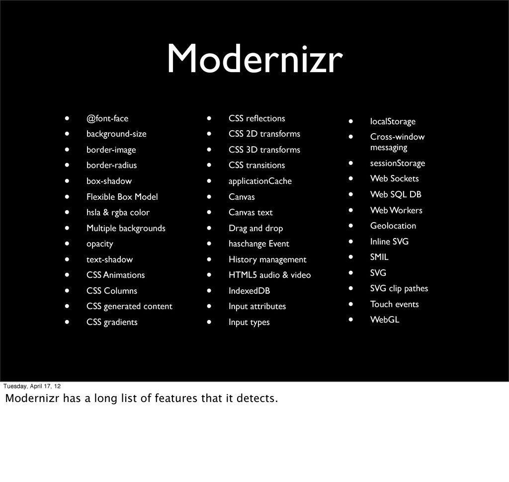
17, 12 Modernizr is a JavaScript library for detecting browser features. It offers a lot of flexibility in that you can enhance your site based on the capabilities of each browser.
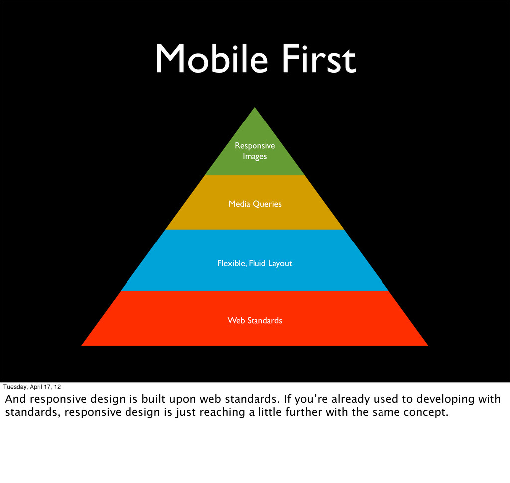
Standards Tuesday, April 17, 12 And responsive design is built upon web standards. If you’re already used to developing with standards, responsive design is just reaching a little further with the same concept.
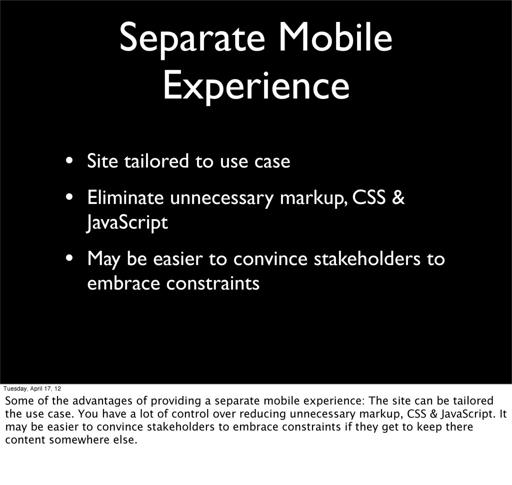
Eliminate unnecessary markup, CSS & JavaScript • May be easier to convince stakeholders to embrace constraints Tuesday, April 17, 12 Some of the advantages of providing a separate mobile experience: The site can be tailored the use case. You have a lot of control over reducing unnecessary markup, CSS & JavaScript. It may be easier to convince stakeholders to embrace constraints if they get to keep there content somewhere else.
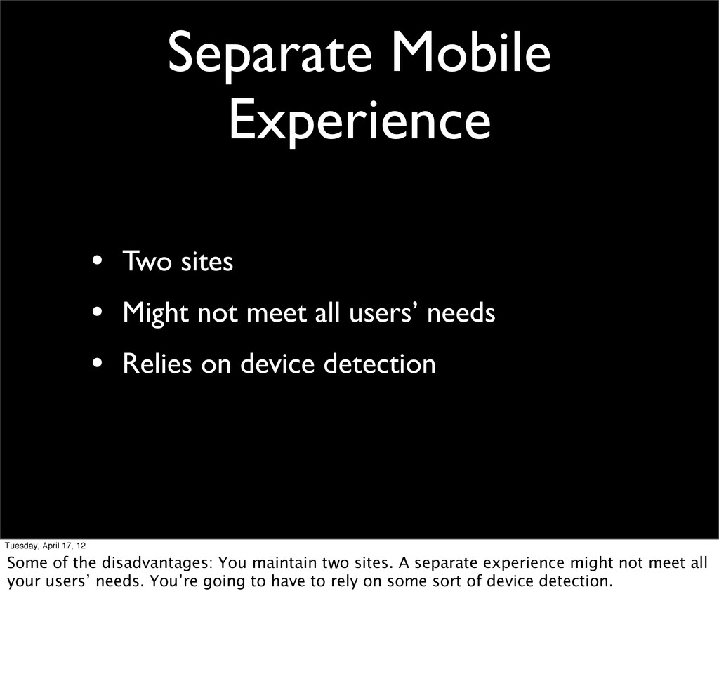
all users’ needs • Relies on device detection Tuesday, April 17, 12 Some of the disadvantages: You maintain two sites. A separate experience might not meet all your users’ needs. You’re going to have to rely on some sort of device detection.
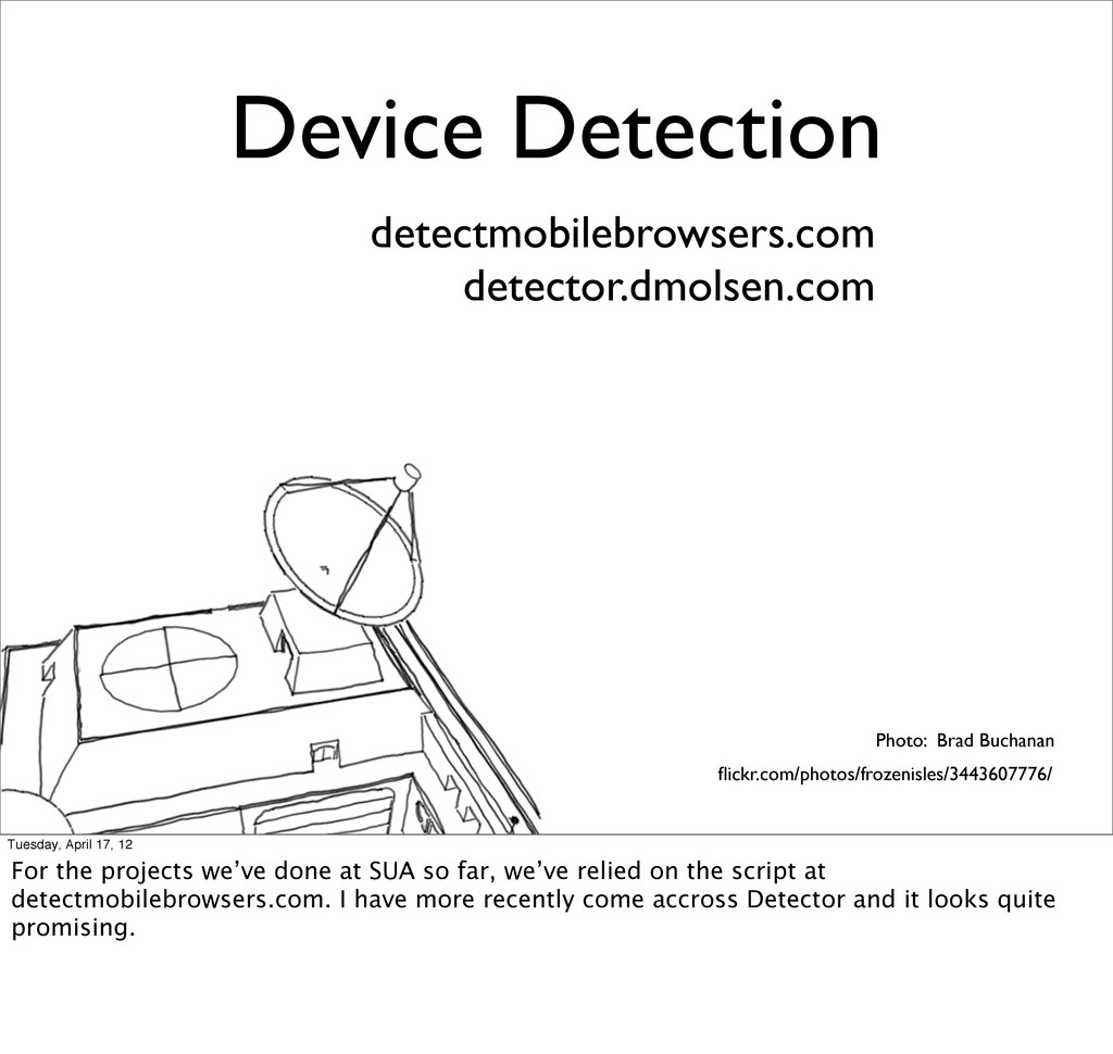
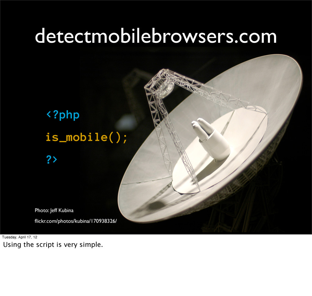
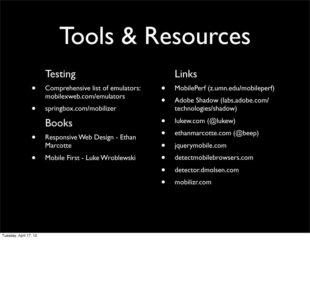
17, 12 For the projects we’ve done at SUA so far, we’ve relied on the script at detectmobilebrowsers.com. I have more recently come accross Detector and it looks quite promising.
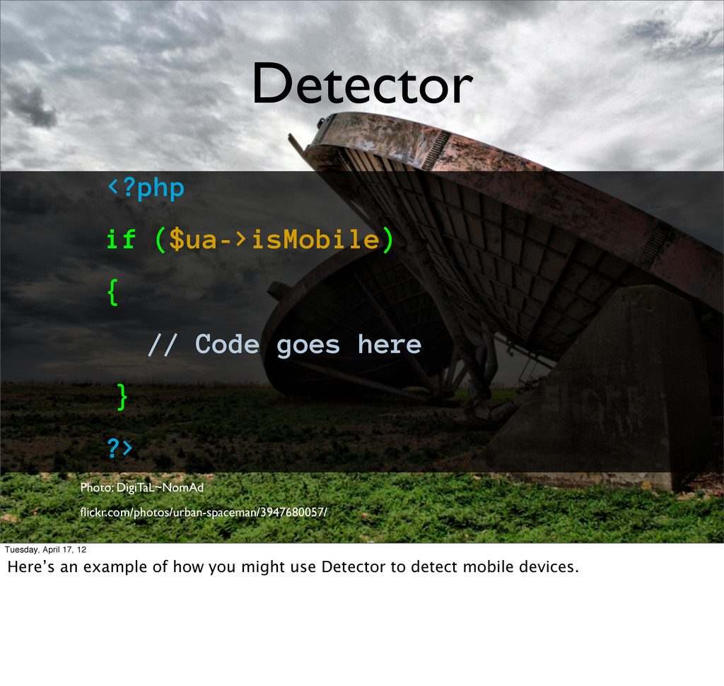
same database of tests as Modernizr Photo: Jason Ahrns flickr.com/photos/musubk/5578348098/ Tuesday, April 17, 12 Detector, by comparison, is only available in PHP. It’s still in beta. It does a lot more than detect whether a device is mobile or not. It also has the same database of feature detection as Modernizr.
?> Photo: DigiTaL~NomAd flickr.com/photos/urban-spaceman/3947680057/ Tuesday, April 17, 12 Here’s an example of how you might use Detector to detect mobile devices.
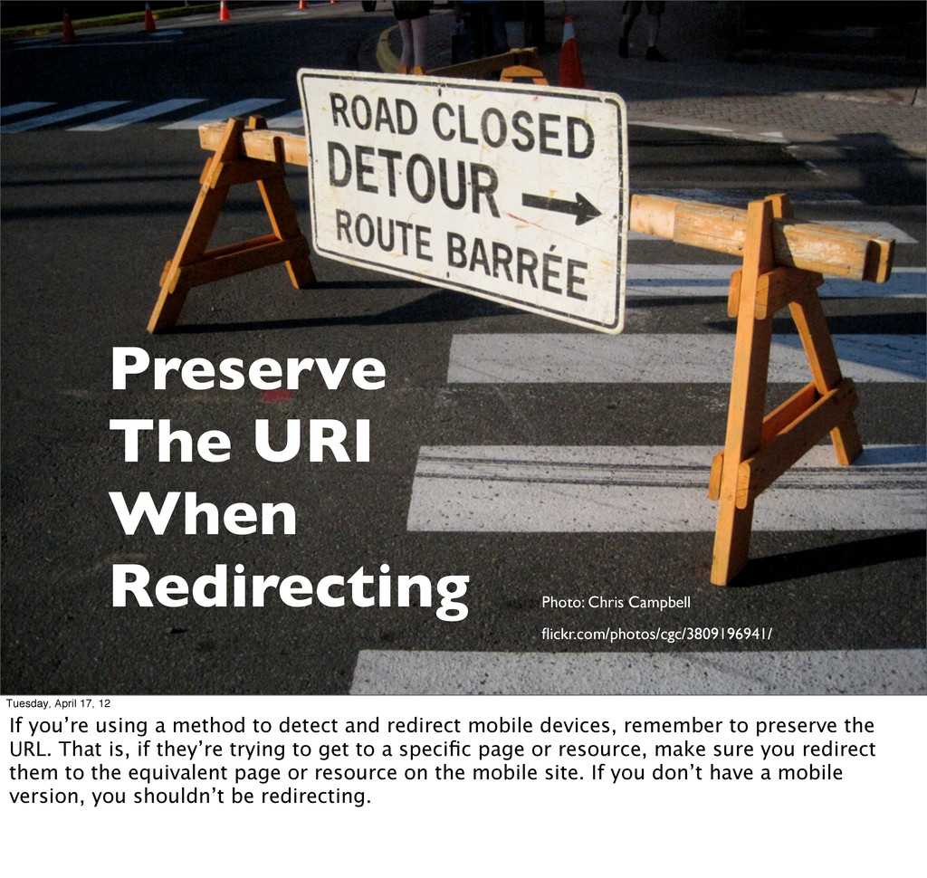
April 17, 12 If you’re using a method to detect and redirect mobile devices, remember to preserve the URL. That is, if they’re trying to get to a specific page or resource, make sure you redirect them to the equivalent page or resource on the mobile site. If you don’t have a mobile version, you shouldn’t be redirecting.
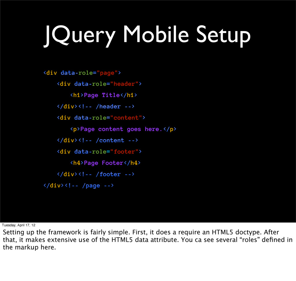
/header --> <div data-role="content"> <p>Page content goes here.</p> </div><!-- /content --> <div data-role="footer"> <h4>Page Footer</h4> </div><!-- /footer --> </div><!-- /page --> Tuesday, April 17, 12 Setting up the framework is fairly simple. First, it does a require an HTML5 doctype. After that, it makes extensive use of the HTML5 data attribute. You ca see several “roles” defined in the markup here.
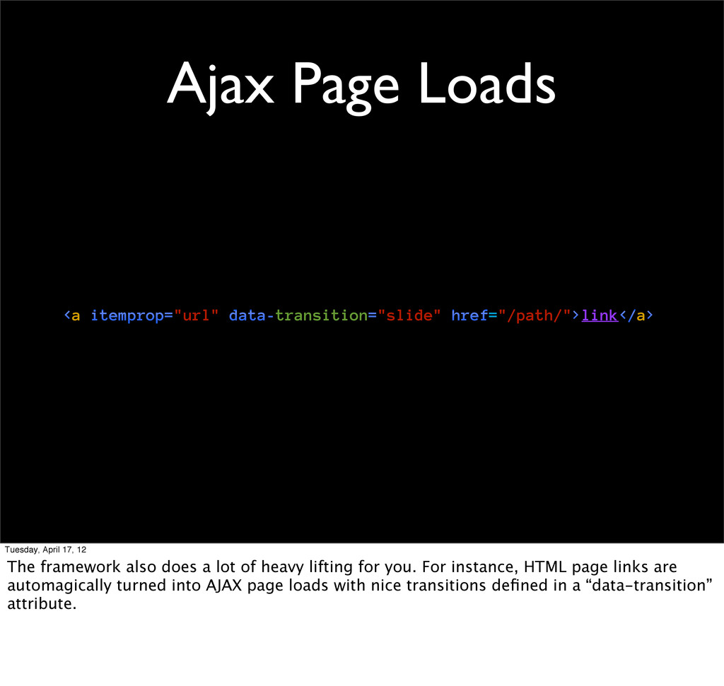
12 The framework also does a lot of heavy lifting for you. For instance, HTML page links are automagically turned into AJAX page loads with nice transitions defined in a “data-transition” attribute.
12 The framework also does a lot of heavy lifting for you. For instance, HTML page links are automagically turned into AJAX page loads with nice transitions defined in a “data-transition” attribute.
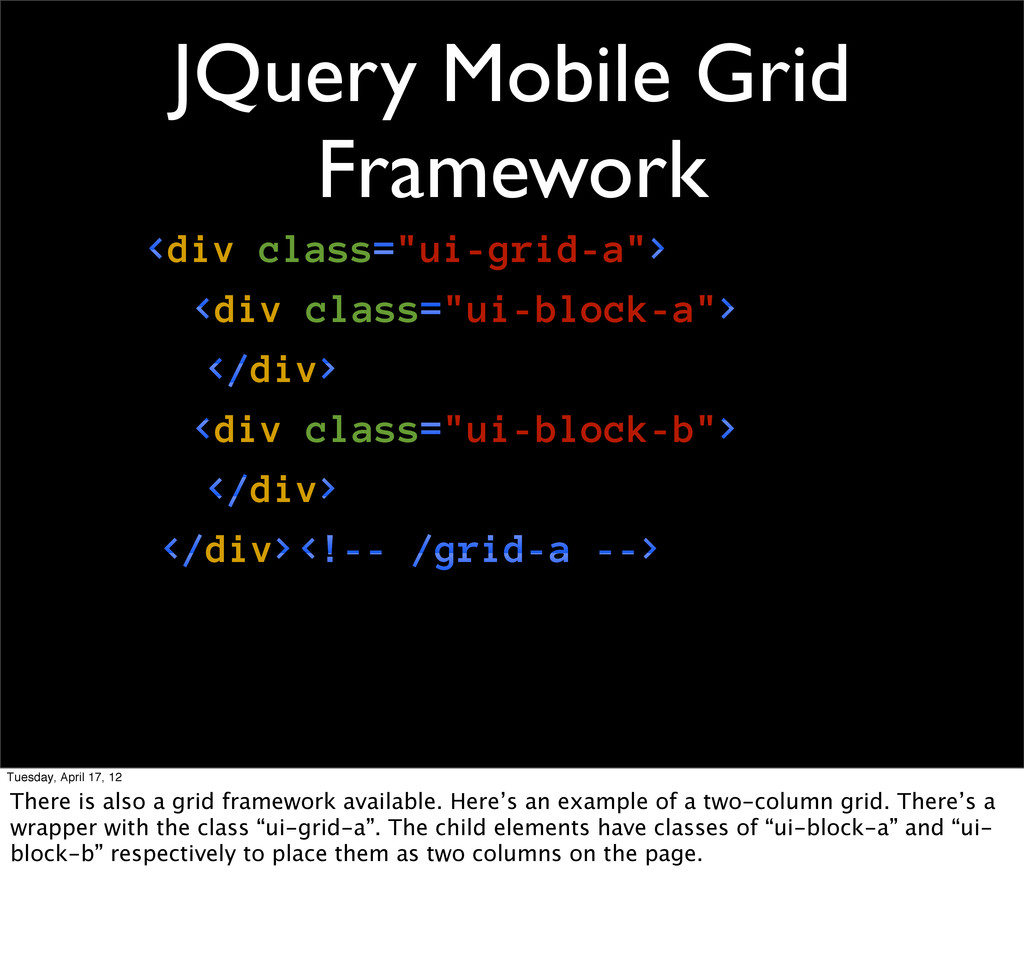
class="ui-block-b"> </div> </div><!-- /grid-a --> Tuesday, April 17, 12 There is also a grid framework available. Here’s an example of a two-column grid. There’s a wrapper with the class “ui-grid-a”. The child elements have classes of “ui-block-a” and “ui- block-b” respectively to place them as two columns on the page.
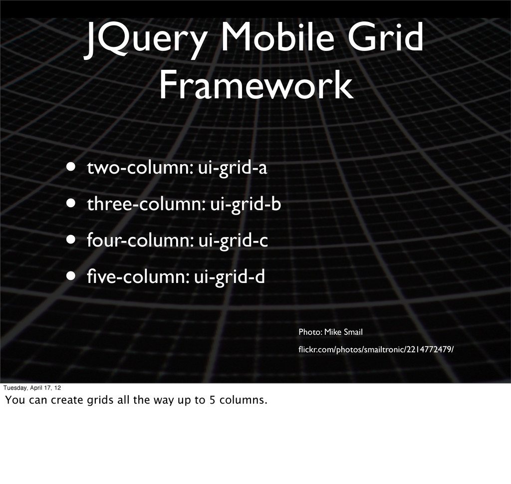
• four-column: ui-grid-c • five-column: ui-grid-d Photo: Mike Smail flickr.com/photos/smailtronic/2214772479/ Tuesday, April 17, 12 You can create grids all the way up to 5 columns.
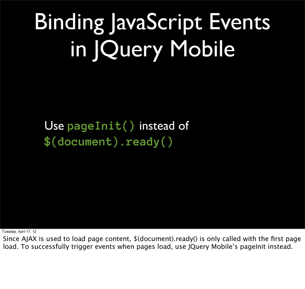
$(document).ready() Tuesday, April 17, 12 Since AJAX is used to load page content, $(document).ready() is only called with the first page load. To successfully trigger events when pages load, use JQuery Mobile’s pageInit instead.
17, 12 Luke Wroblewski, who authored Mobile First, also has written about RESS, which is a combination of responsive design techniques and server-side feature detection.
provide a finely-tuned experience • Removes need for redirects REsponsive & Server Side (RESS) Tuesday, April 17, 12 Some of RESS’ advantages: The work of feature detection is handled on the server side, making the browser on the phone do less work. It offers a way to create a very finely-tuned experience. No more redirects to a different mobile site. Preserves what Phil Hawksworth calls the contract of the URI for providing content.
REsponsive & Server Side (RESS) Tuesday, April 17, 12 • Harder to execute ◦ more resources needed in terms of client and server side coding skills and time ◦ A lot of thought and planning needs to go into components and device classes (phone, tablet, desktop, TV, etc.) • Requires some user agent sniffing
 knih
knih
 kairim0
 junki
junki
 ham0215
 8maki
8maki
 whisaiyo
 ebiken
 recruitengineers
 tosho
tosho
 amarelo_n24
 hamukazu
 demaecan
 reverentgeek
 tammyeverts
 skipperchong
 varn
varn
 gr2m
gr2m
 rasagy
 csswizardry
 matthewcrist
 kneath
 paigeccino
 elsirapls
![if (is_mobile() && !isset($_COOKIE['mobile'])) { $redirect = '/mobile/'; if (preg_match('/event\/(\d+)/',](https://files.speakerdeck.com/presentations/4f8e1c1e37aff9001f005903/slide_67.jpg)