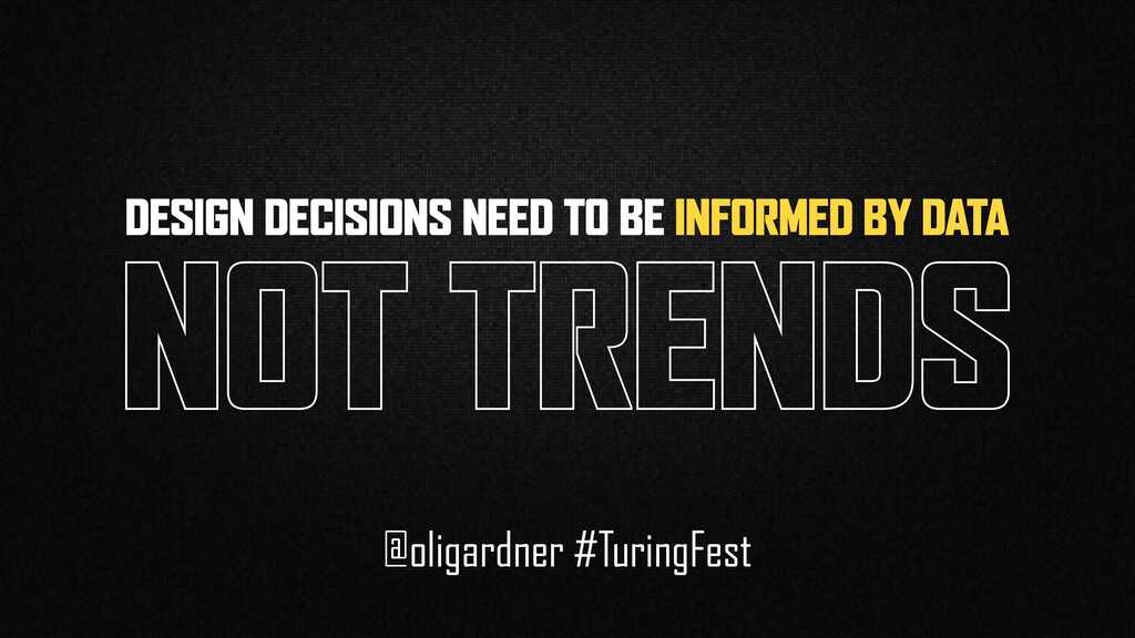
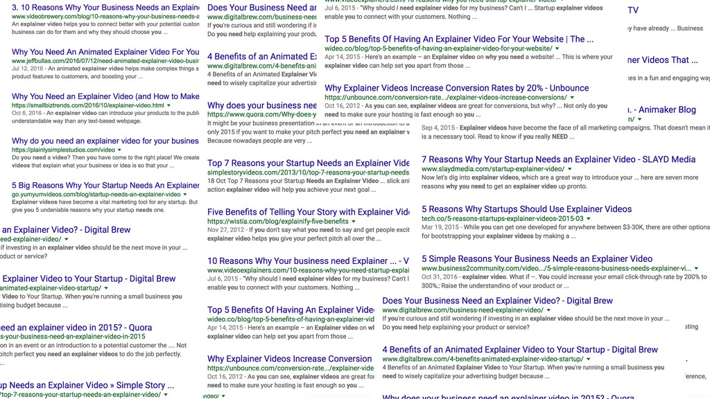
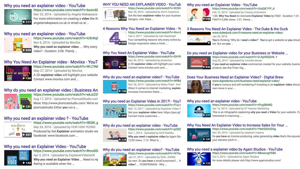
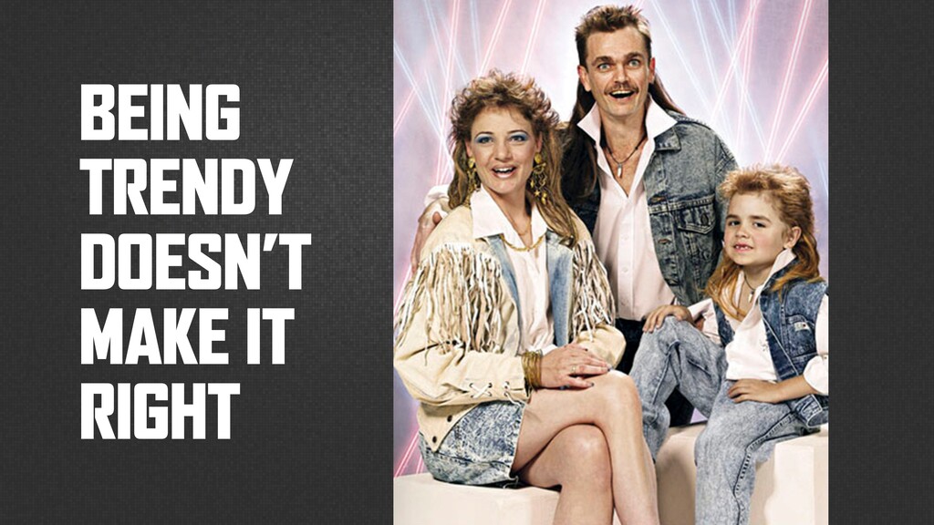
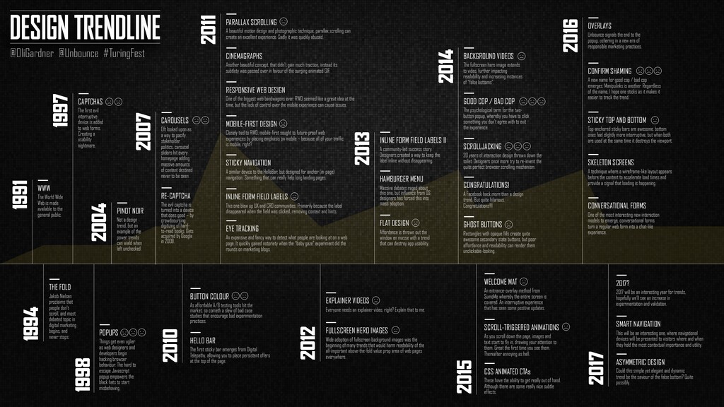
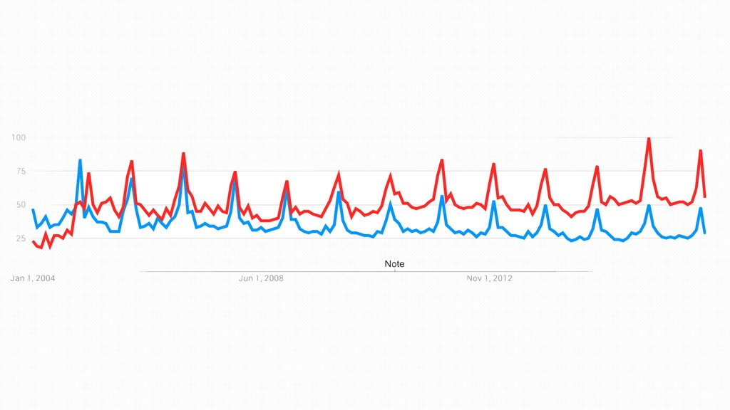
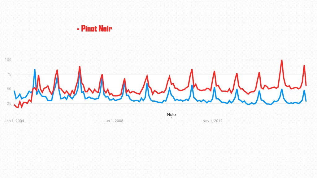
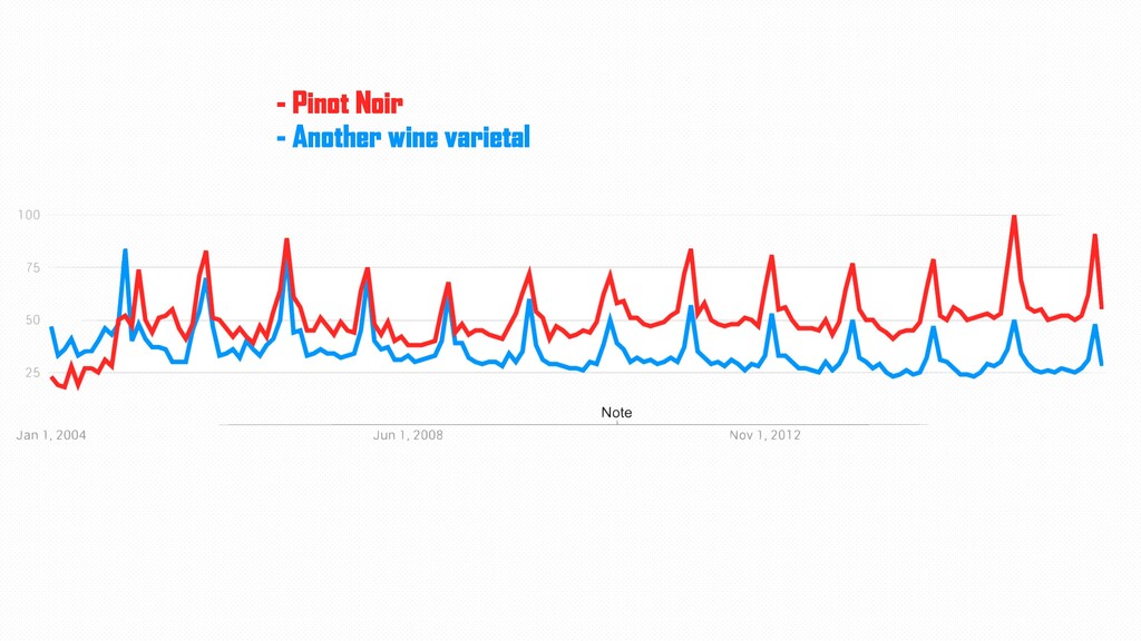
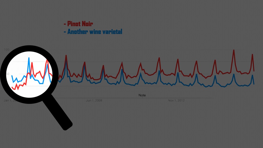
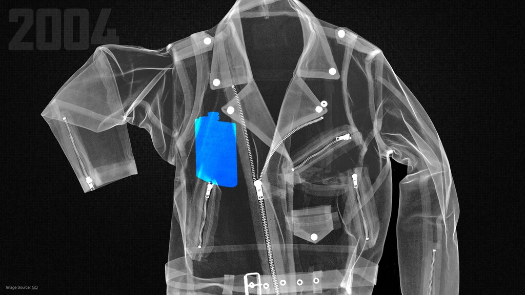
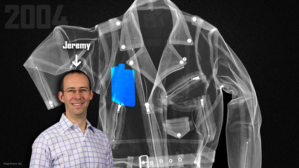
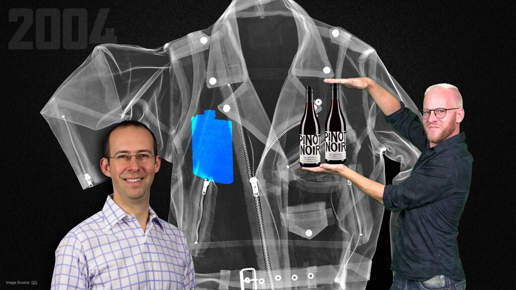
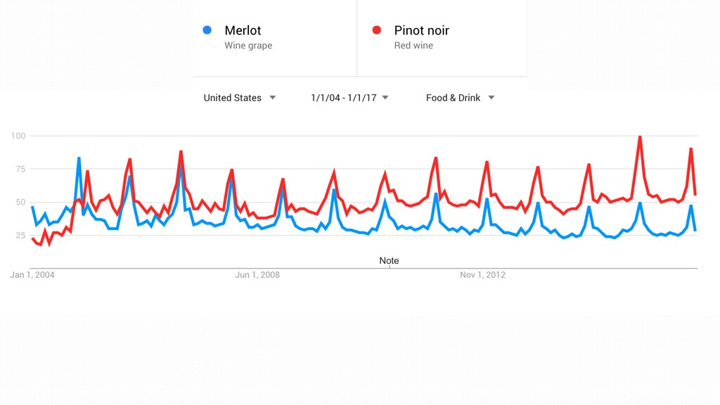
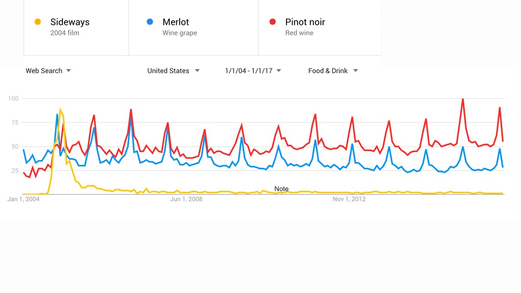
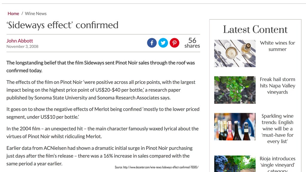
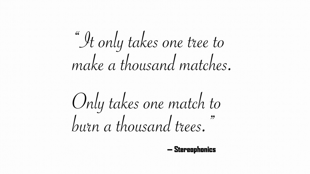
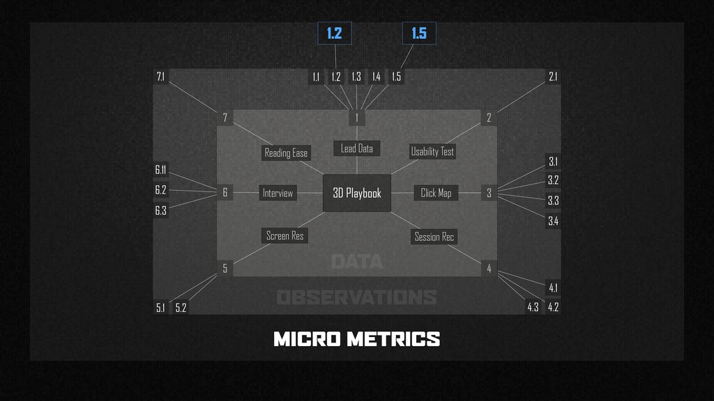
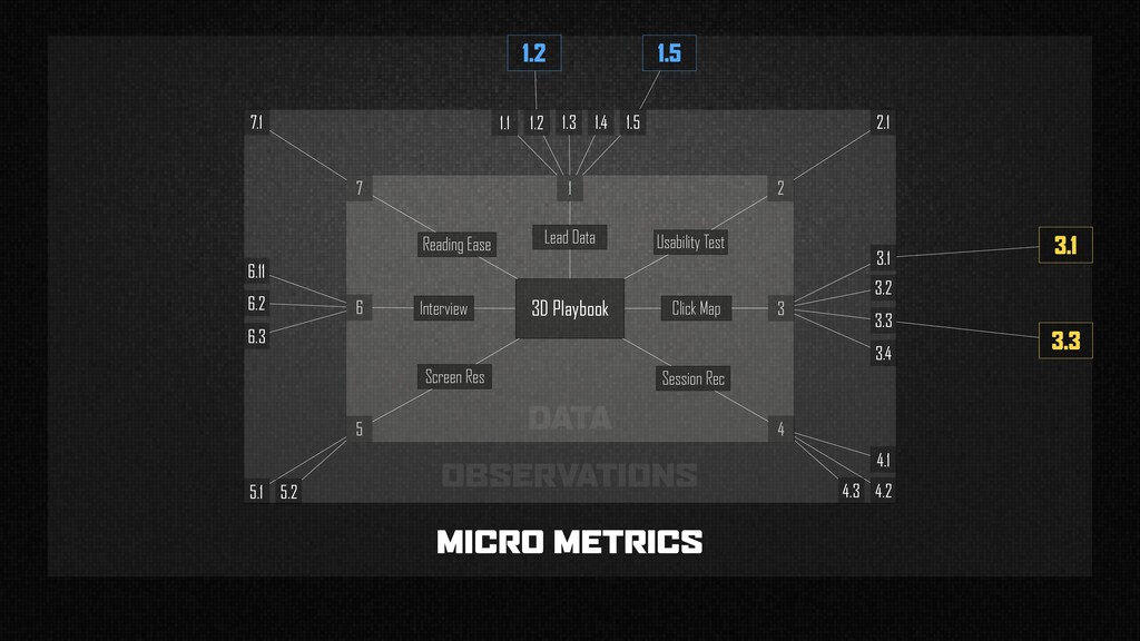
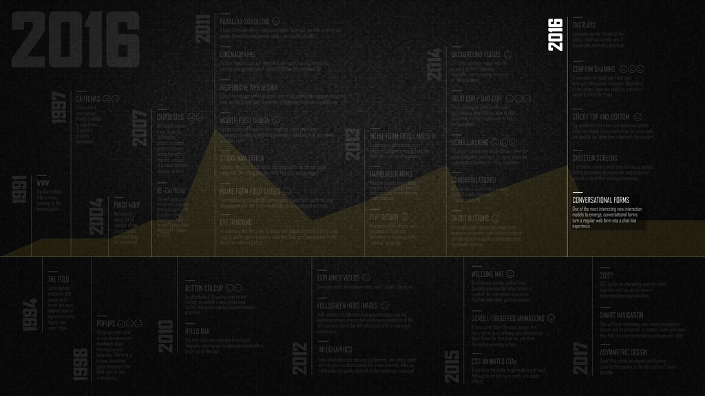
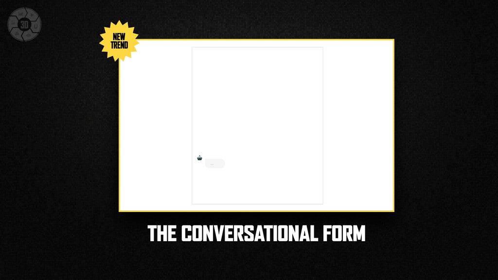
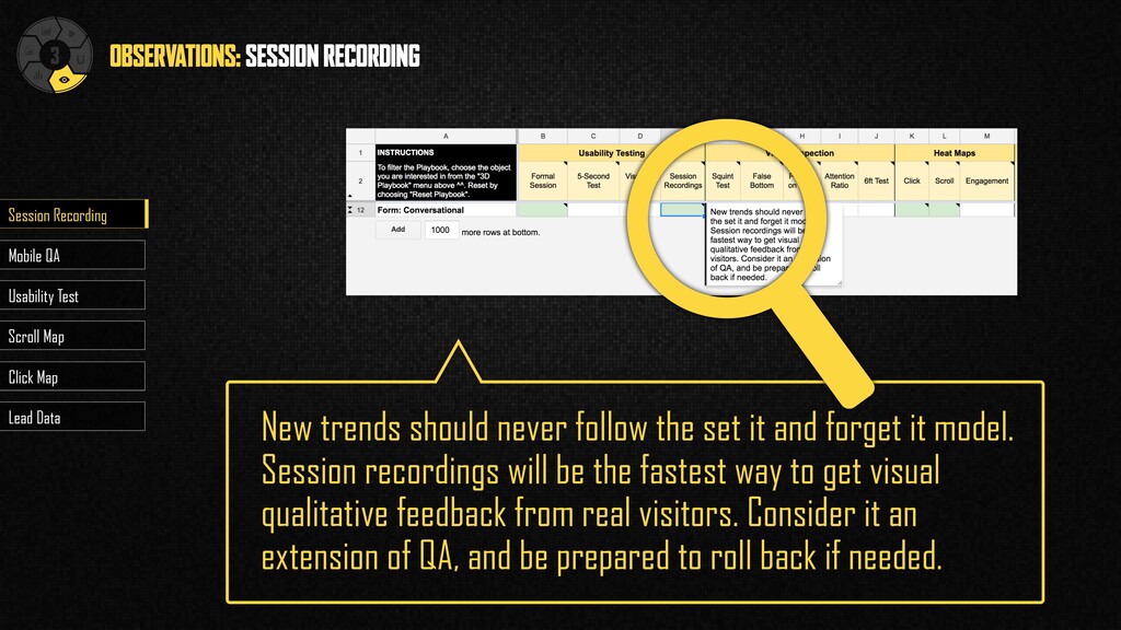
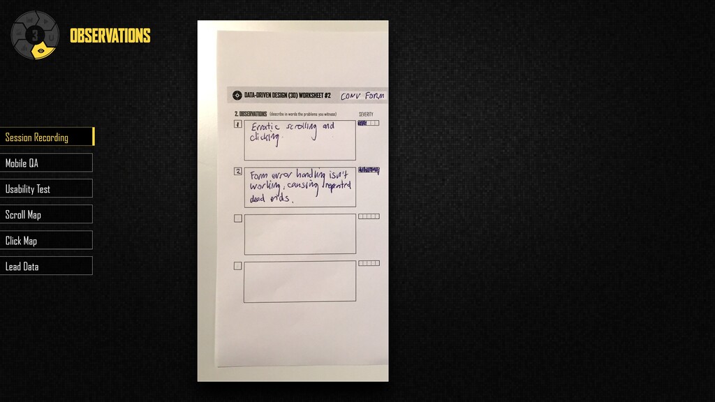
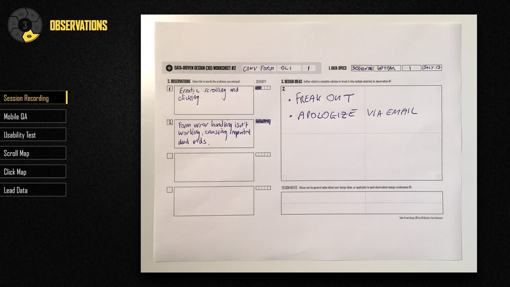
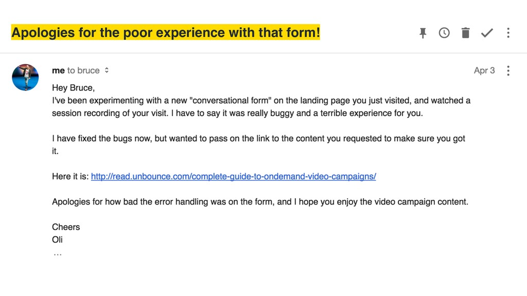
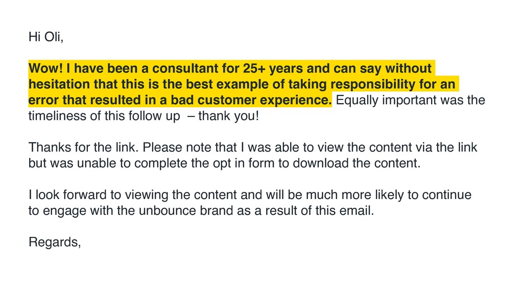
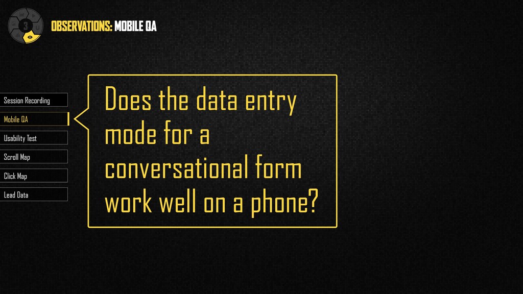
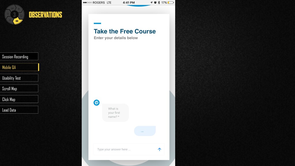
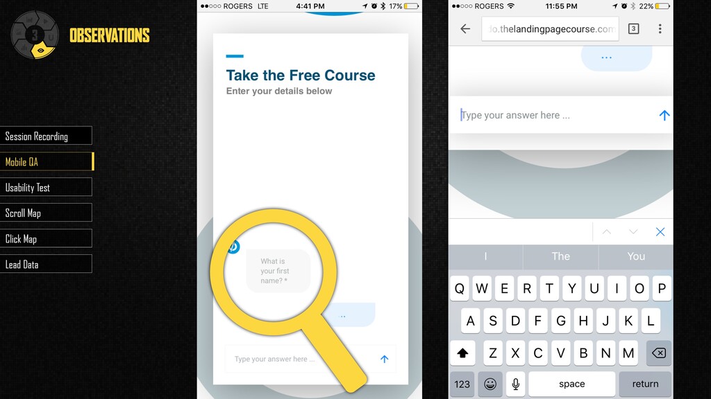
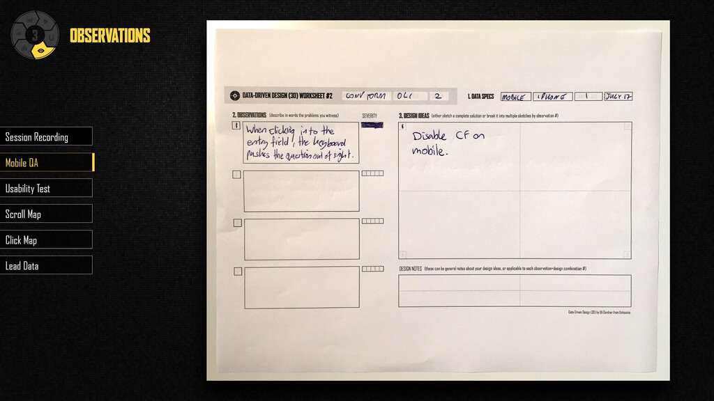
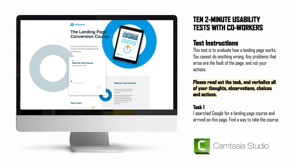
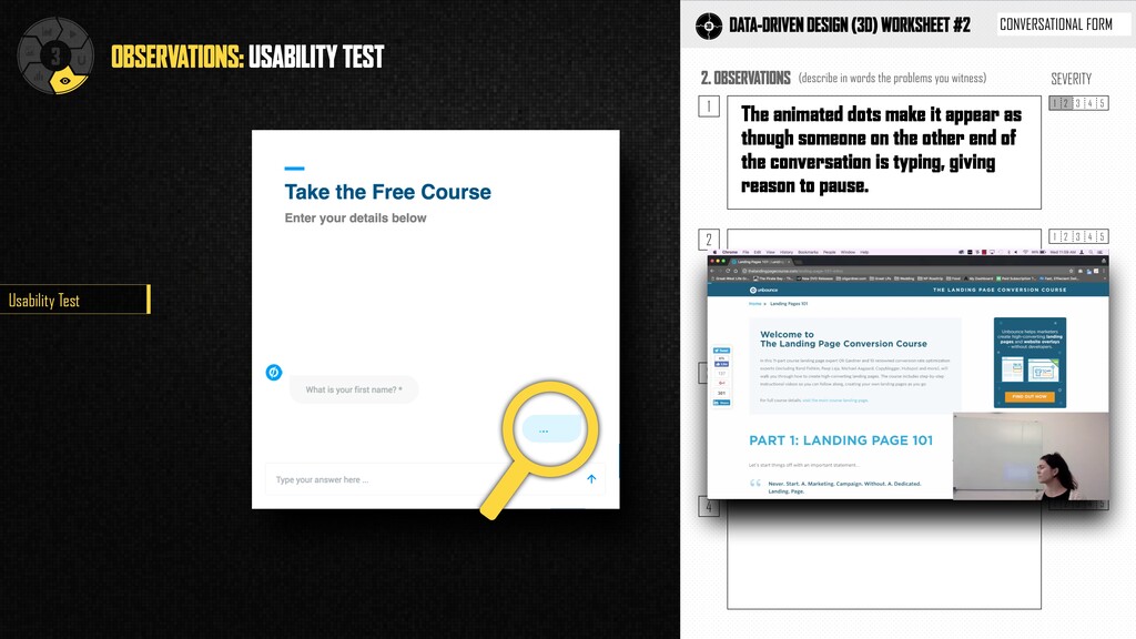
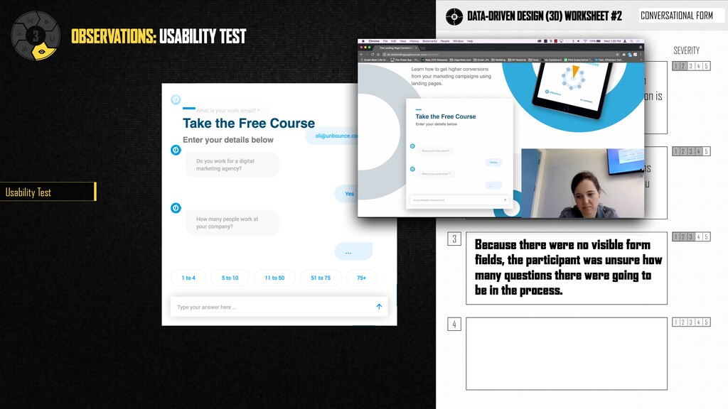
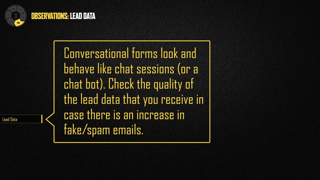
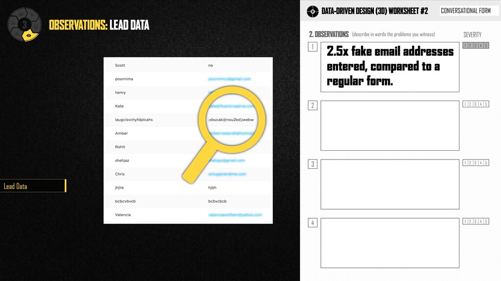
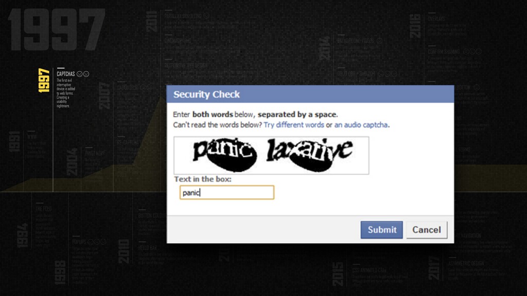
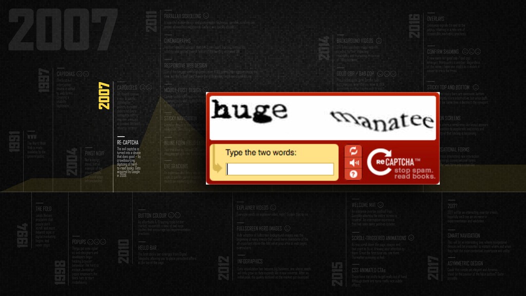
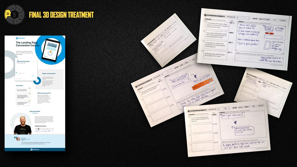
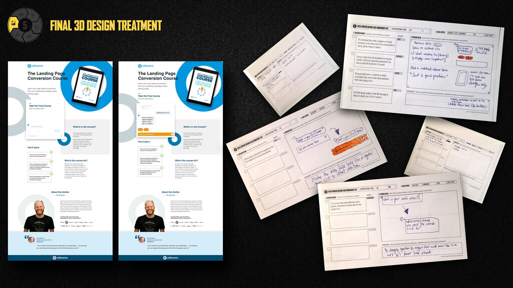
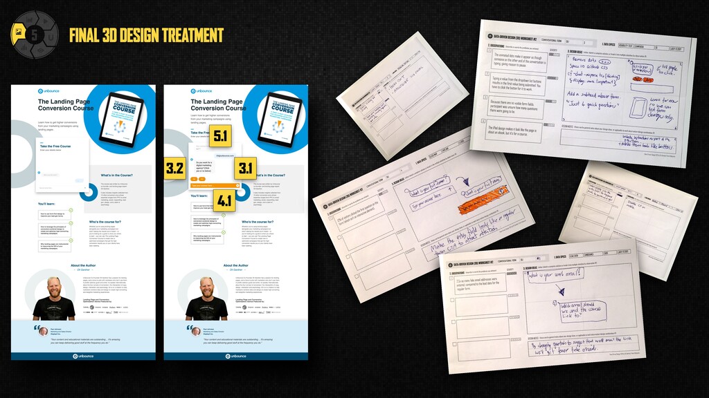
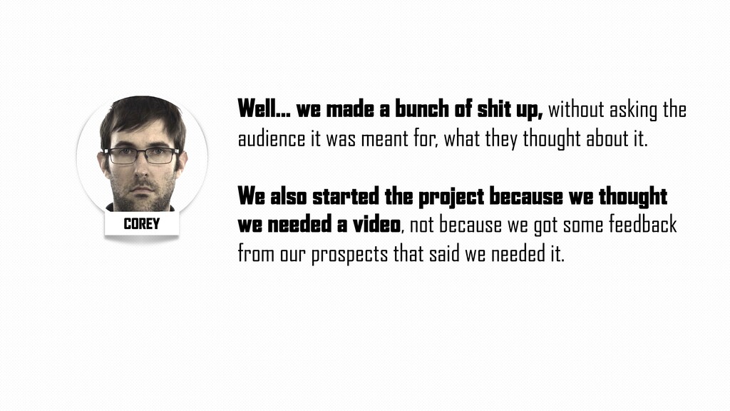
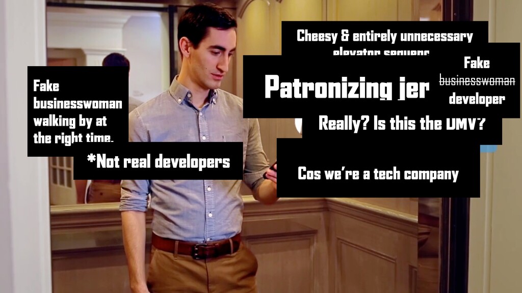
2014 2015 2016 2017 PARALLAX SCROLLING A beautiful motion design and photographic technique, parallax scrolling can create an excellent experience. Sadly it was quickly abused. CINEMAGRAPHS Another beautiful concept, that didn’t gain much traction, instead its subtlety was passed over in favour of the surging animated GIF. STICKY NAVIGATION A similar device to the HelloBar, but designed for anchor (in-page) navigation. Something that can really help long landing pages. INLINE FORM FIELD LABELS This one blew up UX and CRO communities. Primarily because the label disappeared when the field was clicked, removing context and hints. BUTTON COLOUR As affordable A/B testing tools hit the market, so cometh a slew of bad case studies that encourage bad experimentation practices. HELLO BAR The first sticky bar emerges from Digital Telepathy, allowing you to place persistent offers at the top of the page. EXPLAINER VIDEOS Everyone needs an explainer video, right? Explain that to me. FULLSCREEN HERO IMAGES Wide adoption of fullscreen background images was the beginning of many trends that would harm readability of the all-important above-the-fold value prop area of web pages everywhere. WWW The World Wide Web is made available to the general public. THE FOLD Jakob Nielsen proclaims that people don’t scroll, and most debated topic in digital marketing begins, and never stops. CAPTCHAS The first evil interruptive device is added to web forms. Creating a usability nightmare. POPUPS Things get even uglier as web designers and developers begin hacking browser behaviour. The hard to escape Javascript popup empowers the black hats to start misbehaving. PINOT NOIR Not a design trend, but an example of the power trends can wield when left unchecked. CAROUSELS Oft looked upon as a way to pacify stakeholder politics, carousel sliders hit every homepage adding massive amounts of content destined never to be seen. RE-CAPTCHA The evil captcha is turned into a device that does good – by crowdsourcing digitizing of hard- to-read books. Gets acquired by Google in 2009. RESPONSIVE WEB DESIGN One of the biggest web bandwagons ever. RWD seemed like a great idea at the time, but the lack of control over the mobile experience can cause issues. MOBILE-FIRST DESIGN Closely tied to RWD, mobile-first sought to future-proof web experiences by placing emphasis on mobile – because all of your traffic is mobile, right? EYE TRACKING An expensive and fancy way to detect what people are looking at on a web page. It quickly gained notoriety when the “baby gaze” experiment did the rounds on marketing blogs. INLINE FORM FIELD LABELS II A community-led success story. Designers created a way to keep the label inline without disappearing. HAMBURGER MENU Massive debates raged about this one, but influence from OS designers has forced this into mass adoption. FLAT DESIGN Microsoft’s 2010 efforts were amplified by Apple and affordance is thrown out the “window” en masse. BACKGROUND VIDEOS The fullscreen hero image extends to video, further impacting readability and increasing instances of “false bottoms”. CONGRATULATIONS! A Facebook hack more than a design trend. But quite hilarious. Congratulations!!! GHOST BUTTONS Rectangles with opaque fills create quite awesome secondary state buttons, but poor affordance and readability can render them unclickable-looking. GOOD COP / BAD COP The psychological term for the two- button popup, whereby you have to click something you don’t agree with to exit the experience. SCROLLJACKING 20 years of interaction design thrown down the toilet. Designers once more try to re-invent the quite perfect browser scrolling mechanism. SCROLL-TRIGGERED ANIMATIONS As you scroll down the page, images and text start to fly in, drawing your attention to them. Great the first time you see them. Thereafter annoying as hell. CSS ANIMATED CTAs These have the ability to get really out of hand. Although there are some really nice subtle effects. WELCOME MAT An entrance-overlay method from SumoMe whereby the entire screen is covered. An interruptive experience that has seen some positive updates. OVERLAYS Unbounce signals the end to the popup, ushering in a new era of responsible marketing practices. SKELETON SCREENS A technique where a wireframe-like layout appears before the content to accelerate load times and provide a signal that loading is happening. CONVERSATIONAL FORMS One of the most interesting new interaction models to emerge, conversational forms turn a regular web form into a chat-like experience. CONFIRM SHAMING A new name for good cop / bad cop emerges. Manipulinks is another. Regardless of the name, I hope one sticks as it makes it easier to track the trend. STICKY TOP AND BOTTOM Top-anchored sticky bars are awesome, bottom ones feel slightly more interruptive, but when both are used at the same time it destroys the viewport. SMART NAVIGATION This will be an interesting one, where navigational devices will be presented to visitors where and when they hold the most contextual importance and utility. ASYMMETRIC DESIGN Could this simple yet elegant and dynamic trend be the saviour of the false bottom? Quite possibly. 2017? 2017 will be an interesting year for trends, hopefully we’ll see an increase in experimentation and validation. Data visualization has become big business, one whose needs will only grow as data expands like a new universe. After an initial peak, the quality declined as the market got swamped. INFOGRAPHICS 2016 CONVERSATIONAL FORMS One of the most interesting new interaction models to emerge, conversational forms turn a regular web form into a chat-like experience. 2016