Upgrade to Pro — share decks privately, control downloads, hide ads and more …

Responsive Retrofitting for Refresh LX, 2012

Ben Callahan
September 21, 2012

Responsive Retrofitting for Refresh LX, 2012

Slides from my presentation on Responsive Retrofitting at Refresh LX in Lisbon, Portugal.

Ben Callahan

September 21, 2012
Tweet

More Decks by Ben Callahan

Other Decks in Design

Transcript

  1. Ben Callahan President, Sparkbox Refresh LX September 20 & 21,

    2012 Responsive Retrofitting RESPONSIVE RETROFITTING @BENCALLAHAN http://github.com/bencallahan/rwd-retrofitting Friday, September 21, 12
  2. @BENCALLAHAN What is a Retrofit? Finding the fastest and lowest-risk

    approach to creating a better experience on an existing site for users of any size screen. RESPONSIVE RETROFITTING Friday, September 21, 12
  3. @BENCALLAHAN What is a Retrofit? 1. How to do it.

    2. Managing your client. RESPONSIVE RETROFITTING Friday, September 21, 12
  4. @BENCALLAHAN Retrofitting Techniques: From Fixed to Fluid ➡ Demo of

    Twitter.com http://www.alistapart.com/articles/fluidgrids/ target  /  context  =  result RESPONSIVE RETROFITTING Friday, September 21, 12
  5. @BENCALLAHAN Retrofitting Techniques: From Fixed to Fluid ➡ Demo of

    Twitter.com http://www.alistapart.com/articles/fluidgrids/ target  /  context  =  result 302  /  837  =  36.08% 522  /  837  =  62.37% RESPONSIVE RETROFITTING Friday, September 21, 12
  6. @BENCALLAHAN Retrofitting Techniques: From Fixed to Fluid ➡ Demo of

    Twitter.com http://paulirish.com/2012/box-sizing-border-box-ftw/ *  {      -­‐moz-­‐box-­‐sizing:  border-­‐box;      -­‐webkit-­‐box-­‐sizing:  border-­‐box;      box-­‐sizing:  border-­‐box; } RESPONSIVE RETROFITTING Friday, September 21, 12
  7. @BENCALLAHAN Retrofitting Techniques: From Fixed to Fluid ➡ Semantic Grid

    Systems ‣ http://semantic.gs ‣ http://susy.oddbird.net RESPONSIVE RETROFITTING Friday, September 21, 12
  8. @BENCALLAHAN Retrofitting Techniques: From Fixed to Fluid @column-­‐width:  60; @gutter-­‐width:

     20; @columns:  12; @total-­‐width:  100%; header  {  .column(12);  } article  {  .column(12);  } aside  {  .column(12);  } @media  (min-­‐width:  38em)  {      article  {  .column(8);  }      aside  {  .column(4);  } } RESPONSIVE RETROFITTING Friday, September 21, 12
  9. @BENCALLAHAN Retrofitting Techniques: Inline Image Styles ➡ Support ‣ FireFox

    5+ Win/Mac ‣ IE7+ (exception: IE8 & min-width) ‣ Chrome 14+ Win/Mac ‣ Safari 4+ Win, 5+ Mac ‣ Opera 10+ Win, 11+ Mac ‣ Mobile Safari (iOS 5) ‣ Android Browser 2.3+ RESPONSIVE RETROFITTING Friday, September 21, 12
  10. @BENCALLAHAN Retrofitting Techniques: Media Queries ➡ Large Resolution First ➡

    Small Resolution First, Capped RESPONSIVE RETROFITTING Friday, September 21, 12
  11. @BENCALLAHAN Retrofitting Techniques: Media Queries ➡ Large Resolution First /*

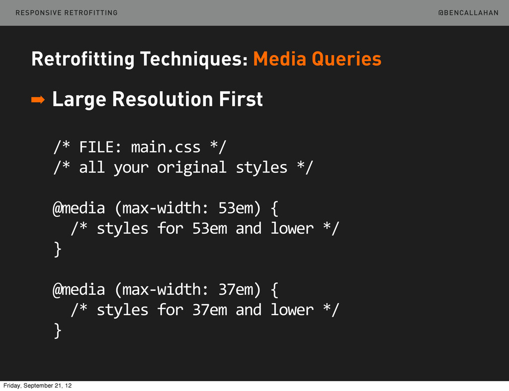
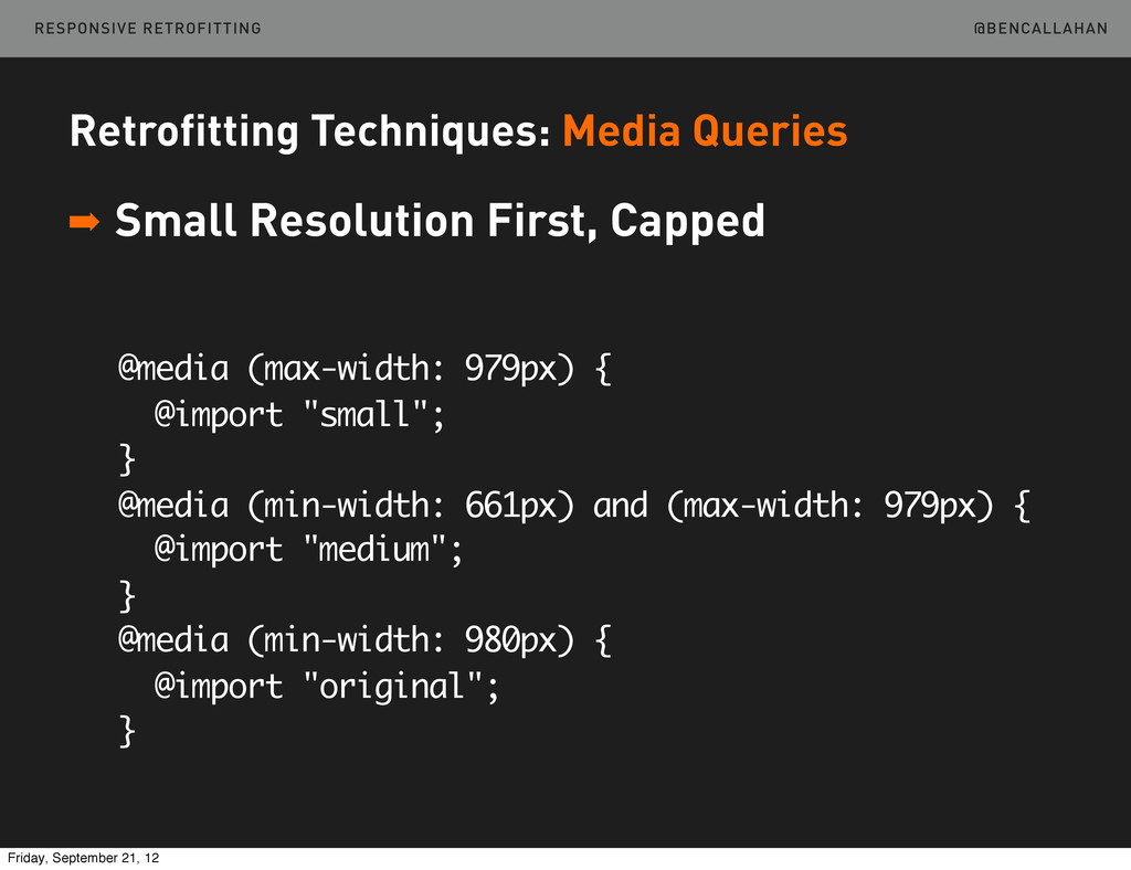
     FILE:  main.css  */ /*  all  your  original  styles  */ @media  (max-­‐width:  53em)  {    /*  styles  for  53em  and  lower  */ } @media  (max-­‐width:  37em)  {    /*  styles  for  37em  and  lower  */ } RESPONSIVE RETROFITTING Friday, September 21, 12
  12. @BENCALLAHAN Retrofitting Techniques: Media Queries ➡ Small Resolution First, Capped

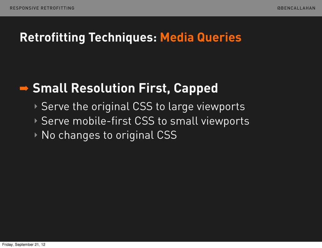
    ‣ Serve the original CSS to large viewports ‣ Serve mobile-first CSS to small viewports ‣ No changes to original CSS RESPONSIVE RETROFITTING Friday, September 21, 12
  13. @BENCALLAHAN Retrofitting Techniques: Media Queries ➡ Small Resolution First, Capped

    <html  class=”no-­‐js”> <head>    <script  src=”/js/modernizr.js”></script>    <script>        yepnope({            test  :  Modernizr.mq(‘(min-­‐width:  0px)’),            yep    :  ‘base.css’,            nope  :  ‘original.css’        });      </script>    <noscript>        <link  rel="stylesheet"  href="original.css">    </noscript> </head> RESPONSIVE RETROFITTING Friday, September 21, 12
  14. @BENCALLAHAN Retrofitting Techniques: Media Queries ➡ Small Resolution First, Capped

    @media (max-width: 979px) { @import "small"; } @media (min-width: 661px) and (max-width: 979px) { @import "medium"; } @media (min-width: 980px) { @import "original"; } RESPONSIVE RETROFITTING Friday, September 21, 12
  15. @BENCALLAHAN Retrofitting Techniques: Other Considerations ➡ Touch Target Area ➡

    Hover States ➡ Contrast ➡ Prioritization RESPONSIVE RETROFITTING Friday, September 21, 12
  16. @BENCALLAHAN Retrofitting Techniques: Other Considerations ➡ Hover States ‣ Consider

    using modernizr a { /* standard styles */ } .no-touch a:hover { /* :hover styles */ } RESPONSIVE RETROFITTING Friday, September 21, 12
  17. @BENCALLAHAN Retrofitting Techniques: Other Considerations ➡ Touch Target Area ➡

    Hover States ➡ Contrast ➡ Prioritization RESPONSIVE RETROFITTING Friday, September 21, 12
  18. @BENCALLAHAN Client Interaction: Great Need Big Companies + No Mobile

    Presence + Triple Digit Mobile Growth = Anxious Clients RESPONSIVE RETROFITTING Friday, September 21, 12
  19. @BENCALLAHAN Client Interaction: Great Need Less than Half the Cost

    + Less than Half the Time + Increased Conversions = Desperate Clients RESPONSIVE RETROFITTING Friday, September 21, 12
  20. @BENCALLAHAN Client Interaction: When It’s Right ➡ Evaluate the Project

    ‣ Solid UX at higher widths? ‣ Semantic markup? ‣ Can’t start over? ‣ Real benefit for the user? RESPONSIVE RETROFITTING Friday, September 21, 12
  21. @BENCALLAHAN Client Interaction: Proceed Carefully Retrofitting is a step in

    the right direction. RESPONSIVE RETROFITTING Friday, September 21, 12
  22. @BENCALLAHAN If you’re not doing a retrofit for your site’s

    users, you’re doing it for the wrong reason. Client Interaction: Proceed Carefully RESPONSIVE RETROFITTING Friday, September 21, 12
  23. @BENCALLAHAN When you’re done and they ask for more... Client

    Interaction: Proceed Carefully ...push for even better experiences! RESPONSIVE RETROFITTING Friday, September 21, 12