Upgrade to Pro — share decks privately, control downloads, hide ads and more …

Designing for diversity: How to create inclusive mobile experiences

Designing for diversity: How to create inclusive mobile experiences

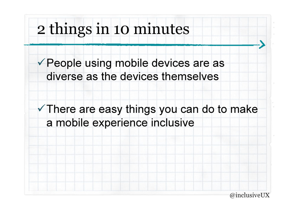
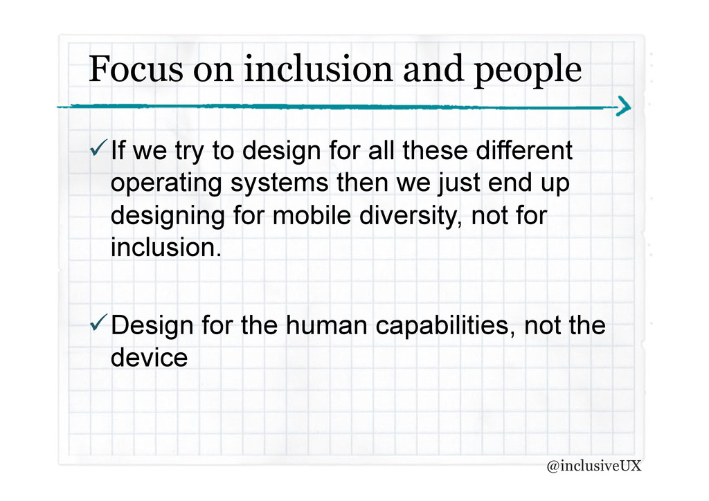
So everyone’s got smartphones these day yes? But not everyone who has a smartphone can see, hear, move or handle cognitive loads without impairment. So how can we include everyone in our mobile design? This talk shares some top tips on how to create an inclusive mobile design and reveals some things you may not know people with disabilities can definitely do on a mobile device.

Presented at Designing for Mobility 2013

uxaustralia
PRO

March 01, 2013
Tweet

More Decks by uxaustralia

Other Decks in Technology

Transcript

  1. Designing for
    Diversity
    How to create inclusive mobile
    experiences
    Katja Forbes | @inclusiveUX
    1 March 2013

    View Slide

  2.  People using mobile devices are as
    diverse as the devices themselves
     There are easy things you can do to make
    a mobile experience inclusive
    2 things in 10 minutes
    @inclusiveUX

    View Slide

  3. There is nothing that
    you can do on the
    iPhone or iPad that I
    can’t do


    @inclusiveUX

    View Slide

  4. Mr Stevie Wonder
    @inclusiveUX

    View Slide

  5. Mobile, by definition, is
    disabling. Poor light,
    small keyboards, glare,
    touch, etc.
    – Henny Swan, Senior Accessibility Specialist, BBC


    @inclusiveUX

    View Slide

  6. A smart phone or tablet
    is basically pictures
    under glass
    – Bret Victor, Former Apple Engineer


    @inclusiveUX

    View Slide

  7. Ommmmm…..
    …from bradfrostweb.com
    @inclusiveUX

    View Slide

  8. Focus on inclusion and people
     If we try to design for all these different
    operating systems then we just end up
    designing for mobile diversity, not for
    inclusion.
     Design for the human capabilities, not the
    device
    @inclusiveUX

    View Slide

  9. There is no Mobile Web.
    There is only The Web, which we view in
    different ways.
    There is also no Desktop Web.
    Or Tablet Web.
    Thank you.
    – Stephen Hay


    @inclusiveUX

    View Slide

  10.  A well-executed responsive design should
    solve a lot of our challenges.
     If a website is already inclusive via the
    desktop then it’s most likely to be mobile
    friendly as well.
    Responsive design is #1
    @inclusiveUX

    View Slide

  11.  An app or mobile site is not a book
     People listen to enough to orientate themselves
    and then move on.
     There are different modes
     Text to speech doesn’t just read
     Not just for visually impaired. People with dyslexia
    also use text to speech to read digital written
    content.
    Lets talk about text to speech
    @inclusiveUX

    View Slide

  12.  There are a lot of buttons in apps and sites
    helping to navigate around.
     The language used in labelling is really
    important.
     Don’t be bossy.
     Don’t double up.
    Labelling with text to speech in mind
    @inclusiveUX

    View Slide

  13.  Inform events in multiple ways.
     Don’t just have one way of achieving a
    task
    There’s more than one way to do things
    @inclusiveUX

    View Slide

  14.  There is a lot of video available on mobile
    and its one of the most consumed types of
    content.
     People who are deaf or have hearing loss
    want to access all this content accessibly,
    which is tough on mobile devices.
    Mobile video? Make sure its captioned
    @inclusiveUX

    View Slide

  15.  Make sure the touch targets are big enough
    for people with dexterity challenges.
     Window 8 ‘metro’ design language has
    something to offer here with its ‘big tile’ user
    interface.
     Choose smart defaults
     Use alternate methods to input information &
    exploit device capabilities
    Supporting dexterity challenges
    @inclusiveUX

    View Slide

  16.  If you have a smart phone, you have a screen
    reader. Test your designs. There is no excuse.
     Test with real people who have real impairments
     Iterate and test again!
     Learn from your mistakes and make your next try
    better.
    Test, test, test
    @inclusiveUX

    View Slide

  17.  The mobile landscape is extremely diverse and
    complex to navigate
     We have to stay focussed on inclusion, not mobile
    diversity
     Our guiding design principles must be technology
    agnostic
     Let’s use what we already have and adapt as we
    learn more
    So, to sum up…
    @inclusiveUX

    View Slide

  18. Thank you
    [email protected]
    @inclusiveUX

    View Slide