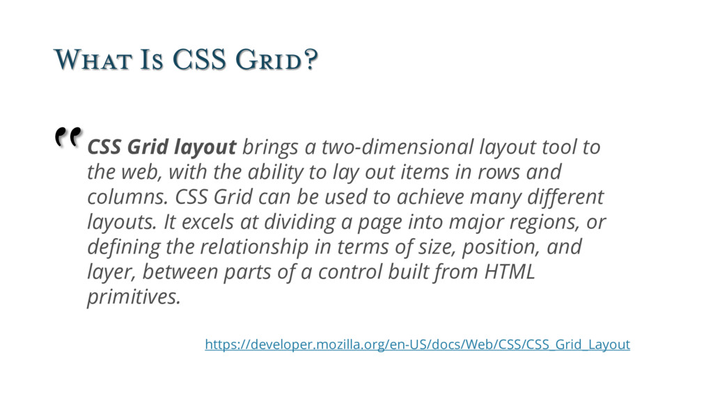
layout tool to the web, with the ability to lay out items in rows and columns. CSS Grid can be used to achieve many different layouts. It excels at dividing a page into major regions, or defining the relationship in terms of size, position, and layer, between parts of a control built from HTML primitives. https://developer.mozilla.org/en-US/docs/Web/CSS/CSS_Grid_Layout “
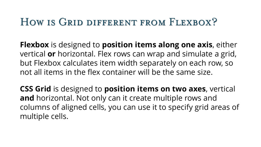
position items along one axis, either vertical or horizontal. Flex rows can wrap and simulate a grid, but Flexbox calculates item width separately on each row, so not all items in the flex container will be the same size. CSS Grid is designed to position items on two axes, vertical and horizontal. Not only can it create multiple rows and columns of aligned cells, you can use it to specify grid areas of multiple cells.
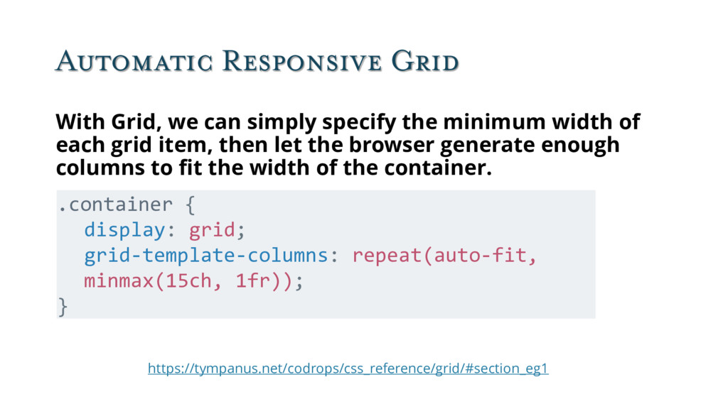
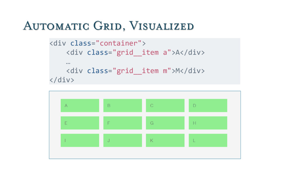
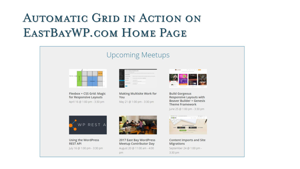
the minimum width of each grid item, then let the browser generate enough columns to fit the width of the container. .container { display: grid; grid-template-columns: repeat(auto-fit, minmax(15ch, 1fr)); }
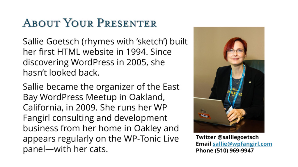
first HTML website in 1994. Since discovering WordPress in 2005, she hasn’t looked back. Sallie became the organizer of the East Bay WordPress Meetup in Oakland, California, in 2009. She runs her WP Fangirl consulting and development business from her home in Oakley and appears regularly on the WP-Tonic Live panel—with her cats. Twitter @salliegoetsch Email [email protected] Phone (510) 969-9947
 SiteGround - Reliable hosting with speed, security, and support you can count on.
 wpfangirl
 hwangbyeonghun
 nari_ex
 vtryo
vtryo
 fullkaiten
 shinyasaita
 smasato
 moznion
 maf_0521
 ritou
ritou
 murabayashi
 ymhiroki
 oprstchn
 holman
 lauravandoore
 danielanewman
 jakevdp
 akademiya2063
 zakiyama
 signer
 caitiem20
 bethany
 lara
lara
 shlominoach
 baasie