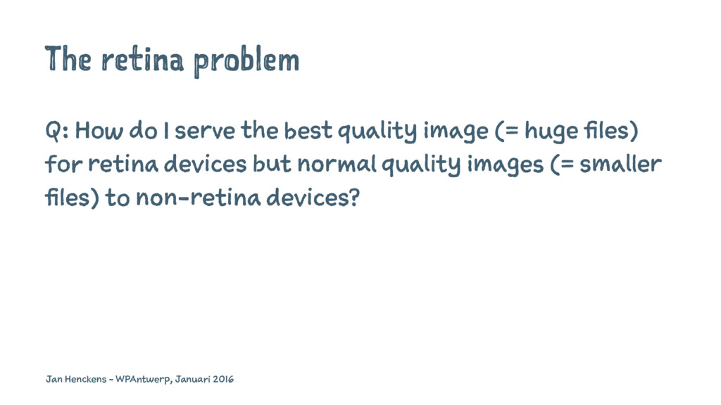
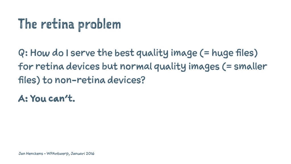
quality image (= huge files) for retina devices but normal quality images (= smaller files) to non-retina devices? Jan Henckens - WPAntwerp, Januari 2016
quality image (= huge files) for retina devices but normal quality images (= smaller files) to non-retina devices? A: You can't. Jan Henckens - WPAntwerp, Januari 2016
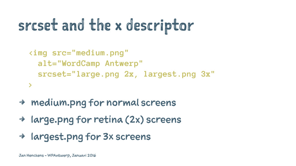
2x, largest.png 3x" > 4 medium.png for normal screens 4 large.png for retina (2x) screens 4 largest.png for 3x screens Jan Henckens - WPAntwerp, Januari 2016
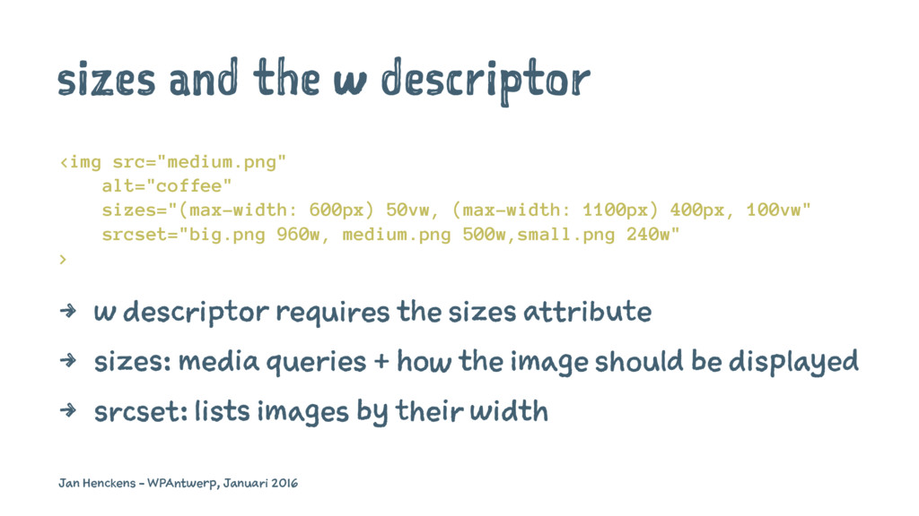
50vw, (max-width: 1100px) 400px, 100vw" srcset="big.png 960w, medium.png 500w,small.png 240w" > 4 w descriptor requires the sizes attribute 4 sizes: media queries + how the image should be displayed 4 srcset: lists images by their width Jan Henckens - WPAntwerp, Januari 2016
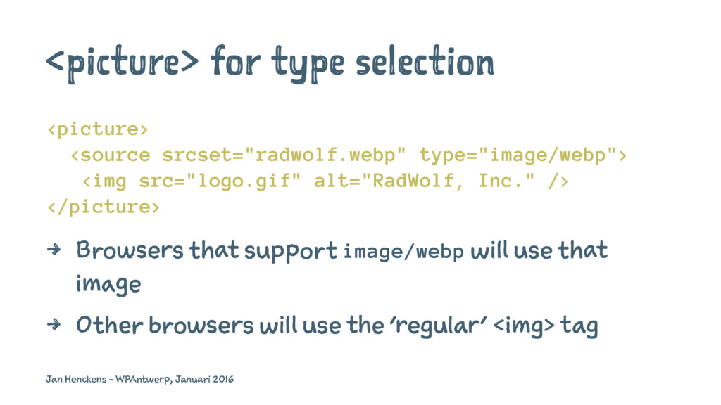
alt="RadWolf, Inc." /> </picture> 4 Browsers that support image/webp will use that image 4 Other browsers will use the 'regular' <img> tag Jan Henckens - WPAntwerp, Januari 2016
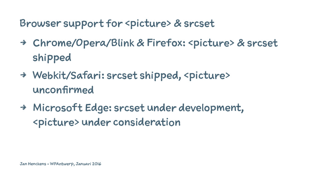
<picture> & srcset shipped 4 Webkit/Safari: srcset shipped, <picture> unconfirmed 4 Microsoft Edge: srcset under development, <picture> under consideration Jan Henckens - WPAntwerp, Januari 2016
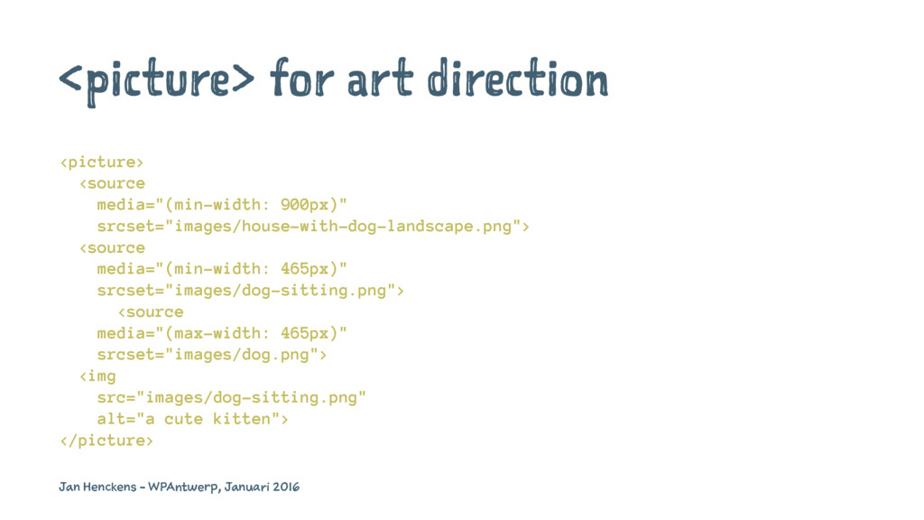
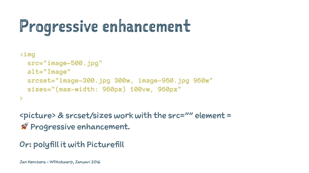
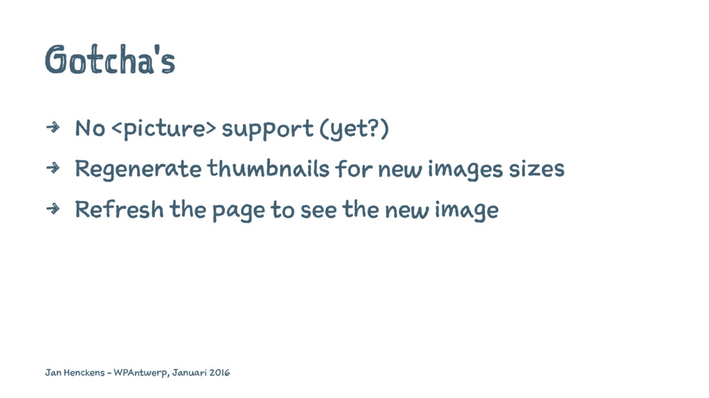
960px) 100vw, 960px" > <picture> & srcset/sizes work with the src="" element = ! Progressive enhancement. Or: polyfill it with Picturefill Jan Henckens - WPAntwerp, Januari 2016
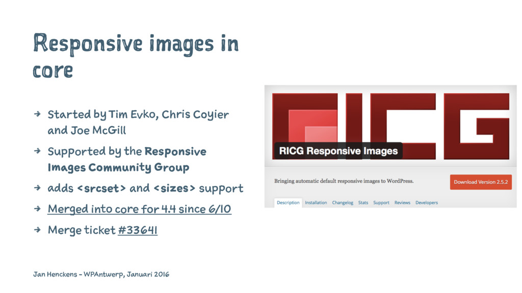
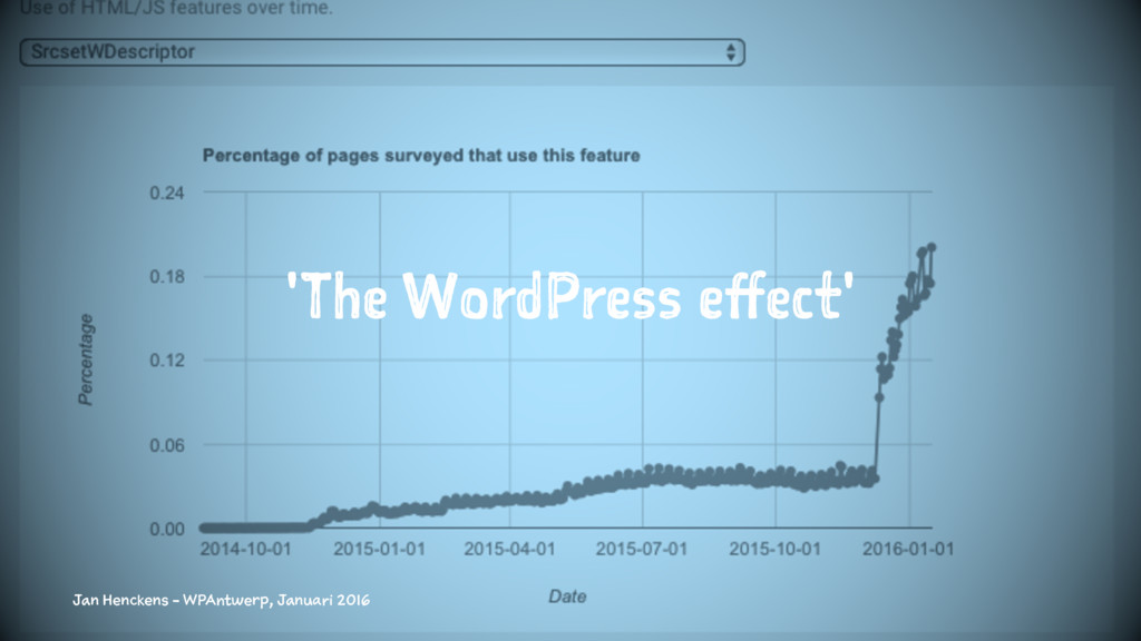
Coyier and Joe McGill 4 Supported by the Responsive Images Community Group 4 adds <srcset> and <sizes> support 4 Merged into core for 4.4 since 6/10 4 Merge ticket #33641 Jan Henckens - WPAntwerp, Januari 2016
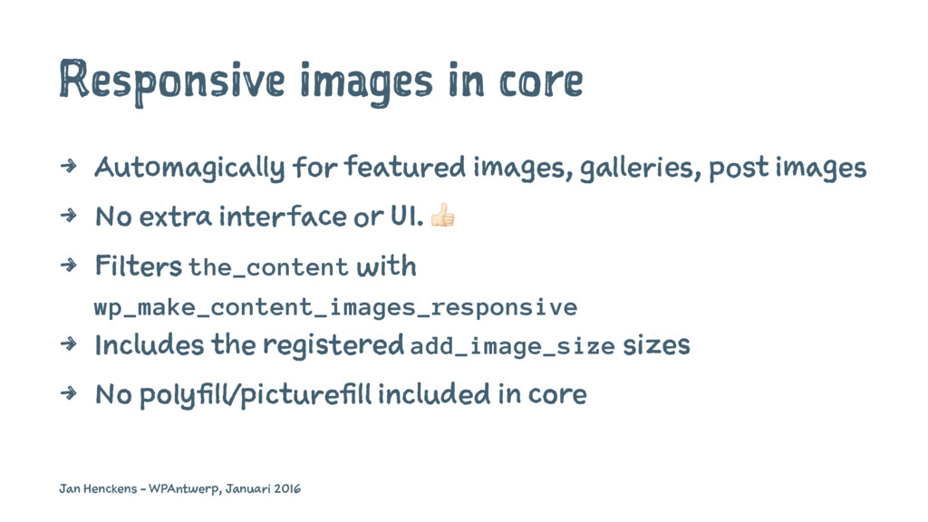
post images 4 No extra interface or UI. ! 4 Filters the_content with wp_make_content_images_responsive 4 Includes the registered add_image_size sizes 4 No polyfill/picturefill included in core Jan Henckens - WPAntwerp, Januari 2016
To <picture> And srcset" 4 Jason Grigsby: "Responsive Images 101" 4 Jake Archibald: The anatomy of responsive images 4 Eric Portis on srcset & sizes 4 Bruwe Lawson: "Why we can’t do real responsive images with CSS or JavaScript" Jan Henckens - WPAntwerp, Januari 2016
 wpmeetupantwerp
 cbtlibrary
 yatabe
 molmolken
 datascientistsociety
 moriyuya
 juanmartin2026
 signer
 masakat0
 iqbocchi
 akiraasano
 dsalo
dsalo
 aleyda
 hatefulcrawdad
 tammyeverts
 marcelosomers
 inesmontani
 letsgokoyo
 codingconduct
 addyosmani
 orderedlist
.png) helenjbeal
helenjbeal
 danielanewman