Upgrade to Pro — share decks privately, control downloads, hide ads and more …

Designing scalable Compose APIs

Designing scalable Compose APIs

Yves Kalume

May 25, 2024
Tweet

More Decks by Yves Kalume

Other Decks in Programming

Transcript

  1. API A set of operations a software component (i.e., a

    system, a sub-system, class, or a function) provides to its clients
  2. What I mean by Scalable Which can be used in

    a large project by a big team of developers.
  3. How to check the quality of an API • Comprehensibility

    • Consistency • Discoverability • Simple Tasks Should Be Easy • Preservation of Investment
  4. @Composable fun Button( onClick: () -> Unit = {}, checked:

    Boolean = false, onCheckedChange: (Boolean) -> Unit, ) { --. } Don’t do this
  5. @Composable fun Button( onClick: () -> Unit, ) { --.

    } @Composable fun ToggleButton( checked: Boolean, onCheckedChange: (Boolean) -> Unit, ) { --. }
  6. Component or Modifier • Make a component if it has

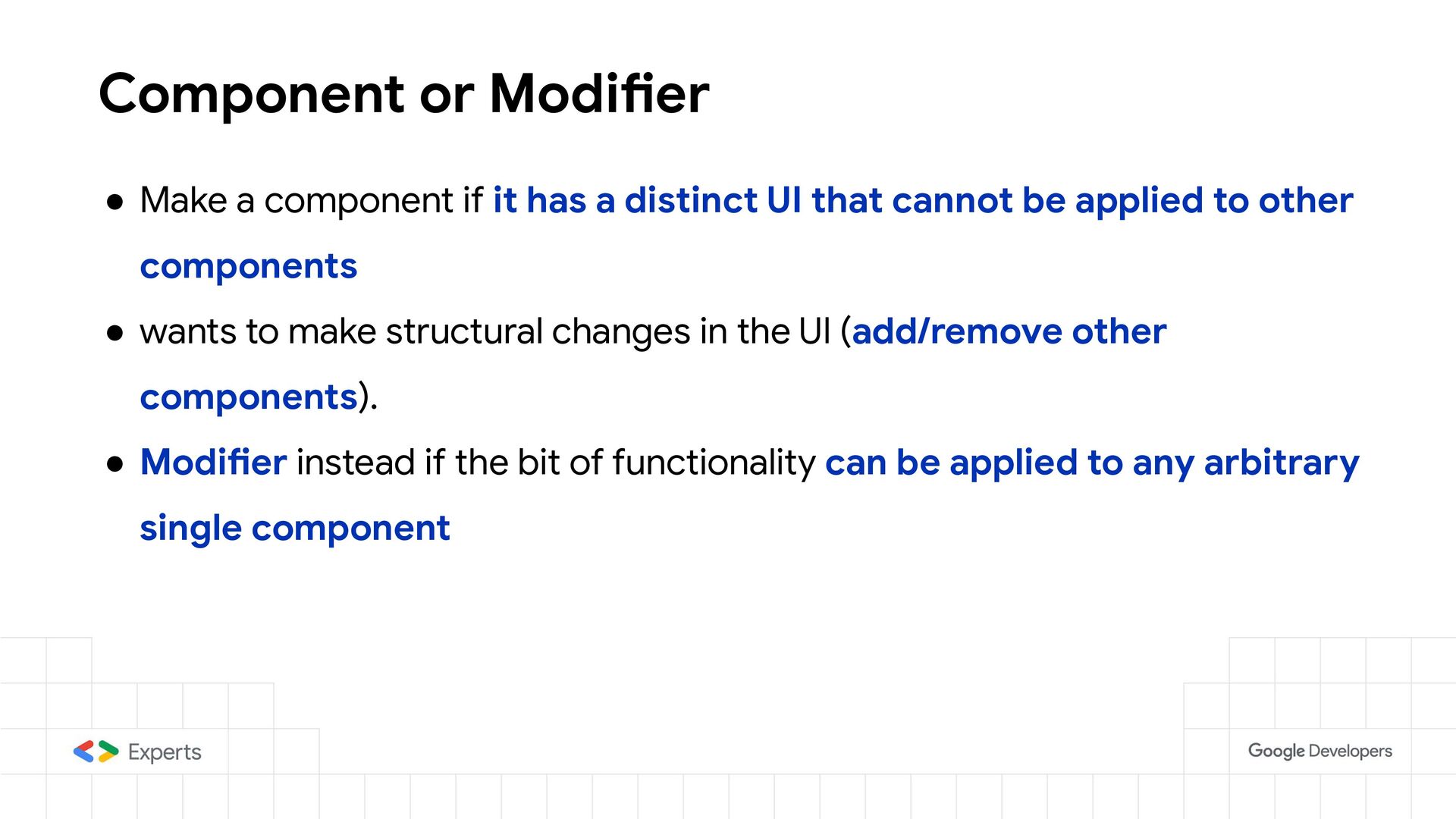
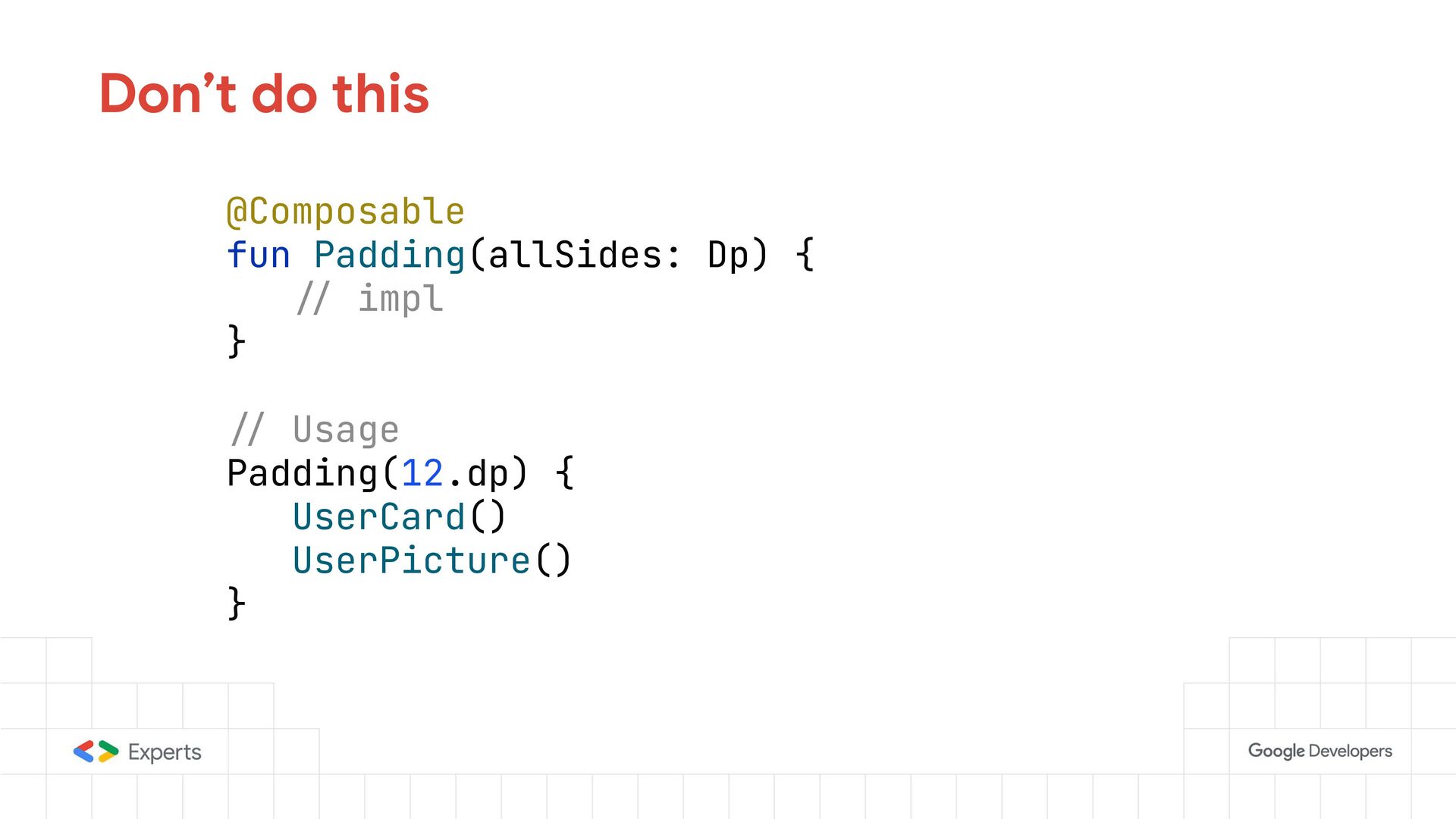
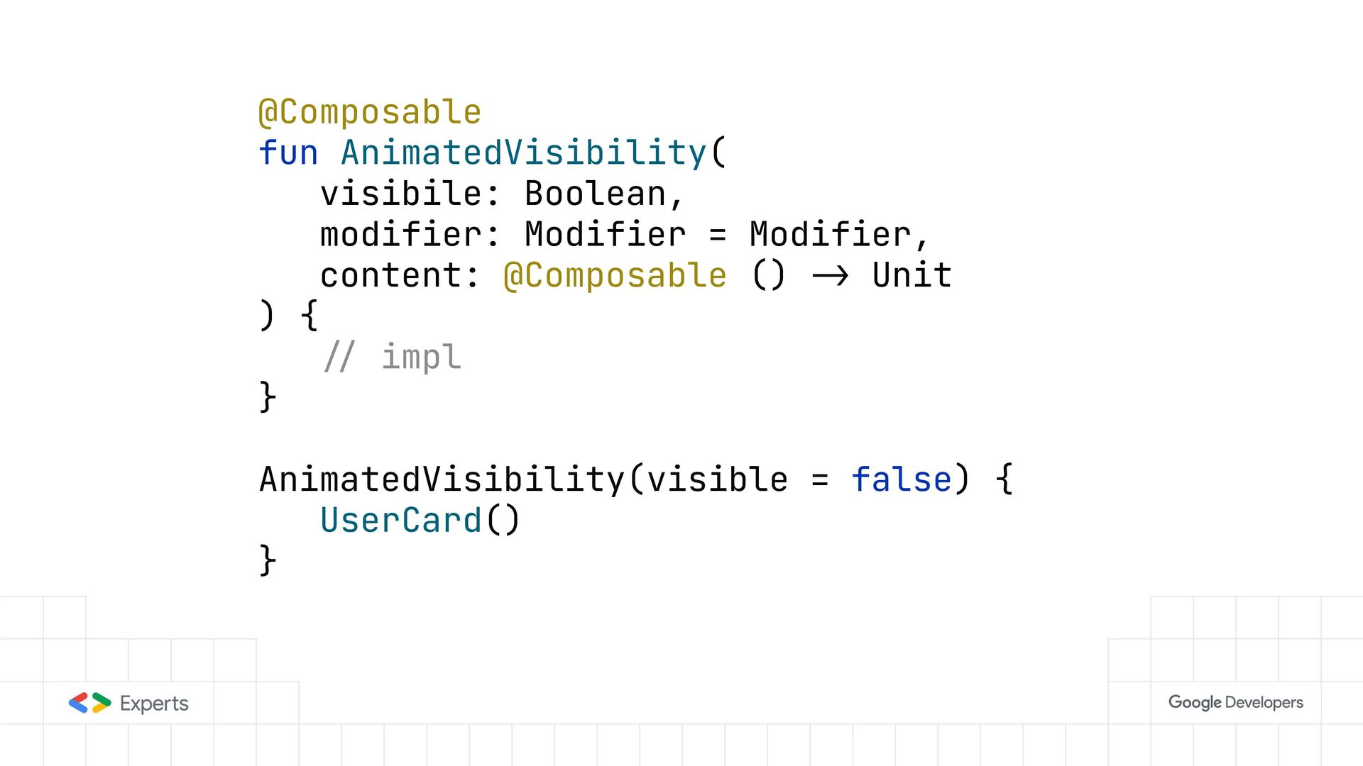
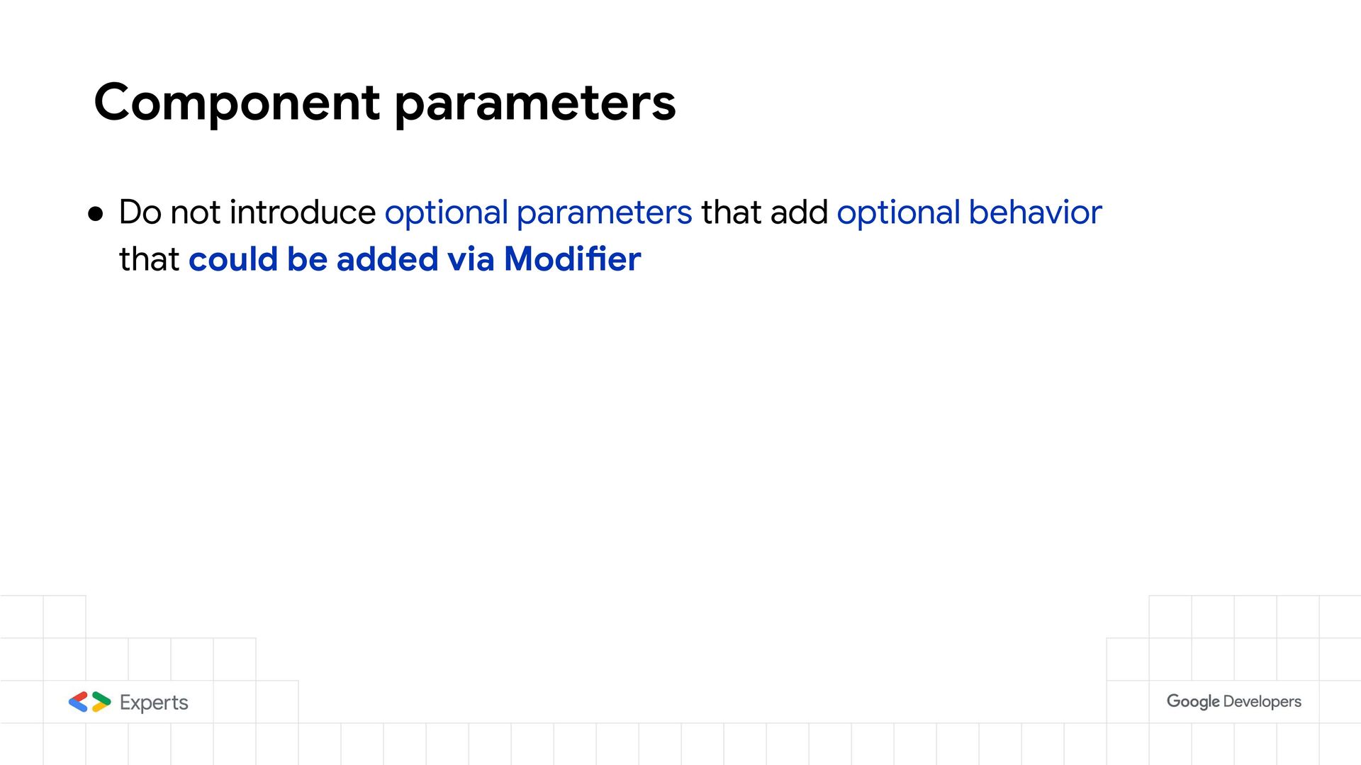
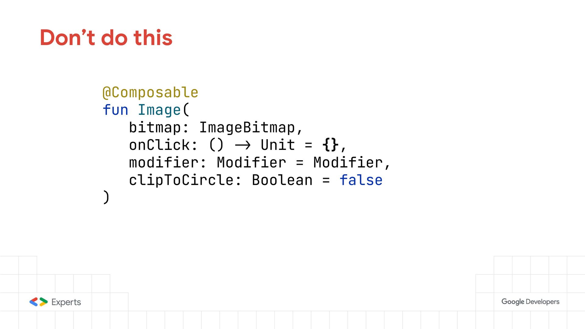
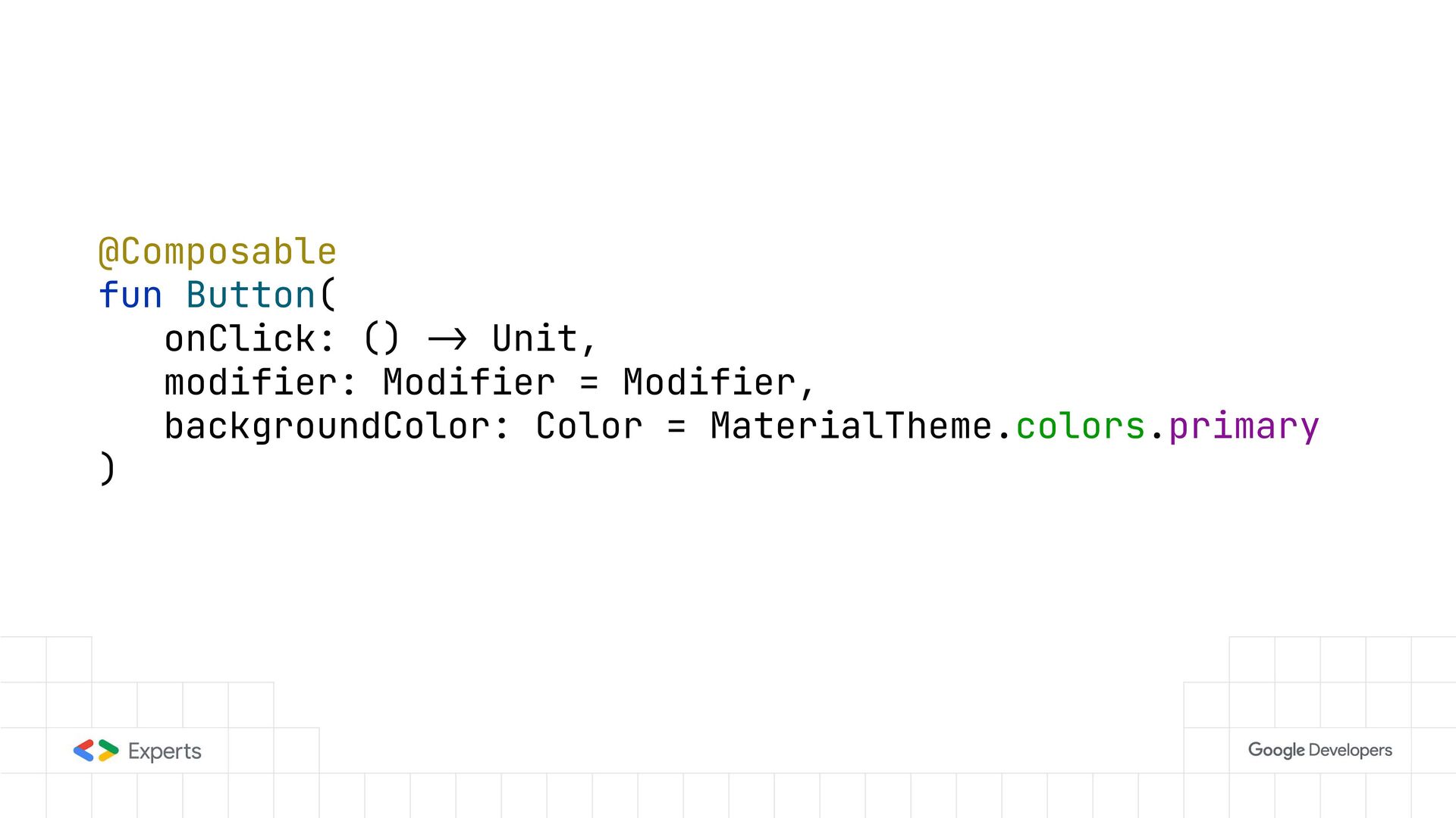
    a distinct UI that cannot be applied to other components • wants to make structural changes in the UI (add/remove other components). • Modifier instead if the bit of functionality can be applied to any arbitrary single component
  7. @Composable fun Padding(allSides: Dp) { -/ impl } -/ Usage

    Padding(12.dp) { UserCard() UserPicture() } Don’t do this
  8. @Composable fun AnimatedVisibility( visibile: Boolean, modifier: Modifier = Modifier, content:

    @Composable () -> Unit ) { -/ impl } AnimatedVisibility(visible = false) { UserCard() }
  9. Component layering • Low level Components : small highly customizable

    components • High Level Components : a component made with multiple small components
  10. @Composable fun Checkbox(--.) { --. } @Composable fun Text(--.) {

    --. } @Composable fun Row(--.) { --. } Low level components
  11. fun rememberCoroutineScope( -/--. ): CoroutineScope { val wrapper = remember

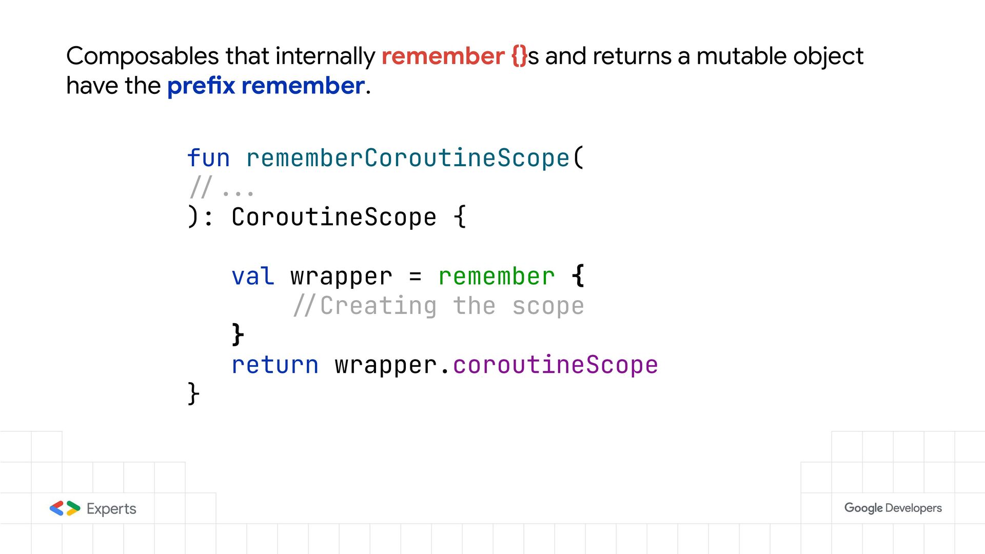
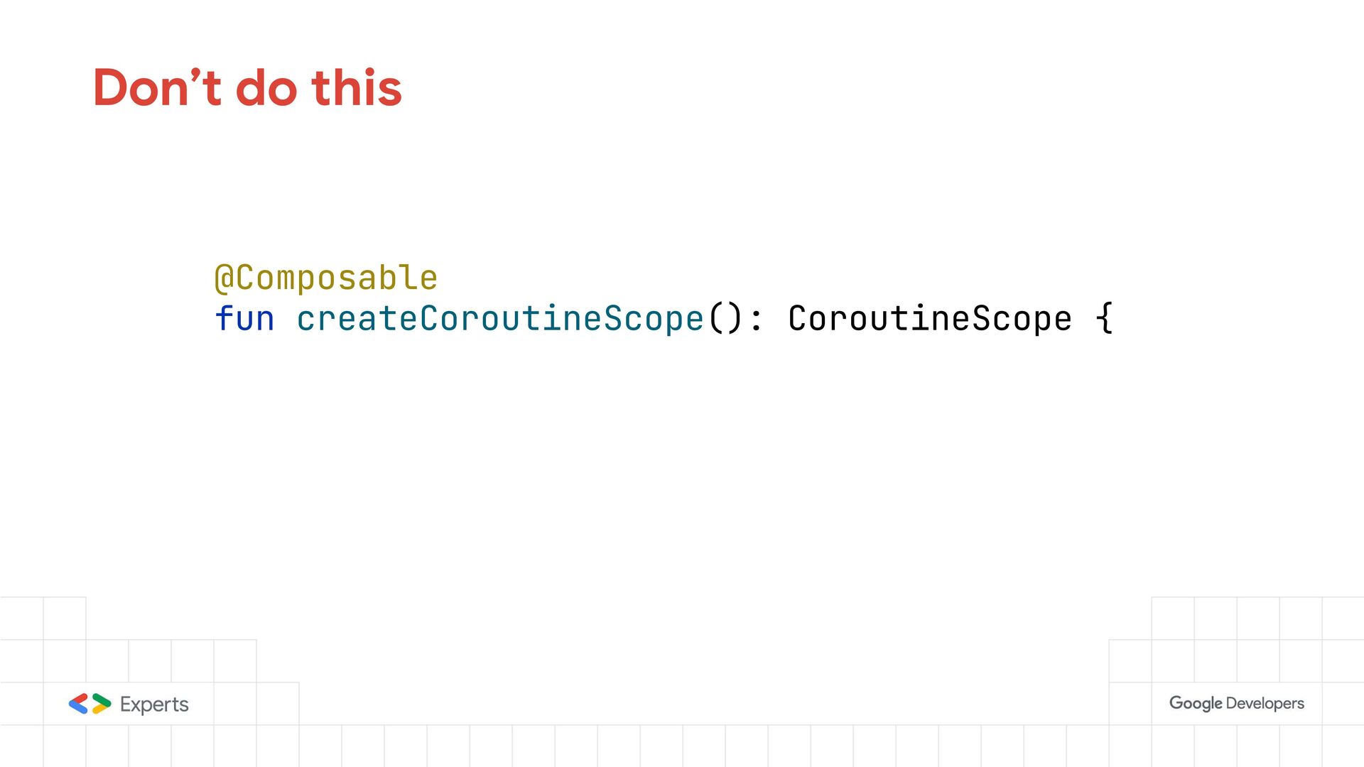
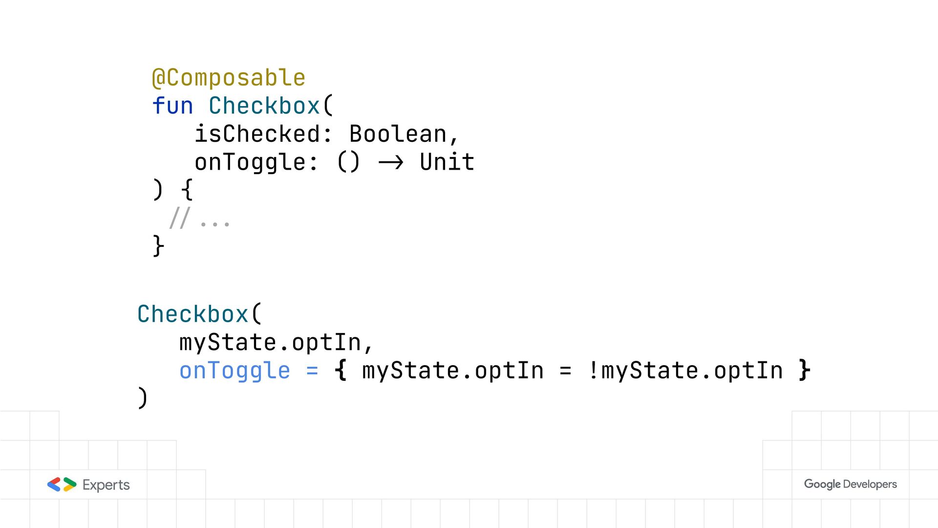
    { -/Creating the scope } return wrapper.coroutineScope } Composables that internally remember {}s and returns a mutable object have the prefix remember.
  12. Component parameters • Do not introduce optional parameters that add

    optional behavior that could be added via Modifier
  13. @Composable fun Image( bitmap: ImageBitmap, onClick: () -> Unit =

    {}, modifier: Modifier = Modifier, clipToCircle: Boolean = false ) Don’t do this
  14. @Composable fun Button( onClick: () -> Unit, modifier: Modifier =

    Modifier, backgroundColor: Color = MaterialTheme.colors.primary )
  15. Modifier parameter • Has the Type Modifier • Is the

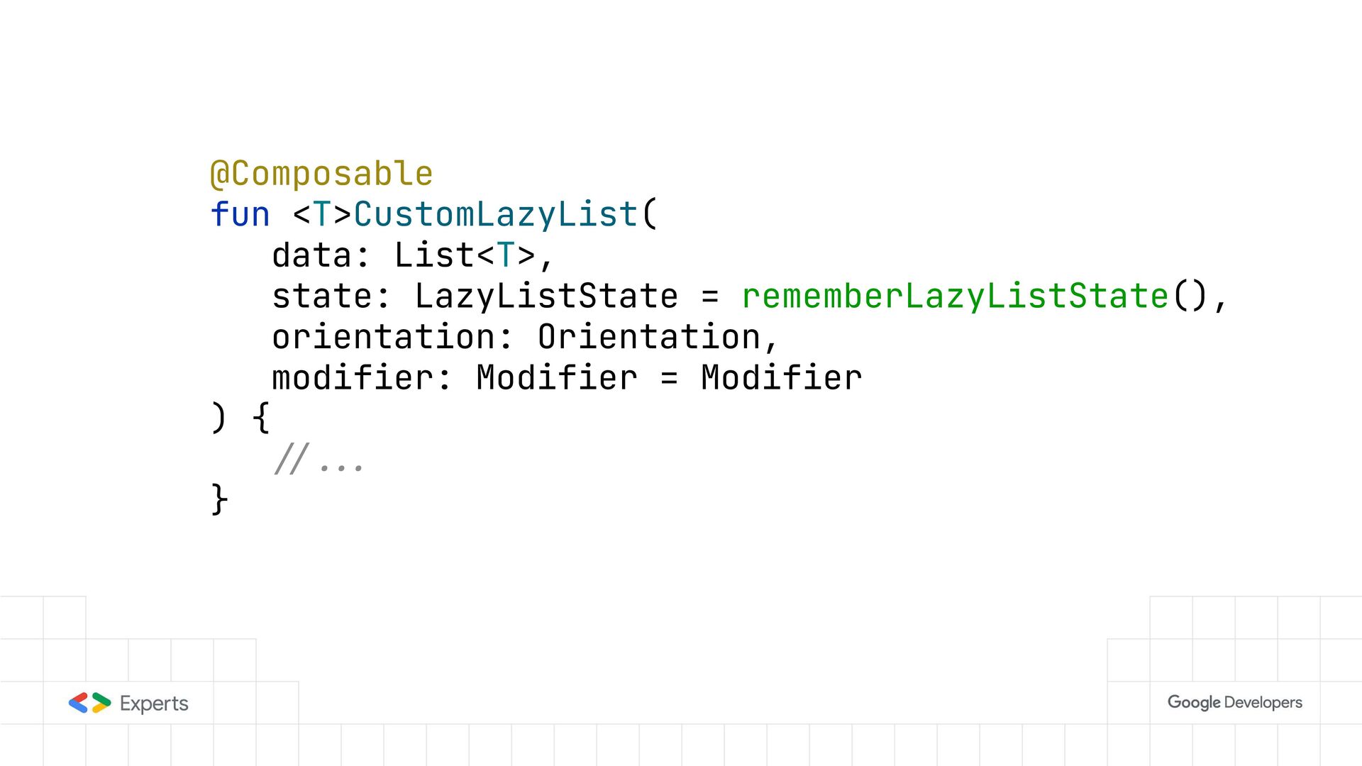
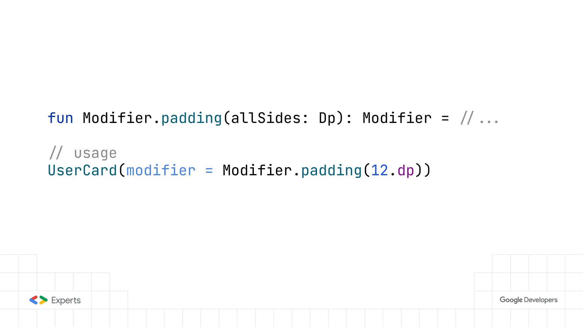
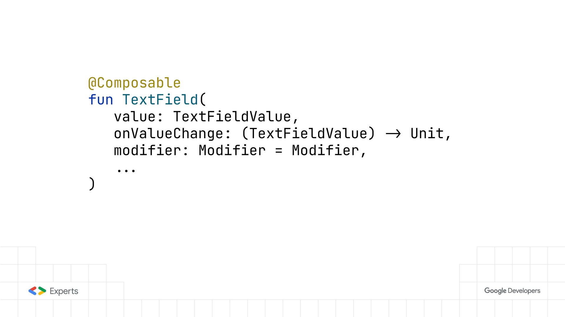
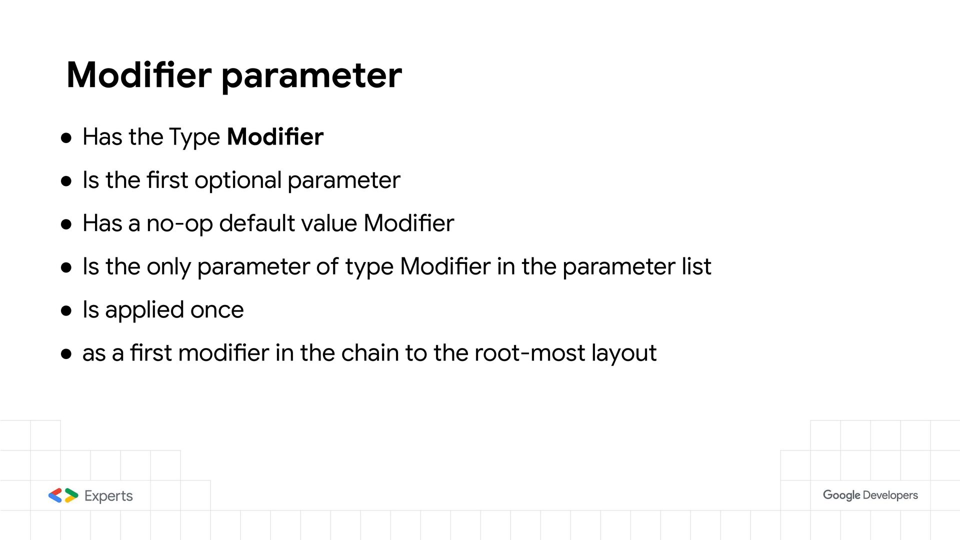
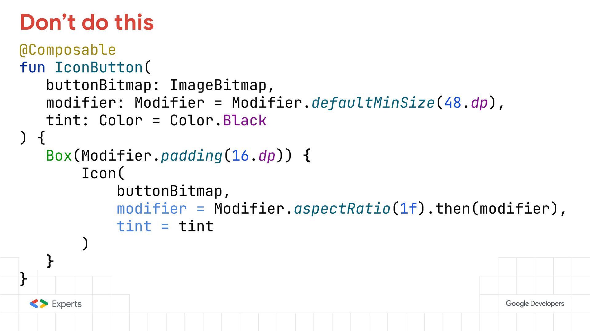
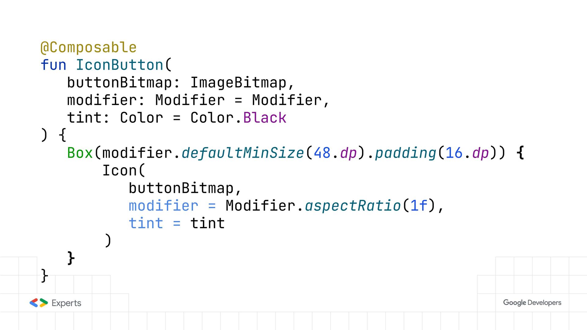
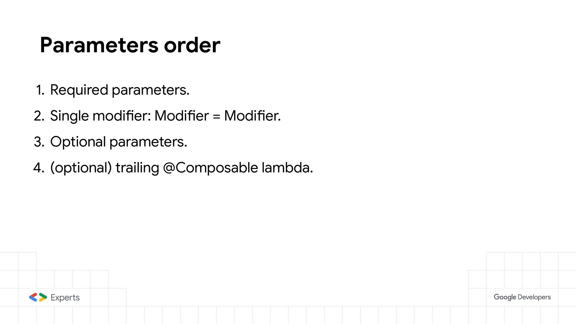
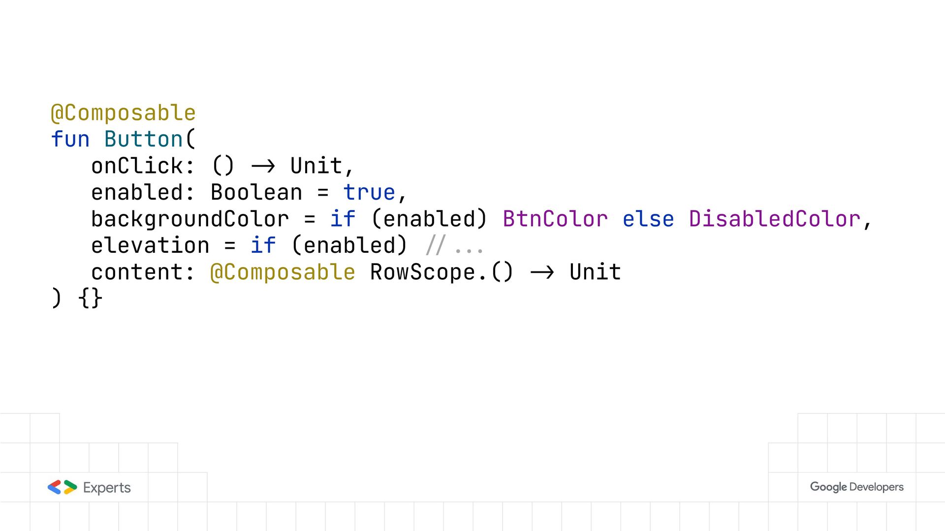
    first optional parameter • Has a no-op default value Modifier • Is the only parameter of type Modifier in the parameter list • Is applied once • as a first modifier in the chain to the root-most layout
  16. @Composable fun IconButton( buttonBitmap: ImageBitmap, modifier: Modifier = Modifier.defaultMinSize(48.dp), tint:

    Color = Color.Black ) { Box(Modifier.padding(16.dp)) { Icon( buttonBitmap, modifier = Modifier.aspectRatio(1f).then(modifier), tint = tint ) } } Don’t do this
  17. @Composable fun IconButton( buttonBitmap: ImageBitmap, modifier: Modifier = Modifier, tint:

    Color = Color.Black ) { Box(modifier.defaultMinSize(48.dp).padding(16.dp)) { Icon( buttonBitmap, modifier = Modifier.aspectRatio(1f), tint = tint ) } }
  18. Parameters order 1. Required parameters. 2. Single modifier: Modifier =

    Modifier. 3. Optional parameters. 4. (optional) trailing @Composable lambda.
  19. Prefer Stateless components • Use state Hoisting • Don’t pass

    MutableState<T> or State<T> as a parameter • Instead of State<T> use the type (ex: Int) • Or param: () -> Float. To delay reading the value.
  20. @Composable fun Checkbox( isChecked: Boolean, onToggle: () -> Unit )

    { -/--. } Checkbox( myState.optIn, onToggle = { myState.optIn = !myState.optIn } )
  21. @Composable fun Button( onClick: () -> Unit, enabled: Boolean =

    true, backgroundColor = if (enabled) BtnColor else DisabledColor, elevation = if (enabled) -/--. content: @Composable RowScope.() -> Unit ) {}
  22. class ButtonColors( backgroundColor: Color, disabledBackgroundColor: Color, contentColor: Color, disabledContentColor: Color

    ) { fun backgroundColor(enabled: Boolean): Color { --. } fun contentColor(enabled: Boolean): Color { --. } } Isolate this to a domain specific class.
  23. object ButtonDefaults { fun colors( backgroundColor: Color = --., disabledBackgroundColor:

    Color = --., contentColor: Color = --., disabledContentColor: Color = --. ): ButtonColors { --. } } You can even create a factory with default values
  24. @Composable fun Button( onClick: () -> Unit, enabled: Boolean =

    true, colors: ButtonColors = ButtonDefaults.colors(), content: @Composable RowScope.() -> Unit ) { val backgroundColor = colors.backgroundColor(enabled) }
  25. Documenting a component • One-liner paragraph summarizing the component and

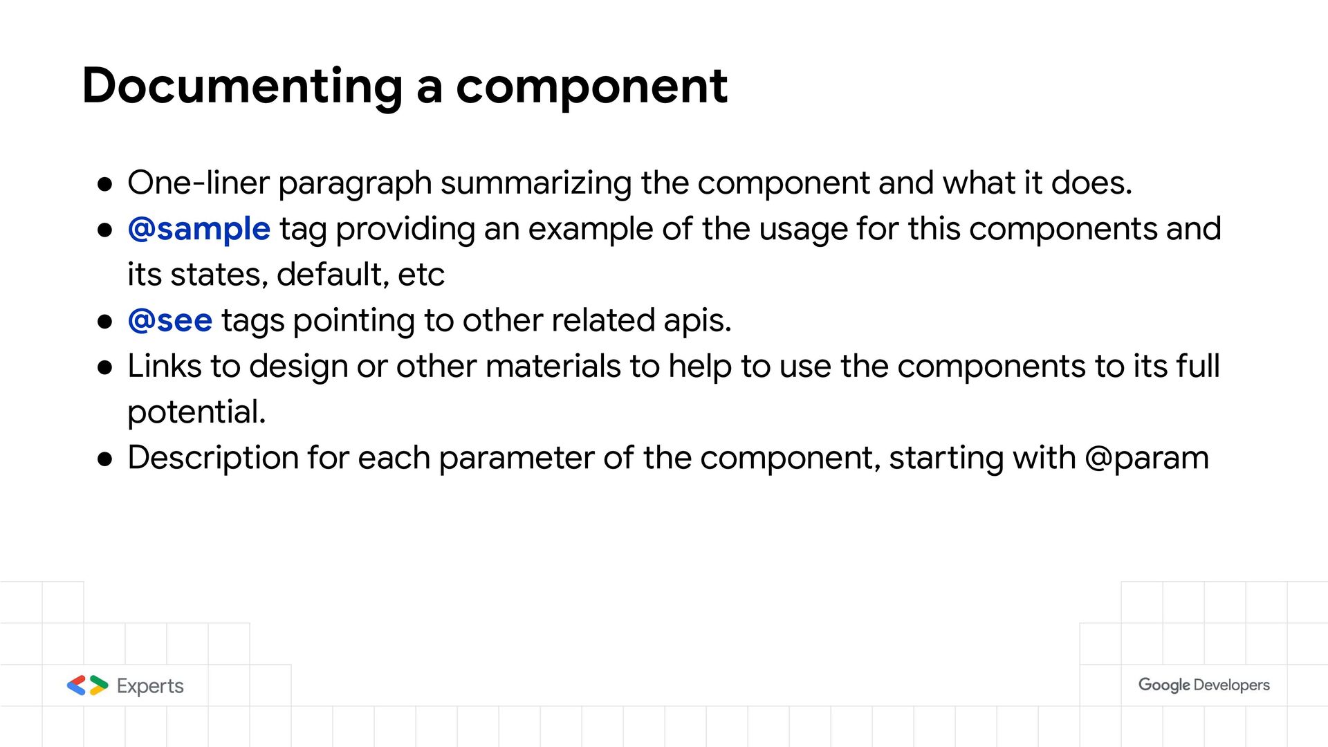
    what it does. • @sample tag providing an example of the usage for this components and its states, default, etc • @see tags pointing to other related apis. • Links to design or other materials to help to use the components to its full potential. • Description for each parameter of the component, starting with @param
  26. Evolution of the Component APIs • Parameters of the functions

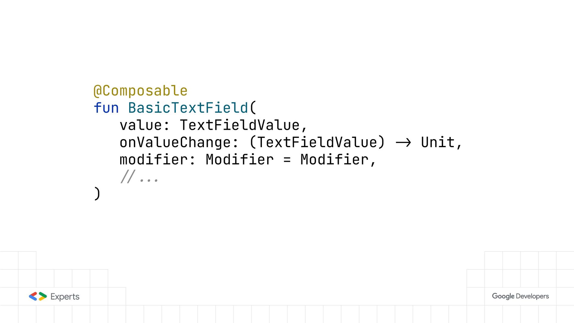
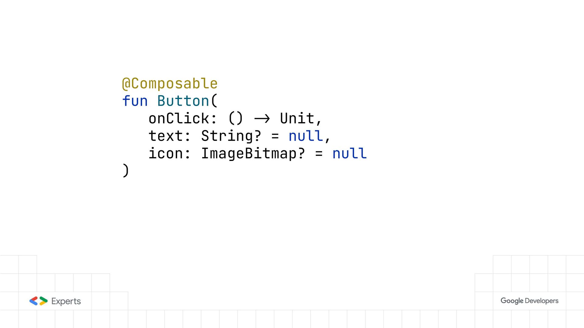
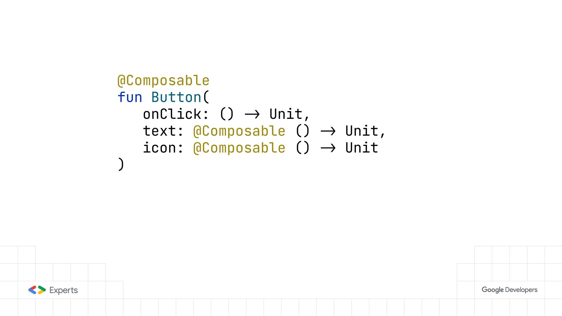
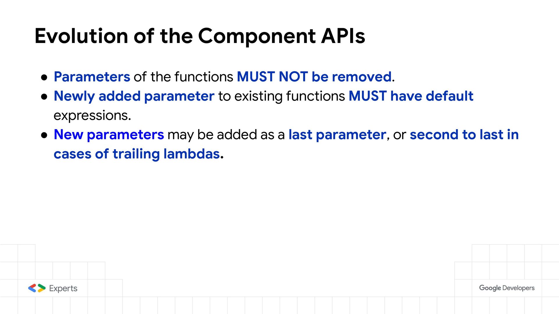
    MUST NOT be removed. • Newly added parameter to existing functions MUST have default expressions. • New parameters may be added as a last parameter, or second to last in cases of trailing lambdas.
  27. References • Designing scalable Compose APIs (Google IO 2024) •

    [Compose API Guidelines] https://github.com/androidx/androidx • [Kotlin API Guidelines] https://github.com/Kotlin/api-guidelines