Upgrade to Pro — share decks privately, control downloads, hide ads and more …

Ancillary Task 2 Plan

Ancillary Task 2 Plan

Zaneta Domanowska

December 03, 2015
Tweet

More Decks by Zaneta Domanowska

Other Decks in Education

Transcript

  1. – During my research, I have found out that different

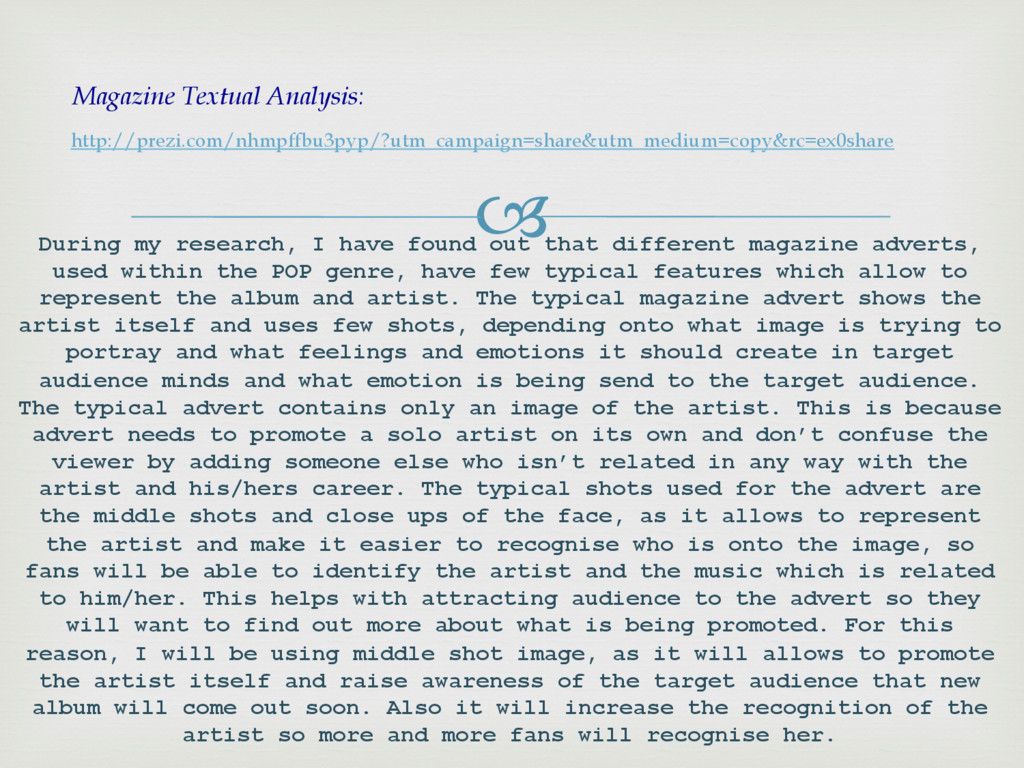
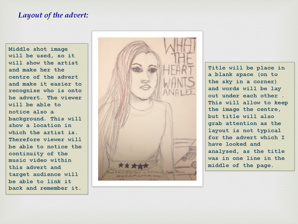
    magazine adverts, used within the POP genre, have few typical features which allow to represent the album and artist. The typical magazine advert shows the artist itself and uses few shots, depending onto what image is trying to portray and what feelings and emotions it should create in target audience minds and what emotion is being send to the target audience. The typical advert contains only an image of the artist. This is because advert needs to promote a solo artist on its own and don’t confuse the viewer by adding someone else who isn’t related in any way with the artist and his/hers career. The typical shots used for the advert are the middle shots and close ups of the face, as it allows to represent the artist and make it easier to recognise who is onto the image, so fans will be able to identify the artist and the music which is related to him/her. This helps with attracting audience to the advert so they will want to find out more about what is being promoted. For this reason, I will be using middle shot image, as it will allows to promote the artist itself and raise awareness of the target audience that new album will come out soon. Also it will increase the recognition of the artist so more and more fans will recognise her. http://prezi.com/nhmpffbu3pyp/?utm_campaign=share&utm_medium=copy&rc=ex0share Magazine Textual Analysis:
  2. The image illustrates a link between the advert and music

    video by the use of the same location and costume (dress), which the artist is wearing. This show the high level of continuity and increases the recognition of whom the artist is, through features such as mise-en-scene. From the two previous images, you are able to identify the difference between the original and edited photo. We have added a range of effects in order to enhance the colour, brightness and quality of the image, making it more unique and appealing for our target audience.
  3. Layout of the advert: Middle shot image will be used,

    so it will show the artist and make her the centre of the advert and make it easier to recognise who is onto he advert. The viewer will be able to notice also a background. This will show a location in which the artist is. Therefore viewer will be able to notice the continuity of the music video within this advert and target audience will be able to link it back and remember it. Title will be place in a blank space (on to the sky in a corner) and words will be lay out under each other . This will allow to keep the image the centre, but title will also grab attention as the layout is not typical for the advert which I have looked and analysed, as the title was in one line in the middle of the page.
  4. I will also place a rating and a quote from

    the magazine saying that album is good. This will show target audience that album is high quality and songs are top ones. This will encourage more people as Music News do recommend the album, showing that it will be worth to buy it. Also this will increase the recognition of the artist as top songs in POP genre are listen by chosen target audience. Therefore, the comment will increase the desire of the females to have this album. At the bottom, I am planning to place the date of the album release. The date will be in different font to make it stand out so target audience will be able to notice when it will be available at stores so target audience will know when to buy it. The date is important as this aware target audience about the release so they will know about it. This also have been included in every advert which I have analysed.