Upgrade to Pro — share decks privately, control downloads, hide ads and more …

Python Data Visualization - PyData Taipei Meetup

Adam
June 03, 2020

Python Data Visualization - PyData Taipei Meetup

Data visualization tools in Python. The objective are making better analysis and communication.

Adam

June 03, 2020
Tweet

More Decks by Adam

Other Decks in Programming

Transcript

  1. Who Am I? 2 PyData Taipei 副主席 籌備PyData Taipei 2020

    Conference & Meetup 新光⼈壽 – 資料⼯程師 數據分析、機器學習、深度學習、API開發、NLP相關應⽤ 聚陽實業 – 專案專員 ⽣產數據分析、設計數據搜集流程、設計⽣產追蹤指標、導 ⼊系統化管理模式、⽣產改善;系統類別涵蓋倉儲、品質管 理、⽣產追蹤、訂單管理等 台灣⼈⼯智慧學校AIA 第⼆期技術⼈班
  2. 3 今天會提到的 和不會提到的 今天會提到的內容: › 什麼是資料視覺化? › 資料視覺化的⺫的? › Python中有哪些套件可以幫助我們做資料視覺化?

    › 哪些是我⾃⼰常⽤的分析圖表? 今天不會提到的內容: › 如何做資料分析、數據的處理 › 有關於實作上的程式碼細節&教學
  3. 什麼是資料視覺化? 4 資訊科技, 22 學⽣, 9 ⾦融/保險, 8 其他, 9

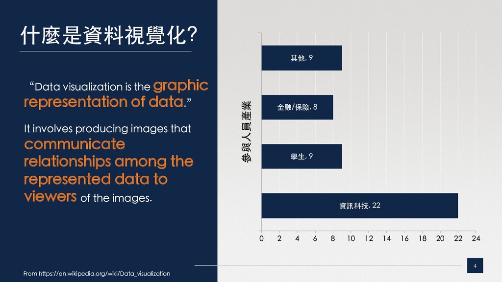
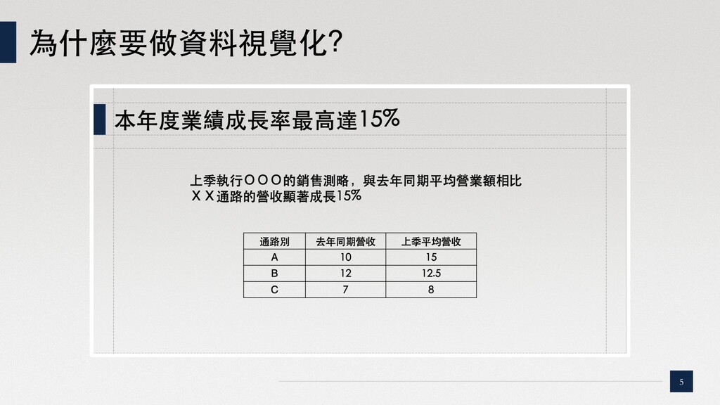
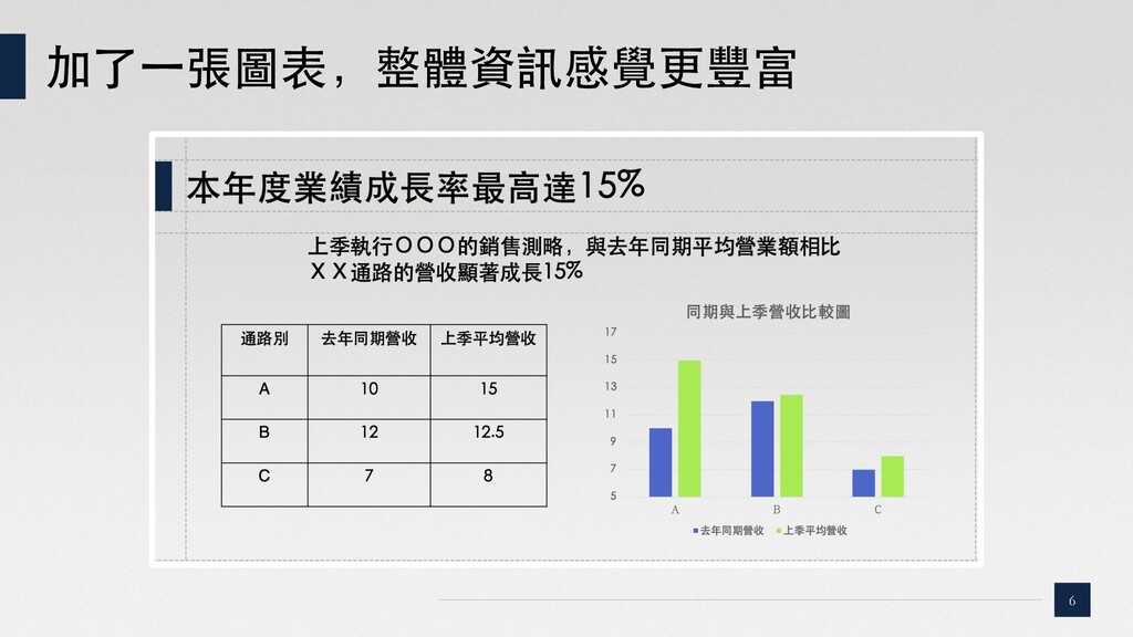
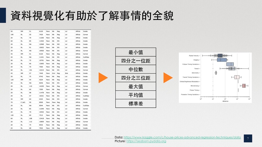
    0 2 4 6 8 10 12 14 16 18 20 22 24 參與⼈員產業 “Data visualization is the graphic representation of data.” It involves producing images that communicate relationships among the represented data to viewers of the images. From https://en.wikipedia.org/wiki/Data_visualization
  4. 資料視覺化有助於了解事情的全貌 7 最⼩值 四分之⼀位距 中位數 四分之三位距 最⼤值 平均值 標準差 Data:

    https://www.kaggle.com/c/house-prices-advanced-regression-techniques/data Picture: https://seaborn.pydata.org
  5. 資料視覺化的⺫的在於分析與溝通 11 『讓⼈對數字有感』 分析 • 看數字 -> 了解關鍵指標 • 看圖表

    -> 分析資料全貌 • 做資料的探索(EDA) • 確認資料的品質 溝通 • 你可能有個⺫的或觀點, 想說服⽤⼾或主管 • 有訊息需要傳遞給其他⼈
  6. Matplotlib – 最基本的Python視覺化⼯具 13 Features: ☞ 與Pandas無縫整合,有利於 在分析結構化資料時,同時快 速繪製分析圖表 ☞

    在視覺化圖表的套件中,幾乎 有最⿑全的⽂檔和教學 ☞ 具備⾼度彈性,可以在圖表上 加⼊各種東⻄ ☞ 幾乎所有常⾒的分析⽤圖表都 可以在matplotlib裡⾯找到教 學 Useful charts: Bar, Line, Scatter, Histogram, Grid... https://matplotlib.org
  7. Seaborn – 易於統計分析的美化版Matplotlib 15 Features: ☞ 美化版的Matplotlib ☞ 整合了許多好⽤的分析圖表 ☞

    可以省下很多美化圖表的功夫 Useful charts: Boxplot, heatmap, pair-grid https://seaborn.pydata.org
  8. Missingno – 探索缺失值分佈的最佳夥伴 17 Features: ☞ 快速檢視各個欄位的缺失資料 分布 ☞ 單張圖⼀次可以檢視50欄位

    ☞ 同時可以看最完整的資料和最 不完整的資料狀況 Useful charts: Missing value distribution https://github.com/ResidentMario/missingno
  9. dtreeviz – 解釋Tree base model的好朋友 18 Features: ☞ 視覺化Tree base

    algorithm ☞ 解釋各個參數變 化對模型判斷的 影響 Useful charts: Scatter or histogram version https://github.com/parrt/dtreeviz
  10. bqplot & jupyter widget – 互動化的Jupyter⼯具 22 Features: ☞ 可以直接使⽤Jupyter

    notebook 進⾏互動 ☞ 整合了多樣化的按鈕及 互動⽅式,可以應⽤ Widget即時觀看資料變 化 Useful charts: Any charts with widgets https://github.com/bqplot/bqplot https://ipywidgets.readthedocs.io/en/latest/examples/Widget%20Basics.html
  11. 26 Summary Objective Package Function Analysis Matplotlib 基本的視覺化⼯具 Seaborn 統計分析圖表

    Missingno 缺失值分佈 dtreeviz 解釋Tree base模型 pdpbox 解釋特定參數的影響 shap 解釋參數的權重 Communication baplot & jupyter widget 最簡單的互動圖表⼯具 bokeh 美觀的互動圖表 dash 儀表板 streamlit 模型Prototyping