Upgrade to Pro
— share decks privately, control downloads, hide ads and more …
Speaker Deck
Features
Speaker Deck
PRO
Sign in
Sign up for free
Search
Search
SKL data analysis internship lecture 1
Search
Sponsored
·
Ship Features Fearlessly
Turn features on and off without deploys. Used by thousands of Ruby developers.
→
Adam
March 10, 2020
Programming
150
0
Share
Embed
Copy iframe code
Copy JS code
Copy link
Start on current slide
SKL data analysis internship lecture 1
Internal intern training for SKL.
Topic: python introduction & data visualization
Adam
March 10, 2020
More Decks by Adam
See All by Adam
Working Backward Reading Group
adamchang
0
110
Python Data Visualization - PyData Taipei Meetup
adamchang
0
250
SKL 2019 Intern Training Data Cleaning and Feature Engineering
adamchang
0
35
SKL 2019 Intern Training Python Data Analysis
adamchang
0
55
Other Decks in Programming
See All in Programming
PHPだって関数型したい 〜できること、できないこと〜 / fp-in-php
jsoizo
1
250
The Bowling Game - From Imperative to Functional Programming - Part 1
philipschwarz
PRO
0
340
PHP Application における Kubernetes 内 gRPC 通信
ganchiku
0
540
はてなアカウント基盤 State of the Union
cockscomb
1
1.3k
AIが無かった頃の素敵な出会いの話
codmoninc
1
230
5分で問診!Composer セキュリティ健康診断
codmoninc
0
600
Laravelで学ぶ Webアプリケーションチューニング入門/web_application_tuning_101
hanhan1978
4
1.3k
Welcome to the "Parametricity" 🏙️ − Generic だけど Specific な世界 −
guvalif
PRO
1
180
鹿野さんに聞く!『TypeScriptコードレシピ集』で磨く実践力
tonkotsuboy_com
4
1.2k
AI時代のPHPer生存戦略 ~「言語、もうなんでもよくない?」に本気で向き合う~
vivion
0
170
Augmenting AI with the Power of Jakarta EE
ivargrimstad
0
210
AI時代の仕事技芸論〜ソフトウェア開発で「遊ぶように働く」職人的熟達のすすめ(スクフェス仙台 2026バージョン)
kuranuki
0
720
Featured
See All Featured
Redefining SEO in the New Era of Traffic Generation
szymonslowik
1
370
HTML-Aware ERB: The Path to Reactive Rendering @ RubyCon 2026, Rimini, Italy
marcoroth
3
360
Put a Button on it: Removing Barriers to Going Fast.
kastner
60
4.5k
Utilizing Notion as your number one productivity tool
mfonobong
4
460
10 Git Anti Patterns You Should be Aware of
lemiorhan
PRO
659
62k
Darren the Foodie - Storyboard
khoart
PRO
3
3.5k
A Modern Web Designer's Workflow
chriscoyier
698
190k
WCS-LA-2024
lcolladotor
0
750
Leveraging LLMs for student feedback in introductory data science courses - posit::conf(2025)
minecr
1
320
Documentation Writing (for coders)
carmenintech
77
5.4k
Building AI with AI
inesmontani
PRO
1
1.1k
Impact Scores and Hybrid Strategies: The future of link building
tamaranovitovic
0
340
Transcript
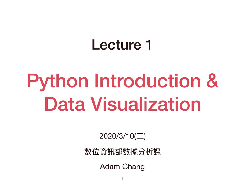
Python Introduction & Data Visualization Lecture 1 2020/3/10(⼆) 數位資訊部數據分析課 Adam
Chang 1
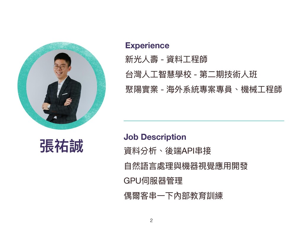
張祐誠 Experience 新光⼈壽 - 資料⼯程師 台灣⼈⼯智慧學校 - 第⼆期技術⼈班 聚陽實業 -
海外系統專案專員、機械⼯程師 Job Description 資料分析、後端API串接 ⾃然語⾔處理與機器視覺應⽤開發 GPU伺服器管理 偶爾客串⼀下內部教育訓練 2
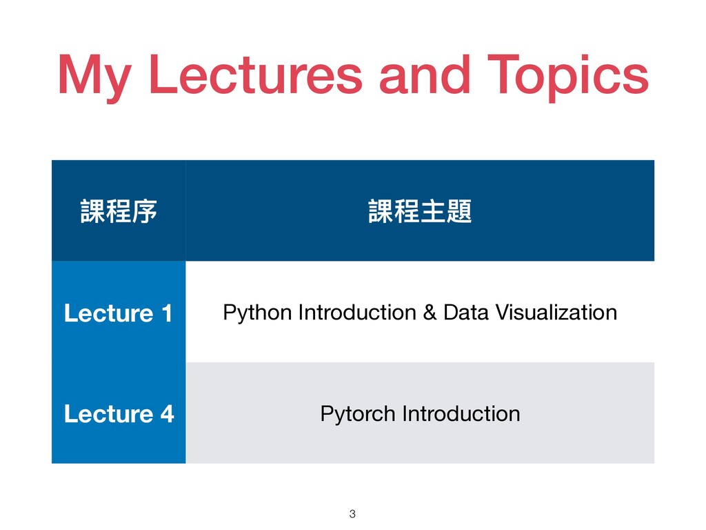
My Lectures and Topics 3 課程序 課程主題 Lecture 1 Python
Introduction & Data Visualization Lecture 4 Pytorch Introduction
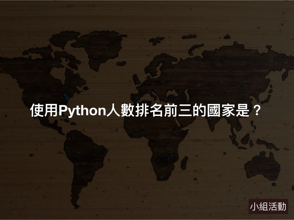
4 使⽤Python⼈數排名前三的國家是? ⼩組活動
使⽤Python的國家分佈 5 Source: https://www.jetbrains.com/lp/devecosystem-2019/python/
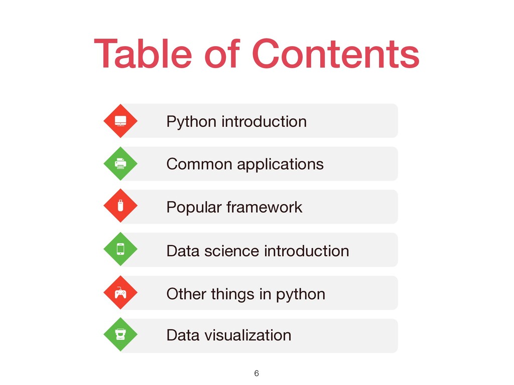
Table of Contents 6 Python introduction Data science introduction Common
applications Popular framework Other things in python Data visualization
WHY PYTHON? 7
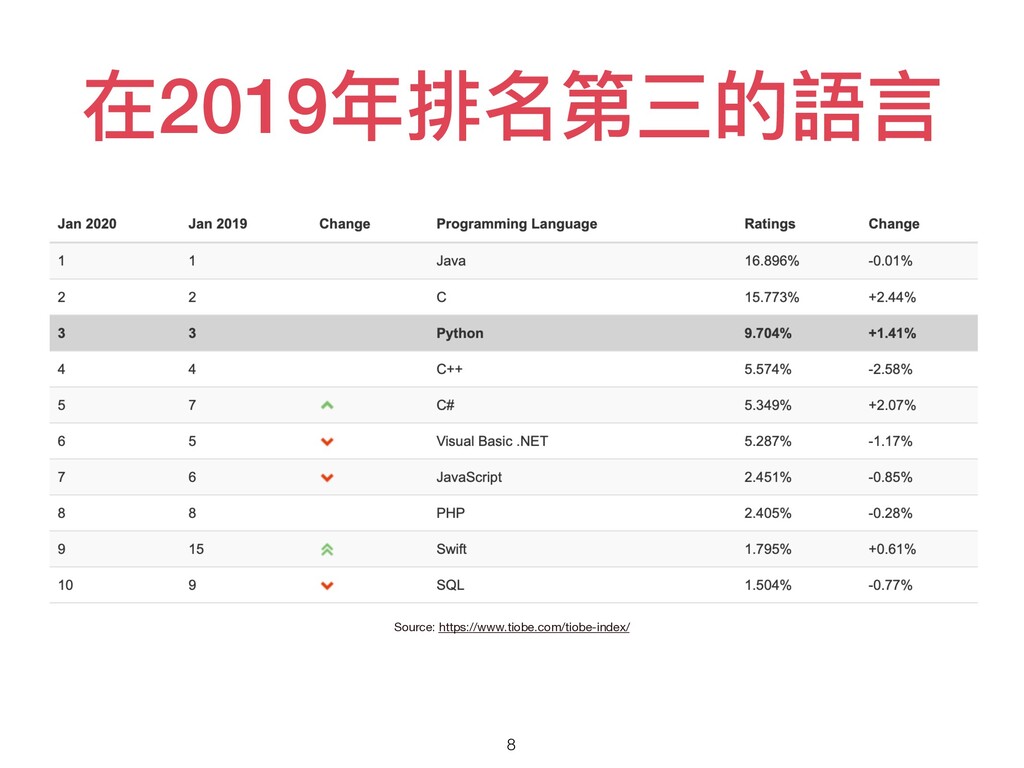
在2019年排名第三的語⾔ 8 Source: https://www.tiobe.com/tiobe-index/
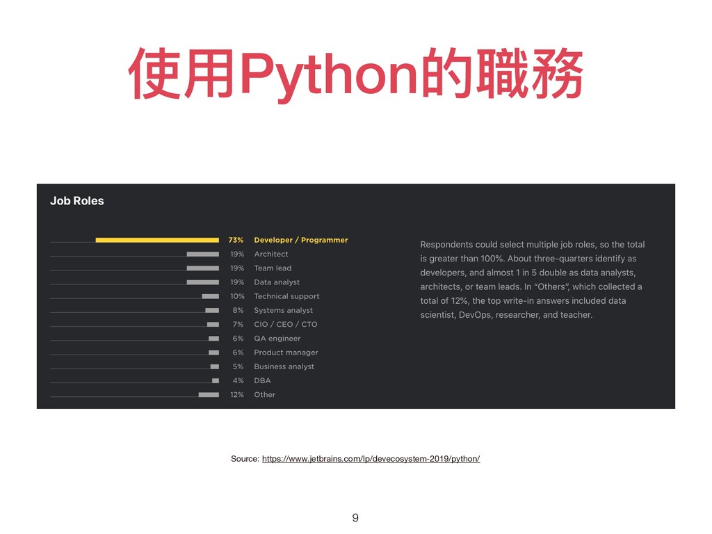
使⽤Python的職務 9 Source: https://www.jetbrains.com/lp/devecosystem-2019/python/
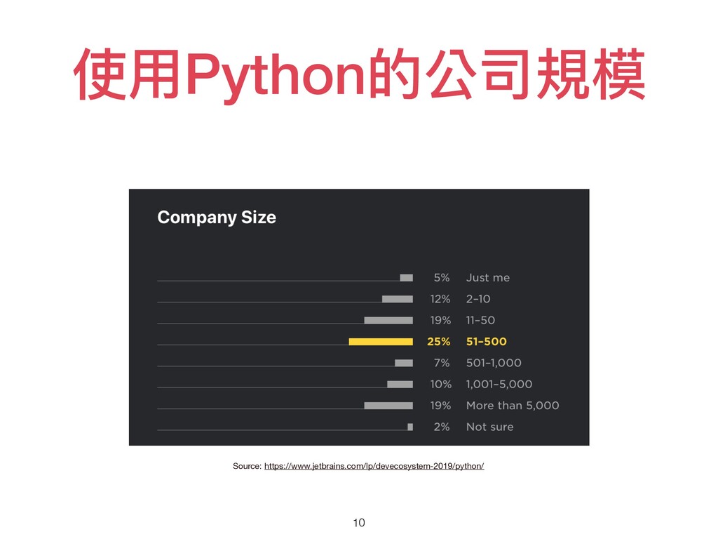
使⽤Python的公司規模 10 Source: https://www.jetbrains.com/lp/devecosystem-2019/python/
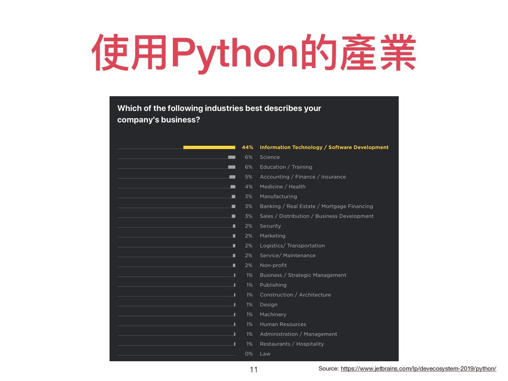
使⽤Python的產業 11 Source: https://www.jetbrains.com/lp/devecosystem-2019/python/
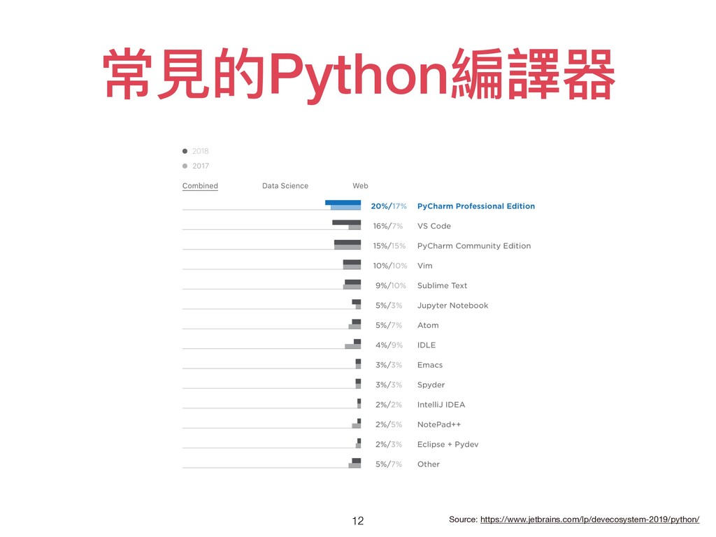
常⾒的Python編譯器 12 Source: https://www.jetbrains.com/lp/devecosystem-2019/python/
PYTHON 的應⽤有什麼? ⼩組活動 13
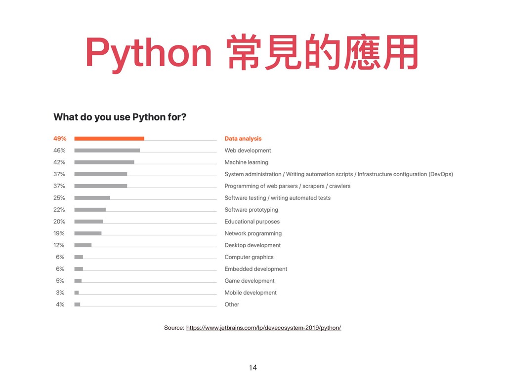
Python 常⾒的應⽤ 14 Source: https://www.jetbrains.com/lp/devecosystem-2019/python/
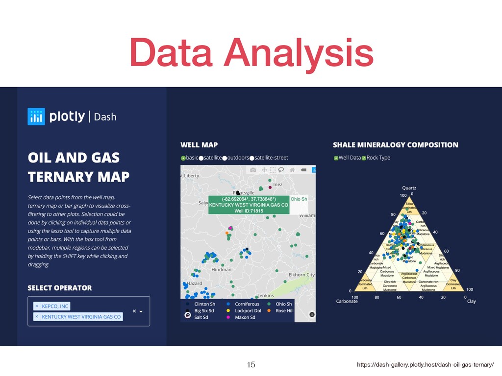
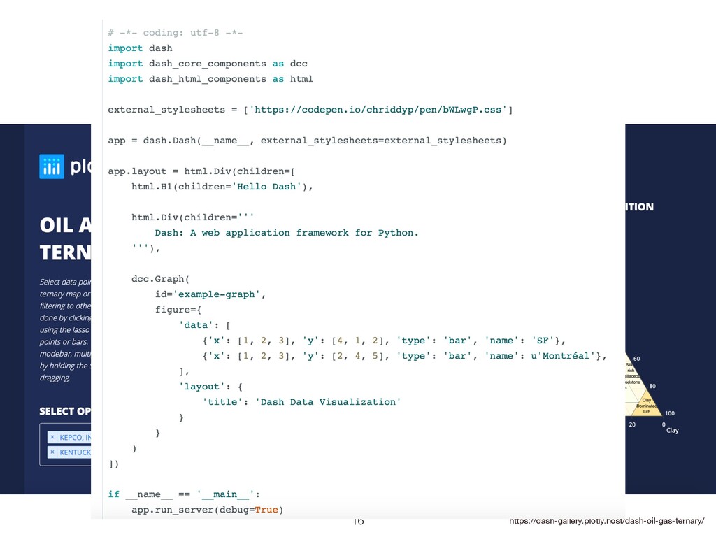
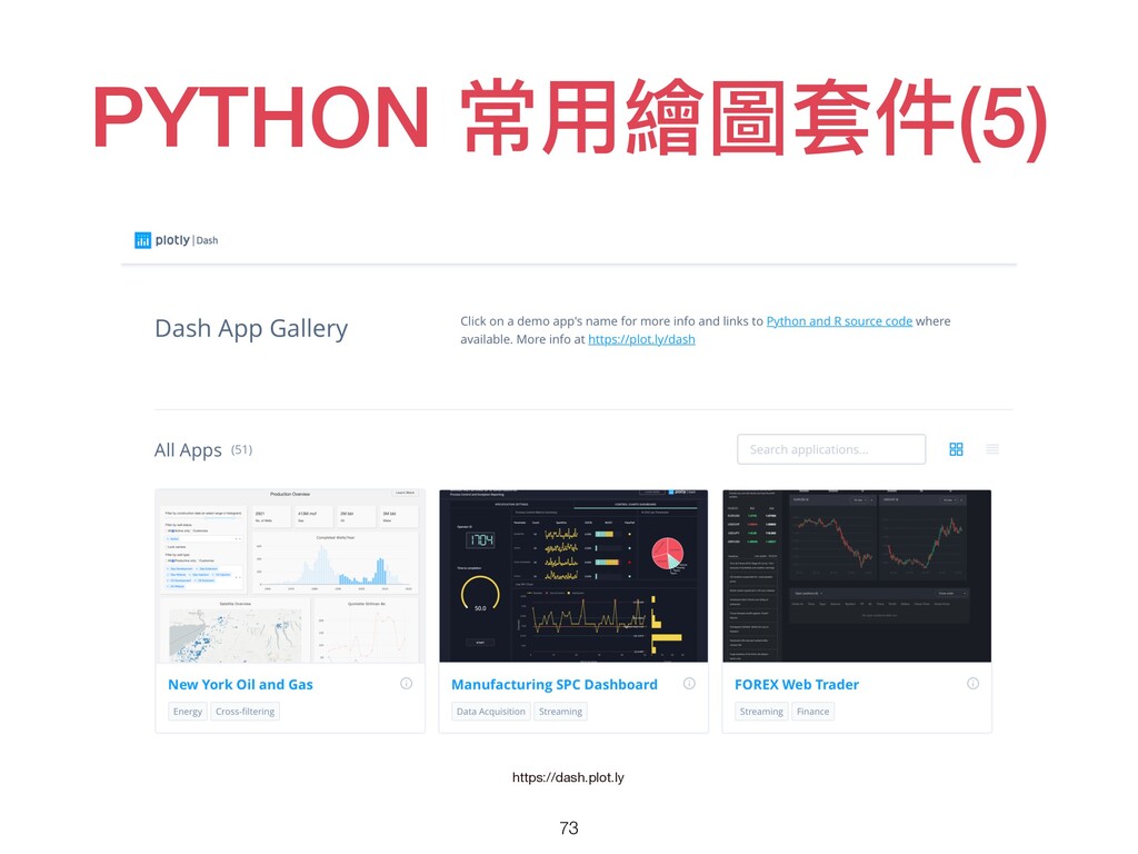
Data Analysis 15 https://dash-gallery.plotly.host/dash-oil-gas-ternary/
Data Analysis 16 https://dash-gallery.plotly.host/dash-oil-gas-ternary/
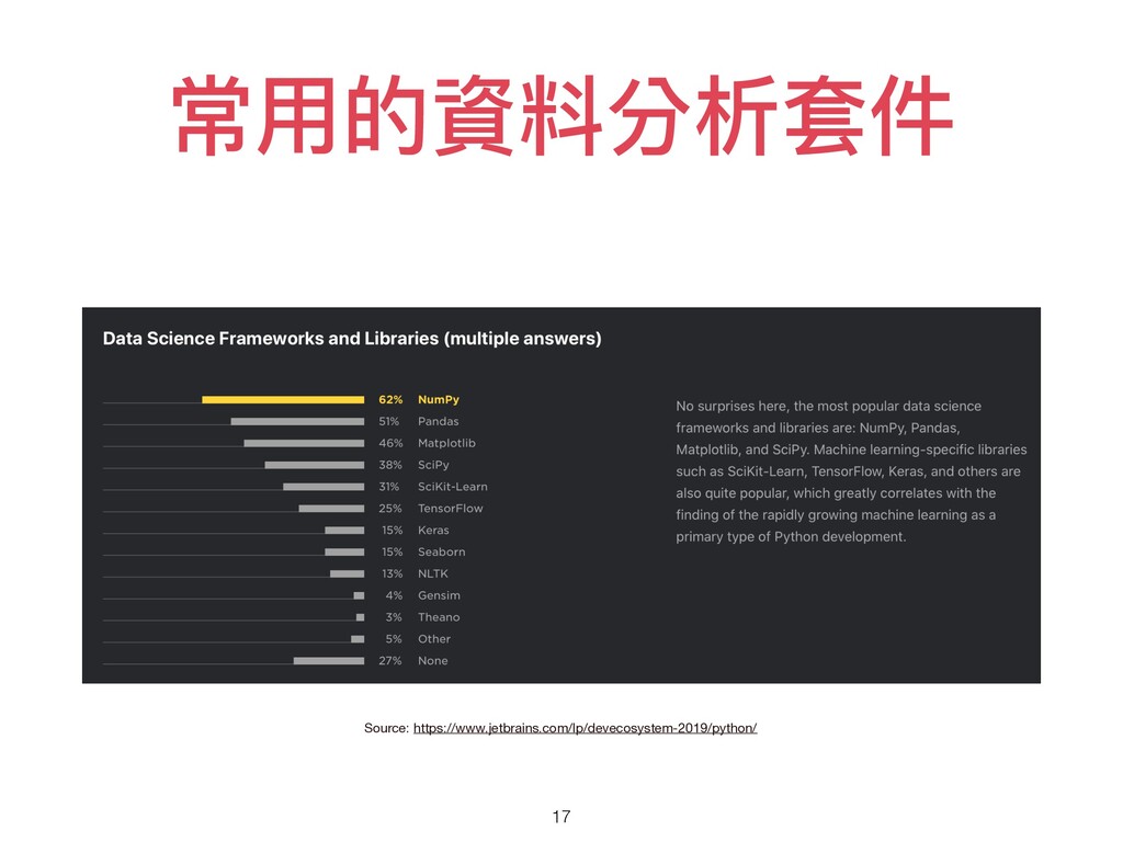
常⽤的資料分析套件 17 Source: https://www.jetbrains.com/lp/devecosystem-2019/python/
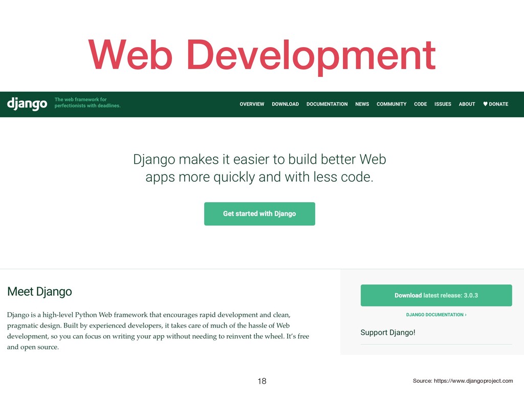
Web Development 18 Source: https://www.djangoproject.com
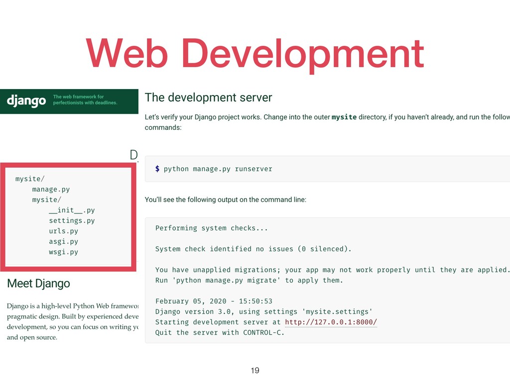
Web Development 19
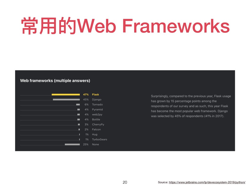
常⽤的Web Frameworks 20 Source: https://www.jetbrains.com/lp/devecosystem-2019/python/
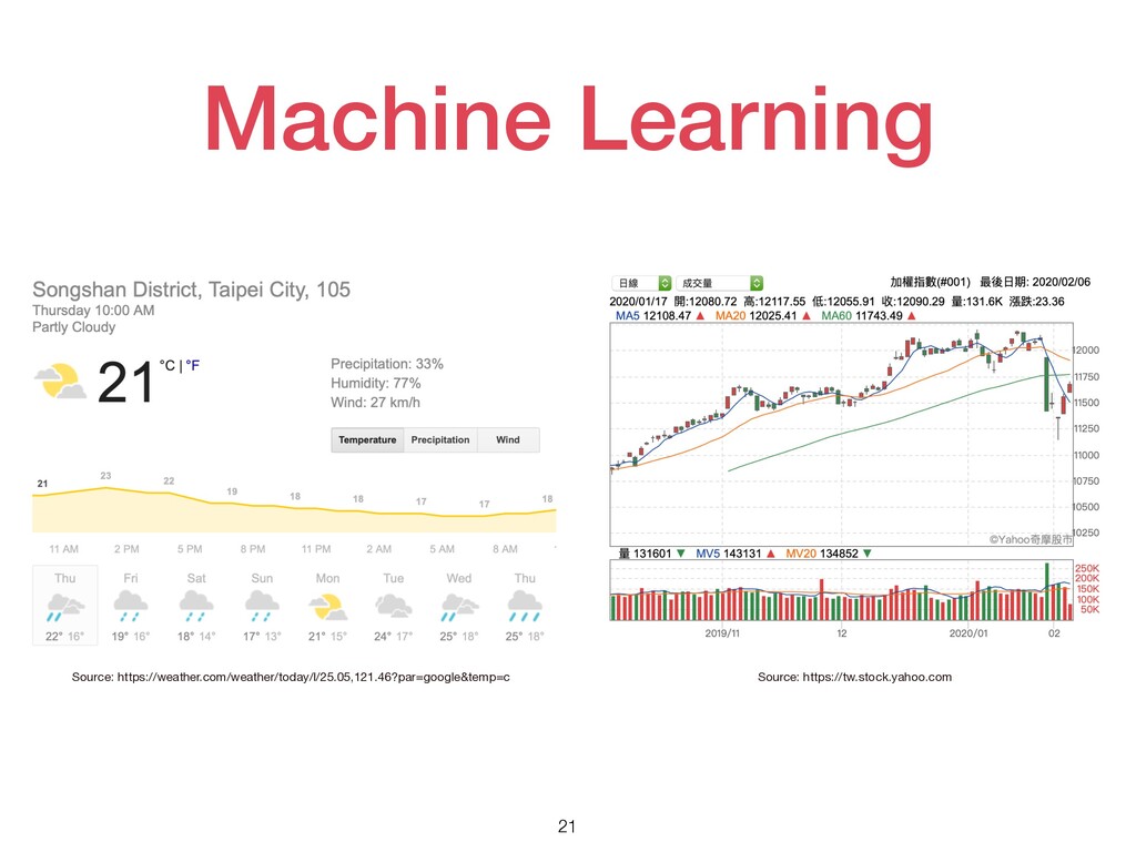
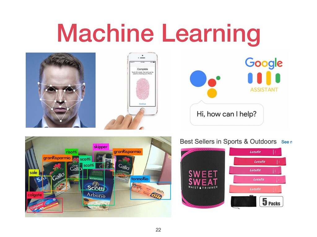
Machine Learning 21 Source: https://weather.com/weather/today/l/25.05,121.46?par=google&temp=c Source: https://tw.stock.yahoo.com
Machine Learning 22
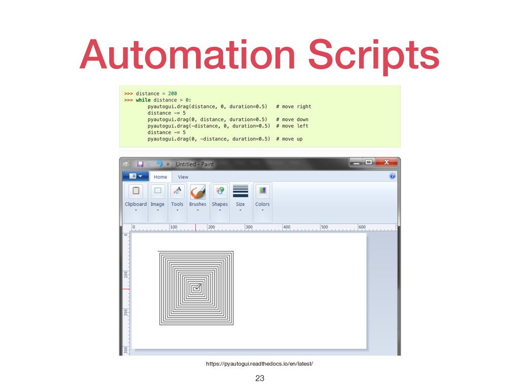
Automation Scripts 23 https://pyautogui.readthedocs.io/en/latest/
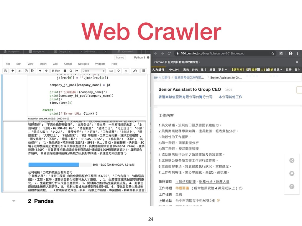
Web Crawler 24
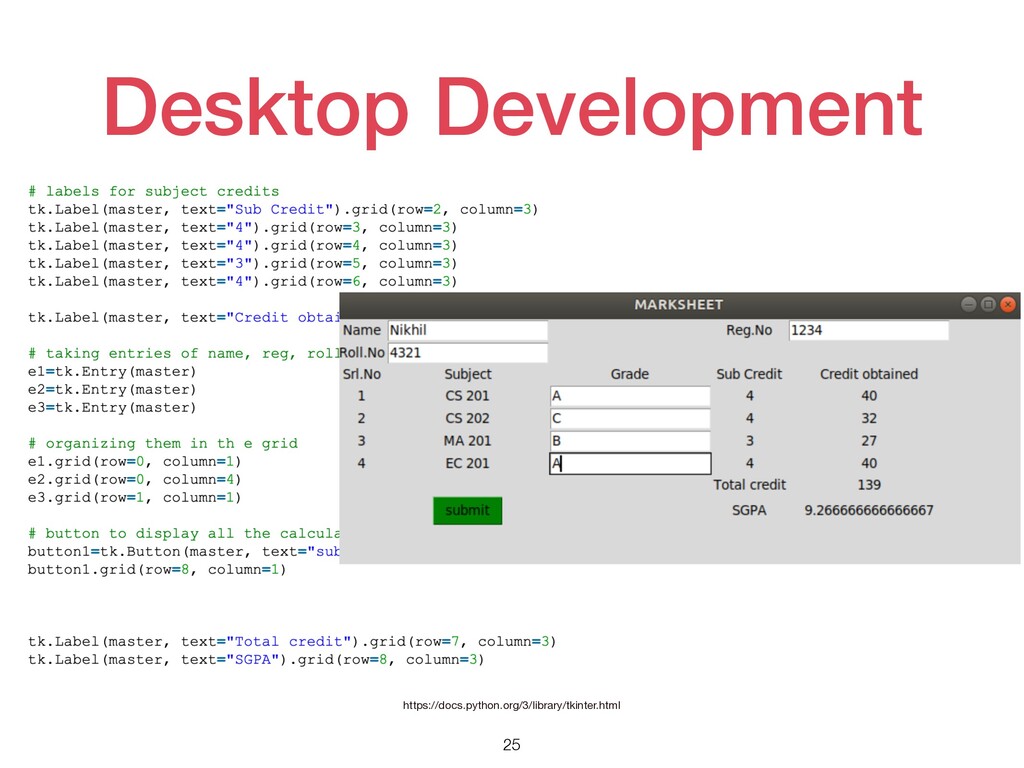
Desktop Development 25 https://docs.python.org/3/library/tkinter.html
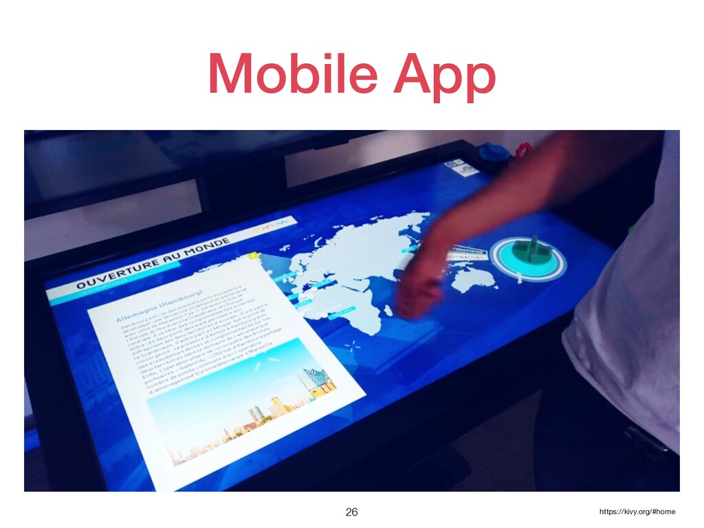
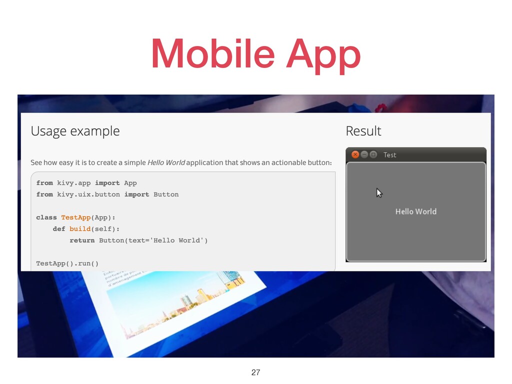
Mobile App 26 https://kivy.org/#home
Mobile App 27
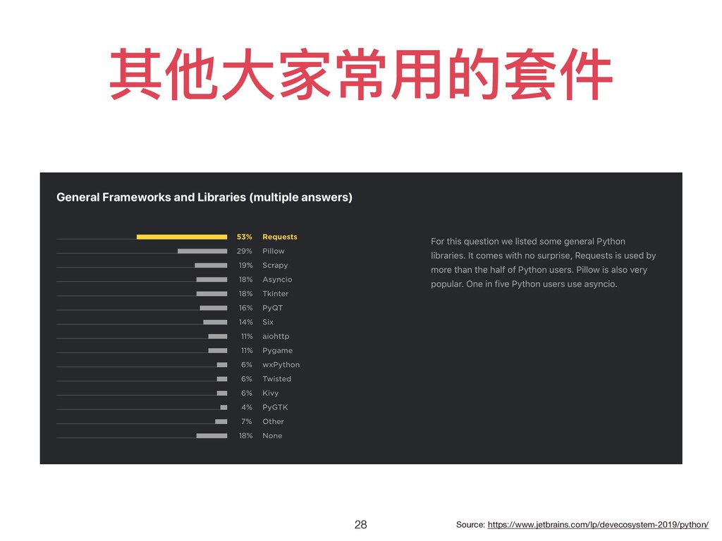
其他⼤家常⽤的套件 28 Source: https://www.jetbrains.com/lp/devecosystem-2019/python/
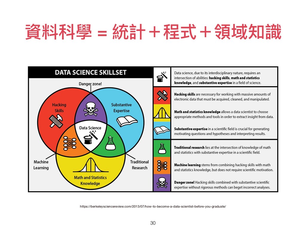
資料科學? 29
資料科學 = 統計+程式+領域知識 30 https://berkeleysciencereview.com/2013/07/how-to-become-a-data-scientist-before-you-graduate/
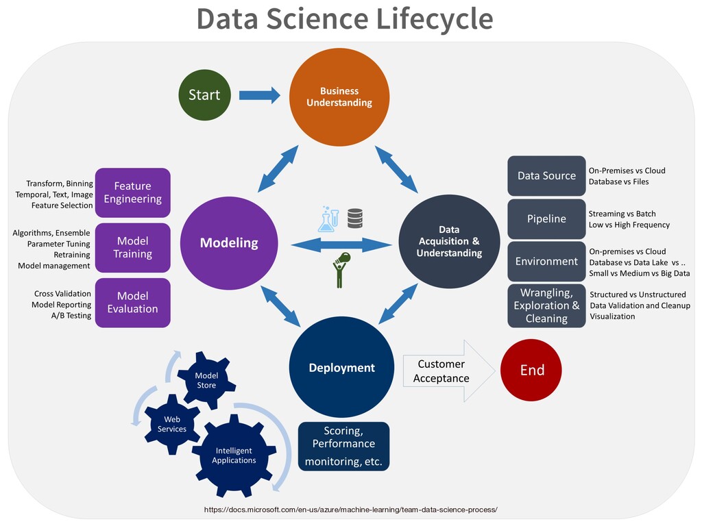
31 https://docs.microsoft.com/en-us/azure/machine-learning/team-data-science-process/
資料科學家要會什麼? 32 ⼩組活動
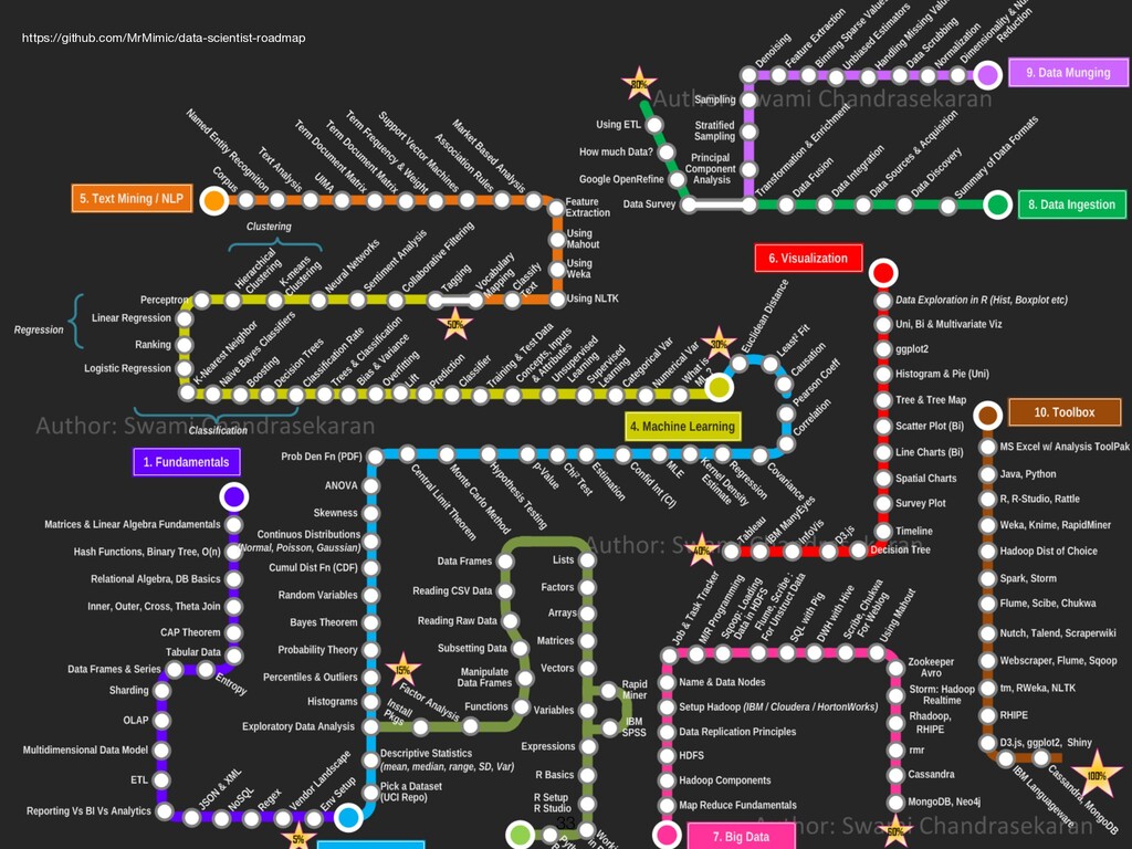
33 https://github.com/MrMimic/data-scientist-roadmap
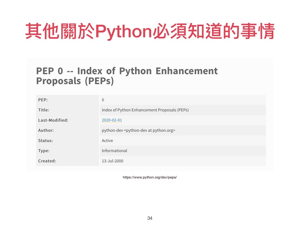
其他關於Python必須知道的事情 34 https://www.python.org/dev/peps/
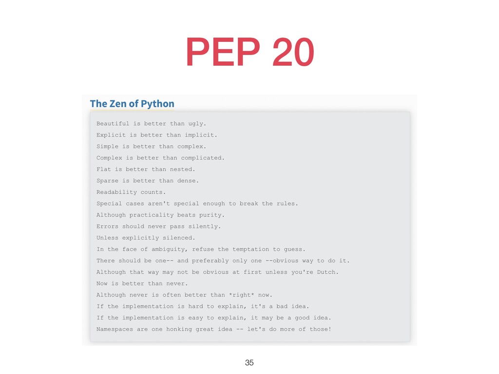
PEP 20 35
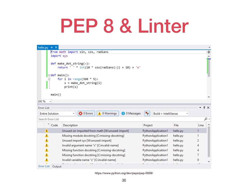
PEP 8 & Linter 36 https://www.python.org/dev/peps/pep-0008/
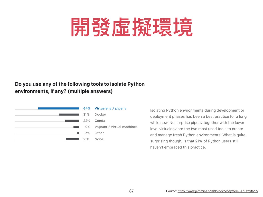
開發虛擬環境 37 Source: https://www.jetbrains.com/lp/devecosystem-2019/python/
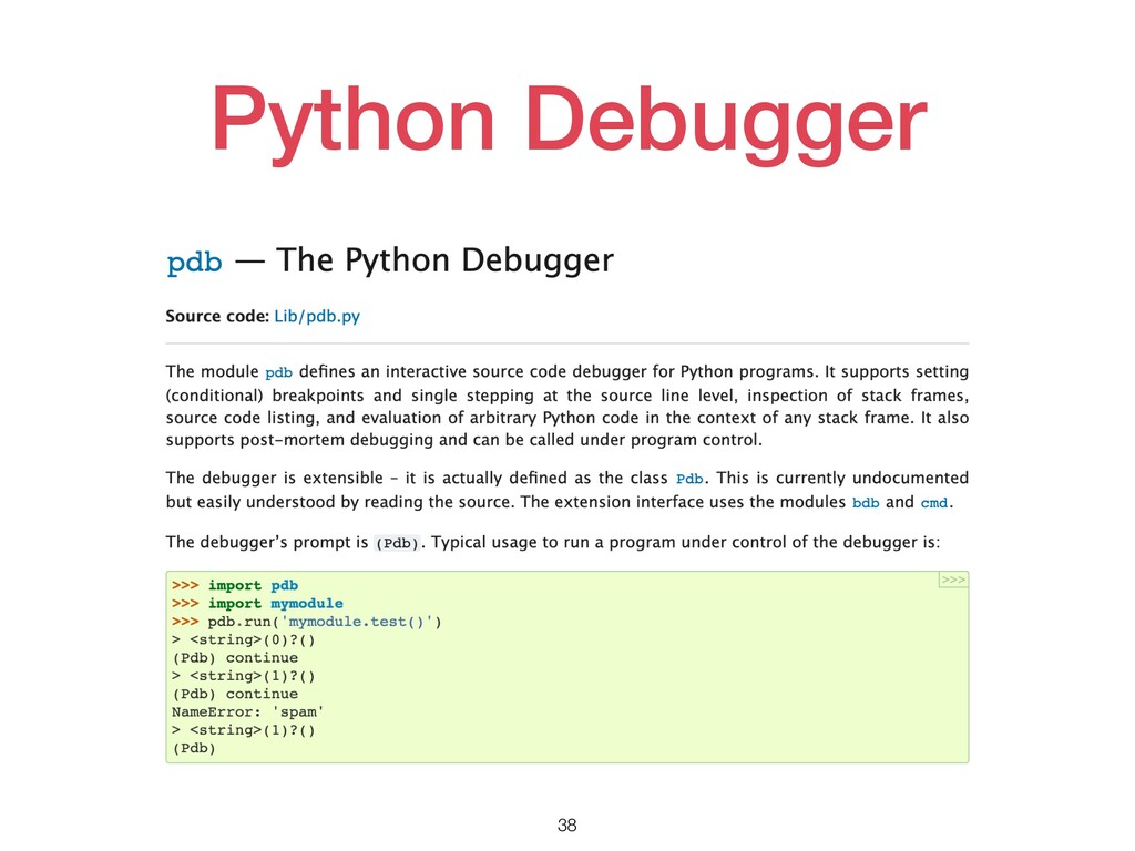
Python Debugger 38
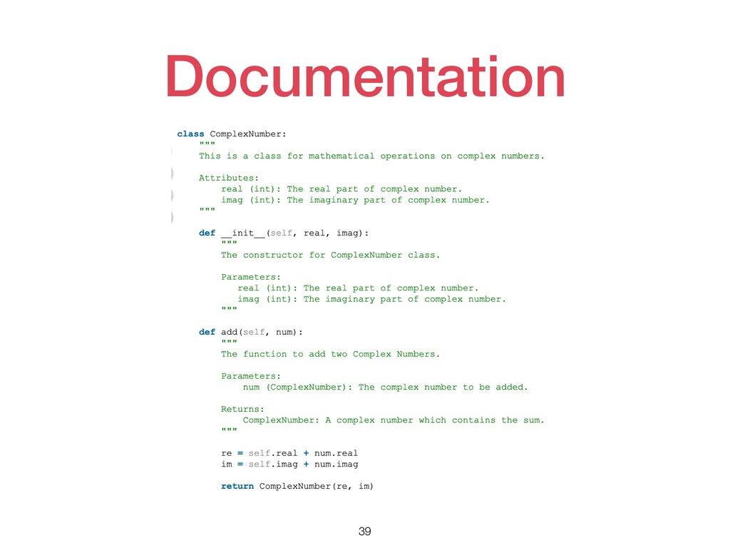
Documentation 39
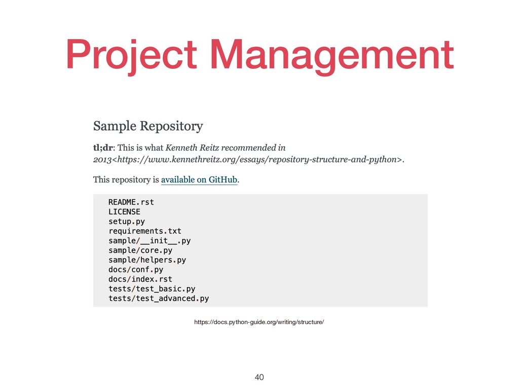
Project Management 40 https://docs.python-guide.org/writing/structure/
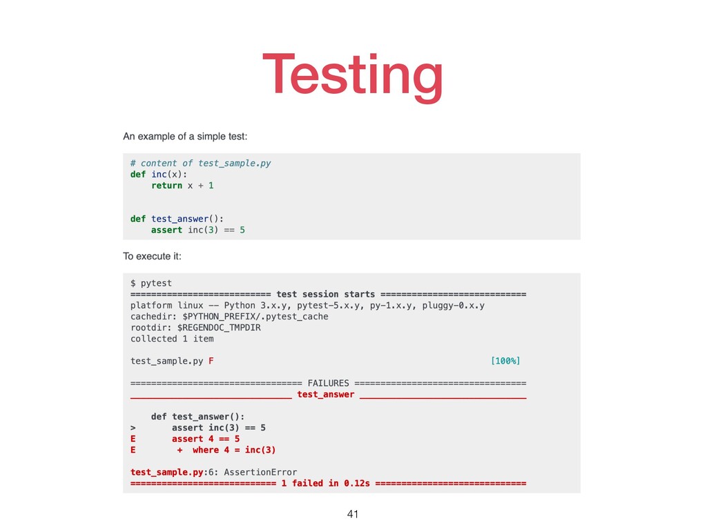
Testing 41
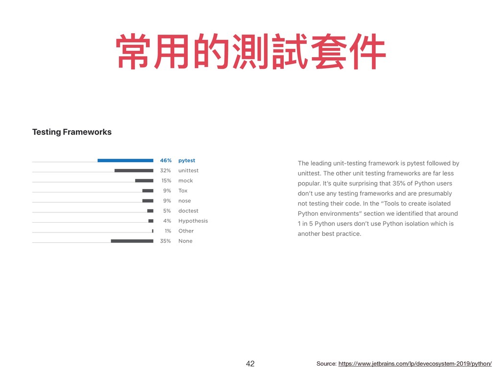
常⽤的測試套件 42 Source: https://www.jetbrains.com/lp/devecosystem-2019/python/
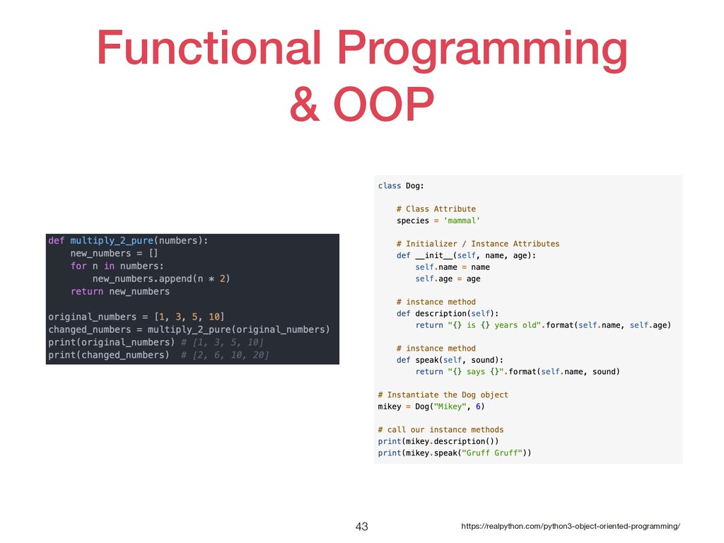
Functional Programming & OOP 43 https://realpython.com/python3-object-oriented-programming/
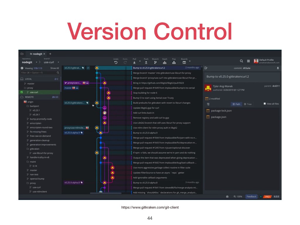
Version Control 44 https://www.gitkraken.com/git-client
Key Takeaways 45 了解要開發哪種應⽤ 選擇對應的套件 選擇喜歡的IDE Pycharm, Sublime text, Jupyter
Vscode, Atom… 程式之外但很重要的事情: PEP Documentation Testing Version Control Functional Programming OOP Project Management
That’s all in first session. 46
Data Visualization 47
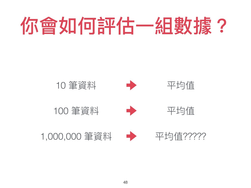
你會如何評估⼀組數據? 48 10 筆資料 100 筆資料 1,000,000 筆資料 平均值 平均值
平均值?????
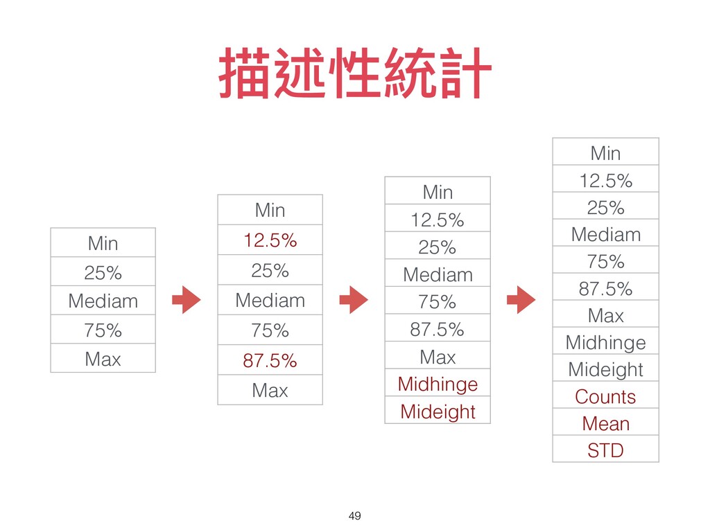
描述性統計 49 Min 25% Mediam 75% Max Min 12.5% 25%
Mediam 75% 87.5% Max Min 12.5% 25% Mediam 75% 87.5% Max Midhinge Mideight Min 12.5% 25% Mediam 75% 87.5% Max Midhinge Mideight Counts Mean STD
–我說的 透過資料視覺化, 去觀察資料的全貌。 50
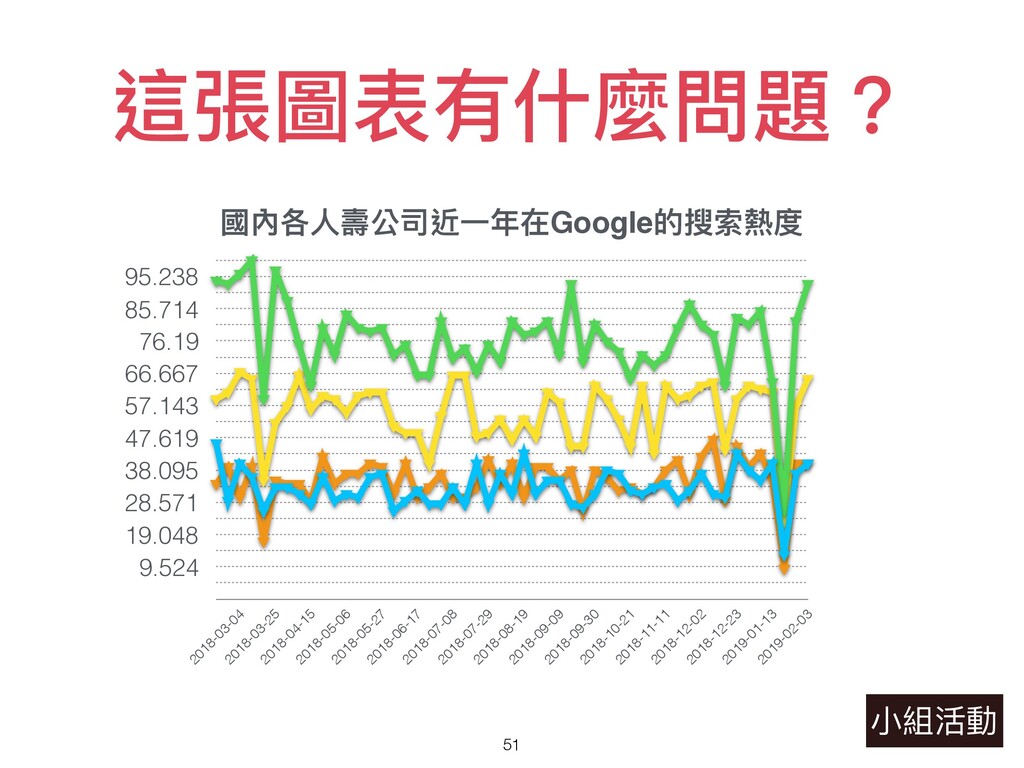
這張圖表有什麼問題? 51 ⼩組活動 國內各⼈壽公司近⼀年在Google的搜索熱度 9.524 19.048 28.571 38.095 47.619 57.143
66.667 76.19 85.714 95.238 2018-03-04 2018-03-25 2018-04-15 2018-05-06 2018-05-27 2018-06-17 2018-07-08 2018-07-29 2018-08-19 2018-09-09 2018-09-30 2018-10-21 2018-11-11 2018-12-02 2018-12-23 2019-01-13 2019-02-03
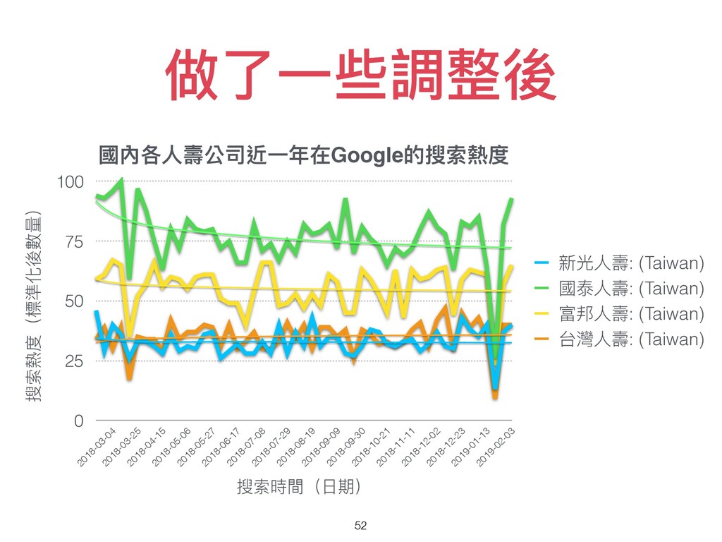
做了⼀些調整後 52 國內各⼈壽公司近⼀年在Google的搜索熱度 搜索熱度(標準化後數量) 0 25 50 75 100 搜索時間(⽇期)
2018-03-04 2018-03-25 2018-04-15 2018-05-06 2018-05-27 2018-06-17 2018-07-08 2018-07-29 2018-08-19 2018-09-09 2018-09-30 2018-10-21 2018-11-11 2018-12-02 2018-12-23 2019-01-13 2019-02-03 新光⼈壽: (Taiwan) 國泰⼈壽: (Taiwan) 富邦⼈壽: (Taiwan) 台灣⼈壽: (Taiwan)
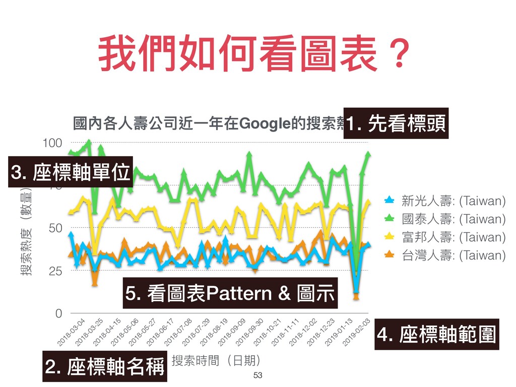
我們如何看圖表? 53 國內各⼈壽公司近⼀年在Google的搜索熱度 搜索熱度(數量) 0 25 50 75 100 搜索時間(⽇期)
2018-03-04 2018-03-25 2018-04-15 2018-05-06 2018-05-27 2018-06-17 2018-07-08 2018-07-29 2018-08-19 2018-09-09 2018-09-30 2018-10-21 2018-11-11 2018-12-02 2018-12-23 2019-01-13 2019-02-03 新光⼈壽: (Taiwan) 國泰⼈壽: (Taiwan) 富邦⼈壽: (Taiwan) 台灣⼈壽: (Taiwan) 1. 先看標頭 2. 座標軸名稱 3. 座標軸單位 4. 座標軸範圍 5. 看圖表Pattern & 圖⽰
你認識哪些圖表? 54 ⼩組活動
你認識哪些圖表? 55 https://python-graph-gallery.com
常⽤圖表介紹 56
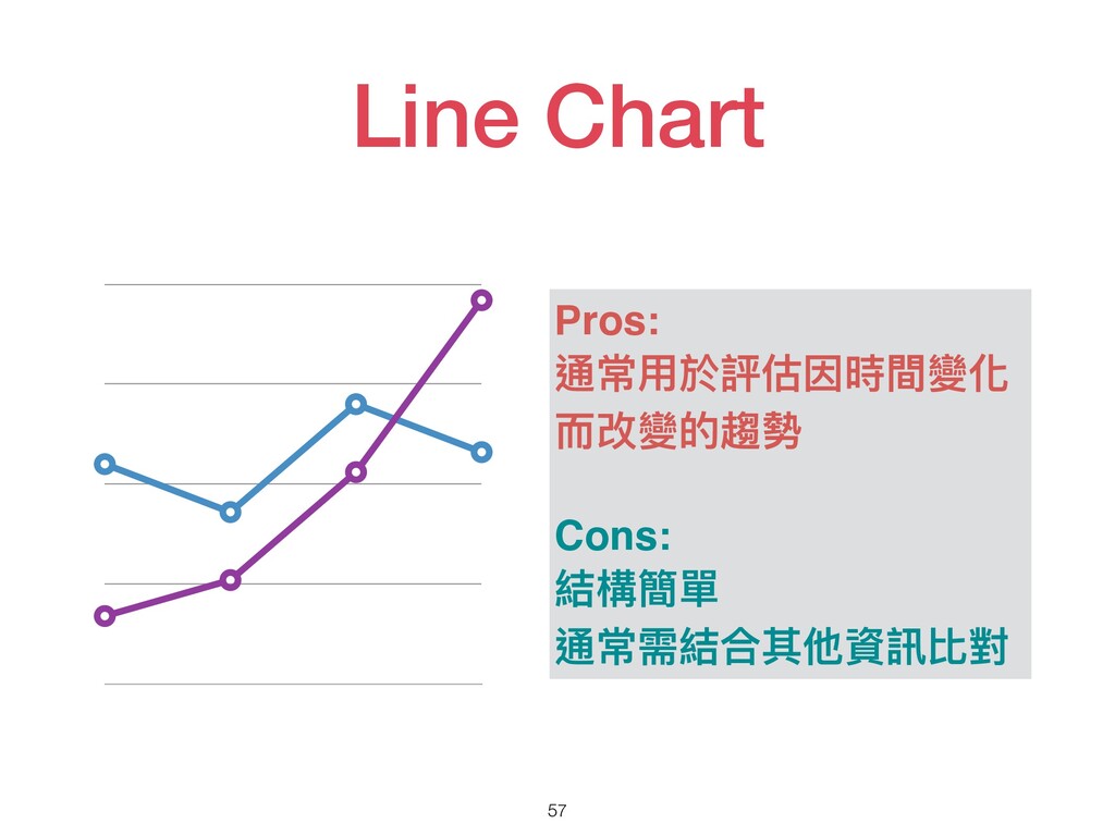
Line Chart 57 0 25 50 75 100 4 ⽉
5 ⽉ 6 ⽉ 7 ⽉ Pros: 通常⽤於評估因時間變化 ⽽改變的趨勢 Cons: 結構簡單 通常需結合其他資訊比對
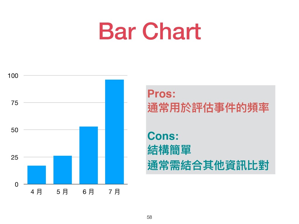
Bar Chart 58 0 25 50 75 100 4 ⽉
5 ⽉ 6 ⽉ 7 ⽉ Pros: 通常⽤於評估事件的頻率 Cons: 結構簡單 通常需結合其他資訊比對
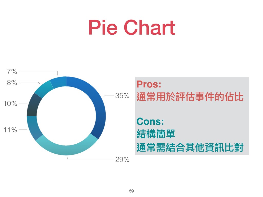
Pie Chart 59 Pros: 通常⽤於評估事件的佔比 Cons: 結構簡單 通常需結合其他資訊比對 7% 8%
10% 11% 29% 35%
Historgram 60 Pros: 通常⽤於評估事件的頻率 分佈,是統計上常⽤的圖 表之⼀ Cons: 需調整資料級距 無法看到關鍵指標的位置
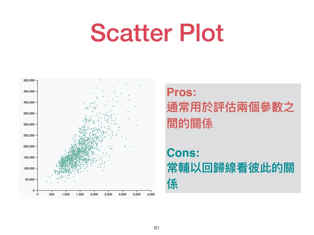
Scatter Plot 61 Pros: 通常⽤於評估兩個參數之 間的關係 Cons: 常輔以回歸線看彼此的關 係
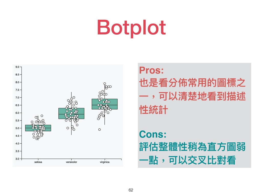
Botplot 62 Pros: 也是看分佈常⽤的圖標之 ⼀,可以清楚地看到描述 性統計 Cons: 評估整體性稍為直⽅圖弱 ⼀點,可以交叉比對看
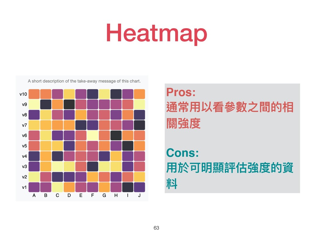
Heatmap 63 Pros: 通常⽤以看參數之間的相 關強度 Cons: ⽤於可明顯評估強度的資 料
常⽤的Python繪圖套件 64
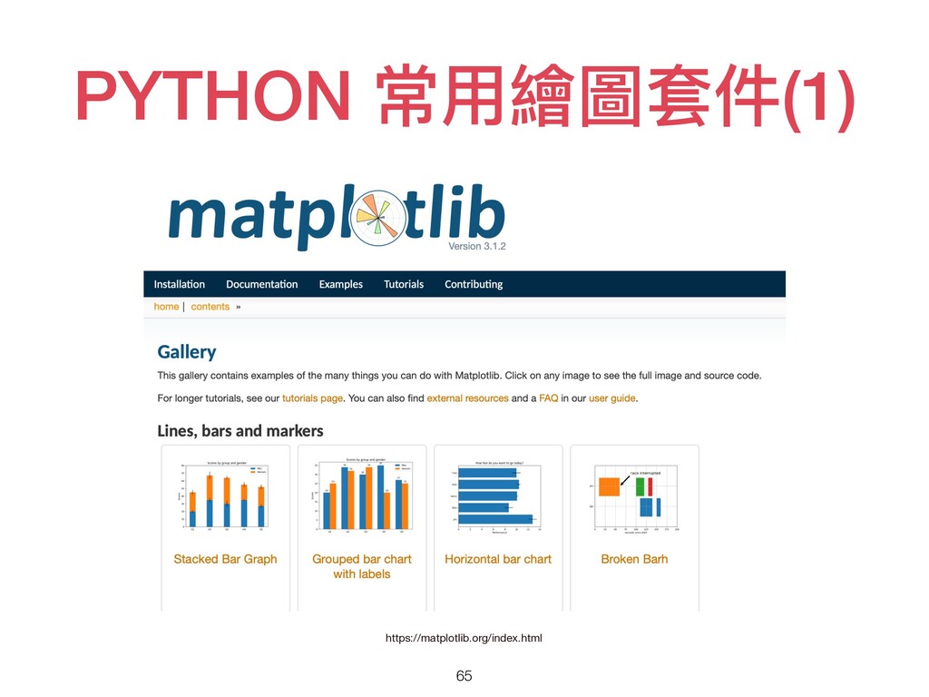
PYTHON 常⽤繪圖套件(1) 65 https://matplotlib.org/index.html
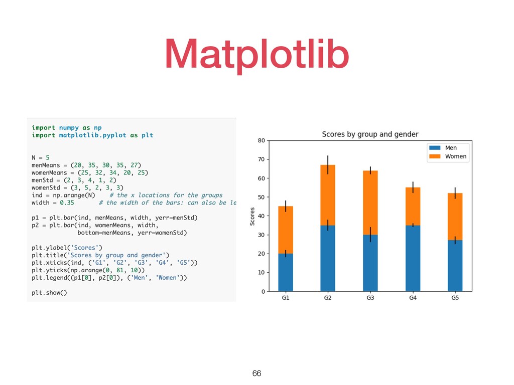
Matplotlib 66
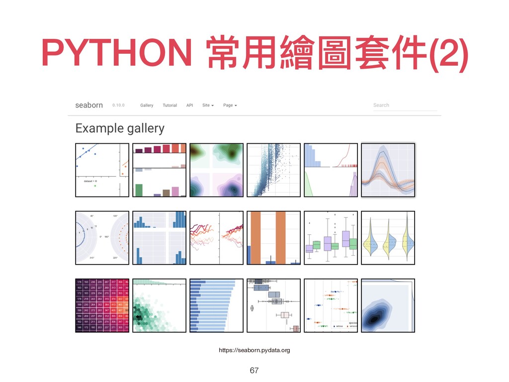
PYTHON 常⽤繪圖套件(2) 67 https://seaborn.pydata.org
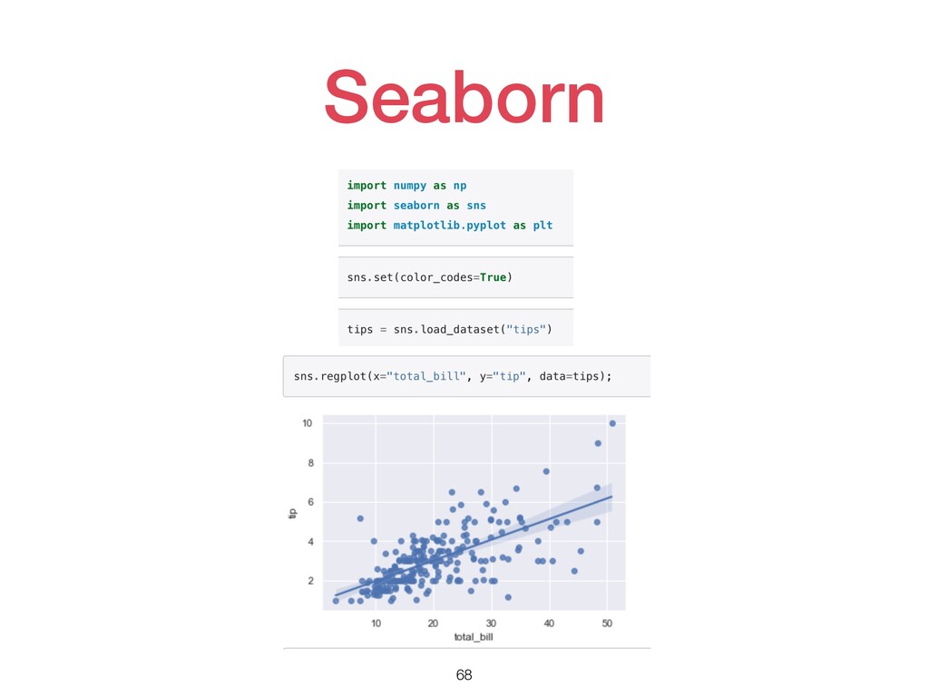
Seaborn 68
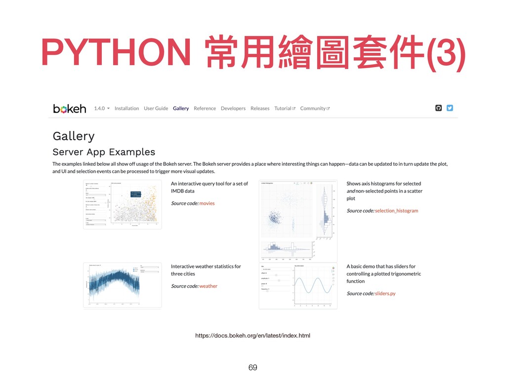
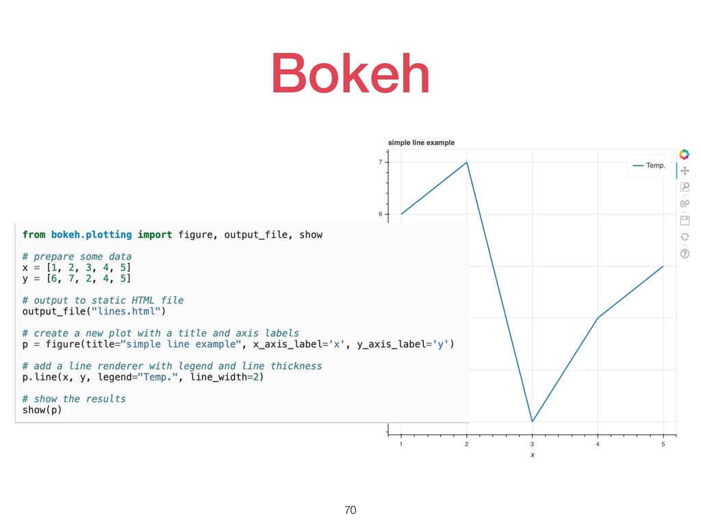
PYTHON 常⽤繪圖套件(3) 69 https://docs.bokeh.org/en/latest/index.html
Bokeh 70
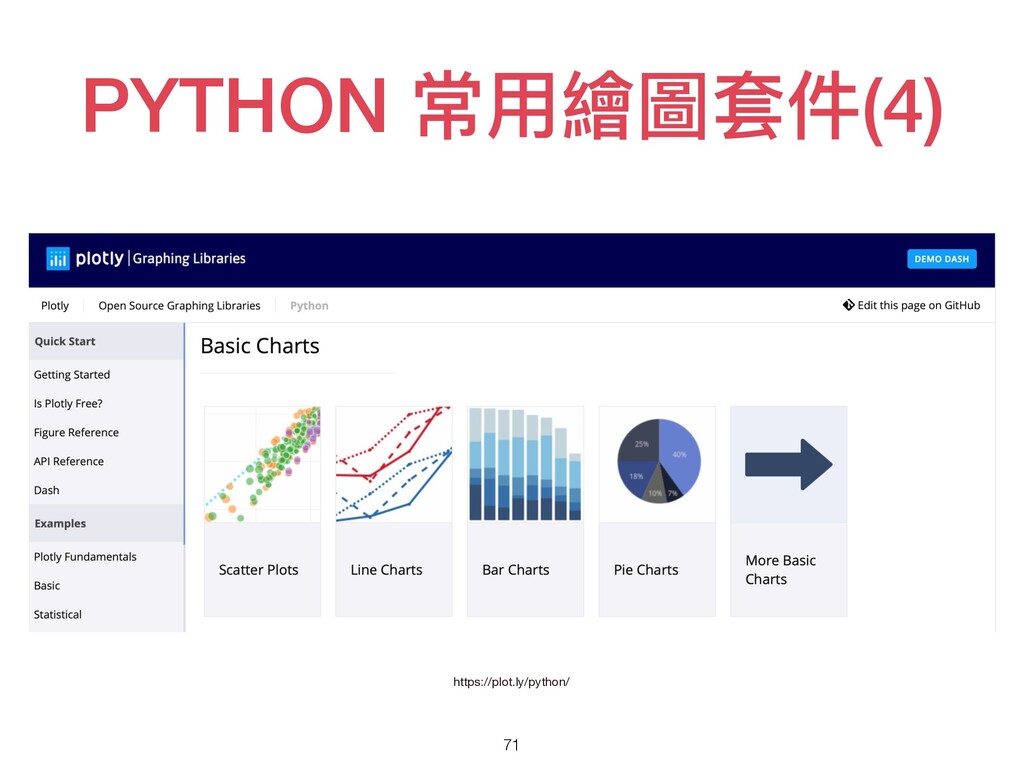
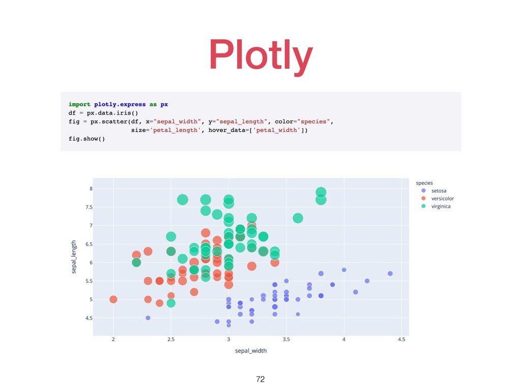
PYTHON 常⽤繪圖套件(4) 71 https://plot.ly/python/
Plotly 72
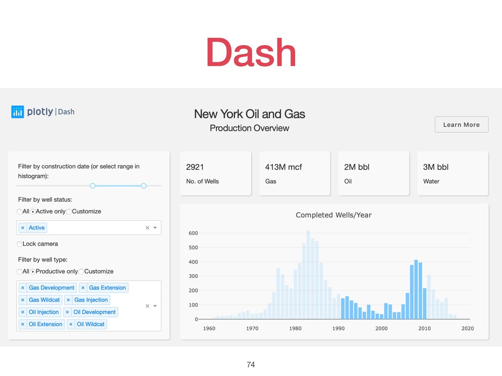
PYTHON 常⽤繪圖套件(5) 73 https://dash.plot.ly
Dash 74
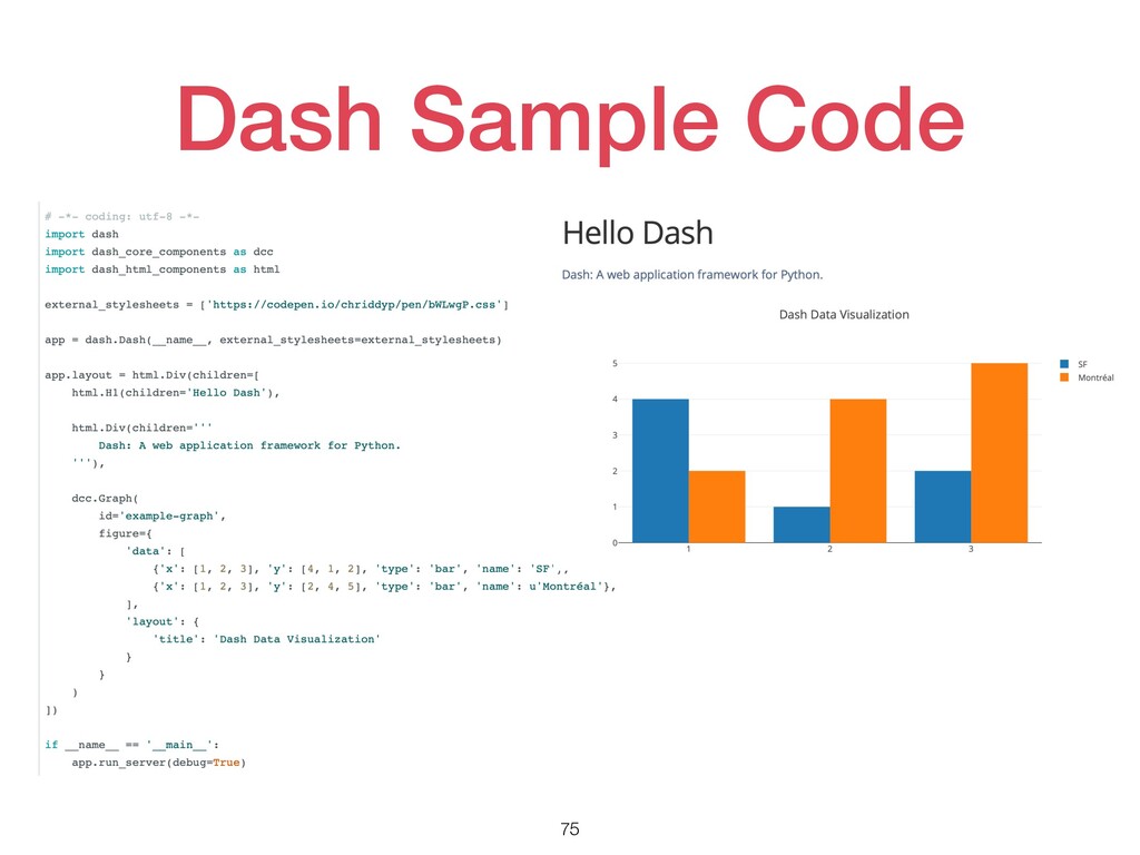
Dash Sample Code 75
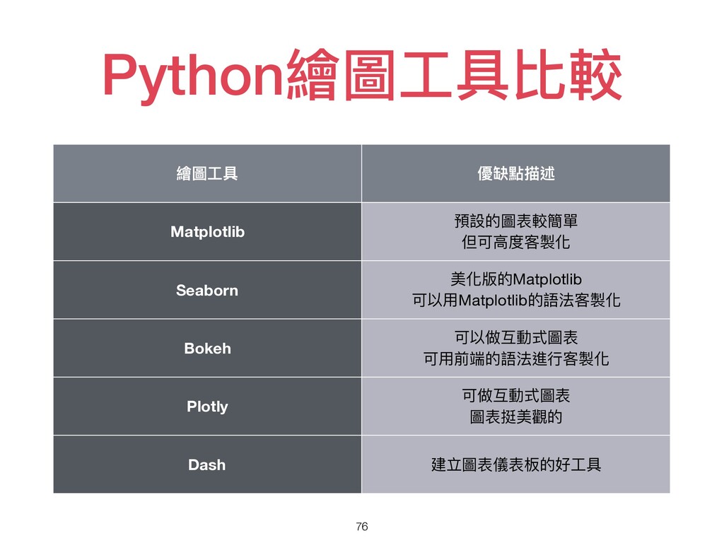
Python繪圖⼯具比較 76 繪圖⼯具 優缺點描述 Matplotlib 預設的圖表較簡單 但可⾼度客製化 Seaborn 美化版的Matplotlib 可以⽤Matplotlib的語法客製化
Bokeh 可以做互動式圖表 可⽤前端的語法進⾏客製化 Plotly 可做互動式圖表 圖表挺美觀的 Dash 建立圖表儀表板的好⼯具
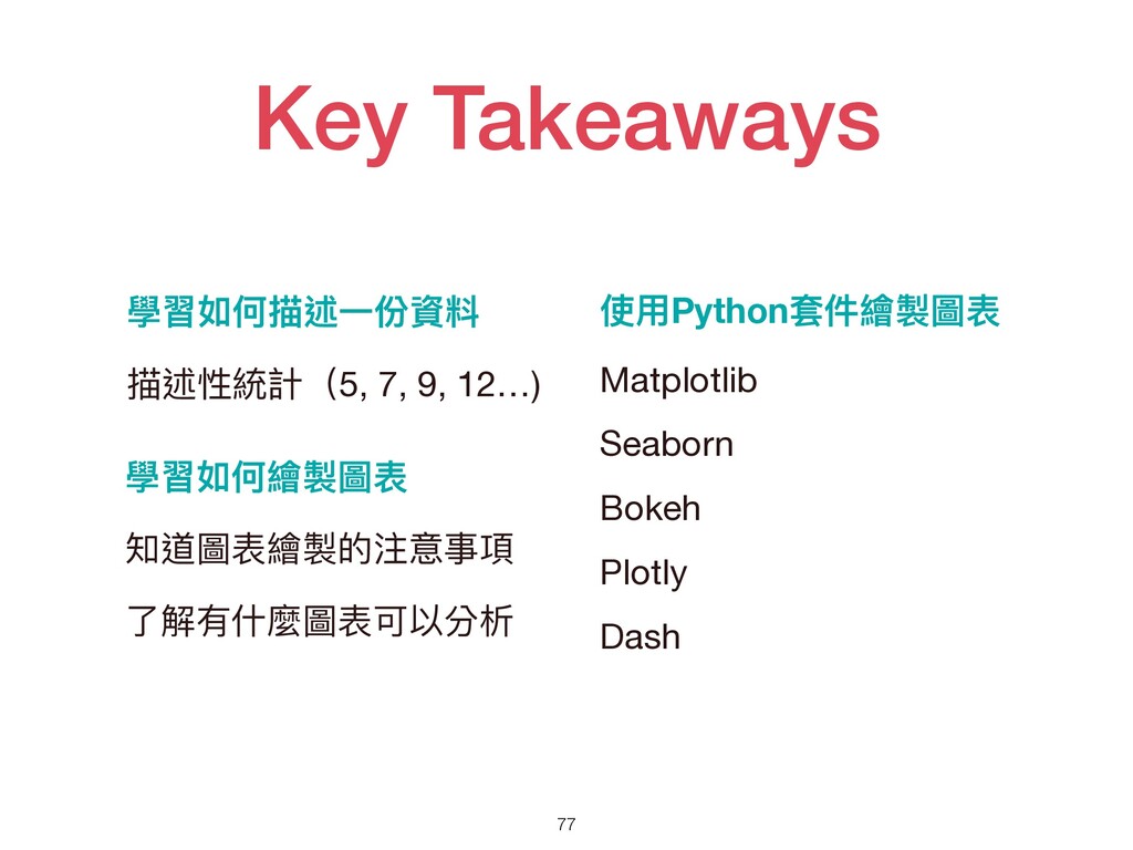
Key Takeaways 77 學習如何描述⼀份資料 描述性統計(5, 7, 9, 12…) 學習如何繪製圖表 知道圖表繪製的注意事項
了解有什麼圖表可以分析 使⽤Python套件繪製圖表 Matplotlib Seaborn Bokeh Plotly Dash
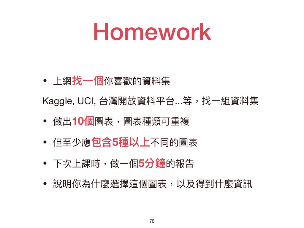
Homework 78 • 上網找⼀個你喜歡的資料集 Kaggle, UCI, 台灣開放資料平台...等,找⼀組資料集 • 做出10個圖表,圖表種類可重複 •
但⾄少應包含5種以上不同的圖表 • 下次上課時,做⼀個5分鐘的報告 • 說明你為什麼選擇這個圖表,以及得到什麼資訊