$30 off During Our Annual Pro Sale. View Details »

Bootstrapping Simple Server Driven UI from a Design System

Bootstrapping Simple Server Driven UI from a Design System

Talk given at Droidcon New York on September 15th, 2023, about how to leverage a design system to build server driven UI.

Ahmed El-Helw

September 29, 2023
Tweet

More Decks by Ahmed El-Helw

Other Decks in Programming

Transcript

  1. Bootstrapping Simple Server Driven UI
    from a Design System
    Abdulahi Osoble
    Ahmed El-Helw

    View Slide

  2. Problems
    • Iteration speed is critical for business success
    • Mobile releases take time for adoption
    • Consistency on iOS and Android

    View Slide

  3. Today
    Mobile fetch data from APIs and bind them to UIs
    on the client side.

    View Slide

  4. What If
    Our features come from an endpoint?

    View Slide

  5. Server Driven UI
    Mobile fetches UI representation from APIs

    View Slide

  6. View Slide

  7. Building SDUI

    View Slide

  8. Building from Scratch
    • Need some UI components
    • Need a serializable data representation

    View Slide

  9. {
    "type": "label",
    "text": "Hello, World!"
    }

    View Slide

  10. data class LabelData(val text: String)
    @Composable
    fun Label(data: LabelData) {
    Text(data.text)
    }

    View Slide

  11. data class LabelData(val text: String)
    @Composable
    fun Label(data: LabelData) {
    Text(data.text)
    }

    View Slide

  12. Let's add Max Lines

    View Slide

  13. {
    "type": "label",
    "text": "Hello, World! This is not very long
    ...
    ",
    "maxLines": 2
    }

    View Slide

  14. data class LabelData(val text: String, val maxLines: Int)
    @Composable
    fun Label(data: LabelData) {
    Text(text = data.text, maxLines = data.maxLines)
    }

    View Slide

  15. Let's Add Typography?

    View Slide

  16. This is a lot of Work
    • We’d have to expose:
    • Text size
    • Colors
    • Typefaces
    • Font weights
    • This also starts to tie us to the underlying platform

    View Slide

  17. Can we make the problem smaller?

    View Slide

  18. Design System
    Already Solves this for Us

    View Slide

  19. Design System
    • Opinionated
    • Limits the landscape of what is possible
    • Lets us use larger building blocks
    • Allows us to save time

    View Slide

  20. Android
    • Views
    • Compose
    iOS
    • UIKit
    • SwiftUI

    View Slide

  21. Design System
    • Components
    • Foundations (types and tokens)

    View Slide

  22. Components
    • May not be easy to serialize / deserialize directly
    • Need a data representation

    View Slide

  23. Types and Tokens
    • Styles, Color Tokens, etc
    • Easy to serialize / deserialize

    View Slide

  24. Demo

    View Slide

  25. Server Driven UI
    • Same payload should render on iOS and Android

    View Slide

  26. Build a Serialization Layer

    View Slide

  27. Step 1 - Decide data representation
    of our widgets
    Step 2 - Render that data
    representation

    View Slide

  28. data class LabelData(val text: String, val maxLines: Int)
    @Composable
    fun Label(data: LabelData) {
    Text(text = data.text, maxLines = data.maxLines)
    }

    View Slide

  29. View Slide

  30. interface Component
    data class LabelData(
    val text: String,
    val maxLines: Int
    ): Component

    View Slide

  31. interface Component
    data class LabelData(
    val text: String,
    val maxLines: Int
    ): Component

    View Slide

  32. How do we Render?
    @Composable
    fun render(component: Component) {
    when (component) {
    is LabelData
    -
    >
    Label(component)
    is ButtonData
    ->
    Button(component)
    // ..
    .
    }
    }

    View Slide

  33. How do we Render?
    @Composable
    fun render(component: Component) {
    when (component) {
    is LabelData
    ->
    Label(component)
    is ButtonData
    ->
    Button(component)
    // ...
    }
    }

    View Slide

  34. Can we Simplify?
    interface Component {
    @Composable fun Content(modifier: Modifier)
    }

    View Slide

  35. class LabelData(
    private val text: String,
    private val maxLines: Int
    ) : Component {
    @Composable
    override
    fun Content(modifier: Modifier) {
    Label(text = text, maxLines = maxLines)
    }
    }

    View Slide

  36. class LabelData(
    private val text: String,
    private val maxLines: Int
    ) : Component {
    @Composable
    override
    fun Content(modifier: Modifier) {
    Label(text = text, maxLines = maxLines)
    }
    }

    View Slide

  37. @Composable
    fun Sample(component: Component, modifier: Modifier) {
    component.Content(modifier)
    }

    View Slide

  38. Tradeoffs

    View Slide

  39. Share with iOS or Not?

    View Slide

  40. iOS 16
    class WidgetData: ObservableObject {
    @Published var count = 0
    }
    struct Widget: View {
    @ObservedObject var data: WidgetData
    var body: some View { /* ... */ }
    }

    View Slide

  41. iOS 17 - Observation Framework
    @Observable
    class WidgetData { var count = 0 }
    struct Widget: View {
    var data: WidgetData
    var body: some View { /* ... */ }
    }

    View Slide

  42. Other Options
    • Share models with KMP with a Swift wrapper
    • codegen Kotlin and Swift models

    View Slide

  43. import SwiftUI
    struct
    {{
    widget.name
    }}
    {
    {% for key, value in widget.fields %}
    let
    {{
    key
    }}
    :
    {{
    value
    }}
    {% endfor %}
    }

    View Slide

  44. data class
    {{
    widget.name
    }}
    (
    {% for key, value in widget.fields %}
    val
    {{
    key
    }}
    :
    {{
    value
    }}
    ,
    {% endfor %}
    )

    View Slide

  45. Other Options
    • Share models with KMP with a Swift wrapper
    • codegen Kotlin and Swift models
    • Expect/action chicanery

    View Slide

  46. expect interface Renderer

    View Slide

  47. actual interface Renderer {
    @Composable fun Content(modifier: Modifier)
    }

    View Slide

  48. actual interface Renderer

    View Slide

  49. interface Component {
    fun renderer(): Renderer
    }

    View Slide

  50. Public API

    View Slide

  51. interface Component {
    @Composable
    fun Content(modifier: Modifier)
    }

    View Slide

  52. data class ServerDrivenUiResponse(
    val root: Component
    )

    View Slide

  53. @Composable
    fun ServerDrivenUi(
    response: ServerDrivenUiResponse,
    modifier: Modifier
    ) {
    response.root.Content(modifier)
    }

    View Slide

  54. {
    "root": {
    "type": "list",
    "contents": [
    ]
    }
    }
    Example of List

    View Slide

  55. class ListComponent(
    private val contents: List
    ) : Component {
    @Composable
    override fun Content(modifier: Modifier) {
    LazyColumn(modifier = modifier) {
    contents.forEach {
    item {
    it.Content(modifier)
    }
    }
    }
    }
    }

    View Slide

  56. class ListComponent(
    private val contents: List
    ) : Component {
    @Composable
    override fun Content(modifier: Modifier) {
    LazyColumn(modifier = modifier) {
    contents.forEach {
    item {
    it.Content(modifier)
    }
    }
    }
    }
    }

    View Slide

  57. How Do We Use This?

    View Slide

  58. @Composable
    public fun Sample(
    response: ServerDrivenUiResponse,
    modifier: Modifier = Modifier
    ) {
    SampleTheme {
    Surface(modifier = modifier) {
    ServerDrivenUi(
    response,
    Modifier.padding(all = 8.dp)
    )
    }
    }
    }

    View Slide

  59. What about events?

    View Slide

  60. Actions

    View Slide

  61. • Based on user interaction
    • Broken down in sections
    • Must have common super-type

    View Slide

  62. interface Action
    sealed class OnClick: Action {
    class Deeplink(val link: String): OnClick()
    }

    View Slide

  63. interface Action
    sealed class OnClick: Action {
    class Deeplink(val link: String): OnClick()
    }

    View Slide

  64. {
    "actions": [
    {
    "type": "onClick_deeplink",
    "link": “careem:
    //
    link“
    }
    ]
    }

    View Slide

  65. {
    "actions": [
    {
    "type": "onClick_deeplink",
    "link": “careem:
    //
    link“
    }
    ]
    }

    View Slide

  66. How do we handle Actions?

    View Slide

  67. //
    Public API
    interface ActionHandler {
    suspend fun onClick(action: OnClick) {}
    }
    val LocalServerDrivenUiActionHandler =
    staticCompositionLocalOf
    { error("nothing provided") }

    View Slide

  68. class LabelData(
    private val text: String,
    private val maxLines: Int,
    private val actions: List = emptyList()
    ) : Component {
    @Composable
    override
    fun Content(modifier: Modifier) {
    Label(
    text = text,
    maxLines = maxLines,
    modifier = modifier.handleAction(actions)
    )
    }

    View Slide

  69. //
    Internal API
    internal fun Modifier.handleActions(actions:
    List): Modifier = composed {
    val handler =
    LocalServerDrivenUiActionHandler.current
    val scope = rememberCoroutineScope()
    var localModifier = this
    actions.forEach { action
    ->
    localModifier = when (action) {
    is OnClick
    ->
    localModifier.clickable {
    scope.launch
    { handler.onClick(action) }
    }
    }

    View Slide

  70. //
    Internal API
    internal fun Modifier.handleActions(actions:
    List): Modifier = composed {
    val handler =
    LocalServerDrivenUiActionHandler.current
    val scope = rememberCoroutineScope()
    var localModifier = this
    actions.forEach { action
    ->
    localModifier = when (action) {
    is OnClick
    ->
    localModifier.clickable {
    scope.launch
    { handler.onClick(action) }
    }
    }

    View Slide

  71. //
    Internal API
    internal fun Modifier.handleActions(actions:
    List): Modifier = composed {
    val handler =
    LocalServerDrivenUiActionHandler.current
    val scope = rememberCoroutineScope()
    var localModifier = this
    actions.forEach { action
    ->
    localModifier = when (action) {
    is OnClick
    ->
    localModifier.clickable {
    scope.launch
    { handler.onClick(action) }
    }
    }

    View Slide

  72. //
    Public API
    val actionHandler = object :
    ActionHandler {
    override suspend fun
    onClick(action: OnClick) {
    when (action) {
    is OnClick.Deeplink
    ->
    {
    //
    ....
    }
    }
    }
    }

    View Slide

  73. //
    Public API
    val actionHandler = object :
    ActionHandler {
    override suspend fun
    onClick(action: OnClick) {
    when (action) {
    is OnClick.Deeplink
    ->
    {
    //
    ....
    }
    }
    }
    }

    View Slide

  74. //
    Public API
    CompositionLocalProvider(
    LocalServerDrivenUiActionHandler provides actionHandler
    ) {
    . ..
    }

    View Slide

  75. Recap
    • Design system simplifies our scope and empowers
    SDUI
    • Actions are powerful and optional on all
    components
    • Components are serialized from payload and self
    render

    View Slide

  76. How about custom components?

    View Slide

  77. View Slide

  78. Extensibility

    View Slide

  79. Open Deserialization

    View Slide

  80. private val componentModule = SerializersModule {
    polymorphic(Component
    ::
    class) {
    subclass(ListComponent
    ::
    class)
    subclass(ListItemComponent
    ::
    class)
    subclass(LabelComponent
    ::
    class)
    // ...
    }
    }
    private val json = Json {
    serializersModule = componentModule
    }

    View Slide

  81. Open Deserialization
    • Pros:
    • Easy to add new components
    • Use SDUI without depending on design system

    View Slide

  82. Open Deserialization
    • Cons:
    • Easy to bypass design system
    • Duplication of widgets over time
    • Lose the ability to change without releasing a
    new version of the App

    View Slide

  83. Open up Primitives

    View Slide

  84. Open up Primitives
    • Rows
    • Columns
    • Modifiers

    View Slide

  85. {
    "type": "row",
    "contents": [
    {
    "type": "column",
    "contents": [],
    "modifiers": []
    },
    {
    "type": "progressStatus",
    "amount": 3,
    "total": 10
    }
    ],
    "modifiers": []

    View Slide

  86. {
    "type": "row",
    "contents": [
    {
    "type": "column",
    "contents": [],
    "modifiers": []
    },
    {
    "type": "progressStatus",
    "amount": 3,
    "total": 10
    }
    ],
    "modifiers": []

    View Slide

  87. {
    "type": "row",
    "contents": [
    {
    "type": "column",
    "contents": [],
    "modifiers": []
    },
    {
    "type": "progressStatus",
    "amount": 3,
    "total": 10
    }
    ],
    "modifiers": []

    View Slide

  88. Open up Primitives
    • Pros:
    • Can only build on top of existing components
    • Can share these on the backend
    • Can update these without a new app update

    View Slide

  89. Open up Primitives
    • Cons:
    • More difficult to add components
    • May need to add more low level components

    View Slide

  90. Demo

    View Slide

  91. Tooling

    View Slide

  92. Other Ideas
    • Web is useful for previewing SDUI from a CMS
    • Drag and drop tool or other generator
    • ChatGPT

    View Slide

  93. To help shipping speeds really fly,
    We started using server 
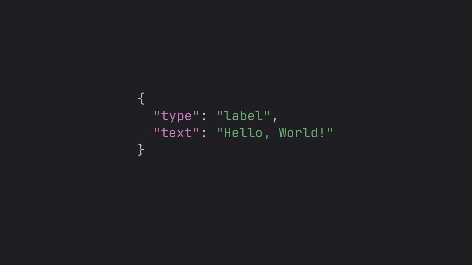
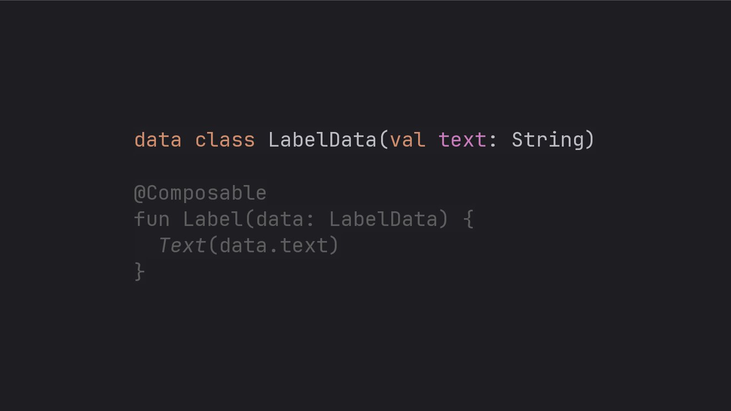
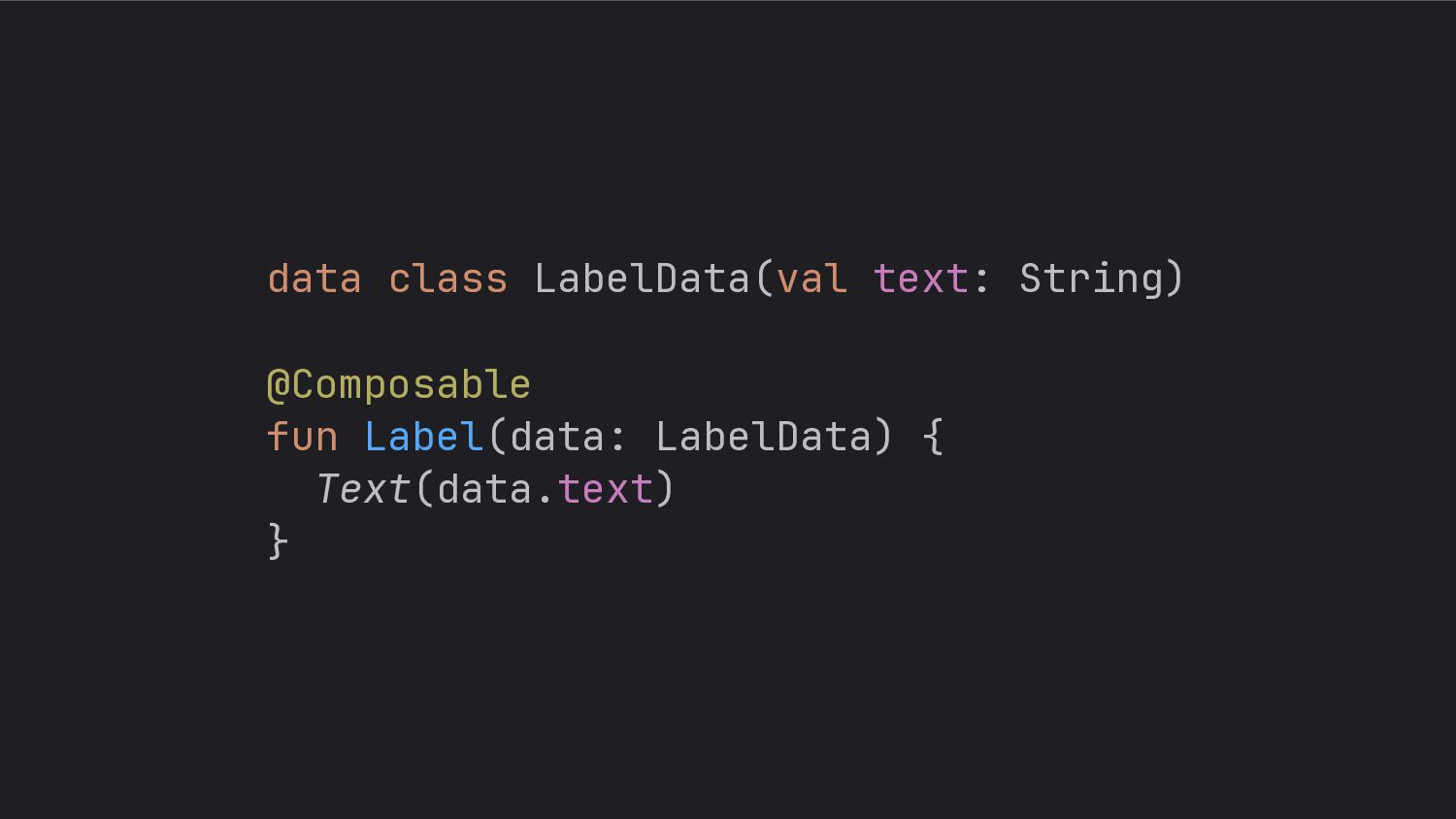
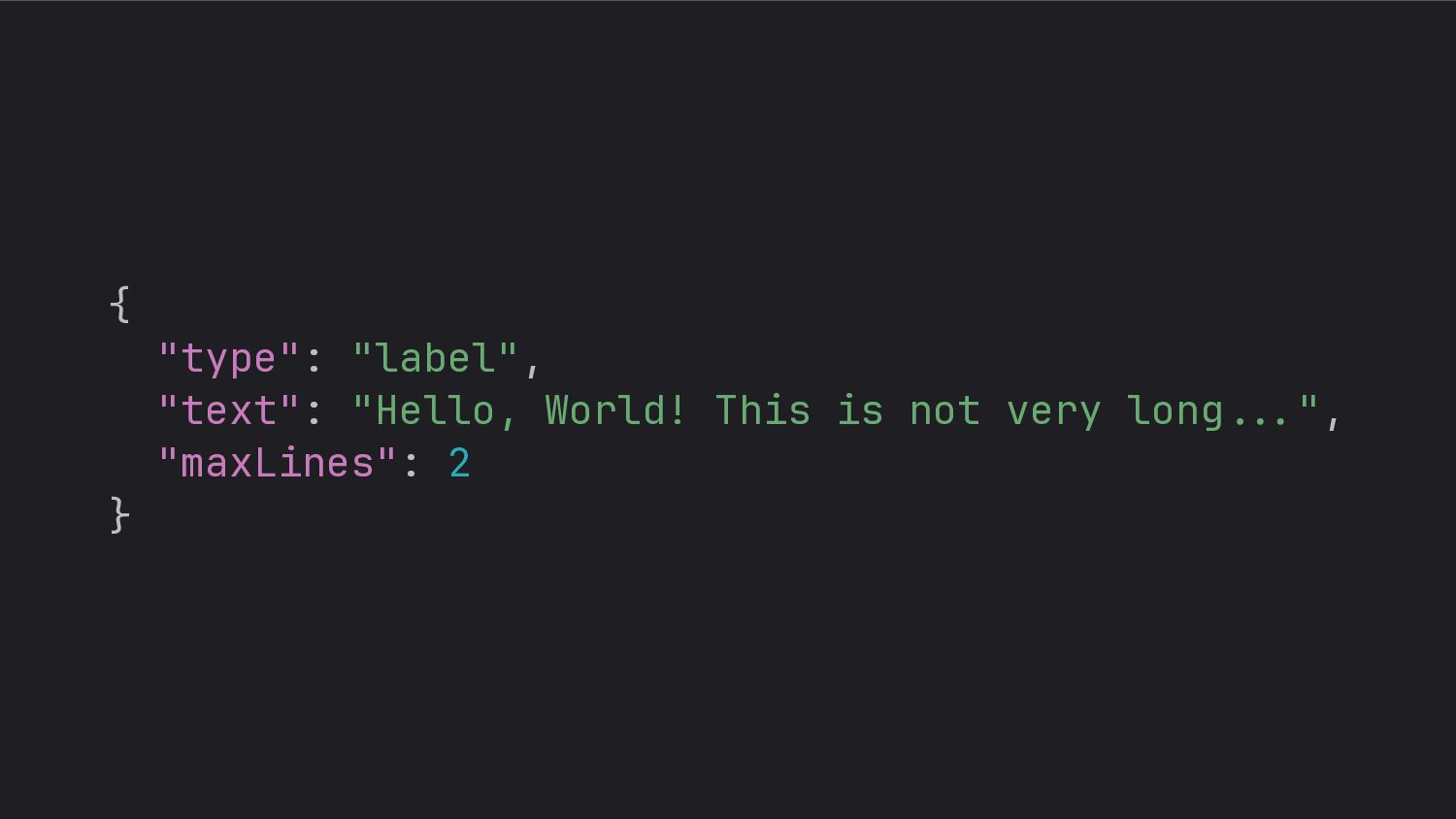
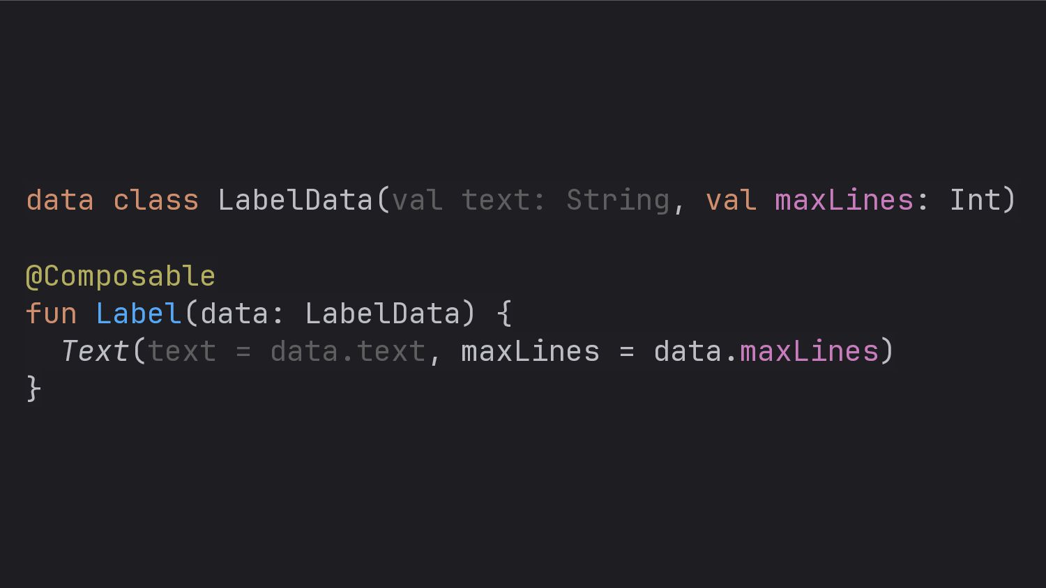
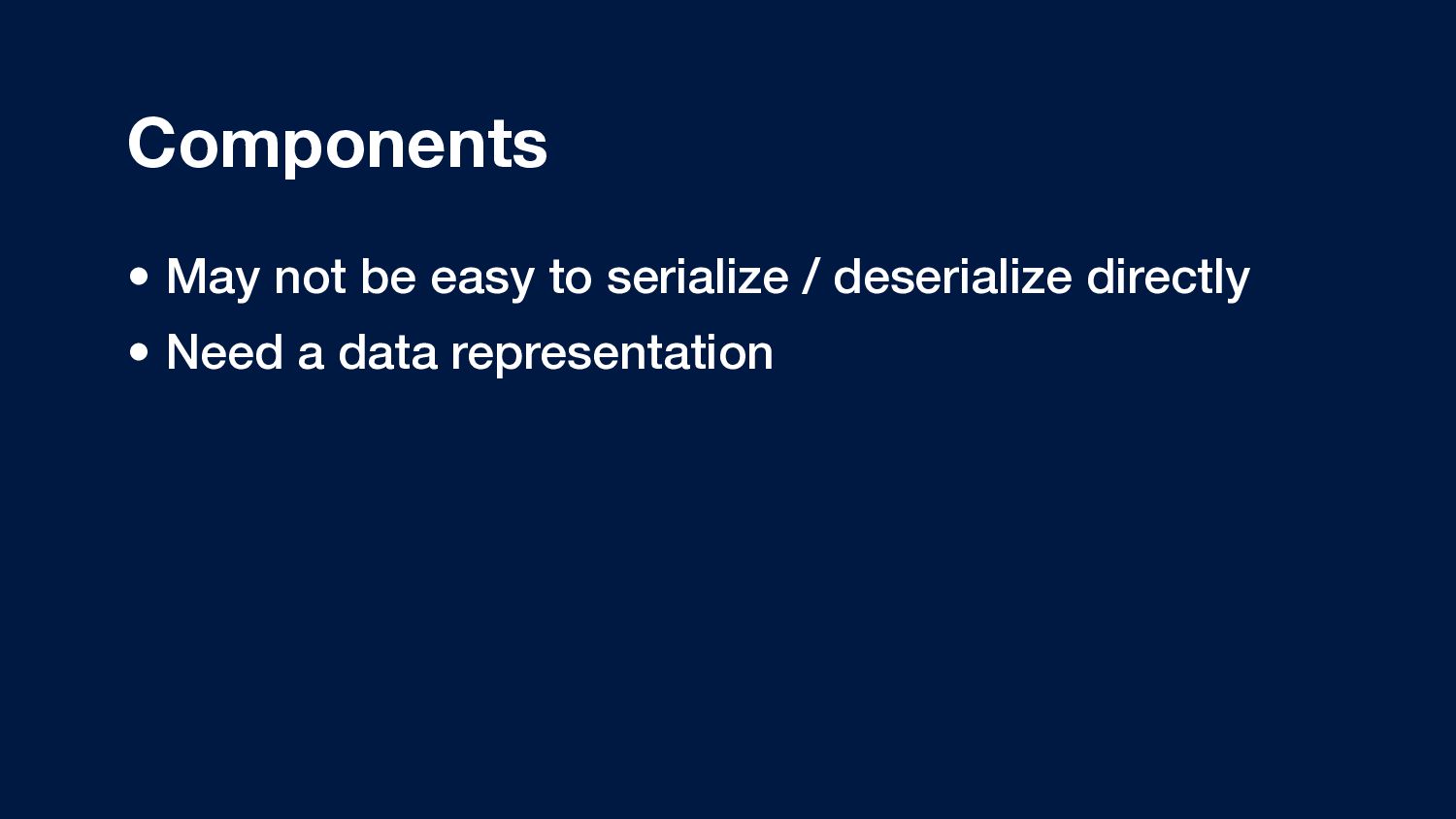
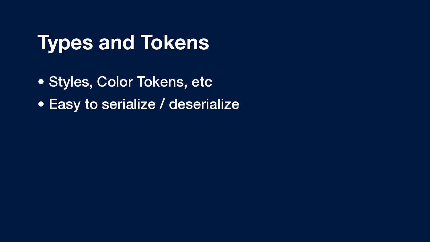
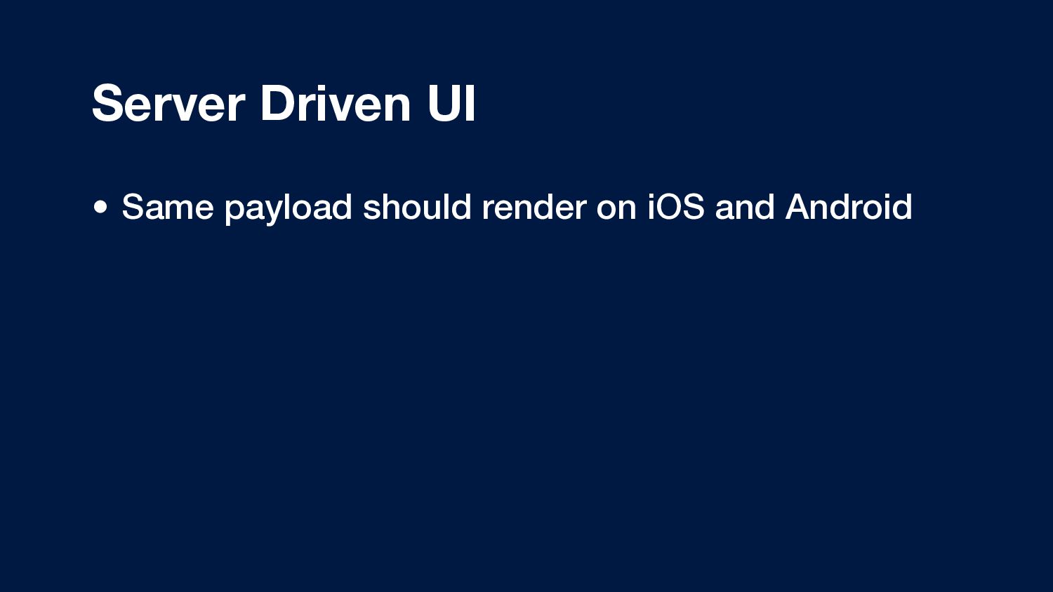
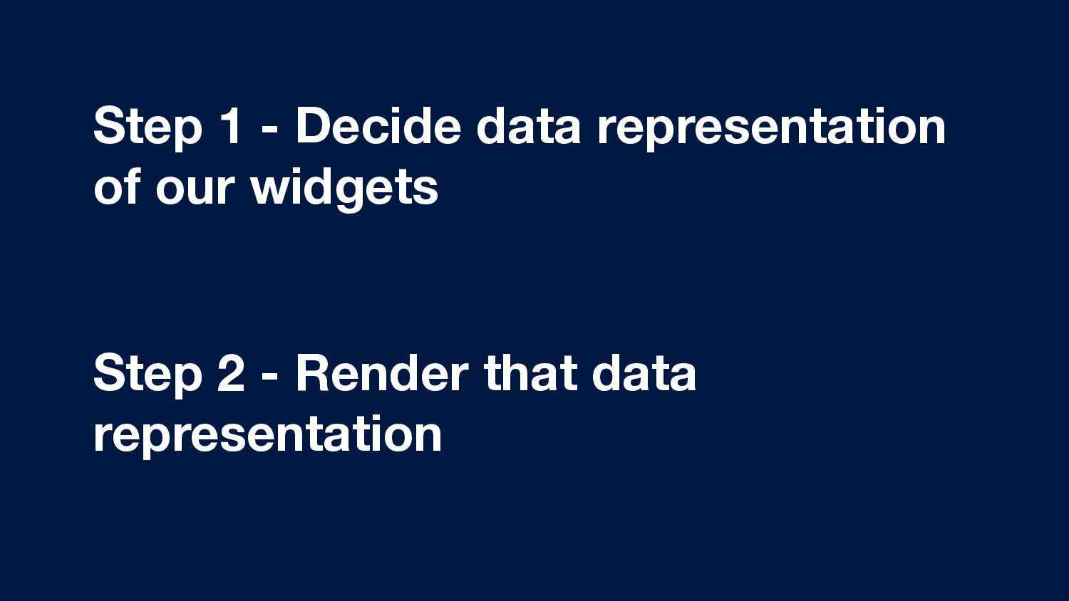
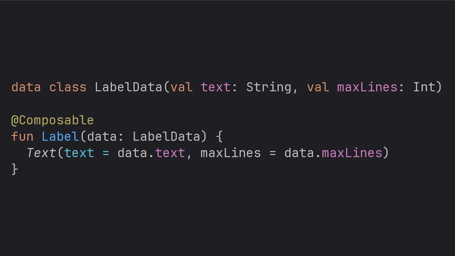
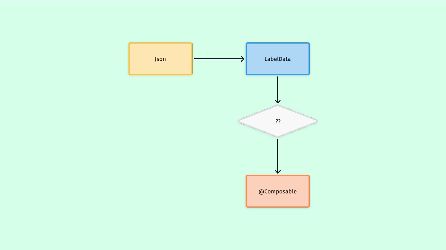
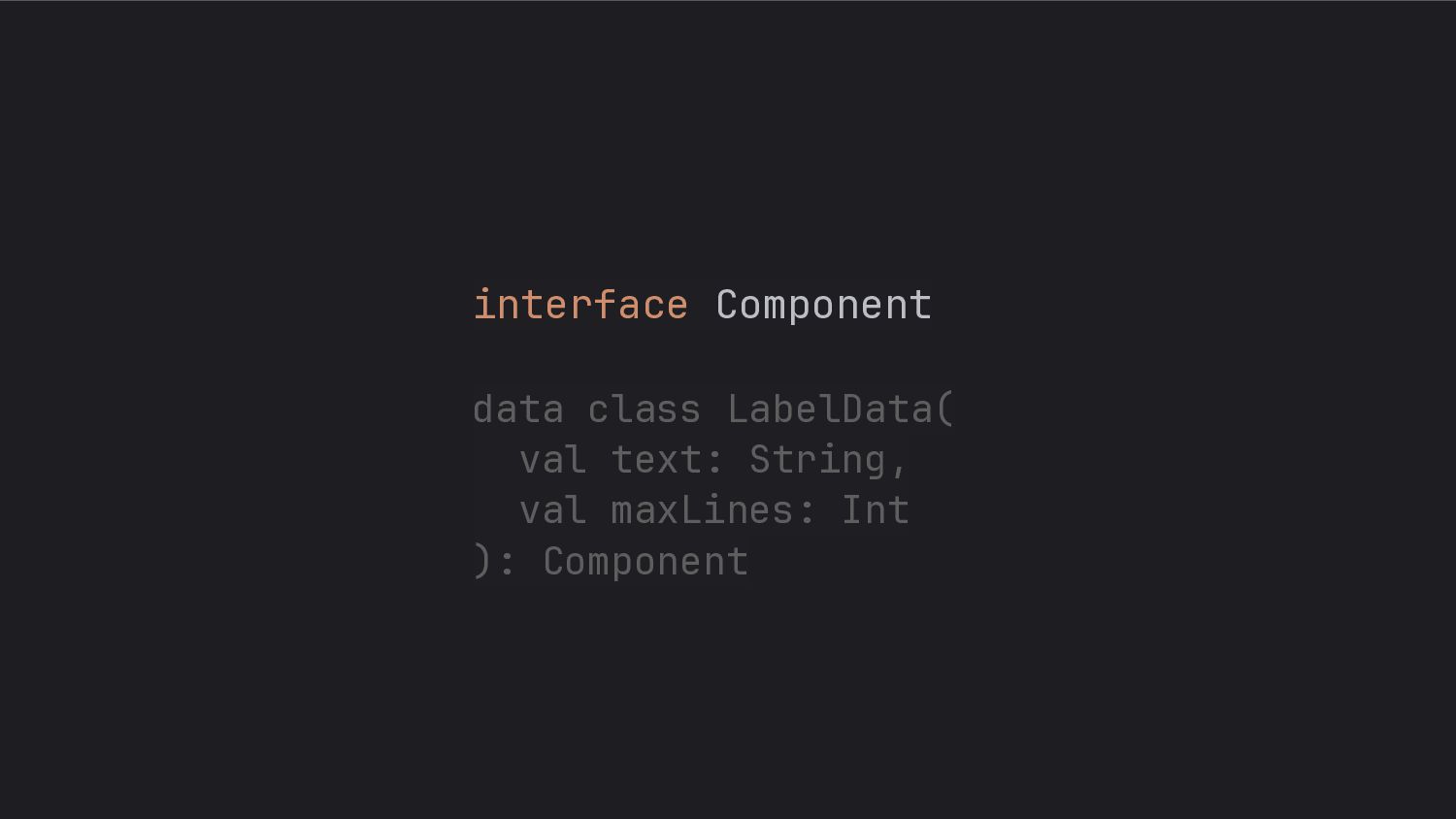
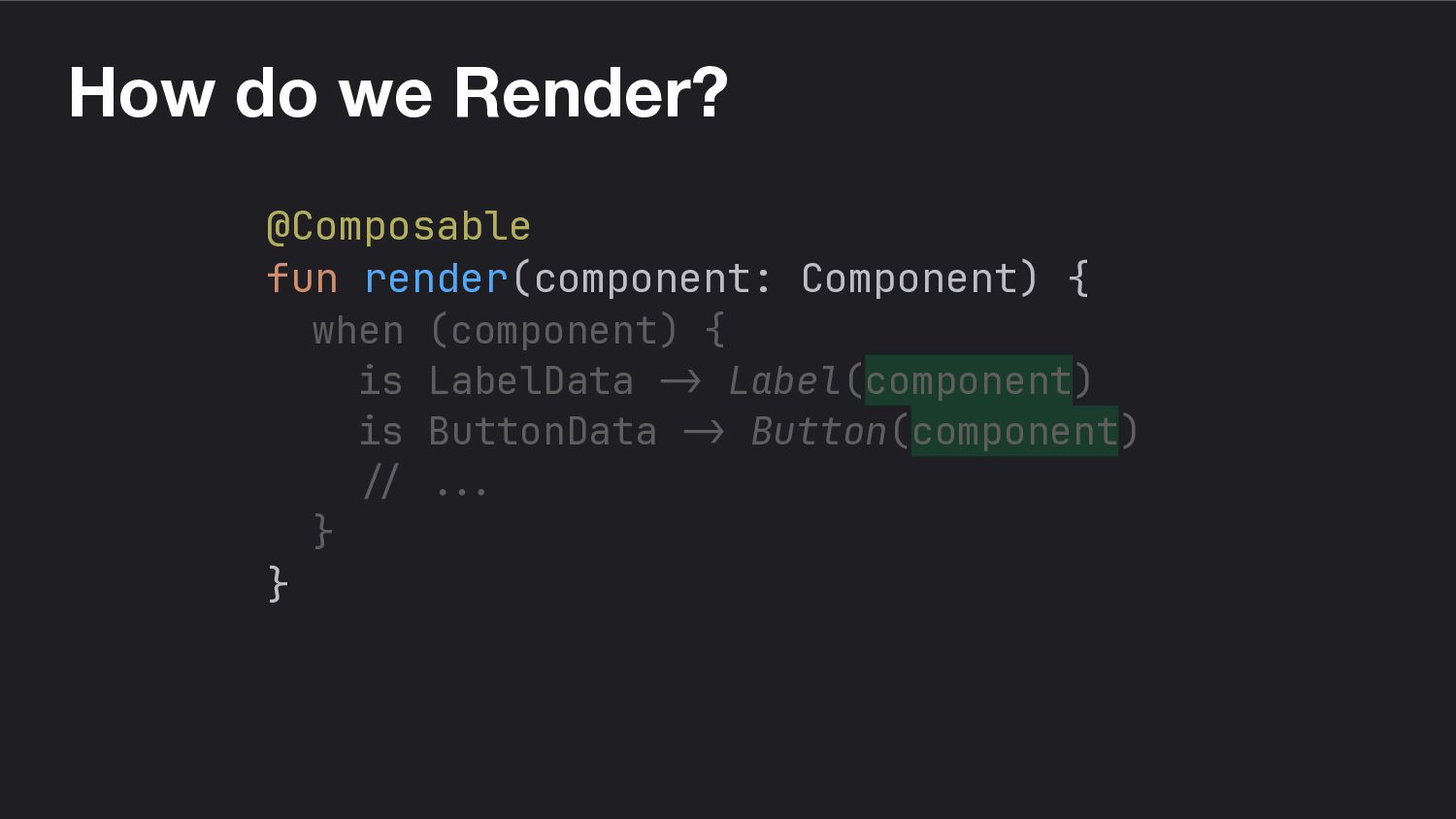
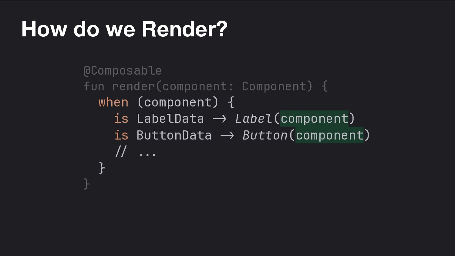
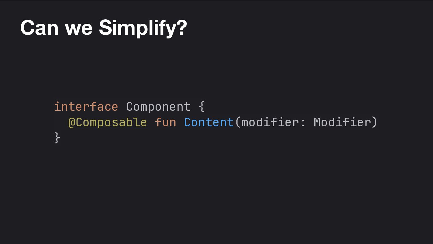
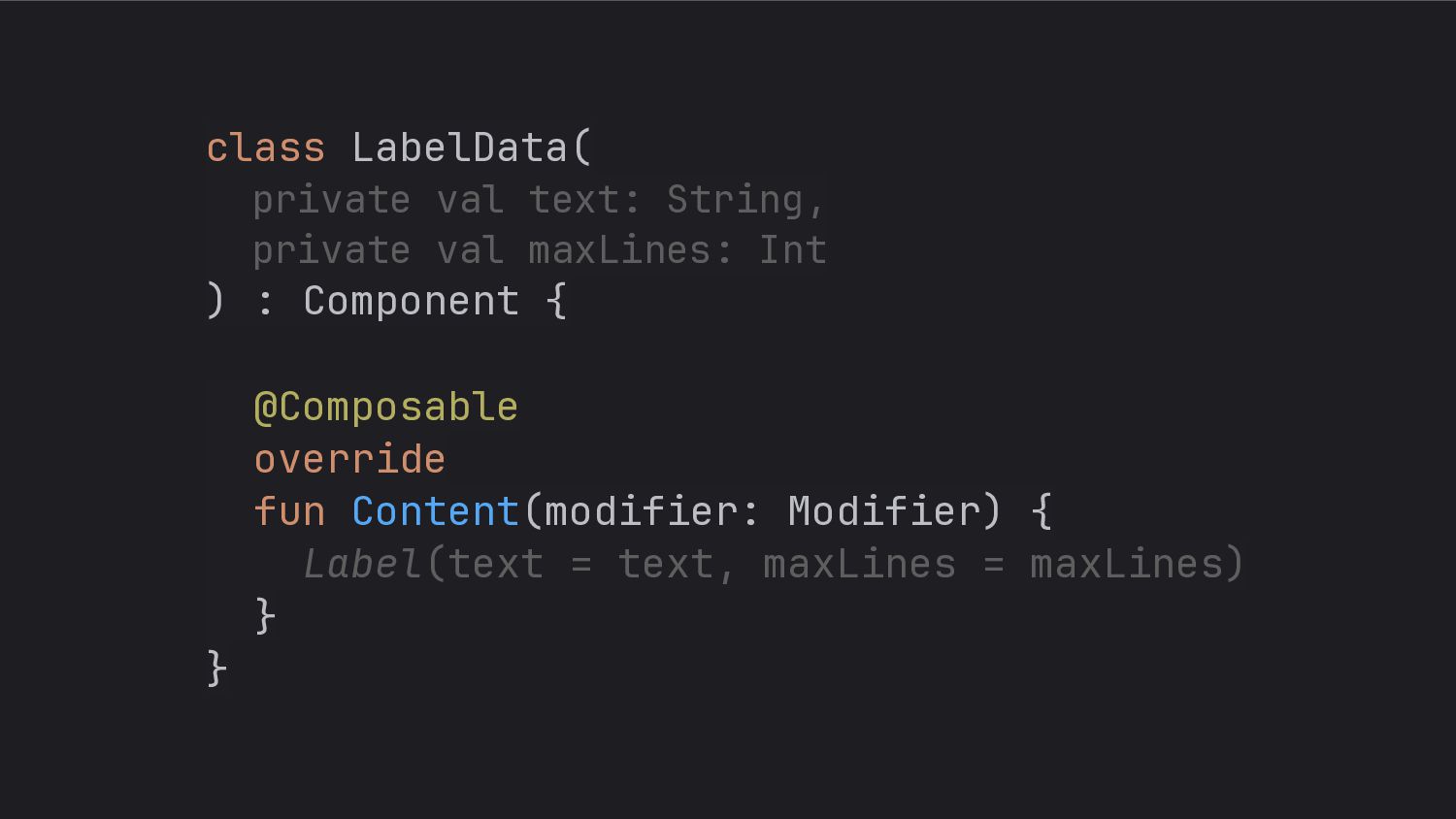
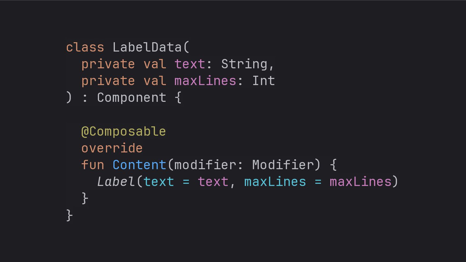
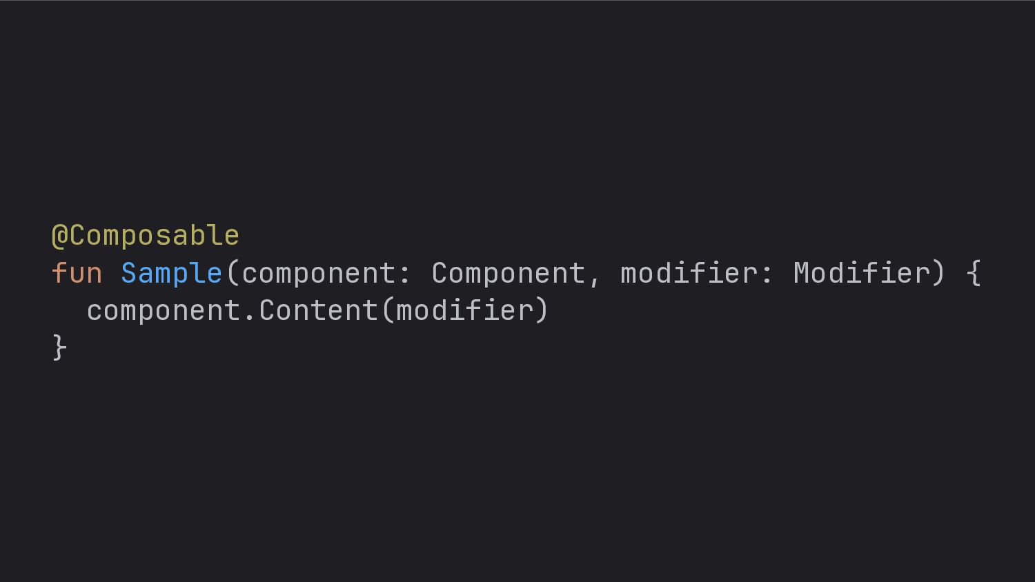
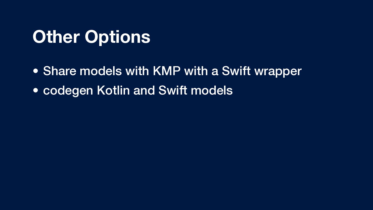
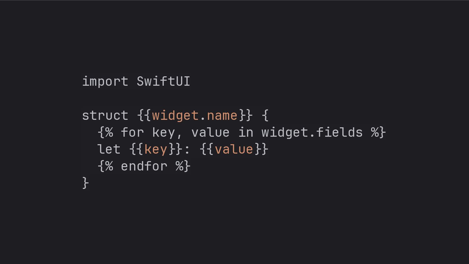
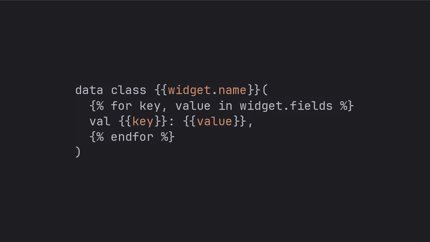
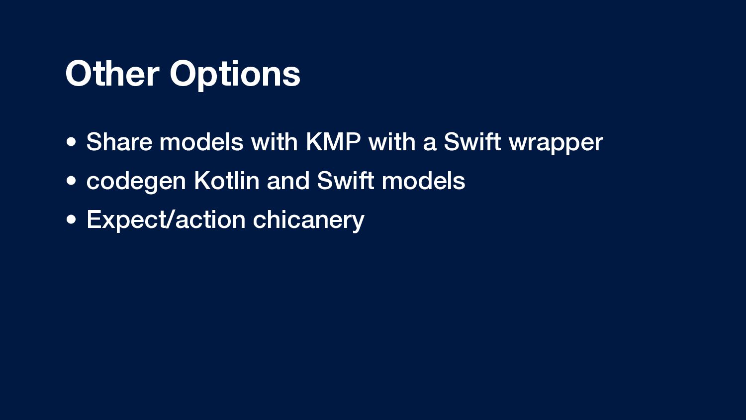
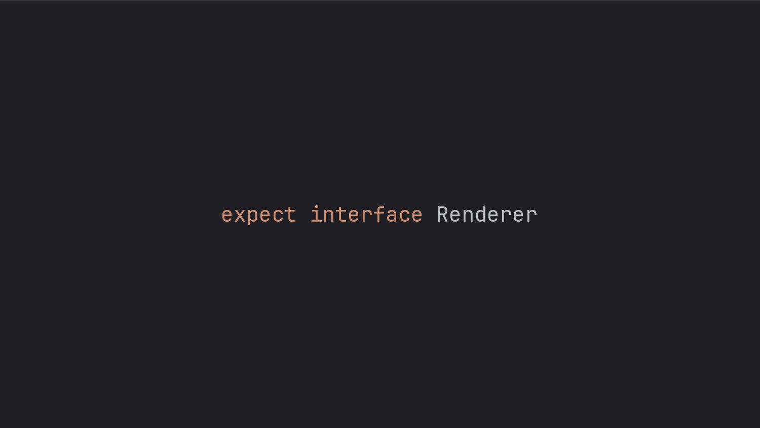
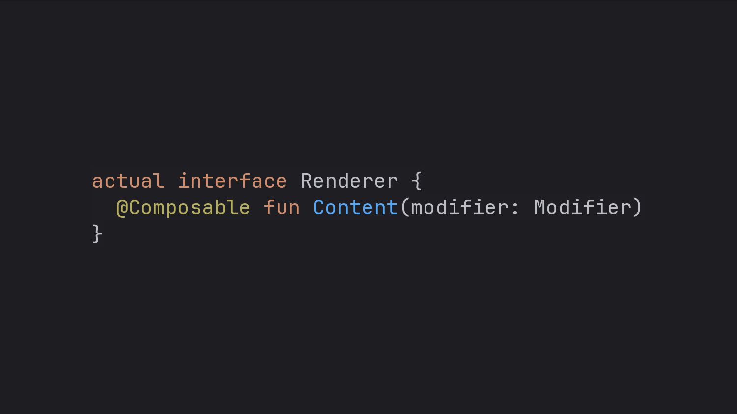
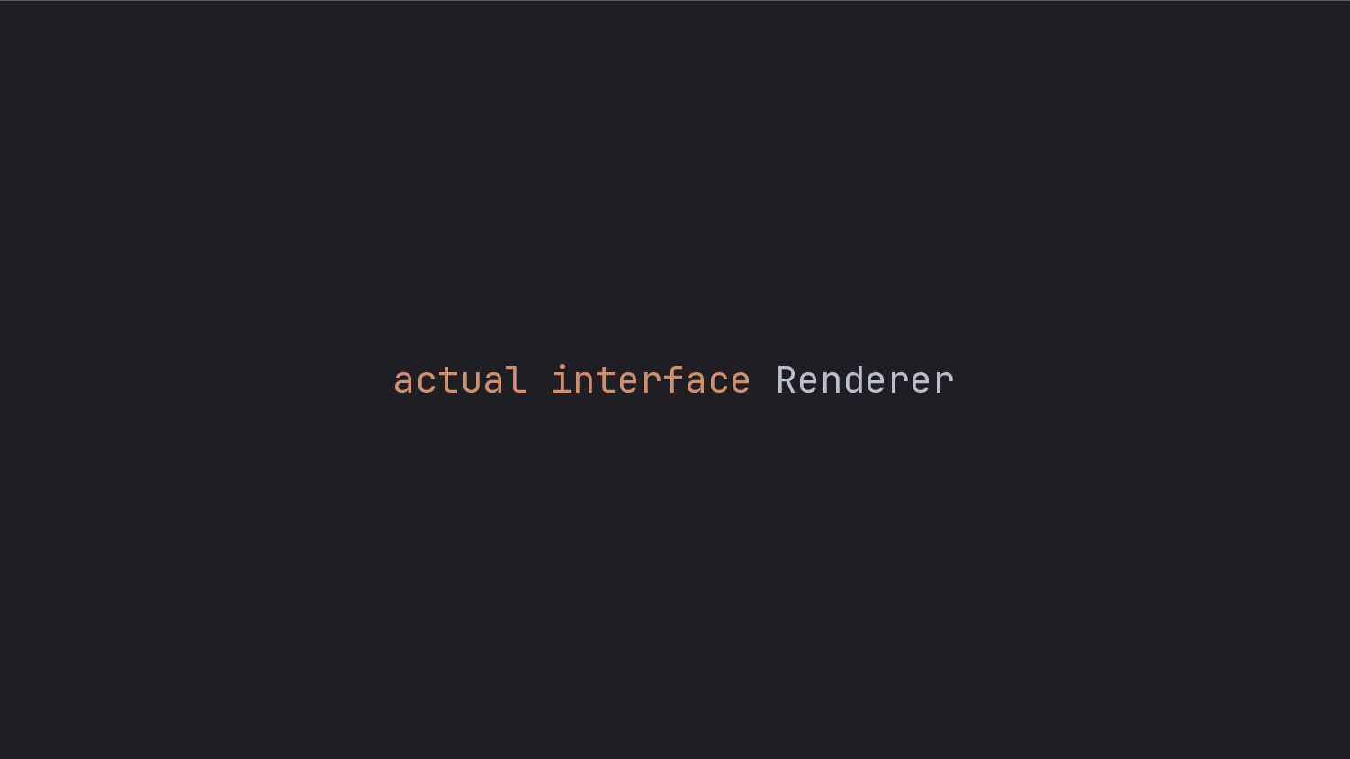
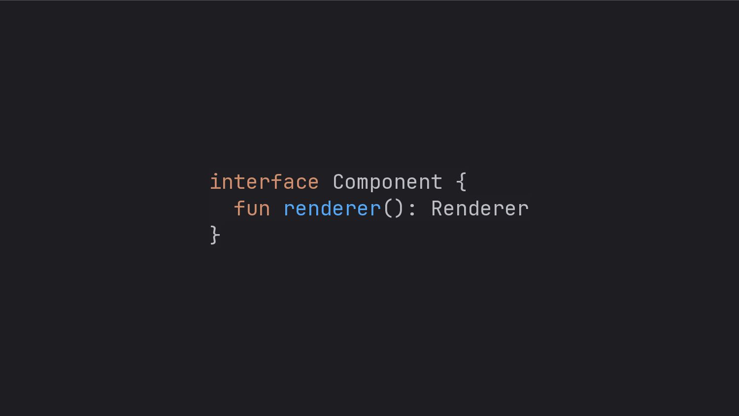
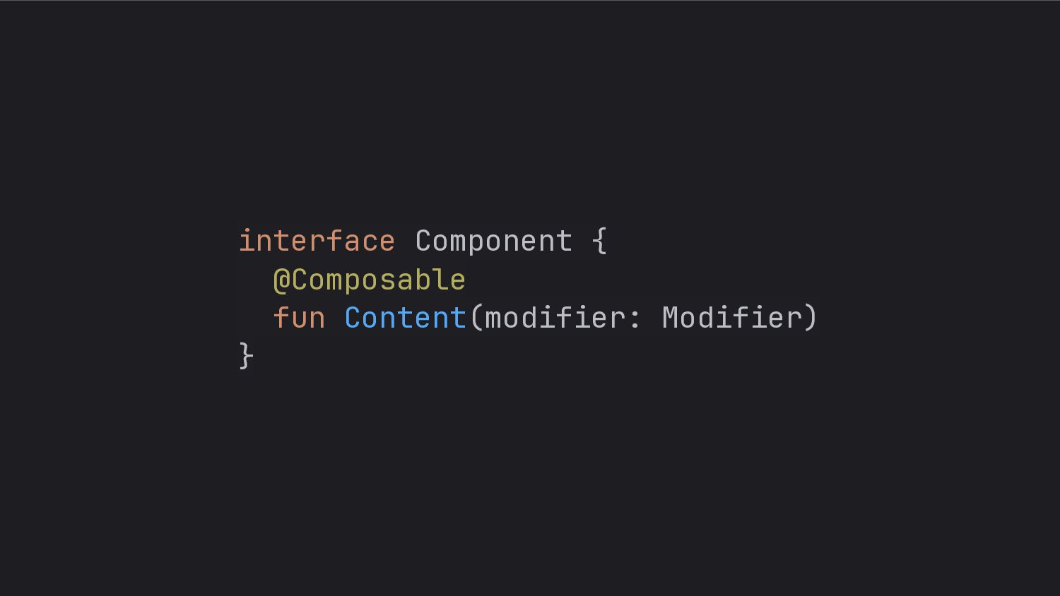
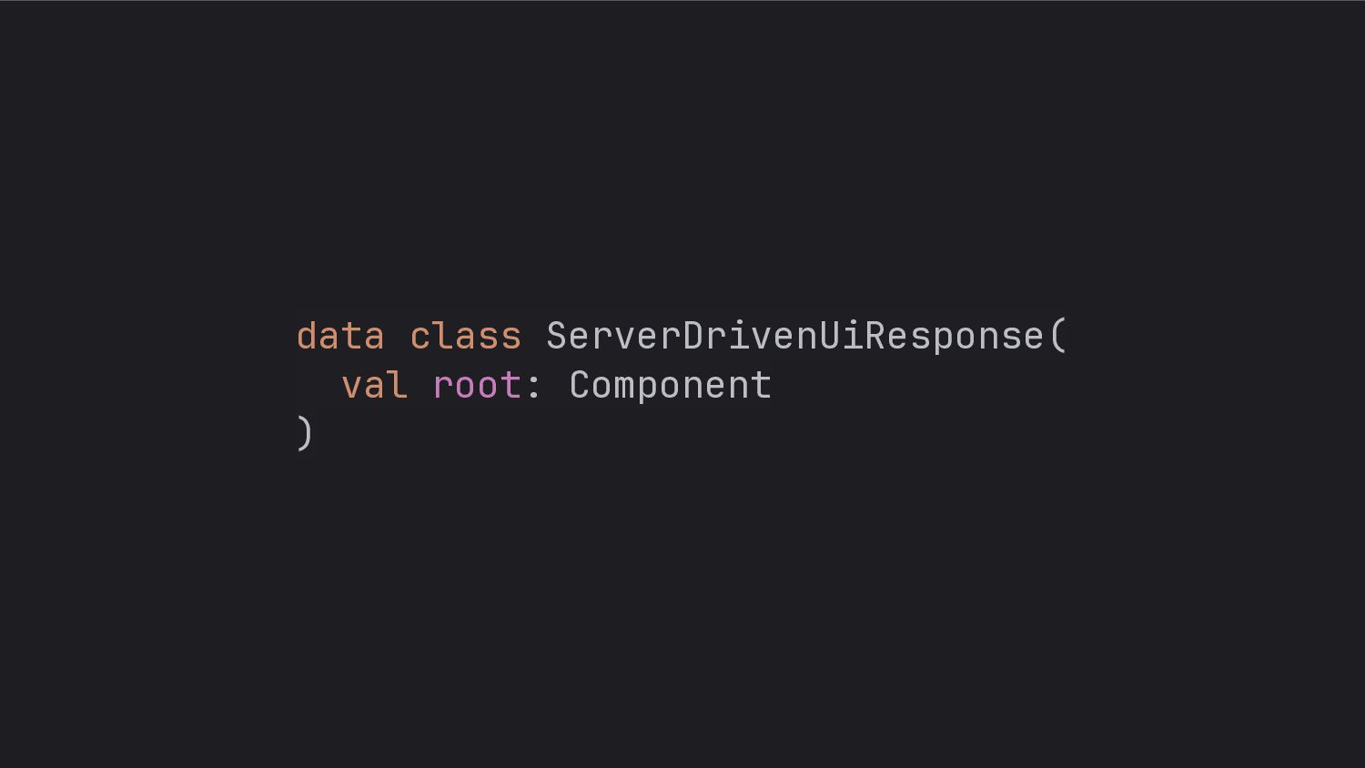
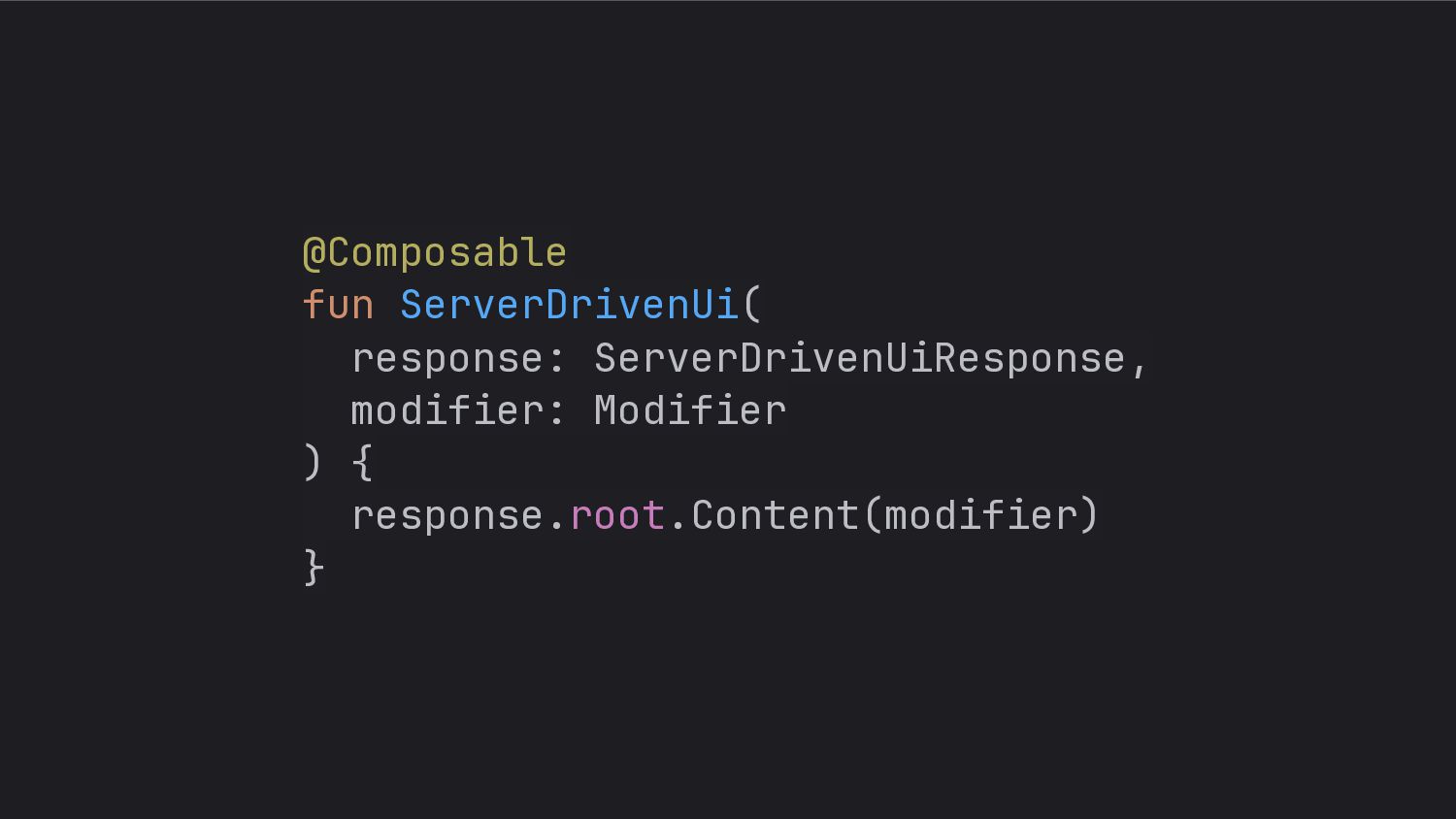
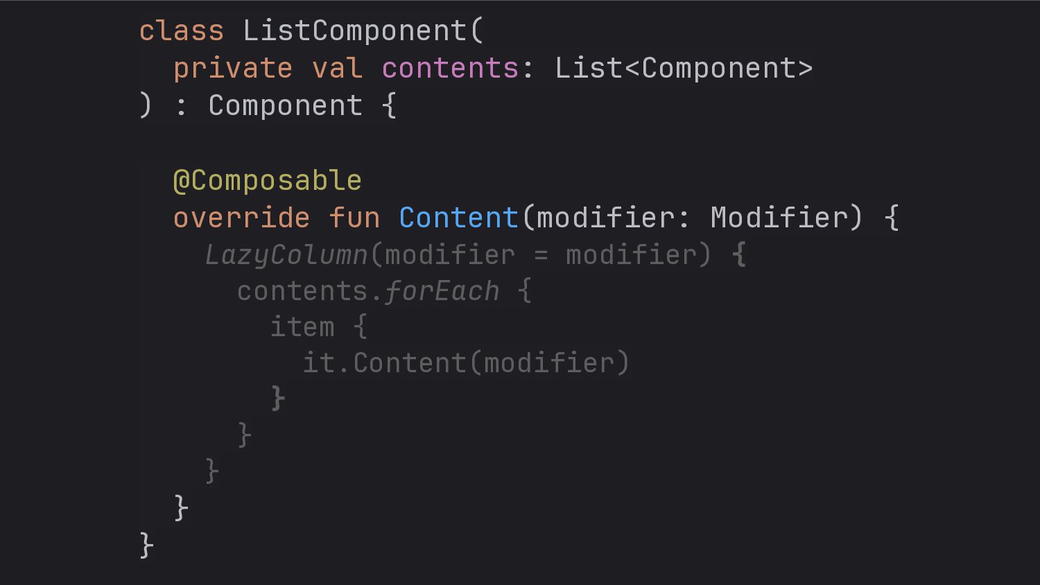
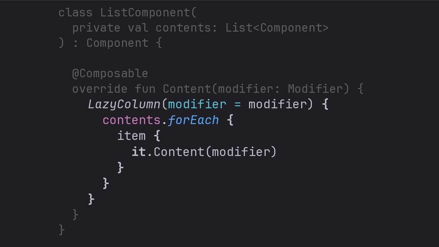
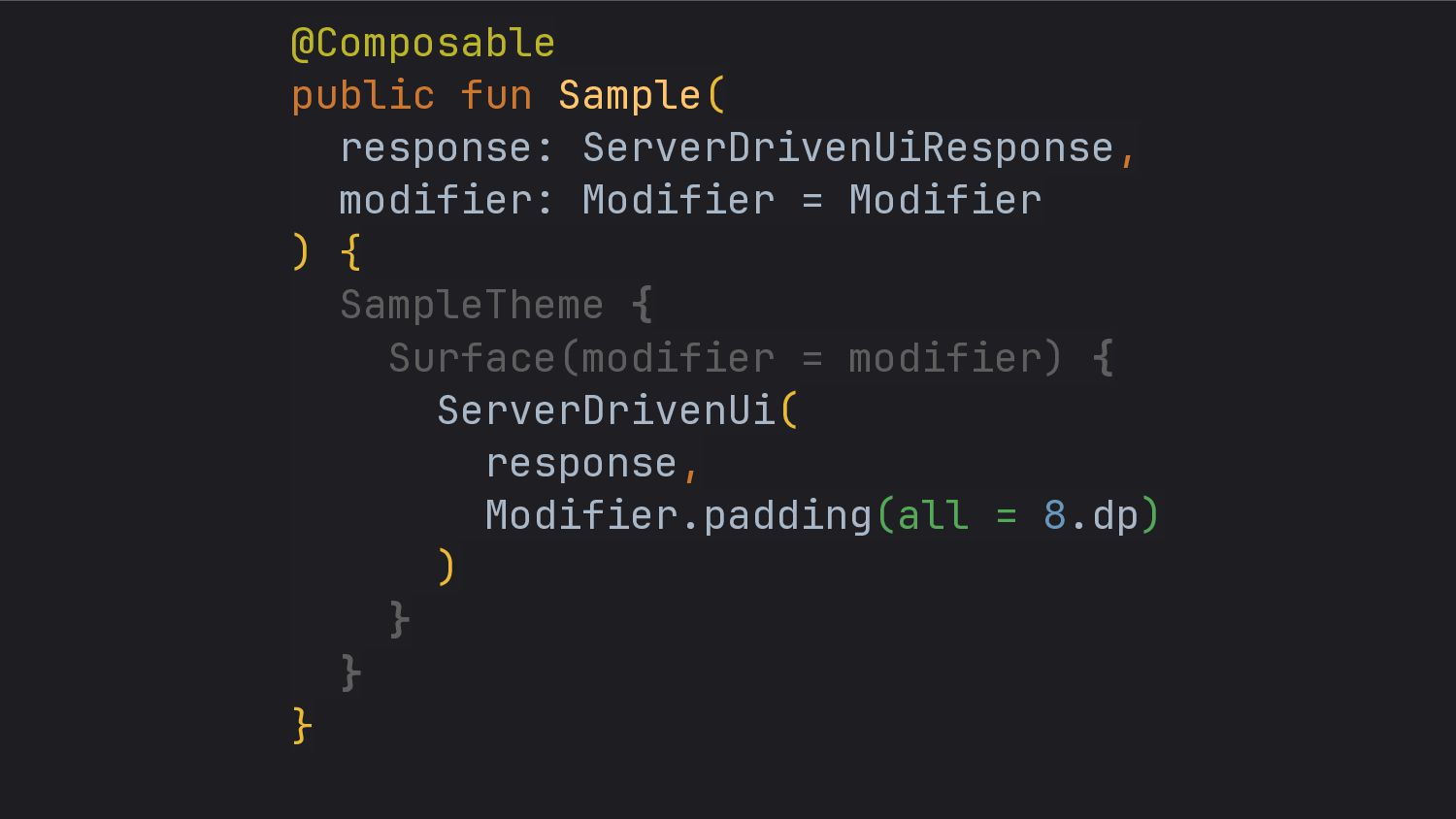
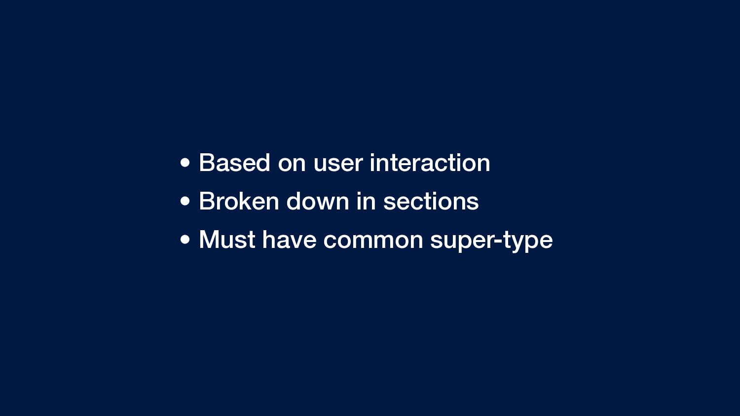
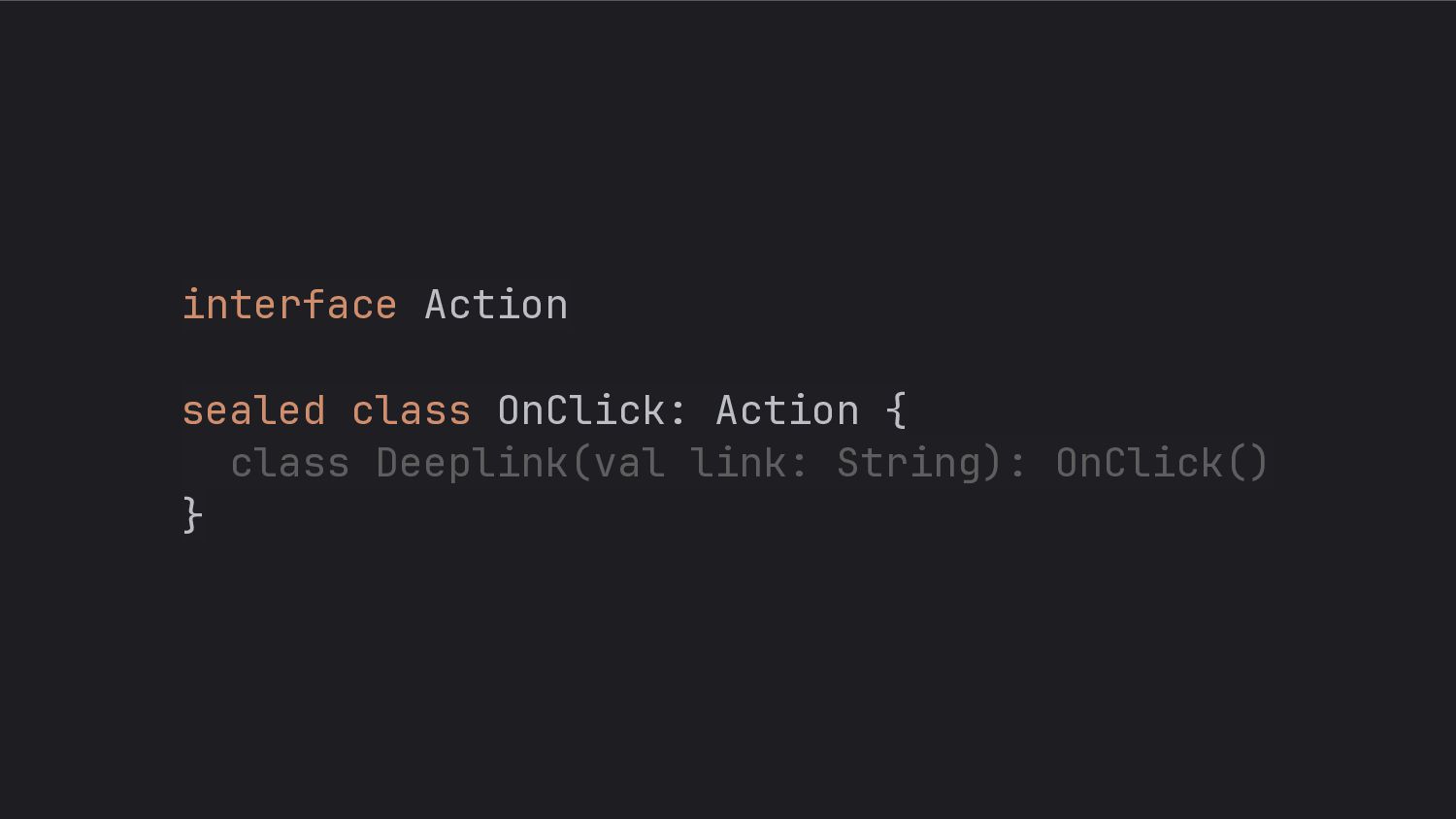
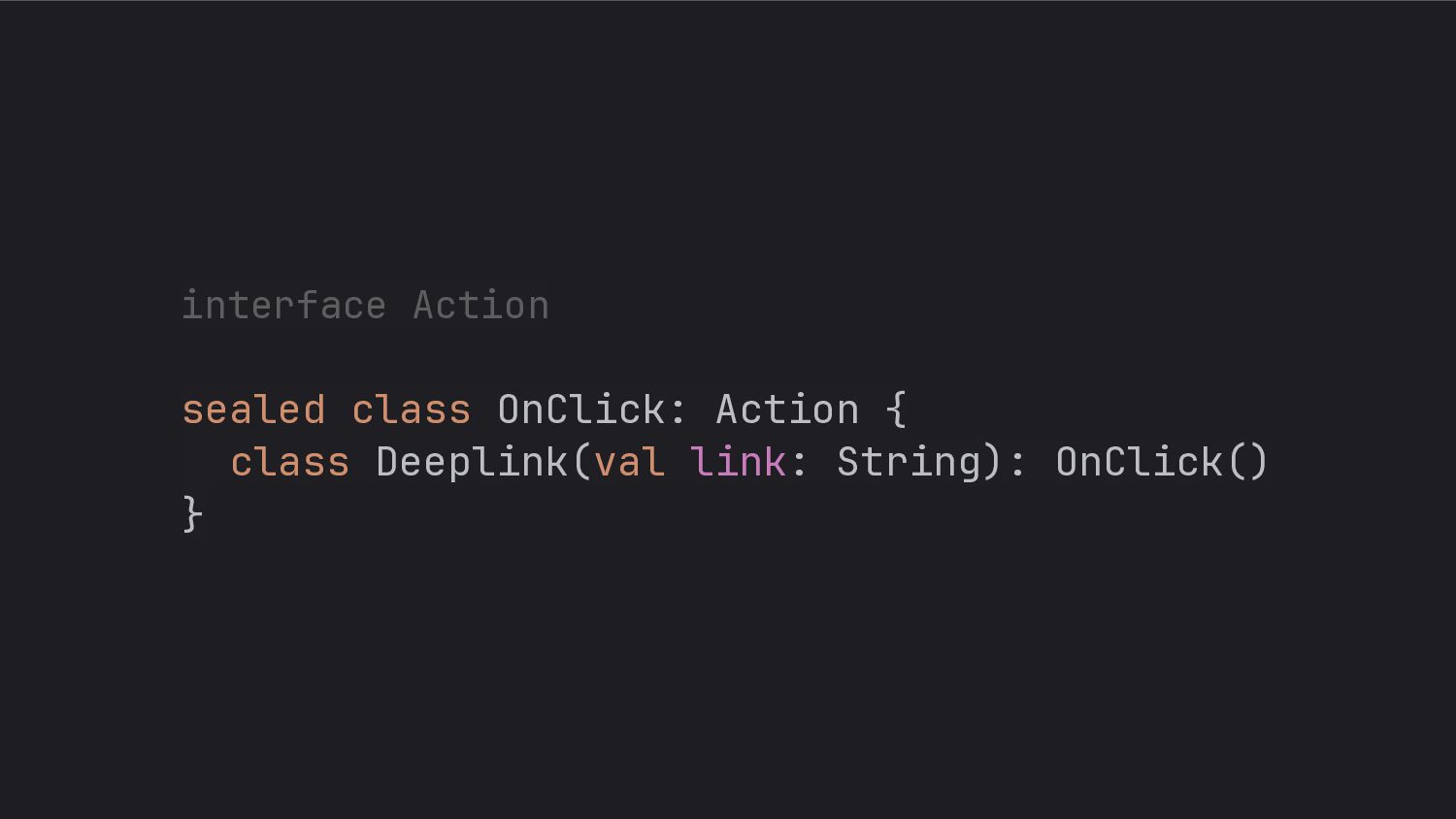
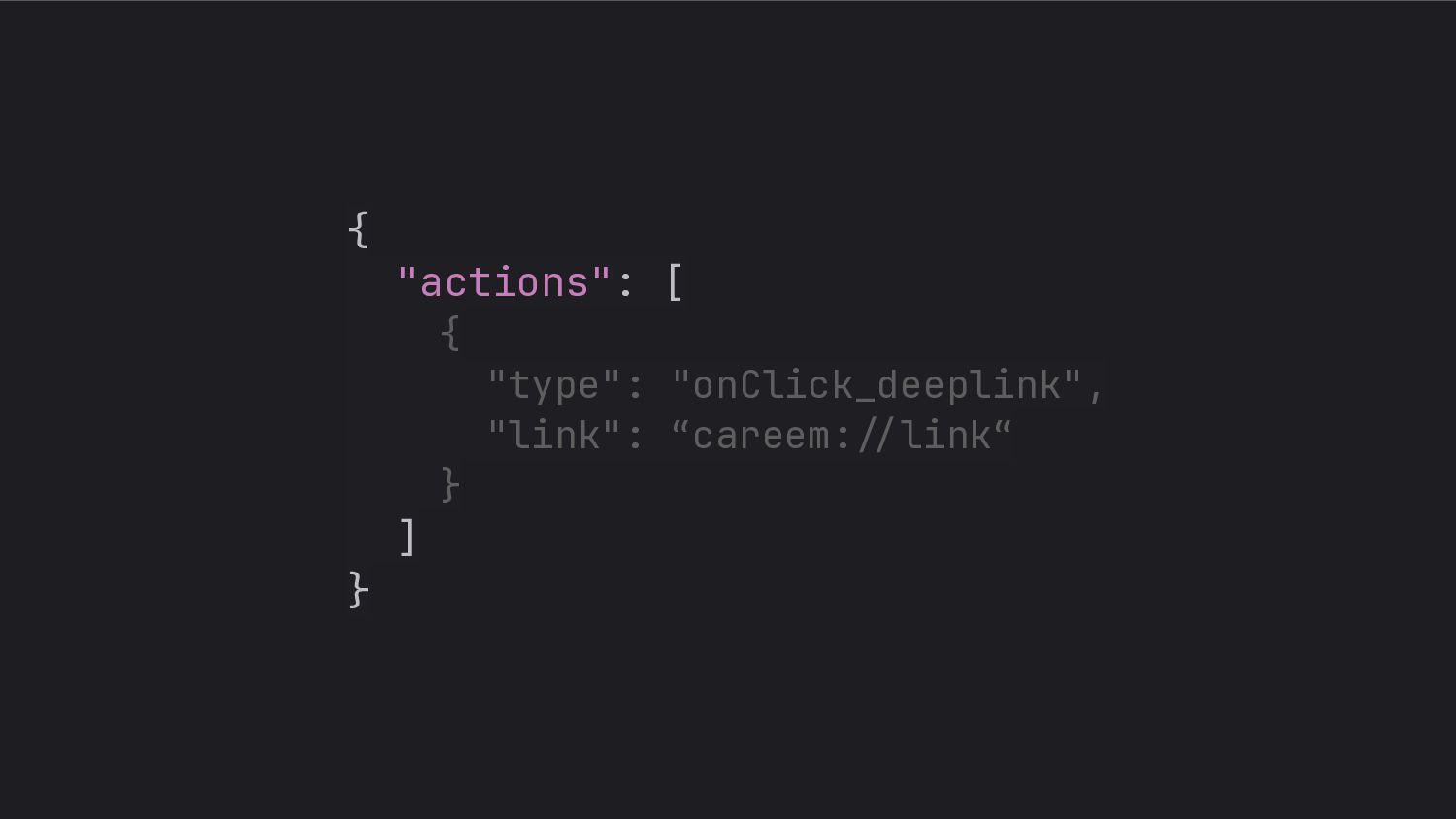
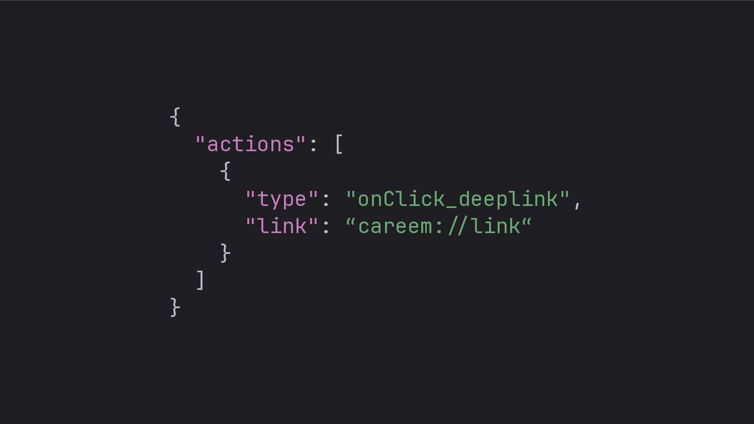
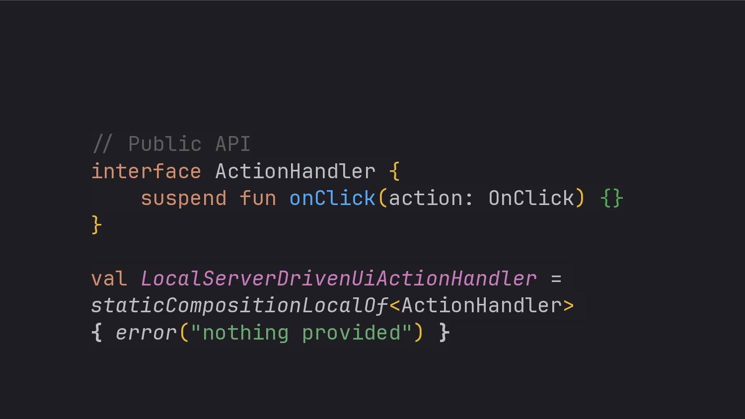
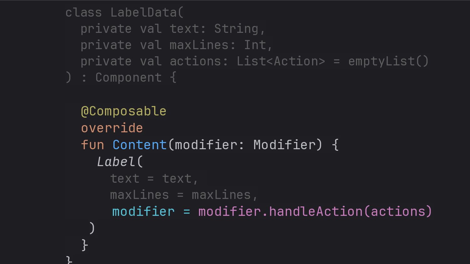
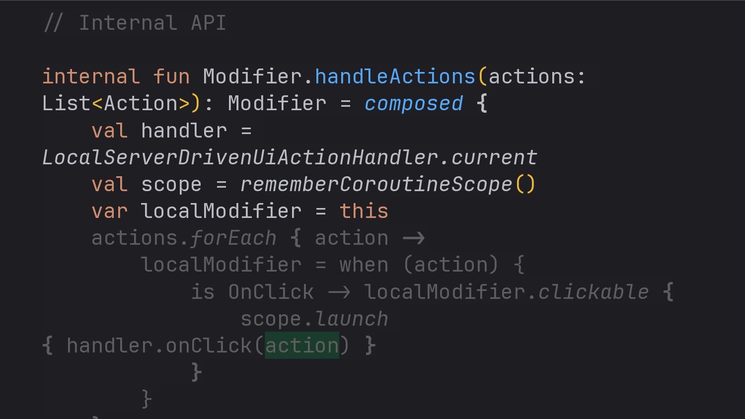
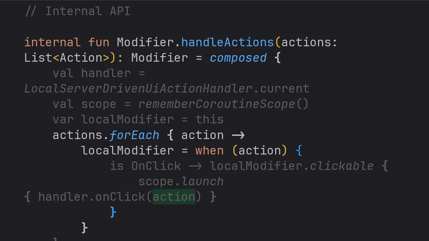
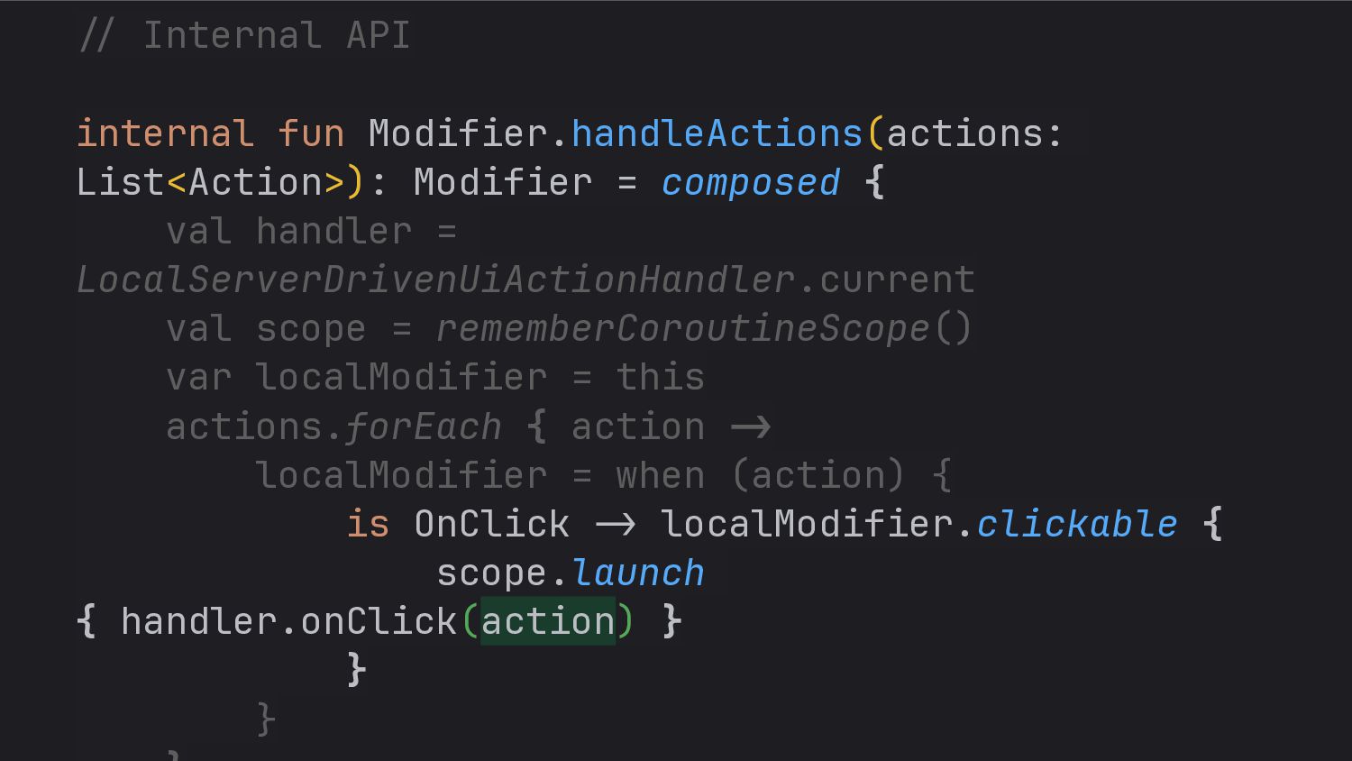
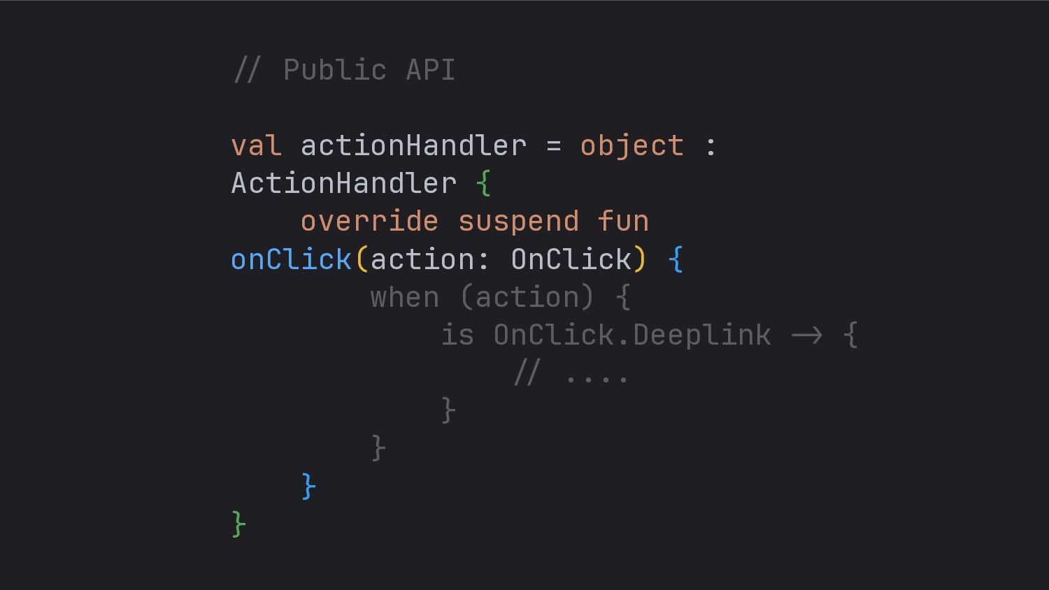
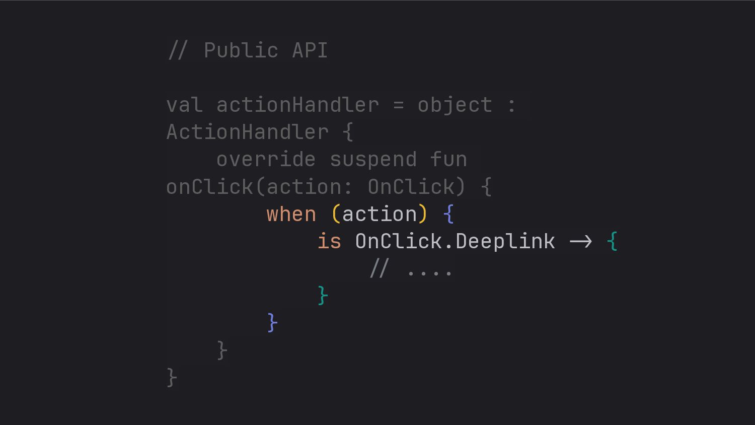
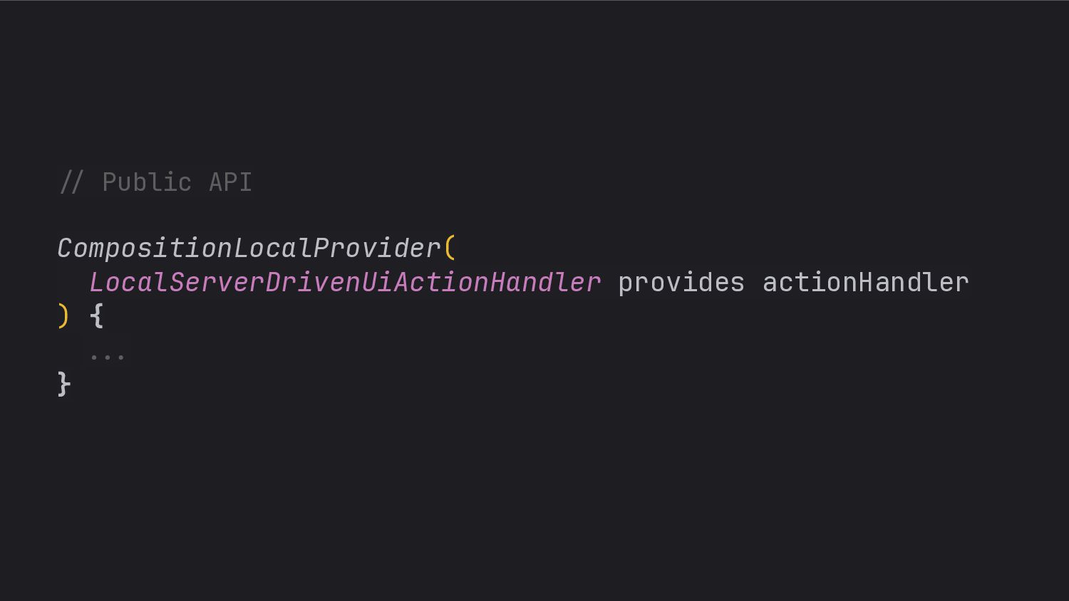
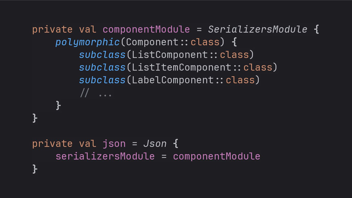
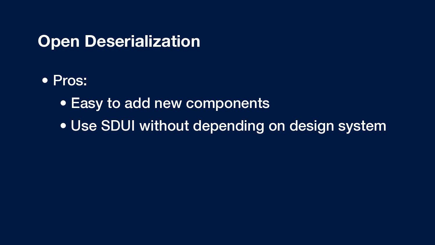
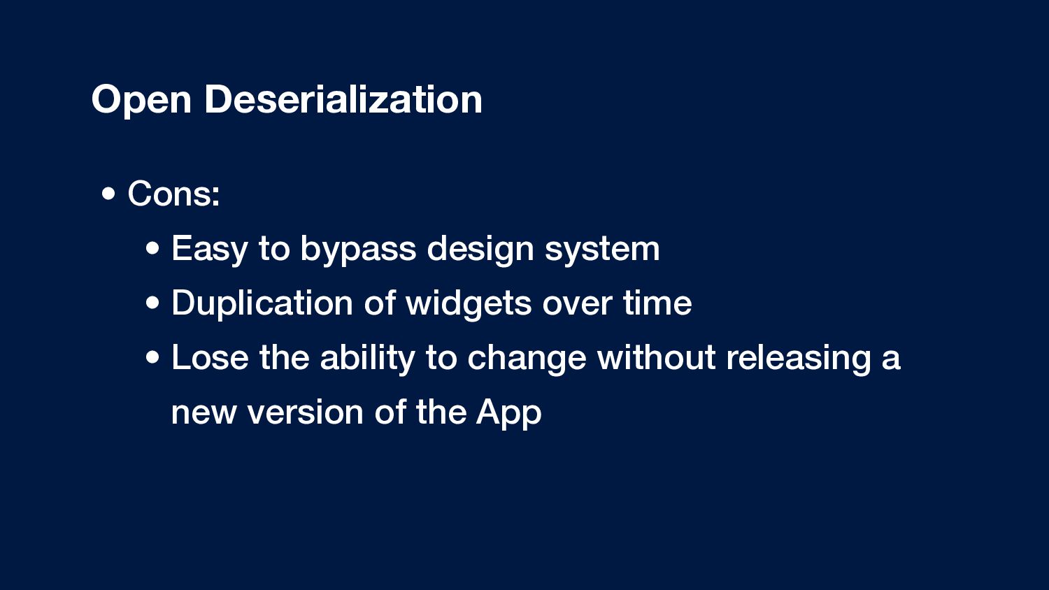
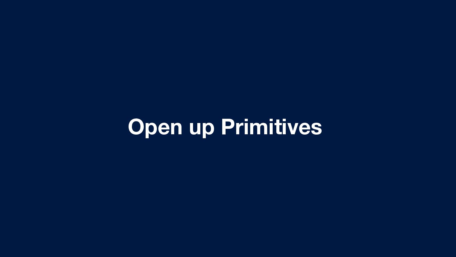
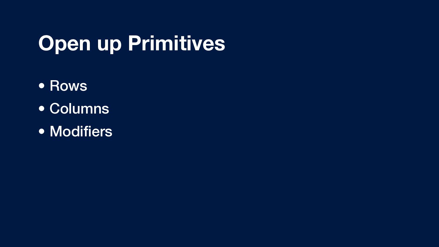
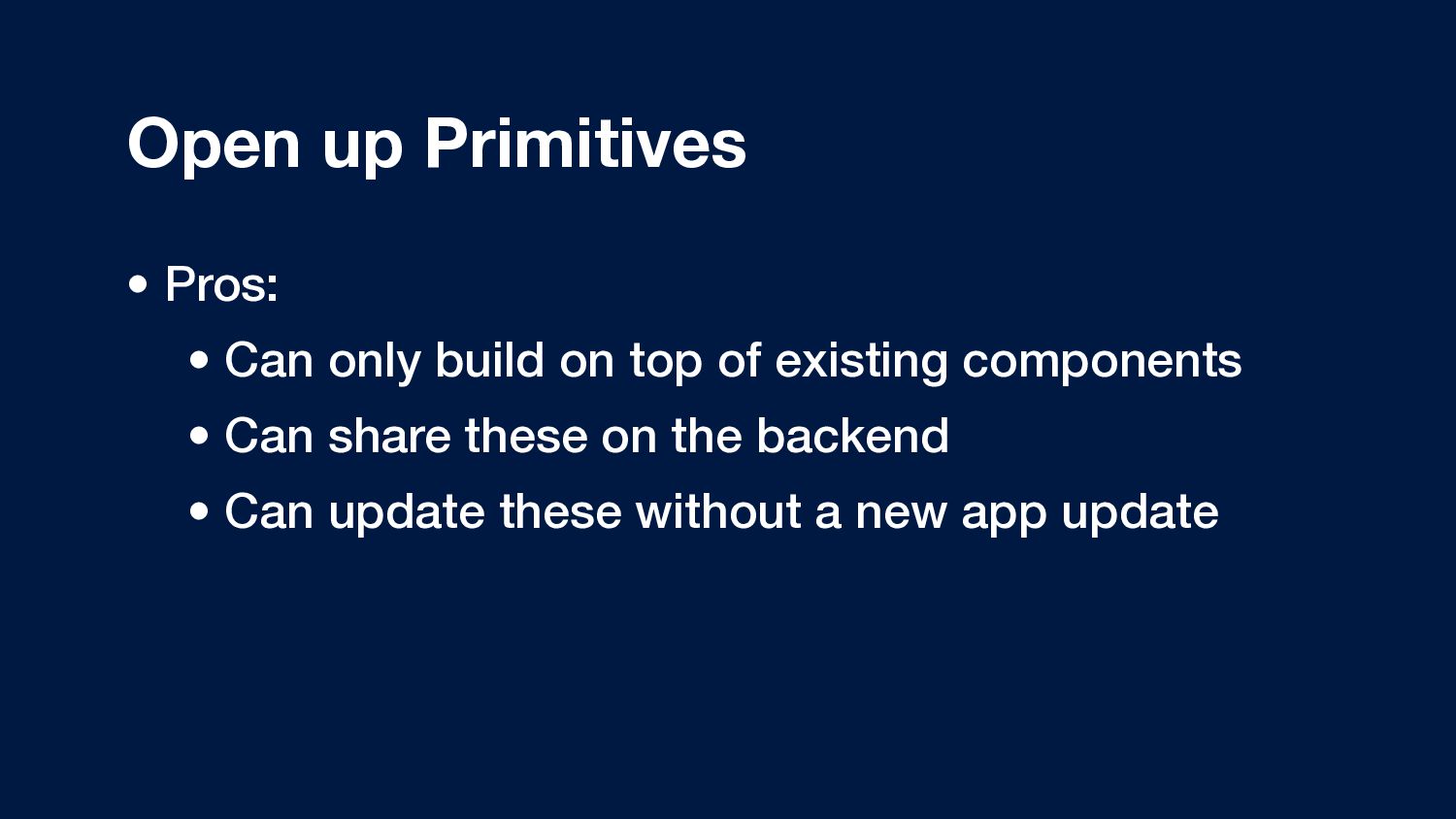
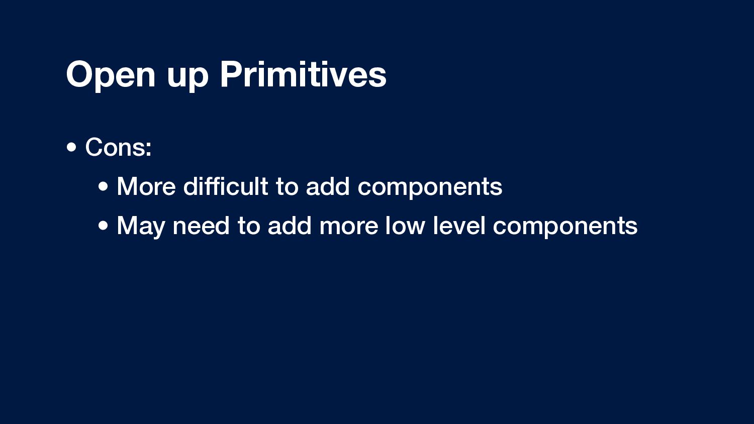
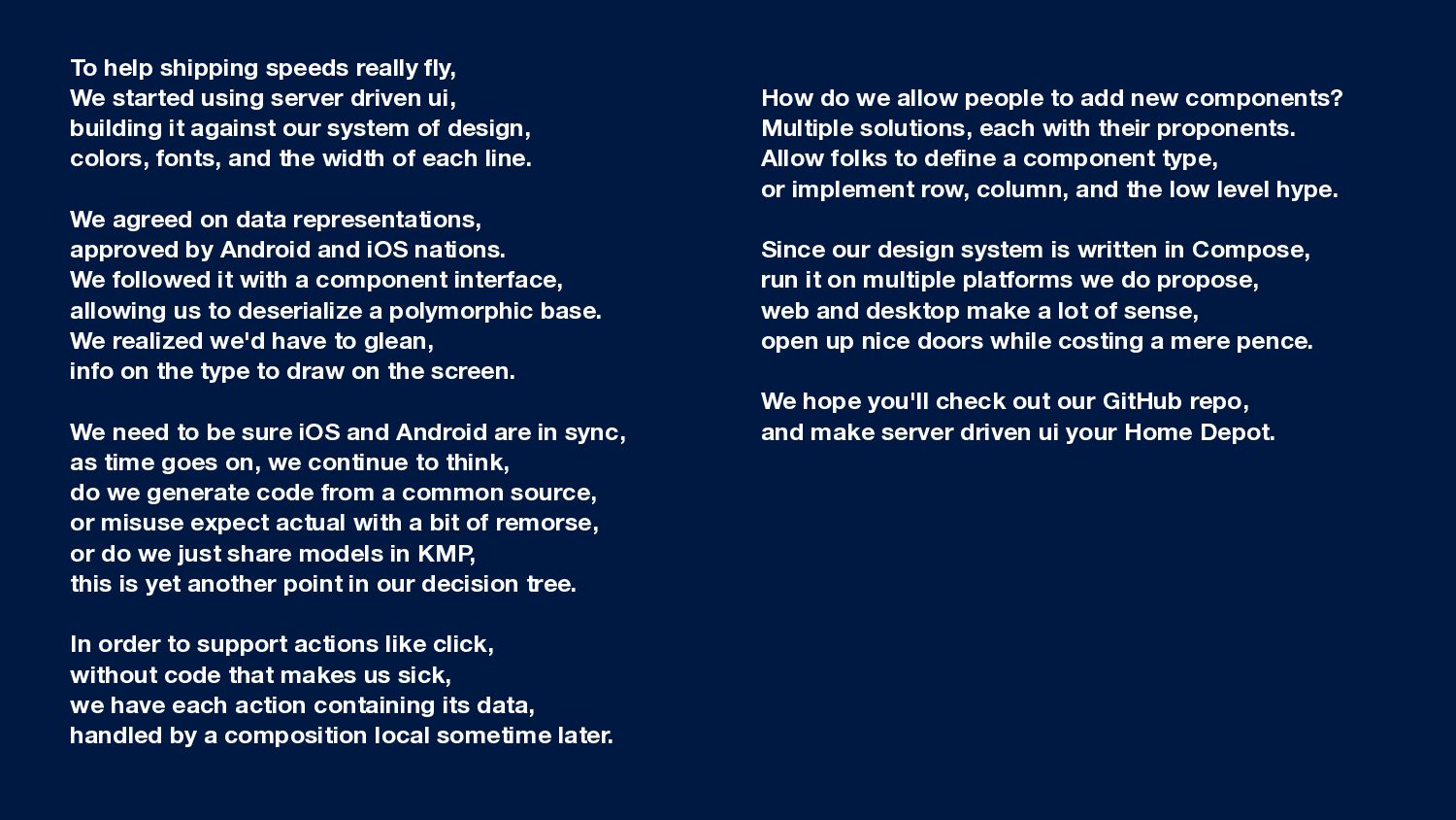
driven ui,
    building it against our system of design,
    colors, fonts, and the width of each line.
    We agreed on data representations,
    approved by Android and iOS nations.
    We followed it with a component interface,
    allowing us to deserialize a polymorphic base.
    We realized we'd have to glean,
    info on the type to draw on the screen.
    We need to be sure iOS and Android are in sync,
    as time goes on, we continue to think,
    do we generate code from a common source,
    or misuse expect actual with a bit of remorse,
    or do we just share models in KMP,
    this is yet another point in our decision tree.
    In order to support actions like click,
    without code that makes us sick,
    we have each action containing its data,
    handled by a composition local sometime later.
    How do we allow people to add new components?
    Multiple solutions, each with their proponents.
    Allow folks to define a component type,
    or implement row, column, and the low level hype.
    Since our design system is written in Compose,
    run it on multiple platforms we do propose,
    web and desktop make a lot of sense,
    open up nice doors while costing a mere pence.
    We hope you'll check out our GitHub repo,
    and make server driven ui your Home Depot.

    View Slide

  94. github.com/ahmedre/sdui

    View Slide