Upgrade to Pro — share decks privately, control downloads, hide ads and more …

Data Wrangling: Getting Started Working with Data for Visualization

Data Wrangling: Getting Started Working with Data for Visualization

These are the slides from Rachel Shadoan's OSBridge talk on June 26, 2014.

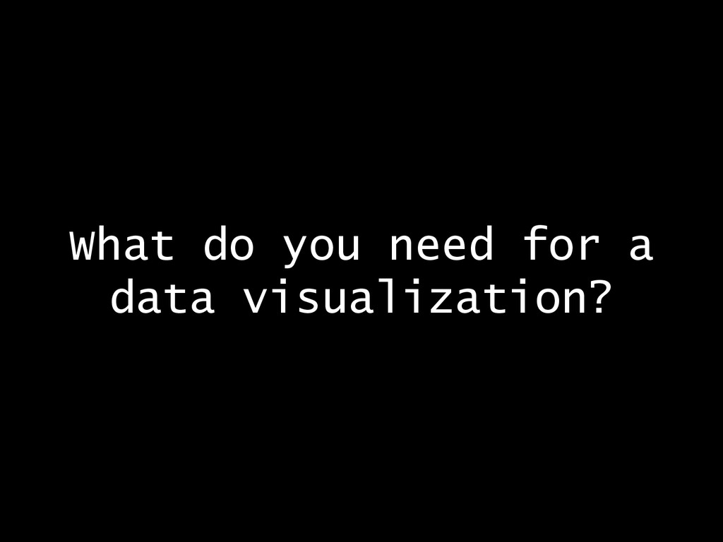
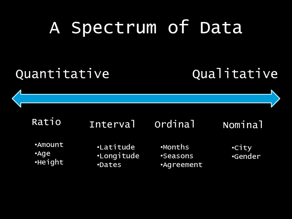
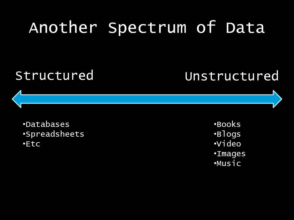
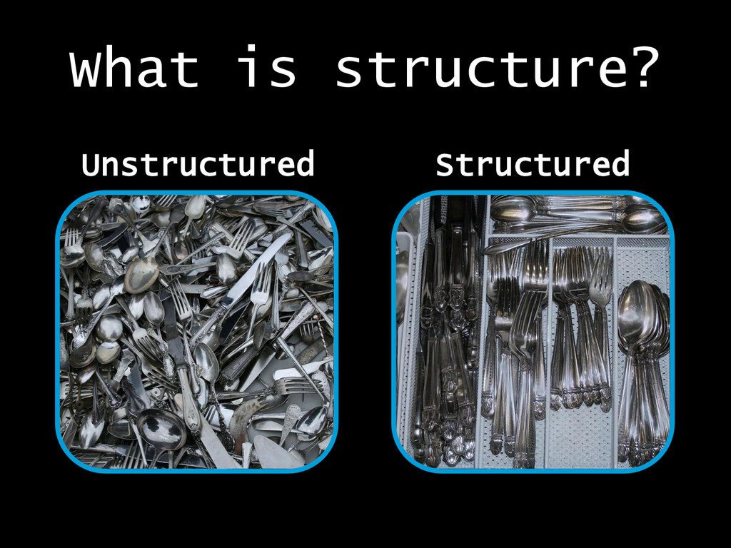
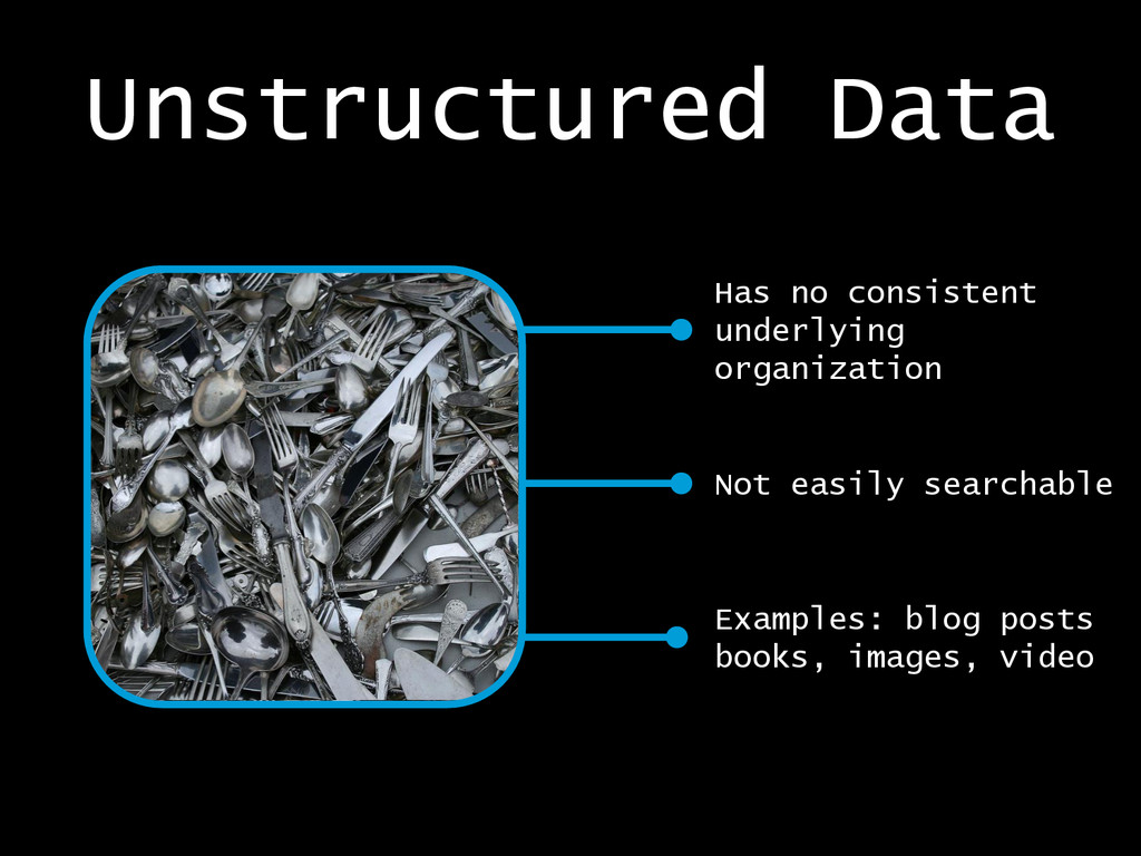
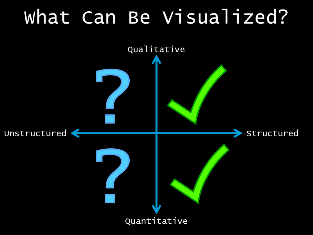
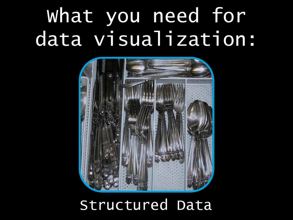
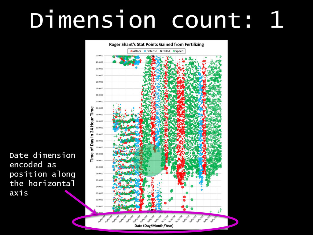
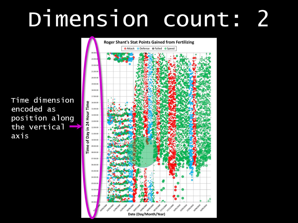
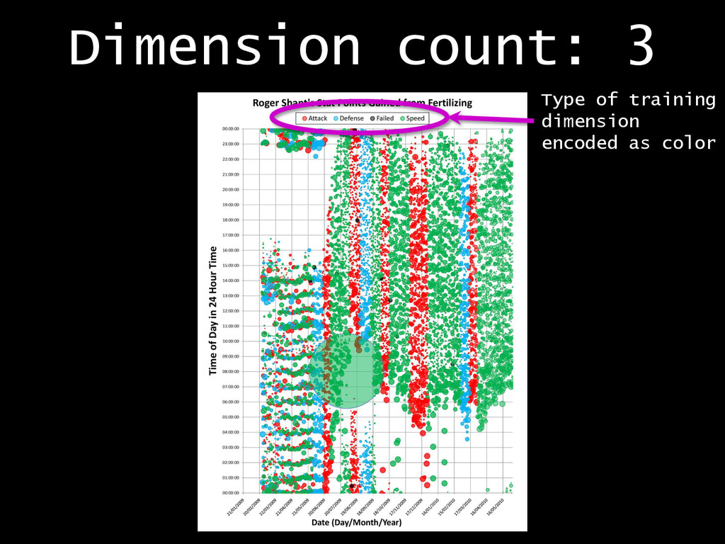
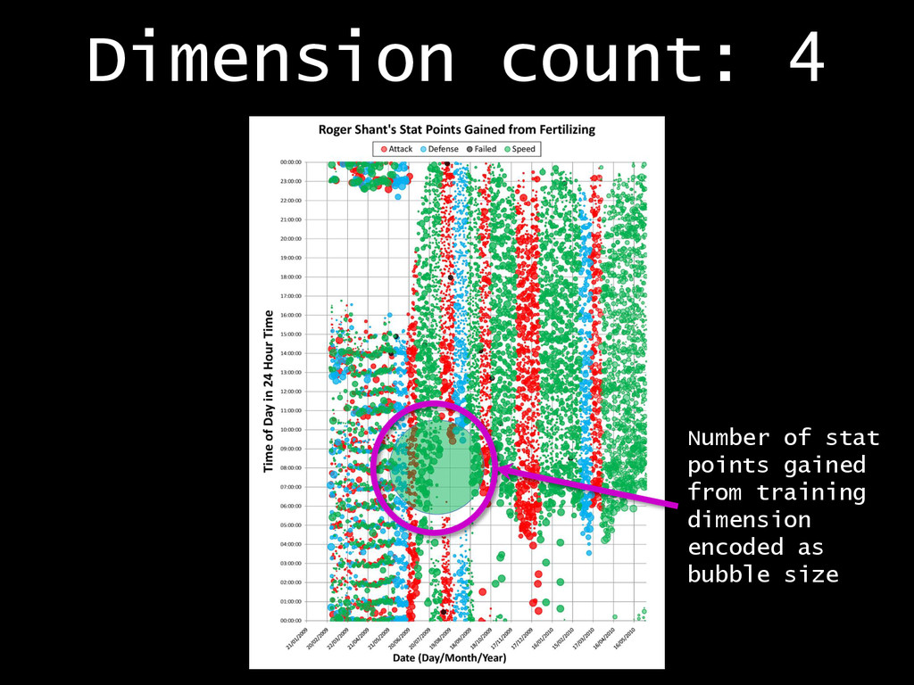
Good data visualization allows us to leverage the incredible pattern-recognition abilities of the human brain to answer questions we care about. But how do you make a good visualization? Here's a crash course.

Akashic Labs

June 26, 2014
Tweet

More Decks by Akashic Labs

Other Decks in Technology

Transcript

  1. A Spectrum of Data Quantitative Qualitative Nominal •City •Gender Ordinal

    •Months •Seasons •Agreement Interval •Latitude •Longitude •Dates Ratio •Amount •Age •Height
  2. Unstructured Data Examples: blog posts books, images, video Not easily

    searchable Has no consistent underlying organization
  3. Structuring Data: Abstract Data Models This is a person. This

    is person data model, which is an abstraction of a person. o Person ID o Name o Age o Height o Profession o Hobbies o Nationality o Native Language Person
  4. An OSBridge Attendee Data Model • Name • Email address

    • Home address • Company/organization • Twitter/identi.ca • Website • Age • Gender • Years in open source • Food preference • Favorite language • Current projects • Favorite color
  5. A dimension is a variable in the data • Name

    • Email address • Home address • Company/organization • Twitter/identi.ca • Website • Age • Gender • Years in open source • Food preference • Favorite language • Current projects • Favorite color These are all dimensions of the data
  6. Dimensionality Increases Quickly Email Home address Company/Org Twitter Website Age

    Gender Years in OS Food preference Favorite language Current projects Favorite color 78 pairwise relationships!
  7. Questions Reduce Dimensionality Email Home address Company/Org Twitter Website Age

    Gender Years in OS Food preference Favorite language Current projects Favorite color How are food preferences distributed among languages and projects?
  8. Questions Reduce Dimensionality Email Home address Company/Org Twitter Website Age

    Gender Years in OS Food preference Favorite language Current projects Favorite color How are languages and projects distributed geographically?
  9. Multiple comparison problem The more relationships you look at, the

    more likely you are to find a pattern that only exists because of random chance
  10. Focus + Context This view shows the details of the

    data selected in the context view Selection
  11. D3.js Limited support for multiple coordinated views, large data sets

    Beautiful browser- based visualizations JavaScript visualization library
  12. Improvise Few resources for learning Java-based desktop design environment Powerful,

    flexible tool for creating multiple-coordinated view visualizations
  13. Python Great for data wrangling and rapid prototyping Check out

    MatPlotLib and ggplot visualization libaries
  14. Credits Liz Mc, CC 2.0, via Flickr Kent K. Barns,

    CC 2.0, kentkb.com Jerome Collins, CC 2.0, via Flickr Cristinacosta, CC 2.0, via Flickr Thinking Machine 4, Mid- game, by Martin Wattenberg and Marek Walczak