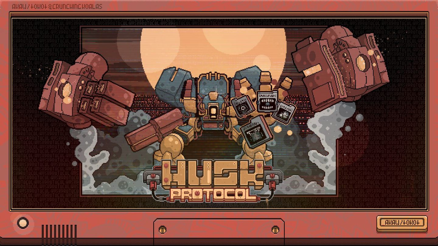
Art Direction on a Shoestring - why consistency beats talent.
How to build memorable artstyle, and why visual consistency beats raw talent every time. An indie creative direction case study establishing an applicable, actionable toolset for small yet ambitious teams.
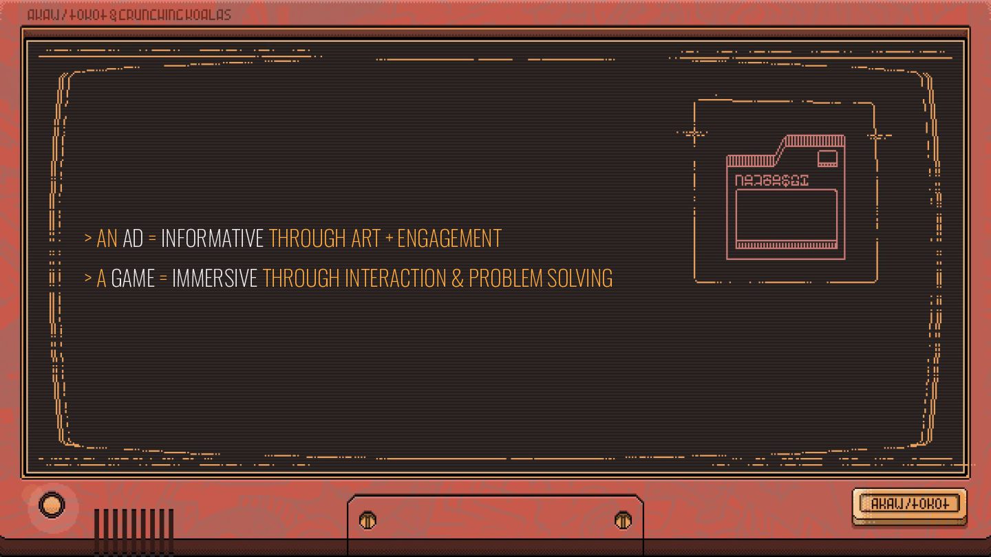
art form, but as a medium of information. When I write an advertisement, I don’t want you to tell me that you find it ‘creative.’ I want you to find it so interesting that you buy the product.” [DAVID OGILVY]
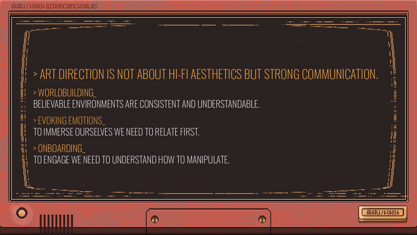
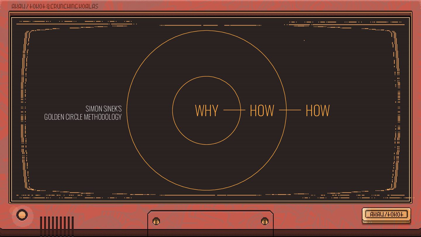
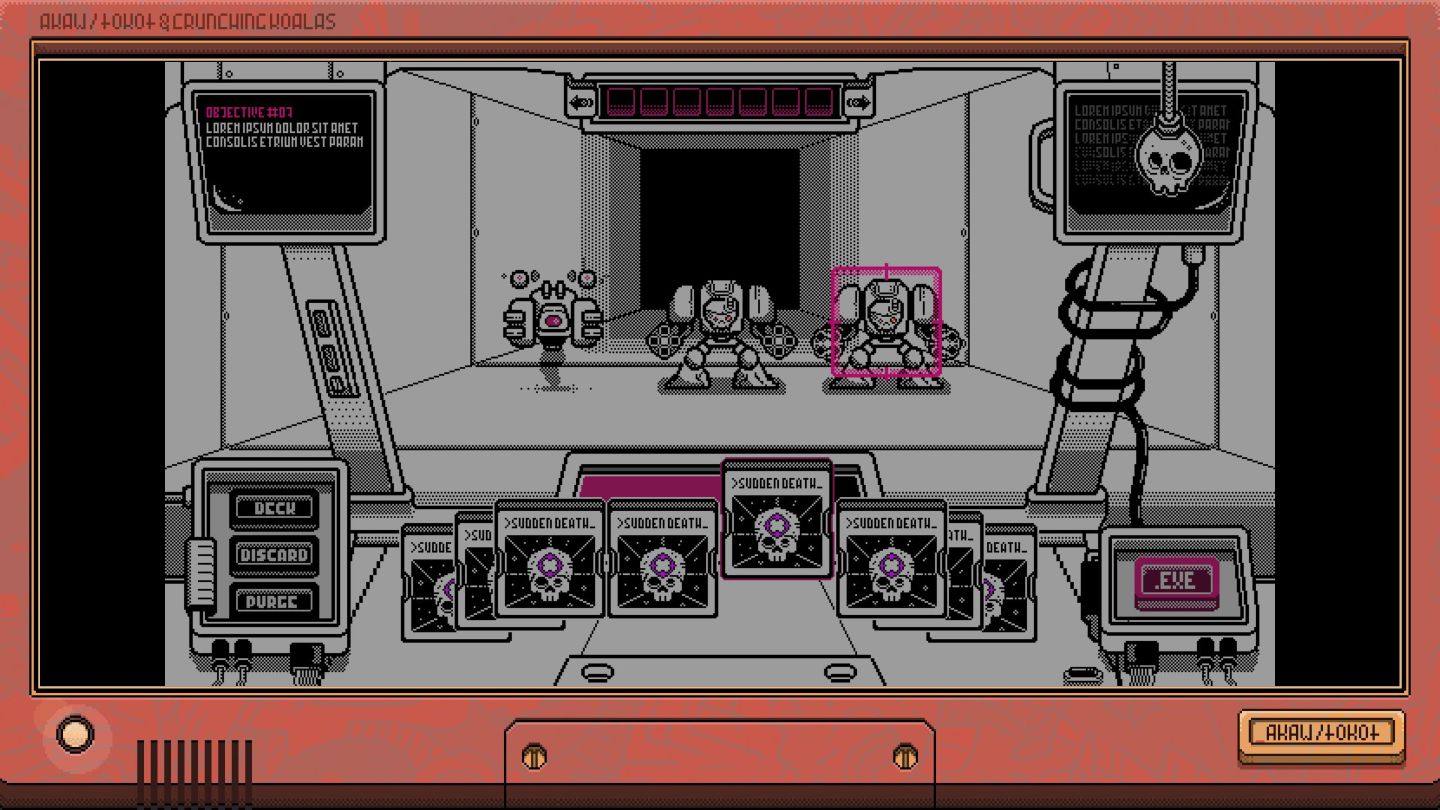
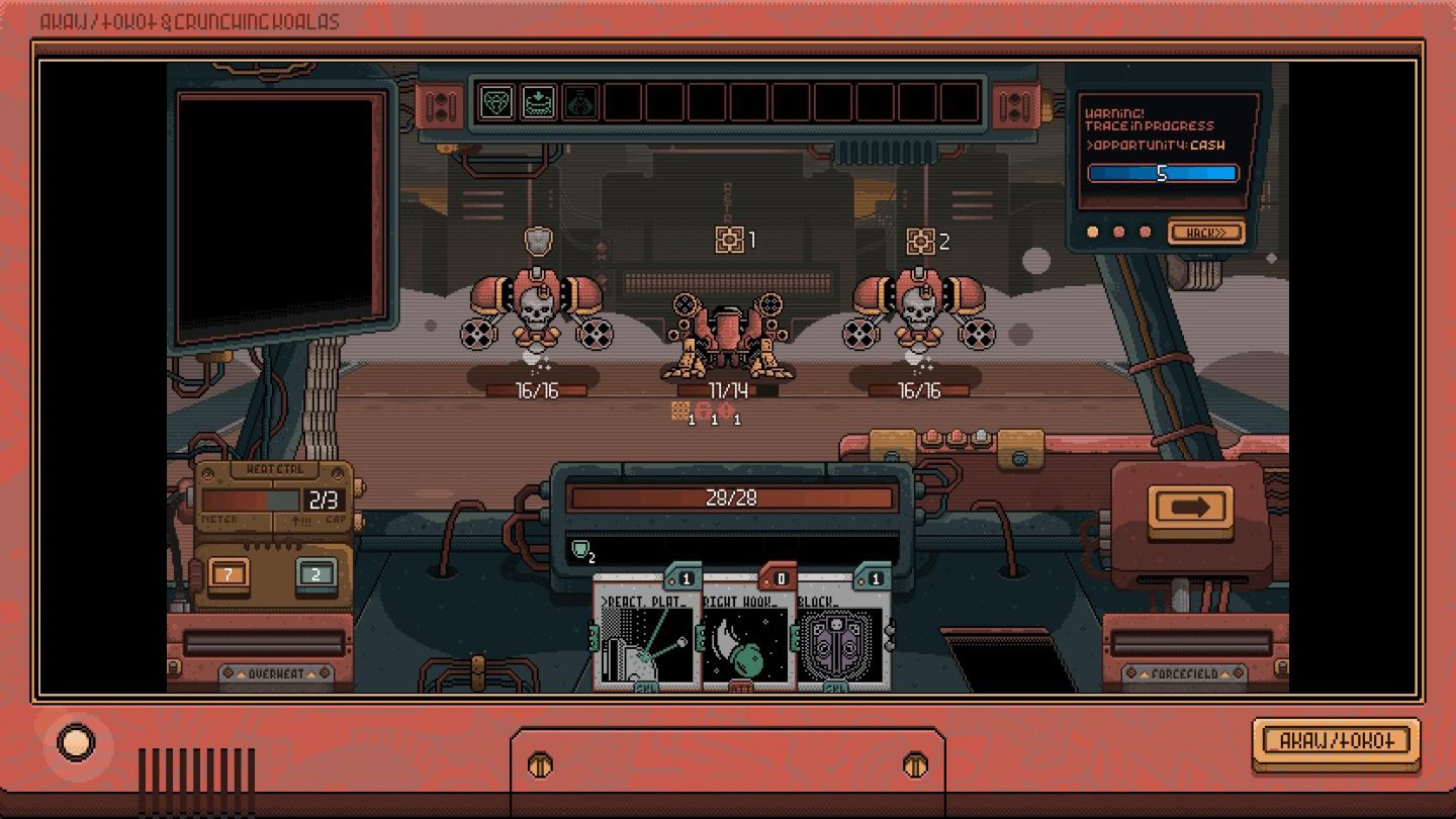
COMMUNICATION. > WORLDBUILDING_ BELIEVABLE ENVIRONMENTS ARE CONSISTENT AND UNDERSTANDABLE. > EVOKING EMOTIONS_ TO IMMERSE OURSELVES WE NEED TO RELATE FIRST. > ONBOARDING_ TO ENGAGE WE NEED TO UNDERSTAND HOW TO MANIPULATE.
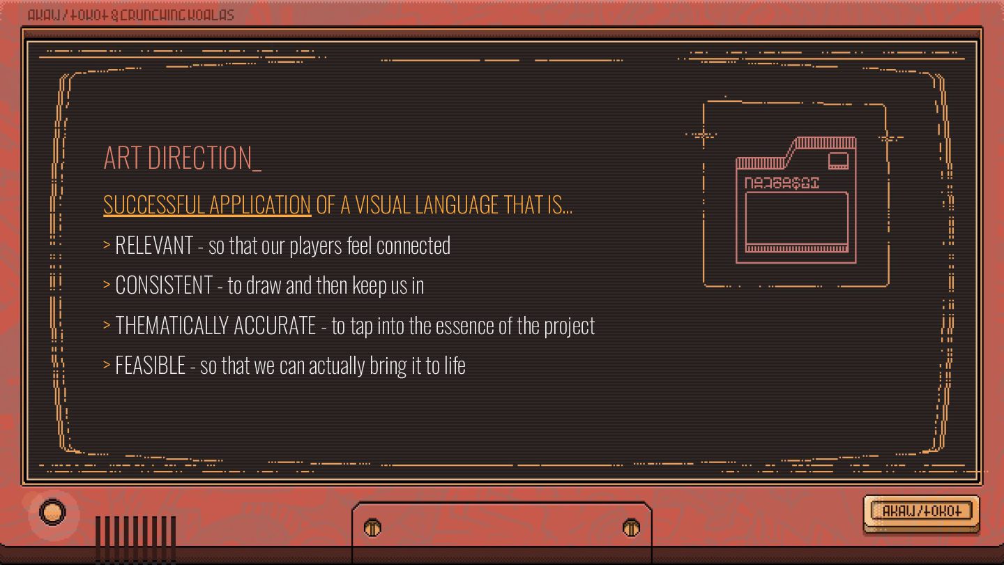
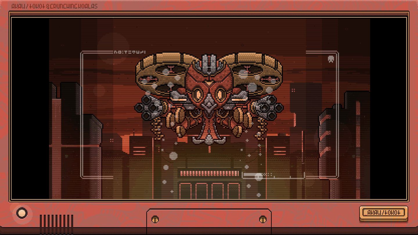
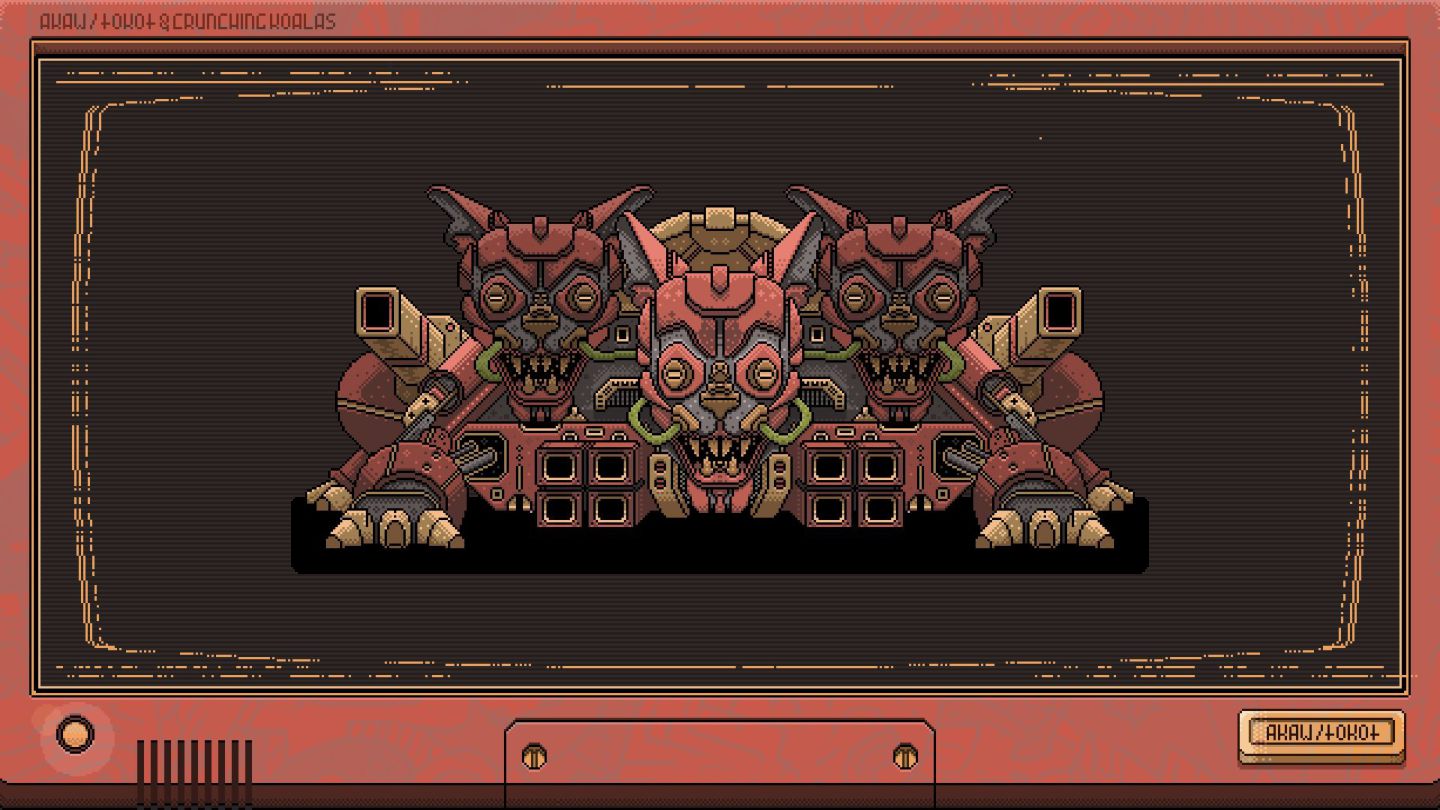
> RELEVANT - so that our players feel connected > CONSISTENT - to draw and then keep us in > THEMATICALLY ACCURATE - to tap into the essence of the project > FEASIBLE - so that we can actually bring it to life
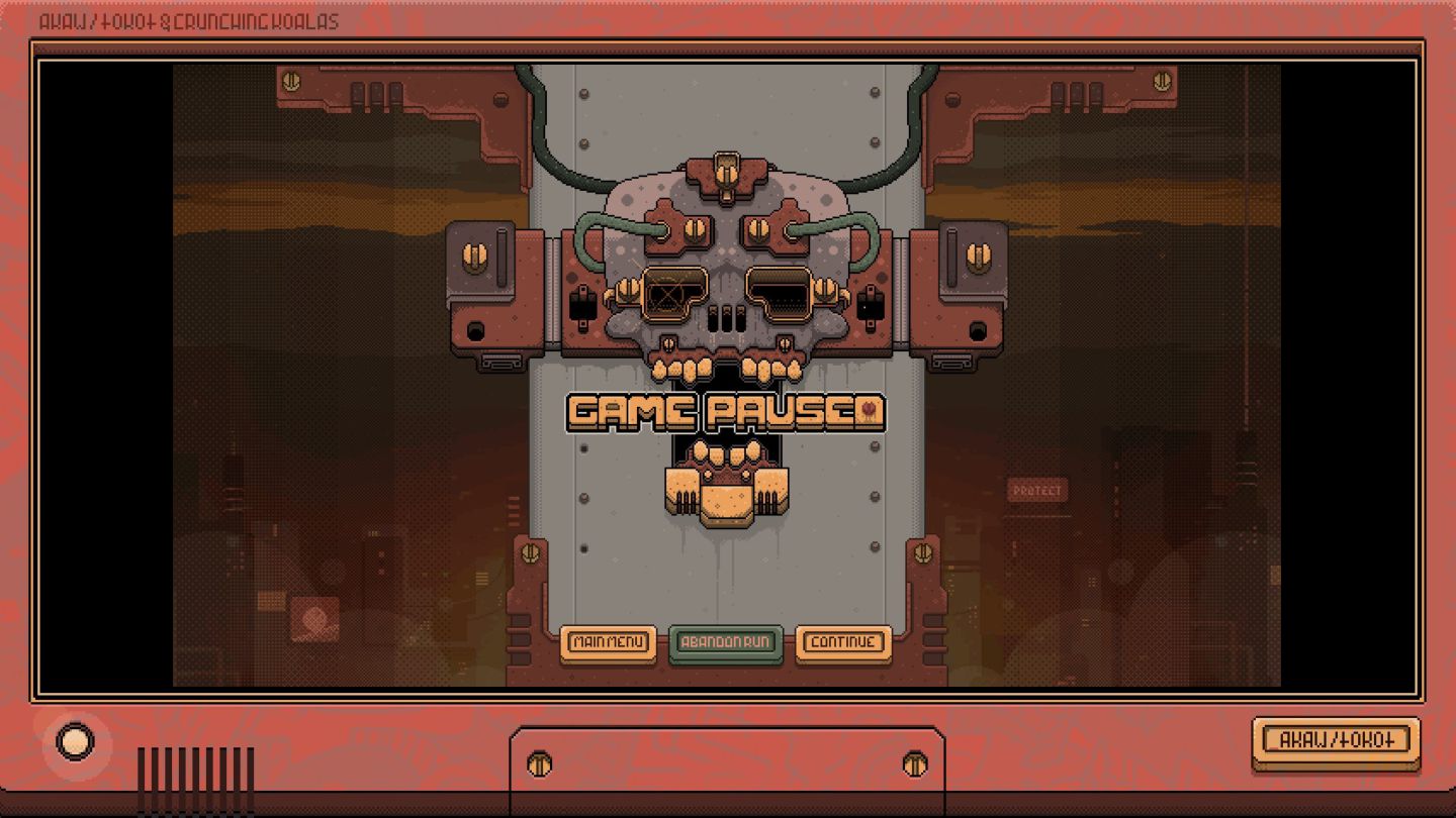
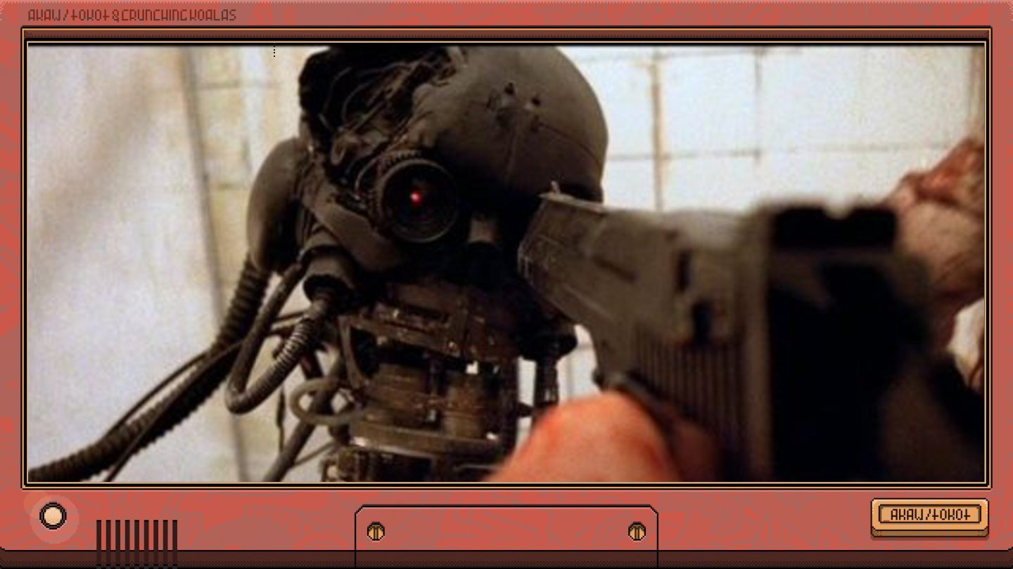
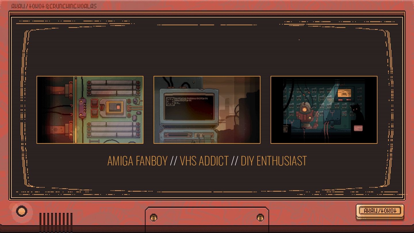
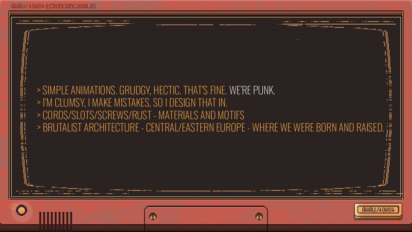
I’M CLUMSY, I MAKE MISTAKES, SO I DESIGN THAT IN. > CORDS/SLOTS/SCREWS/RUST - MATERIALS AND MOTIFS > BRUTALIST ARCHITECTURE - CENTRAL/EASTERN EUROPE - WHERE WE WERE BORN AND RAISED.
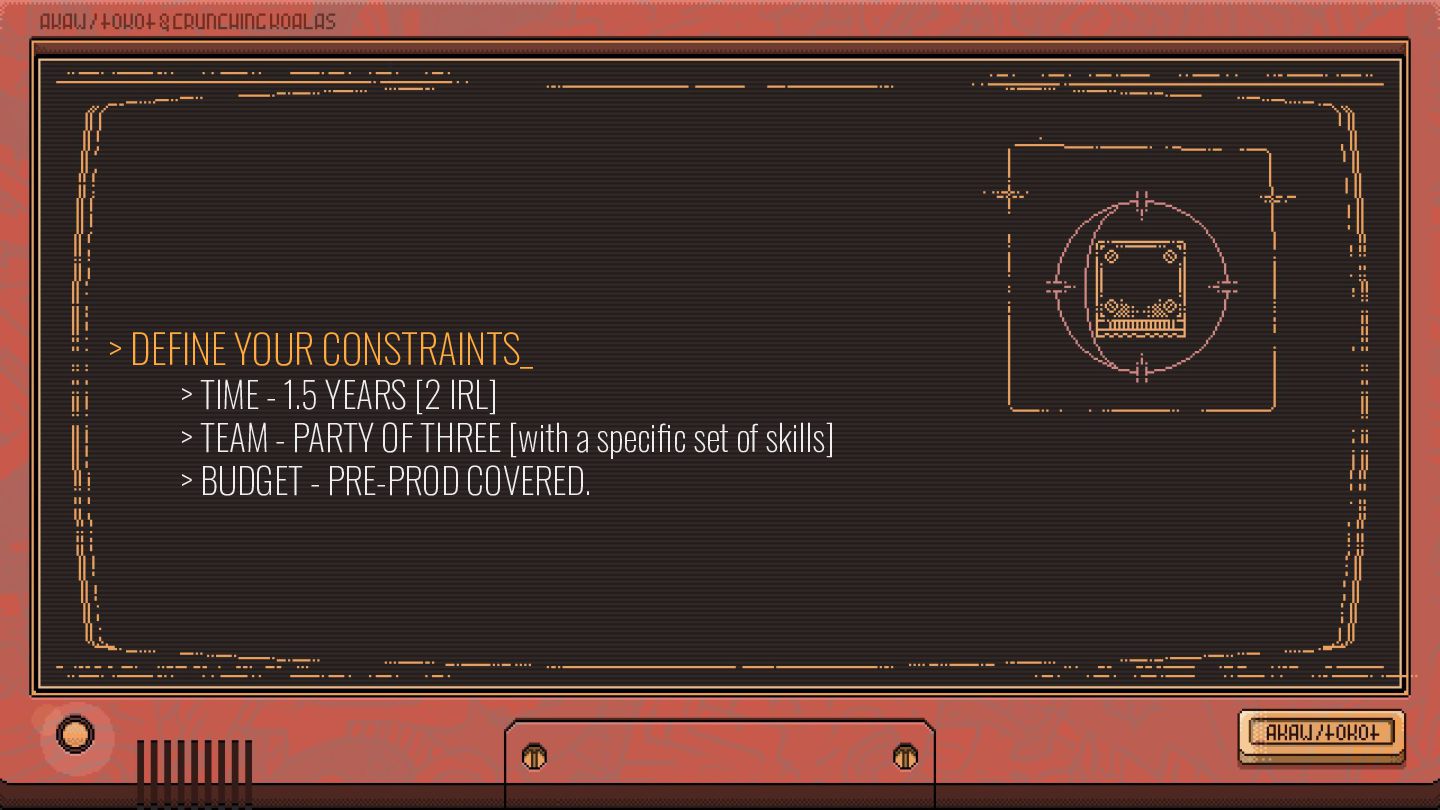
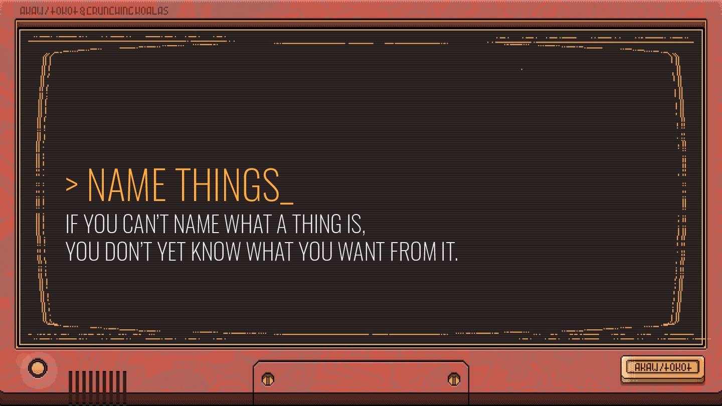
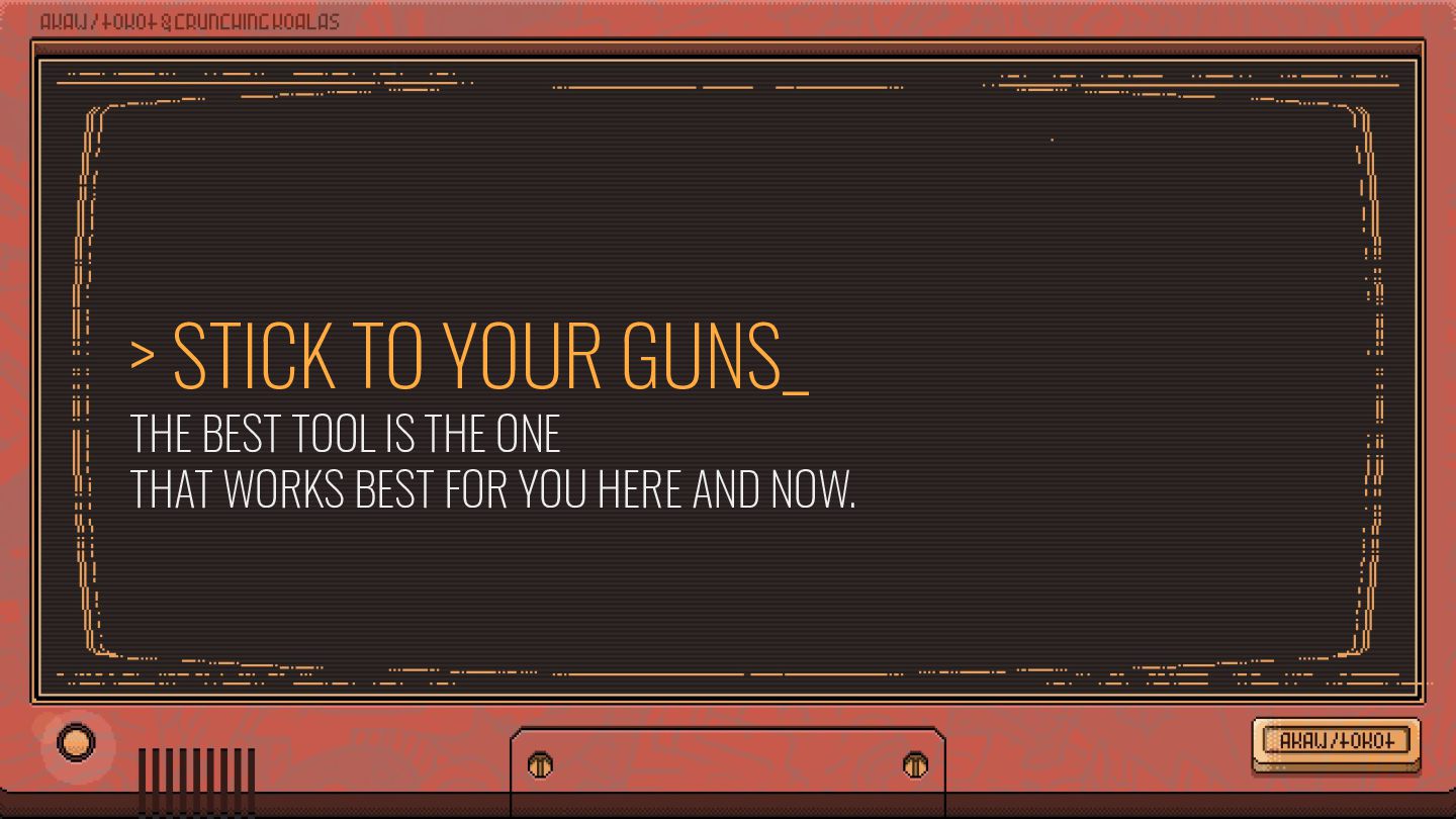
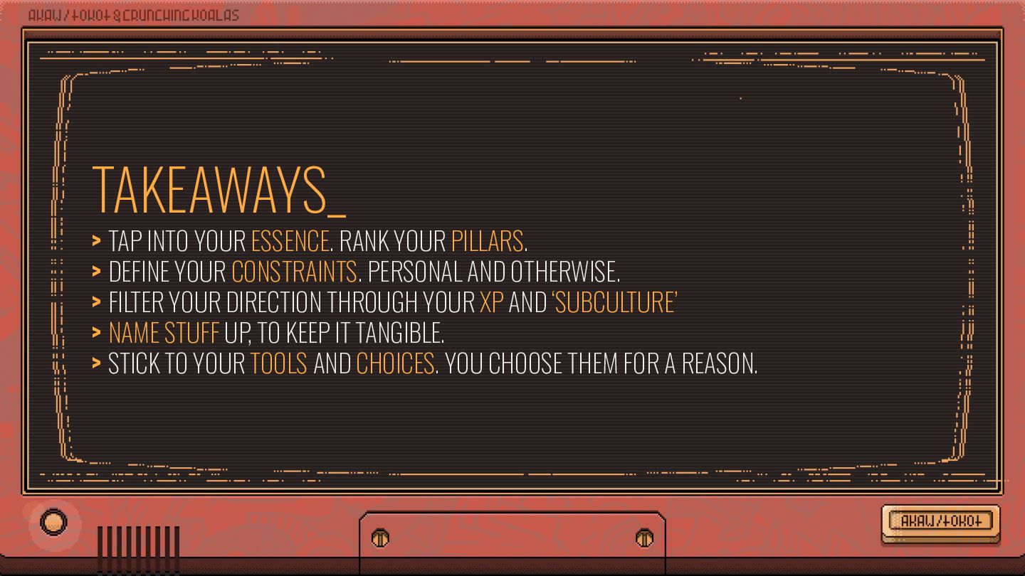
DEFINE YOUR CONSTRAINTS. PERSONAL AND OTHERWISE. > FILTER YOUR DIRECTION THROUGH YOUR XP AND ‘SUBCULTURE’ > NAME STUFF UP, TO KEEP IT TANGIBLE. > STICK TO YOUR TOOLS AND CHOICES. YOU CHOOSE THEM FOR A REASON.


 nishame
 accessinnovations
 rezaline
 niccy
 hiro0218
 securecat
 garyuten
 fumink7
 ishii_mit
 aikautau
 sakiyama
 sugi2000
 marcduiker
 denniskardys
 sergeychernyshev
 gurzu
 reverentgeek
 axbom
 tonyrice
 jnunemaker
 erikaheidi
 techseoconnect
 minecr
 aemeredith