Upgrade to Pro — share decks privately, control downloads, hide ads and more …

NACIS 2020: Mapping COVID-19 Coast to Coast, and Around the World

NACIS 2020: Mapping COVID-19 Coast to Coast, and Around the World

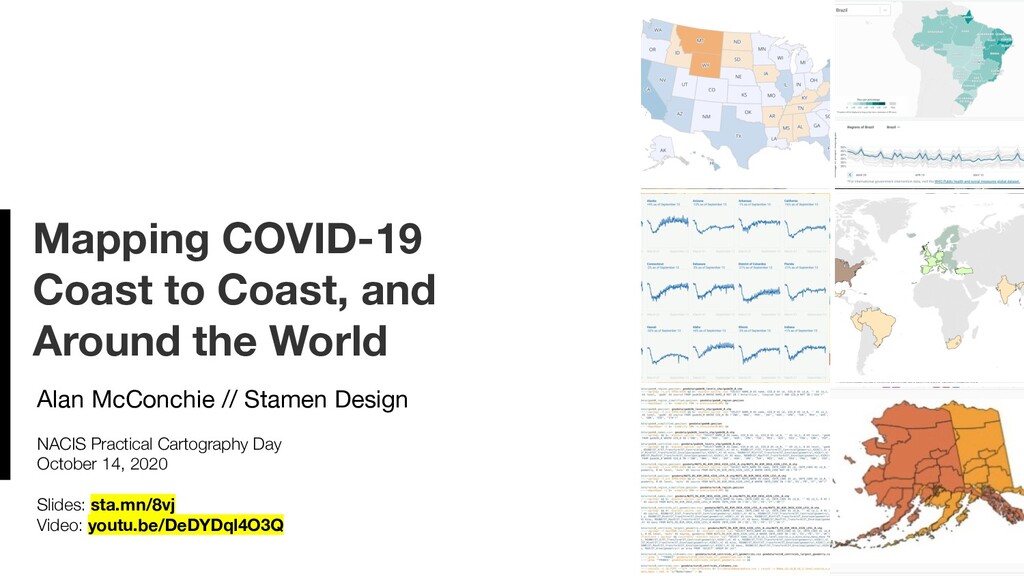
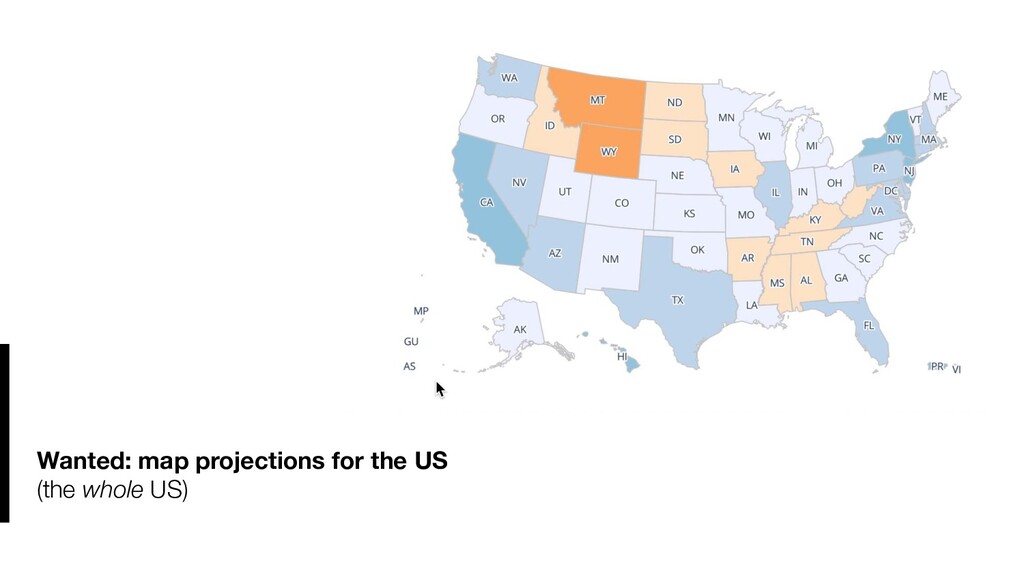
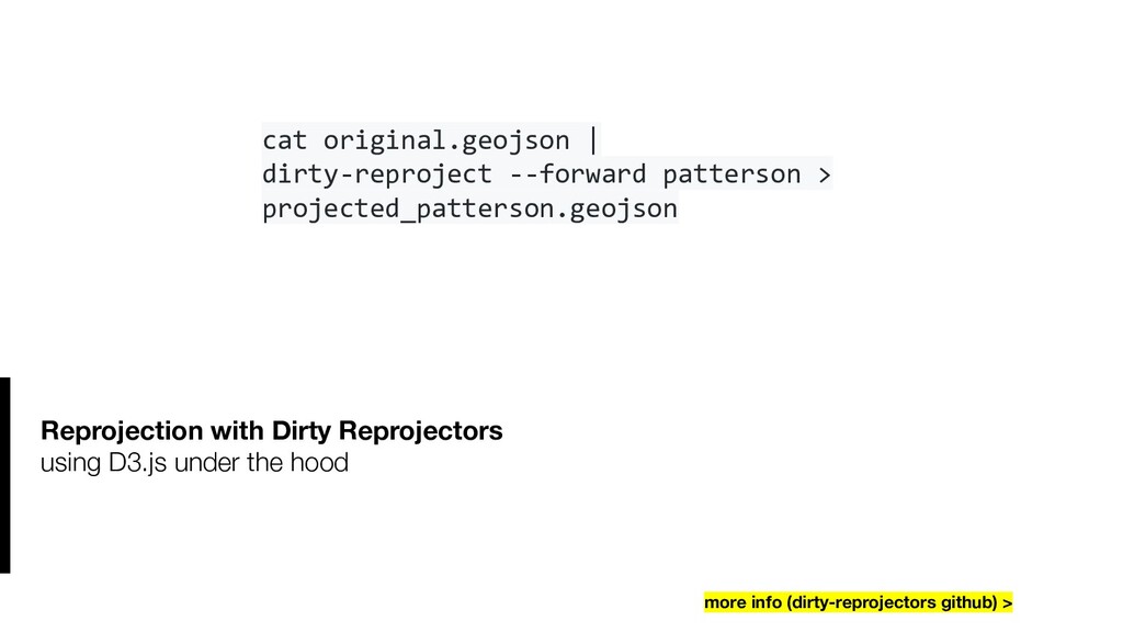
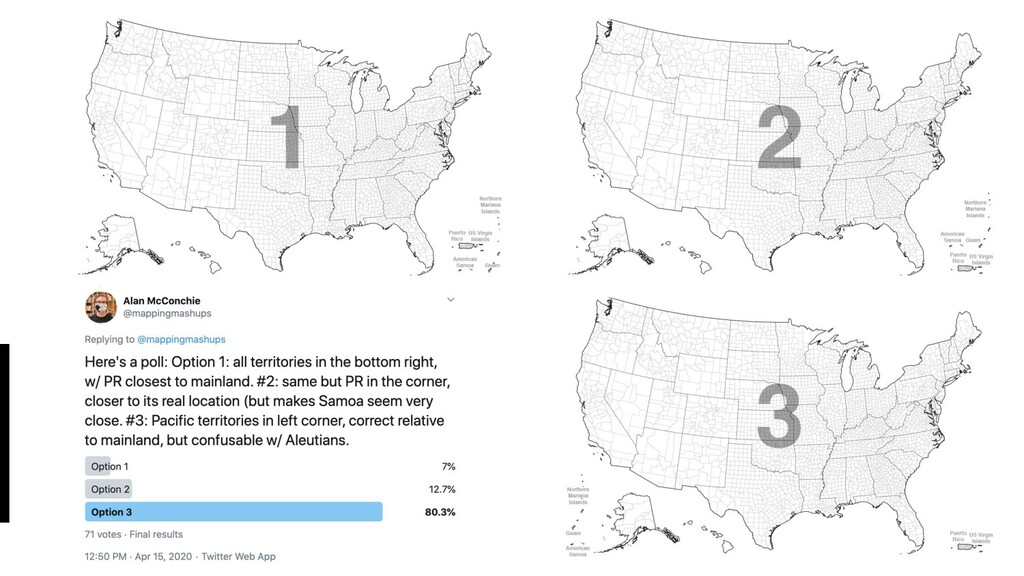
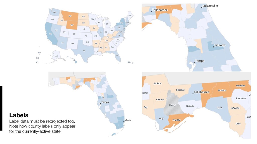
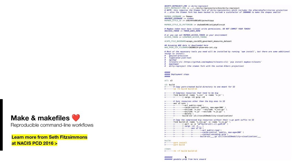
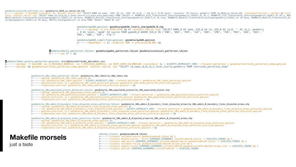
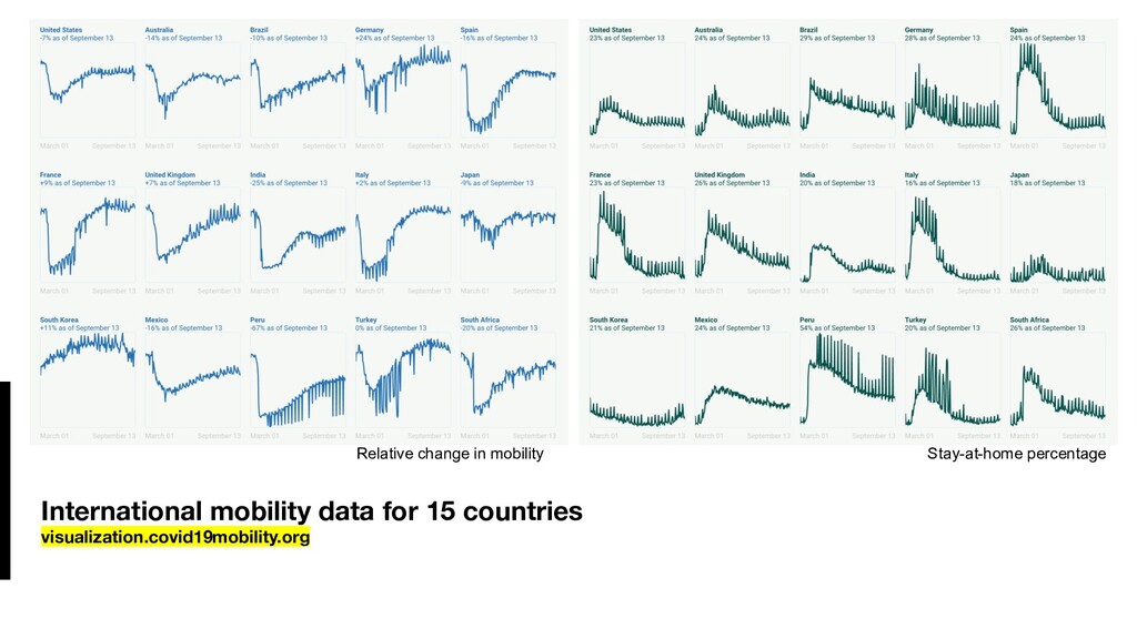
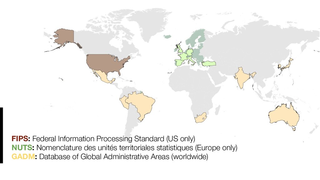
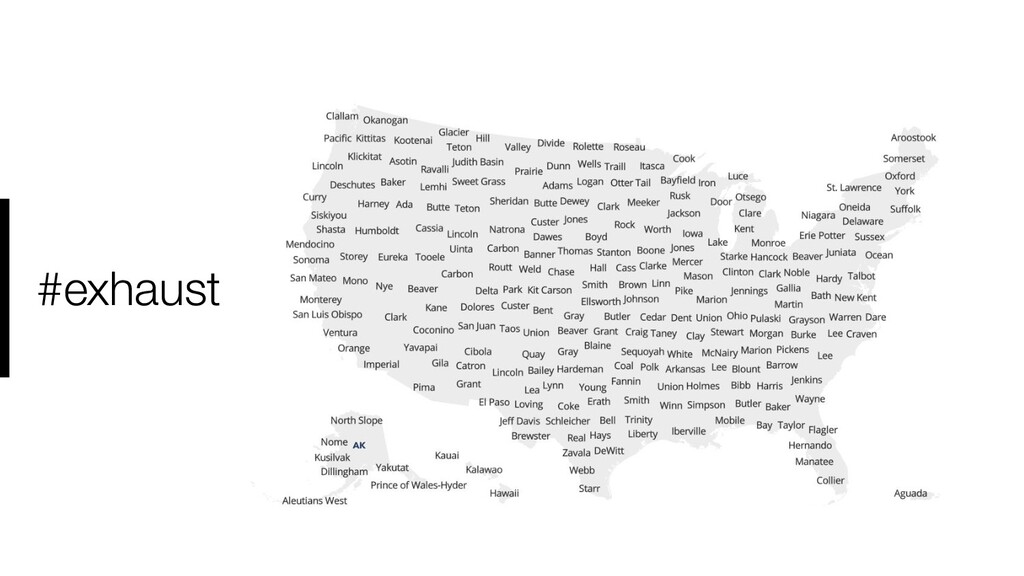
In developing an interactive map for the COVID-19 Mobility Network, we developed a unique set of map projections and dynamic map labels for the clearest and most effective communication of our data. In this session I’ll walk through the stages of developing and refining several iterations of our map, starting with a US-only Albers projection customized to include all US territories and possessions, to a global map combining hierarchical administrative data from many different sources. I explain how we used a variety of open source tools (from D3, Dirty Reprojectors, GDAL/OGR, MapShaper, Makefiles, and numerous Mapbox command-line tools and APIs) to create a repeatable and highly customizable workflow.

Video recording: https://www.youtube.com/watch?v=DeDYDql4O3Q
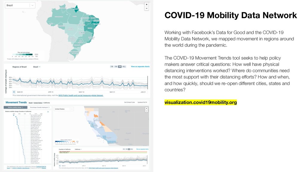
Alan McConchie

October 14, 2020
Tweet

More Decks by Alan McConchie

Other Decks in Programming

Transcript

  1. Mapping COVID-19 Coast to Coast, and Around the World Alan

    McConchie // Stamen Design NACIS Practical Cartography Day October 14, 2020 Slides: sta.mn/8vj Video: youtu.be/DeDYDql4O3Q
  2. COVID-19 Mobility Data Network Working with Facebook’s Data for Good

    and the COVID-19 Mobility Data Network, we mapped movement in regions around the world during the pandemic. The COVID-19 Movement Trends tool seeks to help policy makers answer critical questions: How well have physical distancing interventions worked? Where do communities need the most support with their distancing efforts? How and when, and how quickly, should we re-open different cities, states and countries? visualization.covid19mobility.org
  3. Mobility trends in the wild Governor’s COVID-19 press conference with

    Secretary of the California Health and Human Services Dr. Mark Ghaly, April 13, 2020
  4. Custom map projections in TileMill and Leaflet (aka “Lying to

    Leaflet”) oceanplanning.org climate.audubon.org natgeo.com/climate-change/explore-amazonia more info (NACIS PCD 2015) >
  5. Custom map projections in TileMill and Leaflet (aka “Lying to

    Leaflet”) more info (NACIS PCD 2015) > ogr2ogr -f GeoJSON -t_srs "EPSG:2163" -s_srs "EPSG:4326" /vsistdout/ unprojected.geojson | ogr2ogr -f GeoJSON -t_srs "EPSG:4326" -s_srs "EPSG:3857" projected.geojson /vsistdin/
  6. Custom map projections in PostGIS and CARTO more info (NACIS

    2015) > SELECT cartodb_id, name, ST_Transform(ST_SetSRID(ST_Transform(the_geom,2163),3857),4326) as the_geom FROM my_table
  7. Reprojection with Dirty Reprojectors using D3.js under the hood more

    info (dirty-reprojectors github) > cat original.geojson | dirty-reproject --forward patterson > projected_patterson.geojson
  8. Labels Label data must be reprojected too. Note how county

    labels only appear for the currently-active state.
  9. FIPS: Federal Information Processing Standard (US only) NUTS: Nomenclature des

    unités territoriales statistiques (Europe only) GADM: Database of Global Administrative Areas (worldwide)
  10. Thank you! Alan McConchie @mappingmashups [email protected] Slides: sta.mn/8vj Video: youtu.be/DeDYDql4O3Q

    Explore the map and let us know what you think! Visualization.covid19mobility.org Thanks to the COVID-19 Mobility Data Network, coordinated by Direct Relief and researchers from the Harvard T.H. Chan School of Public Health. Thanks also to Facebook’s Data for Good program.
  11. Tried pasting a Wikipedia table into LibreOffice, because what's the

    worst that could happen? Oh look, some SVG images came along for the ride!