Upgrade to Pro — share decks privately, control downloads, hide ads and more …

Evaluation 1

Anika
January 30, 2017

Evaluation 1

Anika

January 30, 2017
Tweet

Other Decks in Research

Transcript

  1. In what ways do your media products use, develop or

    challenge forms and conventions of real media products?
  2. My media products use forms and conventions of real media

    products. For example, it follows Andrew Goodwin's theory.
  3. 1. The music video of our artist is built around

    the song and follows the structure of verse, chorus, verse. VERSE VERSE CHORUS
  4. 2. Although, the music video does not show the story

    or illustrate the artist's lyrics, it still expressed her emotions through her facial expressions and body gesture. This is why our music is an amplification music video, rather than illustration or disjuncture. It is more of a performance than a story.
  5. 3. Andrew Goodwin also said that the narrator and participant

    of the music video is the artist and our artist follows that theory too. PARTICIPATION NARRATOR (SINGING)
  6. 4. Our artist also breaks the 4th wall time to

    time, to engage and connect with the audience.
  7. 5. Andrew Goodwin also said that there is a lot

    of repetition in a music video. For example, in our music video, it repeats the artist in the same location for the chorus which responds to the repetition of the lyrics in the chorus Different choruses, same location
  8. 1. There are close ups of the artist’s body parts

    in our music video which comes up briefly. This shows that she is represented sexually and from a male’s perspective. (Male gaze)
  9. 2. Our music video represents the artist as being emotional,

    weak and delicate which is what men expects from a woman
  10. However, then again she shows attitude in her lyrics and

    stands up for her worth in her lyrics, especially in the chorus which also challenges the theory.
  11. Our music video also follows Carol Vernallis' theory of how

    edits come much more frequently in a music video, particularly in the chorus. The chorus in our music video has a lot of jump cuts and edits at a fast pace to match with the beat and rhythm of the song. We used a lot of jumpcuts and frequent cuts in the chorus, especially to keep it more repetitive and engaging so it stays in the audience's memory.
  12. During pitch: We decided to go for an amplification music

    video which is very common in pop music videos. This exaggerates the meaning of the song and makes the pop music more intriguing. Examples of pop amplification music videos: Jessie J – Price tag Eminem Ft Rihanna – Love the way you lie
  13. At start of music video production: We used a lot

    of mid shots at the start which is a very common convention of a music video. We used close ups too, to get a personal look at the artist and create a relation between the artist and the audience.
  14. Andrew Goodwin’s theory: Artist breaking the 4th wall - She

    looks directly at the camera to engage with the audience and to make a personal connection with them.
  15. Mid shots: A very common convention in a pop music

    video is mid shots. We used a lot of mid shots but also tried to keep it minimum to make the video unique.
  16. Laura Mulvey’s theory: This shot is taken from a high

    angle which makes the female artist look weak and less dominant as expected from a male’s perspective.
  17. Andrew Goodwin’s theory: the artist is singing as well as

    performing in the music video. She is the narrator and the participant which tells the audience clearly that song belongs to her and it means something to her.
  18. Close ups: Close ups are also very common in all

    music video in fact because it allows audience to see through the artist clearly and find a connection.
  19. I decided to compare my music video with Adele’s song

    “Hello” because this music video and song is a similar style to our artist’s song “Disrespect” as they both talk about lost love and express their emotions.
  20. Adele breaks the 4th wall as soon as the music

    starts which could imply that the song deeply means something to her. Our first similarity with Adele is breaking the 4th wall. Her face shows her emotions visually.
  21. Adele is the participant as well as the narrator of

    her music video. Her video goes back and forth of her singing and her performing. This video follows Andrew Goodwin’s theory just like our music video does.
  22. There are a lot of close ups of her to

    capture the emotion and the deep meaning behind the song. Although, it is a close up, the shots are very dark and there are shadows that overshadow her face, making it mysterious.
  23. Adele’s music video is also an amplification music video because

    she goes back and forth of her singing and showing flashbacks of a man. It doesn’t exactly illustrate the song but it tells us that she misses this certain man and she is having memories about him.
  24. There are more mid shots at the end of the

    music video and the shots are much more fast paced at the end than the beginning which responds to Carol Vernallis’ theory that the shots build up by the end until it fades away.
  25. SIMILARITIES DIFFERENCES 1. They are both amplification music videos. 2.

    They both follow Andrew Goodwin’s theory of breaking the 4th wall. 3. They both include a lot of close ups. 4. They both have a similar pace. 5. They both have the artist as both the narrator and participant. 1. Adele has more than 1 participant, there is a male character in her music video. 2. Adele’s music video shows flashbacks and memories while she sings about them. 3. She has more moving shots and selective focus shots. 4. There are more props used in her music video than ours.
  26. Main convention is the artist’s name: It is big, bold

    and easy to read, so it informs the audience as well as making it easy for them to read.
  27. There is an image of the artist on the front

    panel of the digipak which is a very common convention among the pop genre. This advertises and promotes the artist as well as shows what is visually expected in her music videos.
  28. The track list at the back is straighforward and simple.

    There are usually a lot of space around the track list which makes it clear to read. The production information is usually very small.
  29. Another convention is graphics; nearly all digipaks have some kind

    of graphics which makes a key visual link that connects the back and the front panel together as well as other ancillary texts.
  30. The inside panels also have the same graphics as the

    front which links the whole digipak together.
  31. This is Jessie J’s digipak. I chose hers because her

    music is the same genre as our artist.
  32. First of all, it has an image of the artist

    on the front cover very clear and close up which makes it very easy for the audience to recognise who it is, therefore attracting more customers and promoting the artist.
  33. The artist’s name is at the front cover very big

    and clear with her signature font. This is another convention of a digipak. The artist’s name is the biggest text on a digipak.
  34. Another similarity between my digipak and Jessie J’s is the

    track list, they are both positioned in the centre of the back panel with the production information beneath it.
  35. SIMILARITIES DIFFERENCES 1. They both have the artist’s name bold,

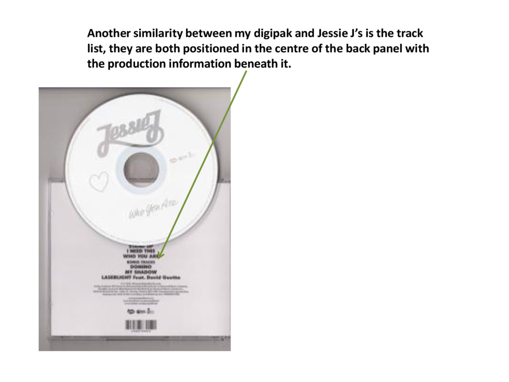
    big and clear at the front panel. 2. Both digipaks have the tracklist on the centre of the page, creating a balanced, neat look. 3. They both have the image of the artist on the front page. 4. They both stuck to their colour scheme. Jessie J: Black, gold and white. 1. Jessie J doesn’t have a specific graphic design on her digipak. 2. The back panel of Jessie J’s digipak is more simple and plain as there is no graphics or image of artist. 3. Jessie J’s digipak does not include the name of the album of the front cover which is usually expected on a digipak.
  36. A common convention is the colour scheme that is used

    for all ancillary products to promote the same thing. The magazine advert stuck to the gold, maroon and black colour scheme.
  37. A magazine advert usually has ratings or comments to advertise

    the music or to let the audience know that it will be worth buying. So, that is what I did here.
  38. A magazine advert usually includes the date that the album

    will be released. Here, shows the date that my artist’s album will be released.
  39. The magazine advert should also inform where the album can

    purchased from. For example, my album can be purchased from the official Carla Smith website, Google Play or iTunes.
  40. I chose Taylor Swift’s magazine advert to compare conventions because

    her music is the same genre as Carla Smith’s.
  41. The first convention is that it has a release date

    and information about where the album can be purchased from.
  42. There is a comment included on the advert to promote

    the artist. This gives the artist a good name and will attract more customers.
  43. The magazine advert sticks to the colour scheme of red,

    white and grey which symbolises the album and music.
  44. SIMILARITIES DIFFERENCES 1. They both have the artist’s name big

    and bold with the same colour scheme as their digipaks. 2. They both include a positive comment about the album to attract customers. 3. They both include information about release date and where the album can be purchased from. 4. They both include an image of the artist. 1. Taylor swift’s magazine advert shows the album name in a bigger size than her name. 2. Taylor swift’s image is more further away, it is a long shot and not close up and personal.
  45. Overall, there are some artists who do not follow all

    the conventions. I believe, my ancillary texts follow most of the conventions in the pop genre.