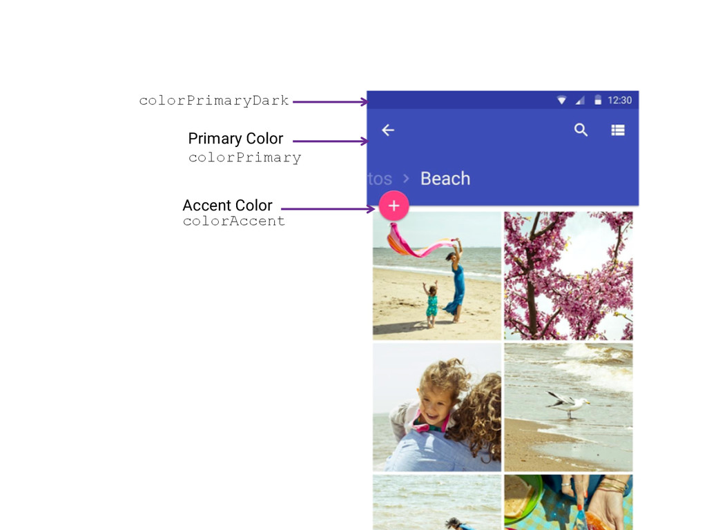
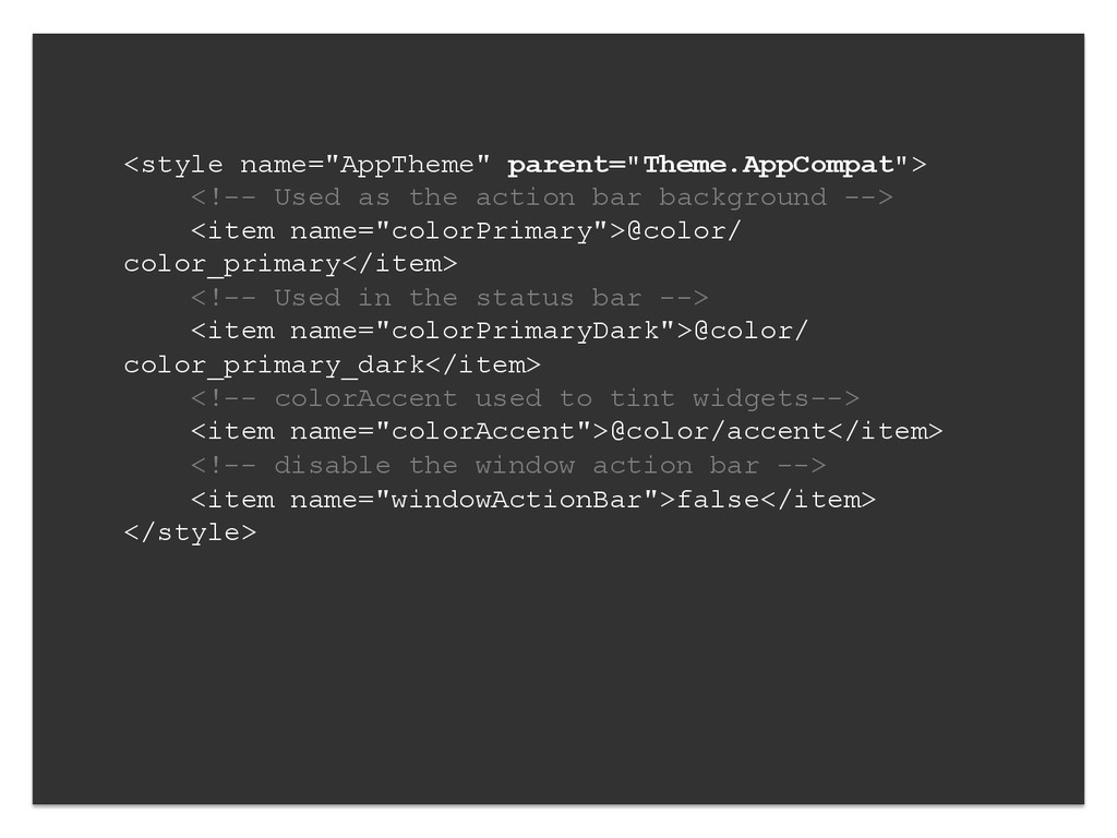
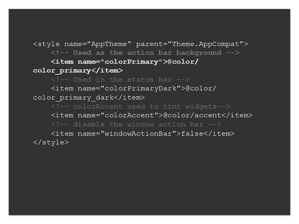
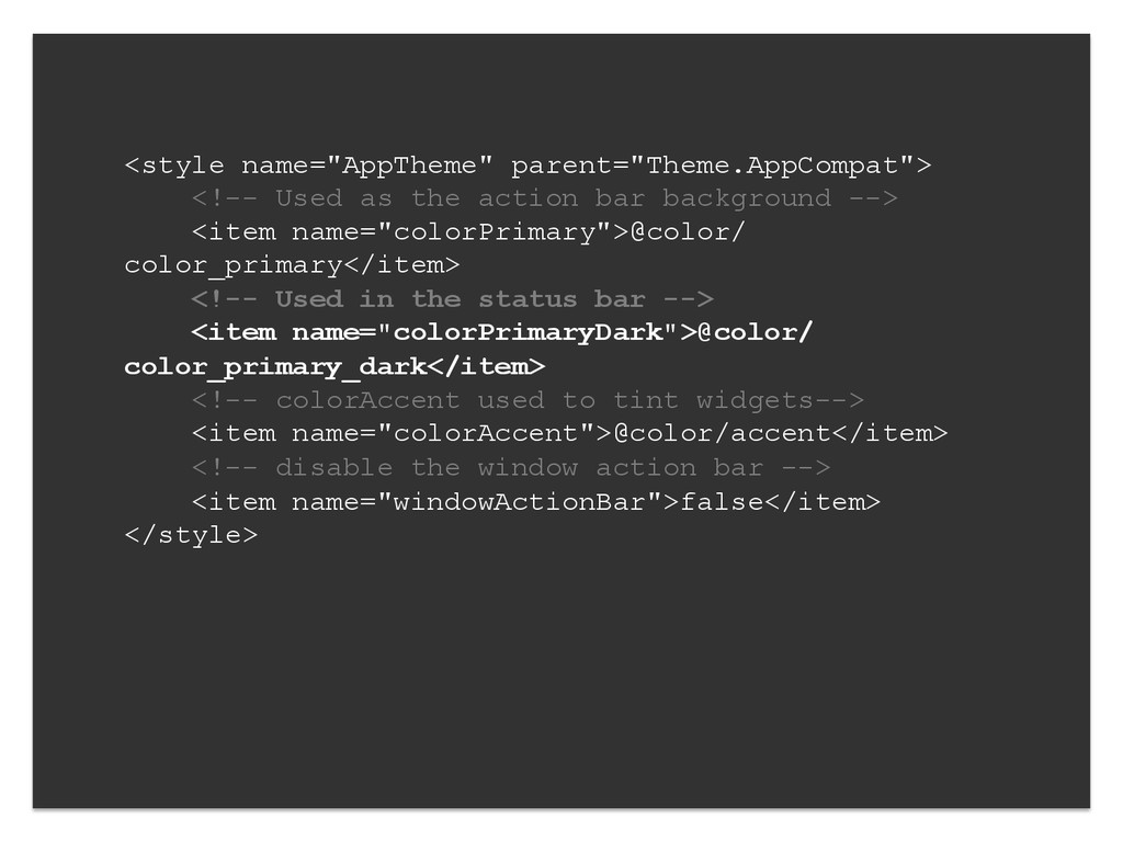
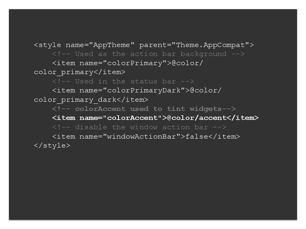
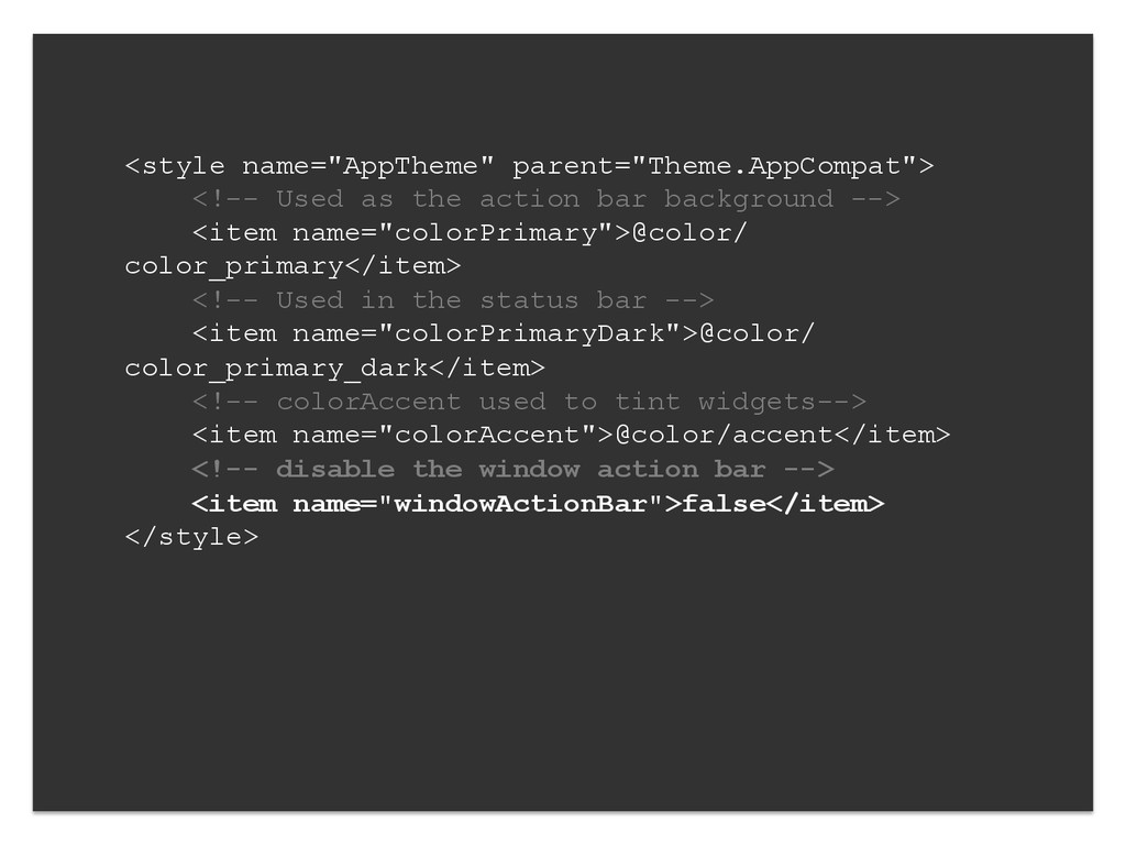
--> <item name="colorPrimary">@color/ color_primary</item> <!-- Used in the status bar --> <item name="colorPrimaryDark">@color/ color_primary_dark</item> <!-- colorAccent used to tint widgets--> <item name="colorAccent">@color/accent</item> <!-- disable the window action bar --> <item name="windowActionBar">false</item> </style>
--> <item name="colorPrimary">@color/ color_primary</item> <!-- Used in the status bar --> <item name="colorPrimaryDark">@color/ color_primary_dark</item> <!-- colorAccent used to tint widgets--> <item name="colorAccent">@color/accent</item> <!-- disable the window action bar --> <item name="windowActionBar">false</item> </style>
--> <item name="colorPrimary">@color/ color_primary</item> <!-- Used in the status bar --> <item name="colorPrimaryDark">@color/ color_primary_dark</item> <!-- colorAccent used to tint widgets--> <item name="colorAccent">@color/accent</item> <!-- disable the window action bar --> <item name="windowActionBar">false</item> </style>
--> <item name="colorPrimary">@color/ color_primary</item> <!-- Used in the status bar --> <item name="colorPrimaryDark">@color/ color_primary_dark</item> <!-- colorAccent used to tint widgets--> <item name="colorAccent">@color/accent</item> <!-- disable the window action bar --> <item name="windowActionBar">false</item> </style>
--> <item name="colorPrimary">@color/ color_primary</item> <!-- Used in the status bar --> <item name="colorPrimaryDark">@color/ color_primary_dark</item> <!-- colorAccent used to tint widgets--> <item name="colorAccent">@color/accent</item> <!-- disable the window action bar --> <item name="windowActionBar">false</item> </style>
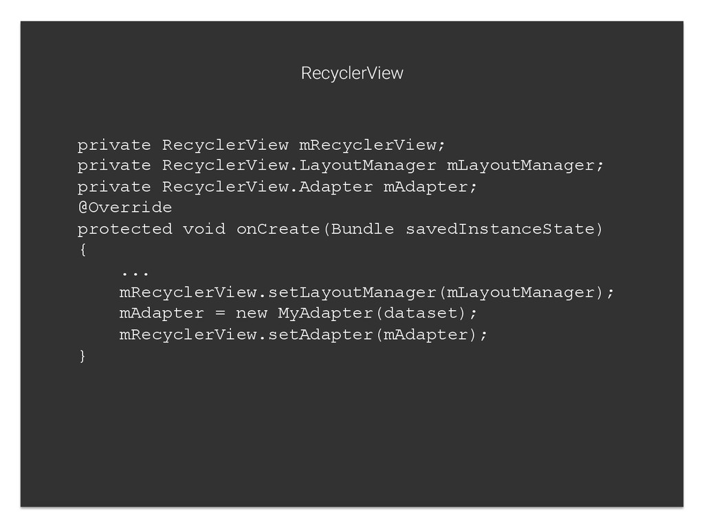
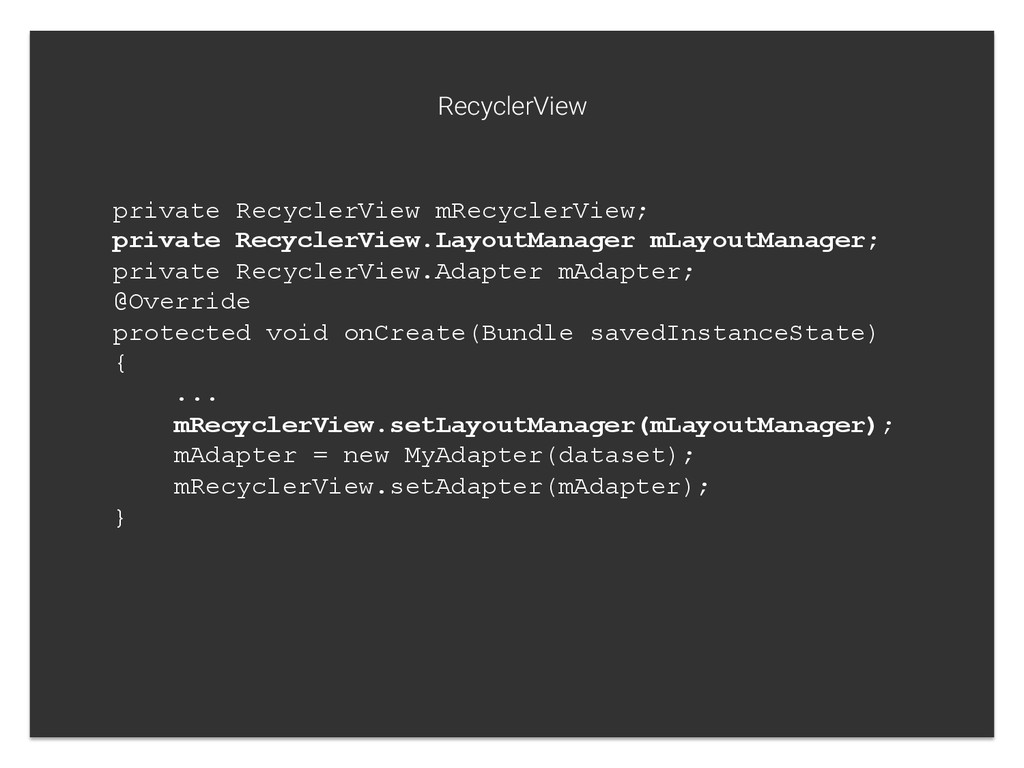
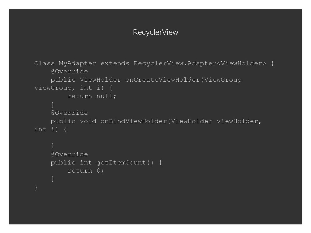
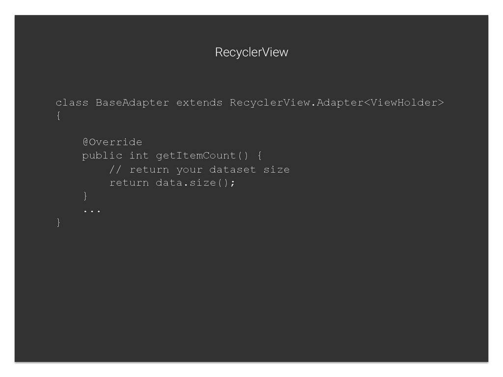
int i) { return null; } @Override public void onBindViewHolder(ViewHolder viewHolder, int i) { } @Override public int getItemCount() { return 0; } } RecyclerView
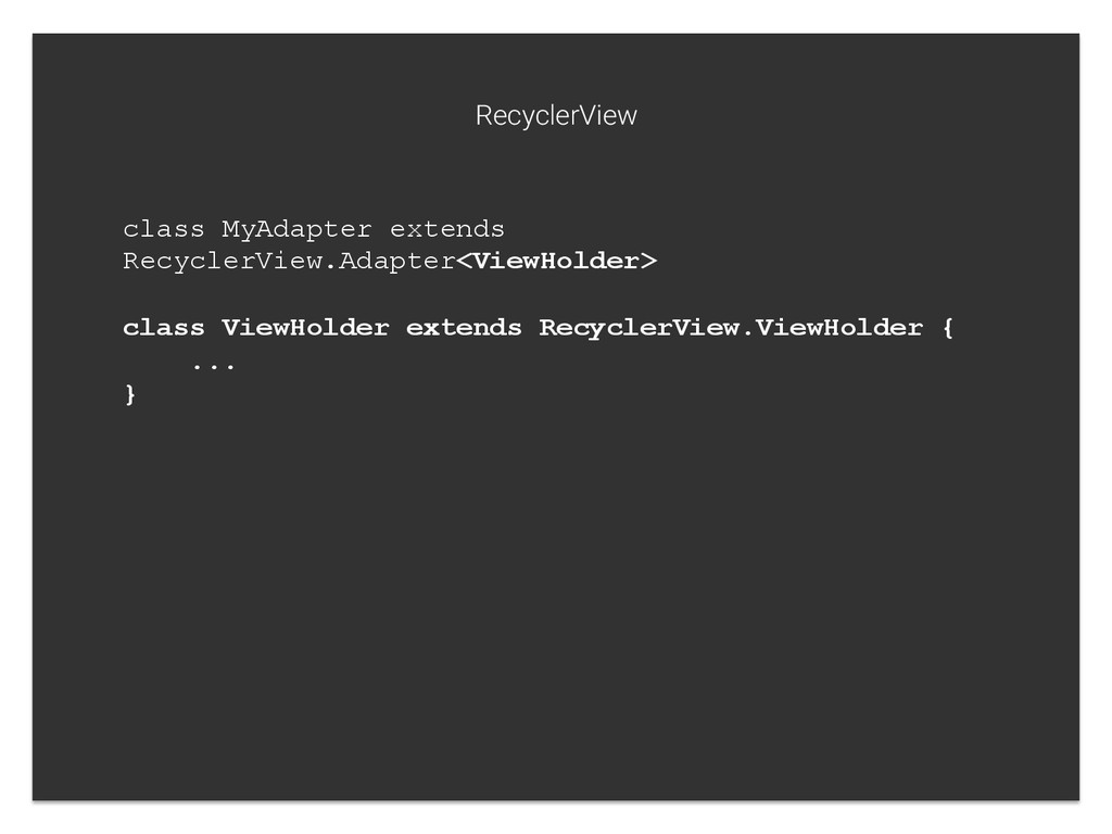
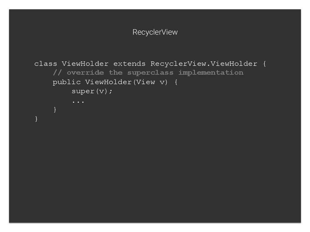
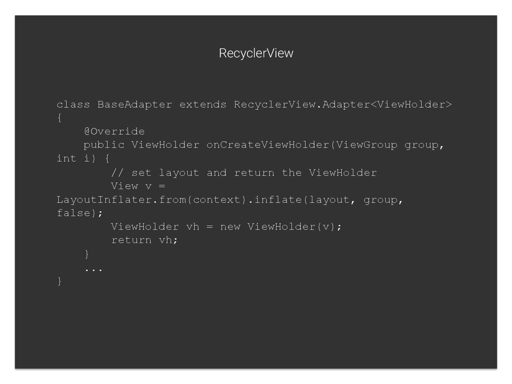
int i) { // set layout and return the ViewHolder View v = LayoutInflater.from(context).inflate(layout, group, false); ViewHolder vh = new ViewHolder(v); return vh; } ... } RecyclerView
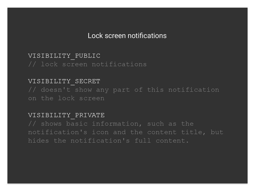
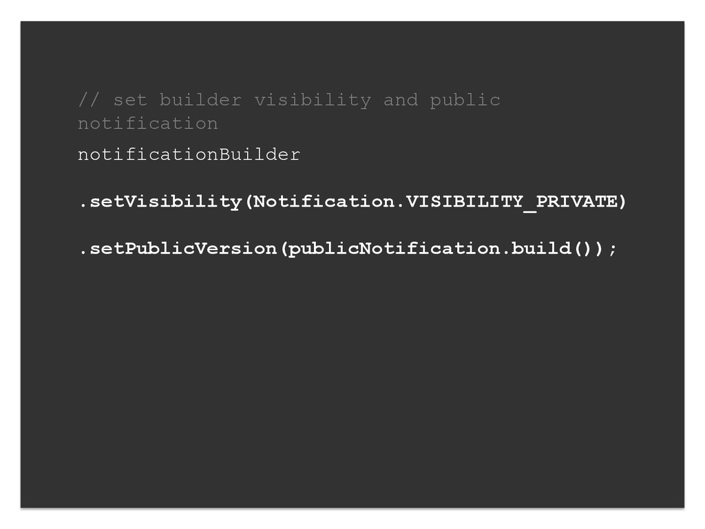
doesn't show any part of this notification on the lock screen VISIBILITY_PRIVATE // shows basic information, such as the notification's icon and the content title, but hides the notification's full content.
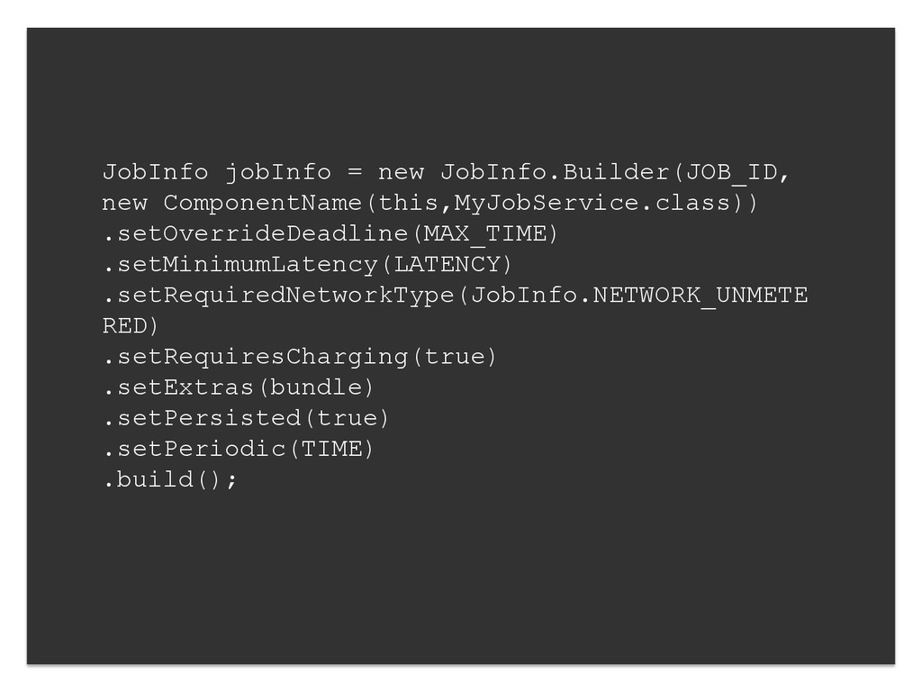
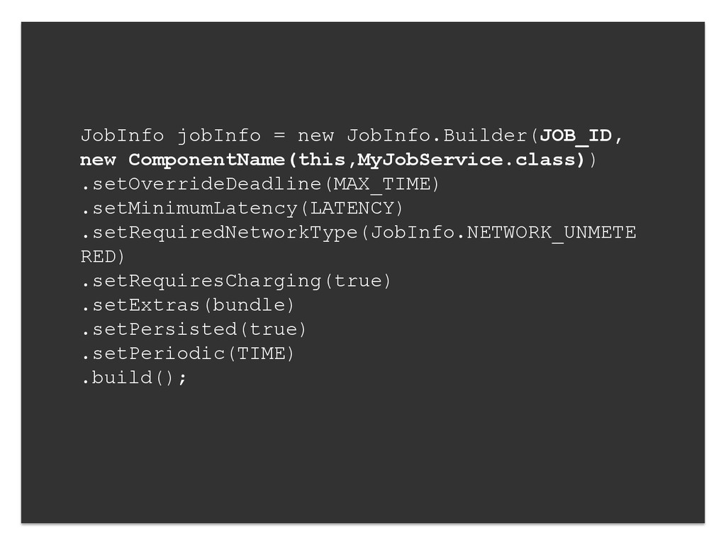
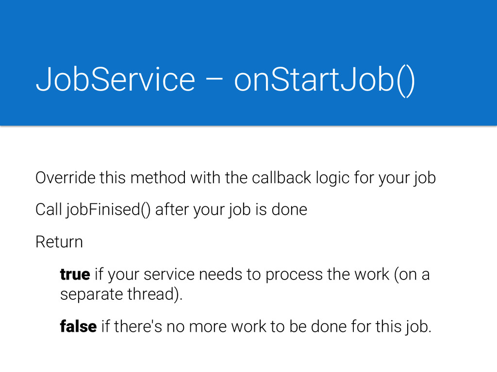
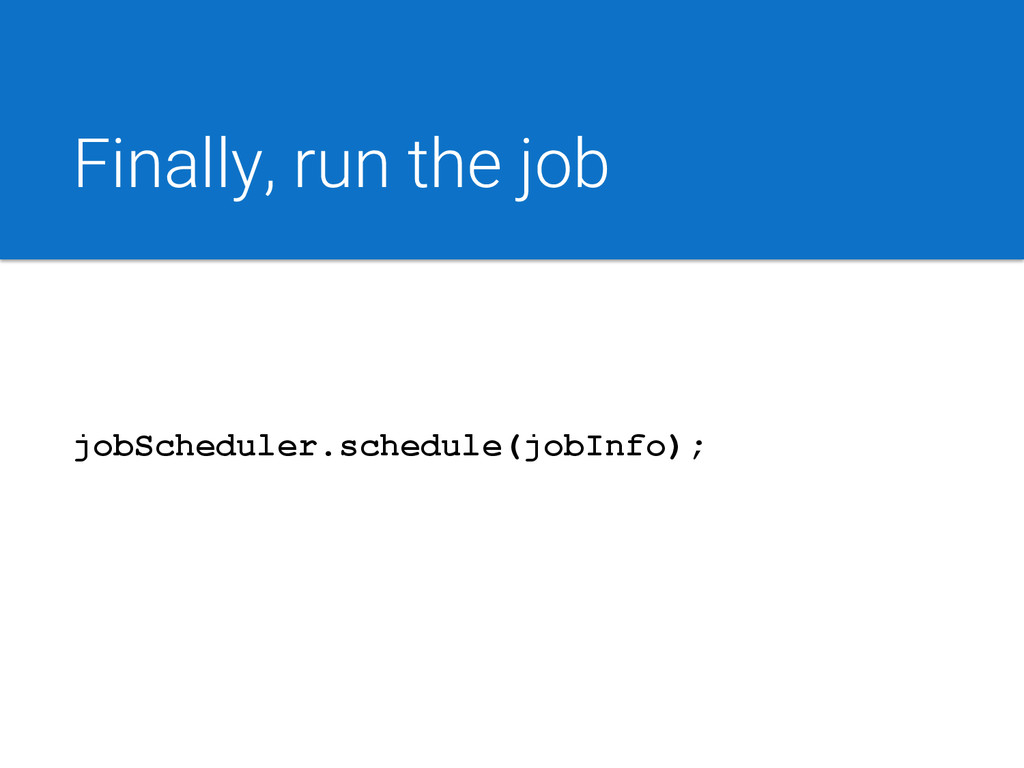
for your job Call jobFinised() after your job is done Return true if your service needs to process the work (on a separate thread). false if there's no more work to be done for this job.
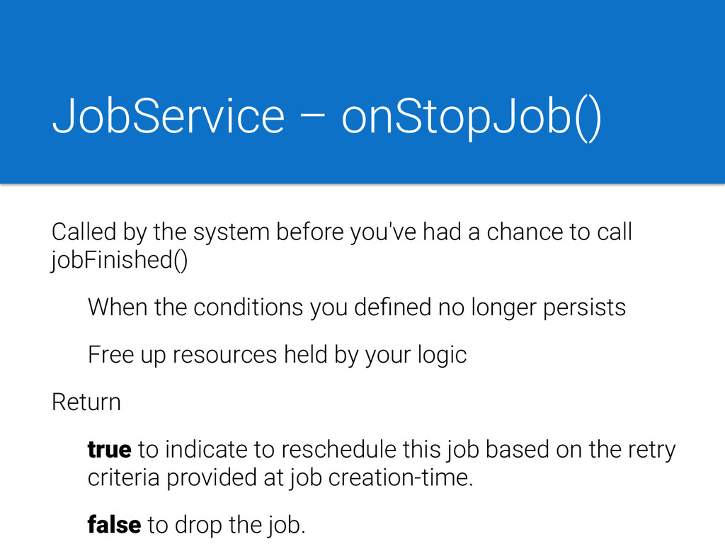
a chance to call jobFinished() When the conditions you defined no longer persists Free up resources held by your logic Return true to indicate to reschedule this job based on the retry criteria provided at job creation-time. false to drop the job.
 anjhero
 kyoshidaxx
 blue_goheimochi
 nakasho
 ykanoh
 overflowinc
 yuheinakasaka
 satohjohn
 yamatai1212
 sansan33
 toru_kubota
 prinlab
 skipperchong
 zakiyama
 mfonobong
 eileencodes
 bermonpainter
 cargoodrich
 michielstock
 nikkihalliwell
 tomoyanonymous
 charlesmeaden
 mza
mza
 katiecoart