Upgrade to Pro — share decks privately, control downloads, hide ads and more …

GRANDMA ! Why would you click on that ?

Arthur Retrou
January 31, 2019

GRANDMA ! Why would you click on that ?

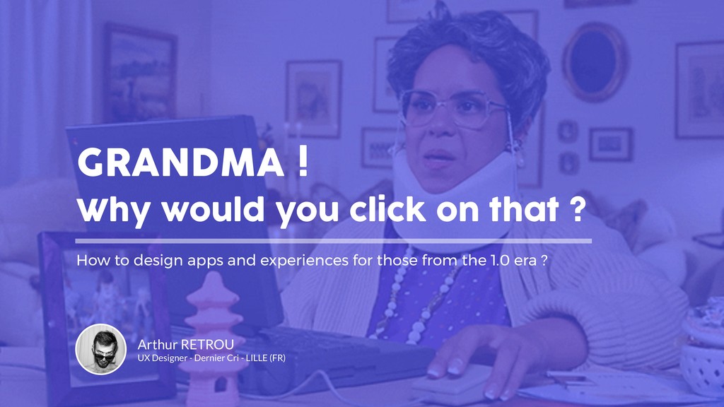
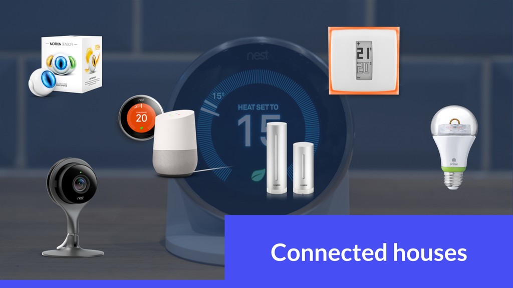
Your grandma is calling you again to say that Avast is a virus ?
Or is it because she just won an Audi on this strange website ?
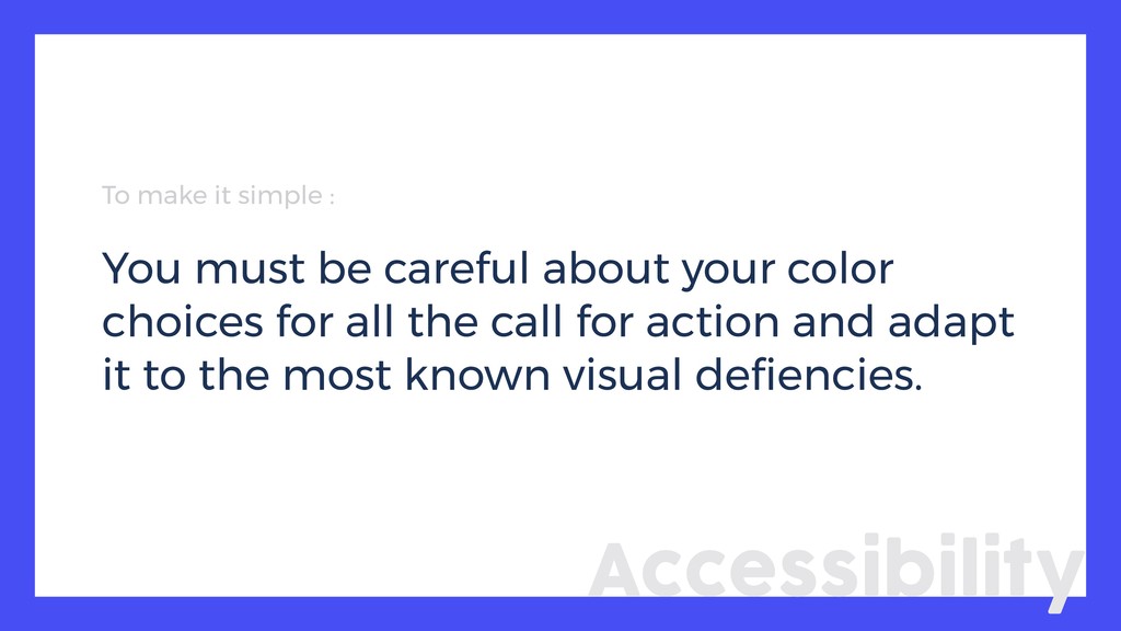
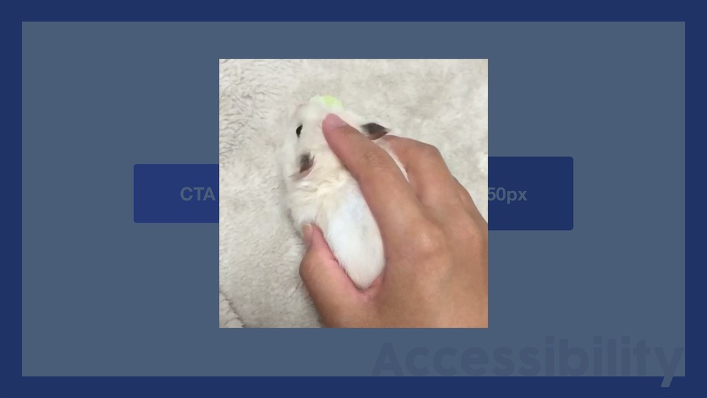
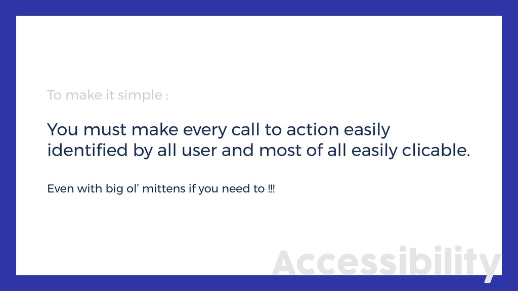
Everybody felt this way once, but the real problem is not with her, it is the design of the products.
In this conference you will have some tips and trick to create better experience and digital products for our loved ones from the 1.0 era.

Arthur Retrou

January 31, 2019
Tweet

More Decks by Arthur Retrou

Other Decks in Design

Transcript

  1. GRANDMA ! Why would you click on that ? How

    to design apps and experiences for those from the 1.0 era ? Arthur RETROU UX Designer - Dernier Cri - LILLE (FR)
  2. So, what’s an « old person » really ? ?

    ? ? ? ? ? ? ? ? ? ? ? ? ? ? ? ? ? ? ?
  3. =

  4. Principle #1 The app should be able to be used

    everyday in a procedural way. Experience
  5. To make it simple : You need to avoid asking

    a detail to remember at one time. Even more if this detail have a great importance for the rest of the experience. Experience
  6. To make it simple : You have to sequence the

    learning of your app to fix all the movements and reflexes needed … Notifications too !!! Experience
  7. To make it simple You have to sequence the learning

    of your app to fix all the movements and reflexes needed … Notifications too Experience Shit, Shit Shit, Shit …
  8. Principle #3 Every interactions needs a proper feedback in order

    to confirm the succes or the failure of the action. Experience
  9. To make it simple : You have to signal the

    user with explicit feedbacks to avoid errors, confusion or misclicks. Experience
  10. Principle #4 You have to show simplified access to the

    most used section instead of showcasing the new stuff/features. Experience
  11. To make it simple : You need a unity in

    your design ergonomy to make easy access on the most used sections in order to fix the learning of your product and the use of it. Experience
  12. Principle #1 You need to be aware of the optical

    capacity of your target in order to offer maximal confort for the user. Accessibility
  13. Accessibility Every day is taco ipsum tuesday. BARBACOA!! Give me

    all your tacos. Every day is taco ipsum tuesday. BARBACOA!! Give me all your tacos. Text of 12px Text of 16px Every day is taco ipsum tuesday. BARBACOA!! Give me all your tacos. Legal stuff you want to hide of 10px
  14. To make it simple : You must propose options in

    order to maximize the confortable use of your product, no matter wich type of user. Accessibility
  15. Principle #2 You have to write and explain more deeply

    your features and how they work Accessibility
  16. To make it simple : Don’t be afraid to write

    long texts about complex features in order to explain it better, in a more direct way Accessibility
  17. To make it simple : You must be careful about

    your color choices for all the call for action and adapt it to the most known visual defiencies. Accessibility
  18. To make it simple : You must make every call

    to action easily identified by all user and most of all easily clicable. Even with big ol’ mittens if you need to !!! Accessibility
  19. So how do you conclude that ? When it’s done,

    we run to the buffet … Alright … Steady … Almost there…