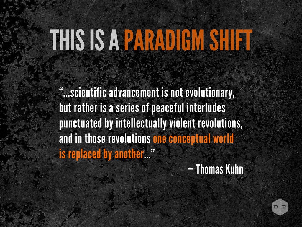
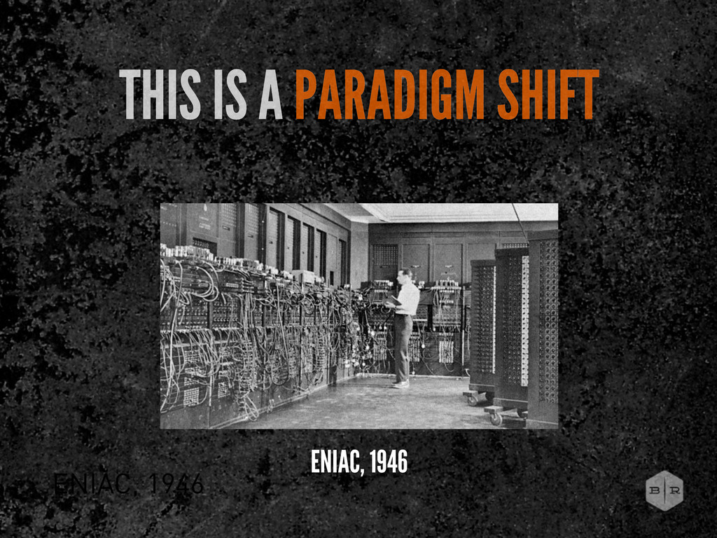
but rather is a series of peaceful interludes punctuated by intellectually violent revolutions, and in those revolutions one conceptual world is replaced by another...” — Thomas Kuhn
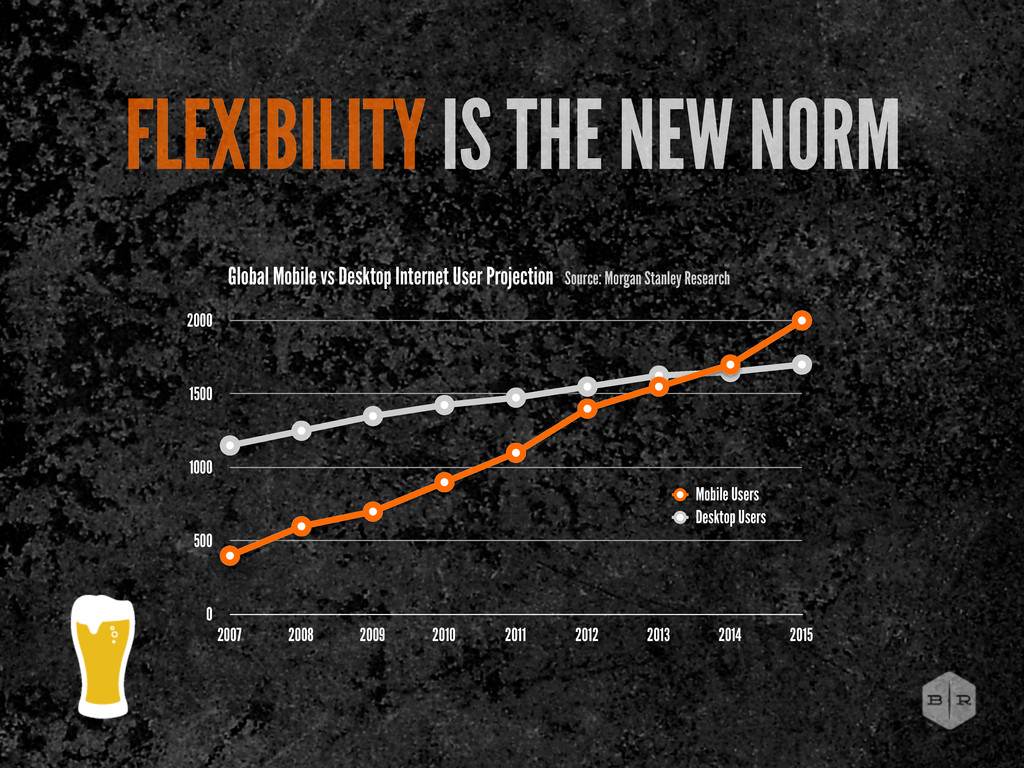
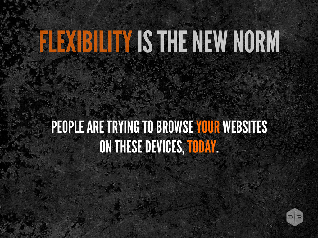
2007 2008 2009 2010 2011 2012 2013 2014 2015 Mobile Users Desktop Users Global Mobile vs Desktop Internet User Projection Source: Morgan Stanley Research
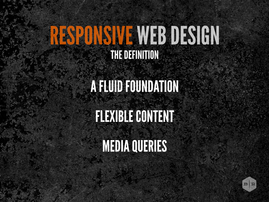
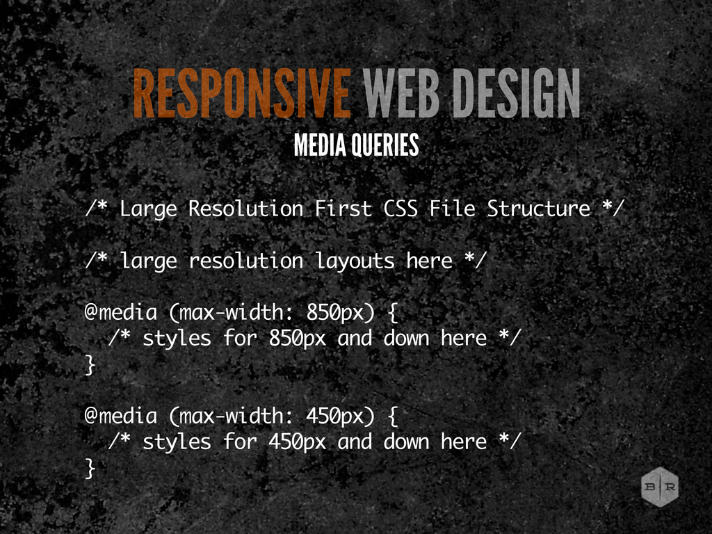
resolution layouts here */ @media (max-width: 850px) { /* styles for 850px and down here */ } @media (max-width: 450px) { /* styles for 450px and down here */ } RESPONSIVE WEB DESIGN MEDIA QUERIES
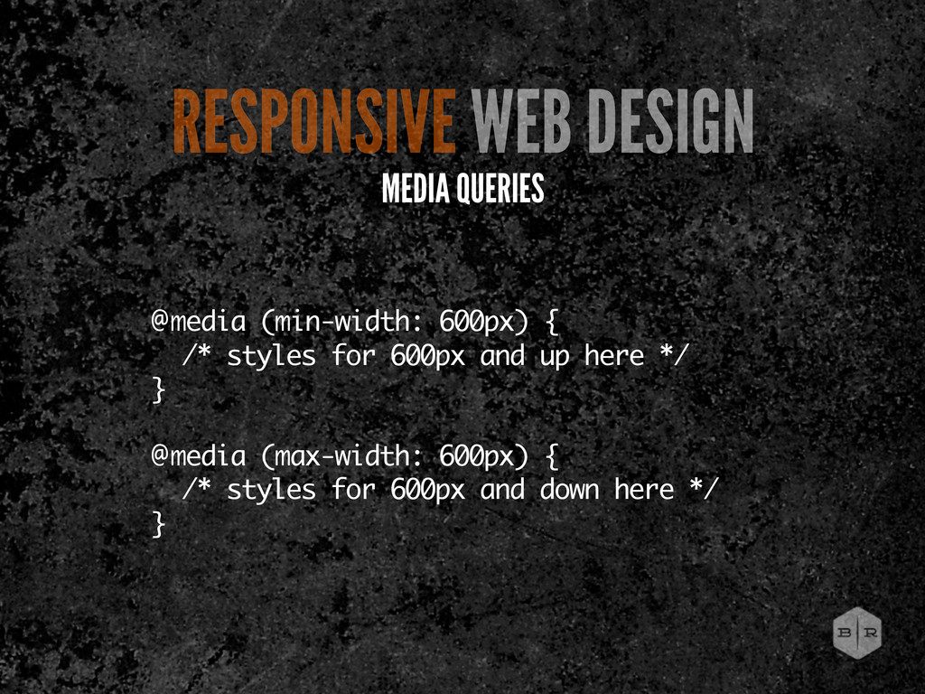
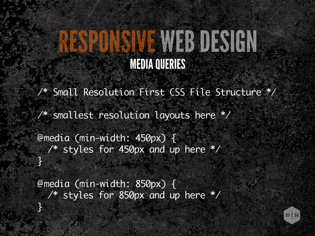
resolution layouts here */ @media (min-width: 450px) { /* styles for 450px and up here */ } @media (min-width: 850px) { /* styles for 850px and up here */ } RESPONSIVE WEB DESIGN MEDIA QUERIES
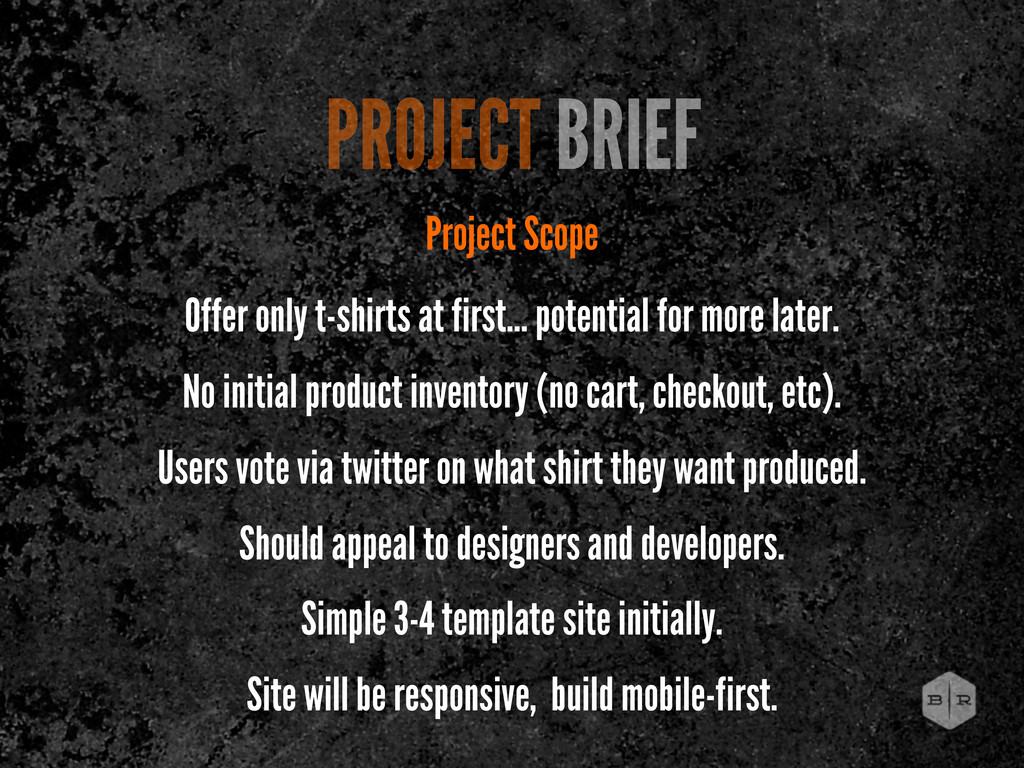
for more later. No initial product inventory (no cart, checkout, etc). Users vote via twitter on what shirt they want produced. Should appeal to designers and developers. Simple 3-4 template site initially. Site will be responsive, build mobile-first.
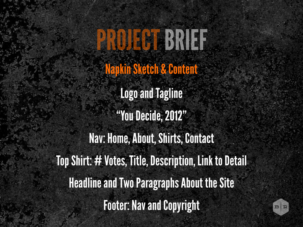
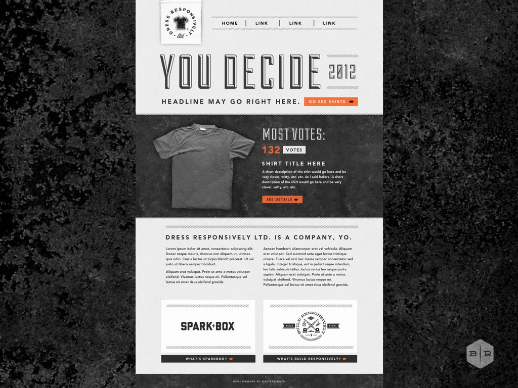
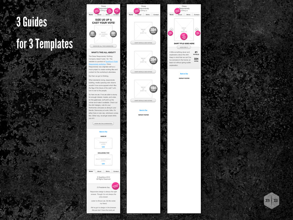
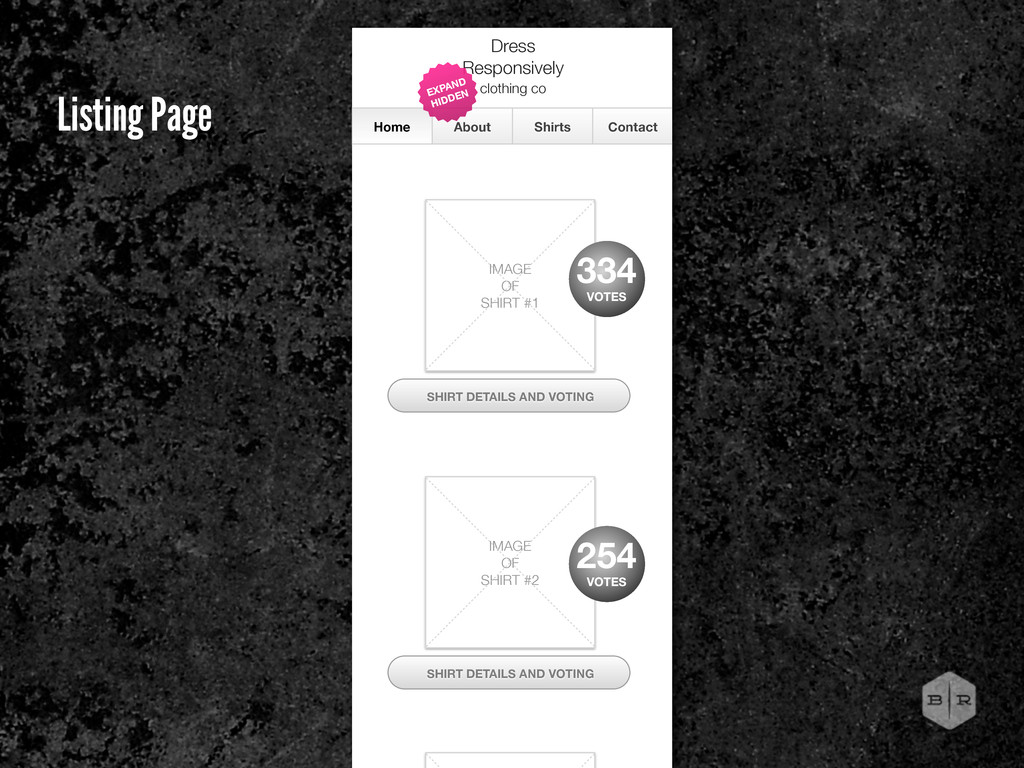
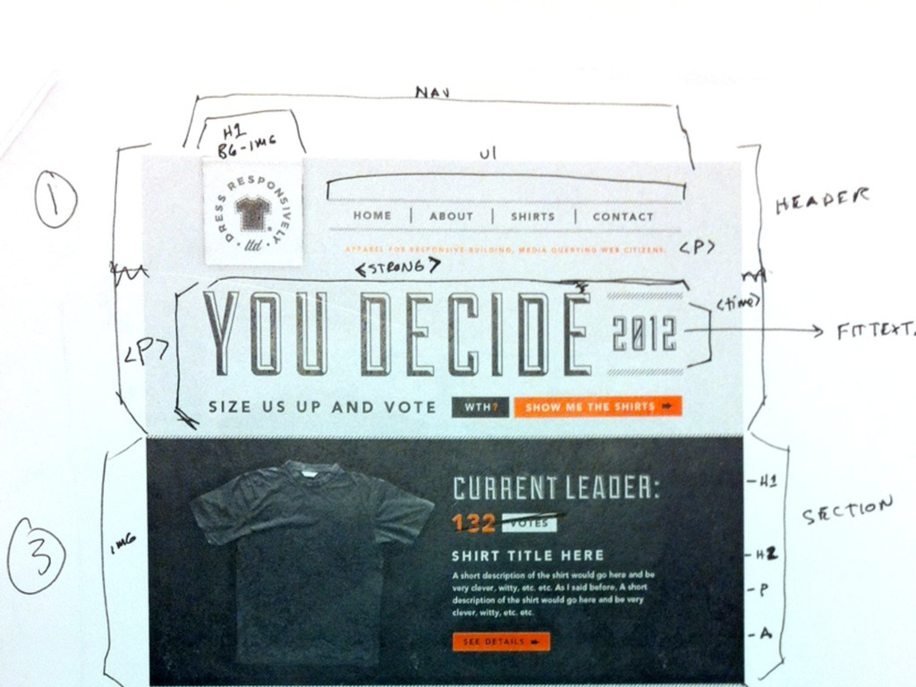
Decide, 2012” Nav: Home, About, Shirts, Contact Top Shirt: # Votes, Title, Description, Link to Detail Headline and Two Paragraphs About the Site Footer: Nav and Copyright
hide and show elements at different sizes? Which things are links? Are the buttons/links large enough for a touch device? How will the navigation respond? How much content do we need to allow for? Will it work in IE?
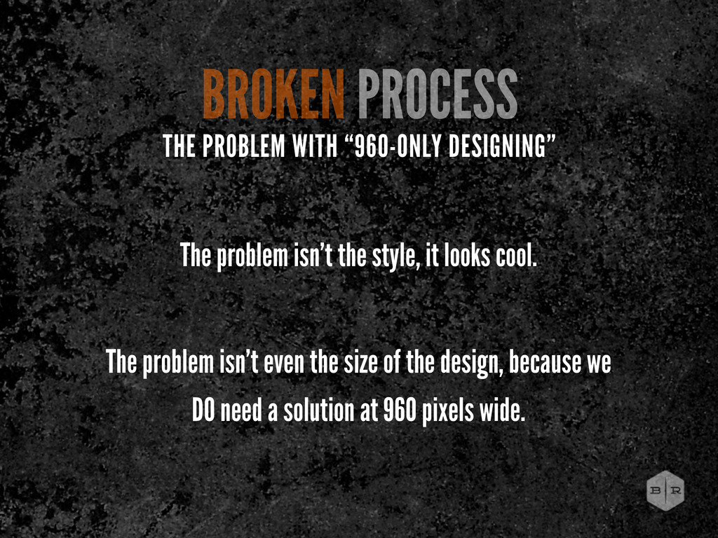
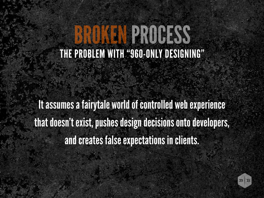
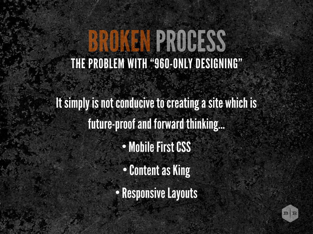
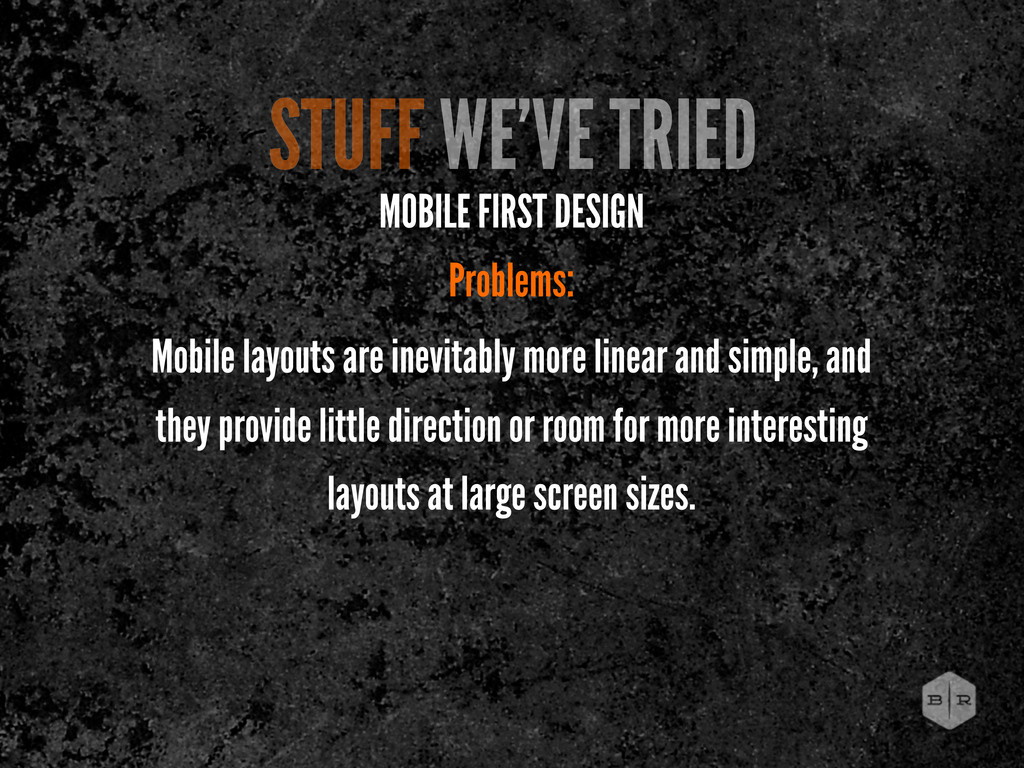
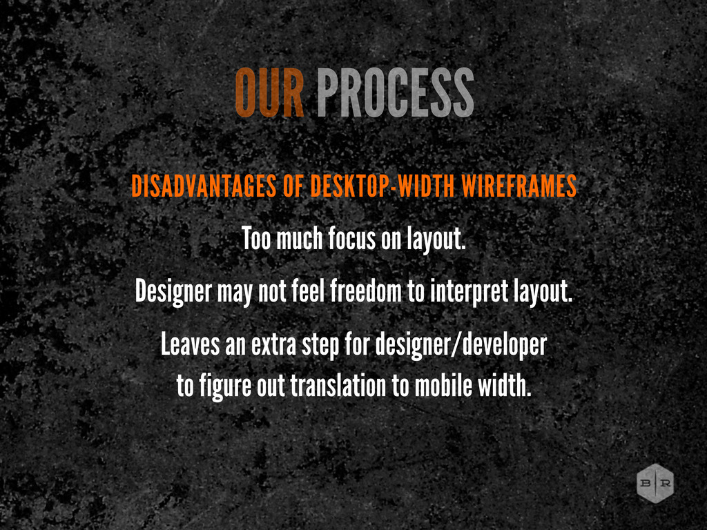
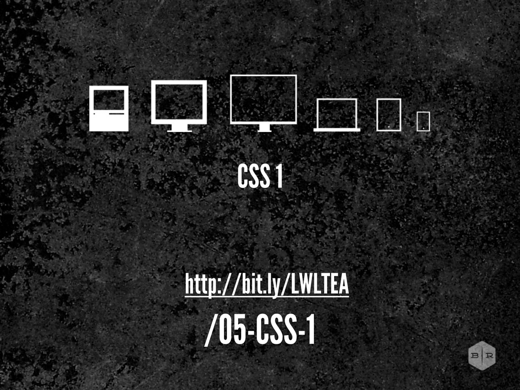
experience that doesn’t exist, pushes design decisions onto developers, and creates false expectations in clients. THE PROBLEM WITH “960-ONLY DESIGNING”
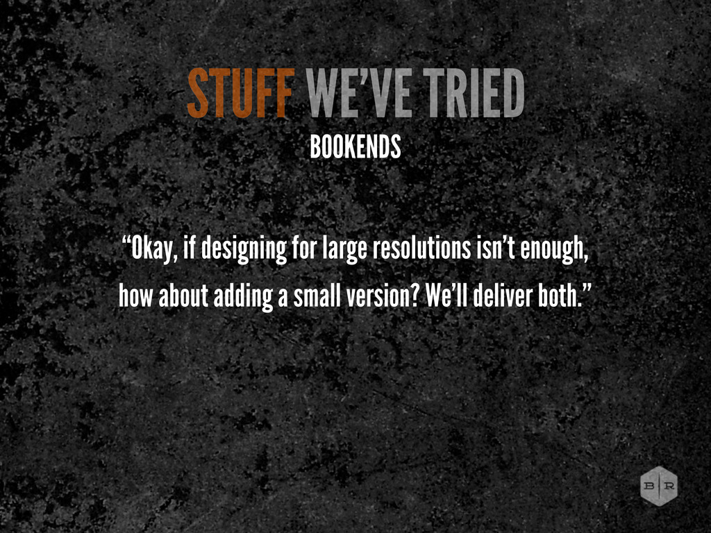
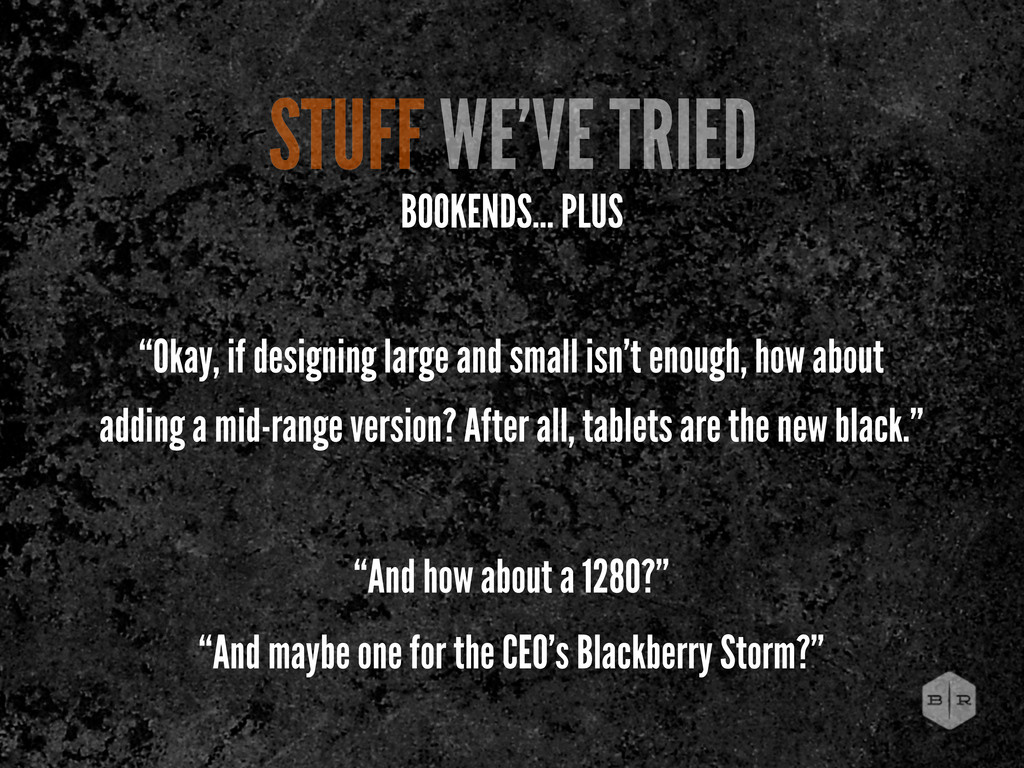
small isn’t enough, how about adding a mid-range version? After all, tablets are the new black.” “And how about a 1280?” “And maybe one for the CEO’s Blackberry Storm?”
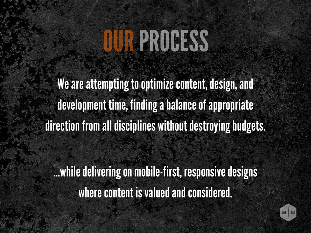
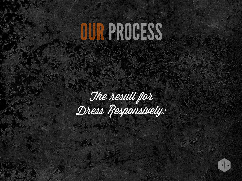
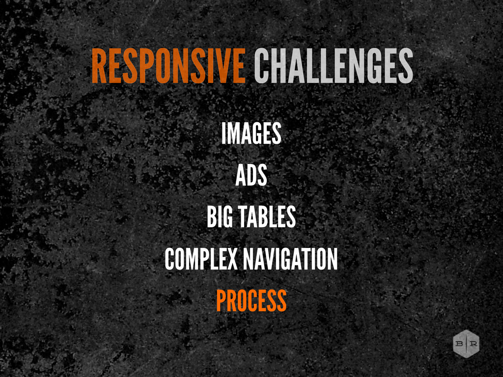
finding a balance of appropriate direction from all disciplines without destroying budgets. ...while delivering on mobile-first, responsive designs where content is valued and considered. OUR PROCESS
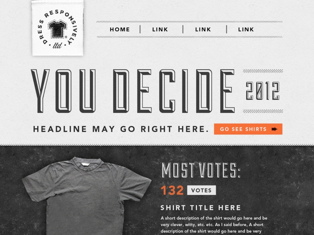
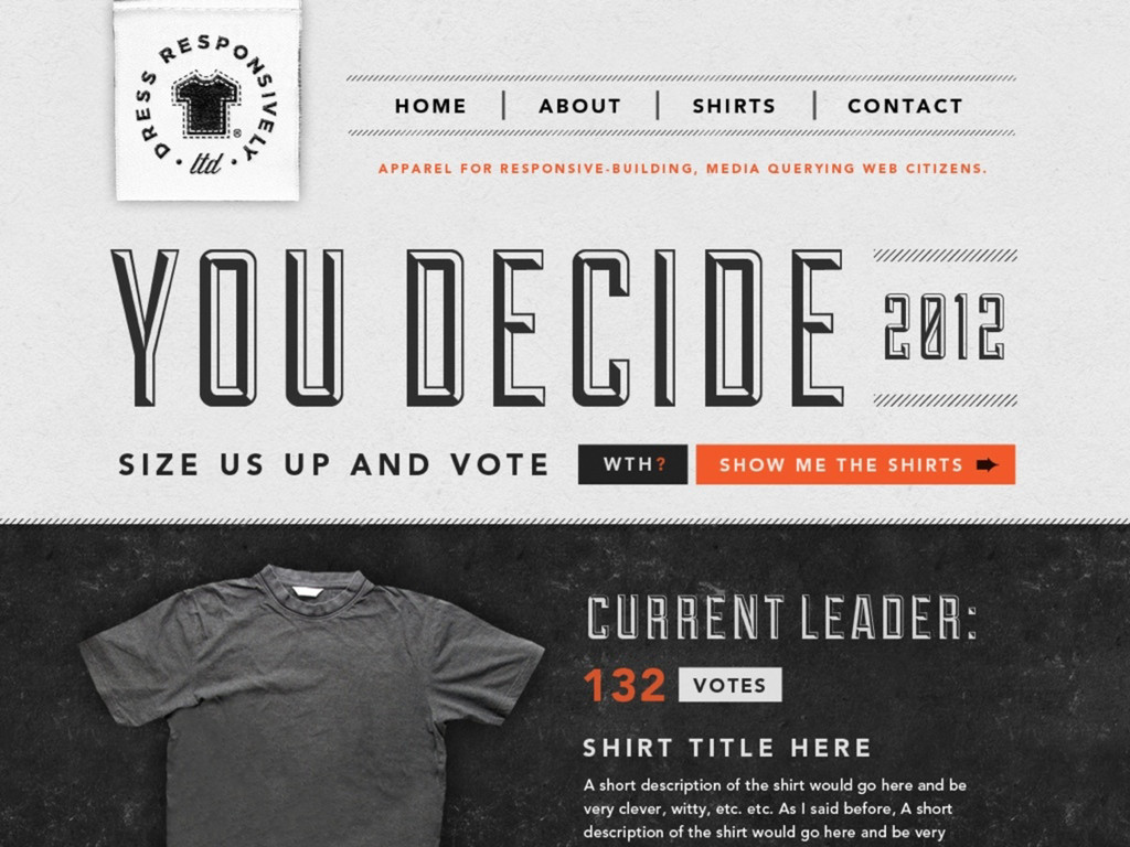
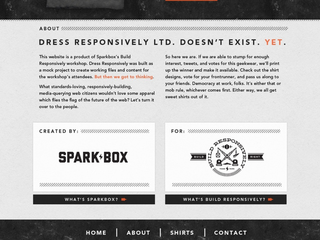
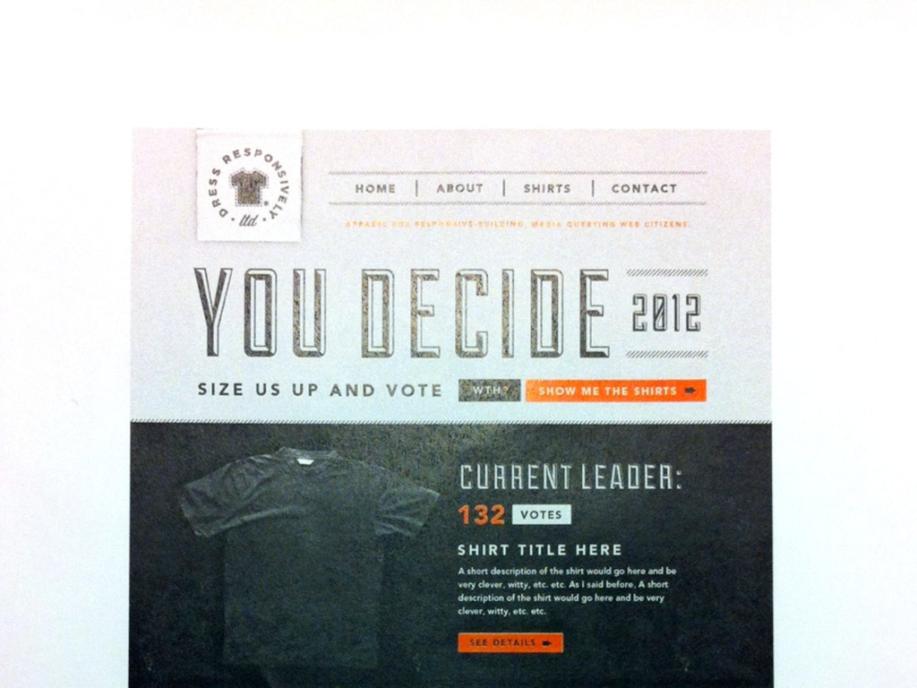
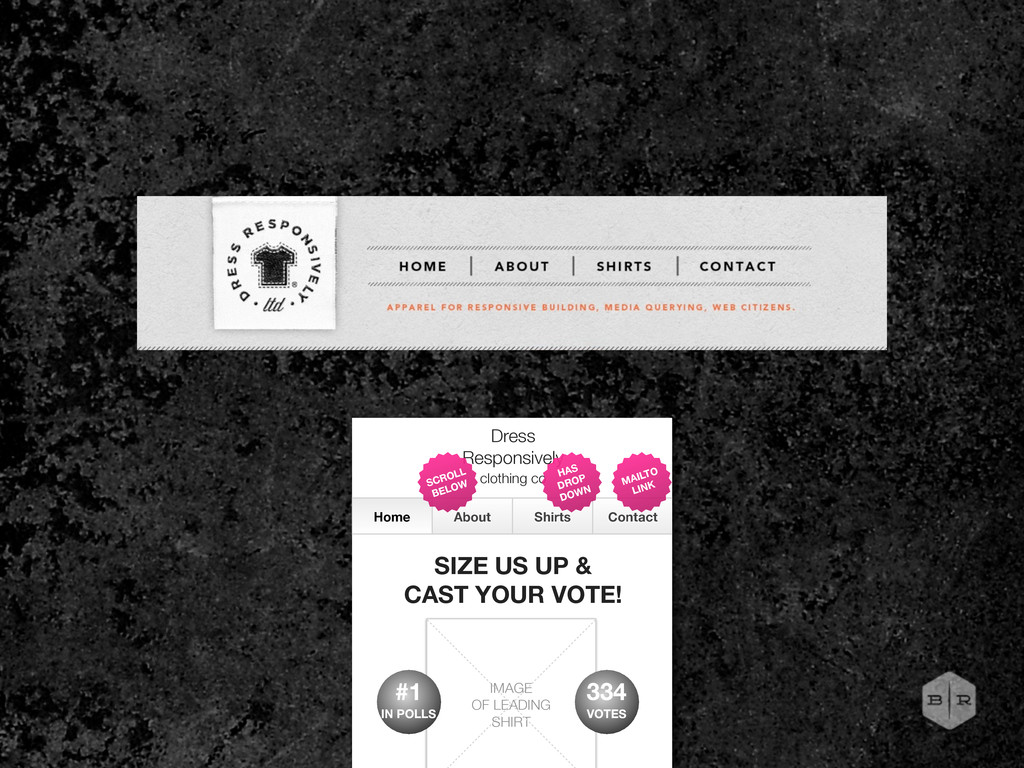
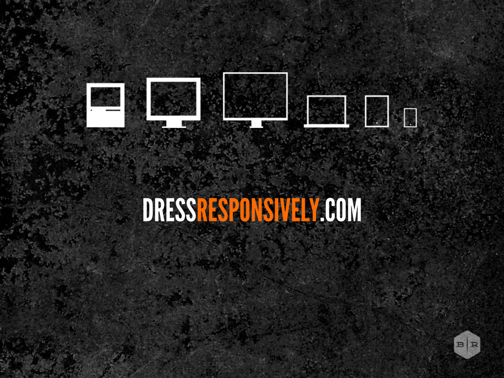
UP & CAST YOUR VOTE! IMAGE OF LEADING SHIRT WHAT’S THIS ALL ABOUT? SHOW ME ALL THE CANDIDATES The Dress Responsively Clothing Company doesn’t exist. Yet. This website is a product of Sparkbox’s Build Responsively workshop. Dress Responsively was originally built as a mock project to create working files and content for the workshop’s attendees. But then we got to thinking. What standards-loving, responsively- HAS DROP DOWN MAILTO LINK SCROLL BELOW 334 VOTES #1 IN POLLS Home Page
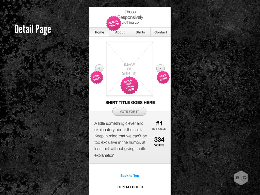
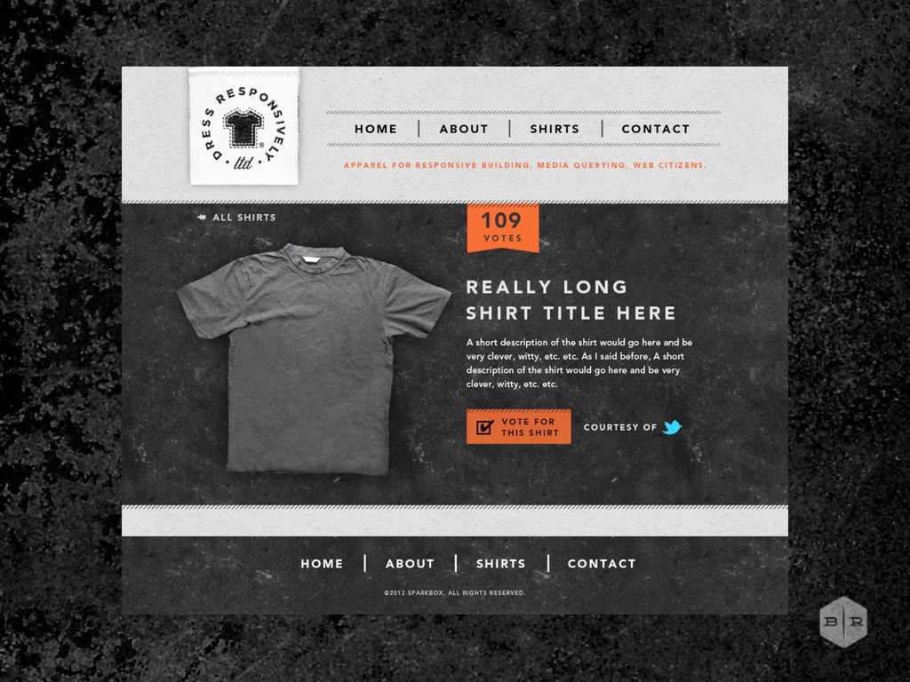
in mind that we can’t be too exclusive in the humor, at least not without giving subtle explanation. Home About Shirts Contact Dress Responsively clothing co IMAGE OF SHIRT #1 VOTE FOR IT EXPAND HIDDEN 334 VOTES CLICK FOR DETAIL VIEW #1 IN POLLS SHIRT TITLE GOES HERE NEXT SHIRT PREV SHIRT Back to Top REPEAT FOOTER Detail Page
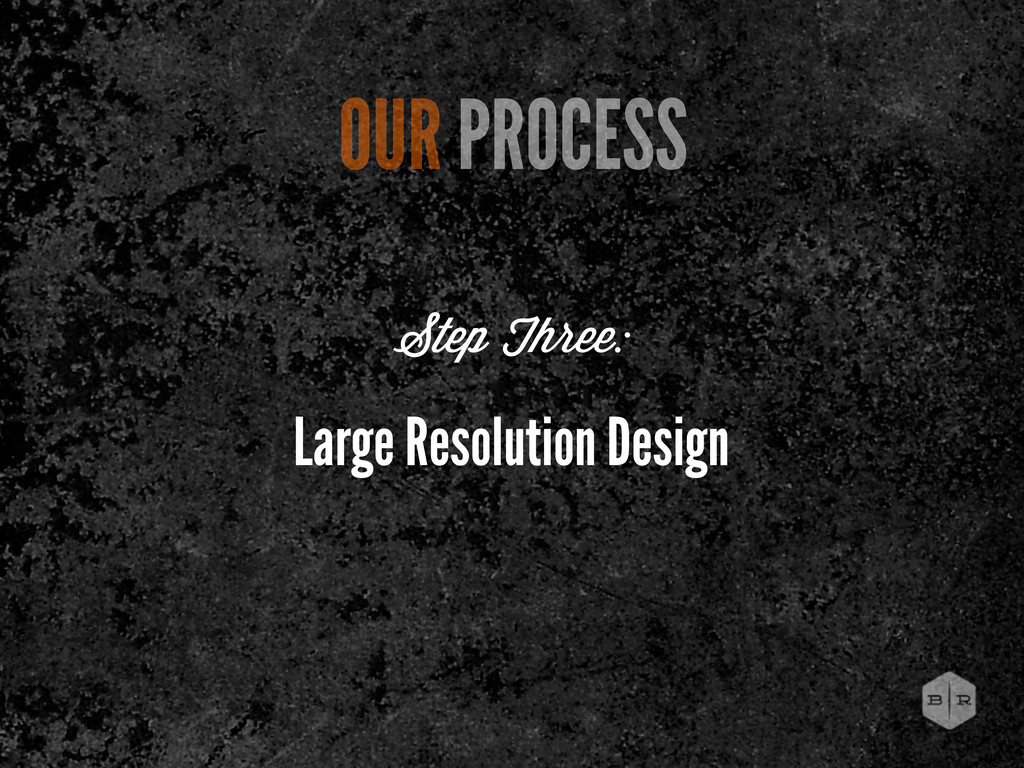
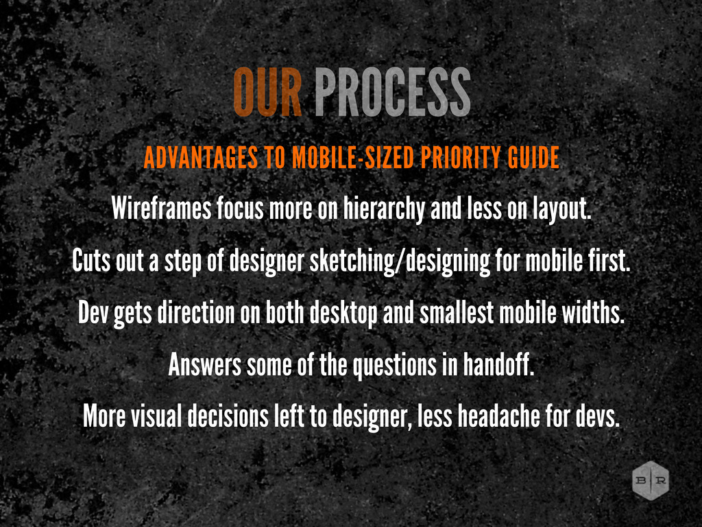
and less on layout. Cuts out a step of designer sketching/designing for mobile first. Dev gets direction on both desktop and smallest mobile widths. Answers some of the questions in handoff. More visual decisions left to designer, less headache for devs. OUR PROCESS
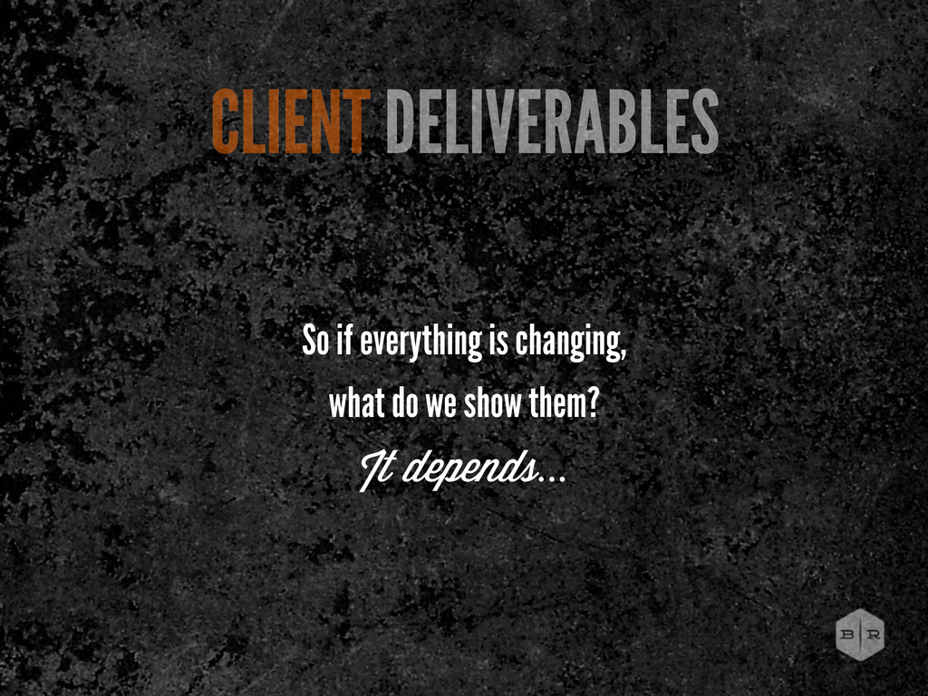
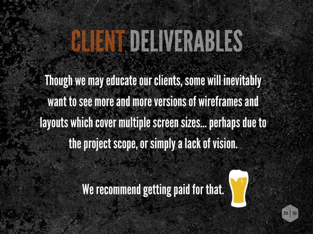
to see more and more versions of wireframes and layouts which cover multiple screen sizes... perhaps due to the project scope, or simply a lack of vision. We recommend getting paid for that. CLIENT DELIVERABLES
 bencallahan
 karad
karad
 lynteo
 securecat
 abokadotyann
 sevendex
 littlebusters
 mhand01
 hiranotomoki
 ncdc
ncdc
 a2k
a2k
 ajstarks
 toshihidemurata
 erikaheidi
 addyosmani
 tomoyanonymous
 aleyda
 sabderemane
 csswizardry
 helmedeiros
 gr2m
gr2m
 szymonslowik
 dougneiner
 mongodb
 axbom
axbom