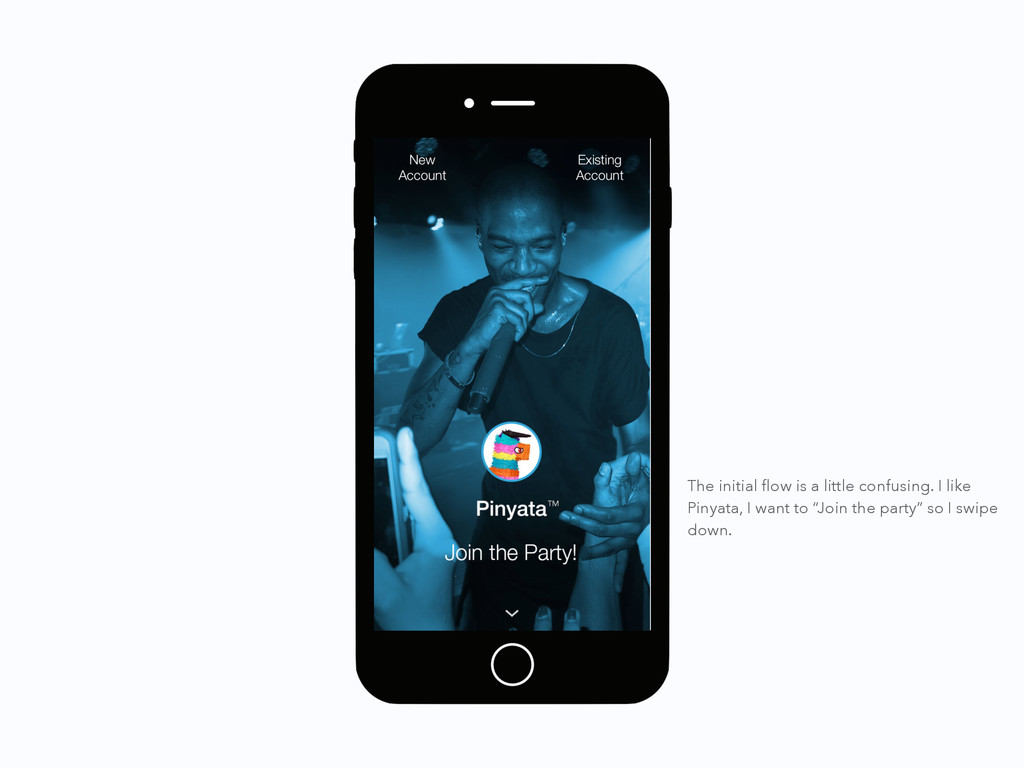
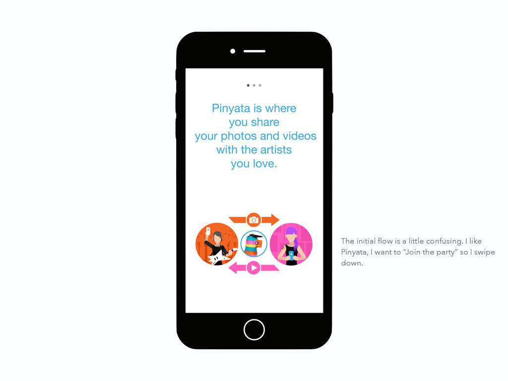
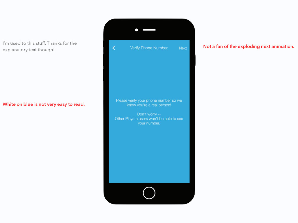
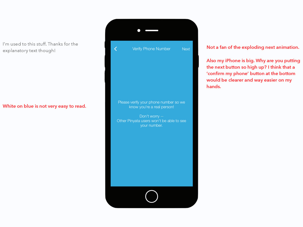
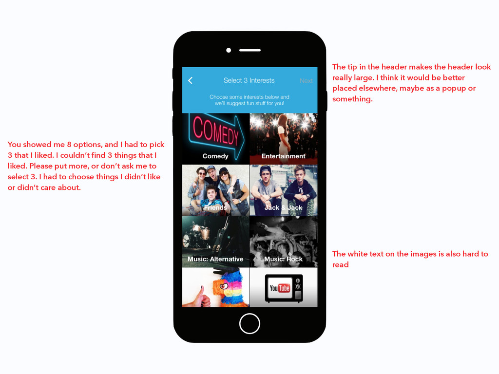
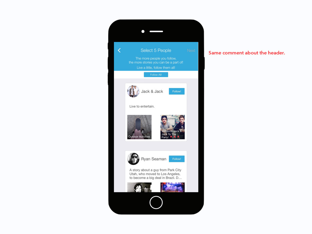
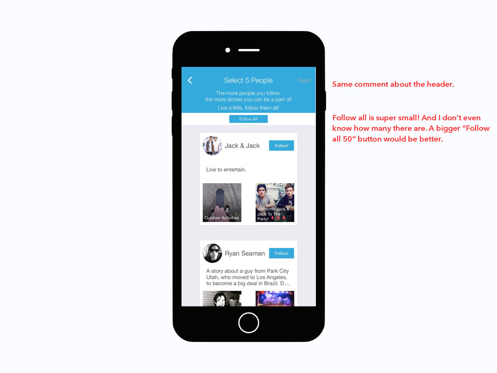
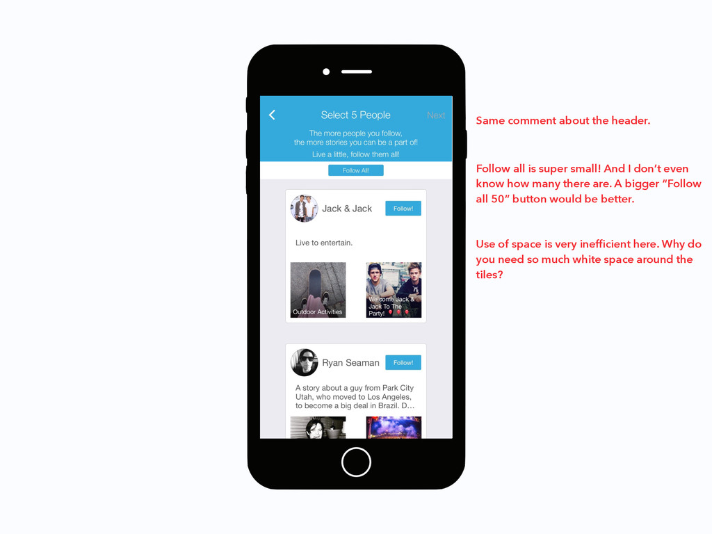
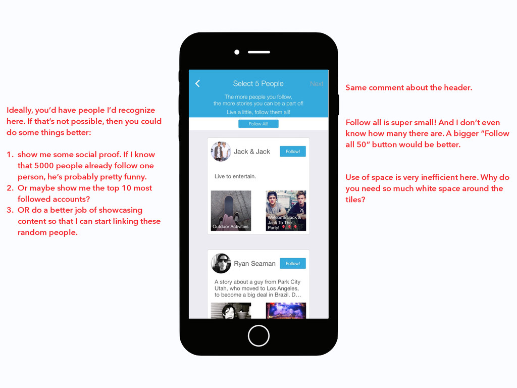
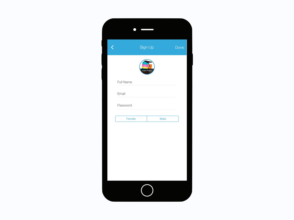
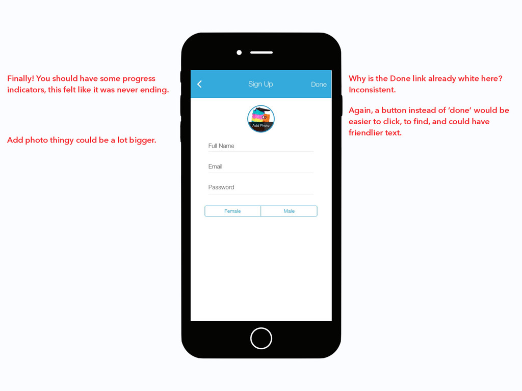
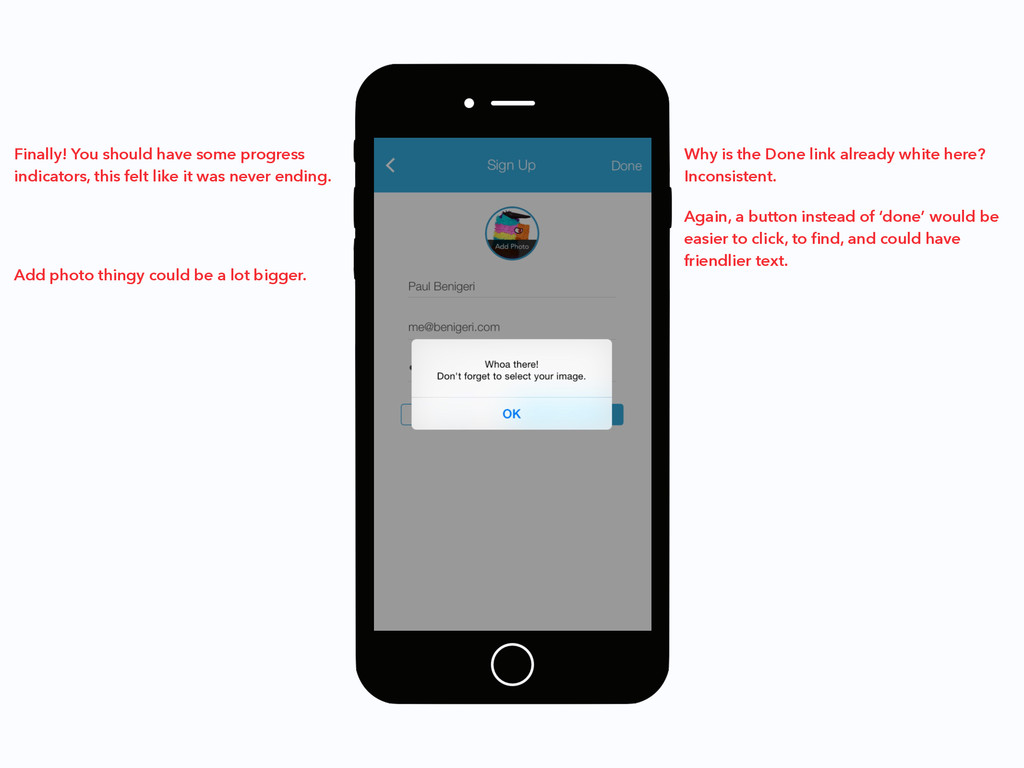
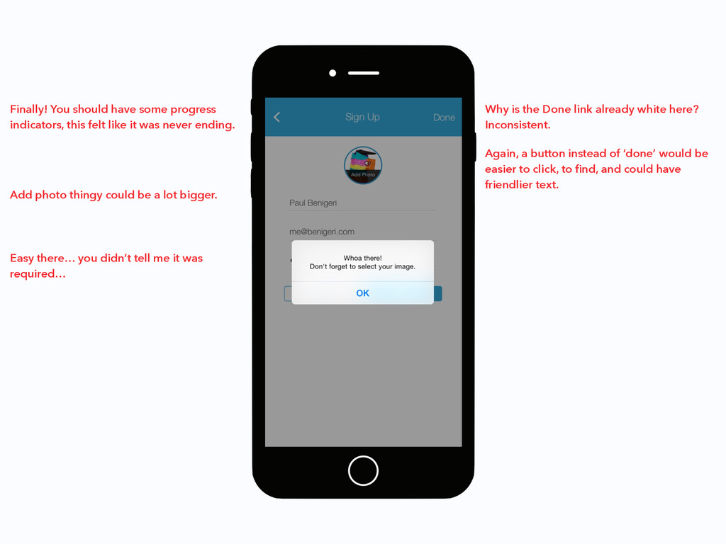
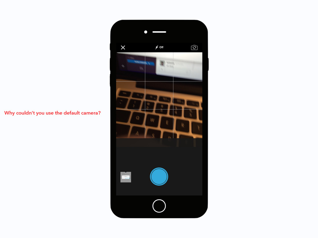
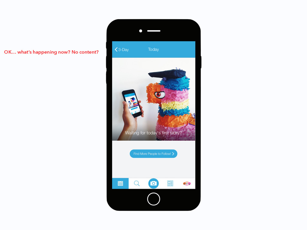
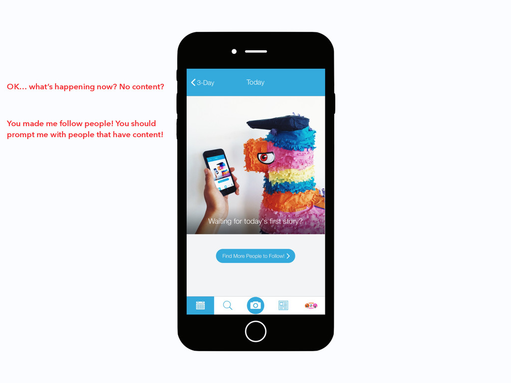
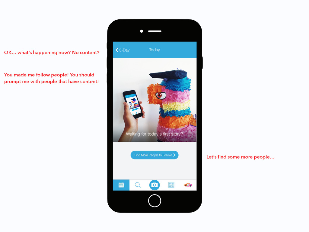
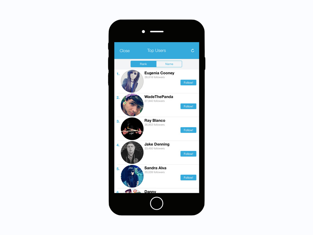
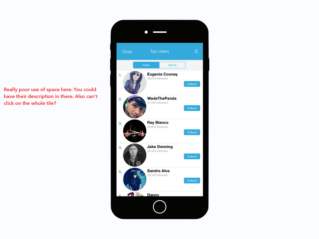
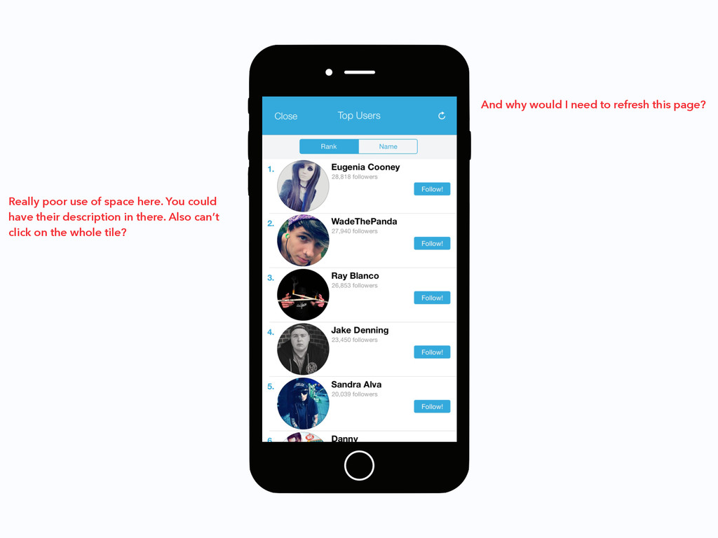
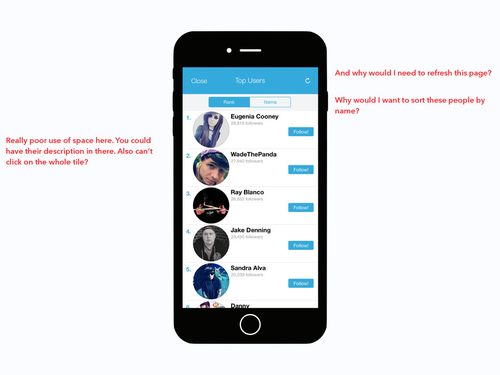
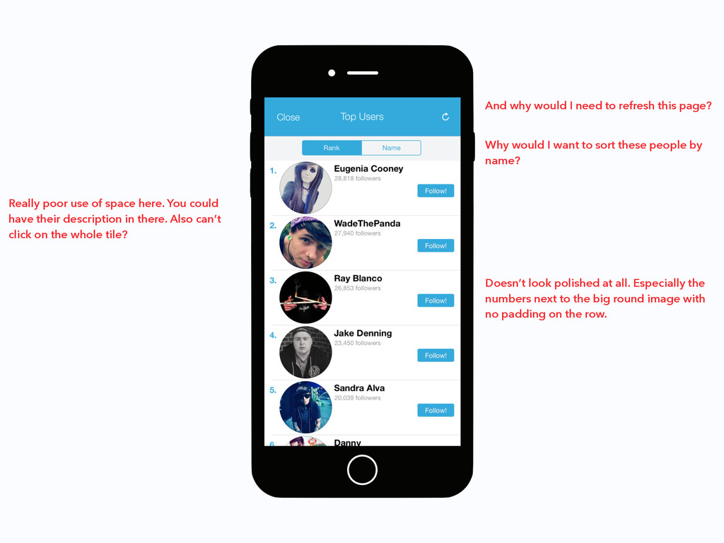
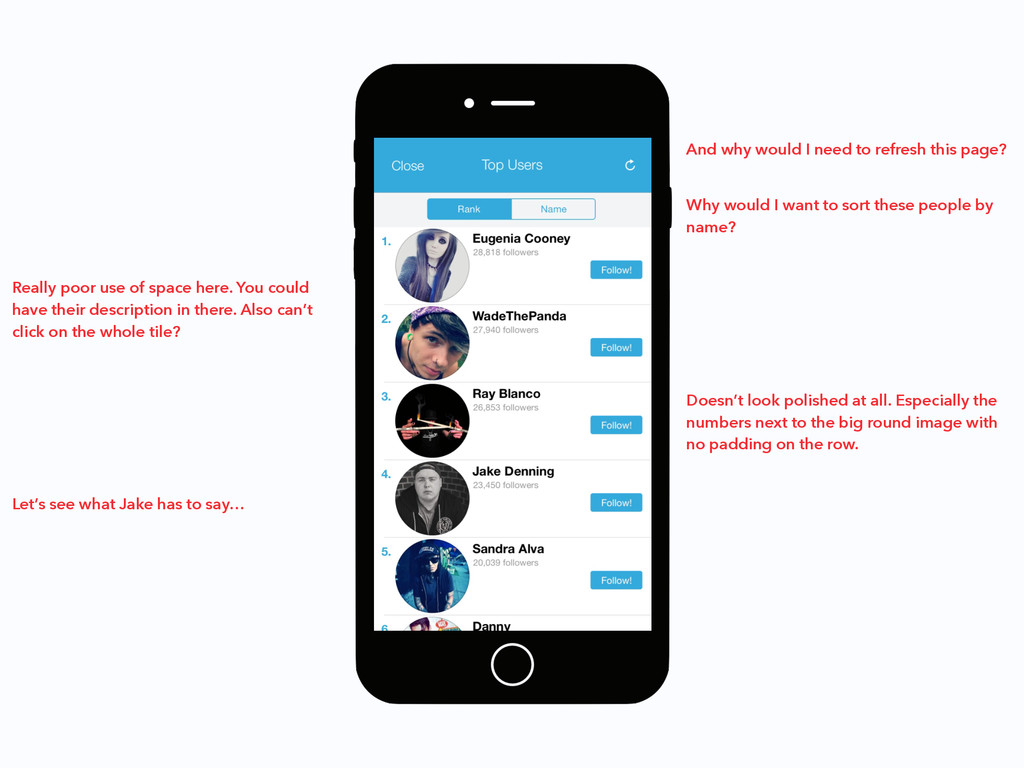
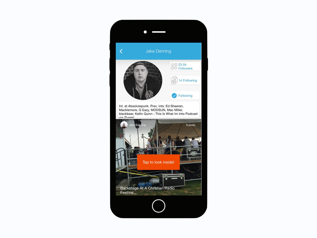
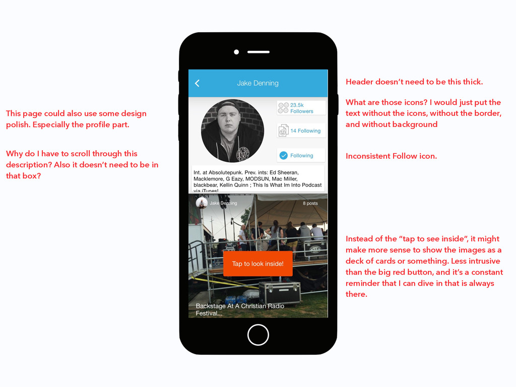
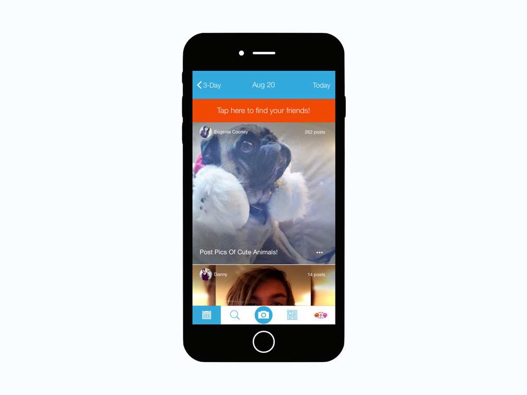
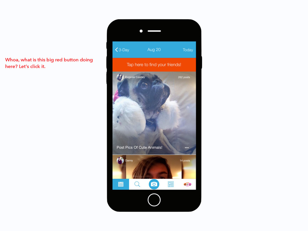
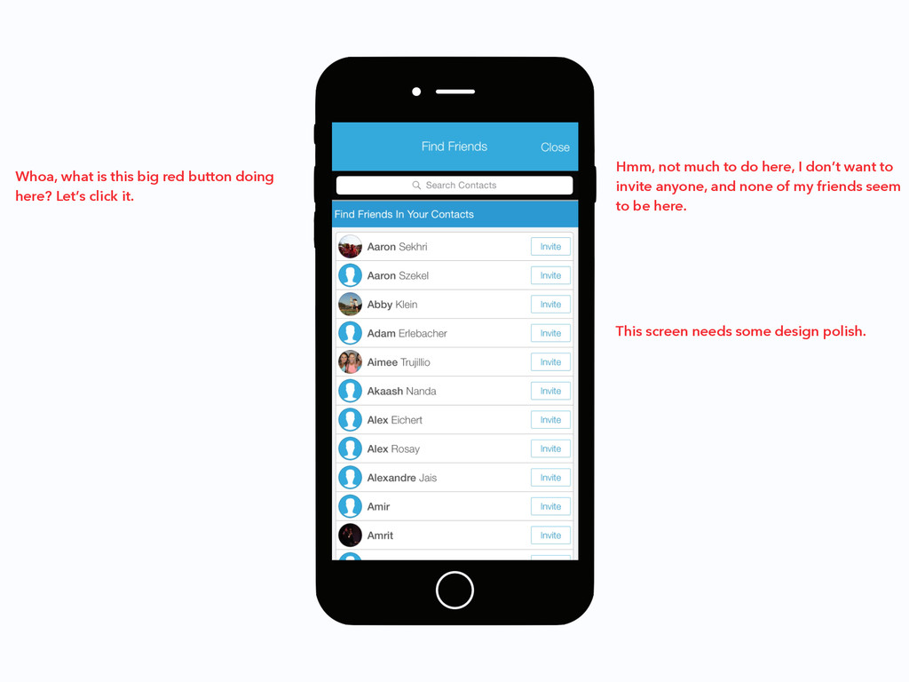
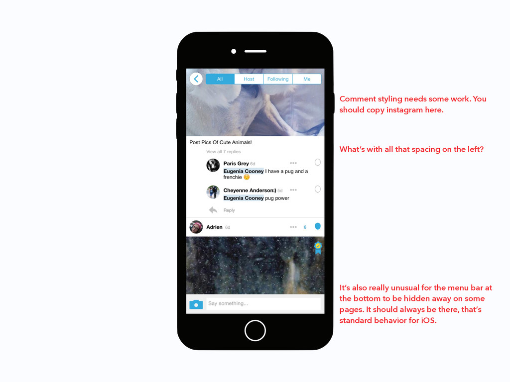
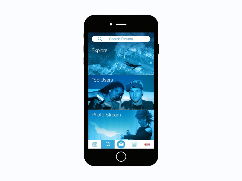
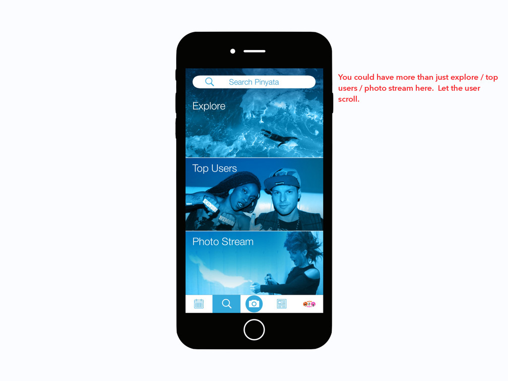
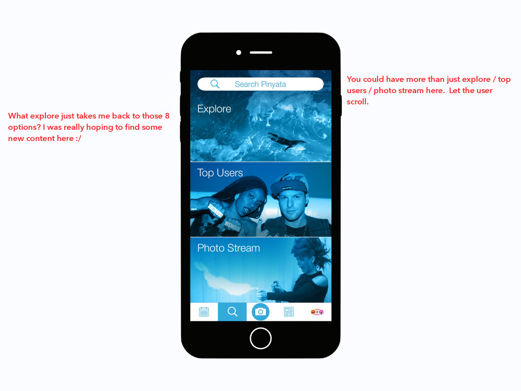
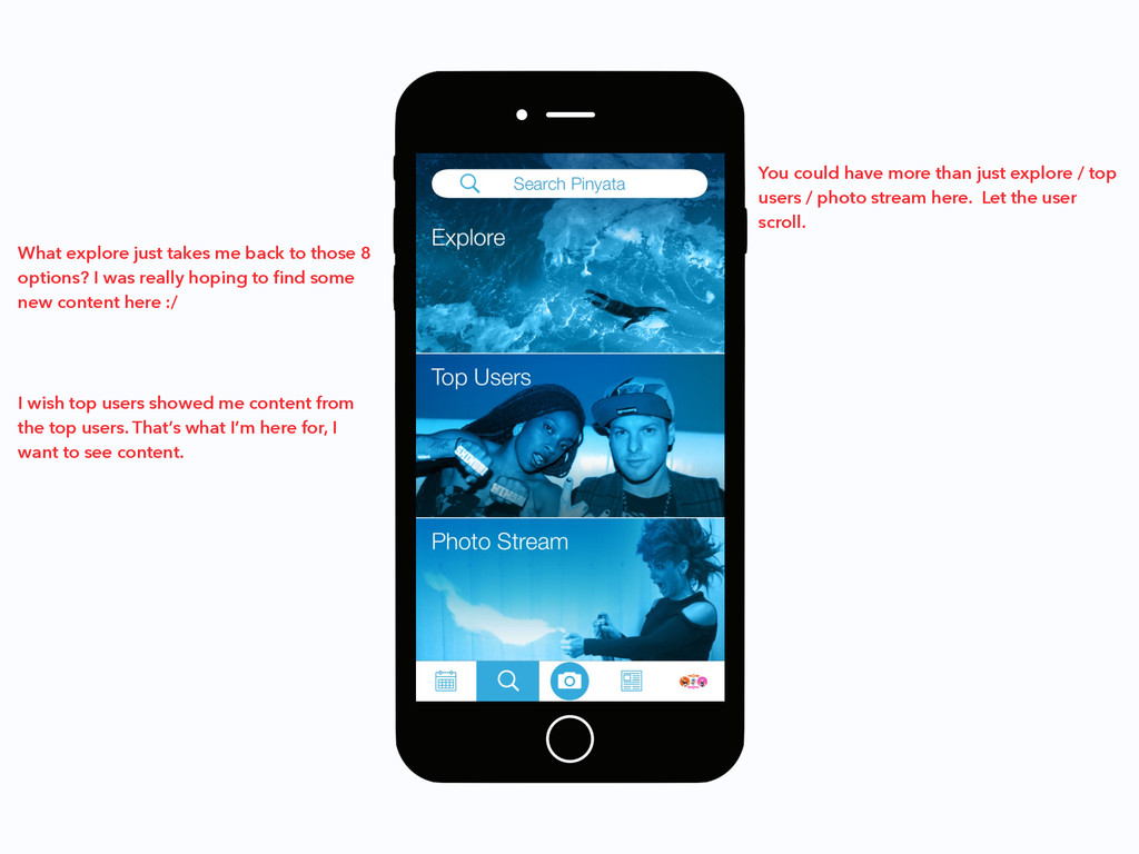
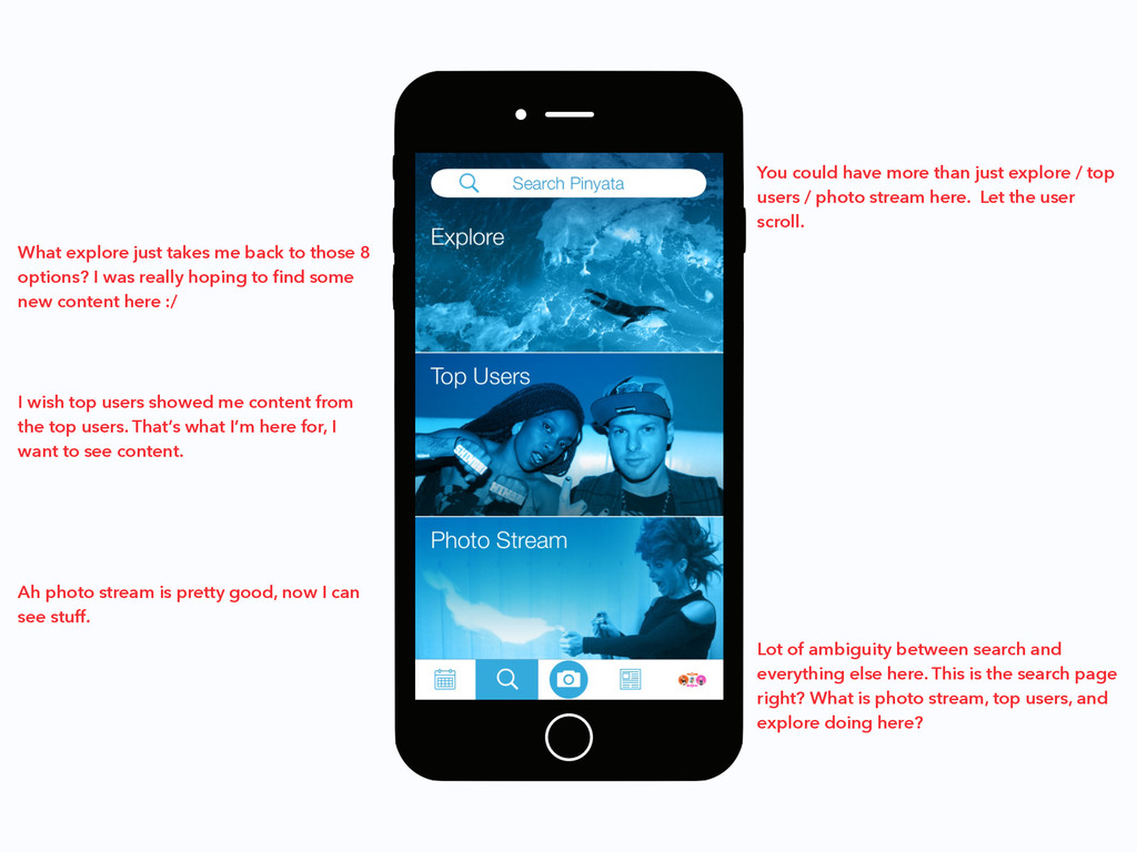
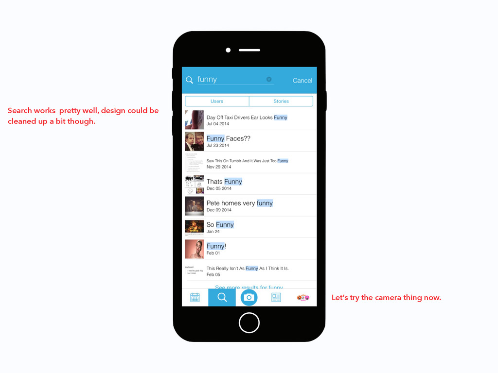
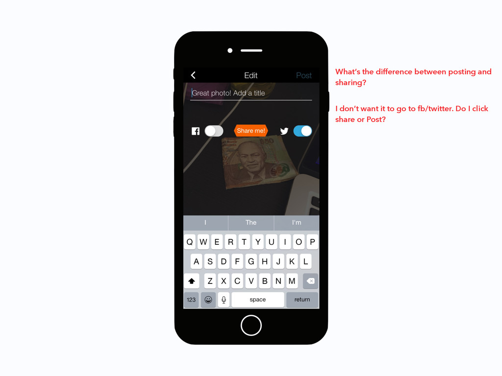
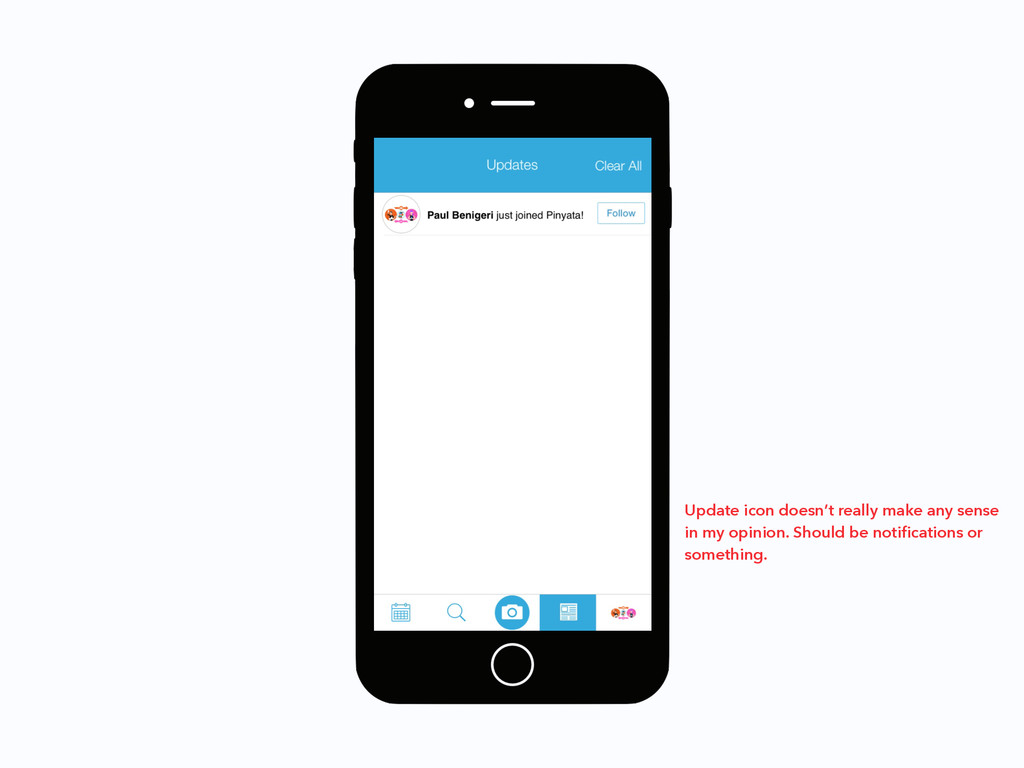
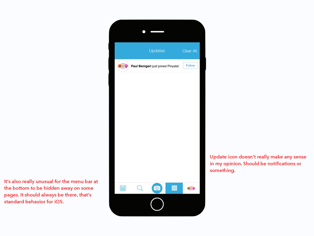
I was really hoping to find some new content here :/ I wish top users showed me content from the top users. That’s what I’m here for, I want to see content. Ah photo stream is pretty good, now I can see stuff. Lot of ambiguity between search and everything else here. This is the search page right? What is photo stream, top users, and explore doing here? You could have more than just explore / top users / photo stream here. Let the user scroll.
![I hope you found this useful! Email me at [email protected]](https://files.speakerdeck.com/presentations/082c45e671e84ebabbe644c40a8b6d83/slide_127.jpg)