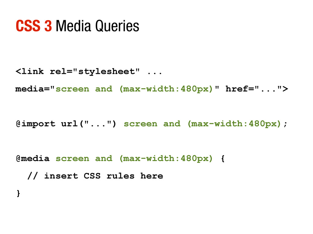
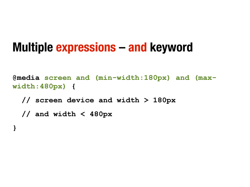
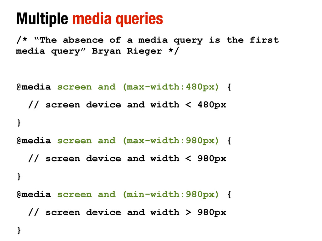
is the first media query” Bryan Rieger */ @media screen and (max-width:480px) { // screen device and width < 480px } @media screen and (max-width:980px) { // screen device and width < 980px } @media screen and (min-width:980px) { // screen device and width > 980px }
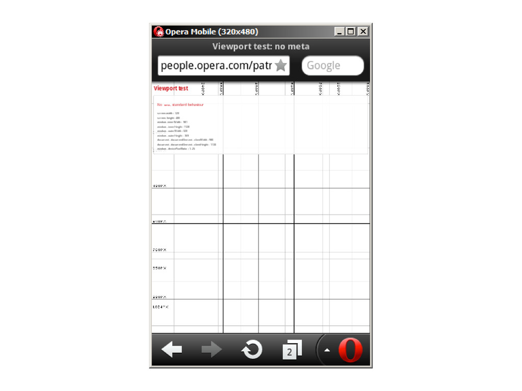
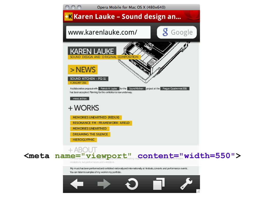
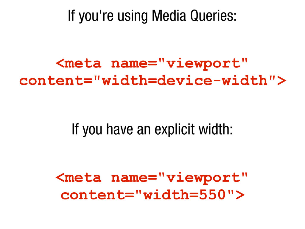
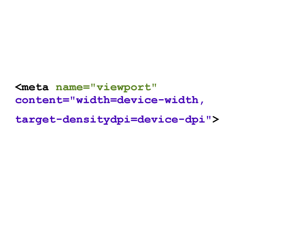
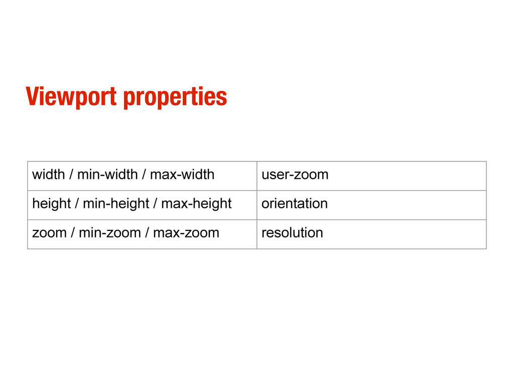
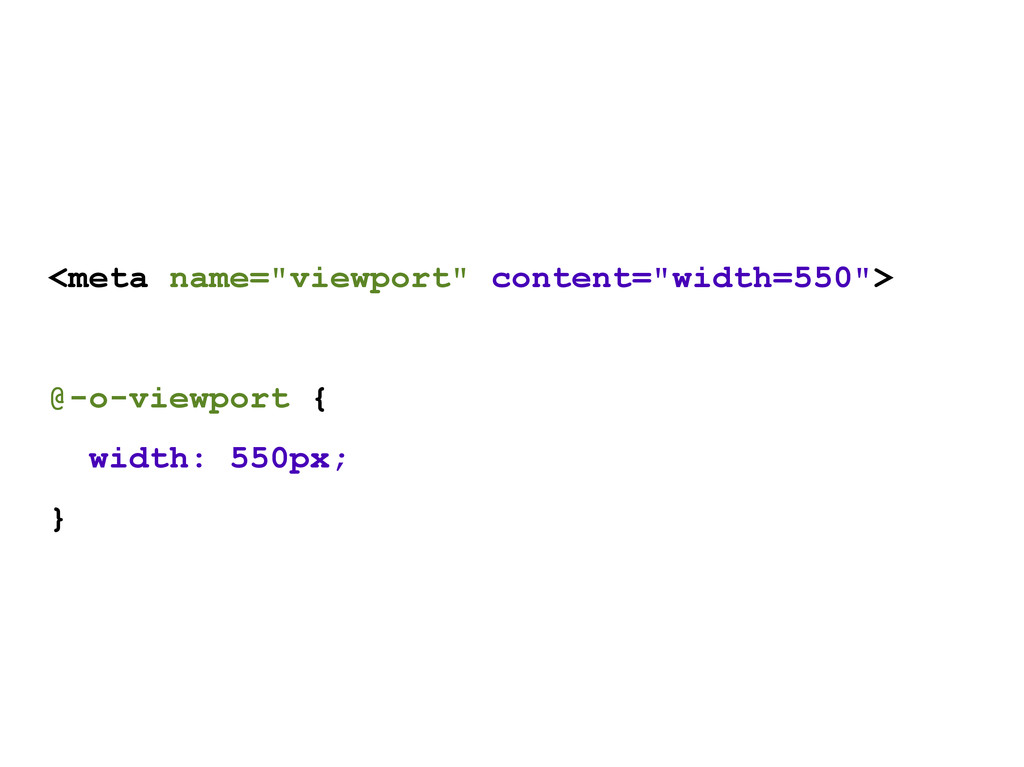
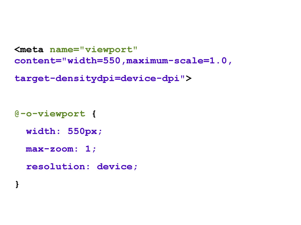
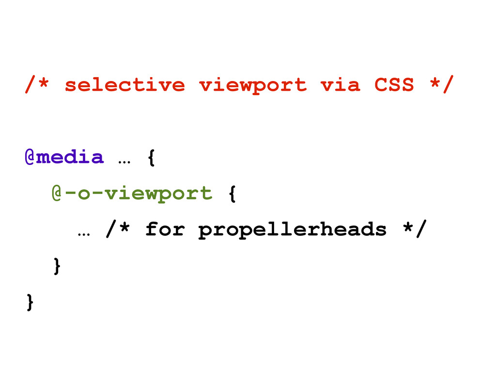
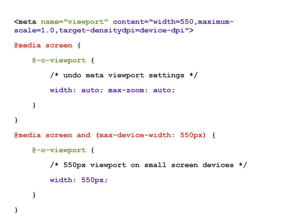
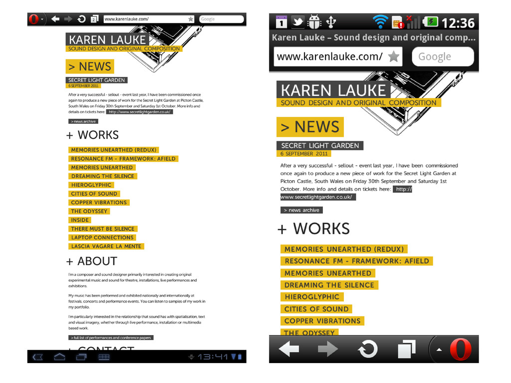
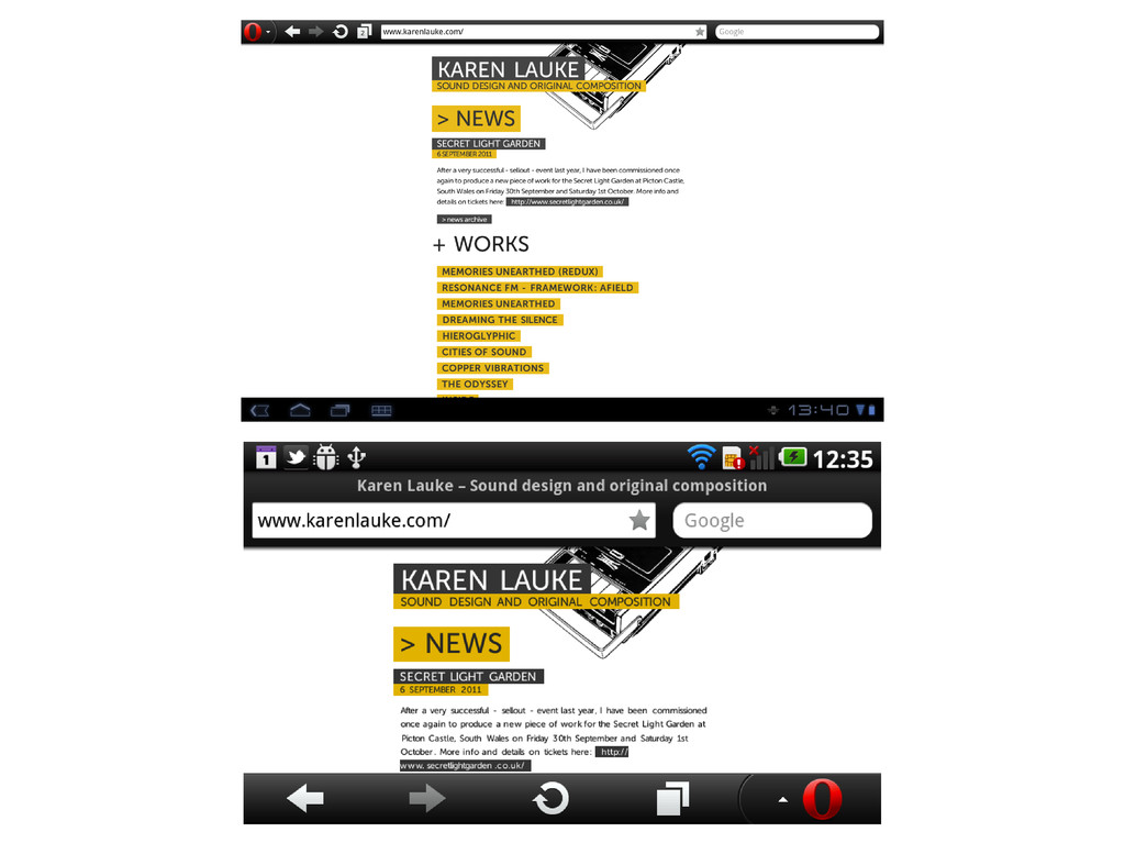
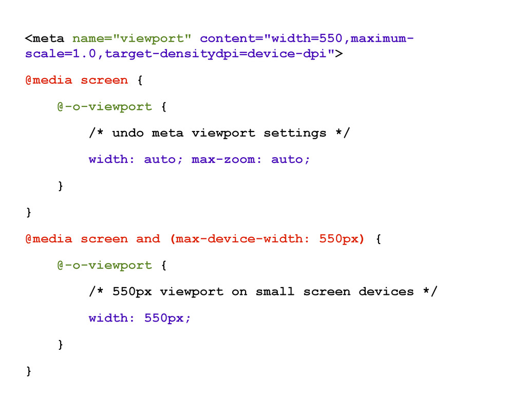
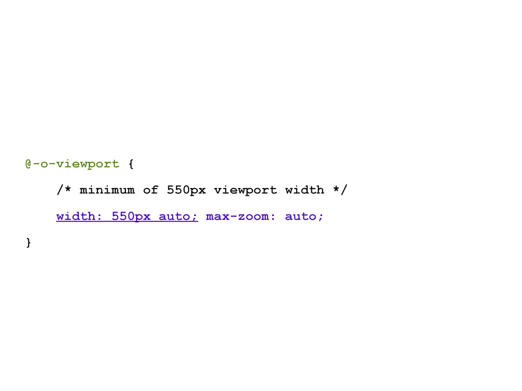
fixed; } www.w3.org/TR/css-device-adapt only works in Opera Mobile 11+ at the moment, with -o- prefix dev.opera.com/articles/view/an-introduction-to-meta-viewport-and-viewport
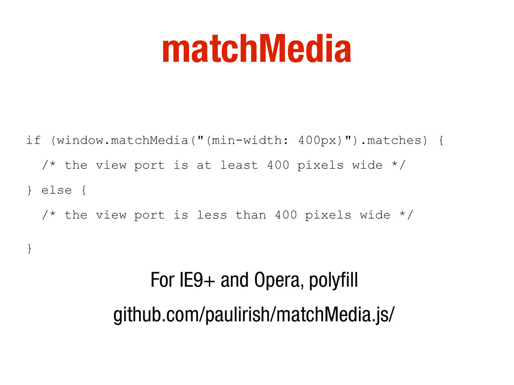
at least 400 pixels wide */ } else { /* the view port is less than 400 pixels wide */ } For IE9+ and Opera, polyfill github.com/paulirish/matchMedia.js/
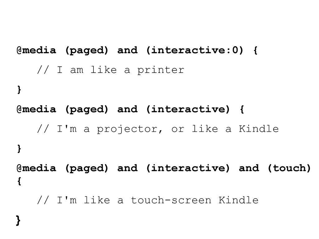
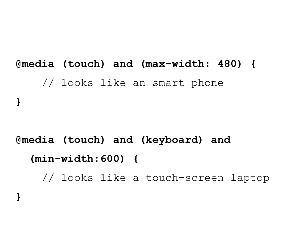
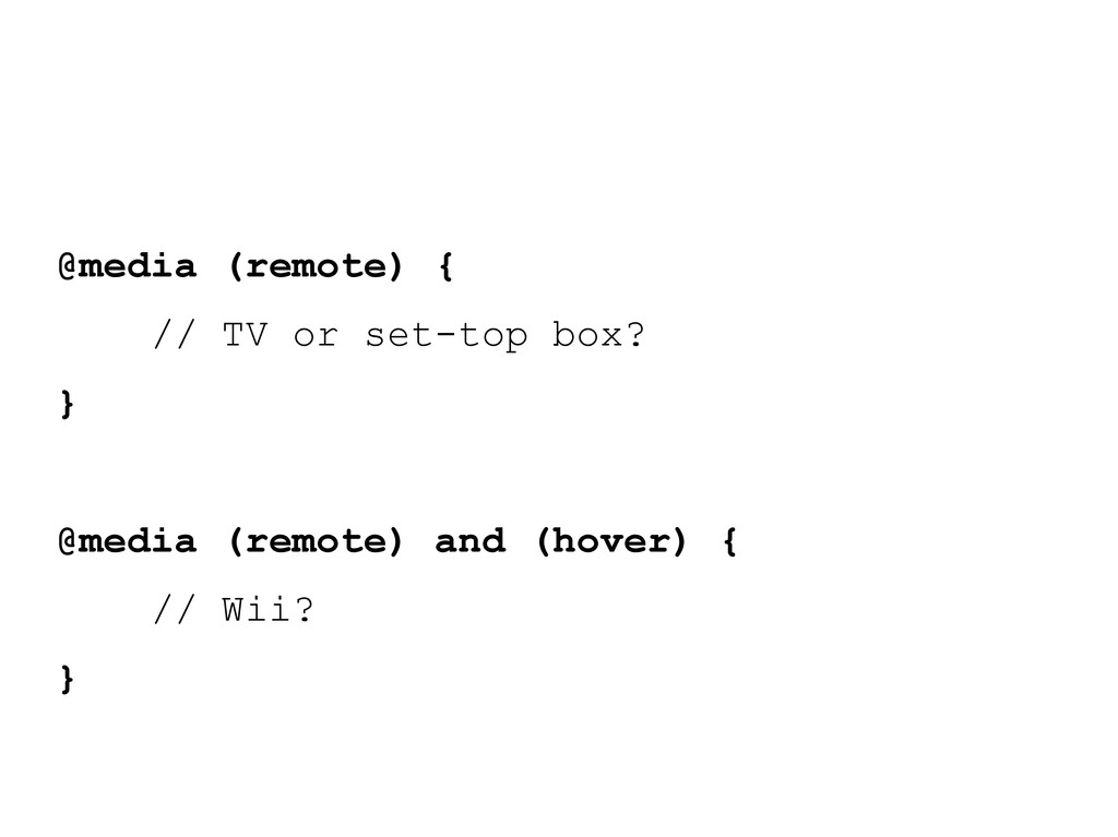
are strawman ideas for the next iteration of Media Queries (CSS 4) and are almost certainly to be completely different if they ever make it into the specification. (CSS 3 MQs became a "Proposed Recommendation", eg a "Standard" week of 23 April 2012, so very early days!)
printer } @media (paged) and (interactive) { // I'm a projector, or like a Kindle } @media (paged) and (interactive) and (touch) { // I'm like a touch-screen Kindle }
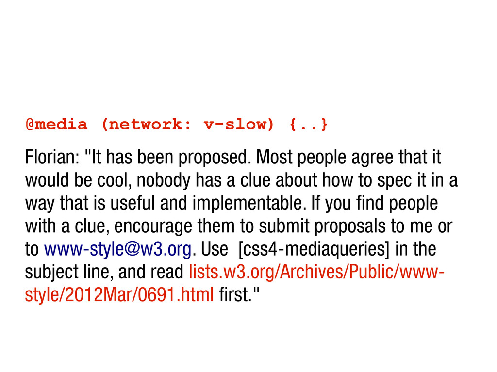
people agree that it would be cool, nobody has a clue about how to spec it in a way that is useful and implementable. If you find people with a clue, encourage them to submit proposals to me or to [email protected]. Use [css4-mediaqueries] in the subject line, and read lists.w3.org/Archives/Public/www- style/2012Mar/0691.html first."


 betabeers
 mutomasa
 yasslab
 doratex
 matleenalaakso
 cbtlibrary
 hiola
hiola
 naochim2026
 tasusu
 yoshimura_datam
 juanmartin2026
 uchi8977
 katiecoart
 techseoconnect
 kimpetersen
 honnibal
 badams
 samanthasiow
 kastner
 ipullrank
 sonatard
 tessaabrams
 speakerdeck
 rocio
rocio






























![[email protected] opera.com/developer www.brucelawson.co.uk @brucel](https://files.speakerdeck.com/presentations/4faf882f4ec127001f0195ab/slide_85.jpg)