Upgrade to Pro
— share decks privately, control downloads, hide ads and more …
Speaker Deck
Features
Speaker Deck
PRO
Sign in
Sign up for free
Search
Search
Mobile is so 2011. Make all your campus sites ...
Search
bpollak
October 08, 2012
Technology
550
1
Share
Embed
Copy iframe code
Copy JS code
Copy link
Start on current slide
Mobile is so 2011. Make all your campus sites & apps look great on any device.
Presentation performed at High Ed Web, 2012
bpollak
October 08, 2012
More Decks by bpollak
See All by bpollak
Guidelines for a Campus Website Refresh
bpollak
0
90
UC San Diego Lync and OneDrive for Business Rollout
bpollak
0
140
Take Your CMS to the Cloud to Lighten the Load
bpollak
0
120
Web Accessibility at UC San Diego
bpollak
0
90
Campus Web Steering Committee (November meeting)
bpollak
0
130
Mobile optimizing your legacy applications
bpollak
0
79
Website Refresh Tips & Strategies
bpollak
0
610
This mobile thing will never catch on
bpollak
0
88
Responsive Design UCSD System Administrator Meeting
bpollak
2
150
Other Decks in Technology
See All in Technology
SRE歴2ヶ月でも開発6年の知見を活かして、チームで止まっていた環境改善を前に進めた話
a_ono
1
210
AIペネトレーションテスト・ セキュリティ検証「AgenticSec」紹介資料
laysakura
2
8k
ループエンジニアリングでE2Eテストを実践
noriyukitakei
0
290
実装だけじゃない! CCA-F取得エンジニアが教えるClaude Code開発プロセス活用術
diggymo
2
380
AIに「使われる」時代のSaaS戦略 〜既存WebAPIのMCPサーバー化における開発ノウハウ〜
ekispert_api
0
300
プロンプト_きのこカンファレンス2026_LT
yurufuwahealer
0
140
フルカイテン株式会社 エンジニア向け採用資料
fullkaiten
0
11k
Compose 新機能総まとめ / What's New in Jetpack Compose
yanzm
0
140
Kotlin 開発のツラミを爆破した話! / Explode the difficulty of Kotlin dev!
eller86
0
150
Empower GenAI with Agile - あなたのアジャイルが生成AIのバフになる仕組み
hageyahhoo
0
130
End-to-Endで考える信頼性 — LINEアプリにおける クライアント開発×SRE連携の実践
maruloop
3
2.1k
AIDLC_ヤフーショッピングの取り組み
lycorptech_jp
PRO
0
550
Featured
See All Featured
Navigating Weather and Climate Data
rabernat
0
280
The SEO Collaboration Effect
kristinabergwall1
1
500
SERP Conf. Vienna - Web Accessibility: Optimizing for Inclusivity and SEO
sarafernandez
2
1.5k
How to make the Groovebox
asonas
2
2.3k
RailsConf 2023
tenderlove
30
1.5k
Between Models and Reality
mayunak
4
360
GraphQLの誤解/rethinking-graphql
sonatard
75
12k
So, you think you're a good person
axbom
PRO
2
2.1k
16th Malabo Montpellier Forum Presentation
akademiya2063
PRO
0
170
How to Create Impact in a Changing Tech Landscape [PerfNow 2023]
tammyeverts
55
3.4k
End of SEO as We Know It (SMX Advanced Version)
ipullrank
3
4.3k
Making Projects Easy
brettharned
120
6.7k
Transcript
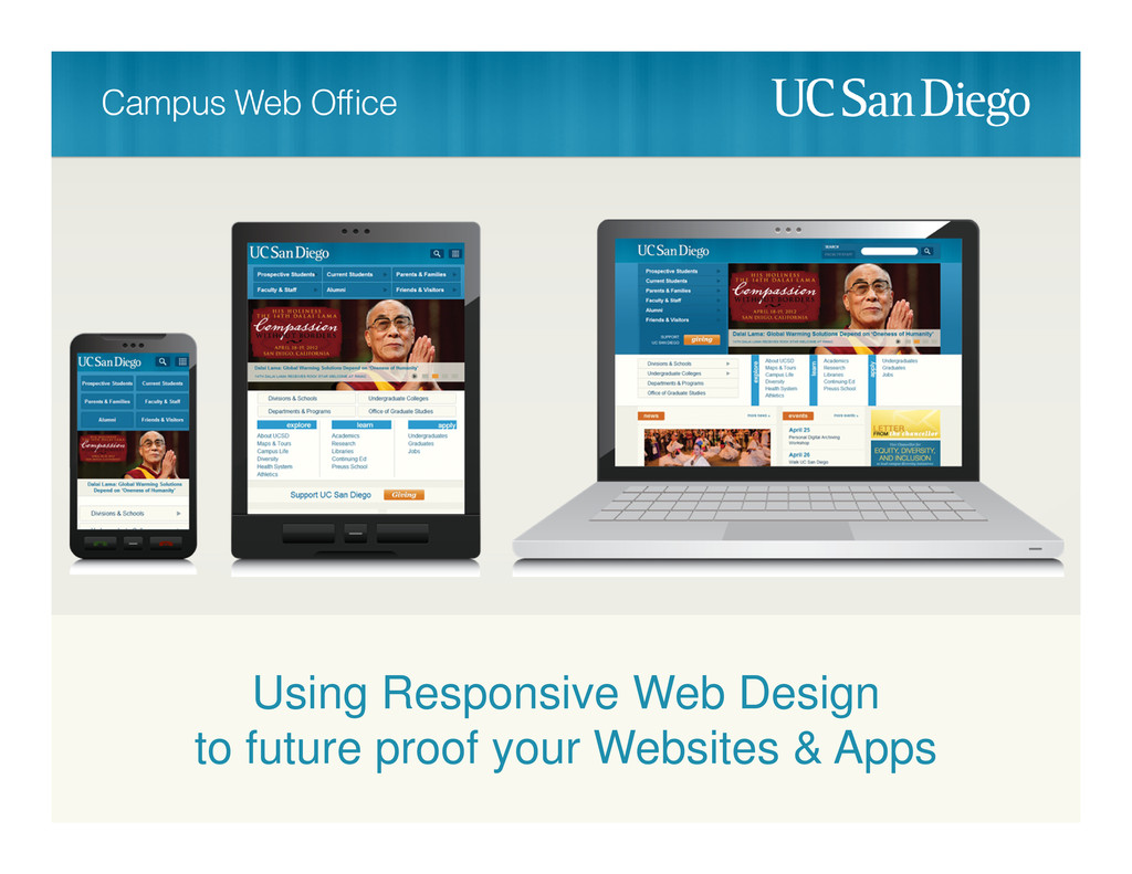
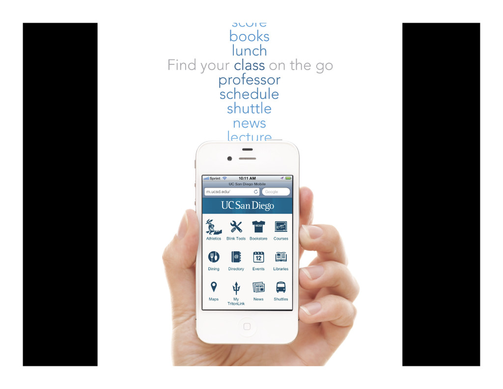
Using Responsive Web Design to future proof your Websites &
Apps
Brett Pollak @brettcpollak #heweb12 #AIM1
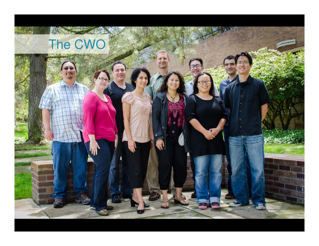
The CWO
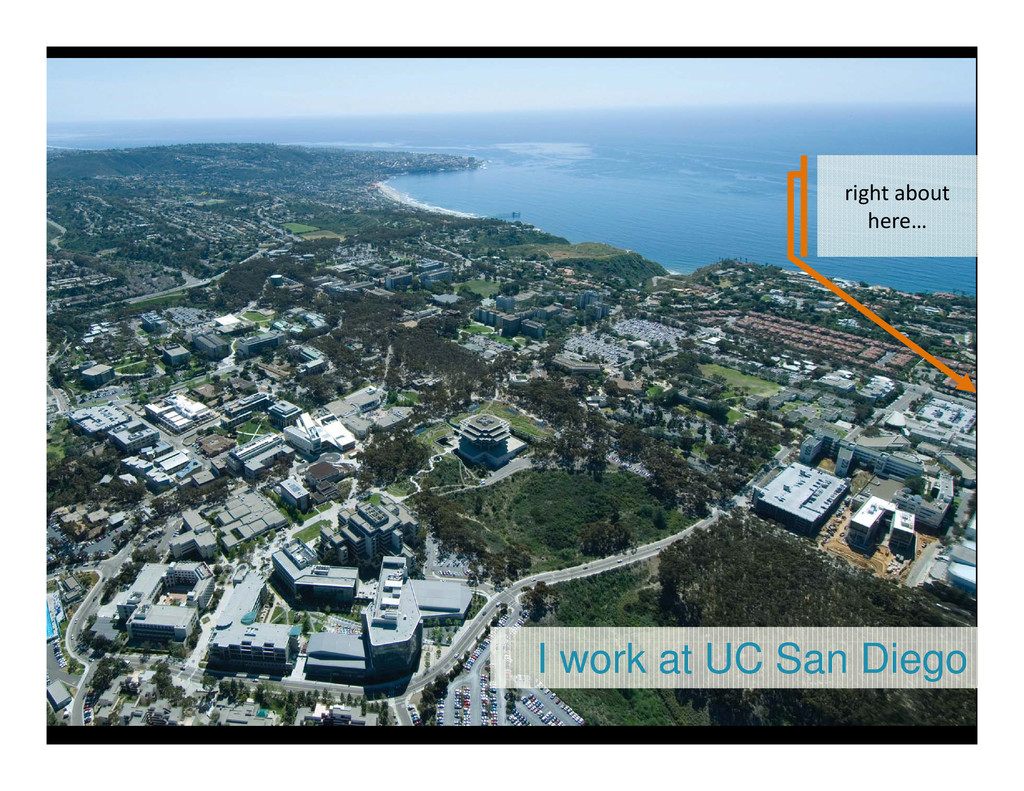
I work at UC San Diego right about here…
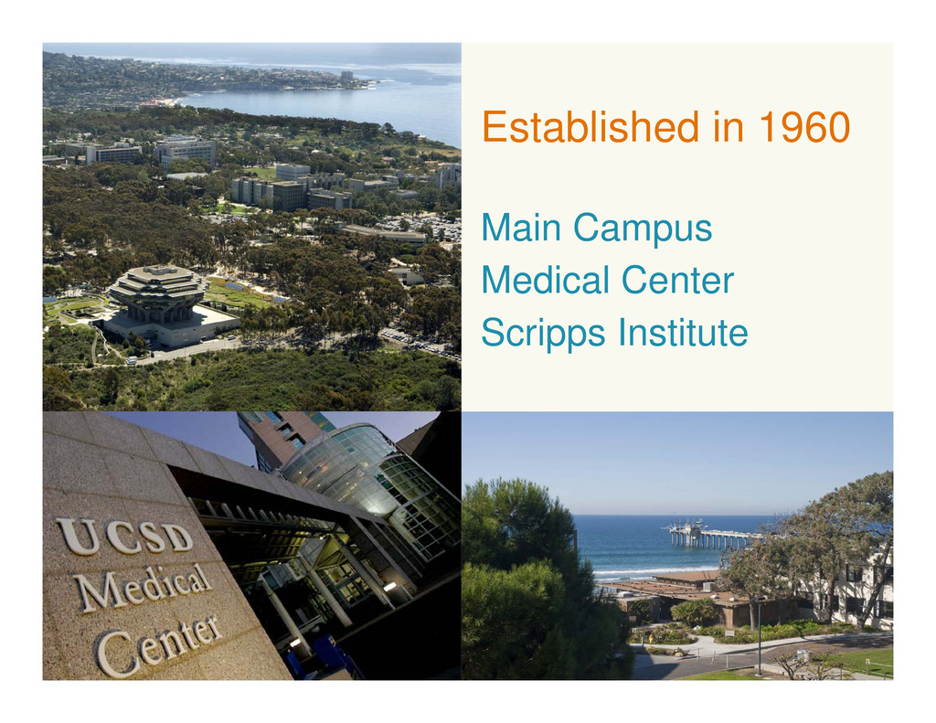
Established in 1960 Main Campus Medical Center Scripps Institute
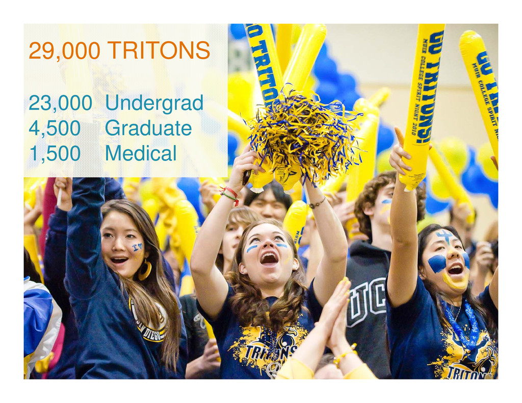
29,000 TRITONS 23,000 Undergrad 4,500 Graduate 1,500 Medical
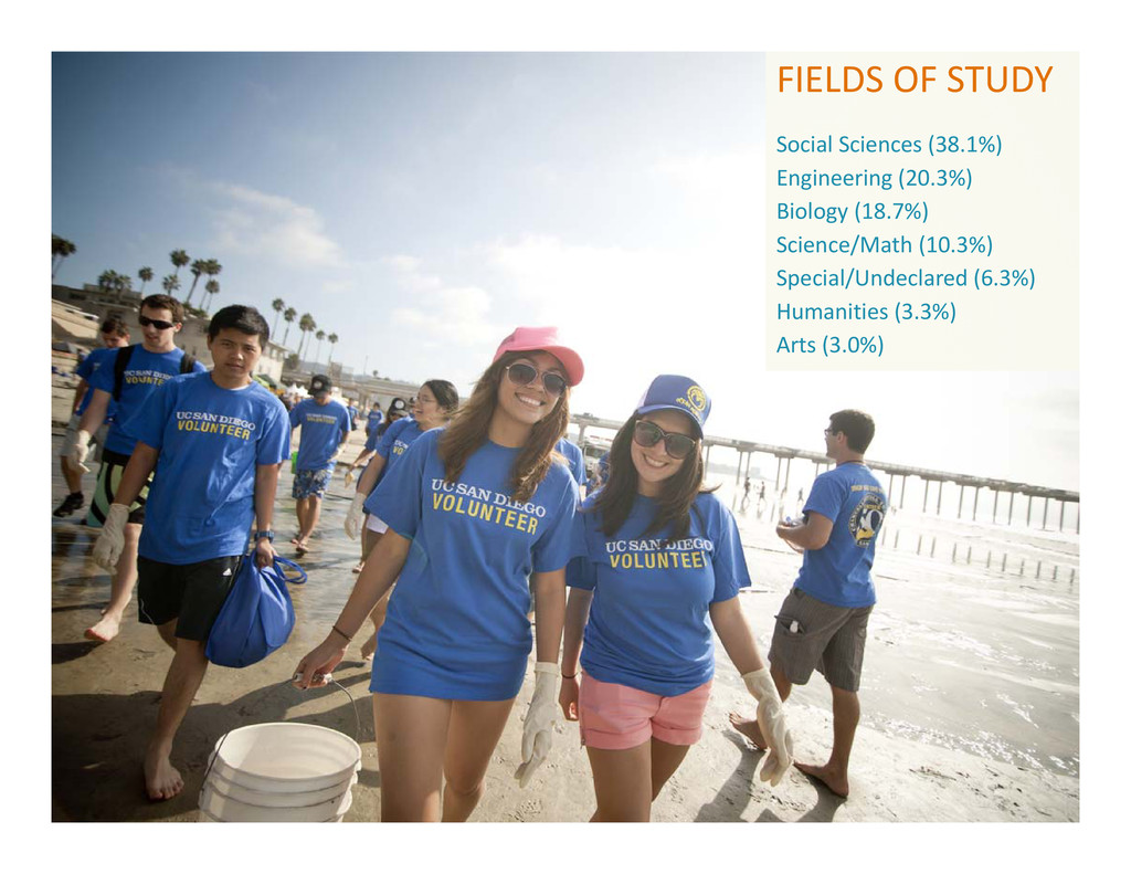
FIELDS OF STUDY Social Sciences (38.1%) Engineering (20.3%) Biology (18.7%)
Science/Math (10.3%) Special/Undeclared (6.3%) Humanities (3.3%) Arts (3.0%)
UNDERGRADUATE COLLEGES Marshall Muir Revelle Roosevelt Sixth Warren
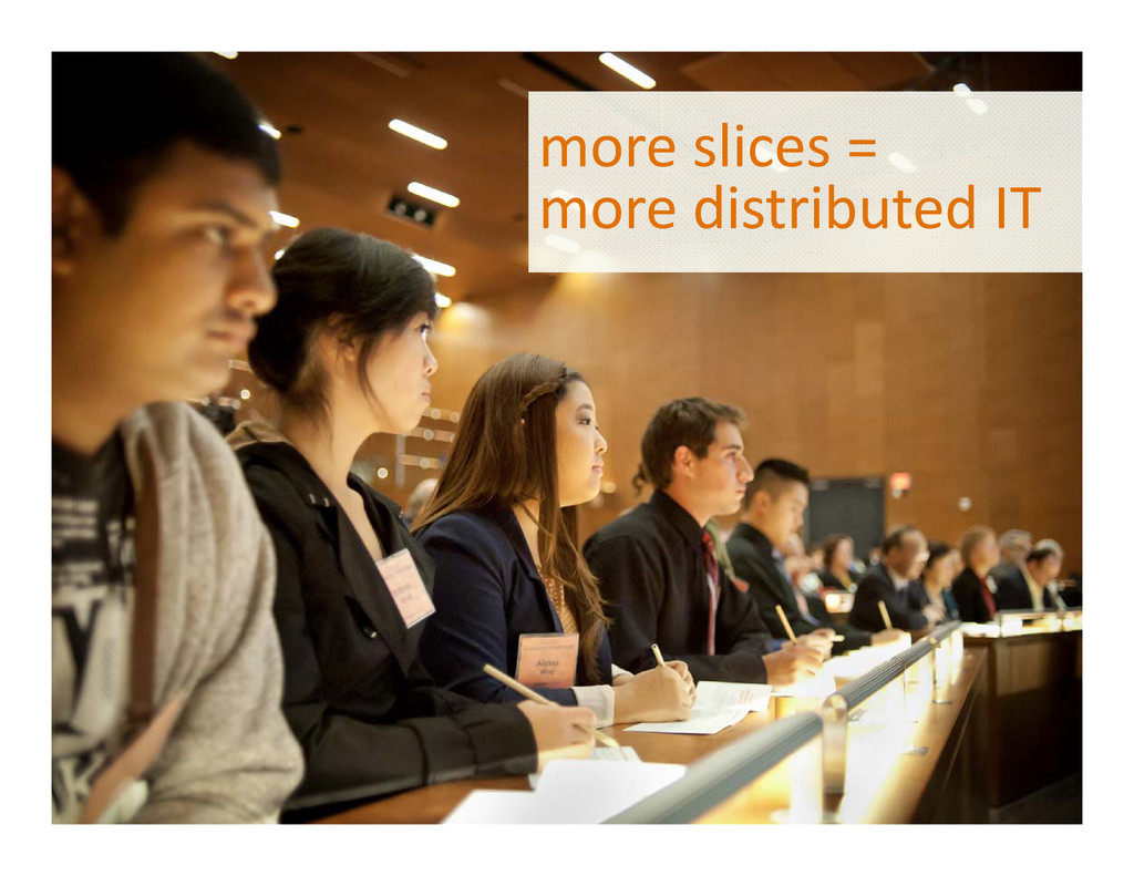
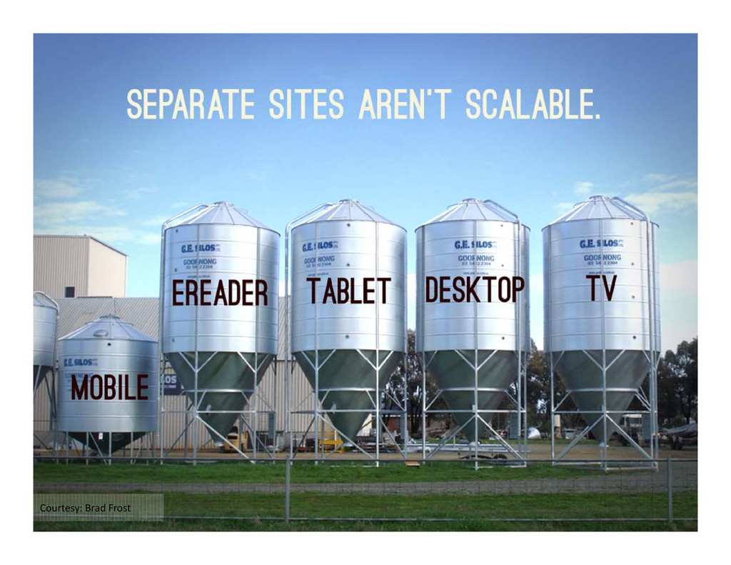
more slices = more distributed IT
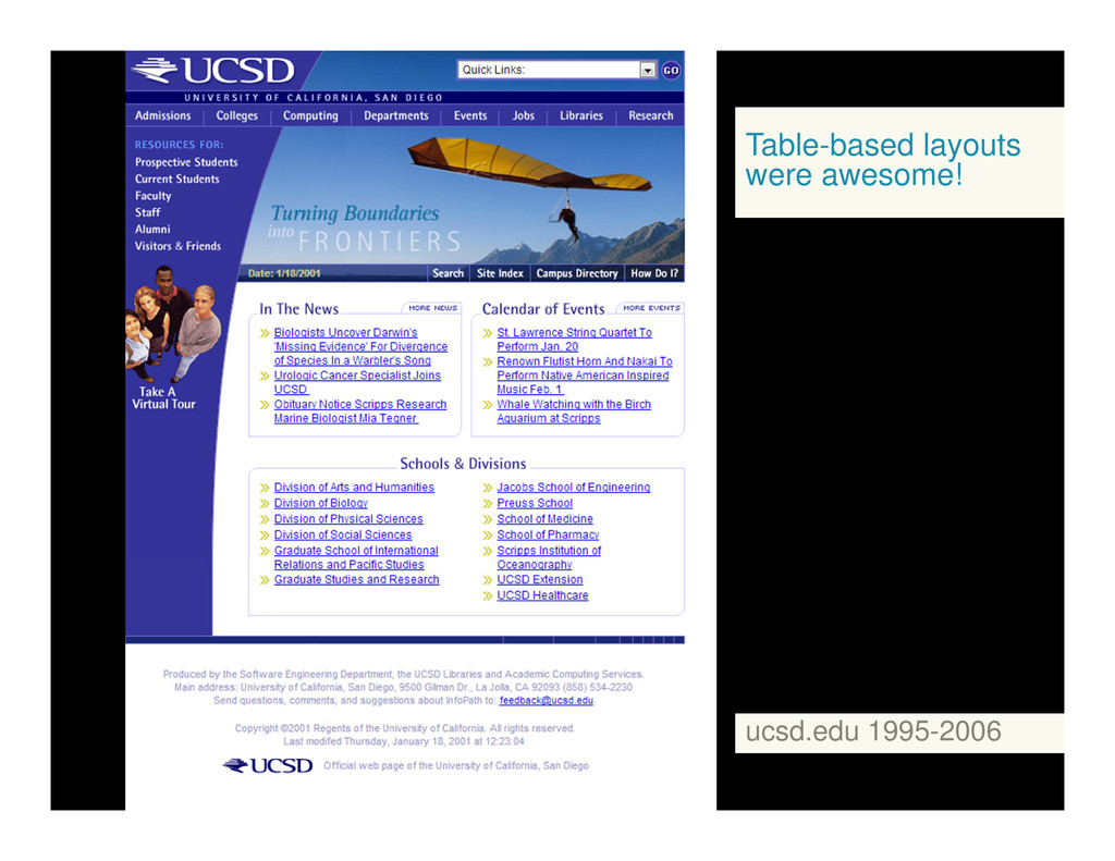
Table-based layouts were awesome! ucsd.edu 1995-2006
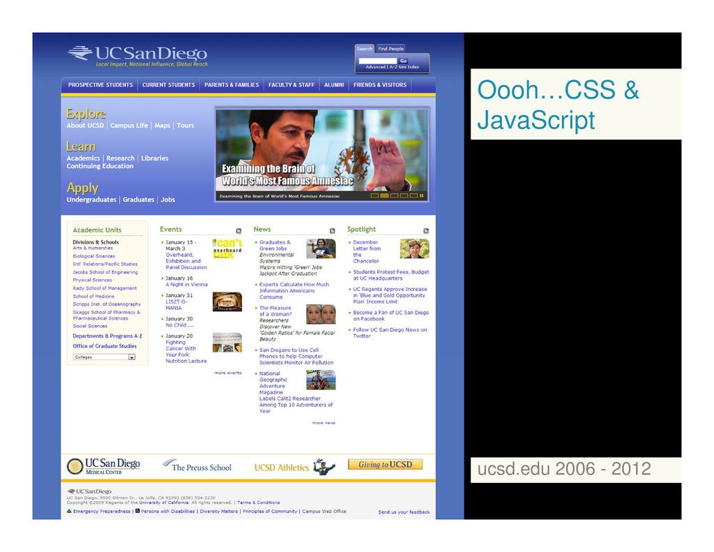
Oooh…CSS & JavaScript ucsd.edu 2006 - 2012
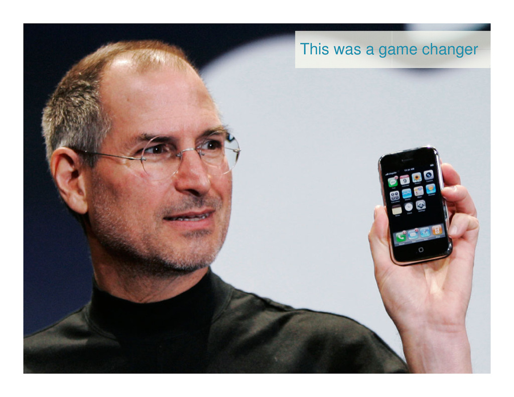
This was a game changer
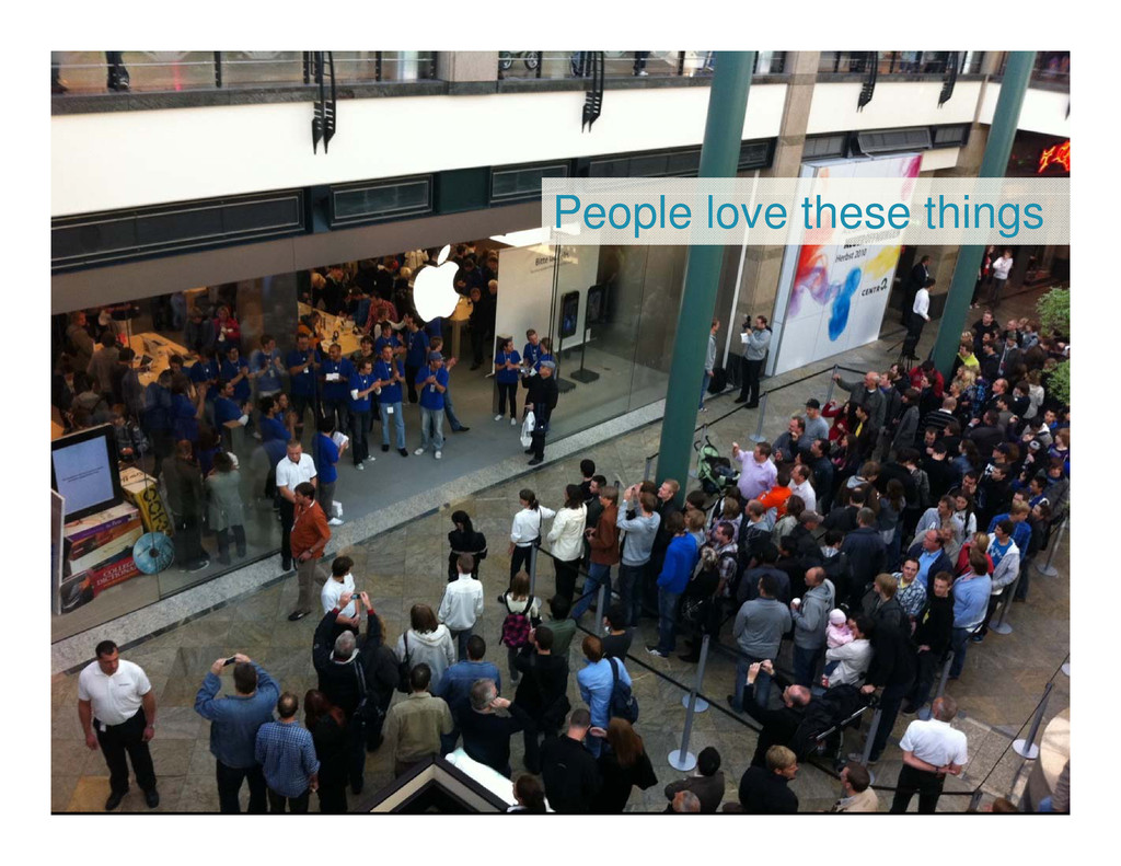
People love these things
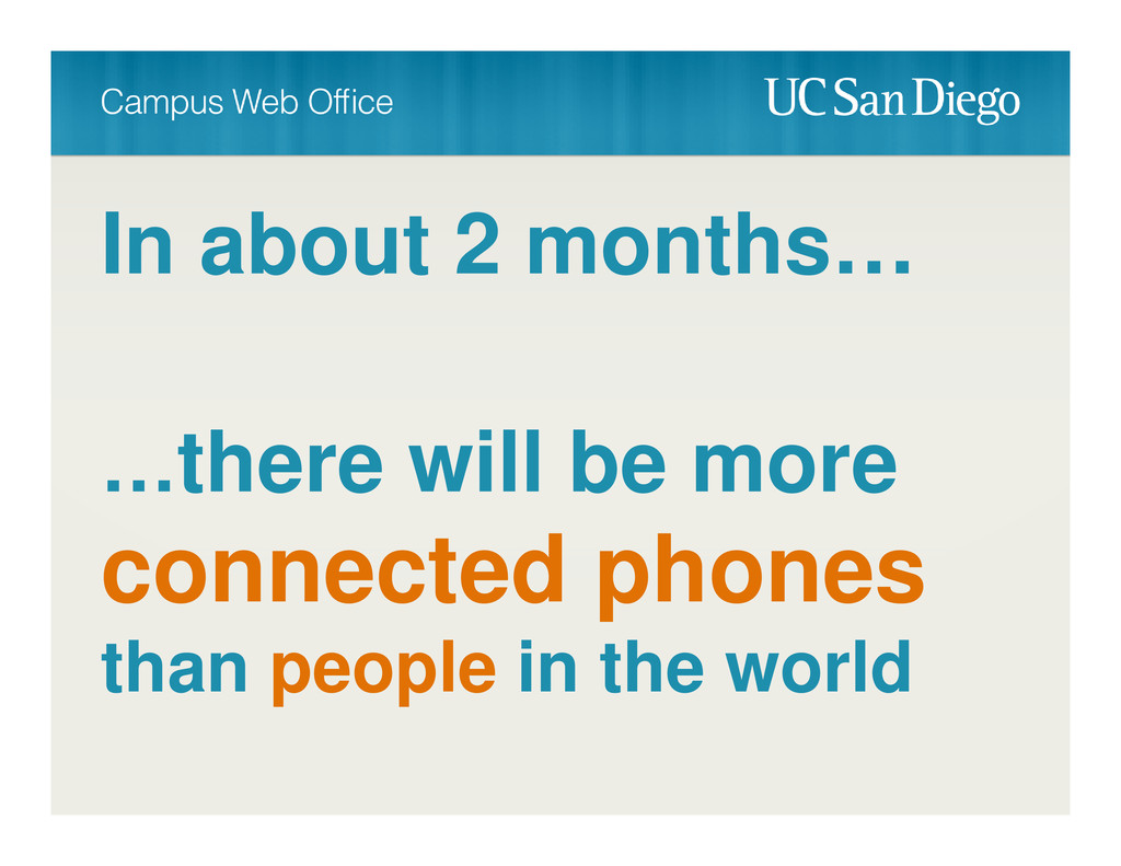
In about 2 months… …there will be more connected phones
than people in the world
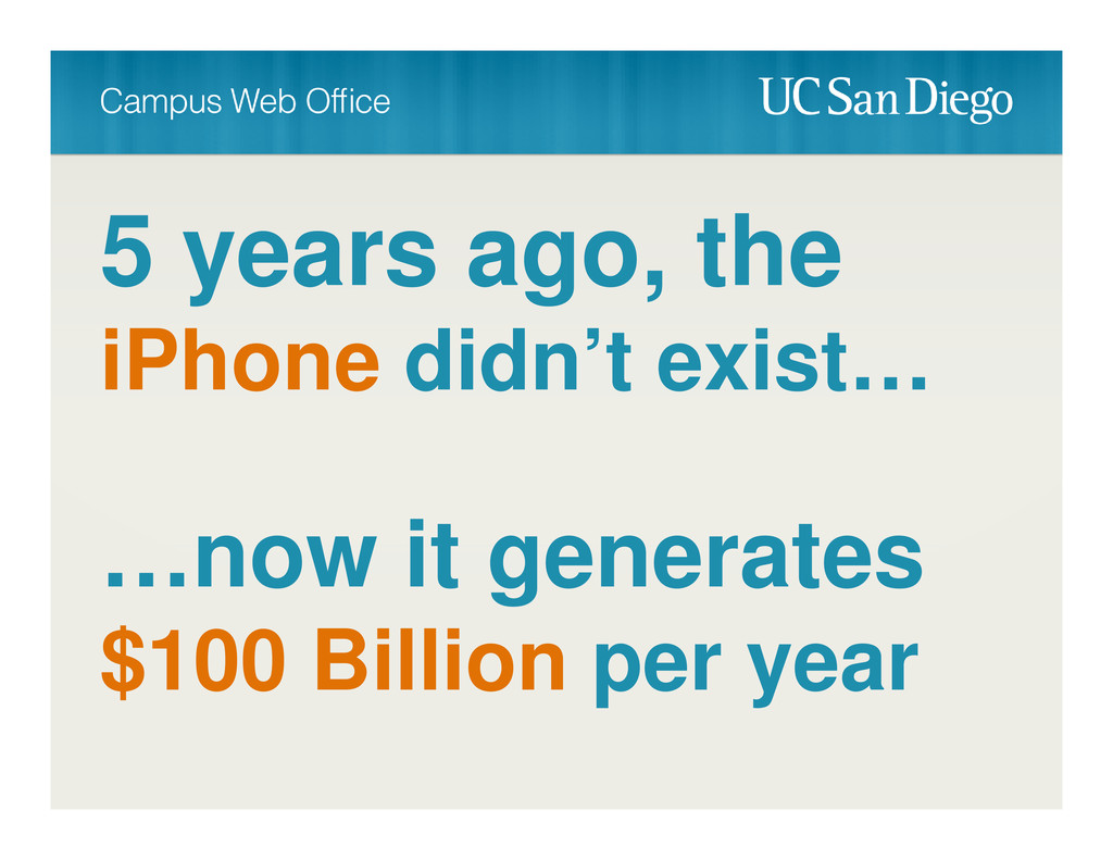
5 years ago, the iPhone didn’t exist… …now it generates
$100 Billion per year
The iPhone is bigger than
more tablets will be sold than PC’s
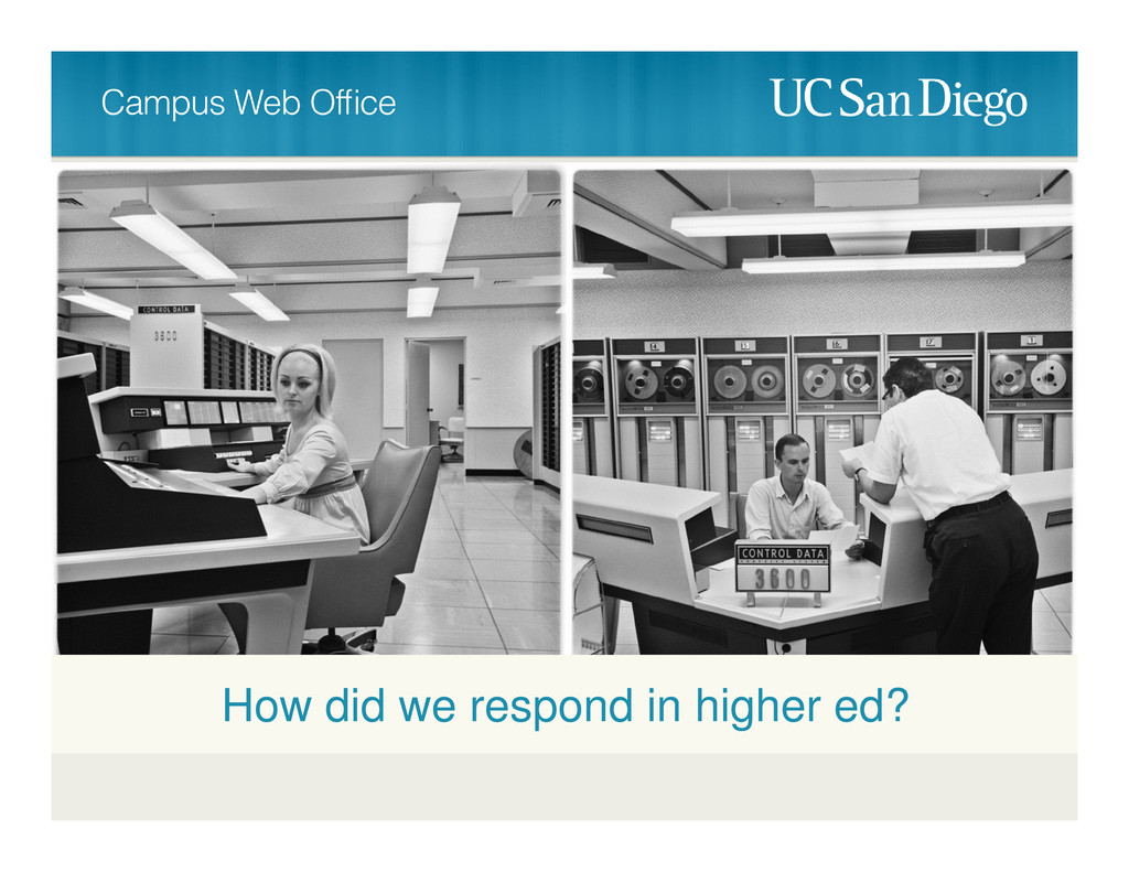
How did we respond in higher ed?
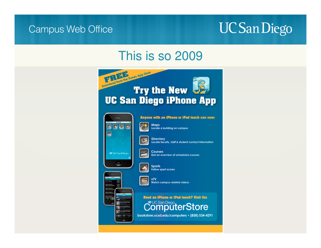
This is so 2009
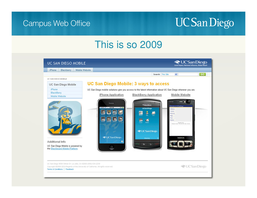
This is so 2009
None
None
None
None
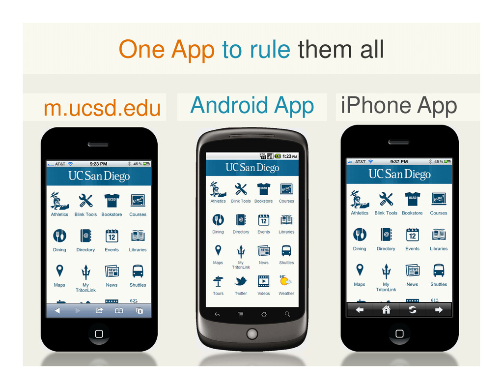
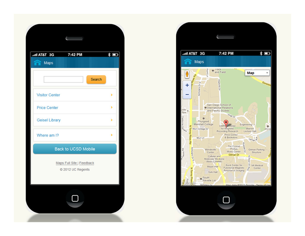
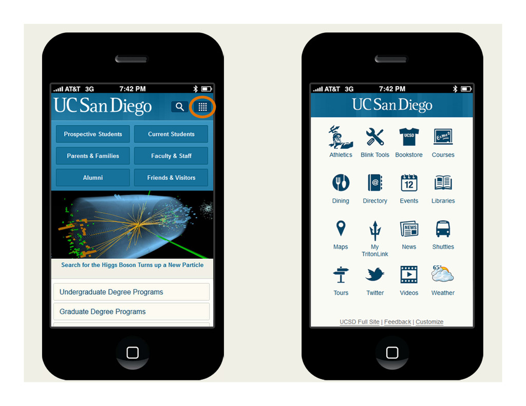
m.ucsd.edu iPhone App Android App One App to rule them
all
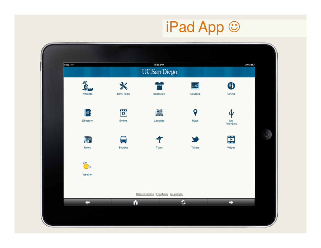
iPad App
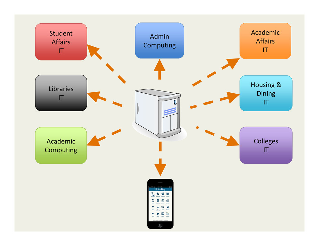
Student Affairs IT Academic Affairs IT Housing & Dining IT
Libraries IT Admin Computing Academic Computing Colleges IT
None
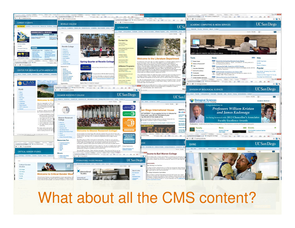
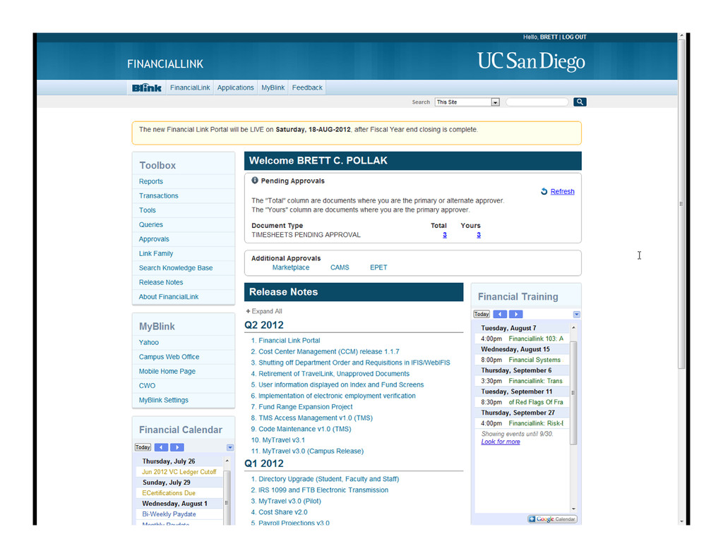
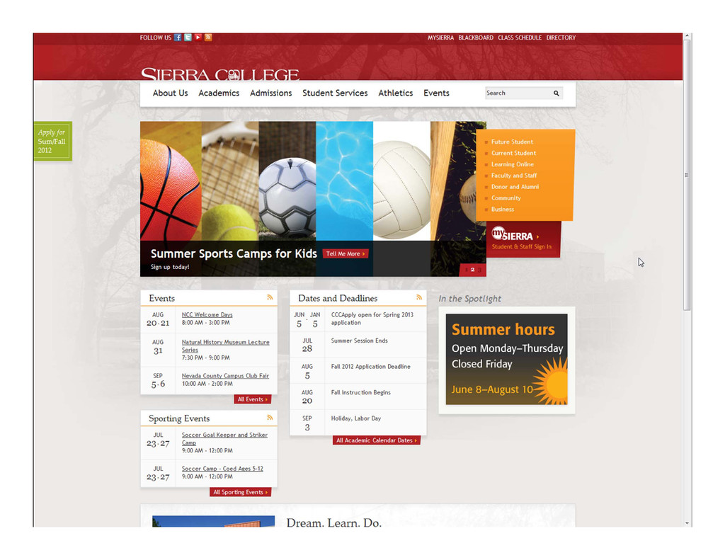
What about all the CMS content?
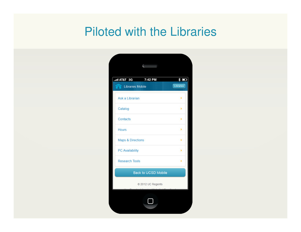
Piloted with the Libraries
Courtesy: Brad Frost
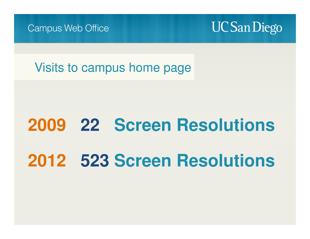
2009 22 Screen Resolutions Visits to campus home page 2012
523 Screen Resolutions
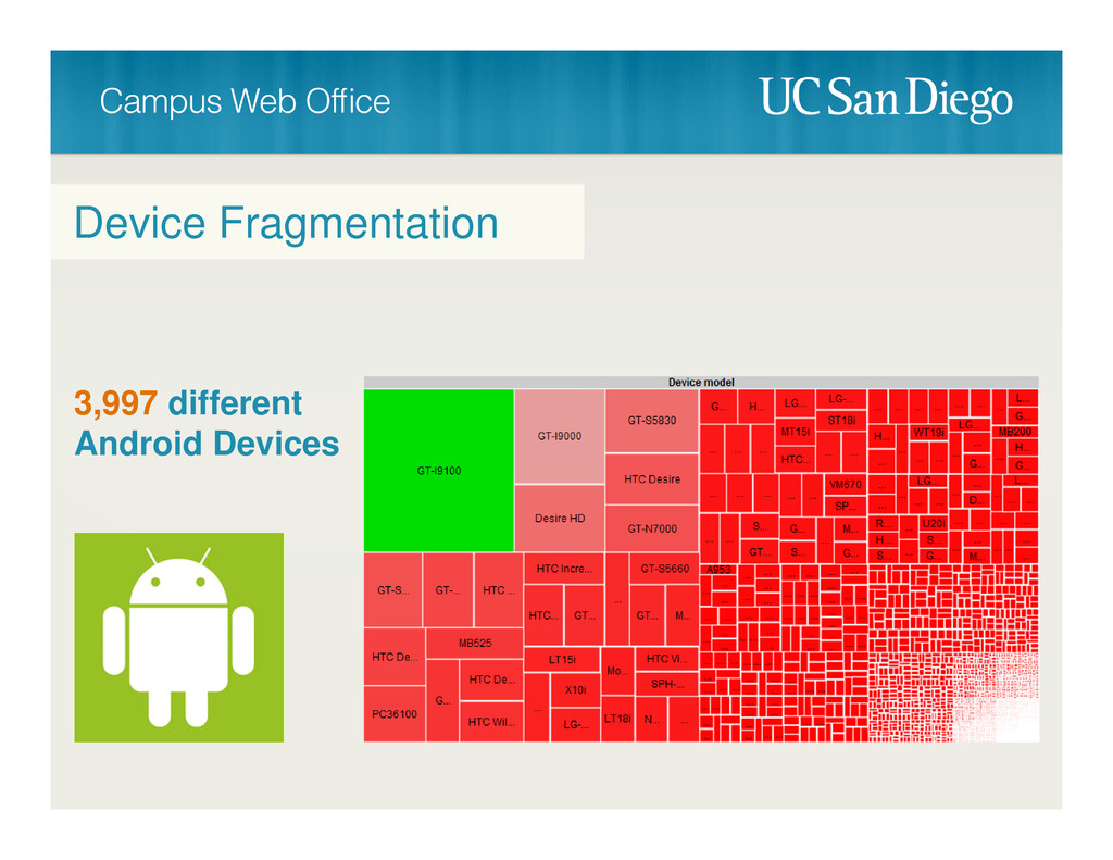
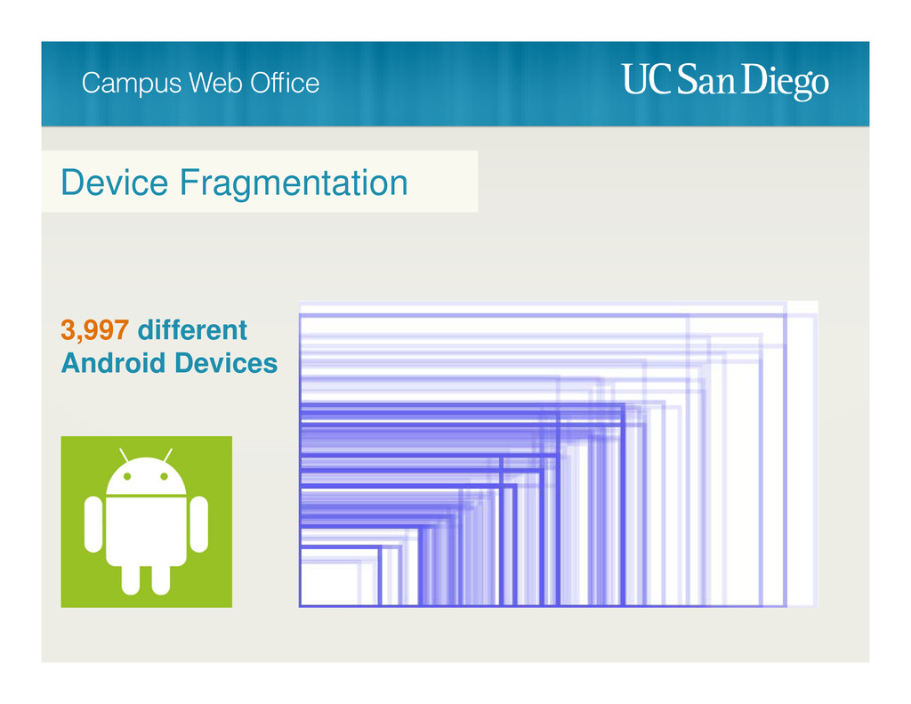
Device Fragmentation 3,997 different Android Devices
Device Fragmentation 3,997 different Android Devices
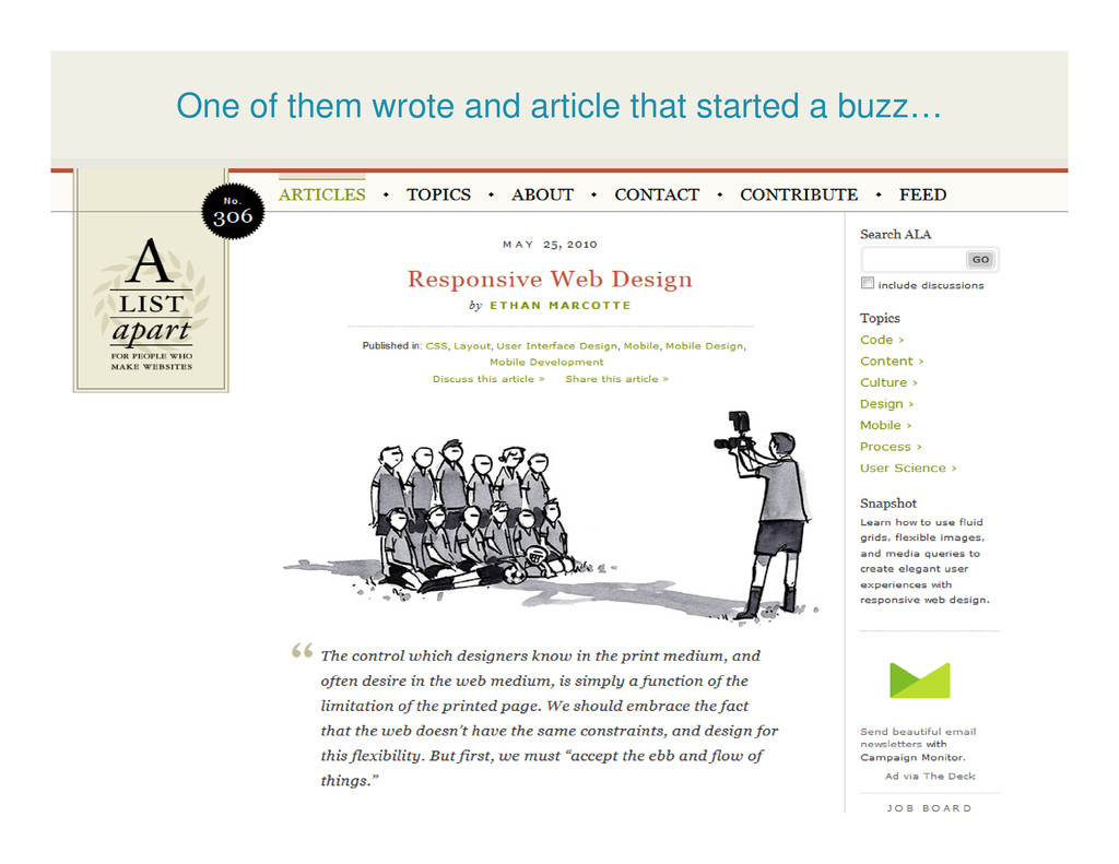
One of them wrote and article that started a buzz…
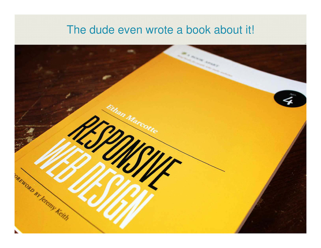
The dude even wrote a book about it!
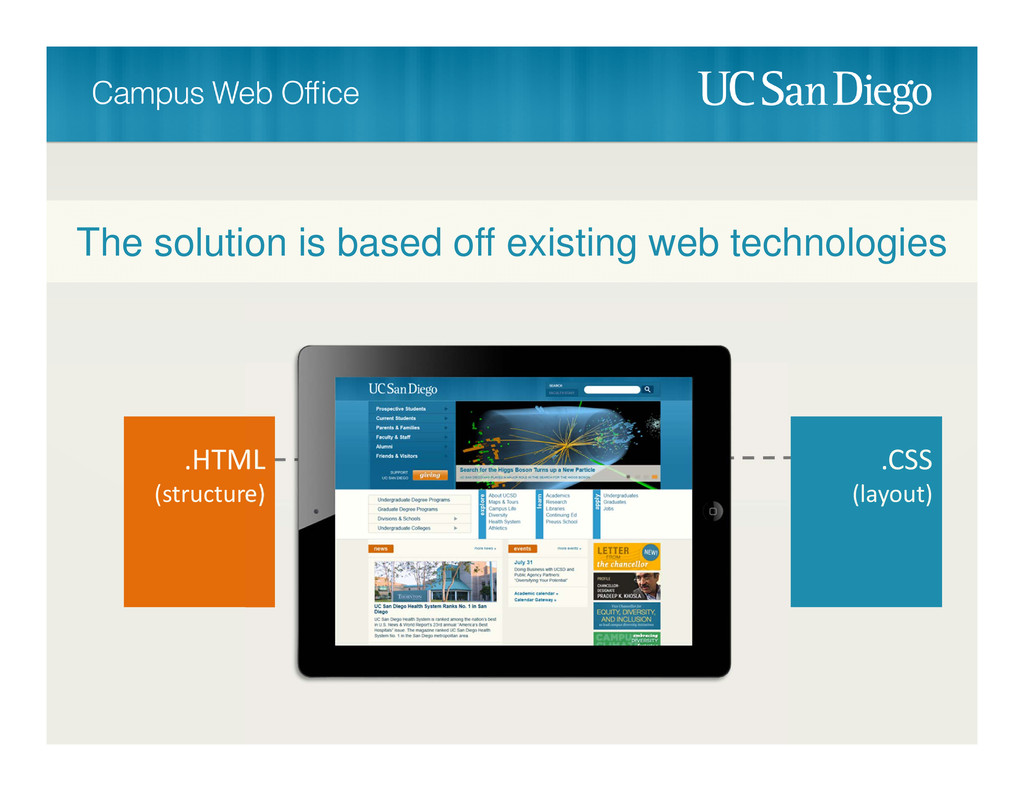
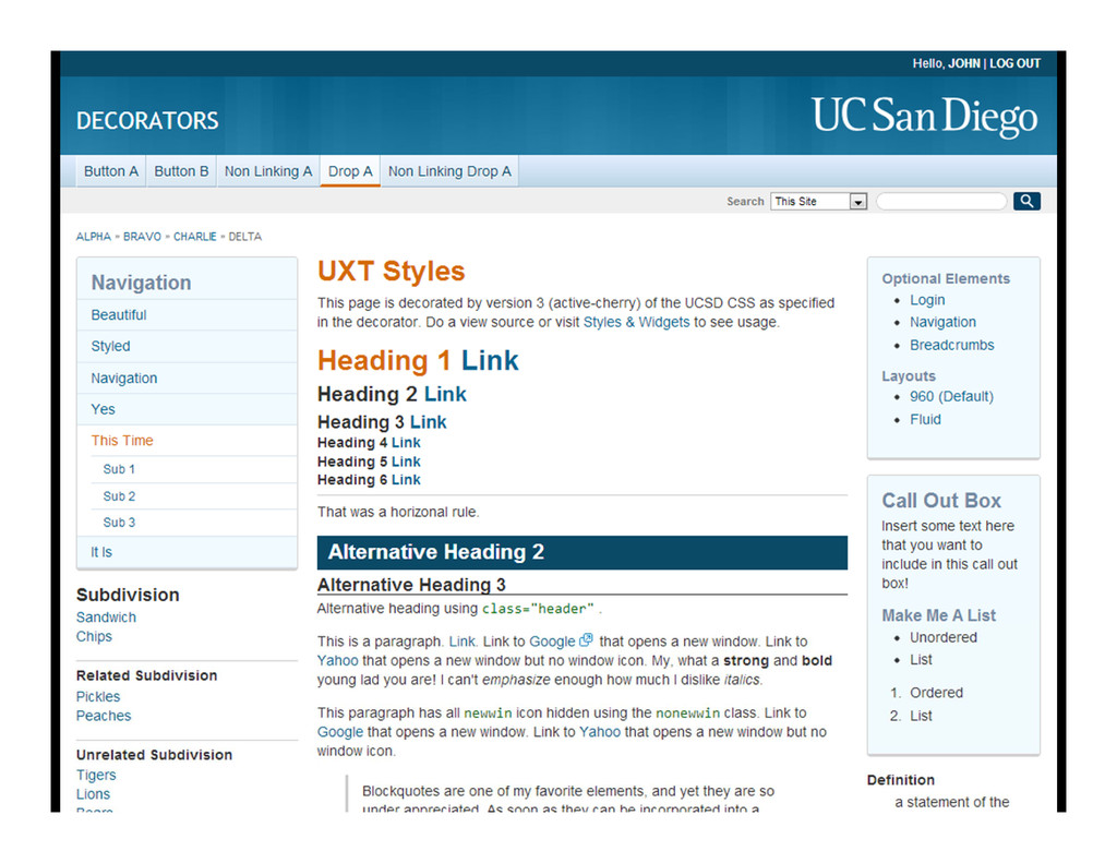
.HTML (structure) .CSS (layout) The solution is based off existing
web technologies
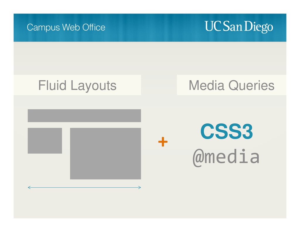
CSS3 @media + Fluid Layouts Media Queries
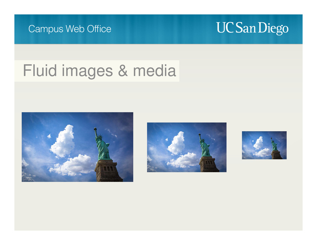
Fluid images & media
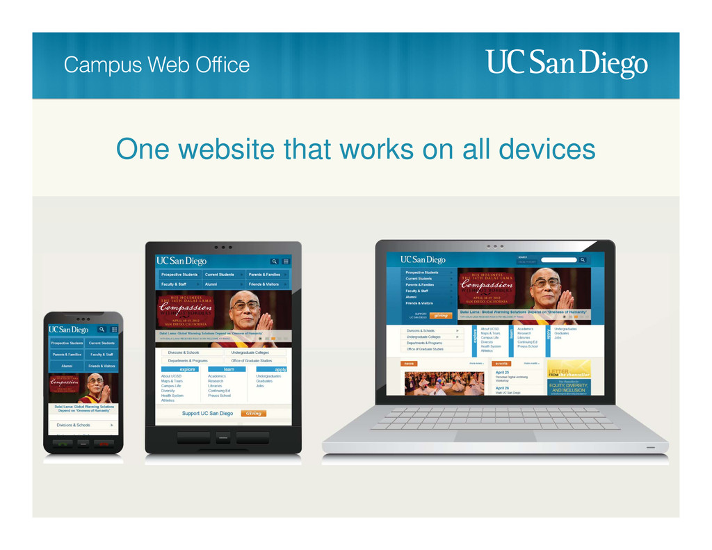
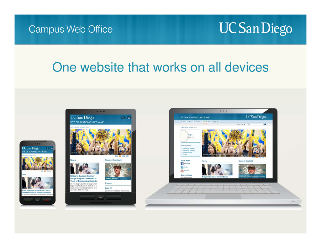
One website that works on all devices
One website that works on all devices
None
None
None
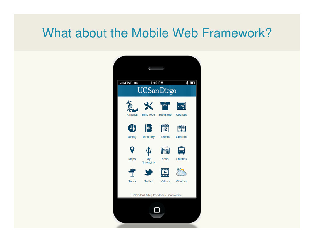
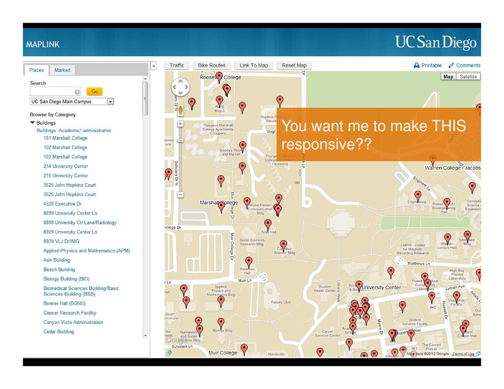
What about the Mobile Web Framework?
You want me to make THIS responsive??
None
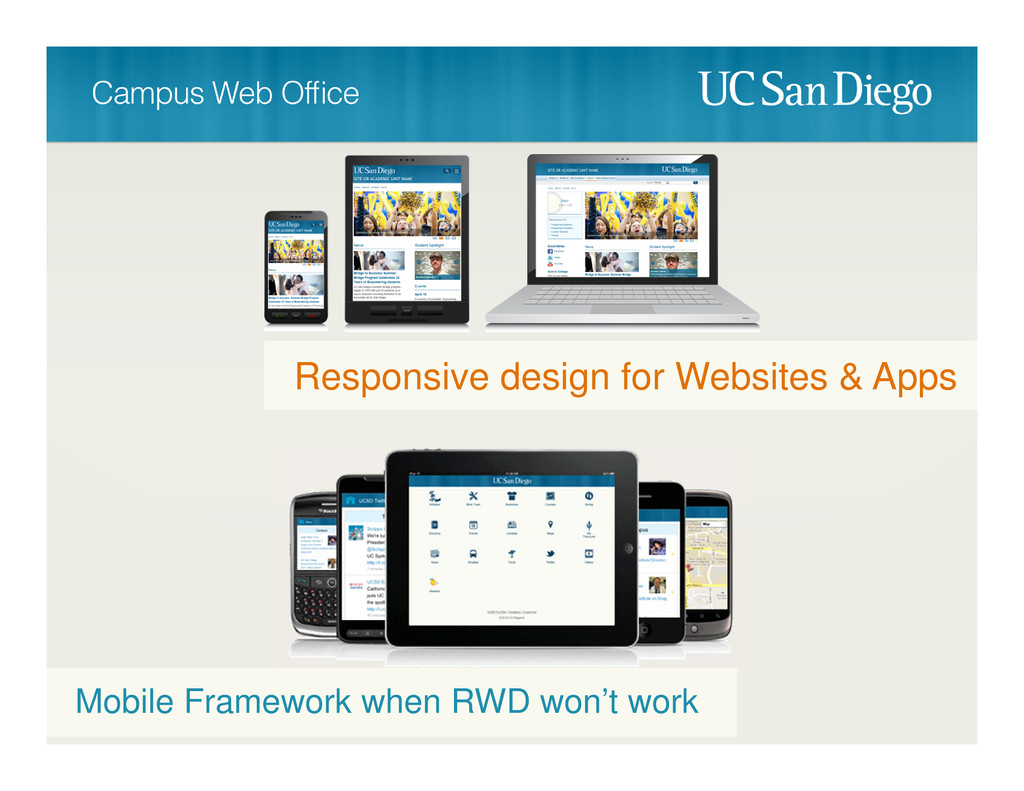
Responsive design for Websites & Apps Mobile Framework when RWD
won’t work
None
None
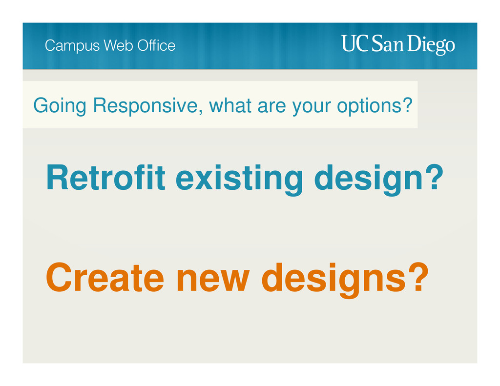
Retrofit existing design? Going Responsive, what are your options? Create
new designs?
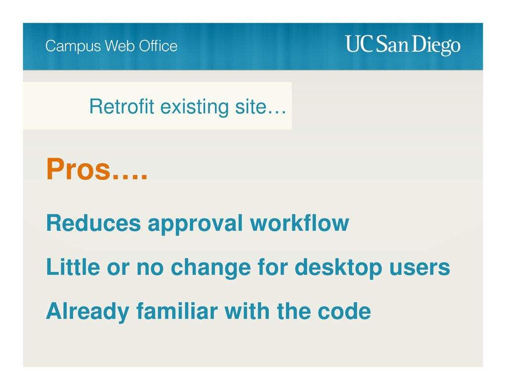
Pros…. Reduces approval workflow Little or no change for desktop
users Already familiar with the code Retrofit existing site…
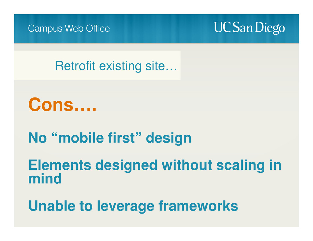
Cons…. No “mobile first” design Elements designed without scaling in
mind Unable to leverage frameworks Retrofit existing site…
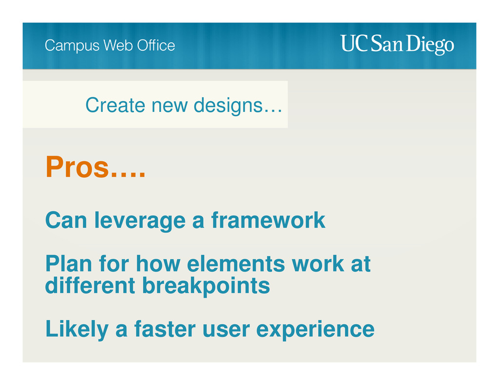
Pros…. Can leverage a framework Plan for how elements work
at different breakpoints Likely a faster user experience Create new designs…
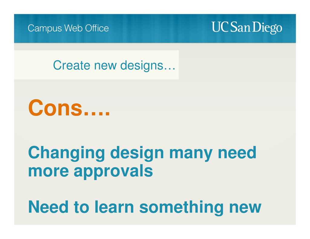
Cons…. Changing design many need more approvals Need to learn
something new Create new designs…
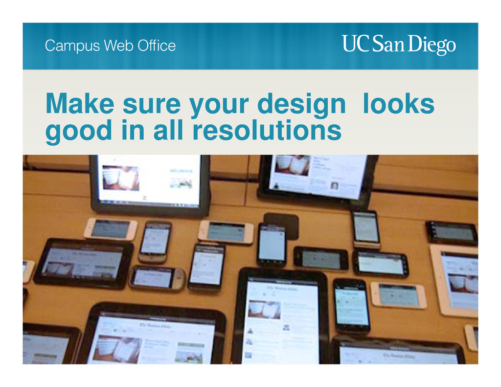
Make sure your design looks good in all resolutions Add
breakpoints when the design starts to break down
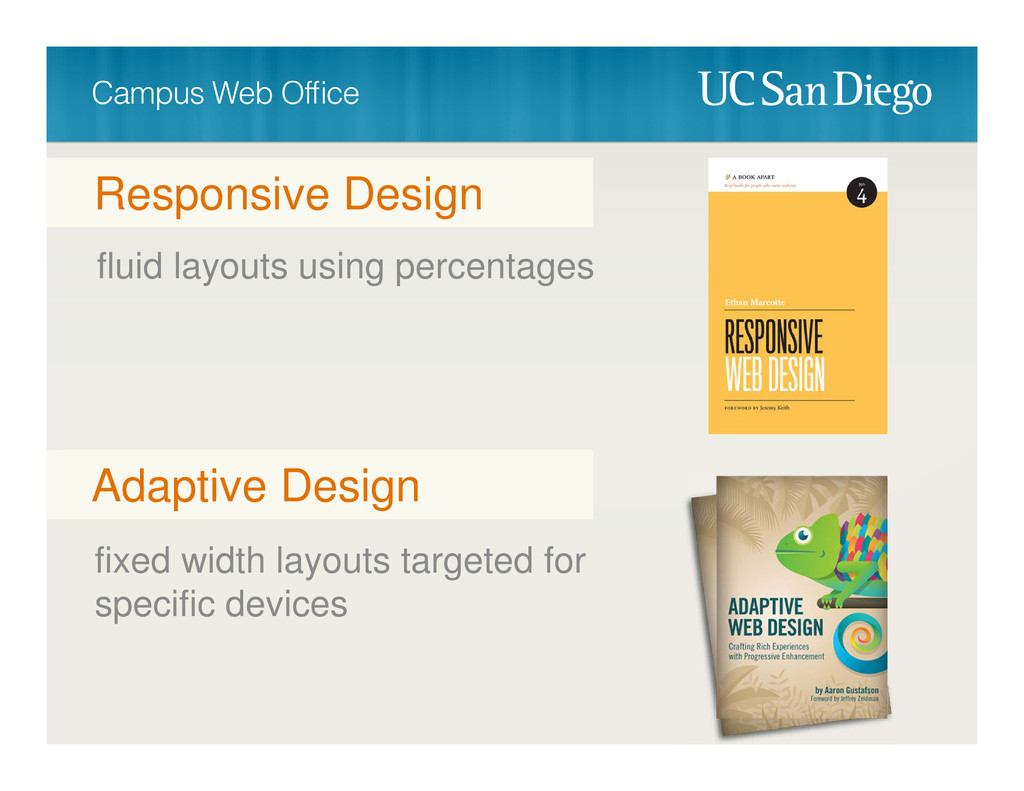
fluid layouts using percentages Responsive Design fixed width layouts targeted
for specific devices Adaptive Design
None
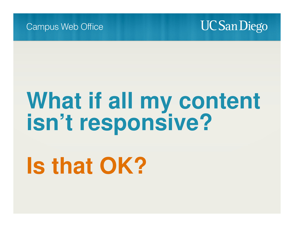
What if all my content isn’t responsive? Is that OK?
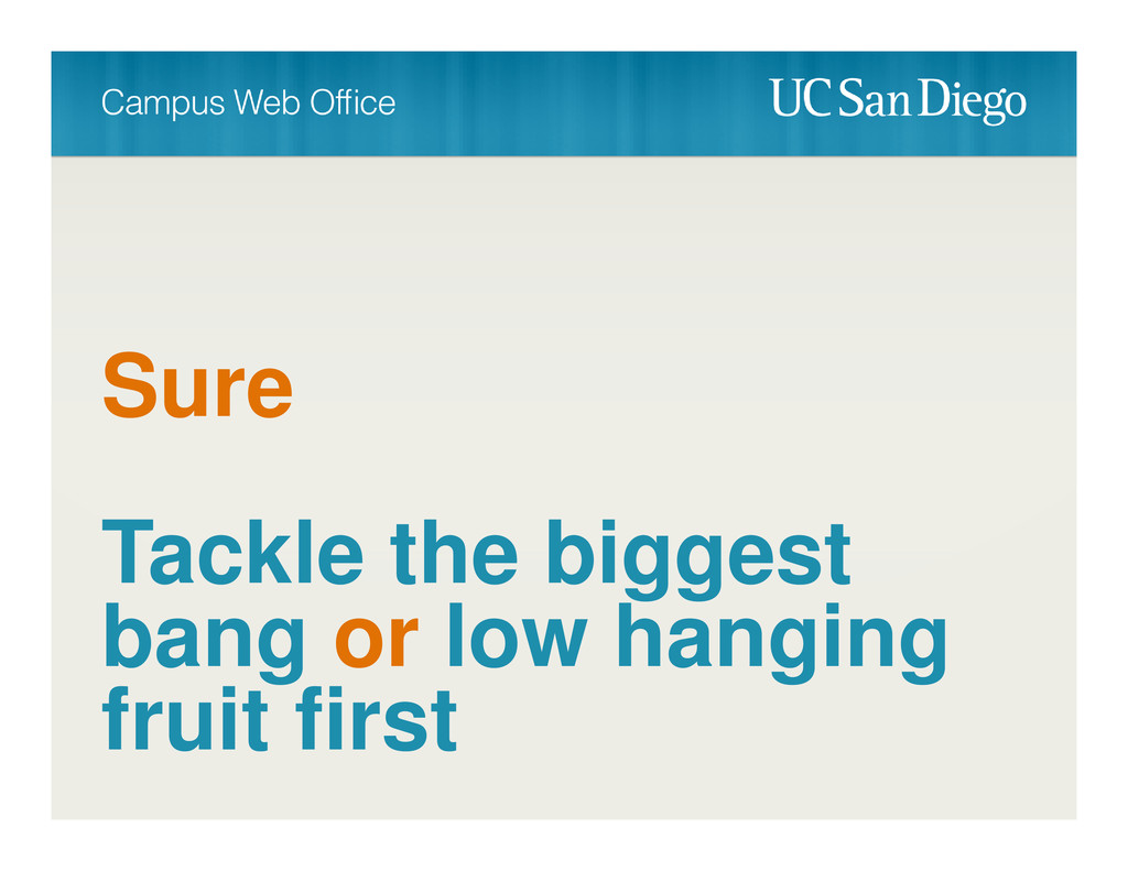
Sure Tackle the biggest bang or low hanging fruit first
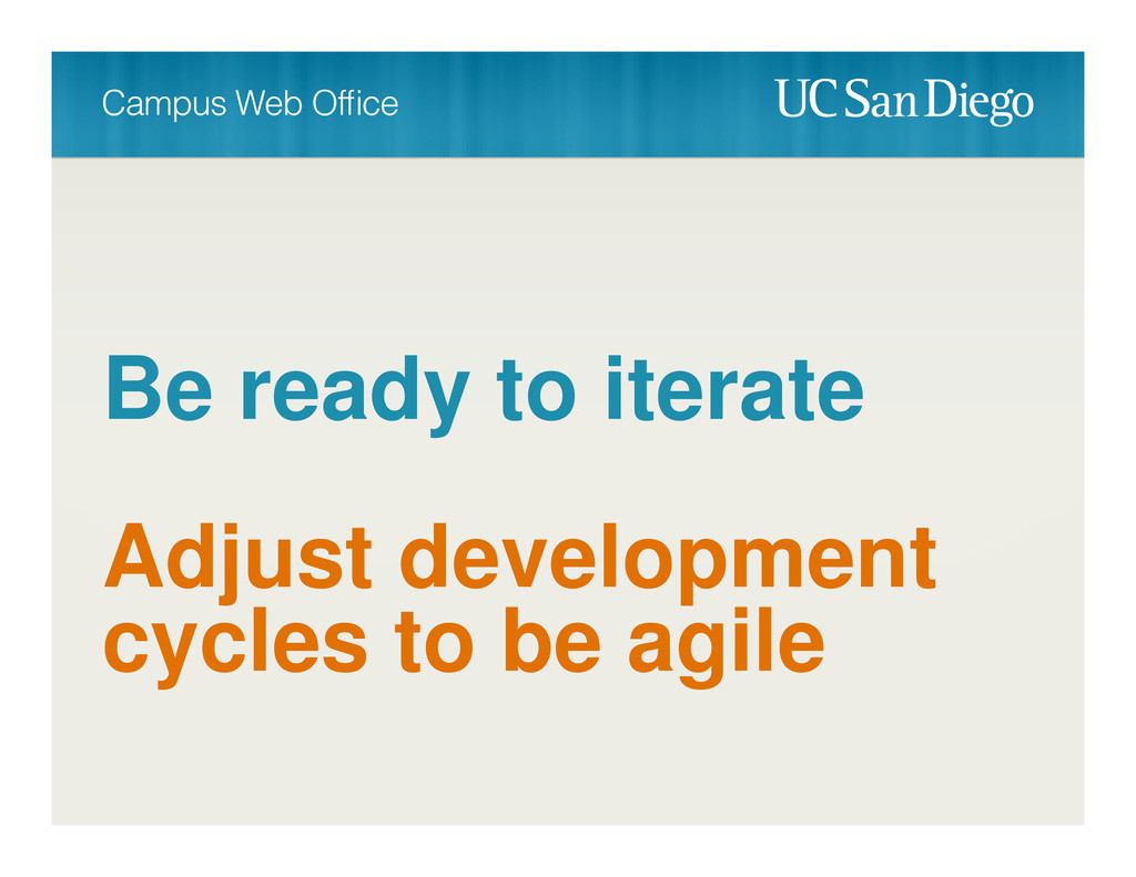
Be ready to iterate Adjust development cycles to be agile
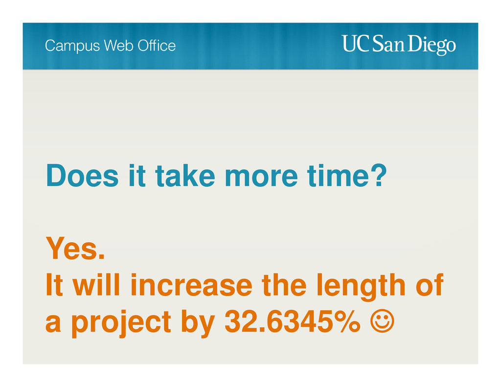
Does it take more time? Yes. It will increase the
length of a project by 32.6345%
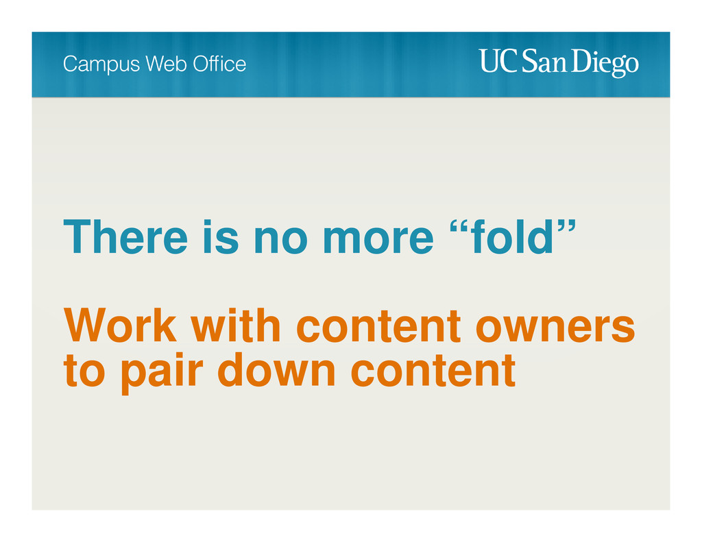
There is no more “fold” Work with content owners to
pair down content
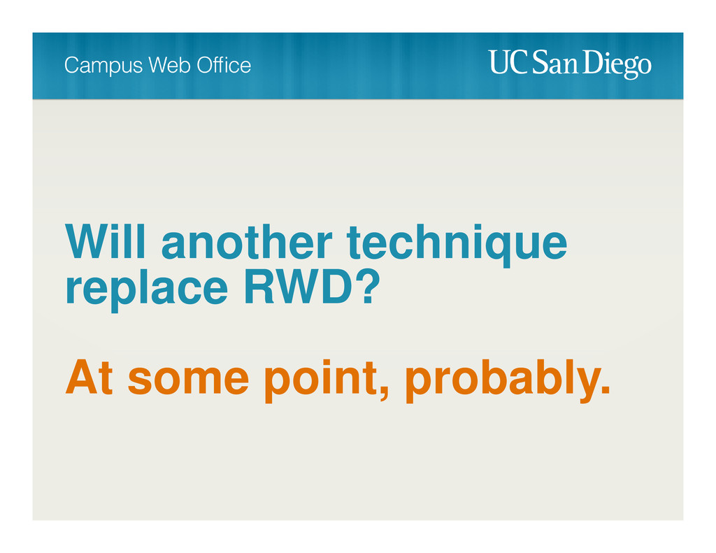
Will another technique replace RWD? At some point, probably.
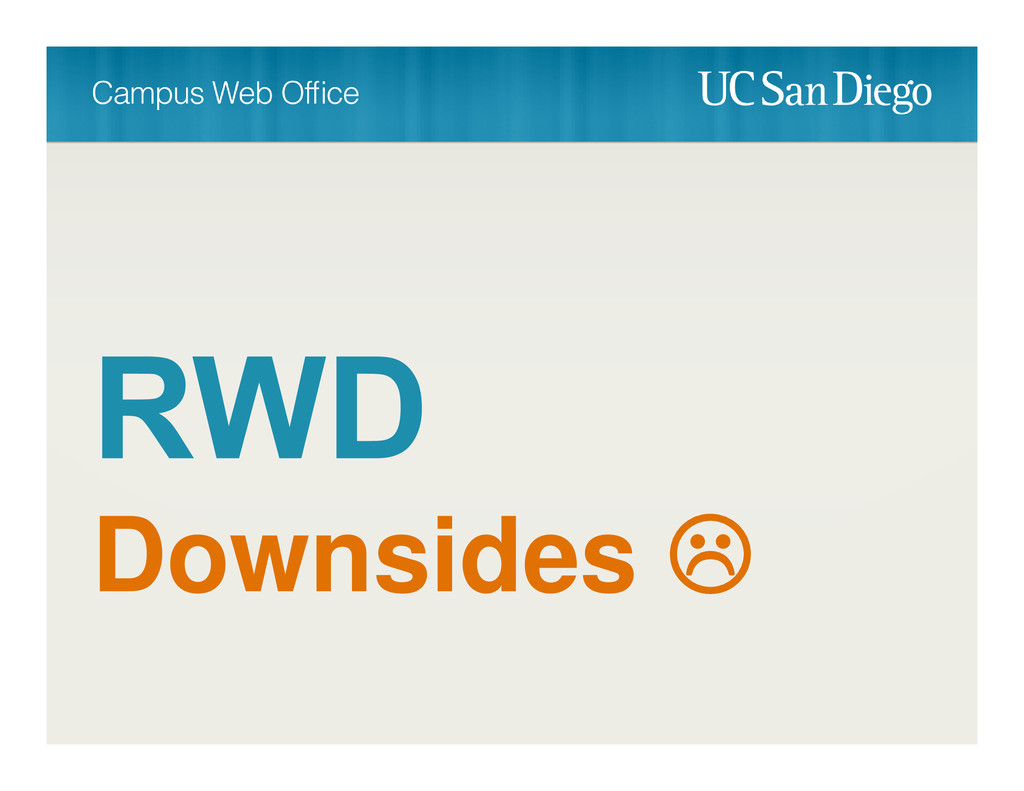
Downsides
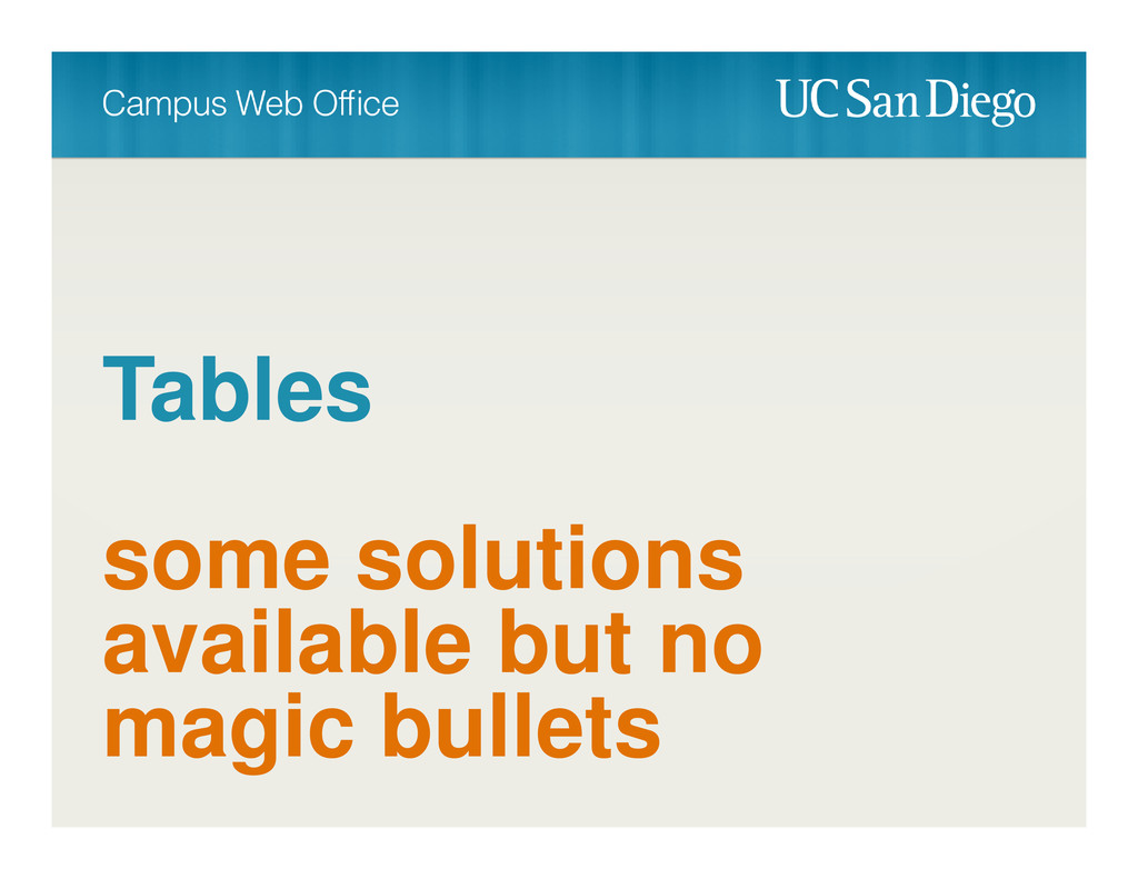
Tables some solutions available but no magic bullets
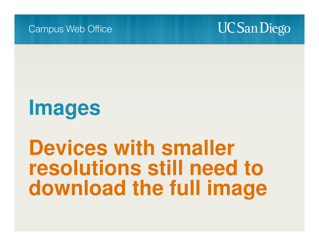
Images Devices with smaller resolutions still need to download the
full image
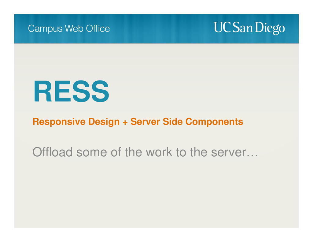
RESS Responsive Design + Server Side Components Offload some of
the work to the server…
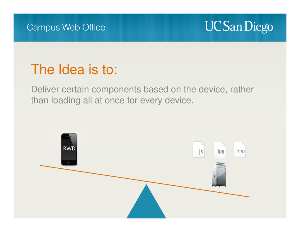
The Idea is to: Deliver certain components based on the
device, rather than loading all at once for every device. RWD .js .jpg .php
None
None
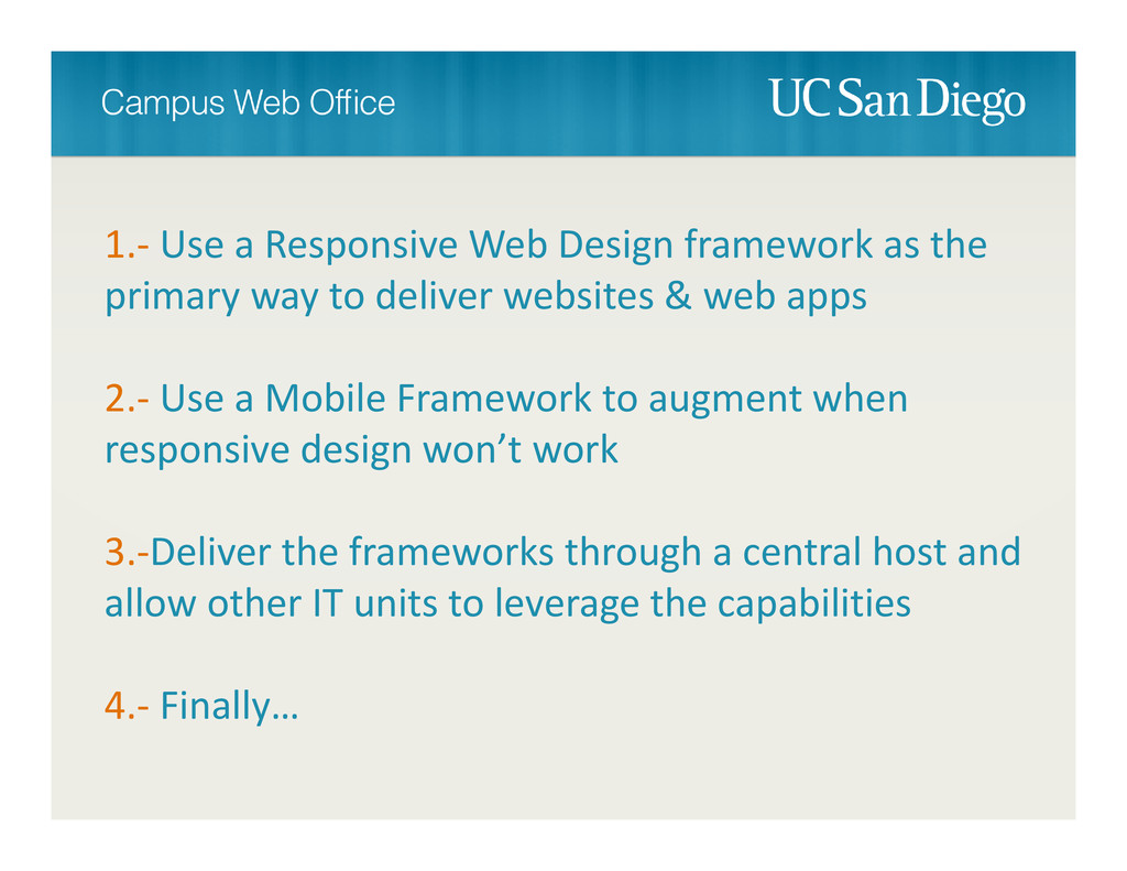
1.‐ Use a Responsive Web Design framework as the primary
way to deliver websites & web apps 2.‐ Use a Mobile Framework to augment when responsive design won’t work 3.‐Deliver the frameworks through a central host and allow other IT units to leverage the capabilities 4.‐ Finally…
None
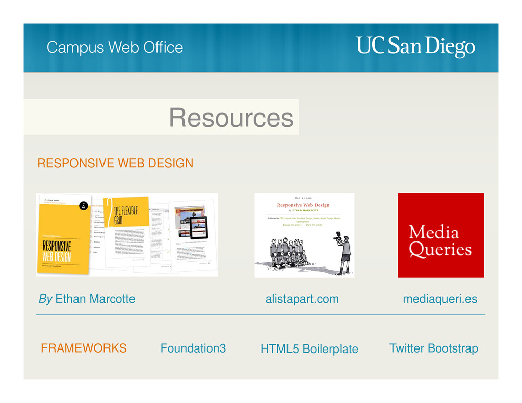
Resources RESPONSIVE WEB DESIGN By Ethan Marcotte alistapart.com mediaqueri.es FRAMEWORKS
Foundation3 Twitter Bootstrap HTML5 Boilerplate
Brett Pollak @brettcpollak #heweb12 Thank You!
 bpollak
 a_ono
a_ono
 laysakura
 noriyukitakei
 diggymo
 ekispert_api
 yurufuwahealer
 fullkaiten
 yanzm
yanzm
 eller86
 hageyahhoo
 maruloop
 lycorptech_jp
 rabernat
 kristinabergwall1
 sarafernandez
 asonas
 tenderlove
 mayunak
 sonatard
 axbom
axbom
 akademiya2063
 tammyeverts
 ipullrank
 brettharned