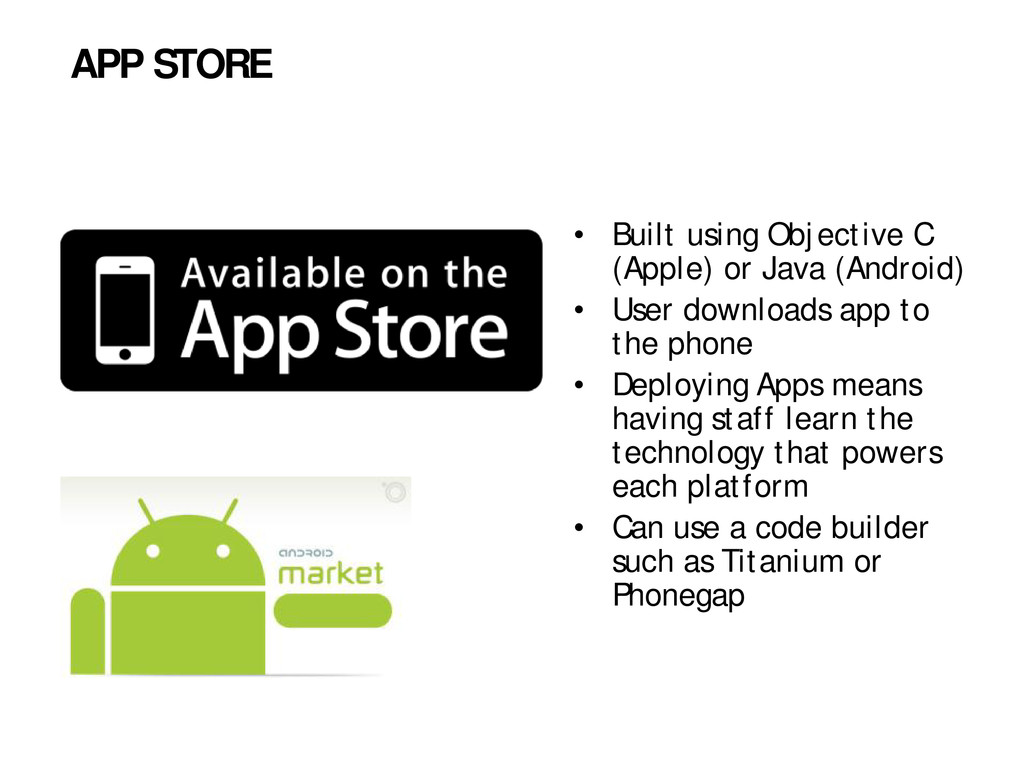
User downloads app to the phone • Deploying Apps means having staff learn the technology that powers each platform • Can use a code builder such as Titanium or Phonegap APP STORE
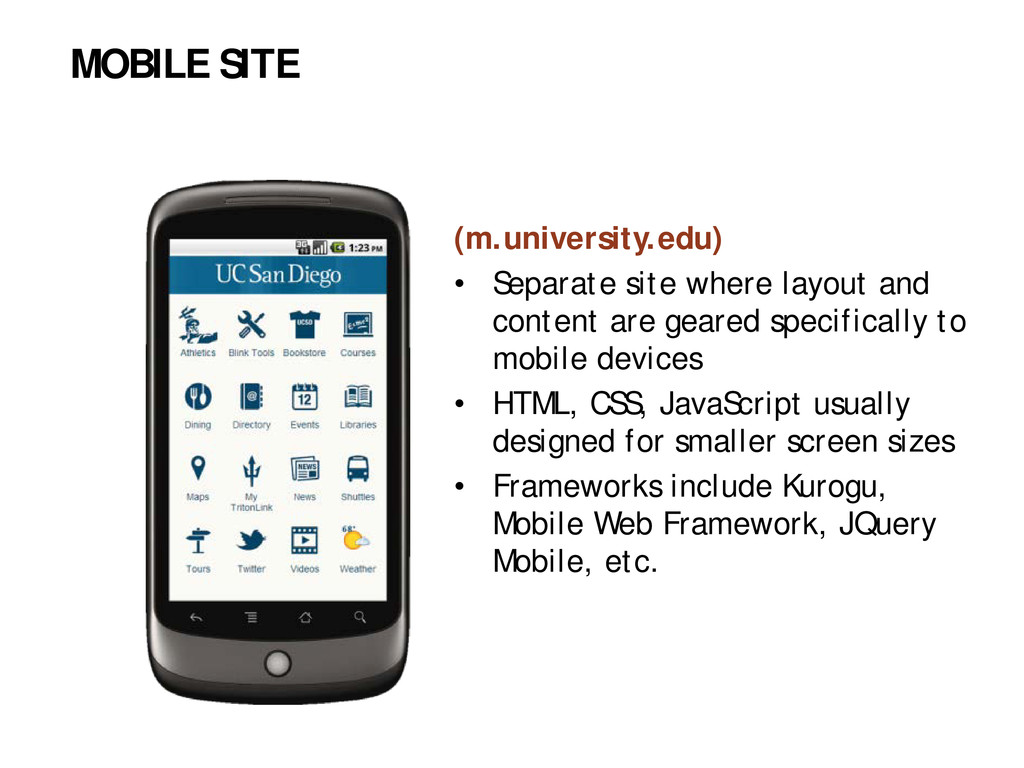
specifically to mobile devices • HTML, CSS, JavaScript usually designed for smaller screen sizes • Frameworks include Kurogu, Mobile Web Framework, JQuery Mobile, etc. MOBILE SITE
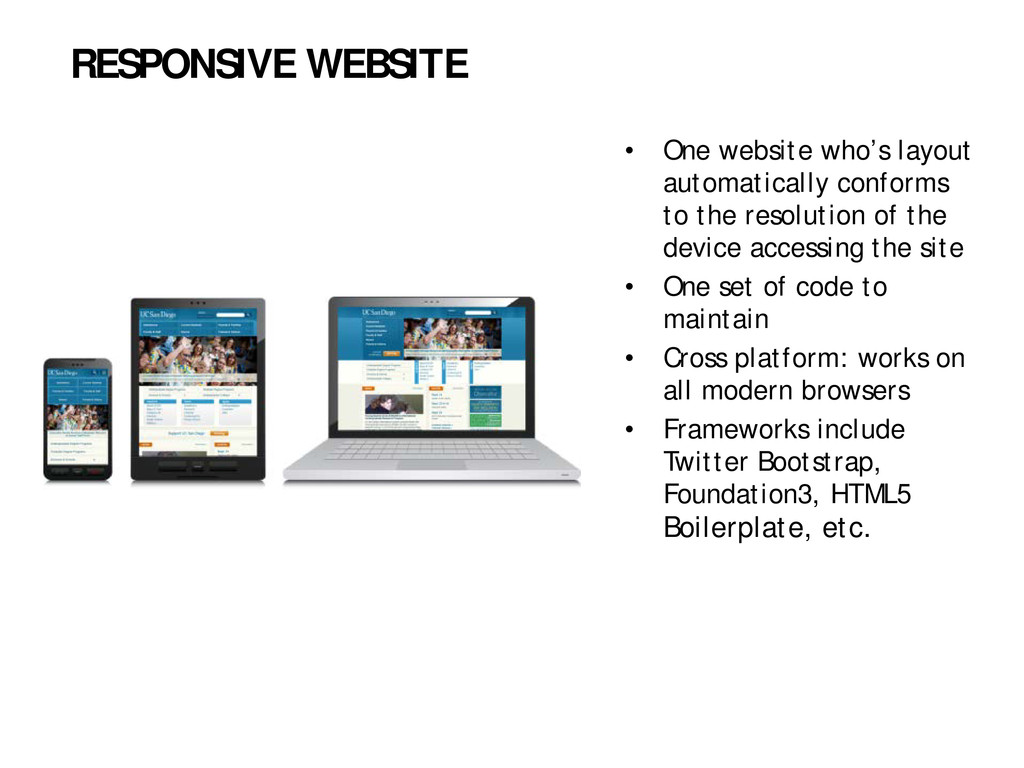
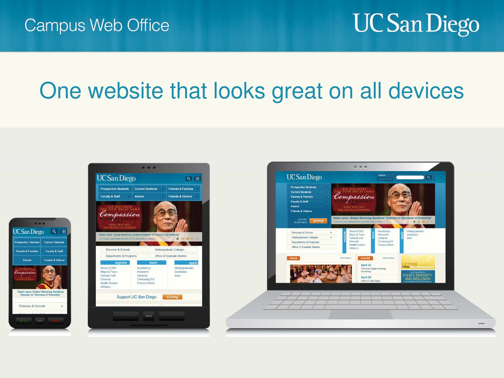
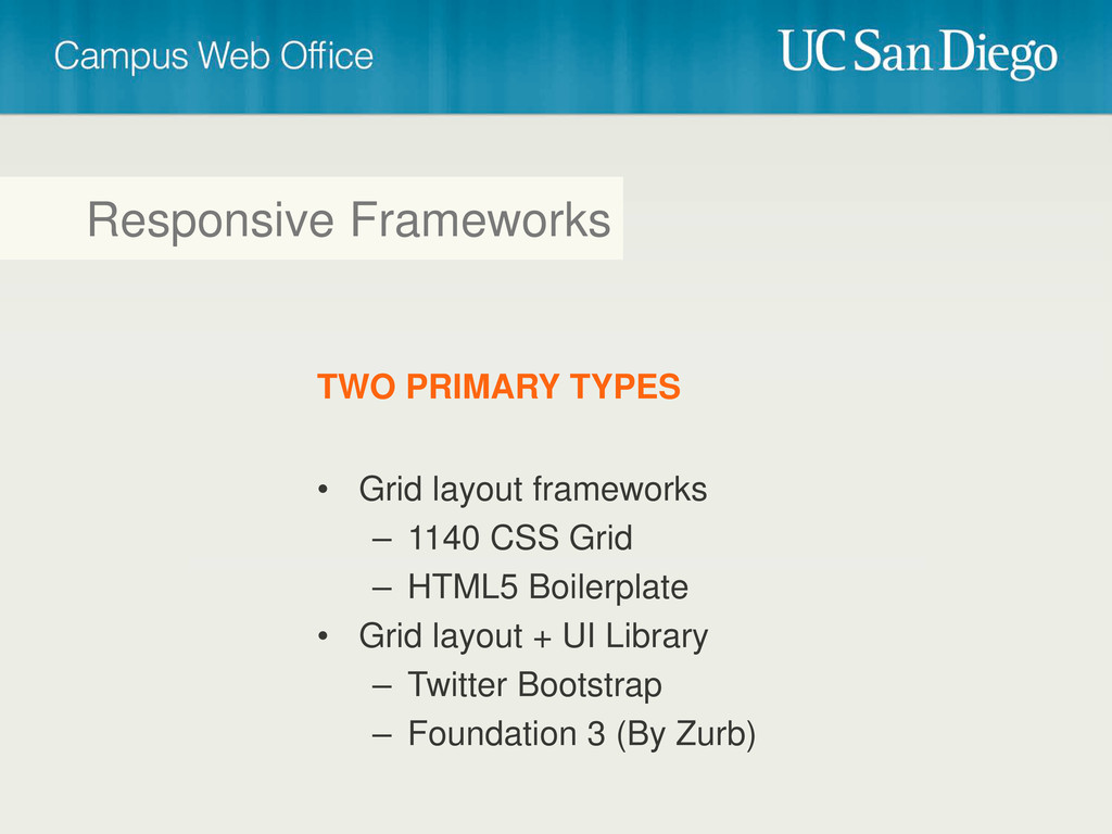
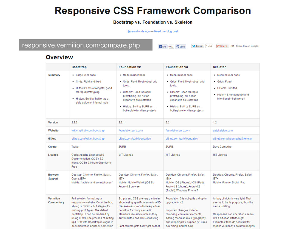
of the device accessing the site • One set of code to maintain • Cross platform: works on all modern browsers • Frameworks include Twitter Bootstrap, Foundation3, HTML5 Boilerplate, etc. RESPONSIVE WEBSITE
 bpollak
 y150saya
 ken6377
 joooee0000
 tanimuyk
 yanzm
yanzm
 grimoh
 chacco38
 kenta_hi
 eitarosuda
 poropinai1966
 yakumo
 ymty
ymty
 bryan
bryan
 helmedeiros
 honzajavorek
 lara
lara
 paigeccino
 tamaranovitovic
 codingconduct
 addyosmani
 jakevdp
 katiecoart
 holman
 ryanjones
![Questions? Contact us: [email protected]](https://files.speakerdeck.com/presentations/ecb6f8e06e3301301c411231381a9c01/slide_55.jpg)
![Thank You! Contact us: [email protected]](https://files.speakerdeck.com/presentations/ecb6f8e06e3301301c411231381a9c01/slide_56.jpg)