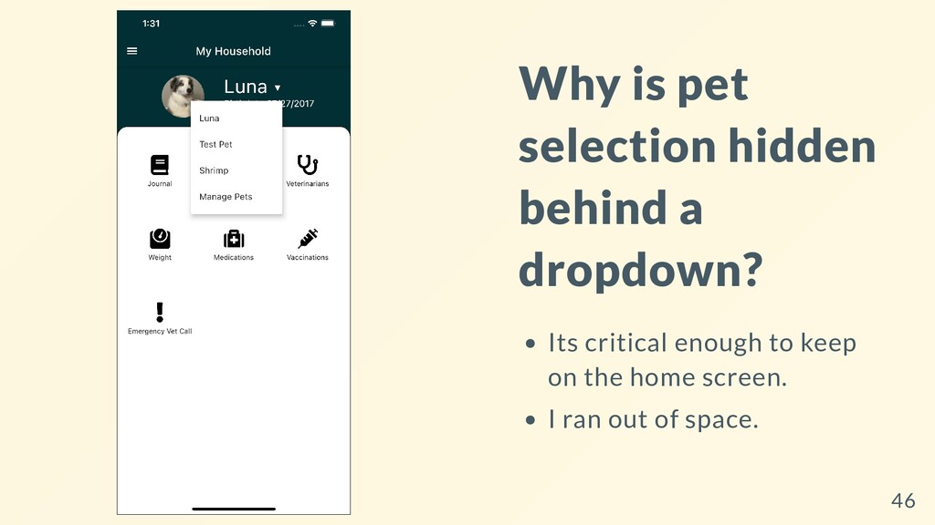
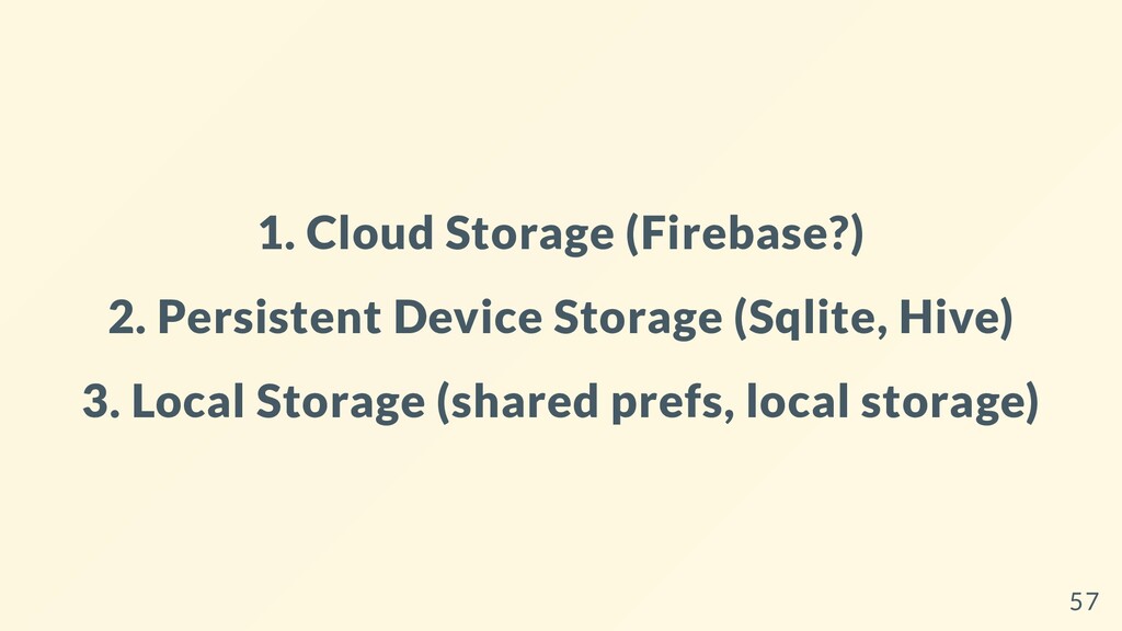
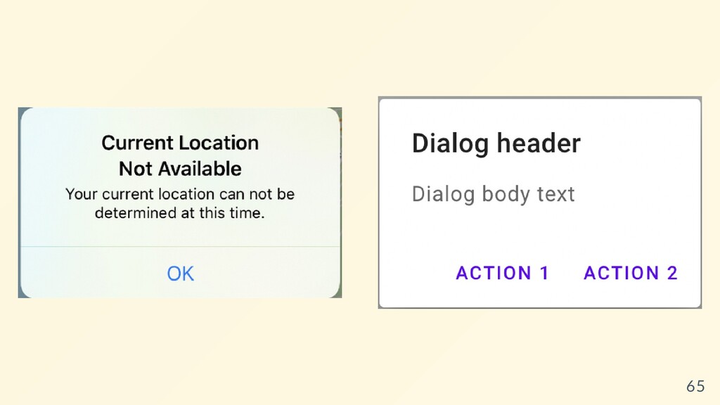
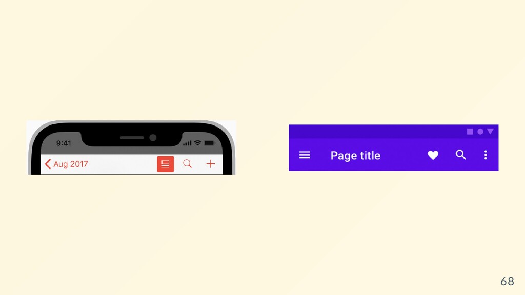
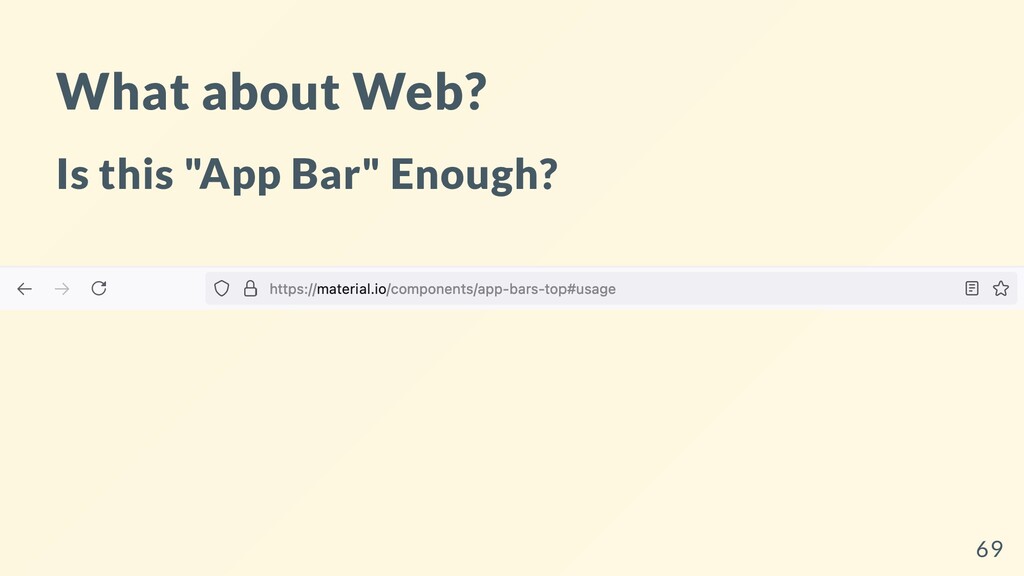
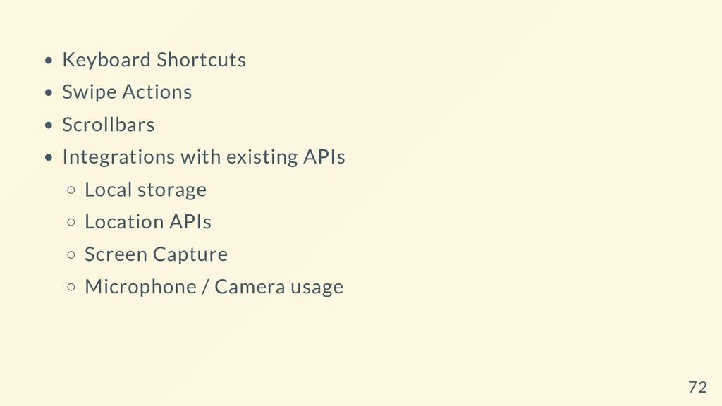
different device types, such as mobile and desktop, requires dealing with mouse and keyboard input, as well as touch input. It also means there are different expectations about the app’s visual density, how component selection works (cascading menus vs bottom sheets, for example), using platform-specific features (such as top-level windows), and more. 6
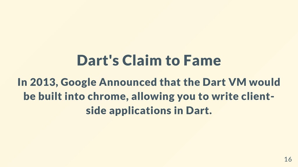
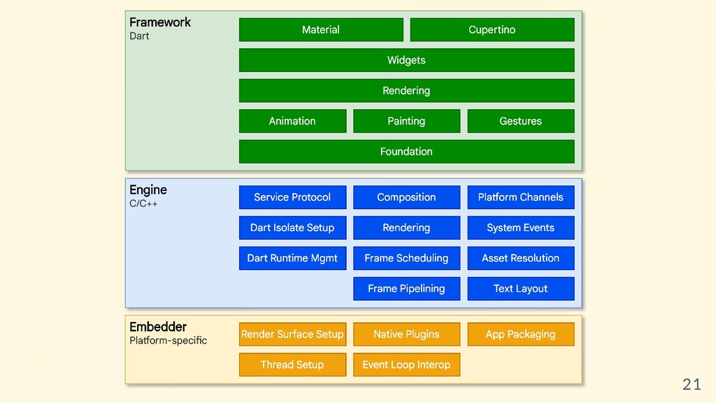
beautiful, natively compiled applications for mobile, web, desktop, and embedded devices from a single codebase. Not Responsive Not Adaptive Provides the tools to make Responsive and Adaptive Apps. Powered by Dart 7
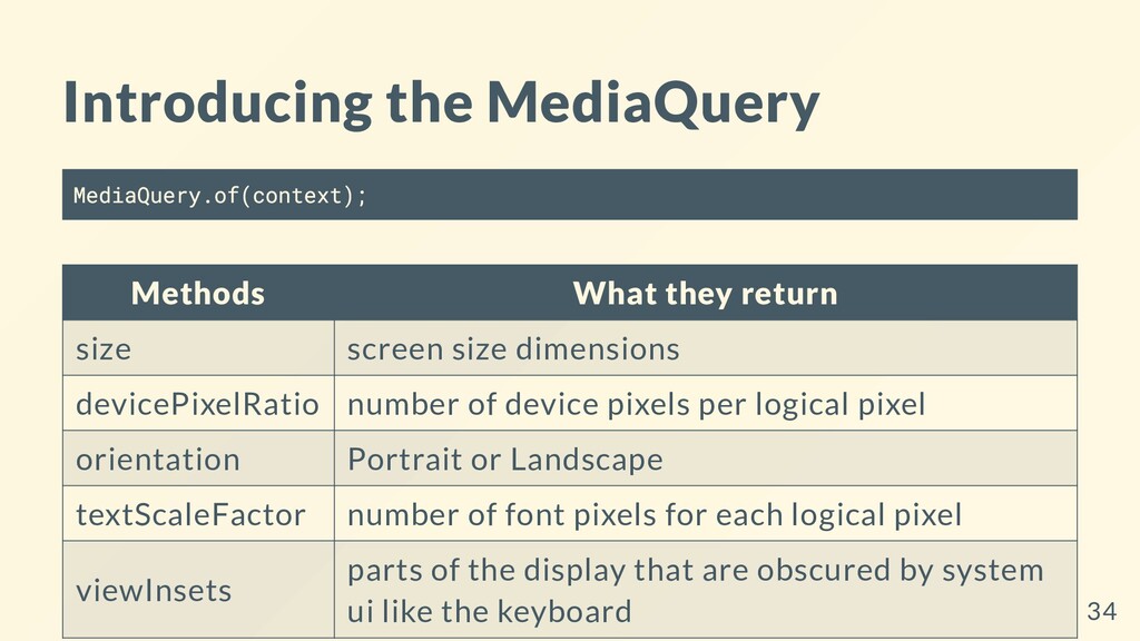
size dimensions devicePixelRatio number of device pixels per logical pixel orientation Portrait or Landscape textScaleFactor number of font pixels for each logical pixel viewInsets parts of the display that are obscured by system ui like the keyboard 34
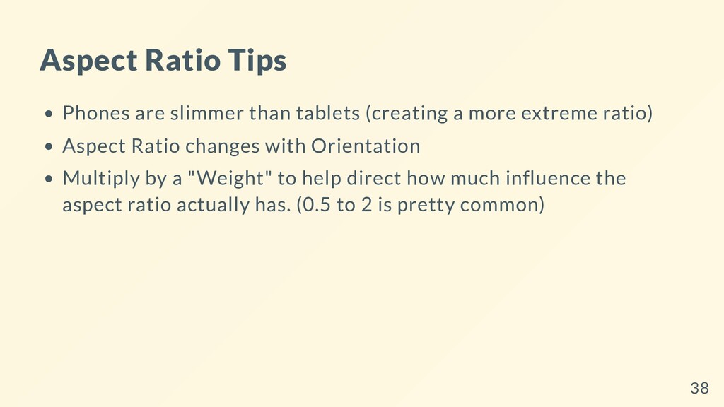
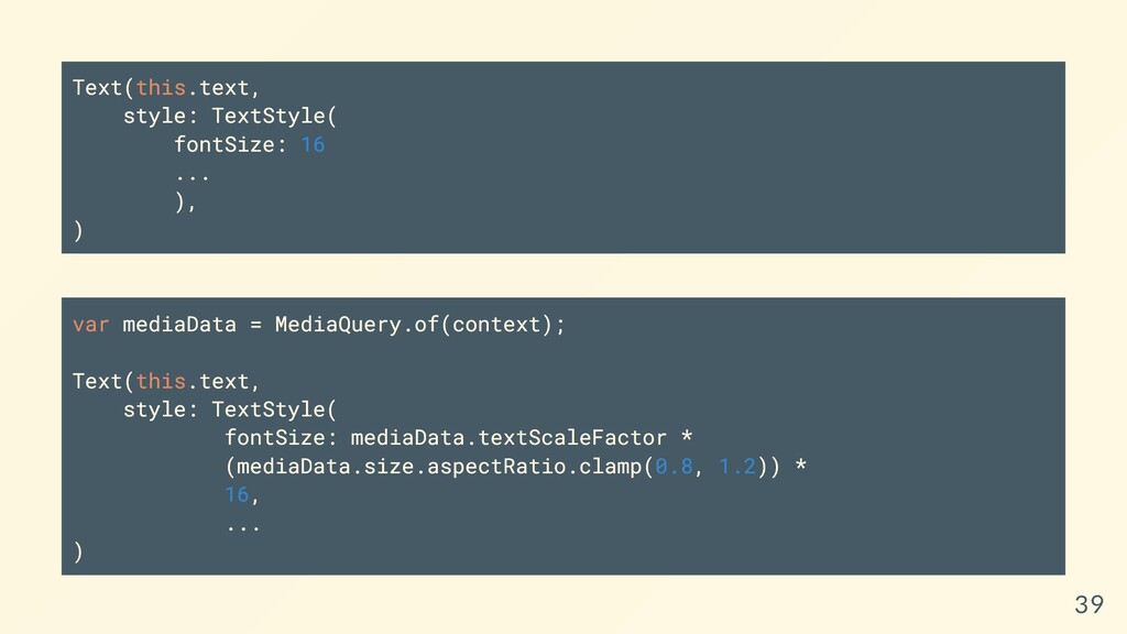
more extreme ratio) Aspect Ratio changes with Orientation Multiply by a "Weight" to help direct how much influence the aspect ratio actually has. (0.5 to 2 is pretty common) 38
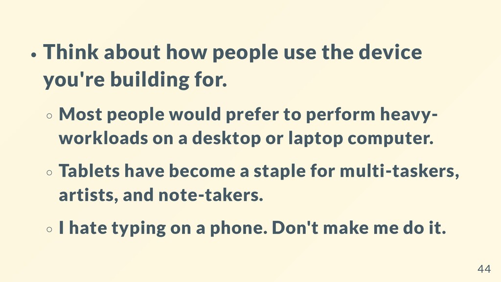
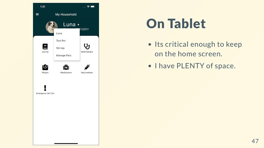
Most people would prefer to perform heavy- workloads on a desktop or laptop computer. Tablets have become a staple for multi-taskers, artists, and note-takers. I hate typing on a phone. Don't make me do it. 44
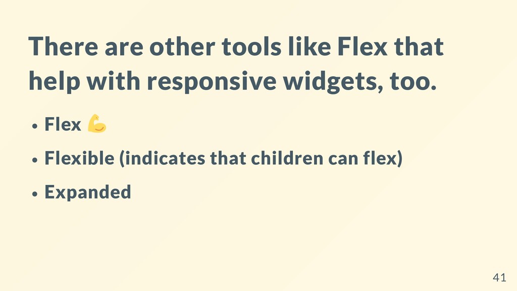
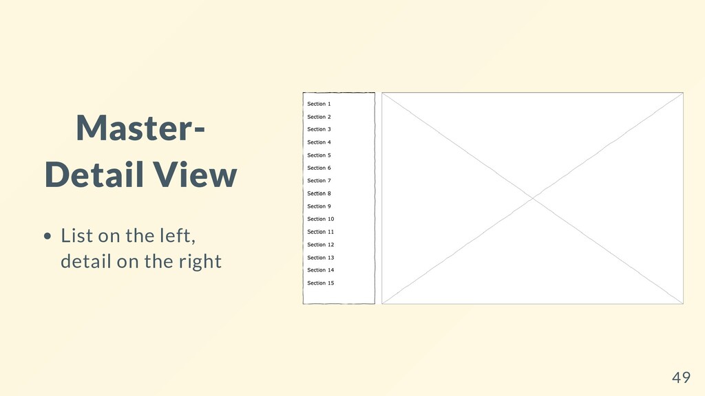
and responsive layouts Use for building large layouts Use for deciding how small widgets should render Widget of the Week: Layout Builder Layout Builder Docs 48
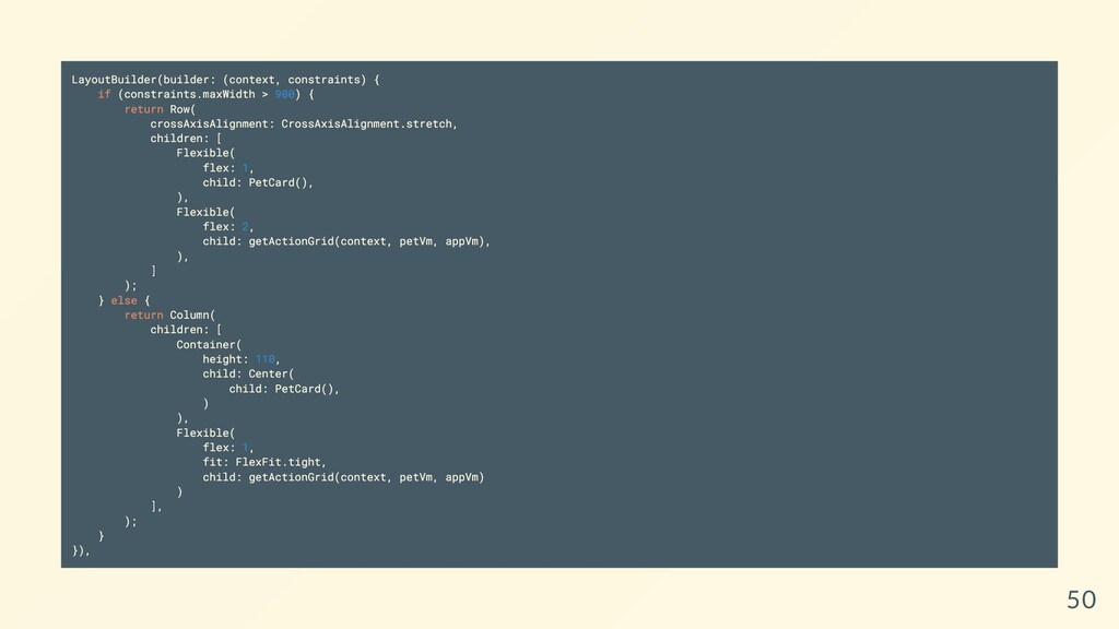
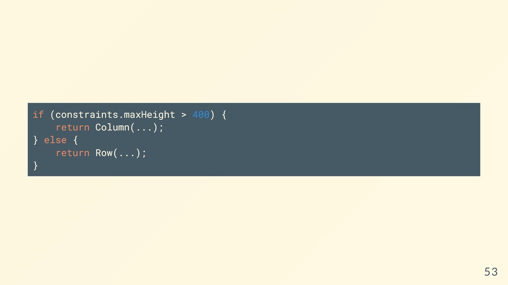
constraints use a LayoutBuilder and constraints.maxHeight > 400 check if the component is being rendered in a box greater than 400 pixels Phone: that box is going to be smaller than 400px given the previous layoutbuilder change. Larger Devices: will be greater than 400px given the previous change. The code for this is actually kind of big, so here's a link (but we'll show a few pieces in a second) 52
 bradcypert
 cscengineer
 oracle4engineer
 junki
junki
 nori_shinoda
 shibuiwilliam
 kentarofujii
 kworkdev
 nekorush14
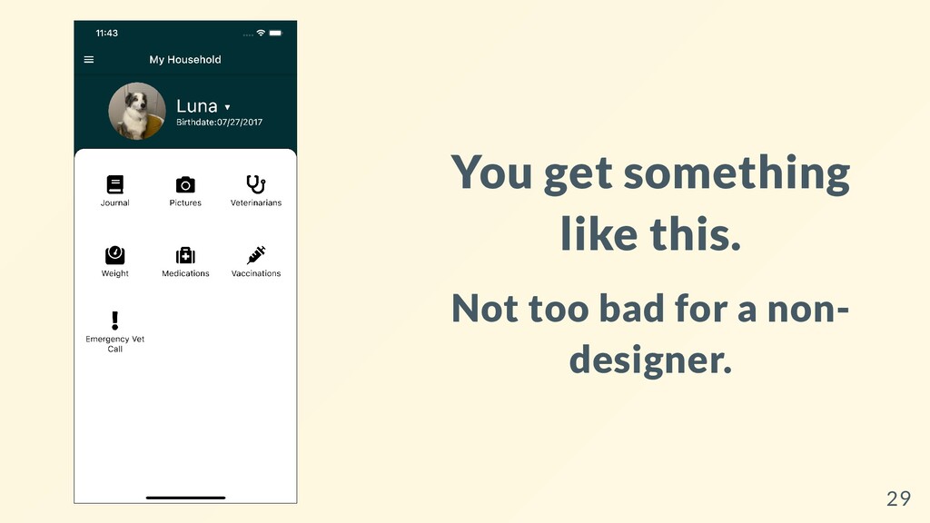
 cheng_wei_chen
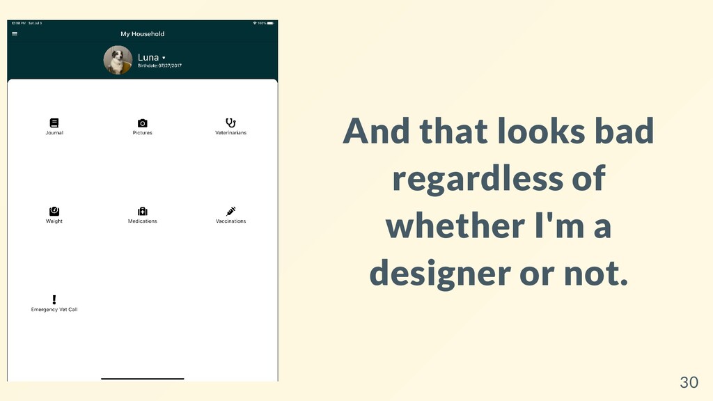
 you
you
 iotengineer22
 seafay
 marketingsoph
 gurzu
gurzu
 aleyda
 mfonobong
 wayneb77
 mza
mza
 chikuwait
 uxyall
 tammyeverts
 mayatellez