Upgrade to Pro
— share decks privately, control downloads, hide ads and more …
Speaker Deck
Features
Speaker Deck
PRO
Sign in
Sign up for free
Search
Search
That's presentation it's about flex-box
Search
Sponsored
·
Your Podcast. Everywhere. Effortlessly.
Share. Educate. Inspire. Entertain. You do you. We'll handle the rest.
→
Bruna Fernandes
March 02, 2019
Design
76
1
Share
That's presentation it's about flex-box
Bruna Fernandes
March 02, 2019
Other Decks in Design
See All in Design
「親切なオンボーディング」 が招く罠 ー AI時代のUXデザイン
godlingkogami
0
120
Drawing for Animation
lynteo
2
300
Accelerating performance improvement based on a software review evaluation matrix
kitanosirokuma
0
240
2026年5月24日Redesigner Career Jamご参加者様ご案内資料
base
PRO
0
140
大企業インハウスデザイン組織における DesignOps改革の現在地 / DesignOps at Scale: Navigating Transformation in Large Enterprises
nttcom
0
670
2026年の勢い / Momentum for 2026
bebe
0
450
CULTURE DECK/Creative Director
mhand01
0
1.2k
I.A. como meio, não como fim. Como avaliar o valor entregue?
videlvequio
0
340
改正JISを見据えた、企業のアクセシビリティ対応ロードマップ
securecat
1
380
Storyboard Assignment: Storyboard from Comic Strip
lynteo
3
270
Frontier
rwang05
0
140
20251217リビングラボ・トークin尼崎(尼崎おせっかい会議&オトナテラコヤ)
a2k
0
120
Featured
See All Featured
Responsive Adventures: Dirty Tricks From The Dark Corners of Front-End
smashingmag
254
22k
WENDY [Excerpt]
tessaabrams
11
38k
Claude Code どこまでも/ Claude Code Everywhere
nwiizo
65
55k
DevOps and Value Stream Thinking: Enabling flow, efficiency and business value
helenjbeal
1
200
"I'm Feeling Lucky" - Building Great Search Experiences for Today's Users (#IAC19)
danielanewman
231
23k
Ten Tips & Tricks for a 🌱 transition
stuffmc
0
120
Embracing the Ebb and Flow
colly
88
5.1k
End of SEO as We Know It (SMX Advanced Version)
ipullrank
3
4.2k
Amusing Abliteration
ianozsvald
1
180
Let's Do A Bunch of Simple Stuff to Make Websites Faster
chriscoyier
508
140k
Code Review Best Practice
trishagee
74
20k
Leading Effective Engineering Teams in the AI Era
addyosmani
9
2k
Transcript
Flexibilizando sua vida com Flex
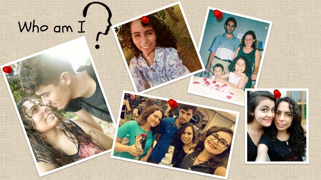
Who am I
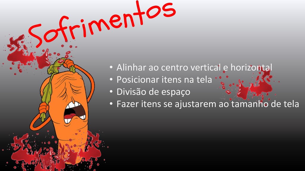
• Alinhar ao centro vertical e horizontal • Posicionar itens
na tela • Divisão de espaço • Fazer itens se ajustarem ao tamanho de tela
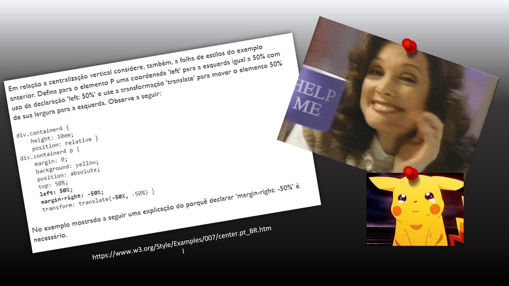
None
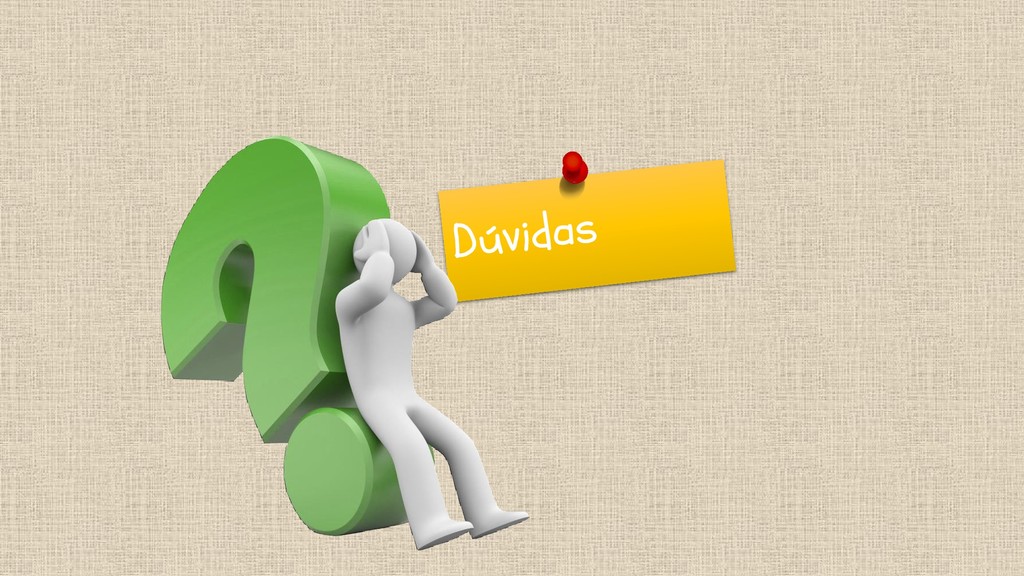
Alguém já passou por isso antes!!!
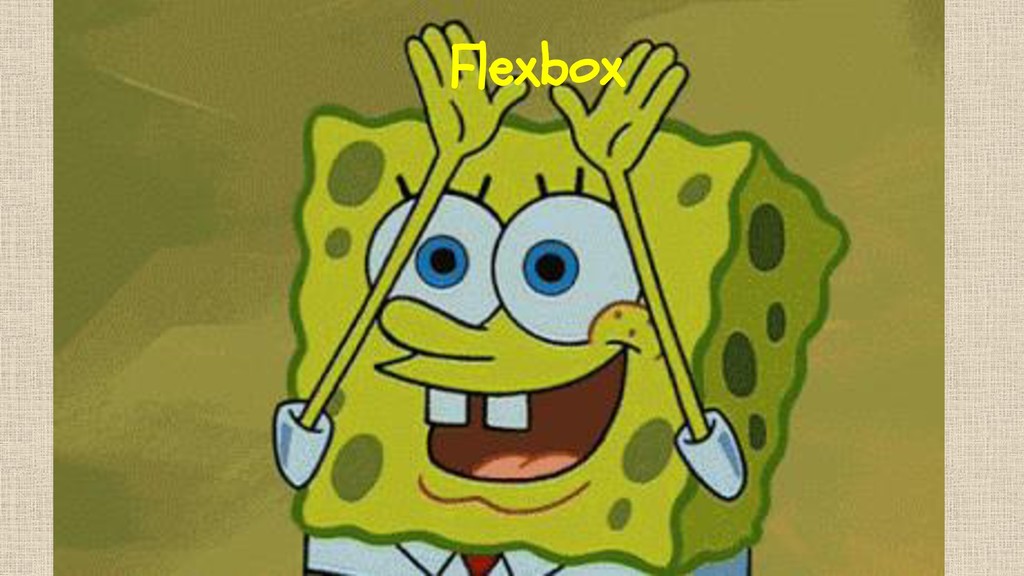
Flexbox
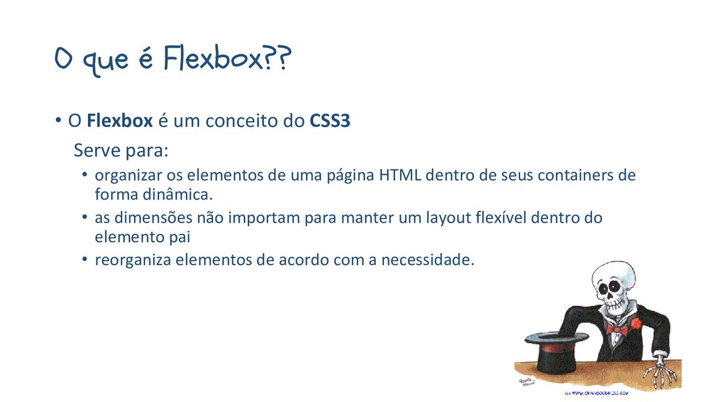
O que é Flexbox?? • O Flexbox é um conceito
do CSS3 Serve para: • organizar os elementos de uma página HTML dentro de seus containers de forma dinâmica. • as dimensões não importam para manter um layout flexível dentro do elemento pai • reorganiza elementos de acordo com a necessidade.
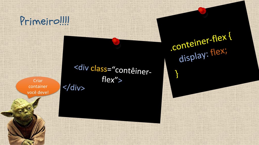
Primeiro!!!! Criar container você deve!
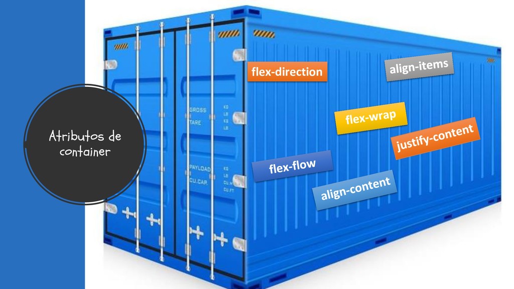
Atributos de container flex-direction
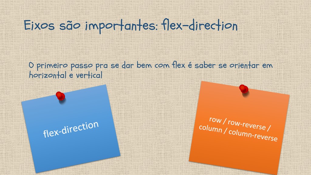
Eixos são importantes: flex-direction O primeiro passo pra se dar
bem com flex é saber se orientar em horizontal e vertical
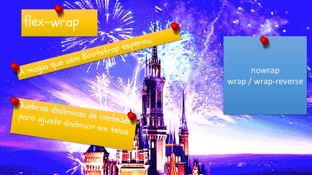
flex-wrap nowrap wrap / wrap-reverse
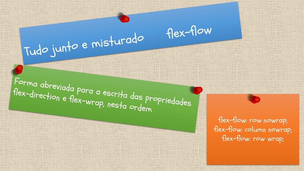
flex-flow: row nowrap; flex-flow: column nowrap; flex-flow: row wrap;
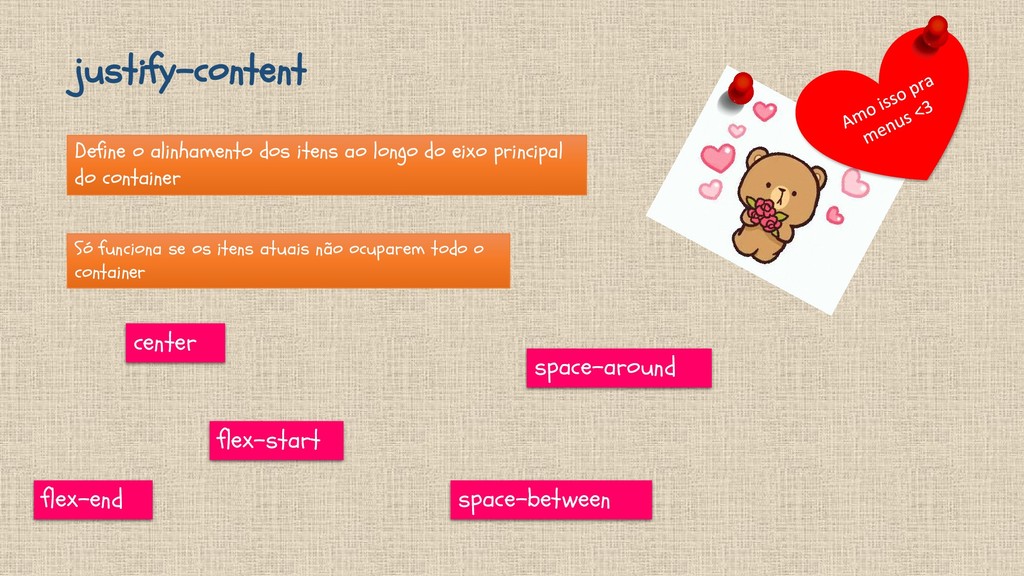
justify-content Define o alinhamento dos itens ao longo do eixo
principal do container Só funciona se os itens atuais não ocuparem todo o container flex-start flex-end center space-between space-around
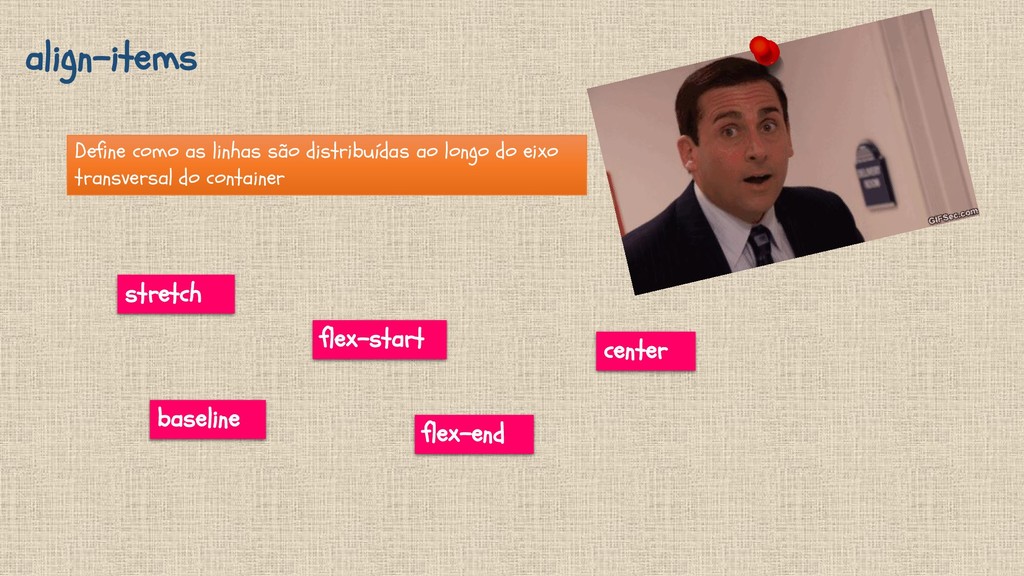
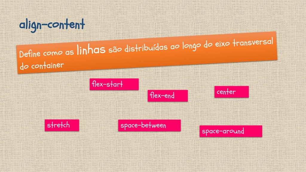
align-items Define como as linhas são distribuídas ao longo do
eixo transversal do container stretch flex-start flex-end center baseline
align-content stretch flex-start flex-end space-between center space-around
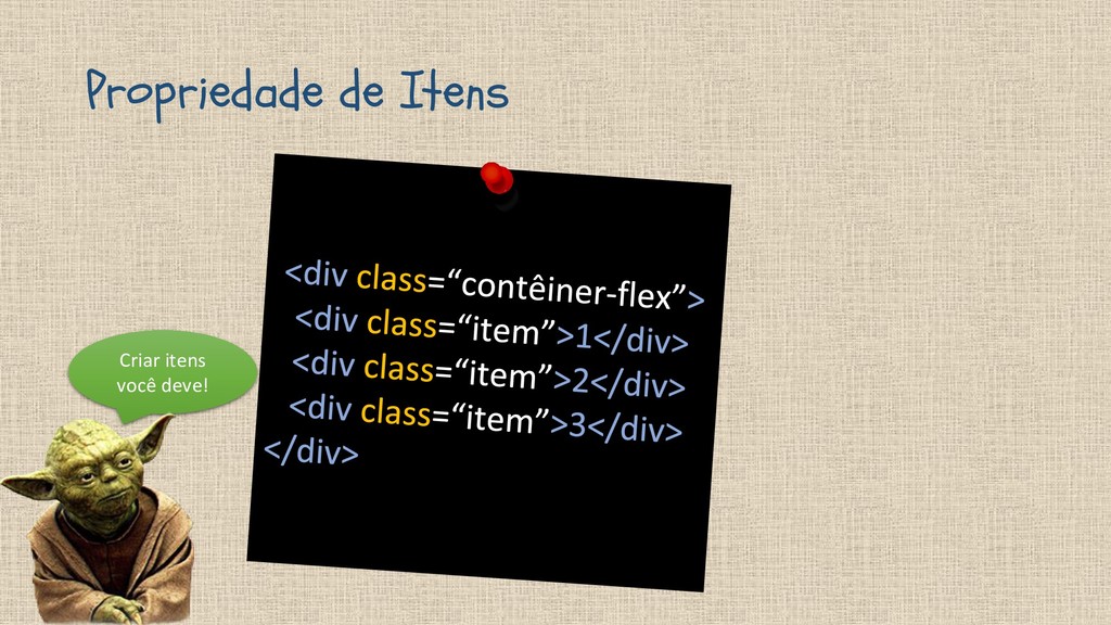
Propriedade de Itens Criar itens você deve!
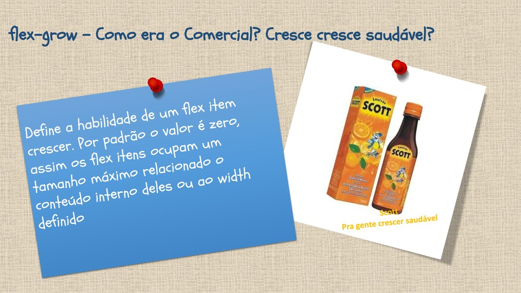
flex-grow – Como era o Comercial? Cresce cresce saudável?
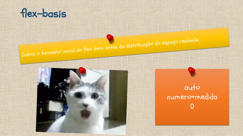
flex-basis auto numero+medida 0
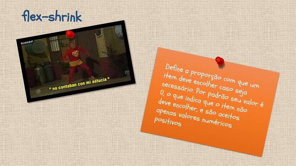
flex-shrink
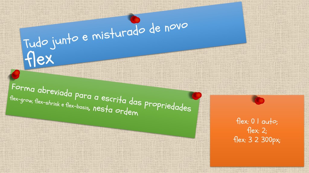
flex: 0 1 auto; flex: 2; flex: 3 2 300px;
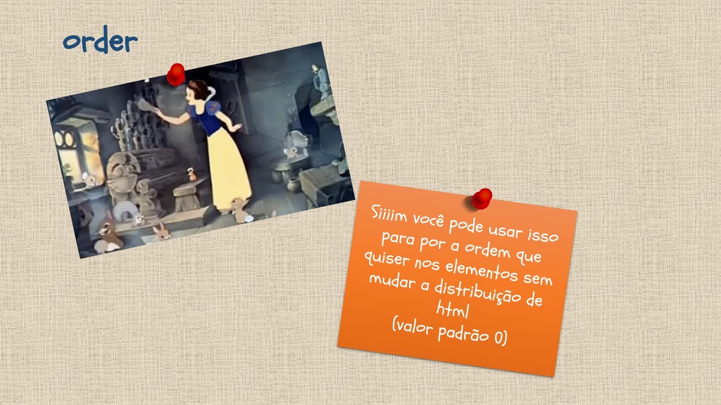
order
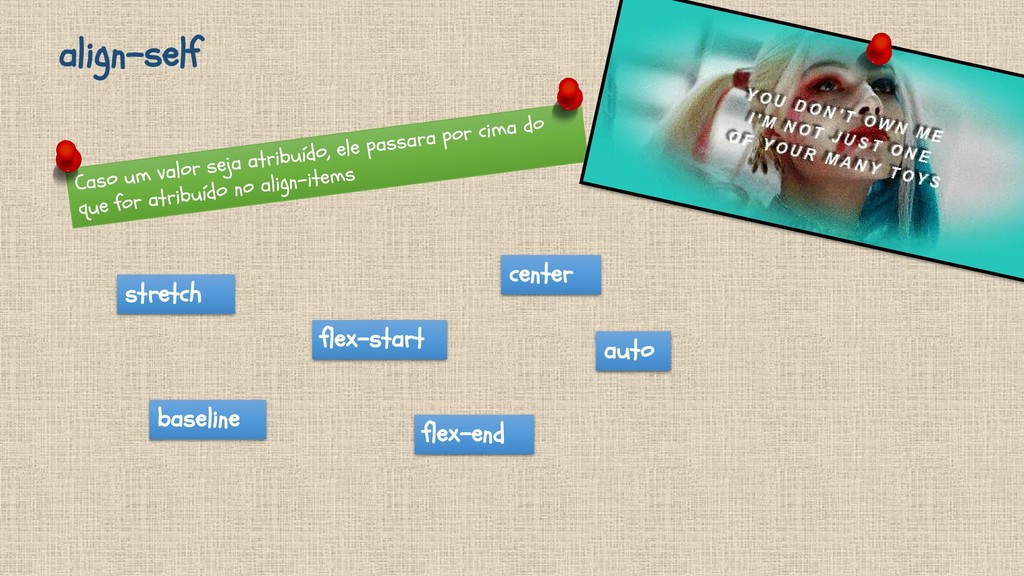
align-self stretch flex-start flex-end auto baseline center
None
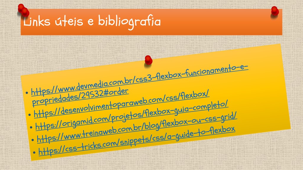
Links úteis e bibliografia
 godlingkogami
 lynteo
 kitanosirokuma
 base
base
 nttcom
 bebe
bebe
 mhand01
 videlvequio
 securecat
.jpg) rwang05
rwang05
 a2k
a2k
 smashingmag
 tessaabrams
 nwiizo
.png) helenjbeal
helenjbeal
 danielanewman
 stuffmc
 colly
colly
 ipullrank
 ianozsvald
 chriscoyier
 trishagee
 addyosmani