Note: There was extensive use of video in this presentation that is lost on Speaker Deck
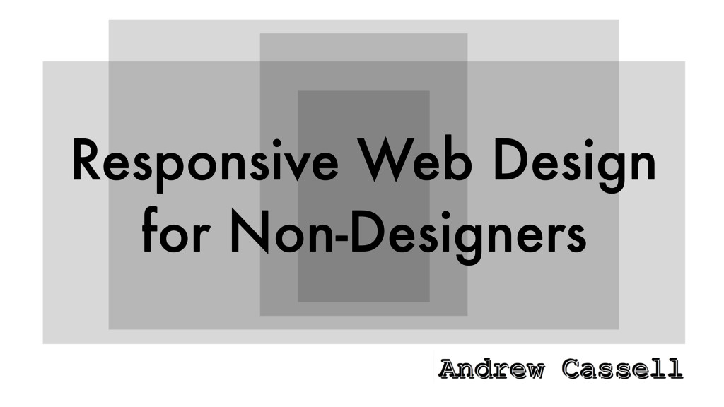
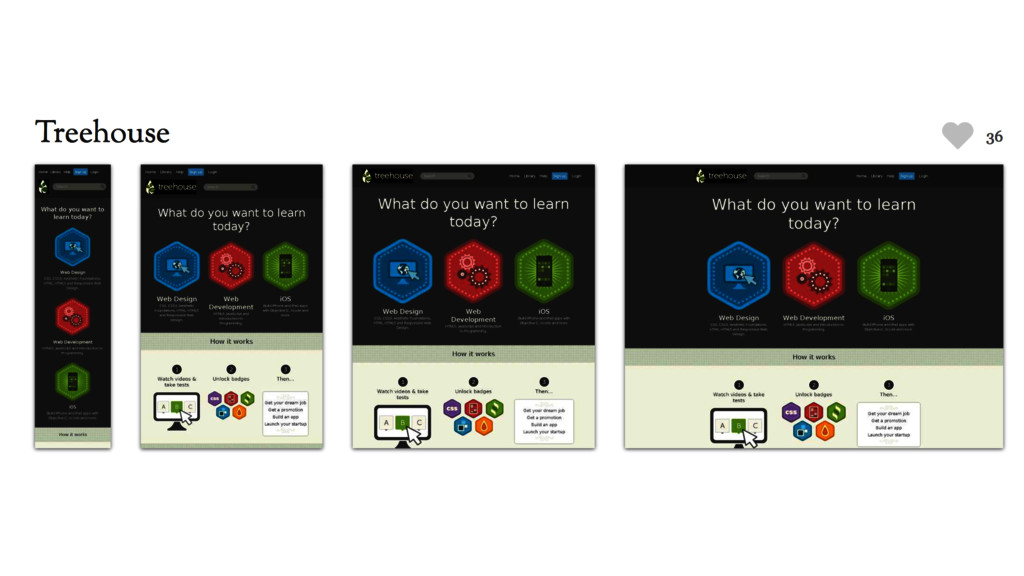
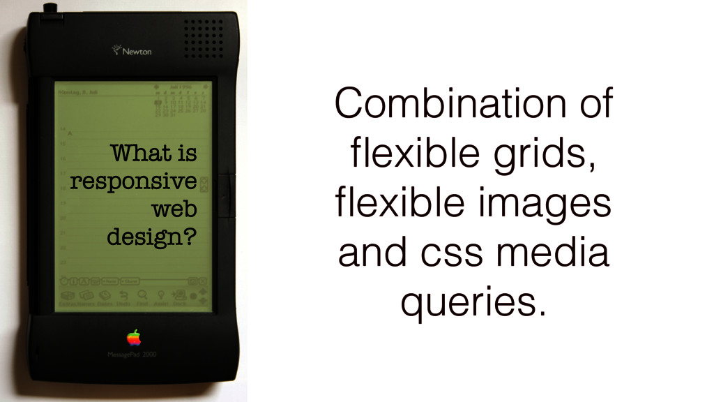
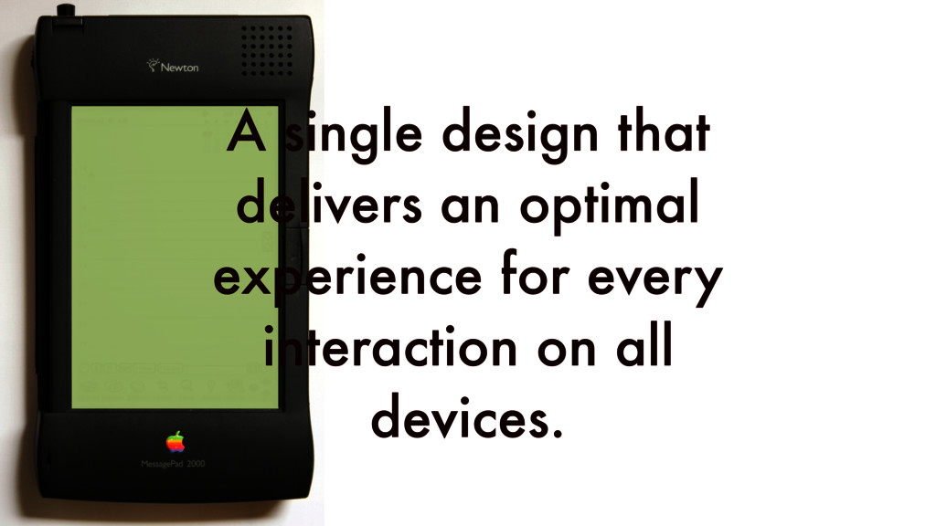
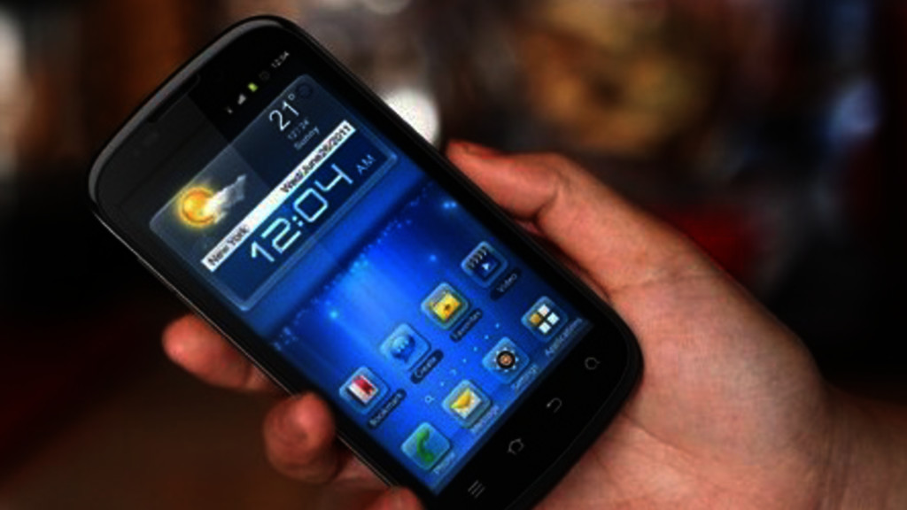
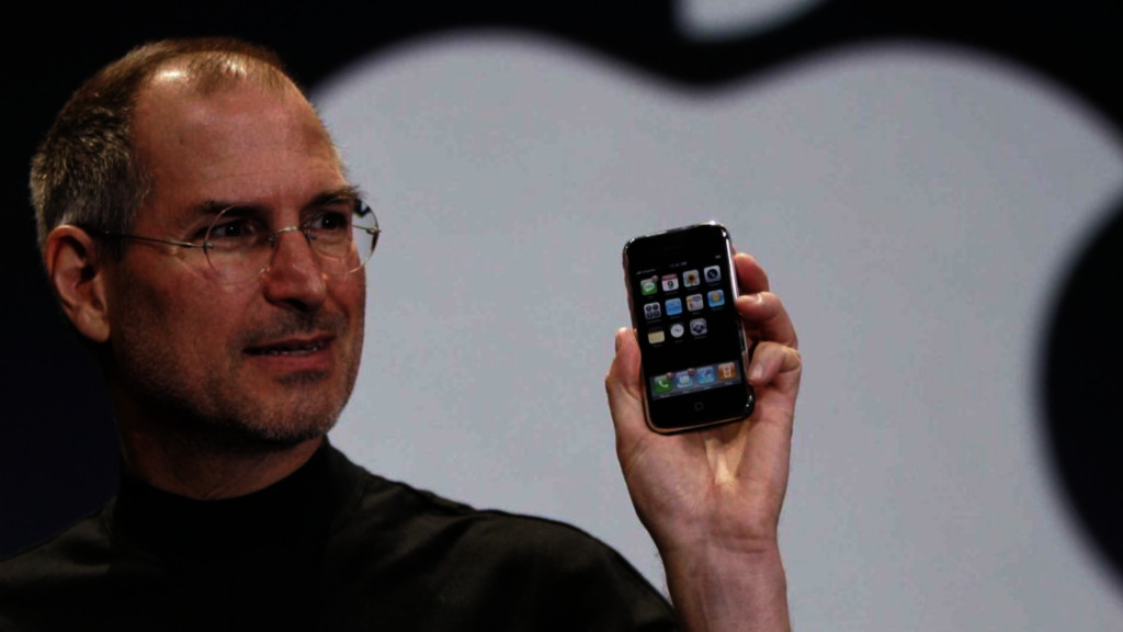
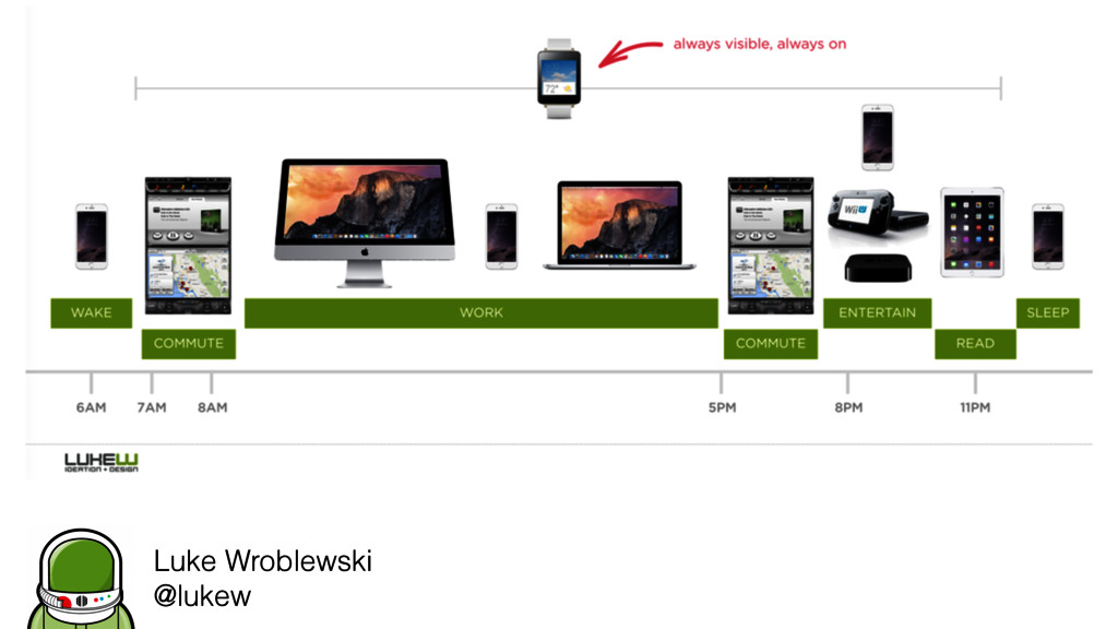
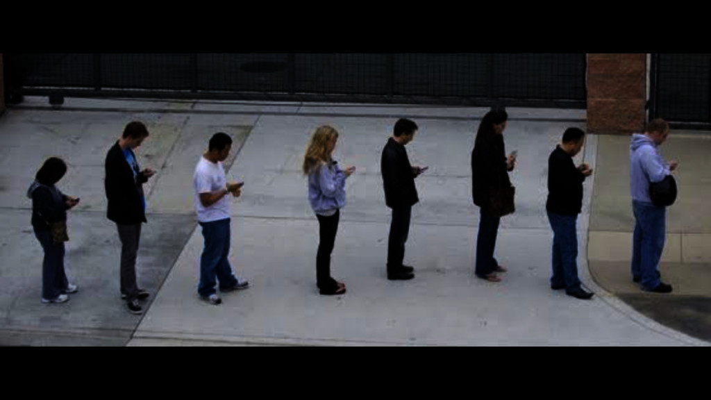
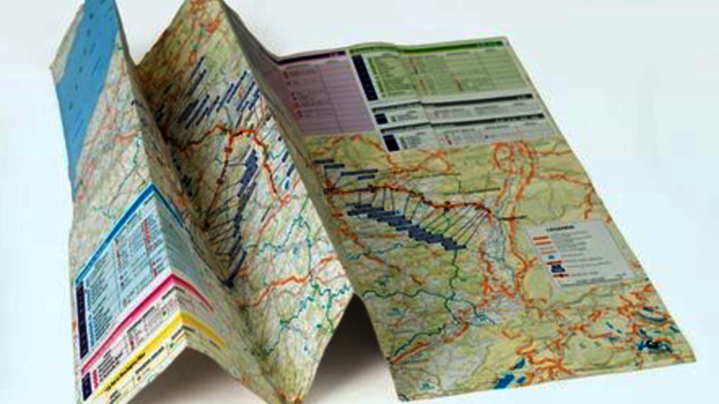
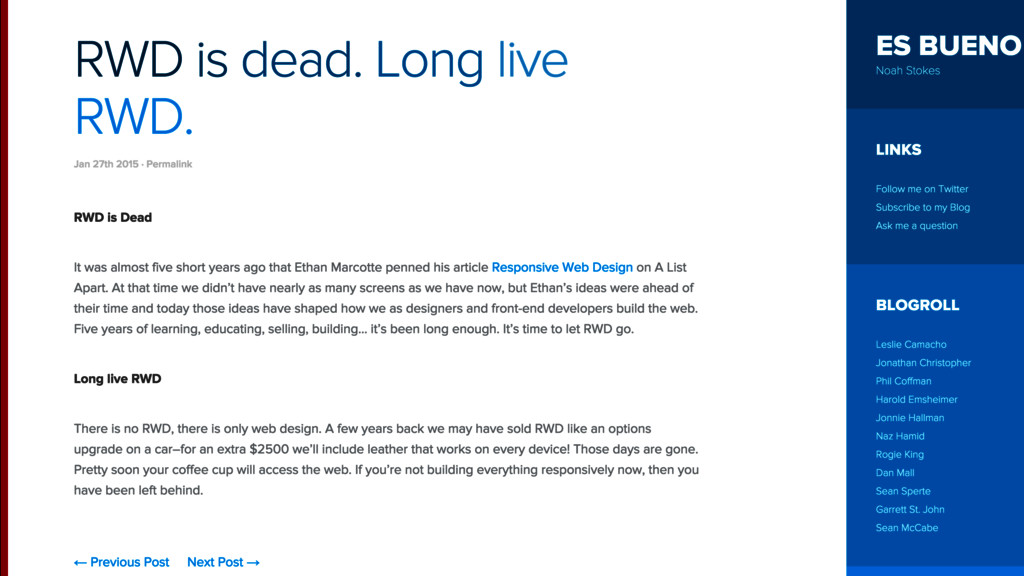
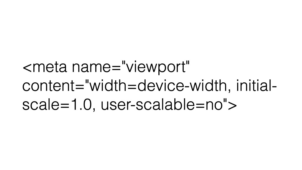
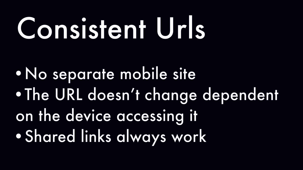
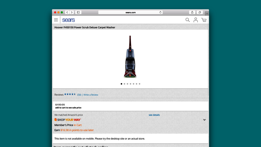
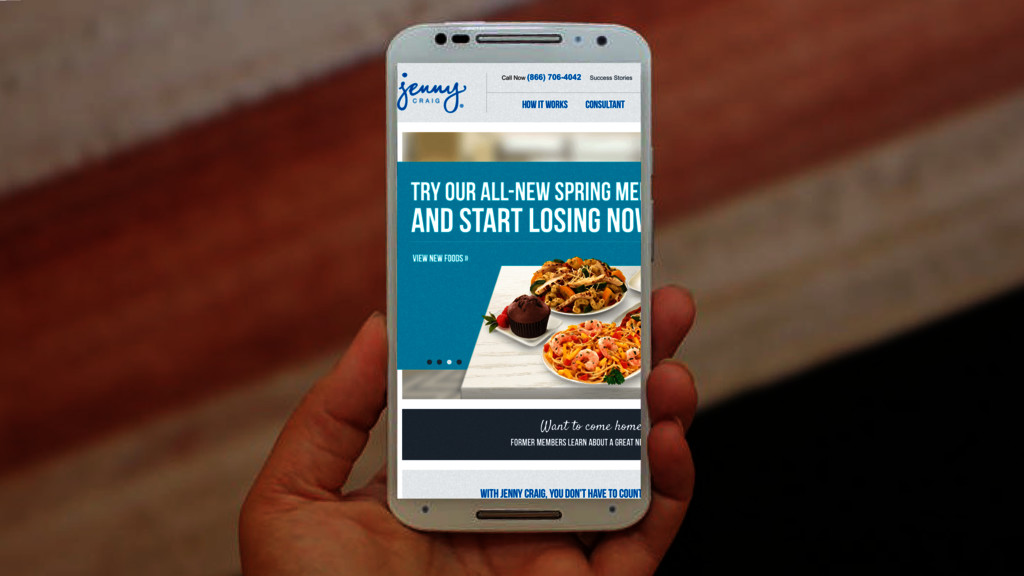
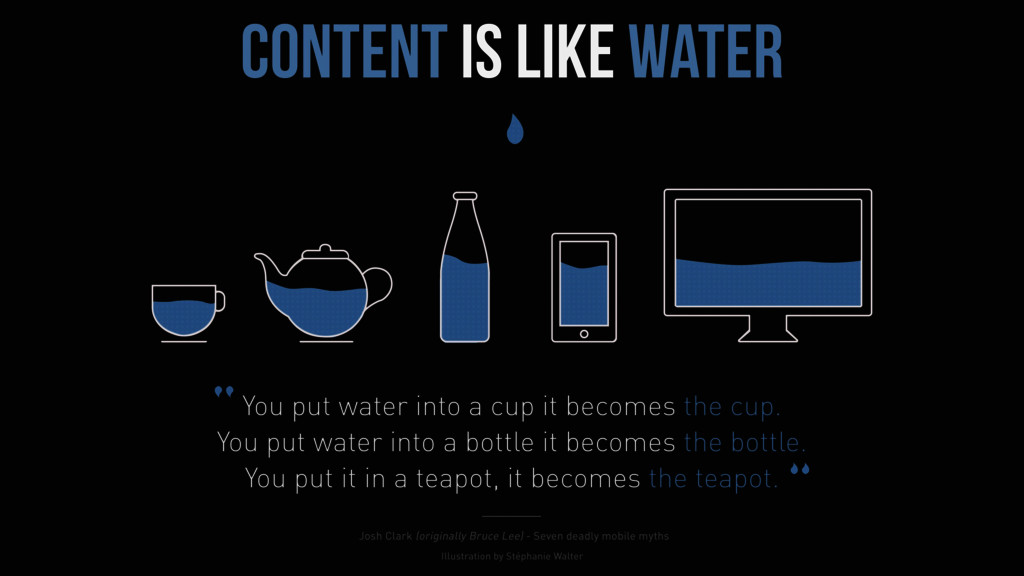
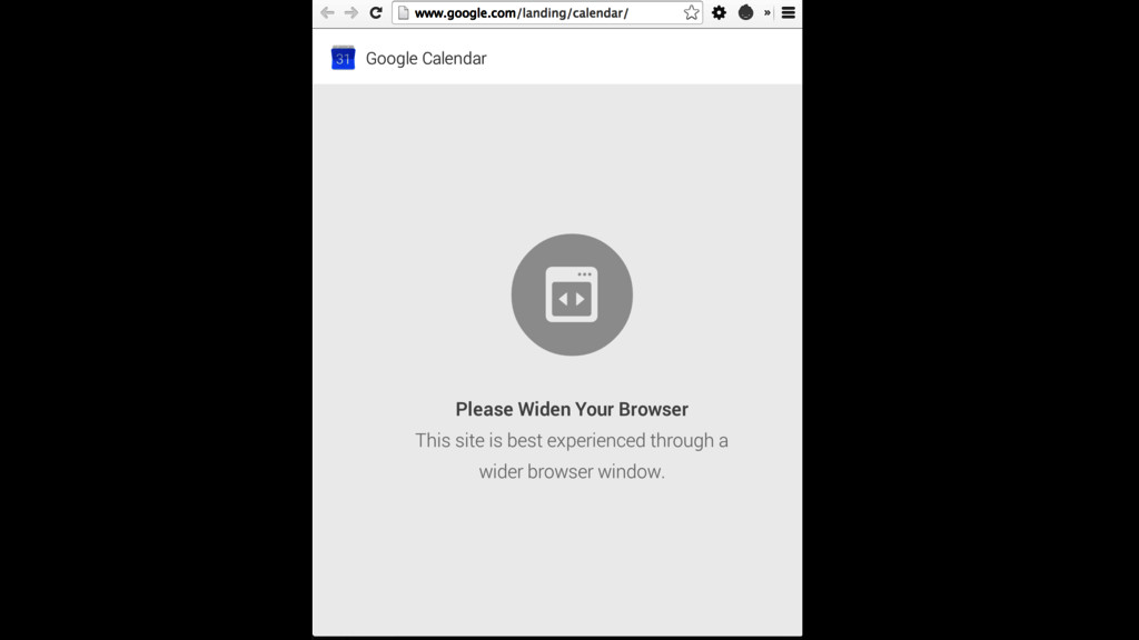
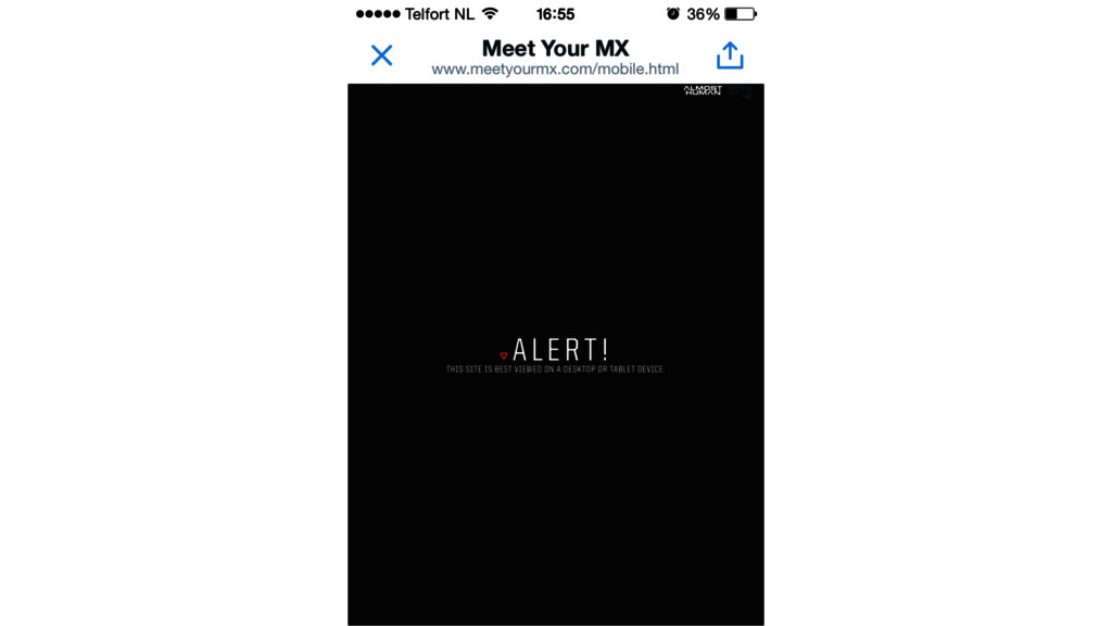
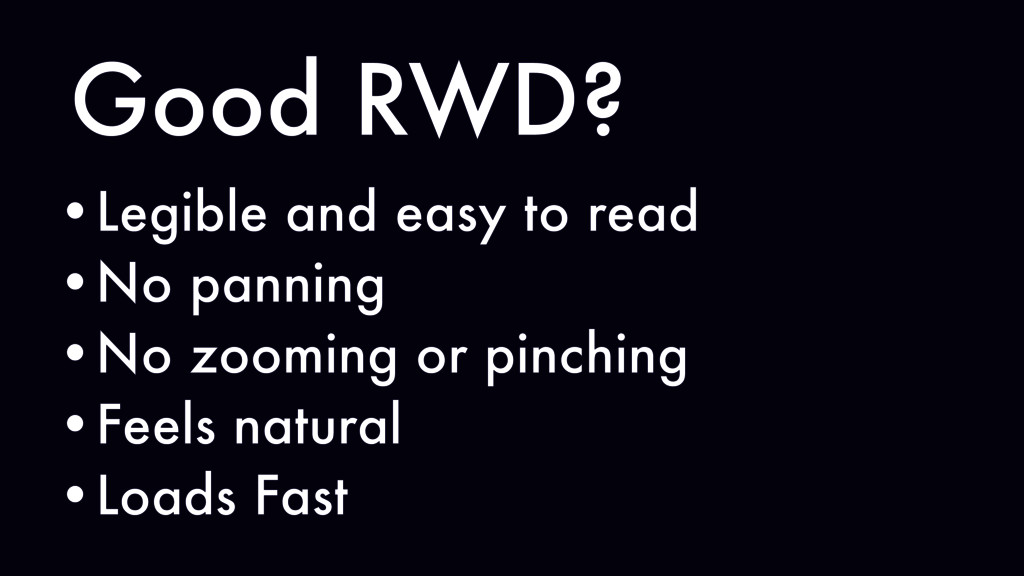
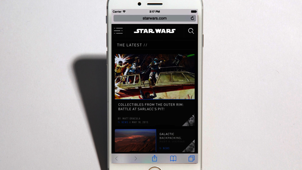
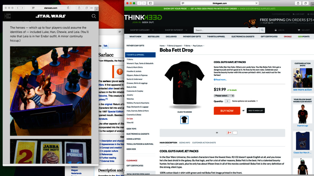
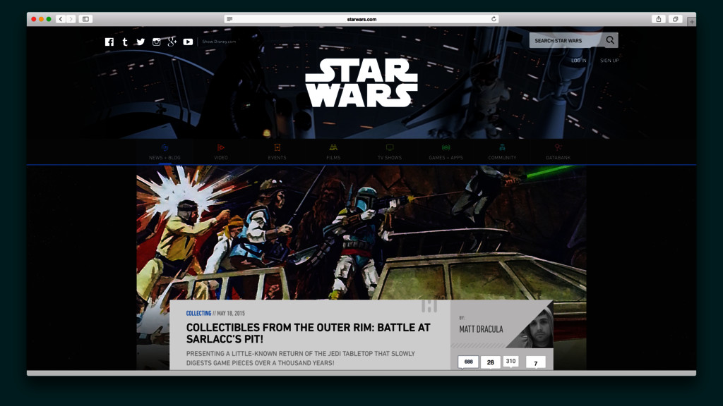
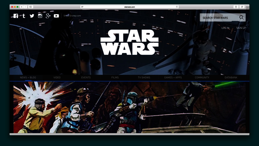
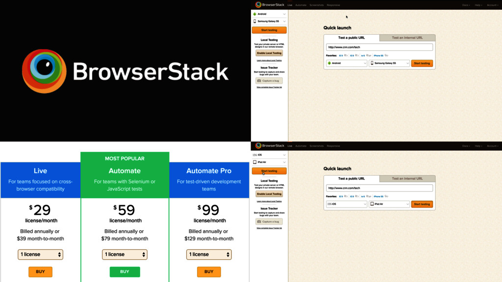
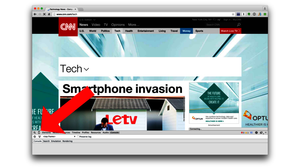
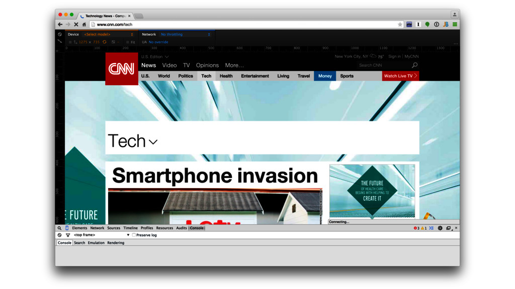
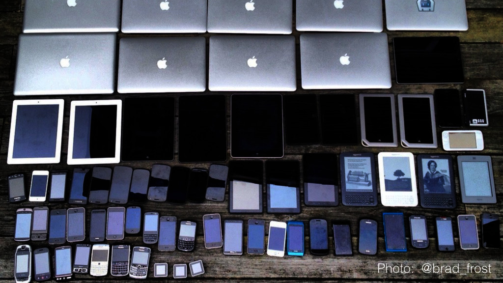
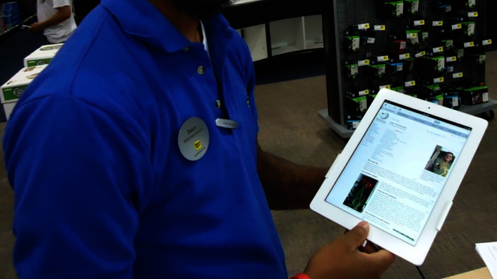
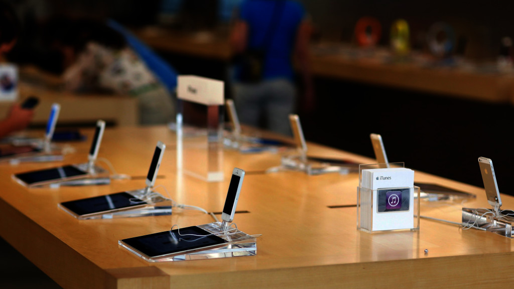
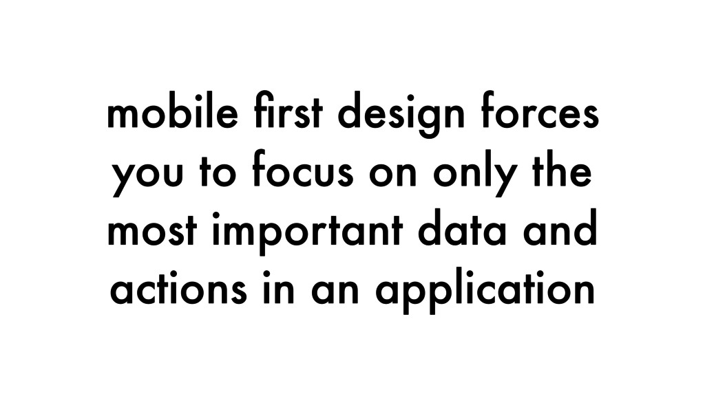
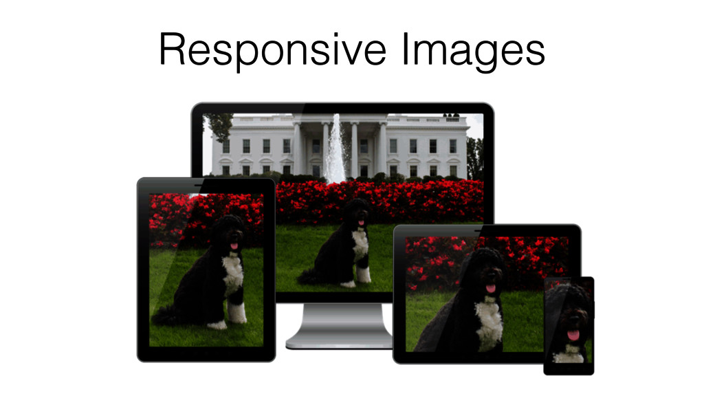
A responsive website or application provides an optimal experience across a wide range of mobile and desktop devices. In this talk, we'll start with the basics of responsive design and cover the various server side and client side approaches used to improve the usability of your web applications and content.
 cassell
 abokadotyann
 teba_eleven
 garyuten
 takanorip
 kakukoki
 shoko_seven11
 kenichiota0711
 webnaut
 kaikou
 hiro93n
 securecat
 nbkouhou
 techseoconnect
 iamctodd
 aleyda
 62gerente
 tammyeverts
 palkan
 cassininazir
 scottboms
 oripsolob
 destraynor
 paigeccino
 addyosmani