Upgrade to Pro — share decks privately, control downloads, hide ads and more …

CodeFest 2017, Иван Васильев (Альфа-Банк), Опыт создания подразделения дизайна в Альфа-Лаборатории

CodeFest
January 31, 2018

CodeFest 2017, Иван Васильев (Альфа-Банк), Опыт создания подразделения дизайна в Альфа-Лаборатории

https://2017.codefest.ru/lecture/1186

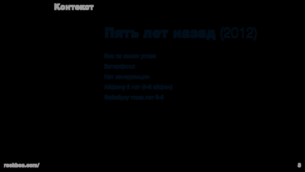
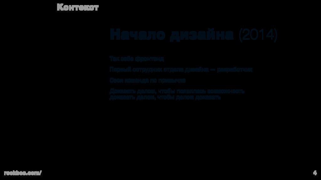
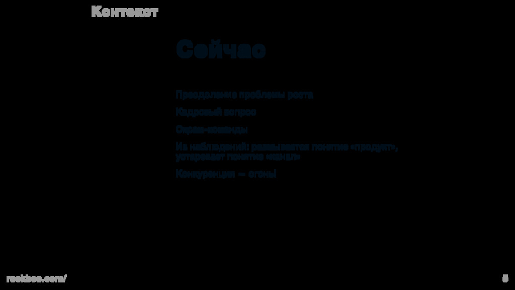
Скрам-команды и подход к продуктовой разработке. Банковские продукты. Как устроено у нас.

10 принципов дизайна для дизайнеров и для команд.

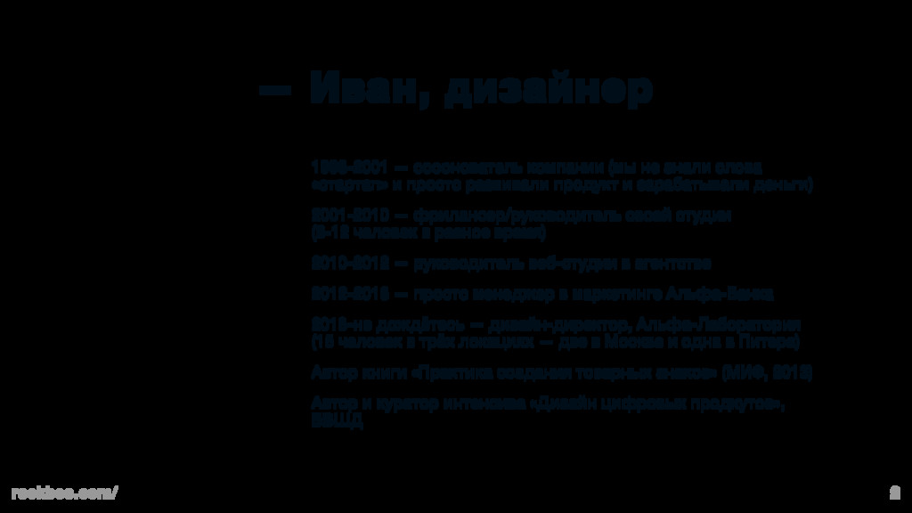
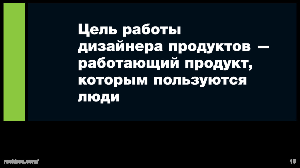
Роль дизайнера в продуктовой команде.

Возможно ли управлять дизайном? Что это такое? Зачем?

CodeFest

January 31, 2018
Tweet

More Decks by CodeFest

Other Decks in Design

Transcript

  1. rockbee.com/ 2 — Иван, дизайнер 1998-2001 — сооснователь компании (мы

    не знали слова «стартап» и просто развивали продукт и зарабатывали деньги) 2001-2010 — фрилансер/руководитель своей студии (8-12 человек в разное время) 2010-2012 — руководитель веб-студии в агентcтве 2012-2013 — просто менеджер в маркетинге Альфа-Банка 2013-не дождётесь — дизайн-директор, Альфа-Лаборатория (15 человек в трёх локациях — две в Москве и одна в Питере) Автор книги «Практика создания товарных знаков» (МИФ, 2013) Автор и куратор интенсива «Дизайн цифровых продкутов», БВШД
  2. rockbee.com/ 3 Контекст Пять лет назад (2012) Все по своим

    углам Ватерфолл Нет конкуренции Айфону 5 лет (4-й айфон) Фейсбуку тоже лет 5-6
  3. rockbee.com/ 4 Контекст Начало дизайна (2014) Так себе фронтенд Первый

    сотрудник отдела дизайна — разработчик Своя команда по привычке Доказать делом, чтобы появилась возможность доказать делом, чтобы делом доказать
  4. rockbee.com/ 5 Контекст Cейчас Преодоление проблемы роста Кадровый вопрос Скрам-команды

    Из наблюдений: размывается понятие «продукт», устаревает понятие «канал» Конкуренция — огонь!
  5. rockbee.com/ 13 Масштабировать на остальные продукты Подход к снаряду Корпоративный

    мобильный банк Розничный веб Корпоративный веб Внутренние банковские системы
  6. rockbee.com/ 15 Роль руководителя отдела дизайна Подход к снаряду HR

    (рекрутмент и бюрократия) Развитие специалистов Внутреннее взаимодействие специалистов (пасти котов) Стратегия дизайн-решений (генеральное направление) Масштабирование разработок на банк (дизайн-система)
  7. rockbee.com/ 18 Работает компьютер, не клиент Принципы Если программисты придут

    к власти, то всё правительство заменят одним скриптом
  8. The problem with style guide is that it gets outdated

    the day it is published, because life is way more interesting and we find lots of reasons to make our products better no matter what guidelines have to say about it. Instead, we have an opportunity to update code library and con- tribute with new findings and keep our apps design always up to date. Design System. Strategy
  9. The difference between Guidelines (styleguide) and Design System Instead of

    just creating a list of co- lours and typography rules and writ- ing them down we have to create a library of UI and UX components made in code. UI components library is a huge list of inputs, buttons, headings, icons library (another big topic), checkbox- es, dropdowns, alerts and way more (the number is multiplied on amount of colour schemes, two or more sizes and desktop/mobile for web apps). They have to be presented as code library, tested UI components for whatever mobile OS/browser list they are required. Think of them as of Lego bricks: they fit each oth- er and the result is consistent, and even kids can create great stuff. UX patterns including things like au- thorization, error and alert indicators, animations and so on (they mostly product or company specific). They are stored in library in code (not graphic files) and can be reused in every app by any team, and when it is updated for some reason (change of style, new UX ideas, easier solu- tion) every team can just update it in a few moments (and be sure updat- ed components will fit perfectly). 1. 2. 3.
  10. Design System Pros Product Development • Quicker customizations. Less time

    on coding means faster delivery • Skillset-mismatch. New developers can start working on products without reinventing the wheel • Cross-departmental collaboration. Different product teams are working within on style so that all the prod- ucts look and feel the same to end user • Approved feasibility. Design in code: every compo- nent has to be programmed, tested, described and stored in common library so that it can be reused again safely. Even if there was something wrong on design stage, it’ll be fixed properly on development stage • QA-free UI. Less bugs and mistakes in UI and UX since more people are using the same components and fixing them from time to time • Approved ergonomics. Best practices, basic compo- nents and UX patterns must be reused to save time and money and to support consistent user experi- ence along all the products
  11. Design System Pros Design • Less time on drawing, more

    time on creating better UX • More time to test ideas while staying in the same visual system • Realistic prototypes instead of dull wireframes • More code-centric design approach changes the way we de- sign: design tools are not that necessary, it’s faster to come up with real page/screen in code than in graphic editor (and use real data instead of “Lorem ipsum”)
  12. Alfa-Bank Design System Our goals Basic principles • Seamless UX

    through all our products • Reusable code • Modern, holistic design through all our products • Save time • Create in code as much as possible • Test as much as you can • Only tested components (UX patterns or UI elements) can be added to libraries We are continuously working on 2 main mobile banking apps (cor- porate and retail) and two internet-banks (also corporate and re- tail). We also help other teams (like Alfa-Forex) to build their apps as well so that our users will have seamless experience using any of our apps—mobile and web.
  13. What we’ve achieved so far Better UI and UX in

    mobile apps (higher CSI) Faster front-end development for web-apps 500+ Web UI Components Web, iOS and Android Code Libraries 260+ Icons Pack Interactive Prototyping System
  14. 500+ Web UI Components • Each component designed in different

    states (regular, active, disabled, depressed, pressed, hover, etc.) • At least four sizes for every component • White and dark themes supported • Desktop and mobile versions • Every component of any size can work well with any other component of any size if aligned properly • Every component and basic UX patterns, specific to our indus- try, are HTML/CSS/JS coded, tested for browsers compatibility and stored in code library.
  15. 260+ Icons Pack • Most of them are drawn in

    three sizes (different shapes, amount of details, stroke weight) to be perfectly optically aligned • They are all SVG so that they can be animated in web • Small file size • One library for web and mobile applications (every icon change affects all other apps) • We covered all the basic functions specific to banking applica- tions and PFM-categories • White and dark themes supported
  16. Code Libraries • If we have to change styles, colours,

    sizes and so on, we just have to do it in our libraries once and all other teams can update their apps (the more products the more effect) • It takes time to support libraries but it pays off by saving time in other teams • Every team can contribute components to library so it evolves naturally (though it requires quality testing and design review) • New functions are stored in system-specific librar- ies: web (BEM, React), iOS and Android so that other teams don’t have to recreate them, they’re just reus- ing and adjusting them (like new features highlights, authorization, lists, transfers and so on) • Since libraries are centralised and always up-to-date, every team can have latest version and thus we sup- port holistic design and user experience across all of our apps
  17. Blueprint Prototyping System • Javascript library for quick prototyping in

    browser with actual components (so that prototype looks and behave as real prod- uct without any exceptions) • Every component’s behaviour is coded (like validations, errors, fields masking and more) • Can use real data (via JSON for example) • Awesome feature: being JS-based library, Blueprint can be synced with Sketch through FramerJS so that almost no cod- ing may be required and pages can be created in a matter of minutes